My Cyanotypes and Chemigrams
|
|
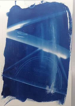
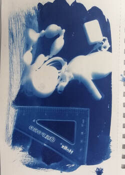
Following in the footsteps of early photographers like Anna Atkins we created our own Cyanotypes.
Pioneering English chemist and photographer John Herschel developed a printing process that used the light sensitivity of of iron salts to create light sensitive paper. By covering the different parts of the paper you are stoping the light from hitting the page giving you original and unusual pictures.
Pioneering English chemist and photographer John Herschel developed a printing process that used the light sensitivity of of iron salts to create light sensitive paper. By covering the different parts of the paper you are stoping the light from hitting the page giving you original and unusual pictures.
Chemigrams


Jaromir Funke
Jaromír Funke, born 1st August 1896, died 22nd March 1945, was a Czech photographer. Funke was a leading figure in Czech photography during the 1920s and 1930s.


|
Image analysis
Focus - Which areas appear clearer or sharpest? Light - The picture is made of harsh directed light and the dark shadows that the shape creates. Lines - The most dominant lines in the image are curved. They outline the shape of a geometric circle or sphere. You can see the shadow of the sphere towards the left of the image. Space - The depth of the image is shown by the deep lines and harsh shadows. Texture - The sphere looks smooth to the touch with nothing jagged or out of place Tone - The photo has no colour there is mostly sharp lines between the dark and the light ones?) |

|
My Shoot inspired by Jaromir Funke


My favourite photos edited


Review:
WWW: I took the photos a range of different angles. I use my camera to get different colours and shadows
EBI: I should have focused more on the shadows than the skull/object I was shooting. I could have used many more objects, closer to what Funke used in an attempt to recreate them.
WWW: I took the photos a range of different angles. I use my camera to get different colours and shadows
EBI: I should have focused more on the shadows than the skull/object I was shooting. I could have used many more objects, closer to what Funke used in an attempt to recreate them.
Ralph Eugene Meatyard
Ralph Eugene Meatyard was born in May 15, 1925 in the town of Normal, Illinois. Meatyard was introduced by a fellow photographer into books on Zen philosophy. Zen, strongly influenced Meatyard’s photography in that his photos reflected the connection between nature and humans. Using the camera's aperture settings Ralph created a blurred background.


|
Using Aperture
Aperture settings controls the area where light enters your camera. If your f/ setting is something like f/16 then all of your picture will be clearer and more detailed but if your f/ setting is something like f/1.2 the detail will be focused to the front and the background will be blurred. |

|
My Shoot


Editing and improving


To edit I used Gimp Photoshop to edit my favourite photos further so they can more closely resemble Ralph Eugene Meatyard's pictures.


Saul Leiter
"Photography allows you to learn to look and see. You begin to see things you'd never paid attention to."
|
|
Saul Leiter was born in Pittsburgh, Pennsylvania in 1923. He trained to become a Rabbi but left theology school and moved to New York to pursue painting at age 23. Once in New York, he was encouraged to try different types of art and with one of his friends he started experimenting with photography. At first he took black and white photos but soon he moved onto colour photos. A lot of Leiter's photographs are taken through glass or windows, often they will have rain or condensation covering them.
|


My Saul Leiter MS Paint Recreation

|

|
A recreation of the Saul Leiter photo on Microsoft paint using different bushes and techniques. I used my mouse and a small brush size, leading to what I think are is a weak recreation.
My Saul Leiter Photo shoot


Review
WWW: I have taken many photos that I am happy with.
EBI: I could have represented Saul Leiters photography style a lot more, all my photos are quite dark, I could have recreated Saul's window photos.
WWW: I have taken many photos that I am happy with.
EBI: I could have represented Saul Leiters photography style a lot more, all my photos are quite dark, I could have recreated Saul's window photos.
Shutter Speed
Shutter Speed is the length of time the camera is open, and exposed to light, when taking a photograph. The amount of light the lens is exposed to depends on the Shutter speed, for example the exposure time. 1⁄500 of a second will let half as much light in as 1⁄250.
Photographer Research - Greg Clayton
Harold Eugene ''Doc'' Edgerton was born April 6, 1903 and died January 4, 1990. He was a professor of Electrical engineering at the Massachusetts institute of technology and he helped innovate photography equipment.


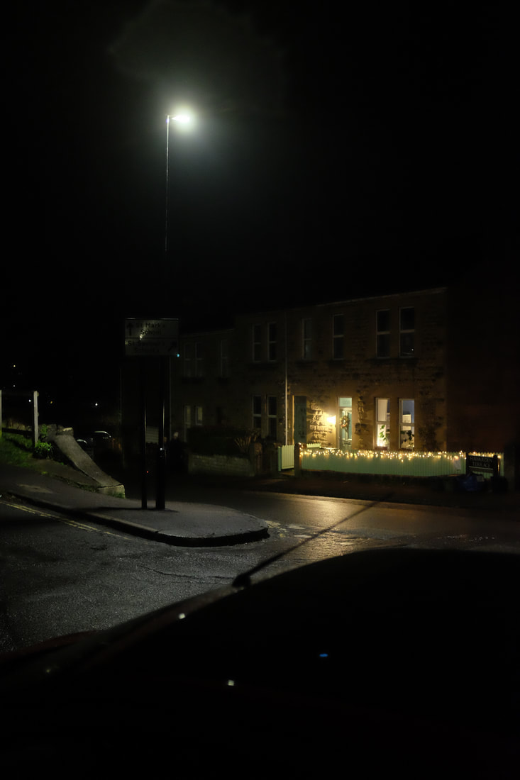
Long Shutter Speed Practice Shoot


Typology in isolation
Typology is the arrangement of photos in a grid. Each collection with a specific characteristic or similar consistency.
Artists that worked with Typologys
Walker Evens
Walker Evens was born in 1903 in St. Louis, Missouri. As a child Evans he enjoyed painting, collected postcards and even experimented with a small camera.


My own Typology
|
First Shoot
For my first shoot I used my families large collection of mugs to create my typology. I also used a photo editing app to change the colour of the background to a light grey. WWW: The typology shows the different styles and sizes of the mugs EBI: I could have taken more photos, to expand the size of the typology. |

|
|
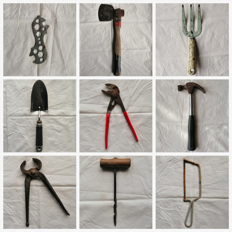
Second Shoot
For my second Typography I used my families collection of building and gardening tools. WWW: The tools work well on the background. EBI: I could have changed the colour of the white background. I could have taken more than just two topologies. |
|
My 'typophotos' in Isolation
The inspiration for this task came from 'ABECEDA: a jazz-age alphabet from Prague', it is a series of photographs of the dancer Milca Mayerová, taken by Teige Karel, where she seems to be spelling the alphabet. Example: (below)


My own 'Typophotos' shoot

|

|
To create my typophotos I used old tools. By shaping the tools into different positions and adding different tools too the picture I could make different letters.
Pattern and Repetition
For this task we were inspired by the work of David Hockney, Alfred Stieglitz and Nick Albertson to take photos of natural and man made pattern and repetition.
All the photos from my patterns and repetition shoot


David Hockney's - Photo Joiners
There is nothing wrong with photography, if you don't mind the perspective of a paralysed Cyclops. - David Hockney


In-Depth Analysis
David Hockney created the art by taking many photos and piecing it all together like a jigsaw. David Hockney voices his dislike for photography often, he doesn't like the fixed view point of a photo as it does not show enough of a perspective.
In the painting style of cubism David Hockney attempted to shows what is left out of a normal photograph. In his Photojoiner 'Pearblossom Highway' he takes photos from the two different perspectives of people in a car, one from the drivers eyes which is represented by the right side of the image. The driver is focused on the road, they see the signs and read the road markings, so Hockney enlarges the signs and positions them closer together by using his PhotoJoiner technique, to show the drivers view point. The left side of the image is the passengers perspective, they don't have to focus on the road so are distracted by the rubbish at the side of the road and the number of cactuses in the desert, small things that the driver would ignore.
|
Photo Analysis
The title of this piece is Pearblossom Highway. It is by David Hockney. It was created on the 11th – 18th April 1986. It is a collage compiled from over 700 separate photographs and measuring over nine feet in width and six feet in height. The composition shows a road in the centre of the image, the road is in a desert and is traveling into the distance. On the right side of the road there are many road signs and writing of the road. On the left of the road we see more litter, rubbish and also more trees and nature. |

|
My Photojoiners inspired by David Hockney

These are the photos that I used to create my Photojoiners.
|
|
|


I used the app ProCreate to edit my photos together creating my photo collages.

Natural patterns found in clouds by Alfred Stieglitz


Editing my Alfred Stieglitz style photos

|

|
On my first two photos I used Gimp to edit them, I used the setting Grayscale.


I edited my second two photos further, after using Grayscale I inverted their colours.


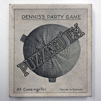
Puzzled ‘em
What is it?
|
Our task is to create a version of the Puzzled 'Em game featuring your own photographs. By photographing objects from unusual angles, in such a way as to confuse the viewer.
Think about:
|
|
My original Shoot


My shoot after editing


I used the app Photoshop Express to crop and edit my photos. I used the filter 'classic' to turn my photos black and white and to add a grainy look to the photos, in my opinion this helps re create the original Puzzled 'em game.
Texture
This week’s project was designed to get us thinking about the relationship between photography and the surface in two senses:
- How the surface texture of the real world, especially objects, can be documented through photography
- How photographs themselves have a surface – their own material reality - and how this surface can be interrogated
My Texture Shoot


Review
WWW: I was able to find a range of different surfaces
EBI: I took more photos and analysed in more detail
WWW: I was able to find a range of different surfaces
EBI: I took more photos and analysed in more detail
Composition and Rule of Thirds
|
Rule of Thirds explained
Divide the image into thirds as shown – If the main visual components (things in the image) lie on or near the lines then the image often tends to look ‘right’. In this image the horizon line is on one of the bisectors. |

|
My Composition and rule of thirds photos
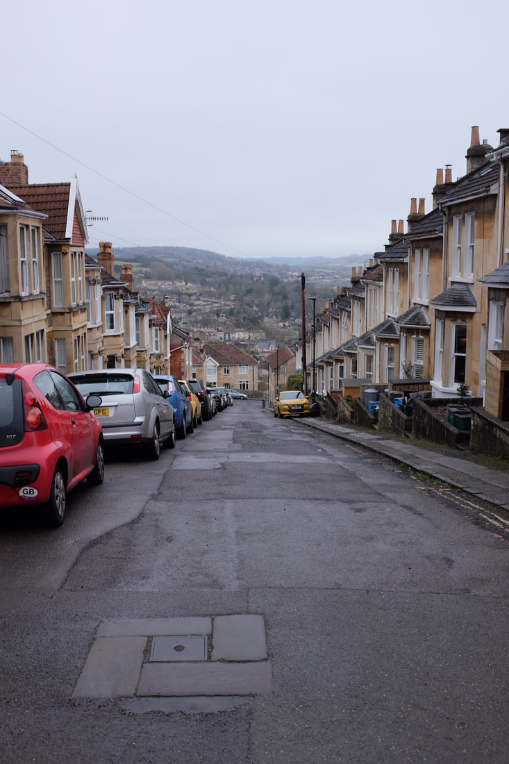
For this collection I have used some of my photos from a trip I took to Morocco in 2019. They are mostly pictures of the Atlas Mountains where the sky, mountains and tree line meet. There is also a street of the Marrakesh Medina where two walls are separated only by the sky.


My Abstraction Sub-theme
Photomontage
So far of our shoots have been instructed to us by our photography teacher. But now, my next shoots be anything we want as long as it follows my chosen abstraction sub-theme. Each shoot will be inspired by an artists I choose, each follow and work with abstract photomontage photography.
I have chosen to do my shoots on photomontage because I haven't worked into it as much as I could have done. I like this photomontage and I think I could be one favourite aspects of photography, so I think doing this could mean I experiment more and am able to see a new light on the subject. The photographer John Baldessari has always stood out to me and I really like his work so I already have some ideas to work with.
My sub-theme photomontage could be better referred to abstract composition, Colour Collaging or even Photopaintage.

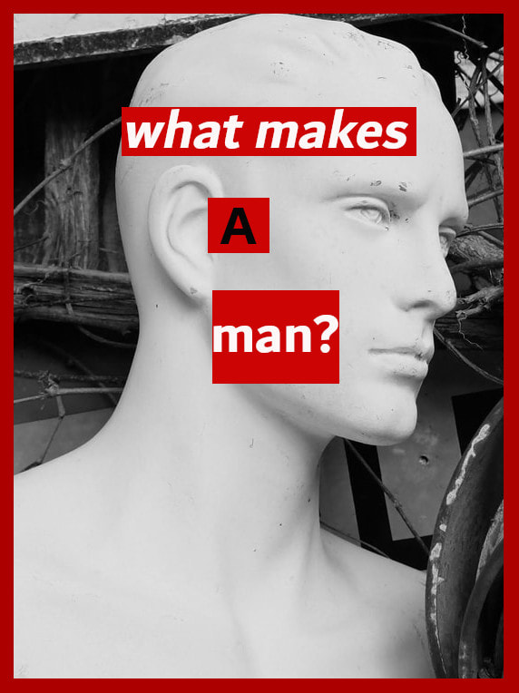
Barbara Kruger
Barbara Kruger was born January 26, 1945 in Newmark, New Jersey. She is an artist and photographer associated with The Pictures Generation. Her most famous work consists of a black and white photograph with her own a comment or statement written with a large bold text coloured black, white and red. Her comments would often include pronouns such as 'I' 'he', 'she', 'they' or 'you'.
A large majority of Kruger's work used photos that are not her own, she found and used advertisements or photographs by other photographers. She would make her work personal by editing ant adding too the photos with her famous text.
A large majority of Kruger's work used photos that are not her own, she found and used advertisements or photographs by other photographers. She would make her work personal by editing ant adding too the photos with her famous text.


|
Image Analysis
The specific title of this piece is unknown but it was made for the Cover of the 'New York Election Issue magazine' 2016. The art is by Barbra Kruger and photograph is by Mark Peterson. It was created in 2016 for the US election. It is an example of Photomontage and Conceptual Art. The composition shows a black-and-white close up photo of Donald Trump face. There is large bold red and white text is in the centre of the photo, reading the adjective ‘Loser’. The photo looks very artificial as it has been edited and added to after it was taken. The focal point (most important/eye-catching part) of the image is the large bold coloured word ‘Loser’. It purposely stands out as the rest of the photo is coloured simply. It is placed directly in the centre taking up a significant portion or the front cover. I believe the photographer Mark Peterson used a handheld flash, large aperture settings like f2.8 and very fast shutter speed so they can catch great detail but don’t get any motion blur; this created an extremely detailed one of a kind photo. The image makes me feel uncomfortable and threatened. The facial expression used by trump combined with the large text could give multipool impressions one of which being Trump shouting and calling, me, the onlooker a ‘Loser’. |

|
My Shoot
I don't have access to models at the moment, so instead I took photos of some mannequins I had discovered in 'Gardenalia' near my house. Then I also used photos of advertisements that I found, inside a magazine, these worked well for me. The artist I chose, Barbara Kruger, also did the same, she would often find pictures from advertisements or other photographers and then add and edit to create her work. I liked using mannequins because they provided an easy emotionless face to work from when also writing text that could go with the picture.


Editing
I used Gimp Photoshop to make my photos black and white, then I added text and the a coloured highlight background.
I enjoyed experimenting with the different fonts available and changing the colour and styles so they worked effectively.
I enjoyed experimenting with the different fonts available and changing the colour and styles so they worked effectively.


My Final Photos


Review
WWW: I sourced lots of my own photos that I could work from, I am happy how my edited final work came out.
EBI: I could source more advertisements or fashion photos. I could have used more and had access to better typography styles to more accurately match Barbara Kruger's work.
WWW: I sourced lots of my own photos that I could work from, I am happy how my edited final work came out.
EBI: I could source more advertisements or fashion photos. I could have used more and had access to better typography styles to more accurately match Barbara Kruger's work.
My work
|
Barbara Kruger's work
|
Alice Quaresma
Alice Quaresma was born in Brazil in 1985, but currently lives in New York after she graduated from Pratt Institute in 2009. Quaresma experiments with materials that push the boundaries of photography as a flat surface. She uses images her own photos to elaborate on the idea of displacement or identity.


|
Photo Analysis
The title of this piece is Better Days by Alice Quaresma. It was created in 2020. I think it is an example of adjusted photographic imagery. The composition shows combination of photography and painting. In the centre foreground a black and white, birds eye view, photo of the New York City. The photo is surrounded by another picture of a beech through palm trees. In between the pictures half covered is a large dark pink rectangle and, on top of that, a yellow circle. The focal point (most important/eye-catching part) of the image I think is… the black and white picture of New York because the amount of colouring for the other parks making it stank out. It is placed in the centre. The artist used bright and bold colours when painting but duller colours for the images. The patterns I can see in the image are repeating quadrilaterals and lines created by the pictures and the paint. |

|
My Shoot
My Shoot Plan:
After looking at the work of Alice Quaresma I am going to attempt to create my own abstract images of my local area. I will collage together my pictures and then add block colours. Some of these I will take on my Phone, and others I will take on my FUJI film x100s camera. I will try to get a range of depth of field and I will change the White Balance which allow me to get accurate shots that are niether to dark or light. I also will be trying to use natural light as much as possible.
After looking at the work of Alice Quaresma I am going to attempt to create my own abstract images of my local area. I will collage together my pictures and then add block colours. Some of these I will take on my Phone, and others I will take on my FUJI film x100s camera. I will try to get a range of depth of field and I will change the White Balance which allow me to get accurate shots that are niether to dark or light. I also will be trying to use natural light as much as possible.


My Final work after editing - I selected my favourite images from the shoot

I selected my favourite three images from the shoot. I used Gimp to edit and add paint/colours, I wanted them to stay fairly true to life but i edited the contrast and made them each a little darker as I think this made them work better.


Shoot Review/reflection -
I have photographed my surroundings near my house in my local area.
I have used are my FUJI film x100s camera to take photos.
What went well I took a lot of photos and was able to work from them well, I created a different way of looking at areas I know well. I worked on the composition and chose colours and shaped that I thought worked with the photos.
I think my shoot could be even better if I had created more photos with the different styles that Alice Quaresma used.
I have learnt to look closely when adding colours and pictures so that they did not clash and looked professional.
This piece of work was influenced by Alice Quaresma The link between our work could be that have collaged photos in a similar way, added colours and shapes that are similar to hers.
My work
|
Alice Quaresma's work
|
John Baldessari
John Anthony Baldessari was born on June 17, 1931 and died in January, 2020. was an American conceptual artist known for his work featuring found photography and appropriated images. He lived and worked in Santa Monica and Venice, California. Initially a painter, Baldessari began to incorporate texts and photography into his canvases in the mid-1960s. In 1970 he began working in printmaking, film, video, installation, sculpture and photography.


|
Image Analysis
The title of this piece is Stonehenge (With Two Persons), Orange. It is by John Baldisseri. It was created in 2005. It is an example of Conceptual photomontage. The composition a black and white photo of two people standing in front of Stonehenge. The people’s faces have been coved by a perfect circle of paint, on the left a yellow circle, on the right a blue circle. Behind them is the orange silhouette of Stonehenge. The focal point (most important/eye-catching part) of the image are the circles on the people’s faces. They are placed in the mid-left and mid-right of the picture. The colours in the image are Orange, yellow and blue. The remaining picture is black and white. The texture in on the paint looks a little rough as it has small amount of texture. The artist used found photos and then added colour with paints. To create an abstract image of Stonehenge. |

|
My Shoot


My Final work after editing
I selected my favourite images from the shoot
I selected my favourite images from the shoot


Editing Further
For this picture I took inspiration from a snooker table edited the colours in the window to match the balls the and green of the table.


I used Gimp to edit and crop then add paint/colours. I also edited the colour of main background colours.

Shoot Review -
I have photographed my areas in my city that I don't usually see.
I have used are my phone camera and my FUJI film x100s camera.
What went well: I created a different way of seeing places I know well. I worked on the composition and chose colours and shaped that I worked into the photos like covering the windows. I made many edits from each image.
I think my shoot could be even better if I had taken more photos and used a variety of the styles that John Baldessari also used.
I have learnt new things on Gimp Photoshop and know to look closely to the photo to learn what worked well and looked professional.
This piece of work was influenced by John Baldessari The link between our work could be which areas I chose to cover and and I added colours and shapes that are similar to what he used in his art.
|
My Work

|
John Baldessari's Work

|
Final Piece for my abstraction project
Abstraction
Over the last few weeks I've been looking at the abstraction subtheme of Photomontage I looked at the work of Barbara Kruger, Alice Quaresma and John Baldessari. I was looking at each artists techniques that they used when working with photomontage to see in what way I could add individuality to my own work. I looked specifically at adding: text, shapes, colour and paints because these parts of my sub-theme choice stood out to me the most.
After studying closely each individual styles of photomontage I believe my abstraction final piece is mostly inspired by the work of John Baldessari but I hope to add other parts of work that I have studied. I will be covering parts of the image up with paints and colour but I will also add text to create a collage feel.
For my final piece I want to create new ideas and work them into my chosen photographs creating a sense of individuality and originality. I want to create them using paints and equipment in person rather than using photoshop and my computer.
I plan to stick my 3 photos onto canvas and add separate text, colours and texture on top.
The photographs I have chosen to use


|
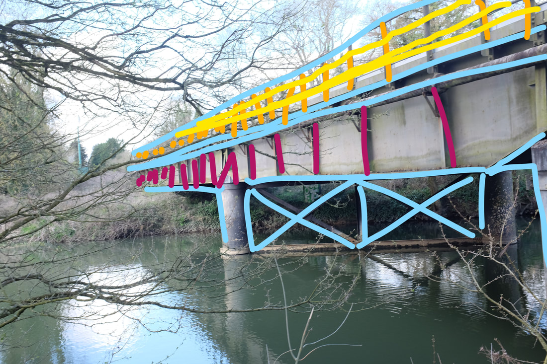
I drew a rough plan of how some of my photos would go. On my picture of the bridge I went over significant lines on the bridge so that I could recognise which bits I should paint over to create the best effect.
I also did this with my other photos to make it easier for me to create when working in real life. |
|
I used Gimp to plan my ideas, I added different colours and different shapes to see what was the best way to collage ideas so it could work best with the images.


|
My Plan
I found what layout I wanted and pre-printed my photos and then laid out my ideas so I knew what to create it in the exam.
|
  |
My Final Piece


I am pleased with my final outcomes because they have been able to accurately represent my ideas of my Photomontage sub-theme. I chose the present them this way as I could use symmetry and was able to mirror different aspects of my photos throughout the piece. If I had more time I would have worked more into the theme of typography and adding more detail through collaging text.
