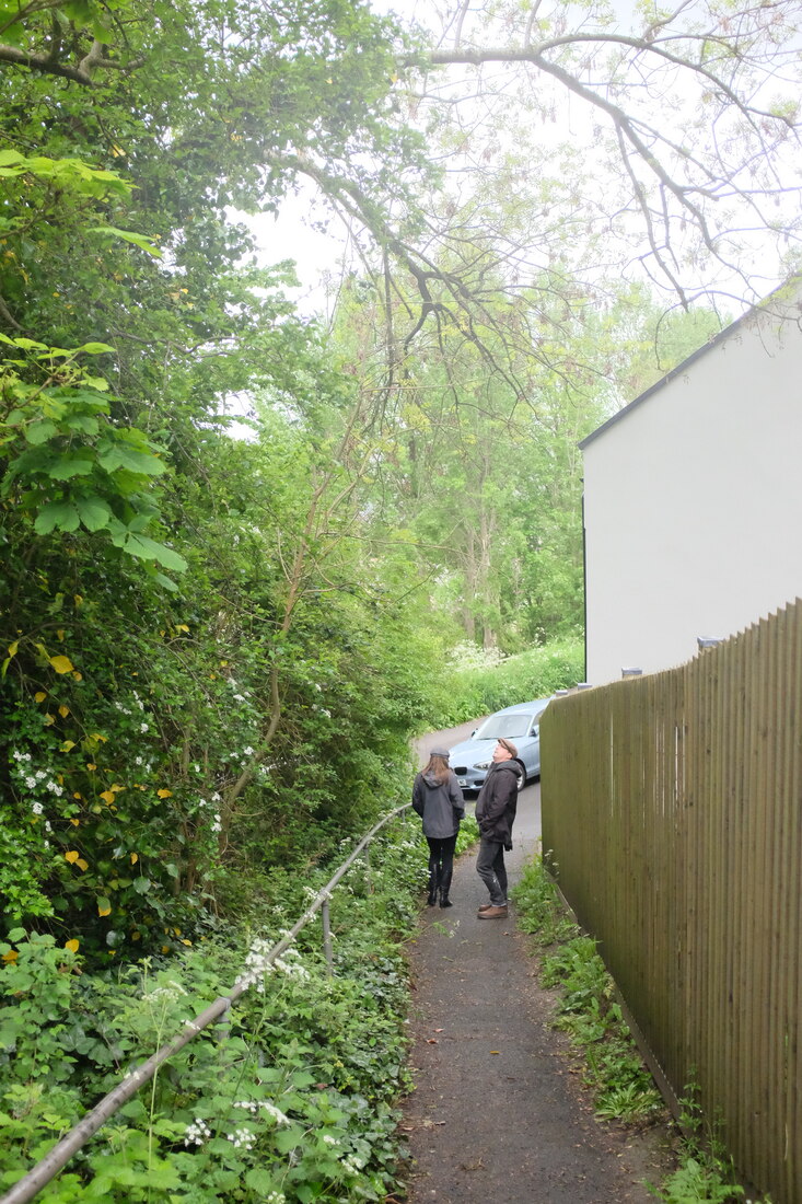
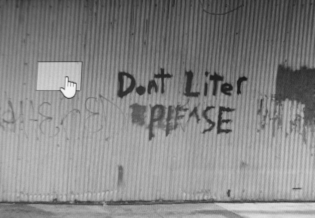
Street Photography
If you can smell the street by looking at the photo, it's a street photograph - Bruce Gilden
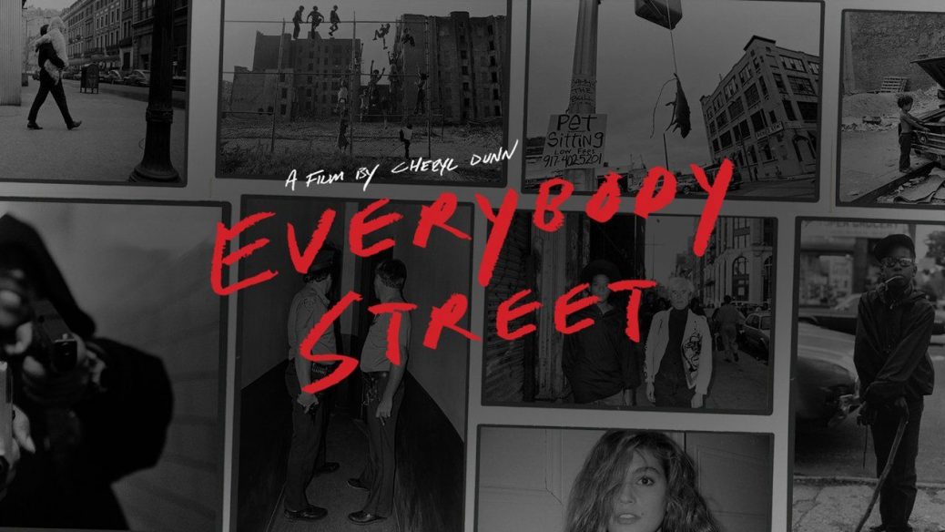
Everybody Street - a street photography film
|
How do street photographers behave?
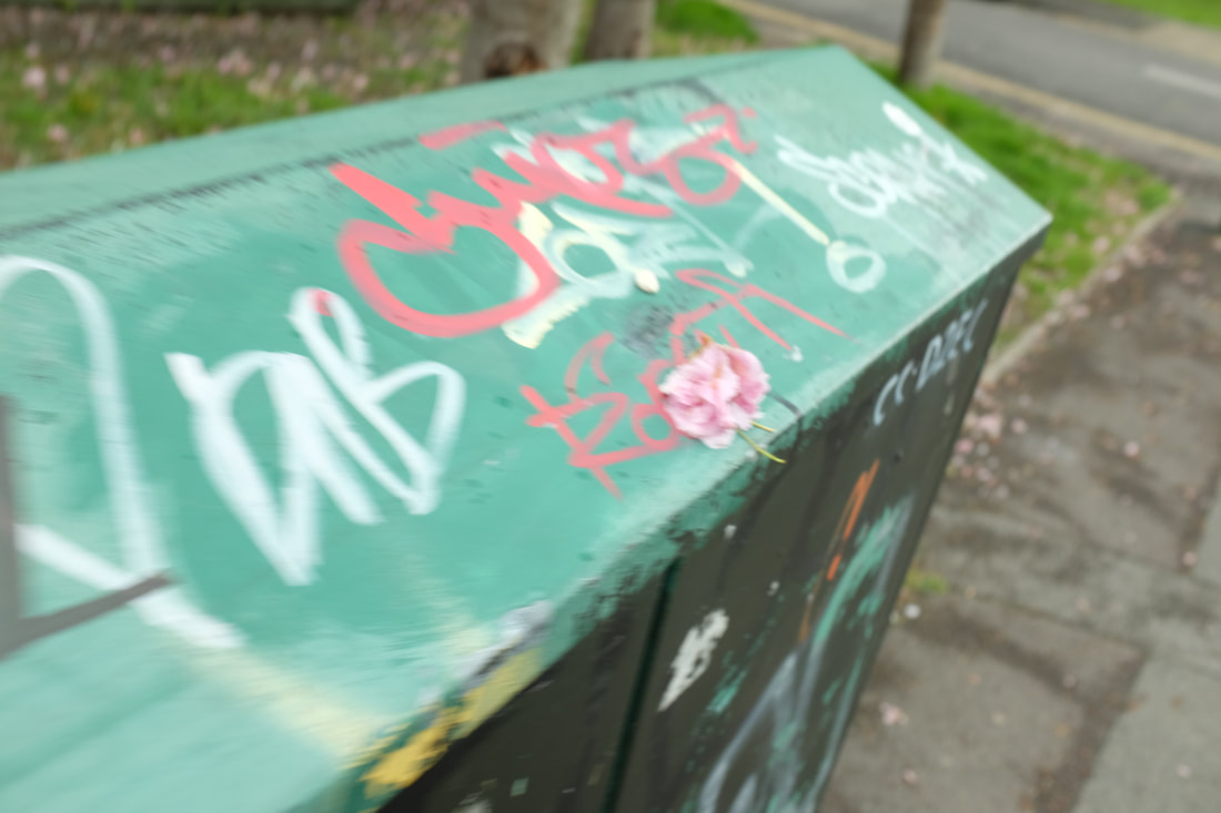
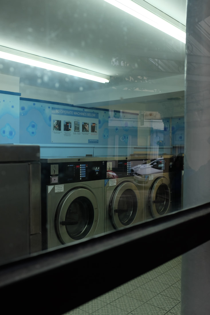
Street Photographers can not be self-conscious when taking photos of people in the streets. They always need to be ready to take the photo and always carrying your camera. What kind of equipment do they use? Different photographers use different equipment, some use film cameras and others use modern digital cameras. People often use external camera flashes to better improve their style. They take photos in both black and white and colour. What kinds of subjects interest them? They look for everyday movement and life. Some photographers look to show the reality of street life and look for street art and graffiti. What are the risks involved in street photography? Photographing in public is legal as long as its not private land, then the owner decides. Some photographer can put themselves in dangerous positions so get the right photo. |
|
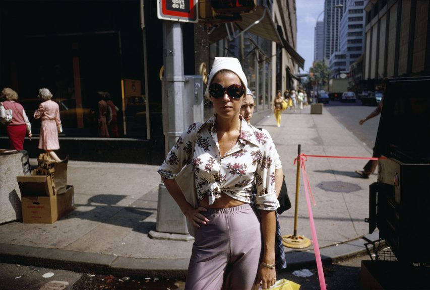
Joel Meyerowitz
I have chosen to look at the work of significant street photographer Joel Meyerowitz.
Joel Meyerowitz was born March 6, 1938. He is an American street, portrait and landscape photographer. He began photographing in color in 1962 and was an early advocate of the use of color during a time when there was significant resistance to the idea of color photography as serious art. In the early 1970s he taught photography at the Cooper Union in New York City.
Joel Meyerowitz was born March 6, 1938. He is an American street, portrait and landscape photographer. He began photographing in color in 1962 and was an early advocate of the use of color during a time when there was significant resistance to the idea of color photography as serious art. In the early 1970s he taught photography at the Cooper Union in New York City.
|
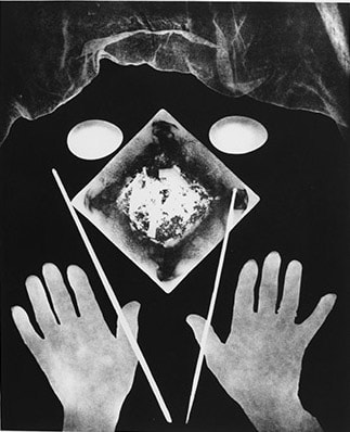
Image Analysis
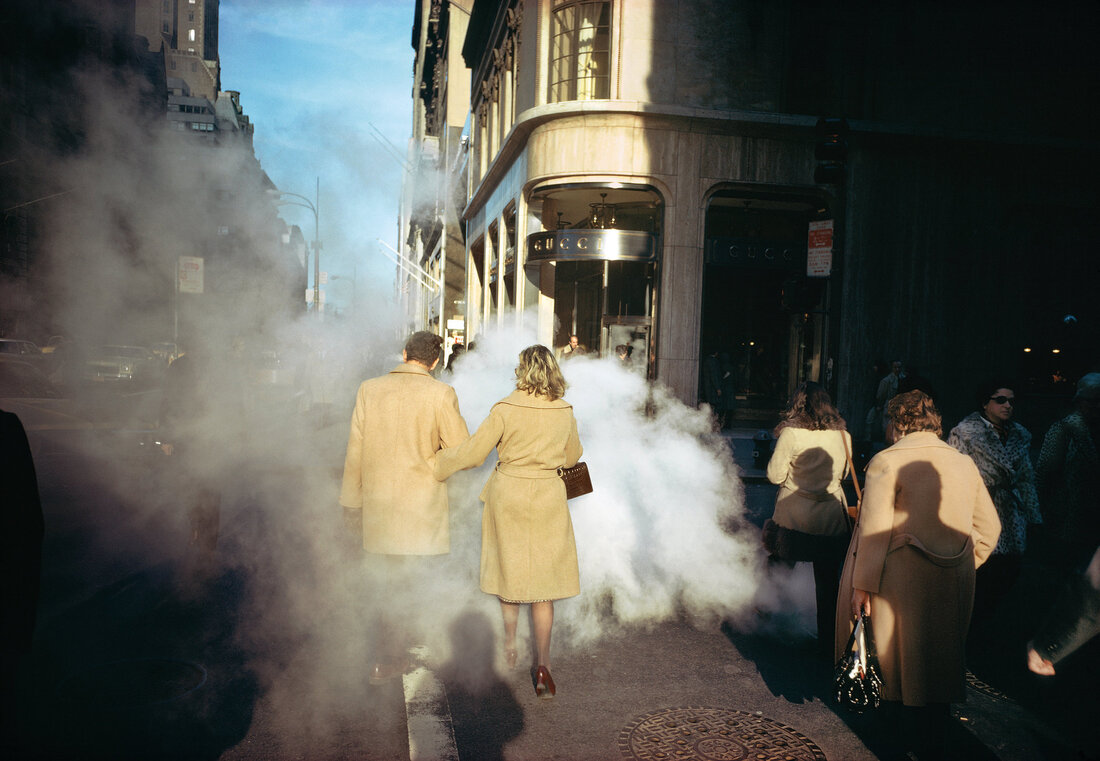
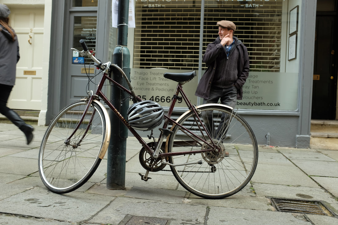
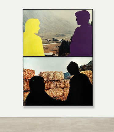
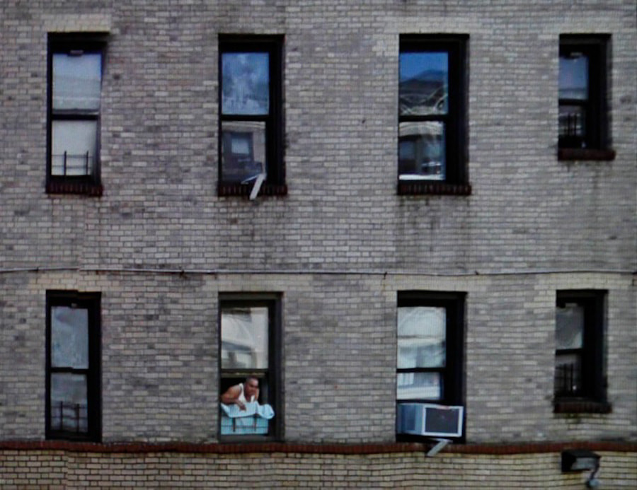
The title of this piece is Camel Coats, New York City, 1975 It is by Joel Meyerowitz. It was created in 1975 It is an example of New York street photography. The composition shows many people walking on a new York city street partly covered by steam or smoke. The sun is bright but large building cased shadows onto the people below. A number of silhouettes are cased onto the sidewalk and backs of people. The focal point of the image are the two people walking in the centre of the picture at the edge of the pavement partially shrouded in the steam. The techniques used here are natural lighting purposeful angle and height, taken at a high depth of field as everything is in detail. The photographer has used a 35mm film camera to create a powerful picture of the New York City streets. |
|
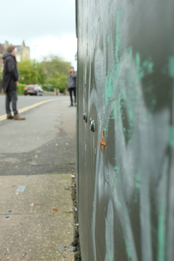
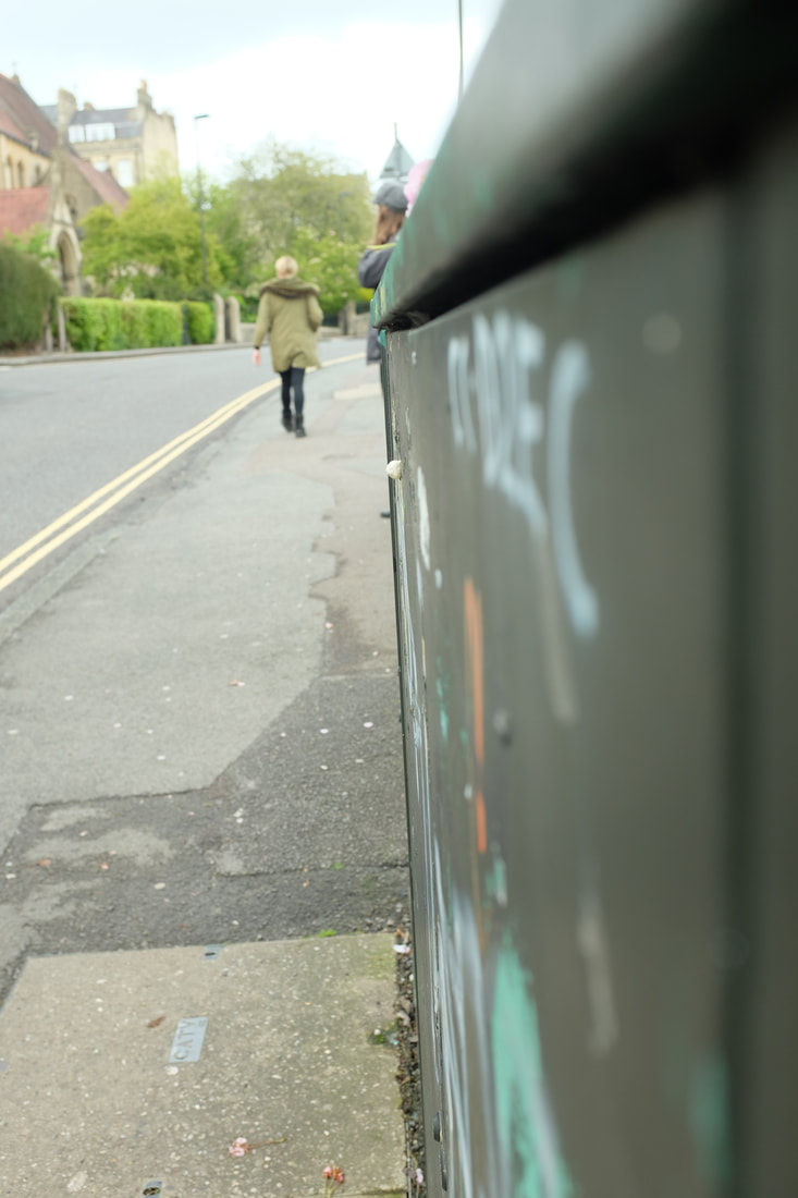
Inspired Photos - Ways of Seeing
We looked at a number of examples of street photography. Our challenge was to respond to these examples and create images of your that were inspired by there viewpoints, subjects and compositions.
Looking Down
Over the Shoulder
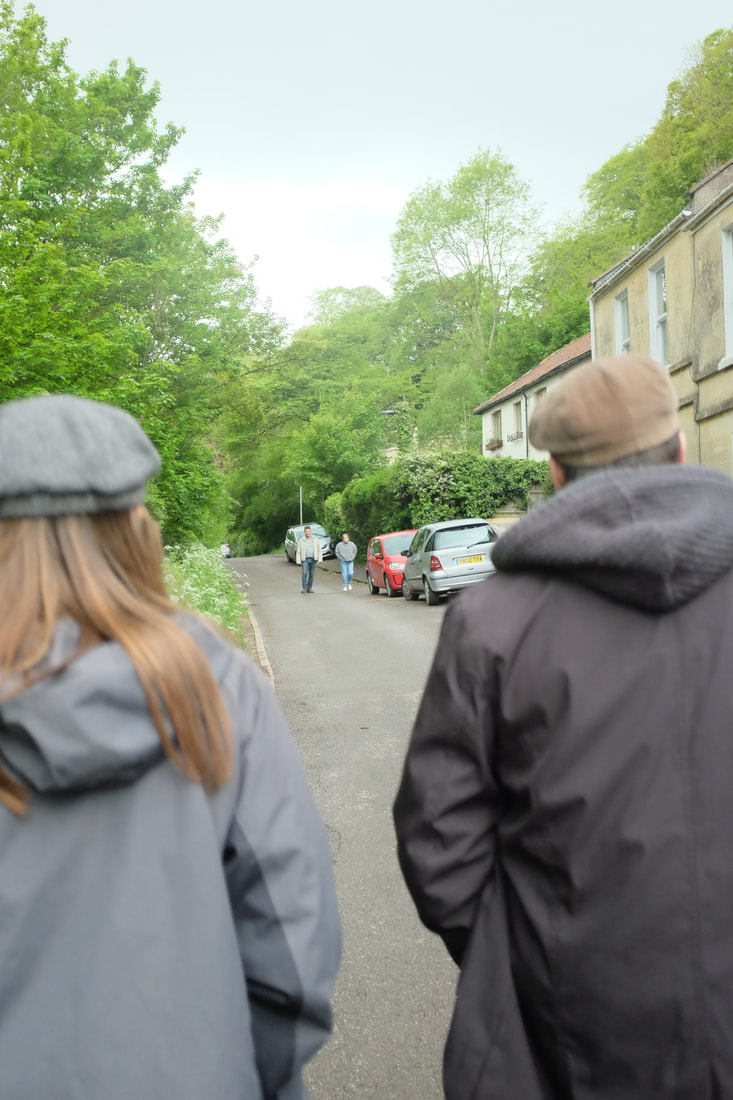
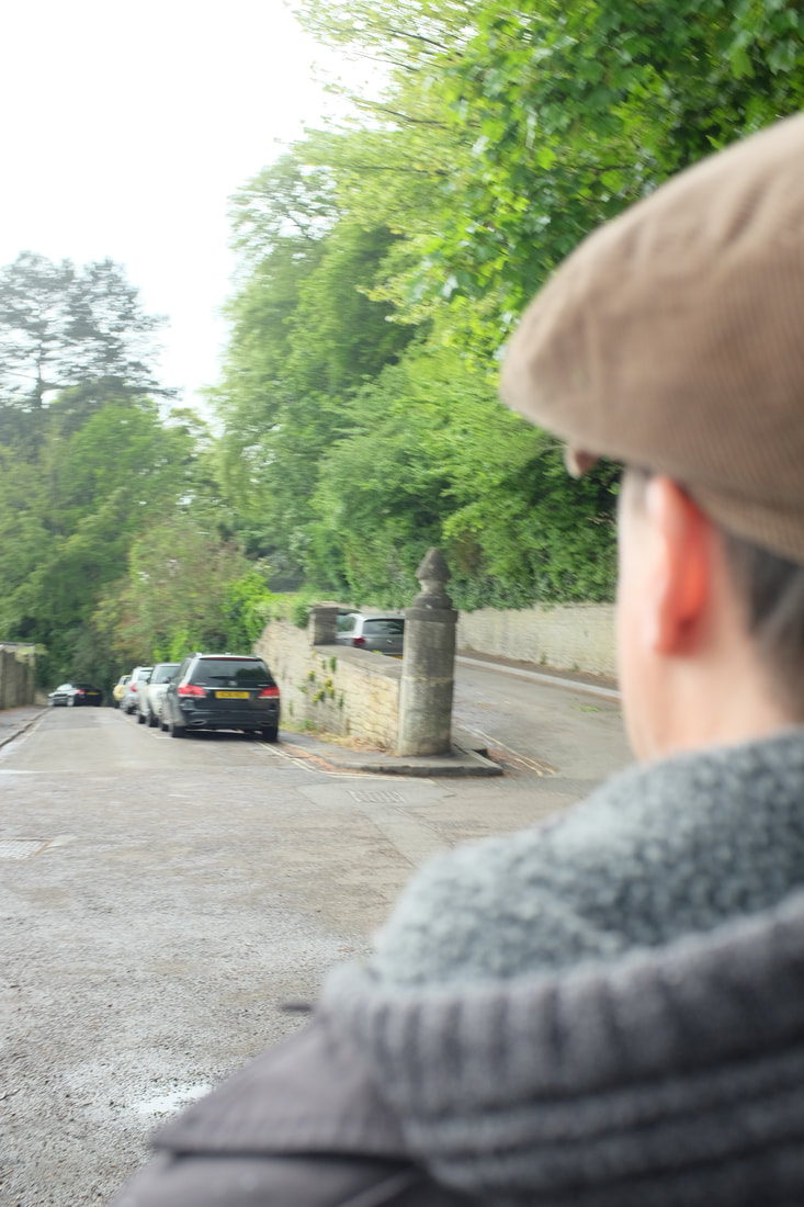
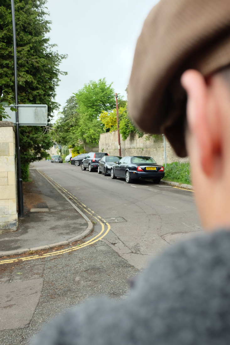
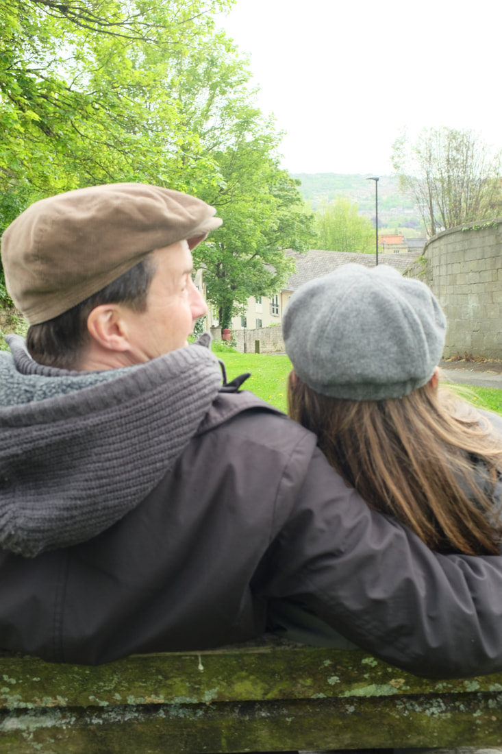
Walk on by
Surfaces
My remaining Photos from the shoot

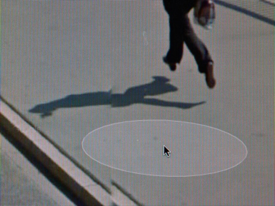
My experimental Photoshoot
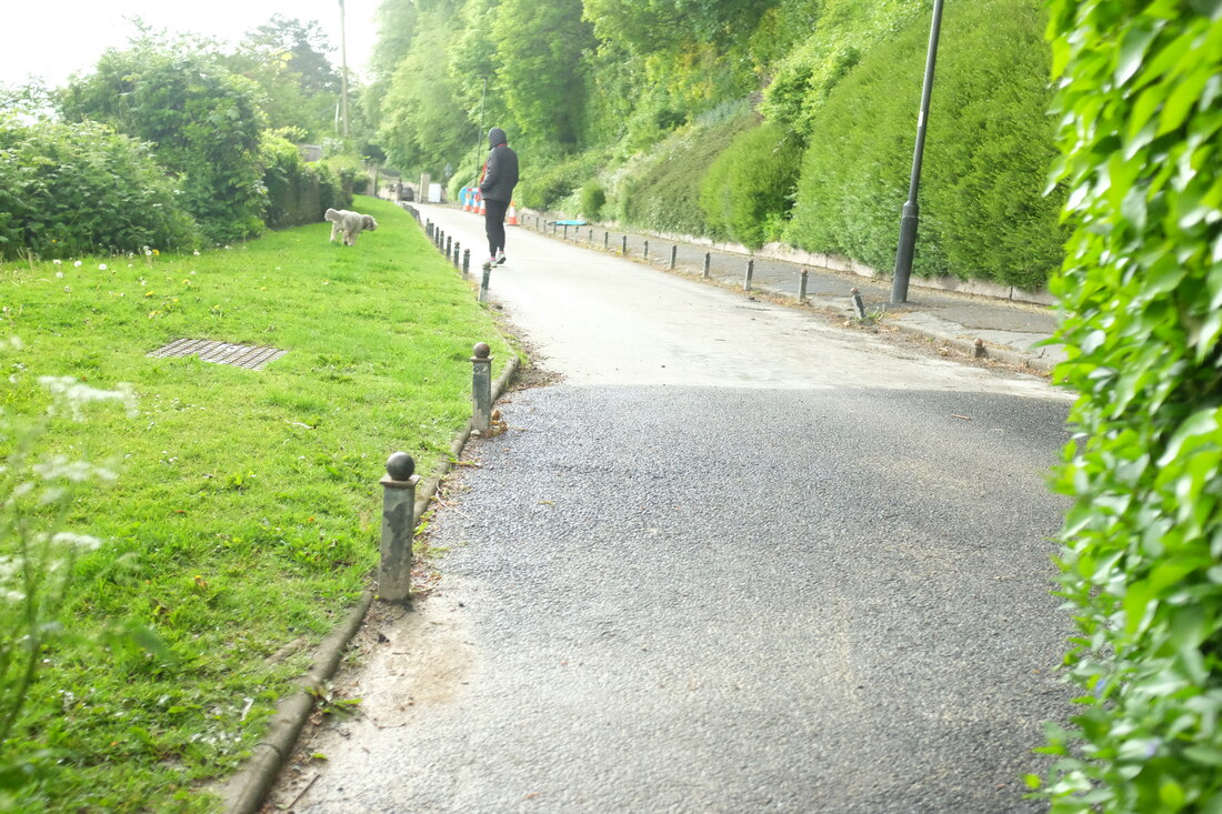
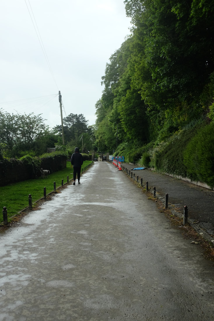
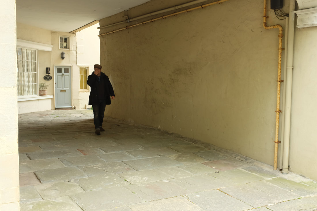
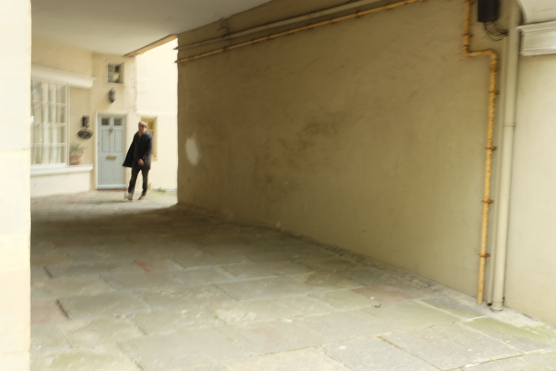
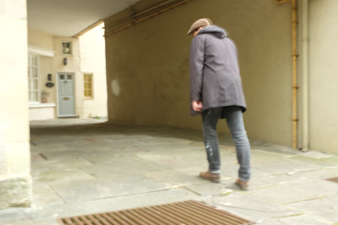
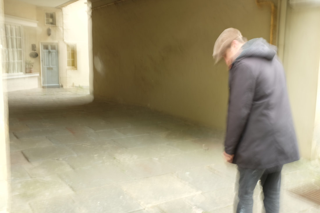
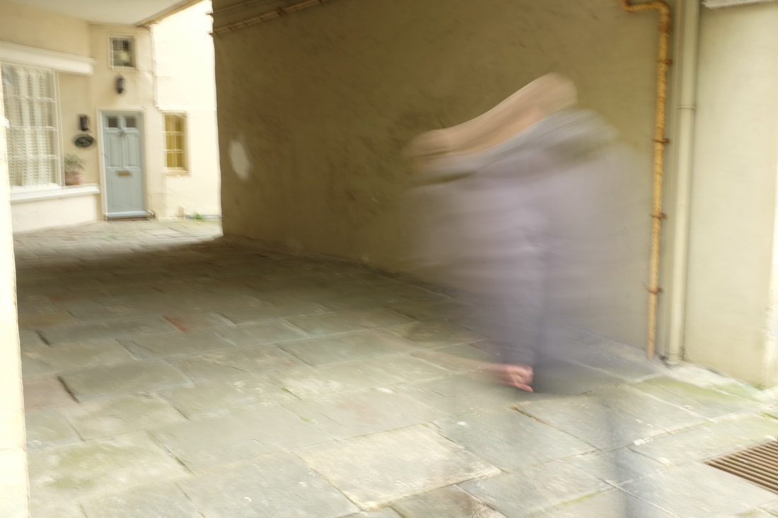
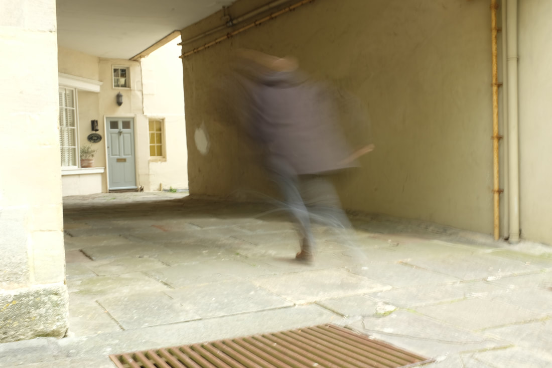
I wanted to experiment a little more with street photography and shutter speed and so I took a number of photos of my dad running down a path with different shutter speeds, going from faster speed of 1/125 to slow speed of 1/4.
Next time I would change the lighting, we took the photos at midday on a cloudy day and so the shadows were from above, this was disappointing as the shadows on a cobbled path would have been good to catch.
I also would have liked for the photos themselves to be not a blurry. As the camera was hand-held there was a slight instability to the rest of the photograph something if taken with a tripod I could have been avoided.
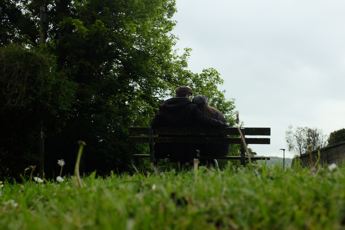
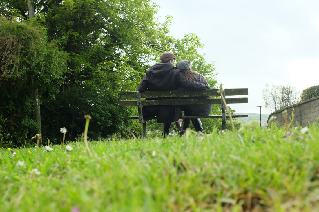
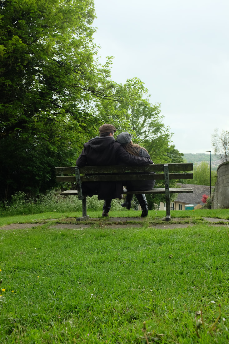
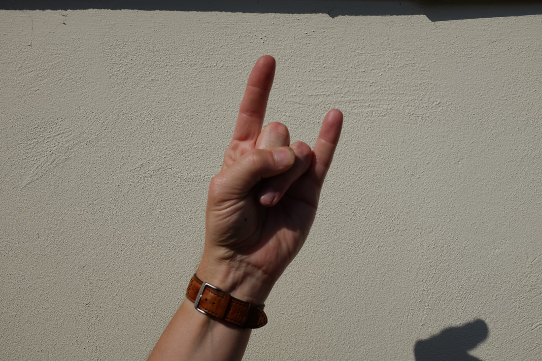
My Photo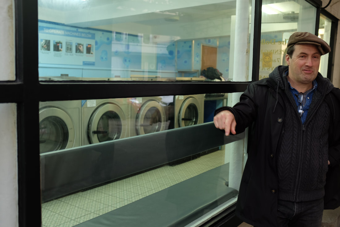
|
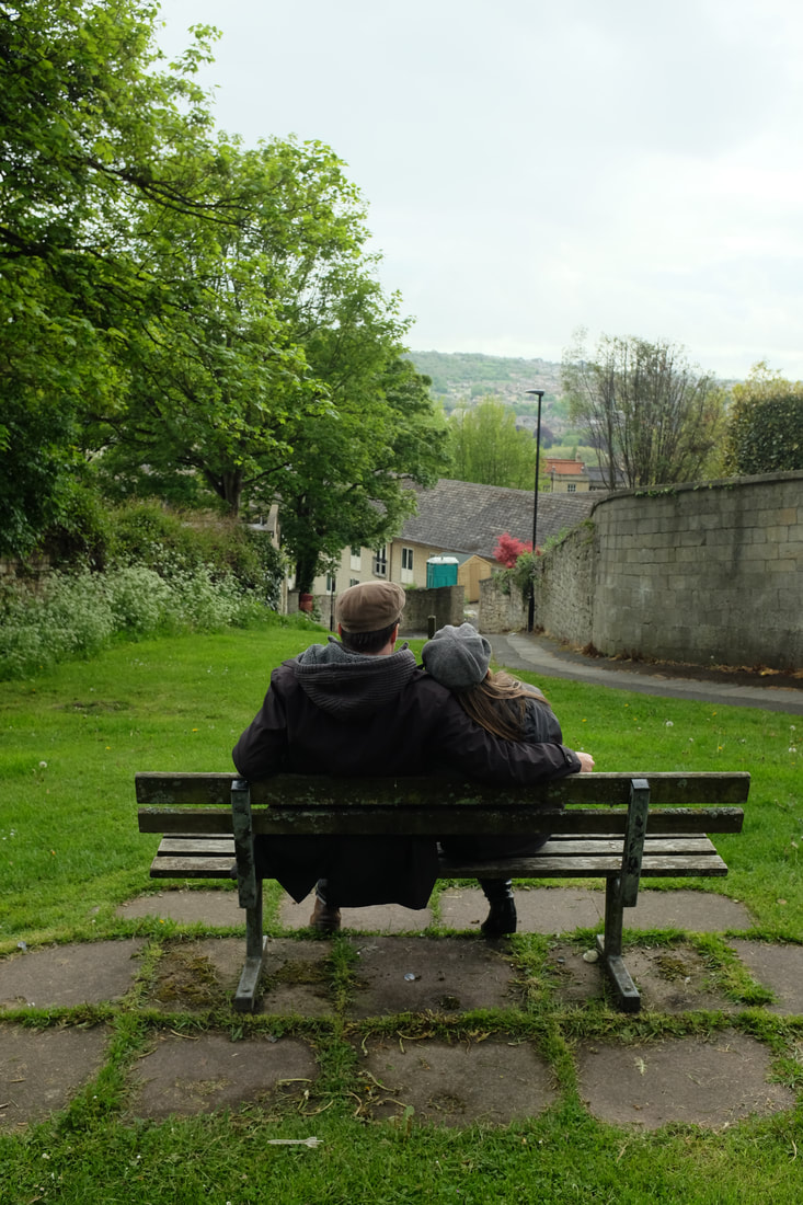
Joel Meyerowitz's Photo
|
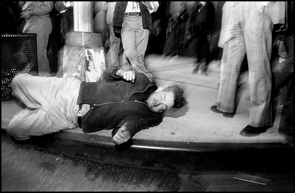
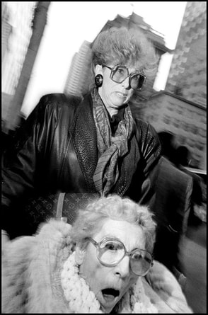
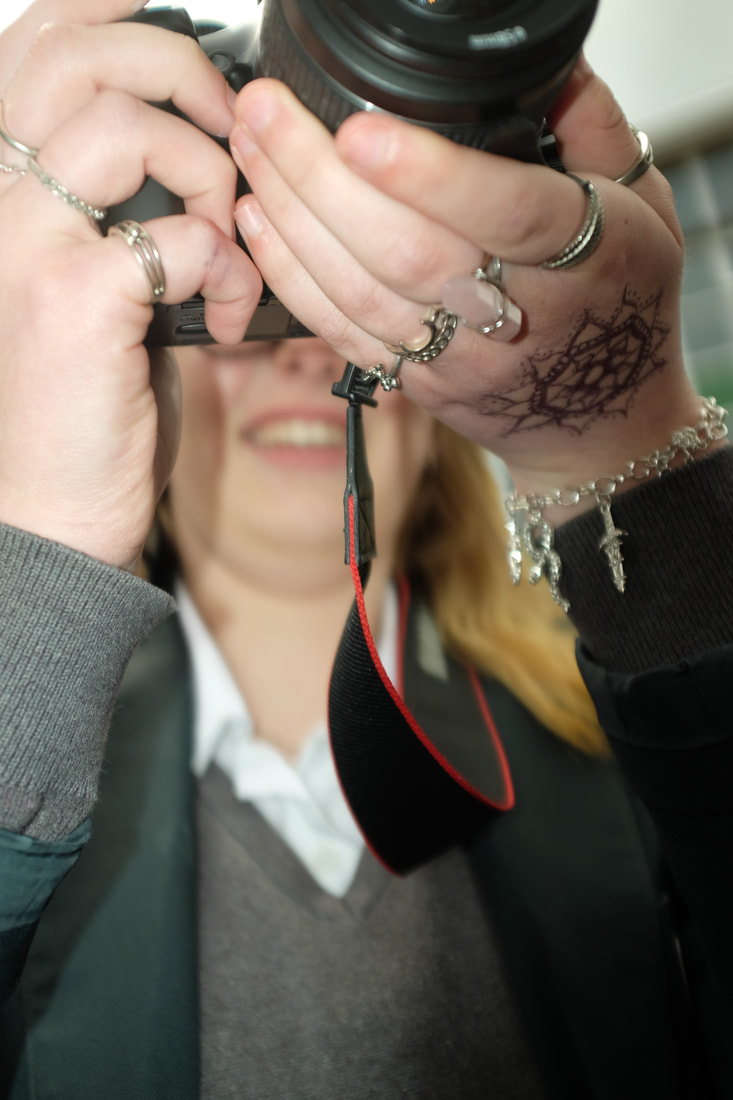
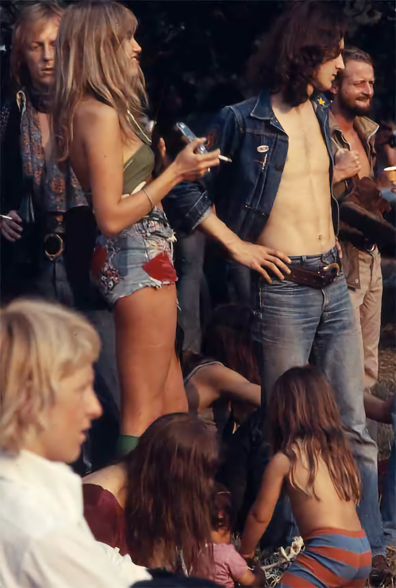
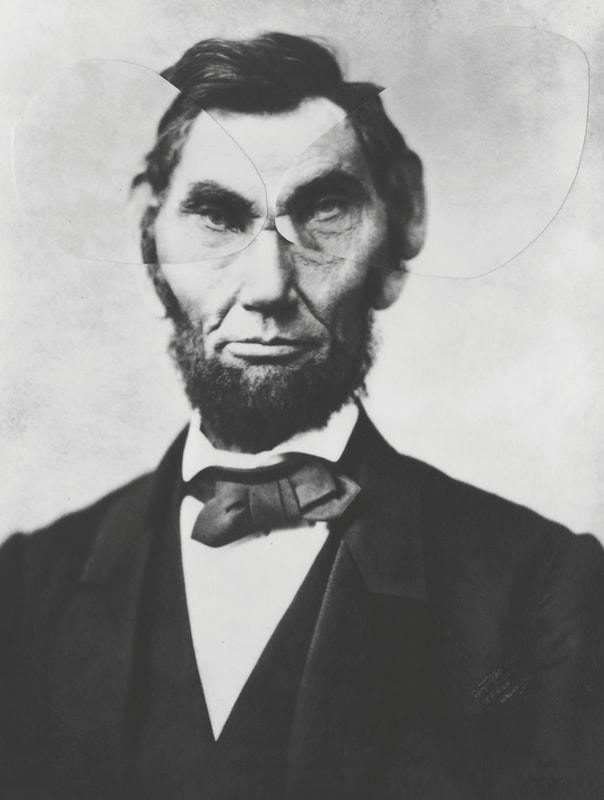
Street Photo Challenge #2 – Bruce Gilden
Bruce Gilden flash and a wide, low camera angle to accurately snapshot people's expressions and there 'character'. By getting close to the main subject he can keep all the motion, expression and drama inside the picture. He also uses movement to give a ghosting effect that increases the effect of the closeness of photographer to the subject.
|
Image Analysis
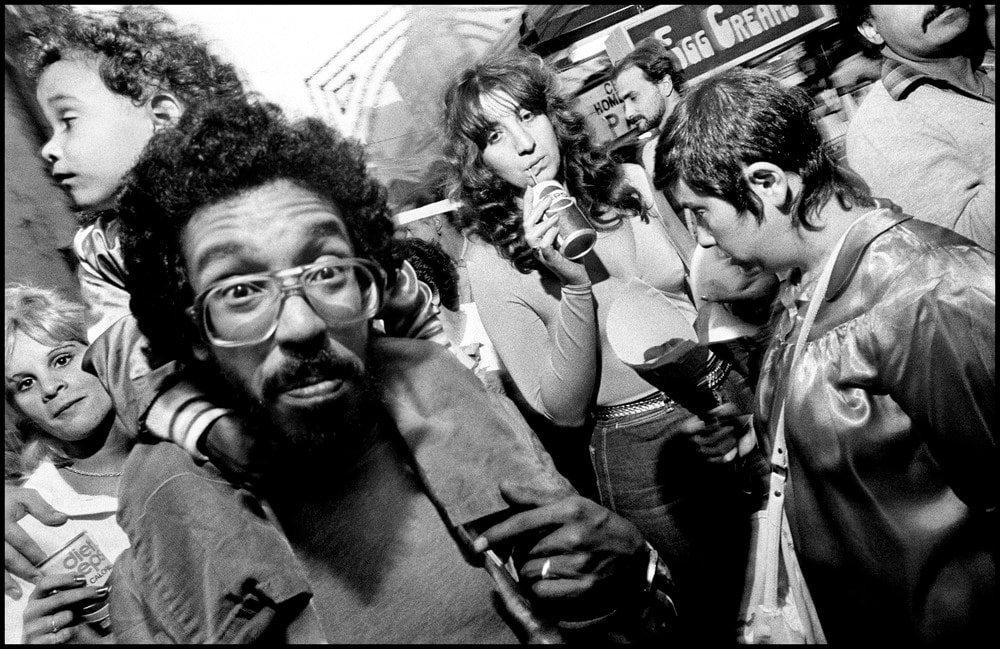
The title of this piece is unknown. It is by Bruce Gilden It was created in 1992. It is an example of Street Photography. The composition shows two women surprised by their photo being taken, one is sitting in lower in the photo the other standing behind. The photo is in black and white and is taken from close to the women , almost in their faces. The focal point of the image is most likely the lower woman’s surprised facial expression. It is placed towards the bottom of the portrait photograph. The techniques used here are the use of an external flash and the angle. The photo was taken in black and white with a more shallow depth of field. The shutter speed is slightly too slow creating a fuzzed or blurred surrounding to the women. The photographer uses flash in his photography. Most of his work has also been in black and white. The image makes me feel uncomfortable and embarrassing. The close nature of the photo in not enjoyable and the detailed reaction by the people is also is slightly unusual. |
|
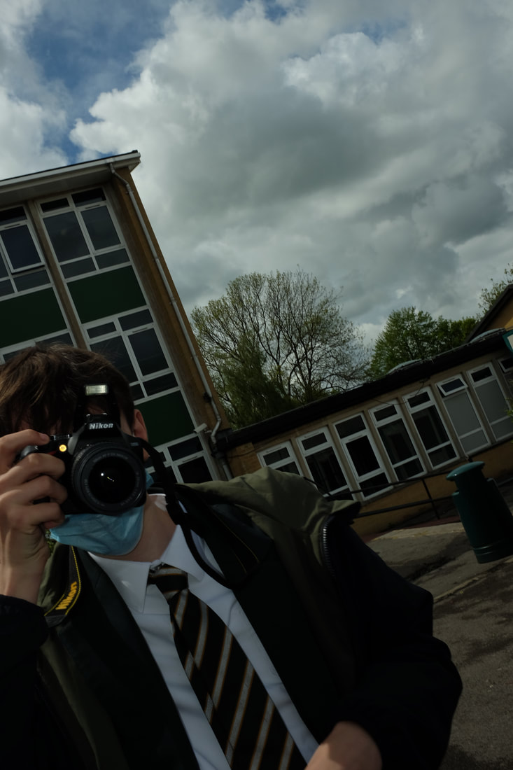
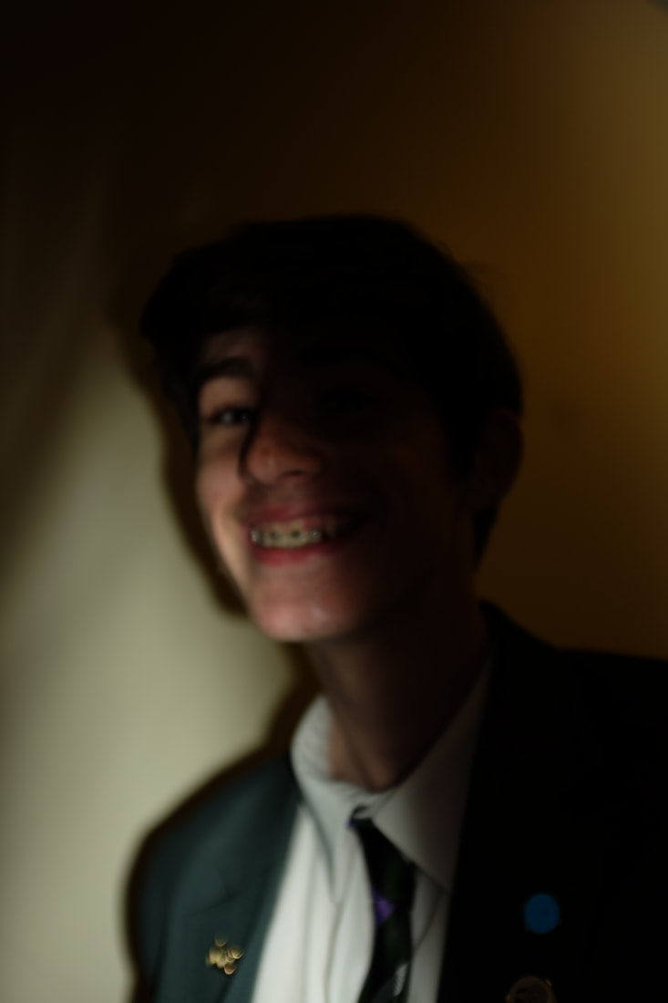
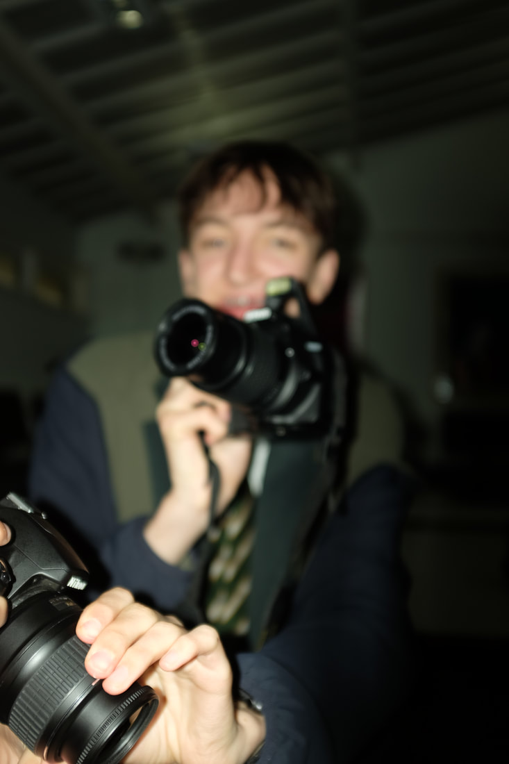
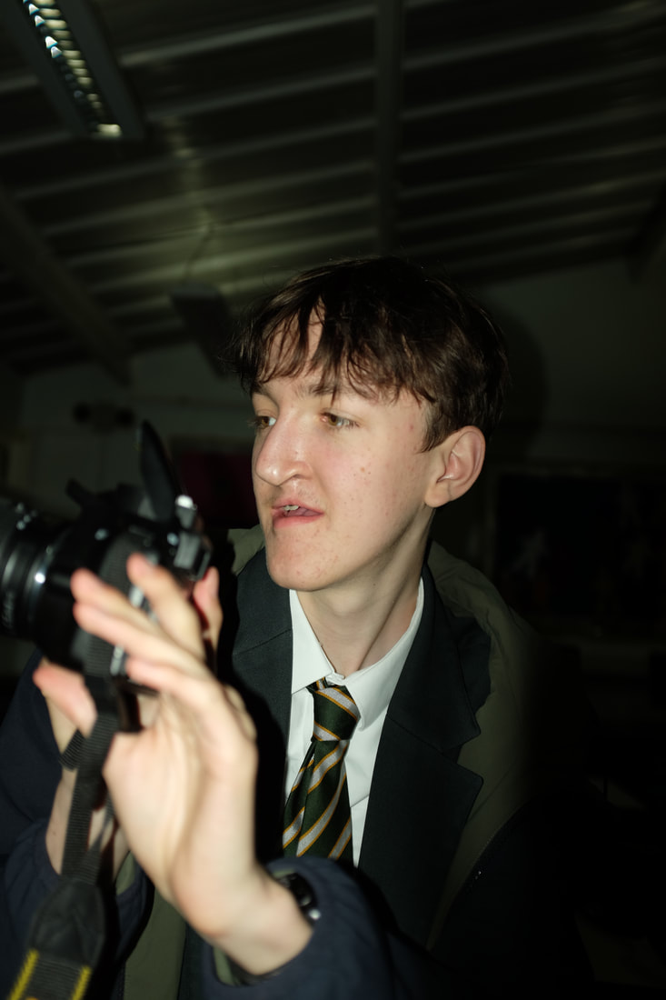
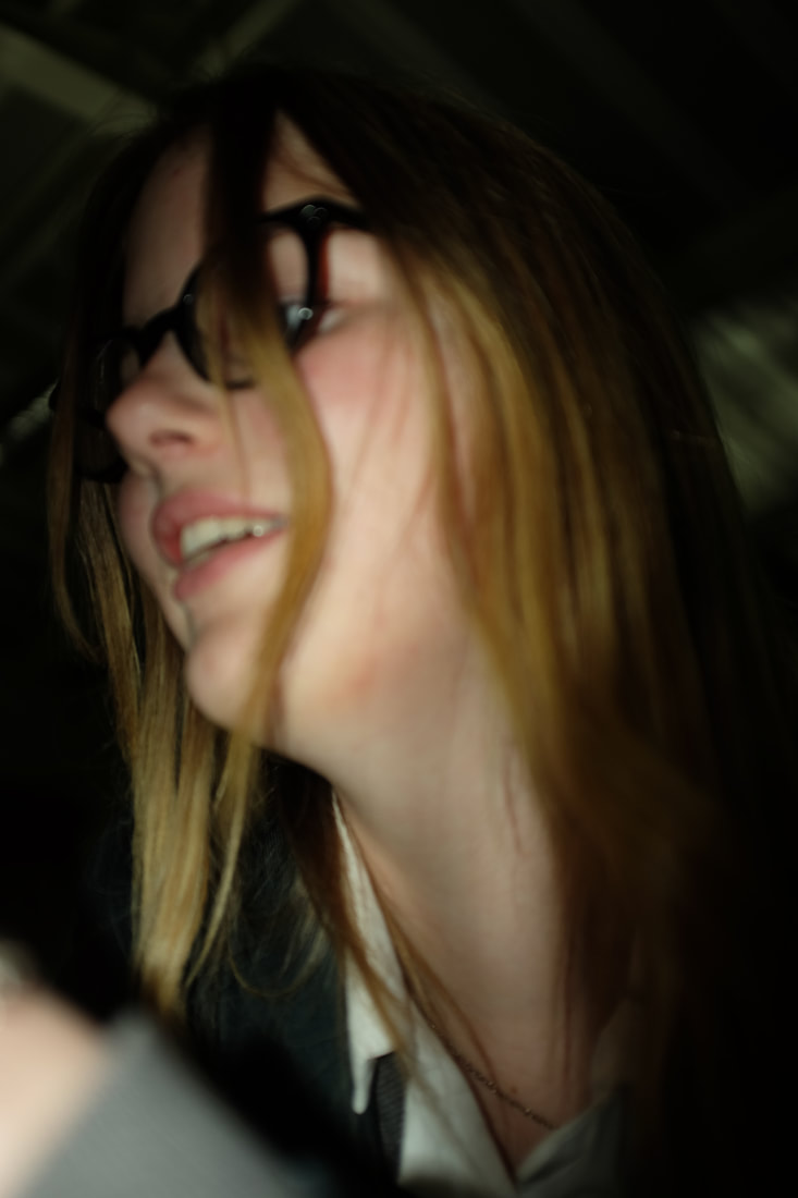
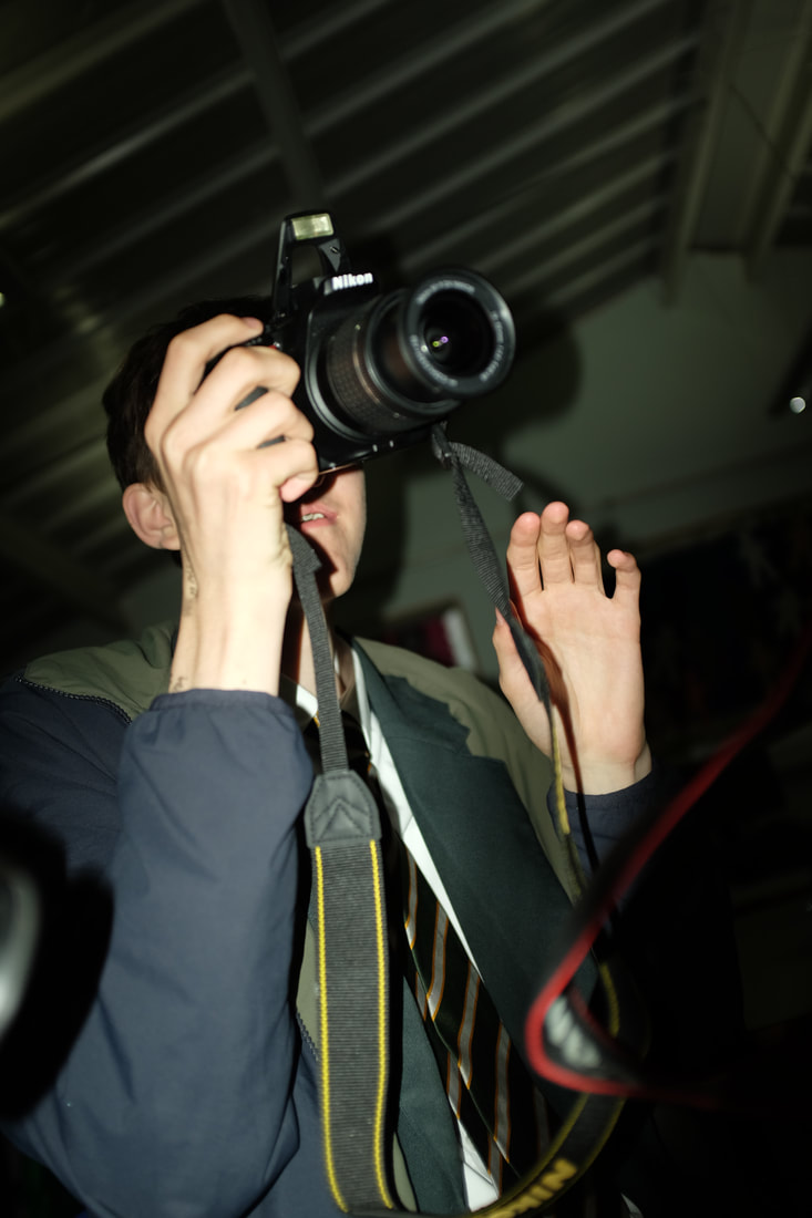
My Bruce Gilden inspired shoot
Shoot Plan
After looking at the work of Bruce Gilden intended to create my own similar photos. We did this with our class, outside in our school.
After looking at the work of Bruce Gilden intended to create my own similar photos. We did this with our class, outside in our school.

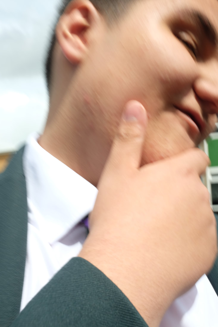
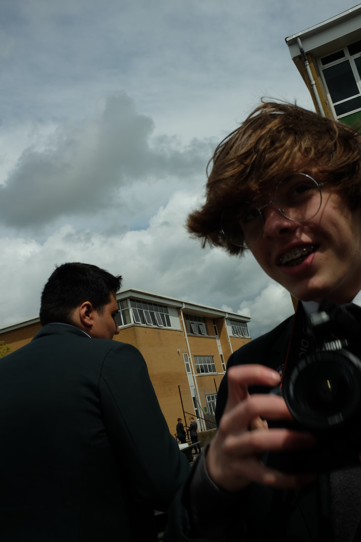
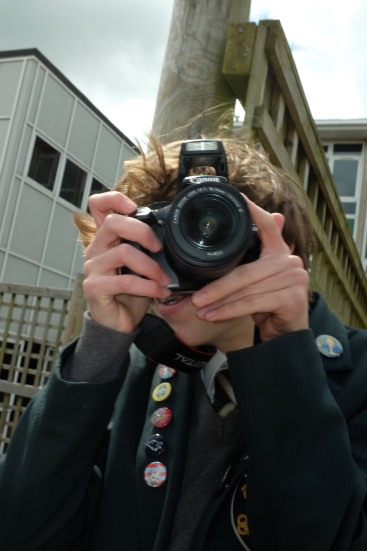
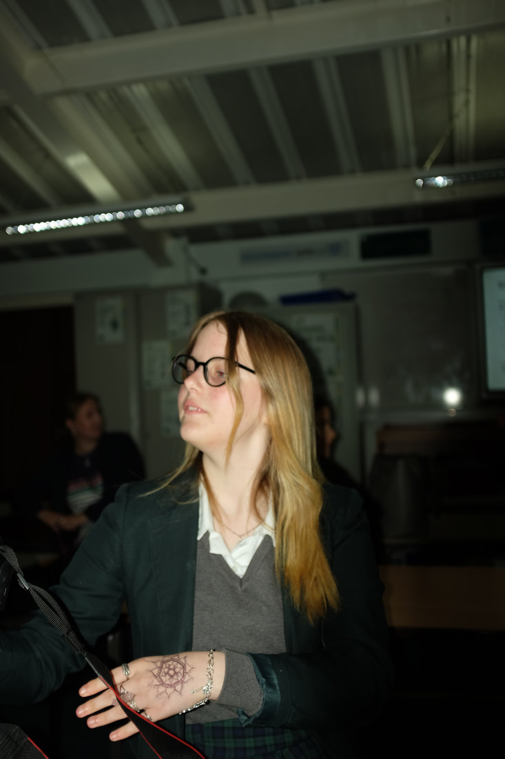
My edited black and white photos
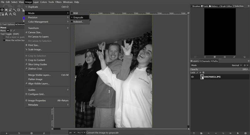
I chose my favourite photos and edited them into grayscale using Gimp Photoshop.
|
My photo

|
Bruce Gilden's photo
|
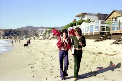
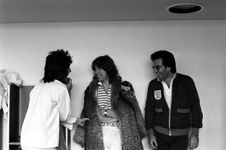
Carinthia West - At the American Museum Bath
Carinthia West (b.1951) is a model, actress, photographer and writer. She is a friend to many rock icons, growing up with some of the most iconic names in music, film and society. West always kept a camera by her side letting her capturing previously unseen moments of the famous lives who crossed her path such as: Mick Jagger, Ronnie Wood, George Harrison, Eric Idle, Helen Mirren and Neil Young.

How I Found Carinthia West
How I Found Carinthia West
https://americanmuseum.org/whats-on/shooting-stars-carinthia-west/
I recently discovered Carinthia West at an exhibition at the The American Museum & Gardens in Bath. The expedition is running from 21st May to 31st October 2021 and it was great eye opener and was very helpful for inspiration. It was a great coincidence that I was looking at street/personal photography as the exhibition was on as it meant I could inspired by her and complete a shoot based on her work.
|
Image Analysis
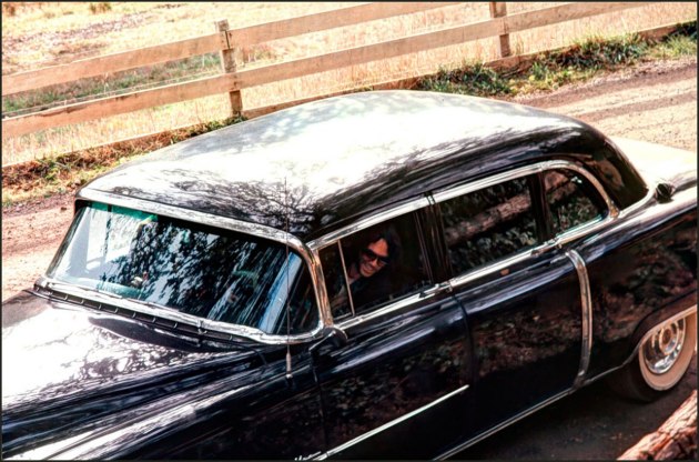
The title of this piece is unknown. The photo is of Mick Jagger and Ronnie Wood walking on Malibu Beach in California. It is by Carinthia West and was created in October 1976. It is an example of street photography. The Composition shows two men, Mick Jagger and Ronnie Wood from the well-known band The Rolling Stones. They are walking down Malibu beach in California, Ronnie stands on the left and is carrying a number of red balloons. The Weather is sunny and the colouring of the film makes it look like the time is the morning, maybe 9-10. The sea is on the left of the beach and in the photo and on the right is a row of houses. The focal point of the image is Ronnie Wood, he is wearing bright red and blue clothes that contrast to the colours. Another thing would be the bright red balloons that are shining and reflecting making them standing out. He is standing in the centre of the image. The techniques used here are natural lighting, camera positioning, and a deep depth of field (probably around f18). The photographer has most likely used a film camera as it was taken in the 1970s. |
|
My drawing of the picture
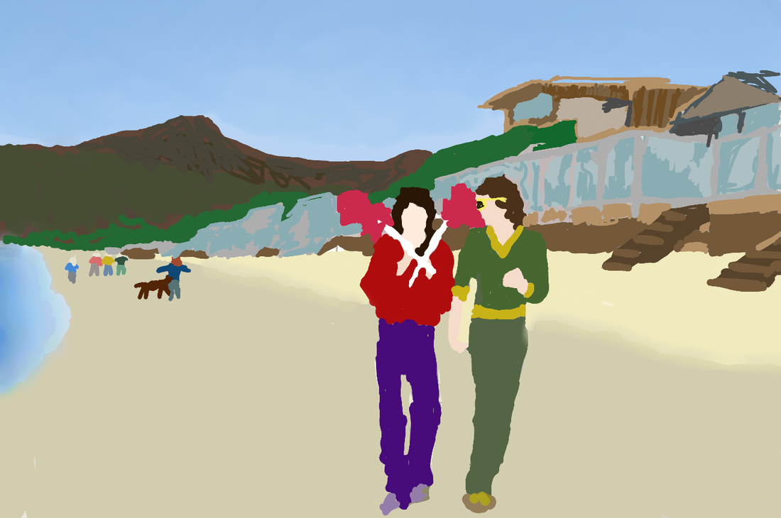
I drew my recreation on Gimp photoshop where I used the paint tool. I used a normal paintbrush and a blur tools. I used the blur tool to more accurately recreate the changing colours in the sky, the sea and the beach. With my laptop I used a separate Bluetooth touchscreen pen which helped me draw and focus on key detail.
My Inspired shoot
I brought my camera when I met with my friends as I knew it would be a good time to get Carinthia West themed street photos.

Shoot reflection
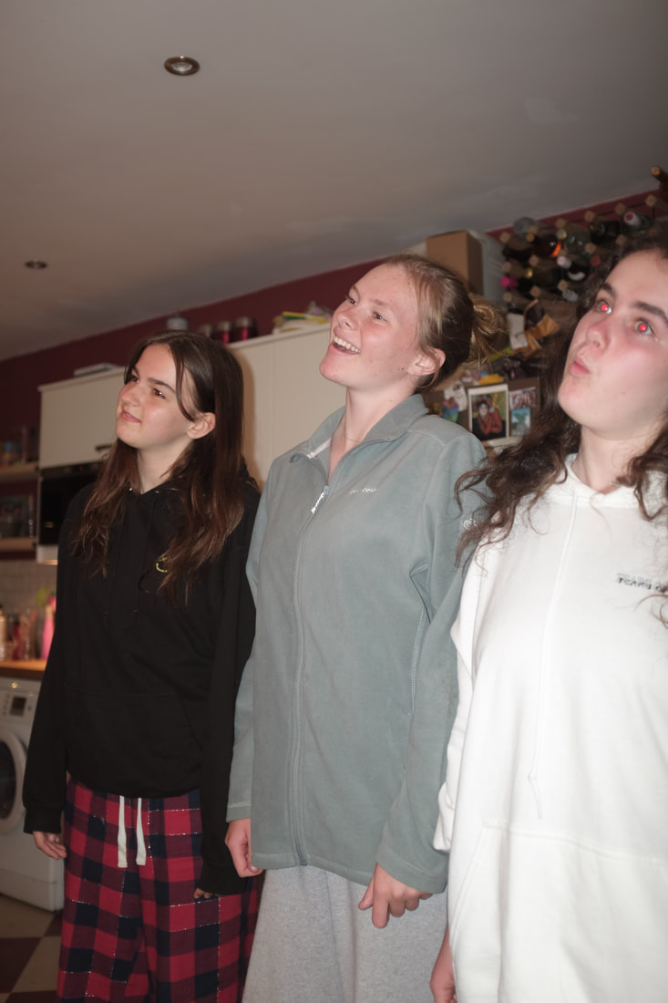
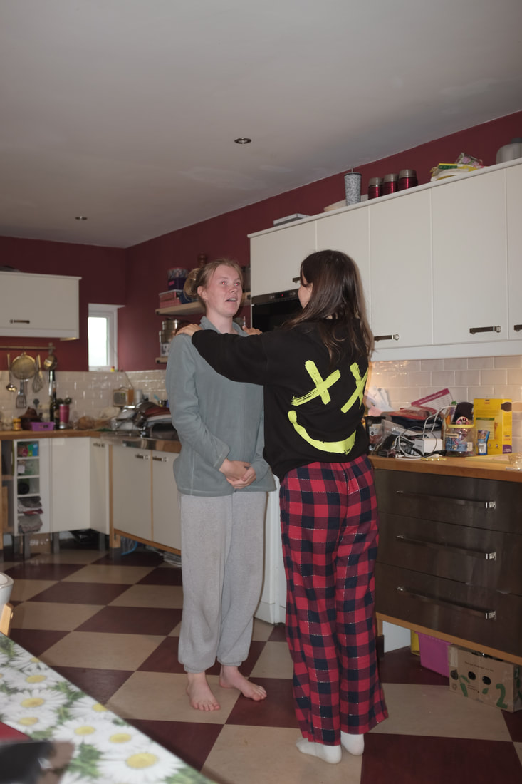
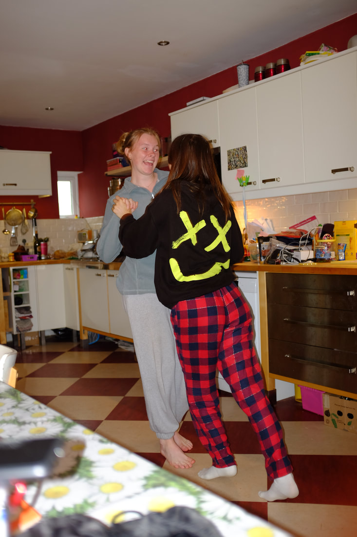
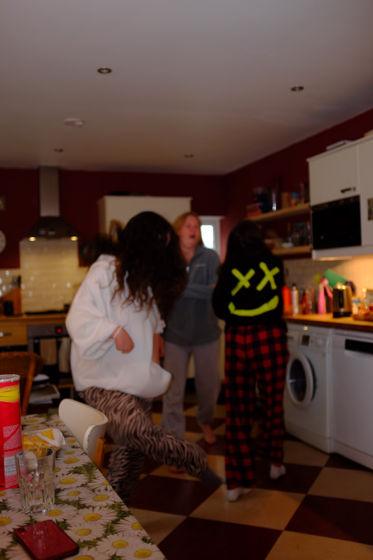
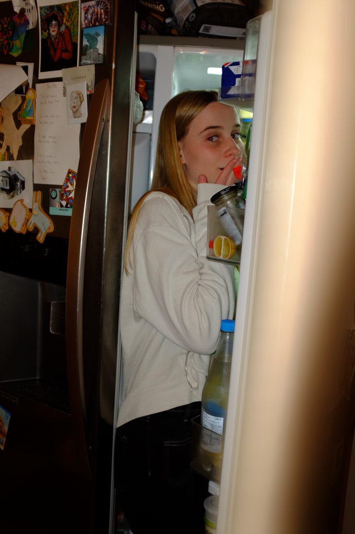
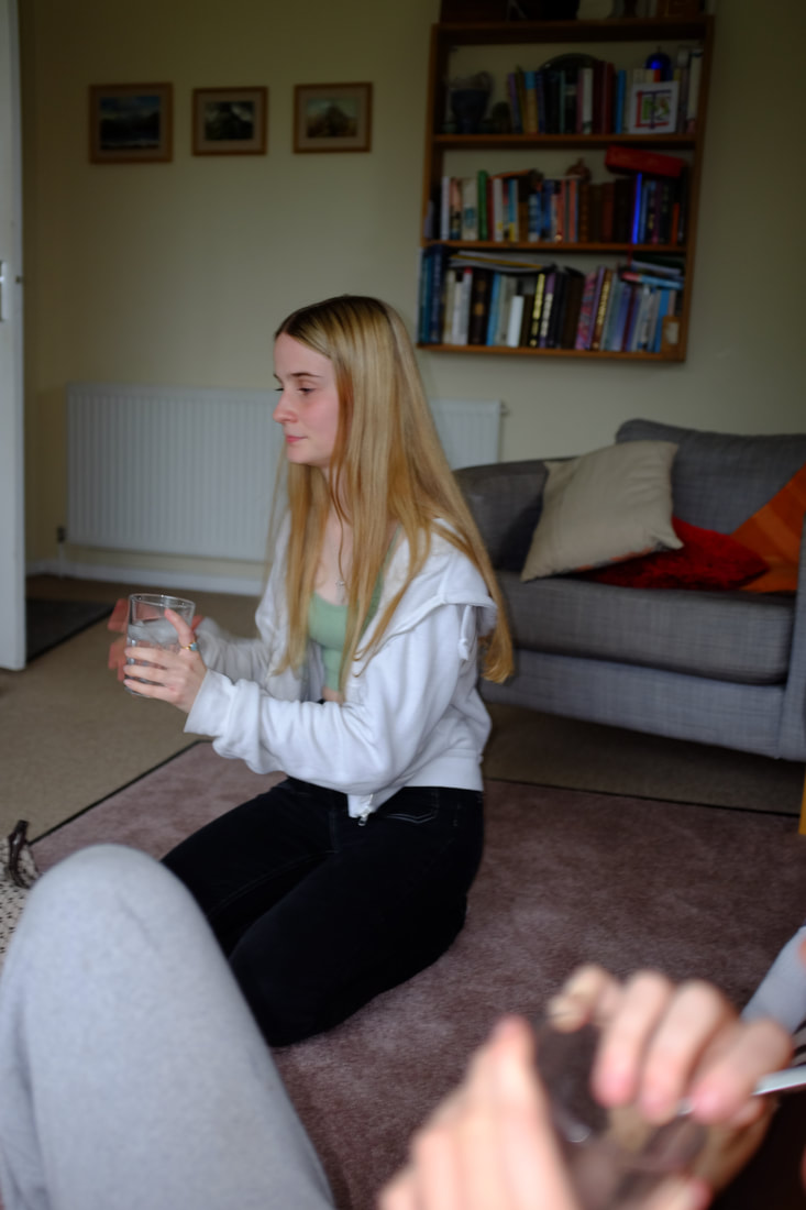
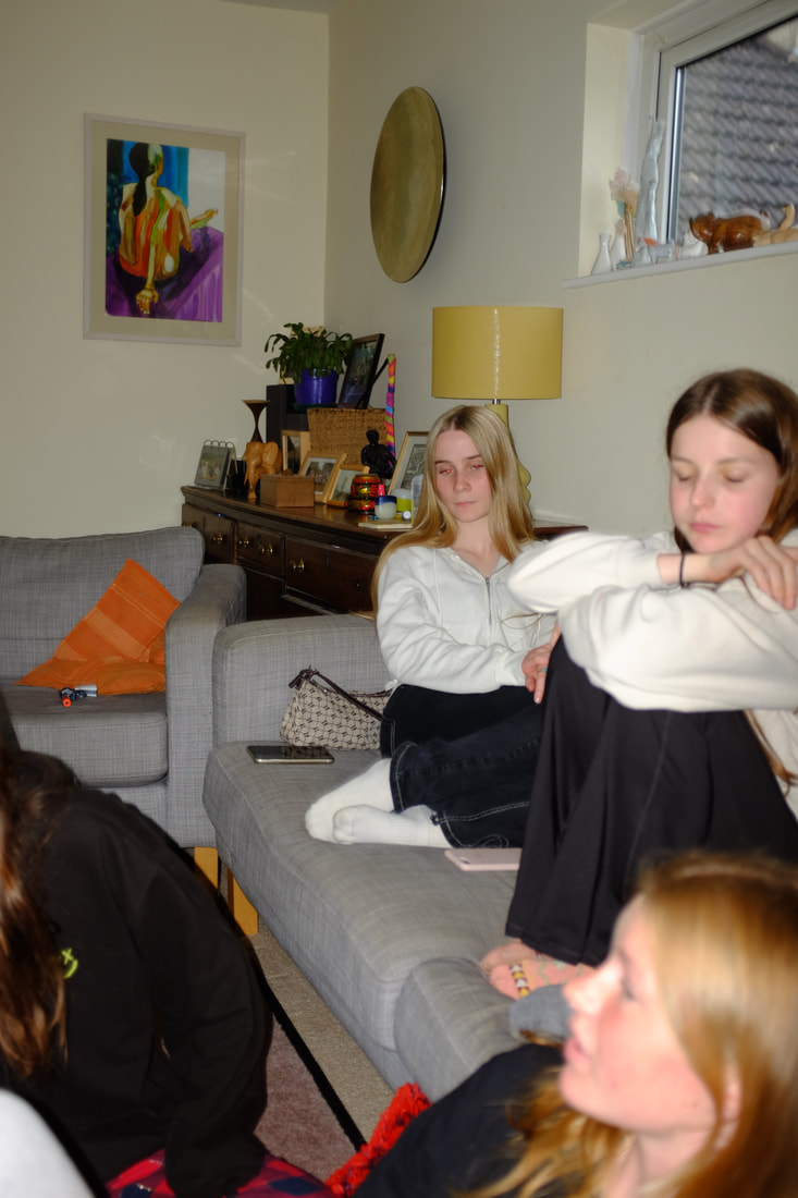
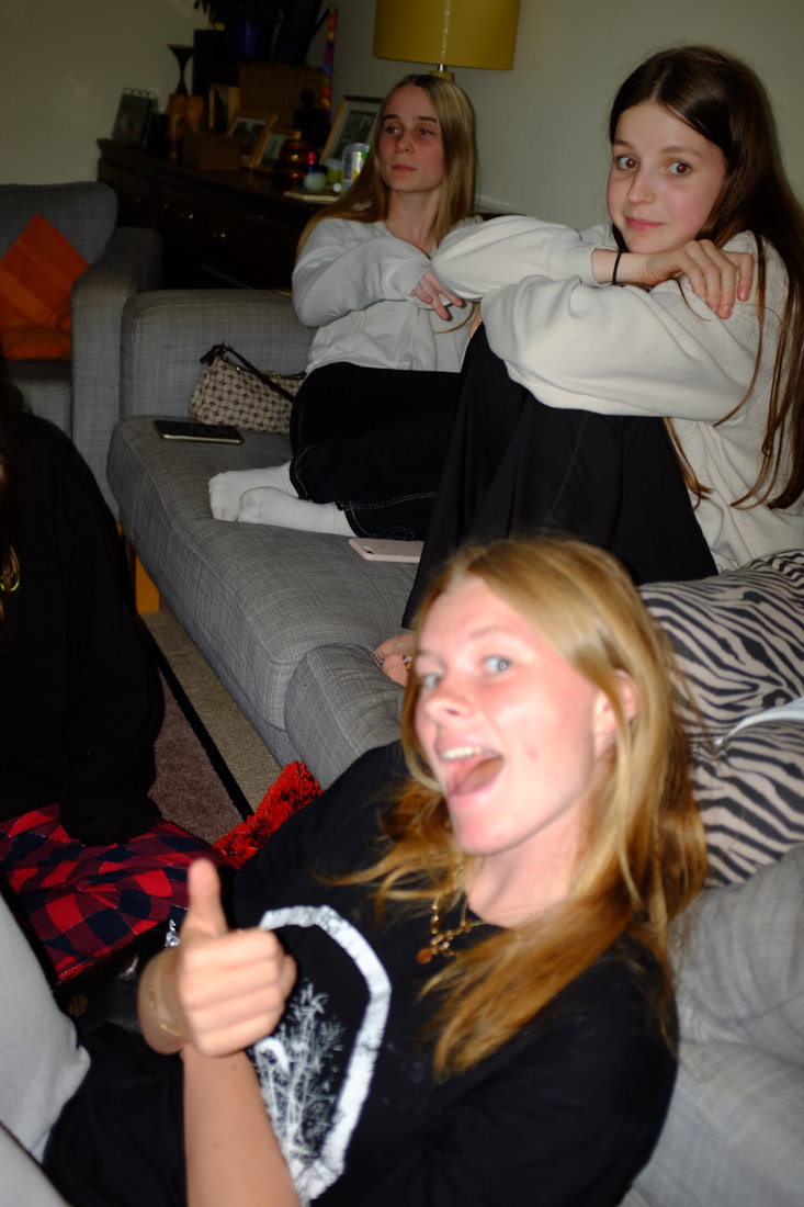
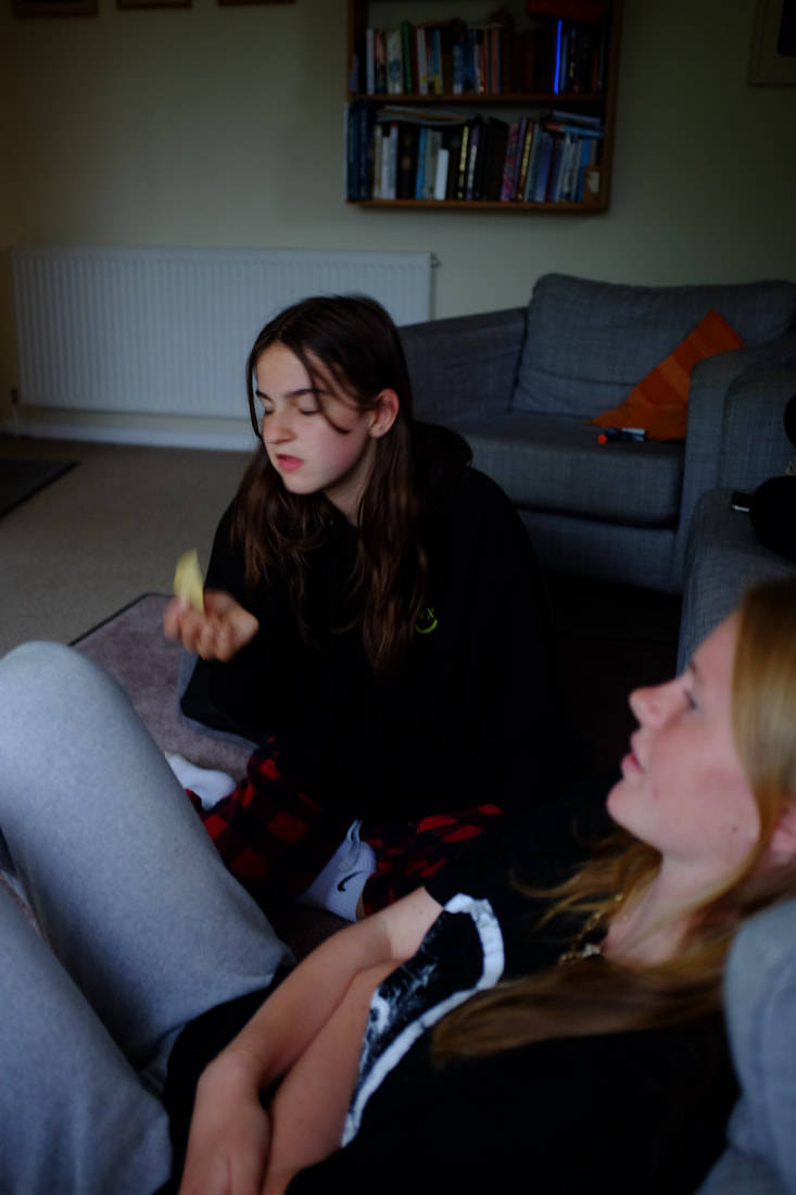
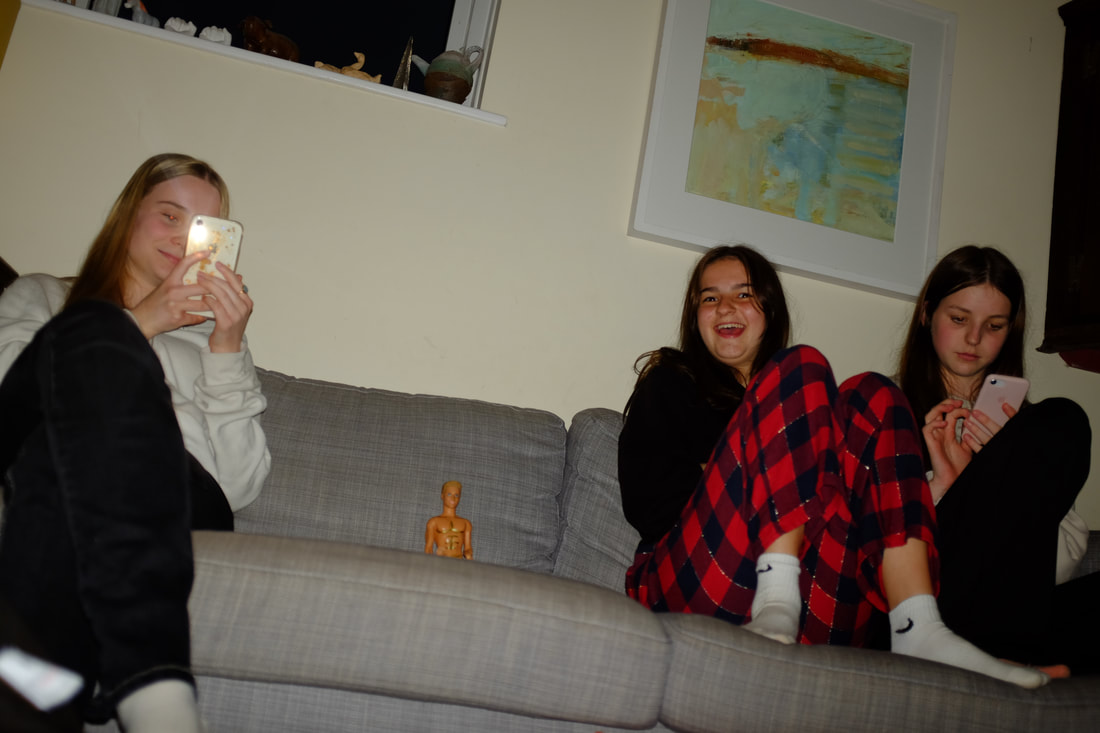
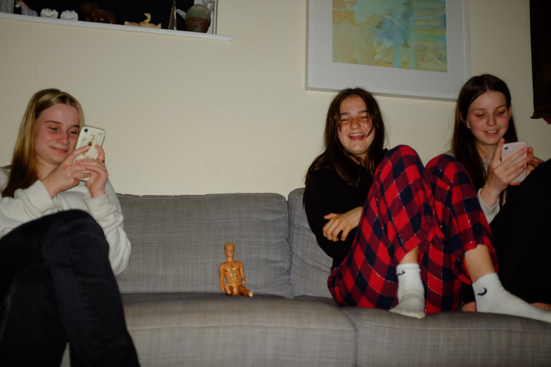
I have photographed my friends when we met up at one of their houses to watch the final of the Euros in 2021. The settings/techniques I have used are a range of shutter speeds but mostly 1/35, mostly f2.0 aperture, ISO 200 and autofocus. What went well was that I think I achieved good lighting and positioning / composition good focus for most of my images and I managed to capture good moments of my friends similar to the way that Carinthia West does. I think my shoot could be even better if I am experimented more with different lighting or colouring as the colours are mostly warm and to see how this would effects the images. I have learnt to look closely and to really consider framing and lighting/ISO.
I have photographed my friends when we met up at one of their houses to watch the final of the Euros in 2021. The settings/techniques I have used are a range of shutter speeds but mostly 1/35, mostly f2.0 aperture, ISO 200 and autofocus. What went well was that I think I achieved good lighting and positioning / composition good focus for most of my images and I managed to capture good moments of my friends similar to the way that Carinthia West does. I think my shoot could be even better if I am experimented more with different lighting or colouring as the colours are mostly warm and to see how this would effects the images. I have learnt to look closely and to really consider framing and lighting/ISO.
Editing My photos

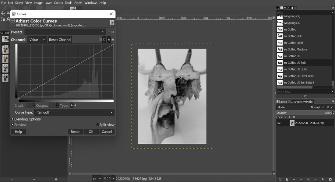
I chose my favourite photos and used Gimp to changed the image to grayscale. I then used the curves settings to change the brightness, darkness and colouring.
My Photos
|
Carinthia West's Photos
|
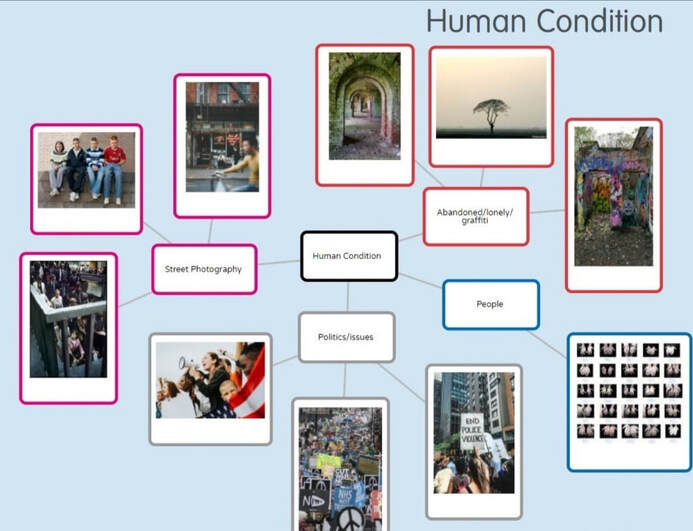
Human Condition
Project two Yr10-11 GCSE Photography
The human condition is "the characteristics, key events, and situations which compose the essentials of human existence, such as birth, growth, emotionality, aspiration, conflict, and mortality.”
This is a very broad topic which has been and continues to be pondered and analysed from many perspectives, including those of religion, philosophy, history, art, literature, psychology and biology.
This is a very broad topic which has been and continues to be pondered and analysed from many perspectives, including those of religion, philosophy, history, art, literature, psychology and biology.
A mind-map of my initial ideas.
My project
Fragmented Body
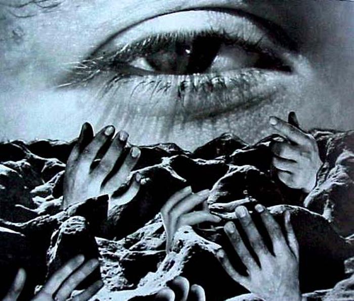
Photographer 1 - Tim Booth
Tim Booth’s has a recognisable shooting style that often mixes the styles of both portraiture and landscape. He has been the winner of many international awards including being voted the No.1 Black & White photographer working in the UK today. He began taking photographs with his father’s camera at the age of eight. By the time he was a teenager he’d bought his first SLR.
|
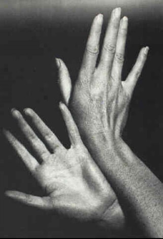
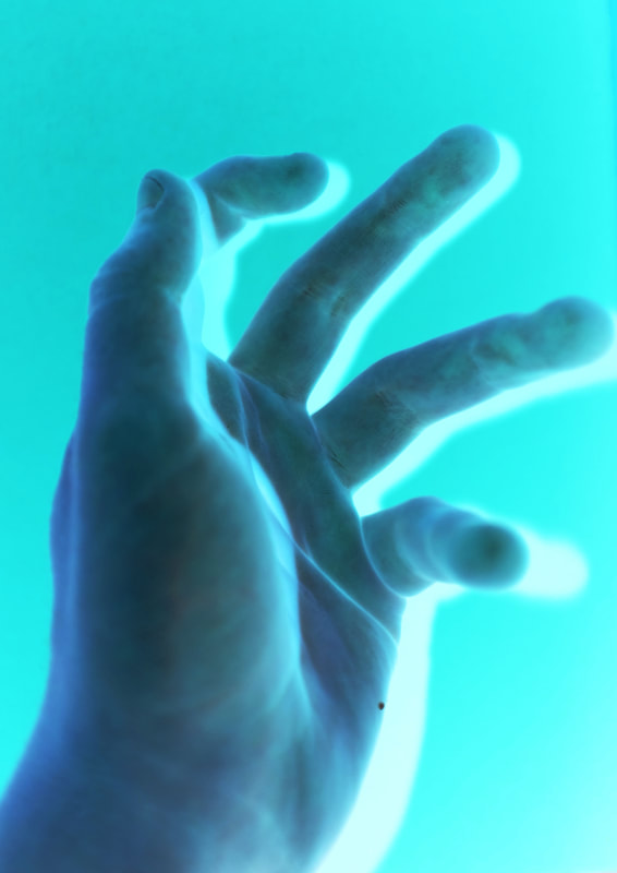
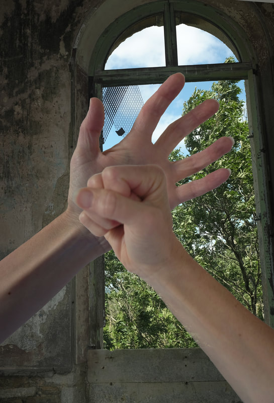
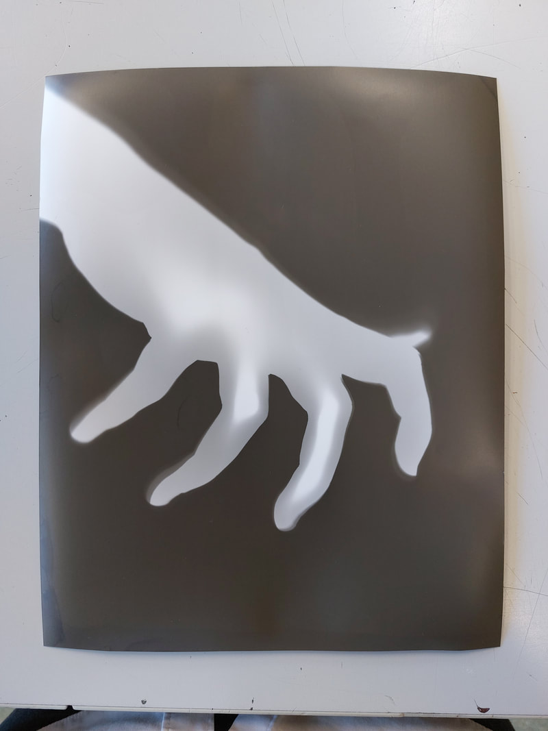
Image Analysis
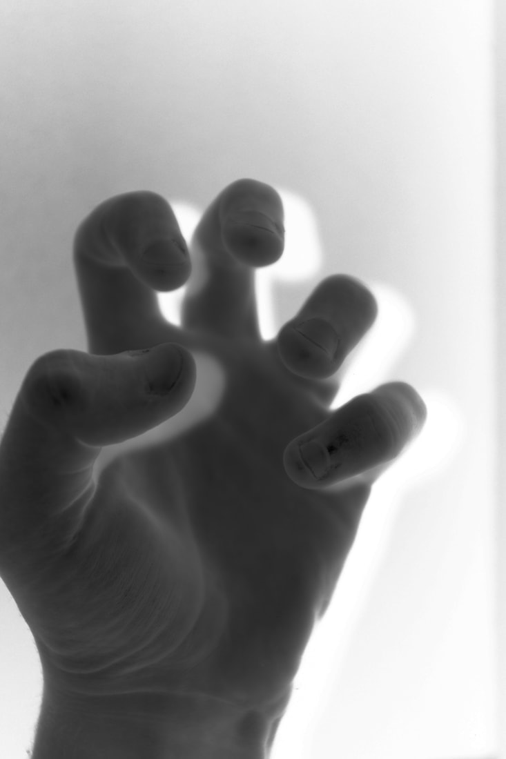
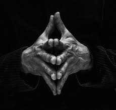
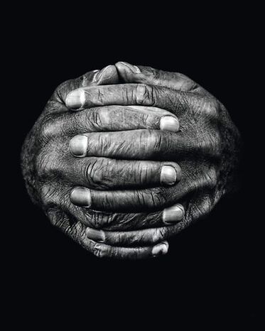
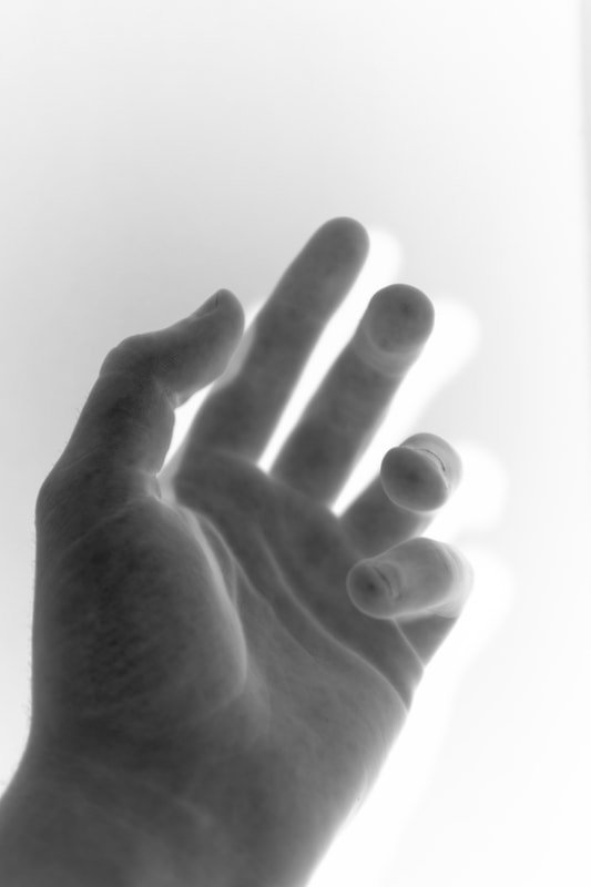
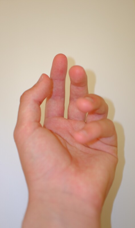
The title of this piece is Jeff King Gladiator. It is by Tim Booth. It is part of a collection called ‘a show of hands’ and was published in 2015. The composition shows a man reaching out from a dark background. The photo has been taken in black and white. His hands are large in comparison to the his body as they are much closer to the camera. The focal point (most important/eye-catching part) of the image is the man’s hands. The contrast from the black background to the hands draws your attention. It is placed covering most of the bottom half of the photo, just bellow the centre. The techniques used here are unnatural lighting and a reasonably small aperture possibly around f/11. The photo gives a uneasy feel as you are able to see an accurate description of the human body but focusing mostly on his hands. This emphasises details such as the man’s veins and grooves. As the photos were taken in recent years it is most likely the photographer used a traditional DSLR camera. |
|
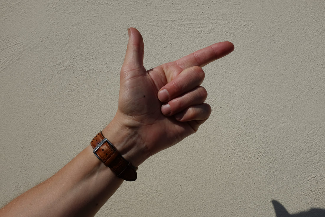
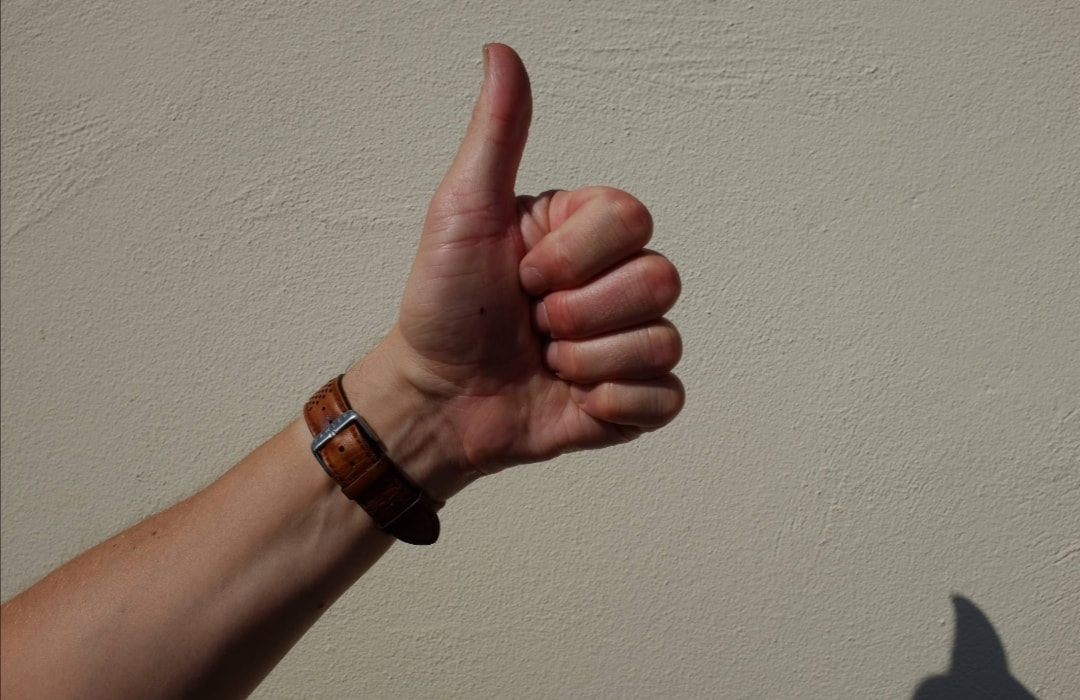
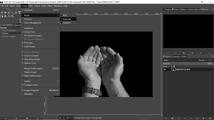
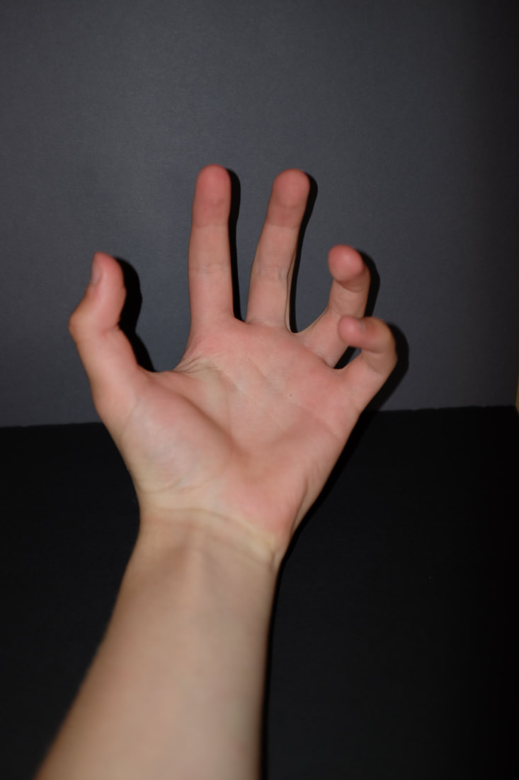
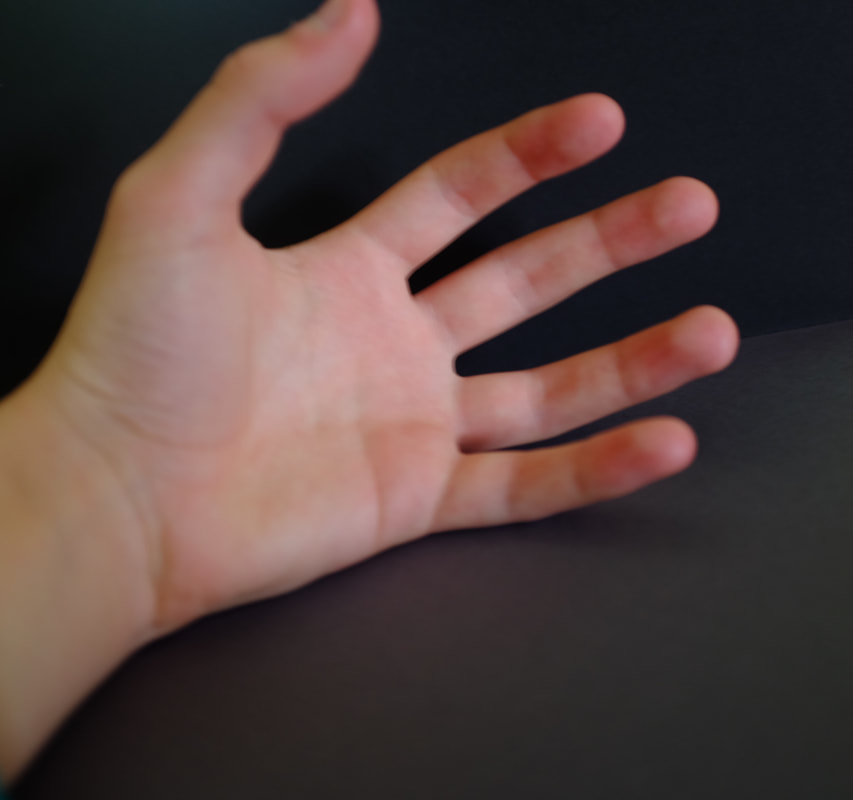
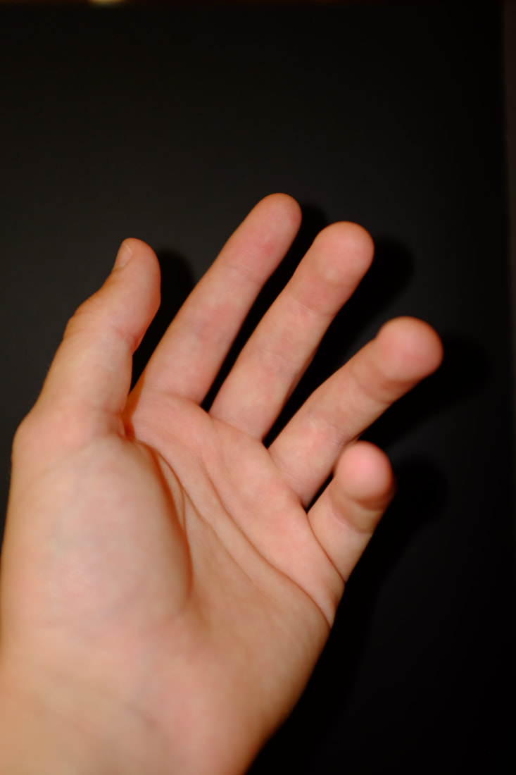
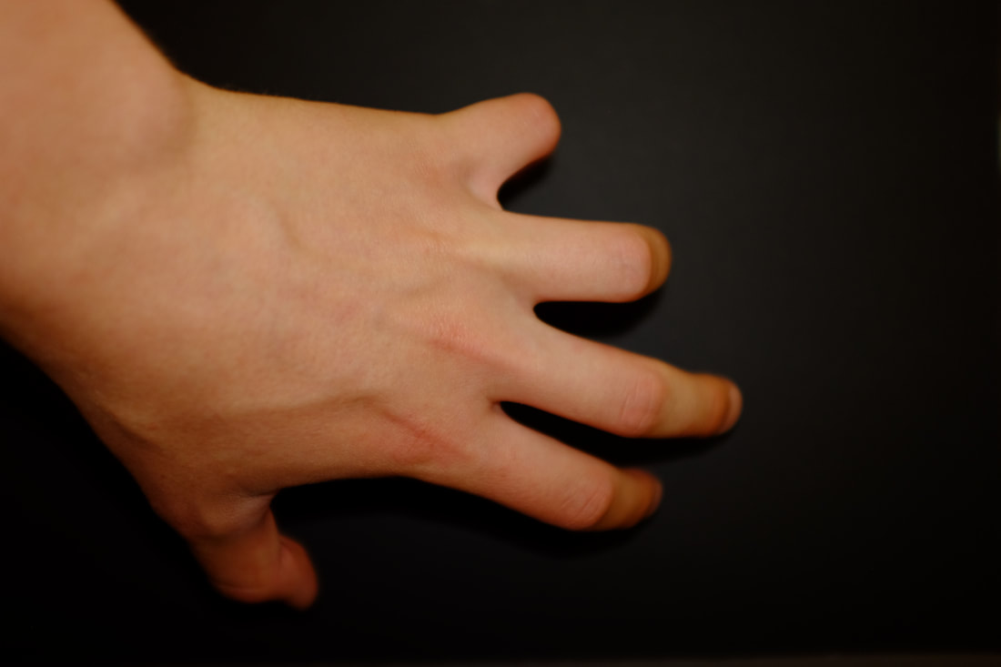
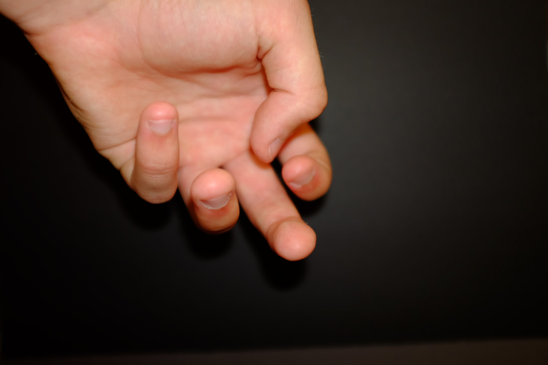
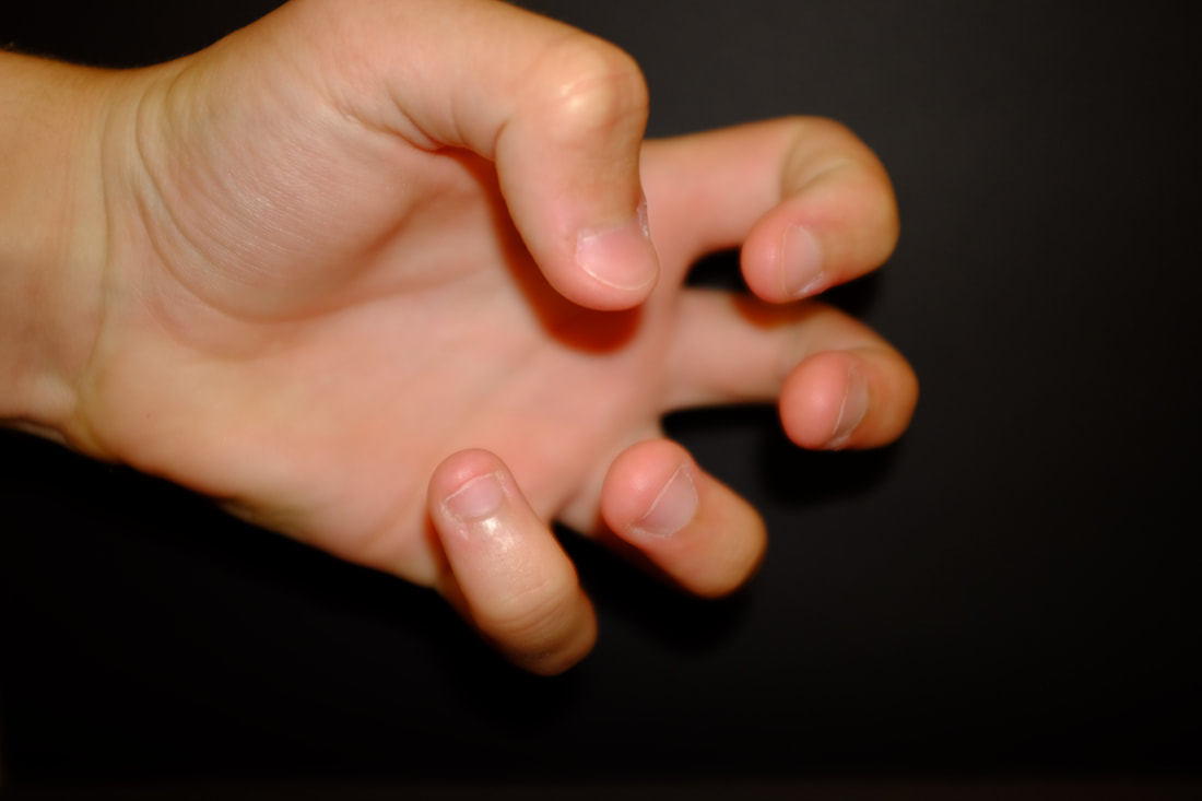
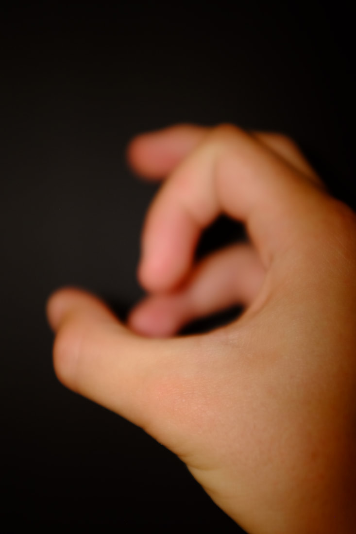
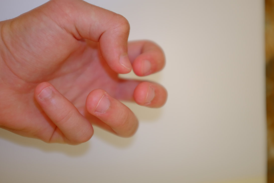
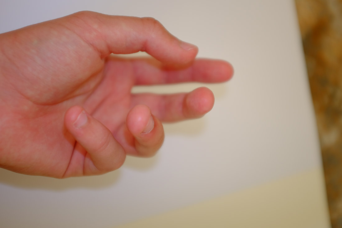
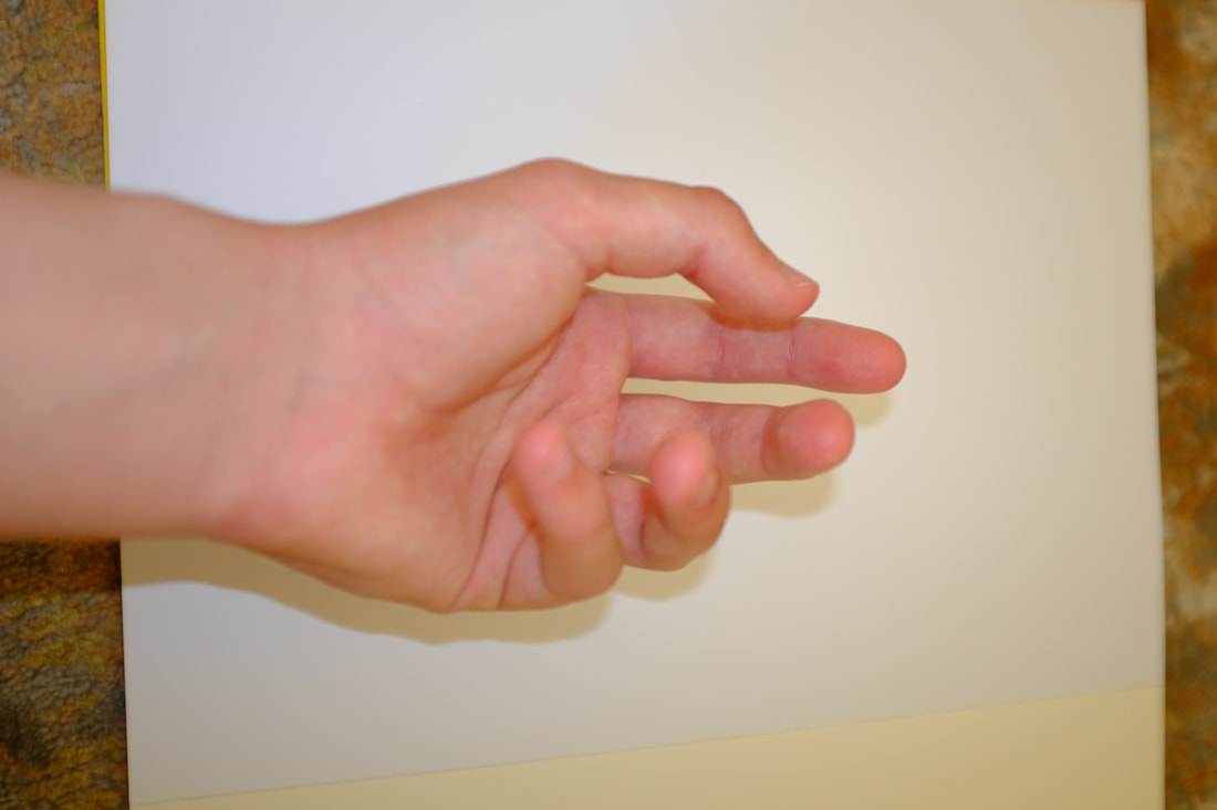
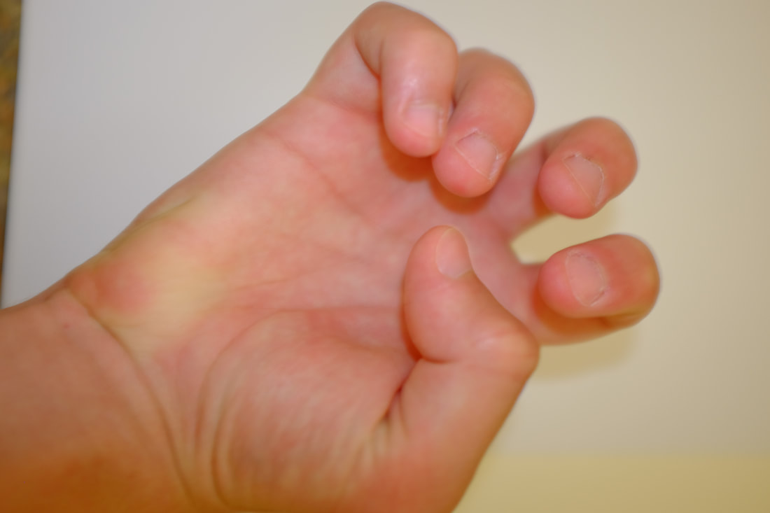
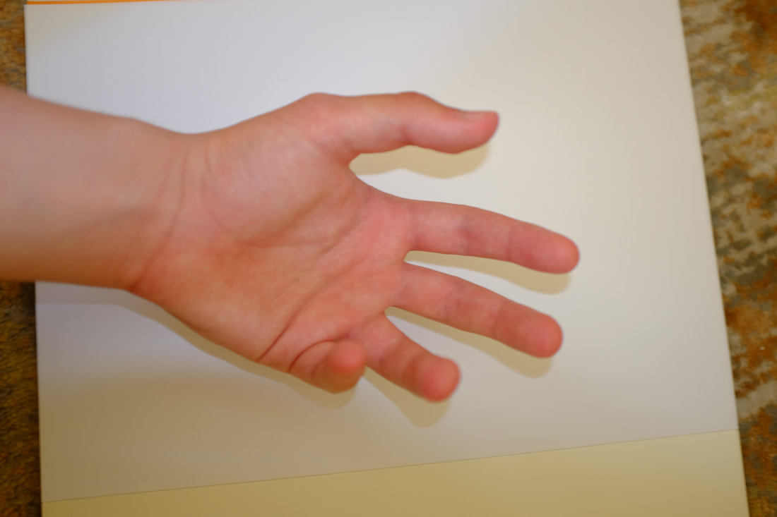
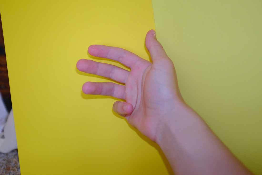
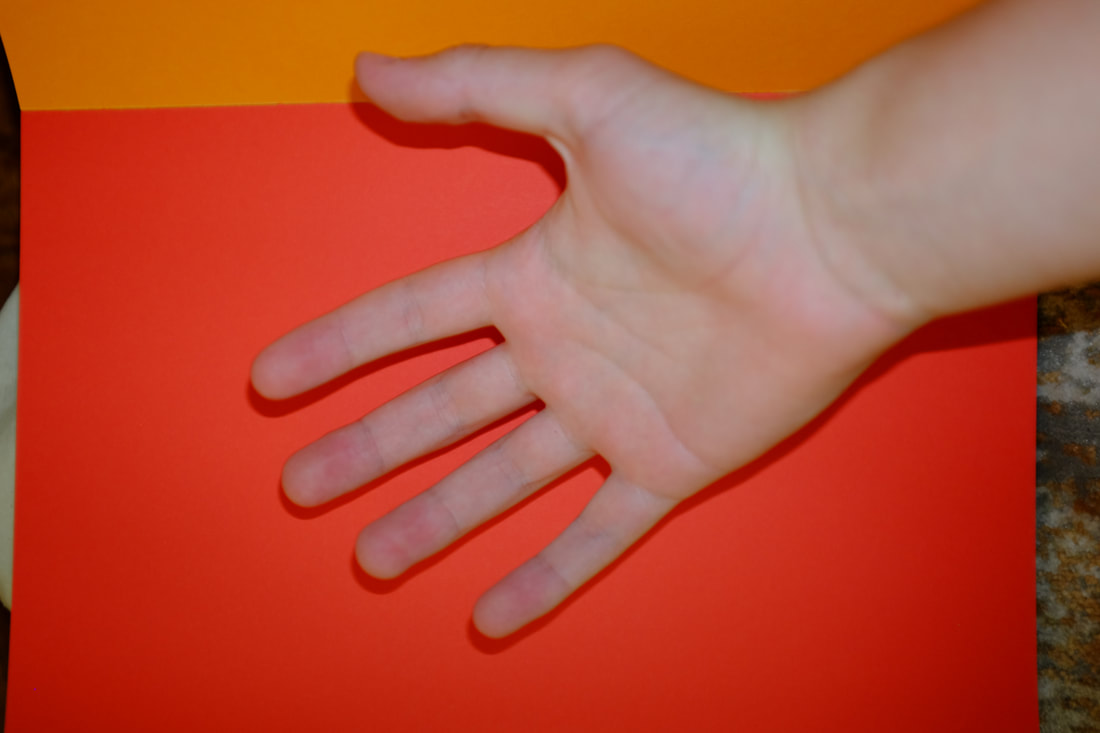
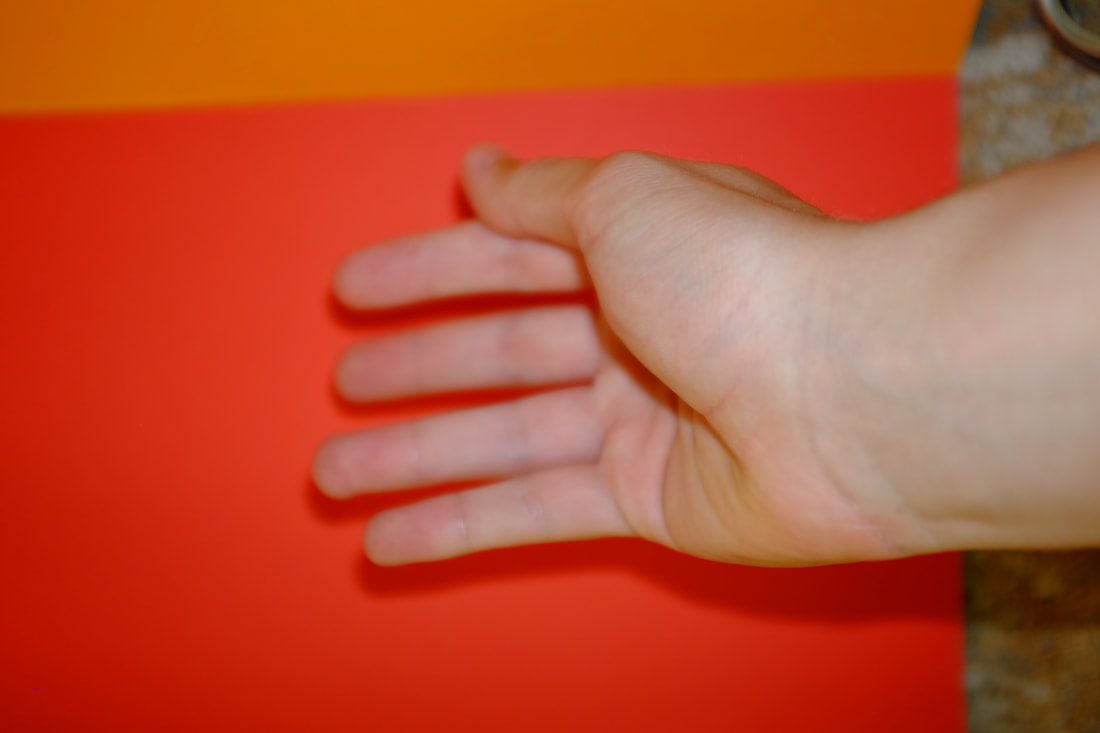
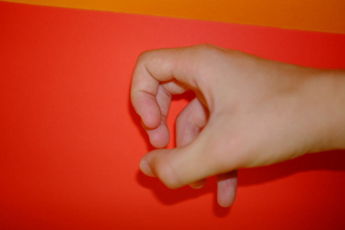
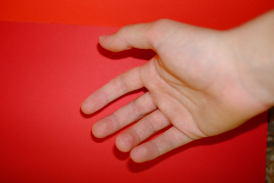
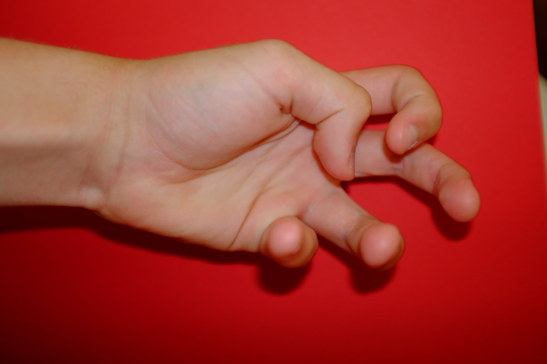
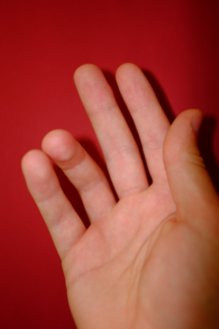
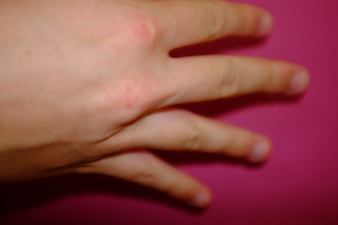
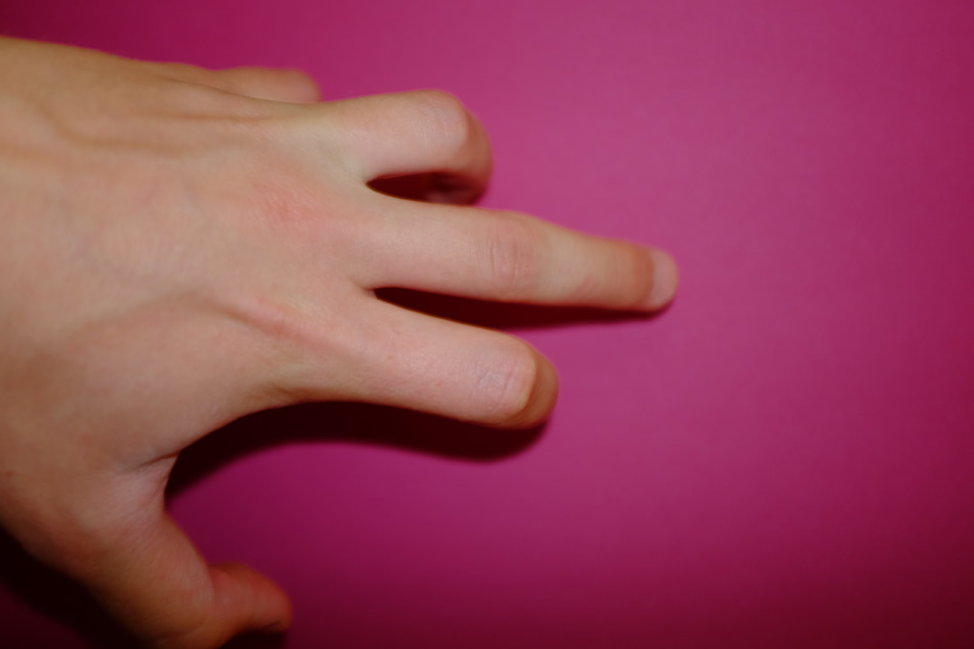
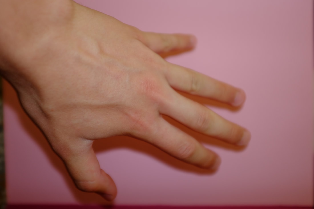
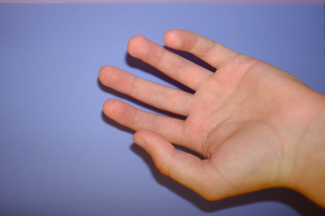
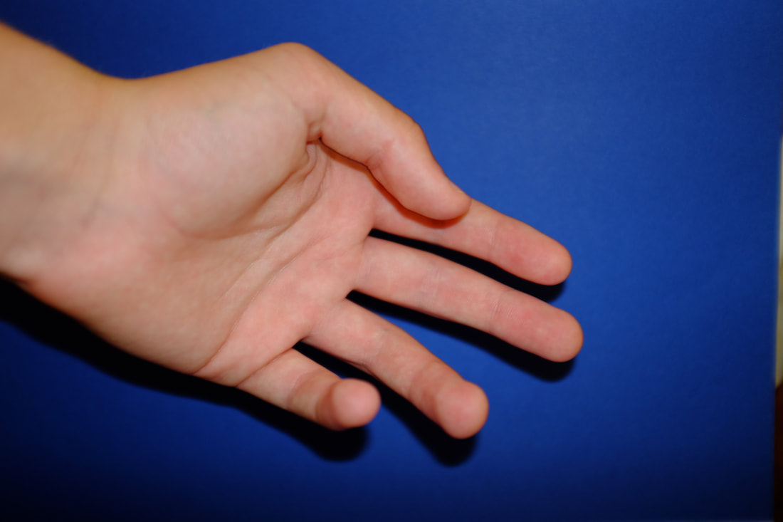
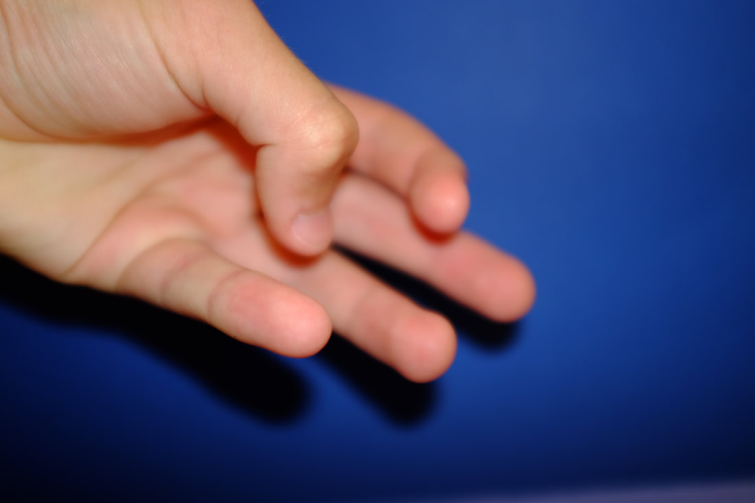
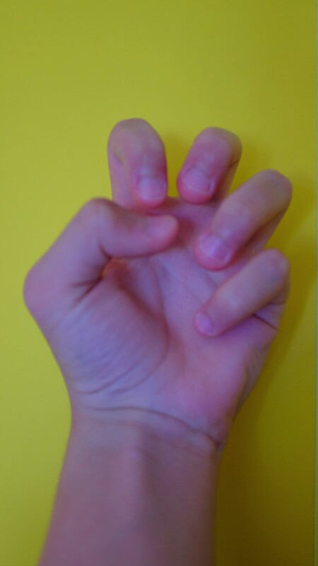
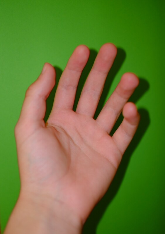
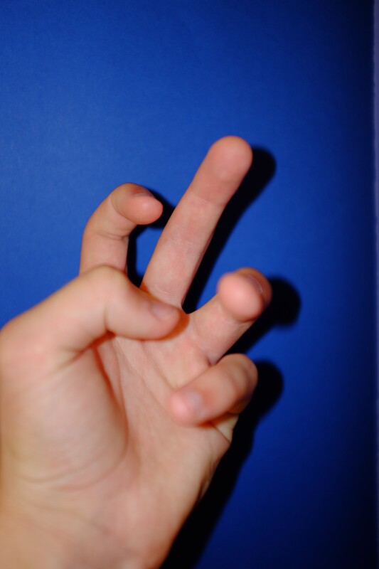
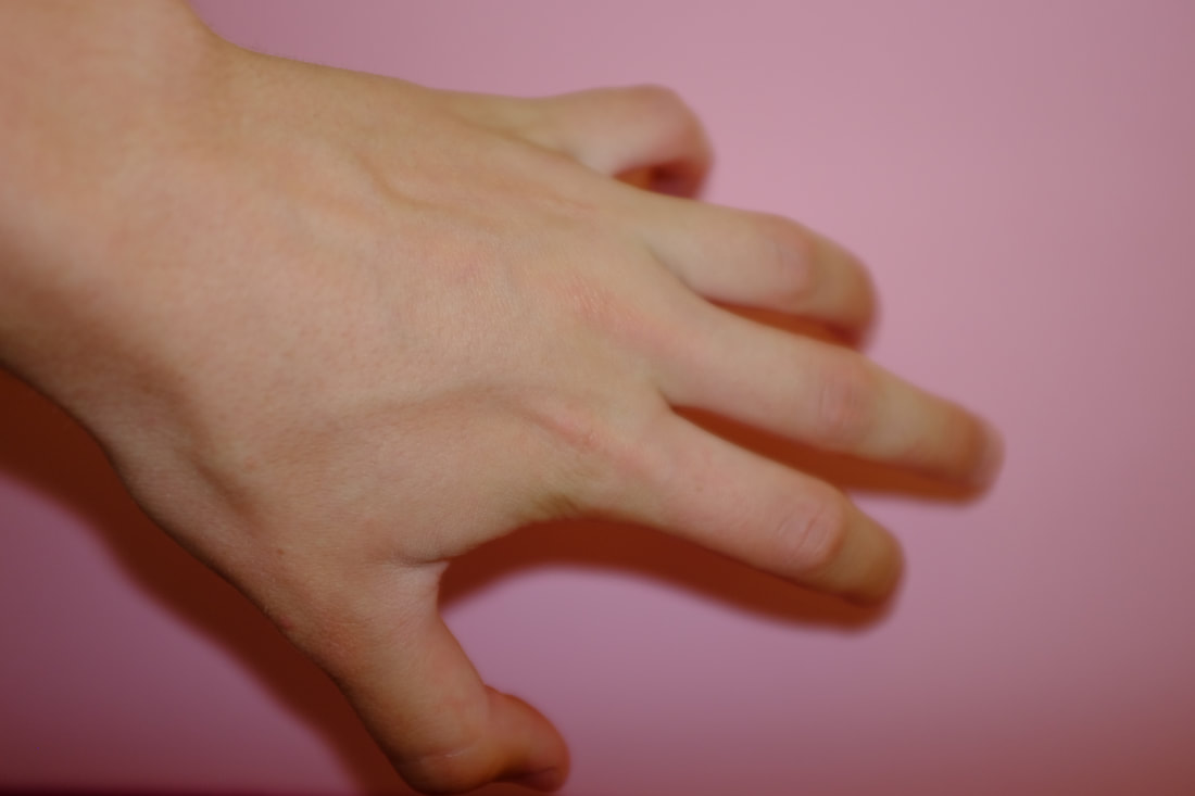
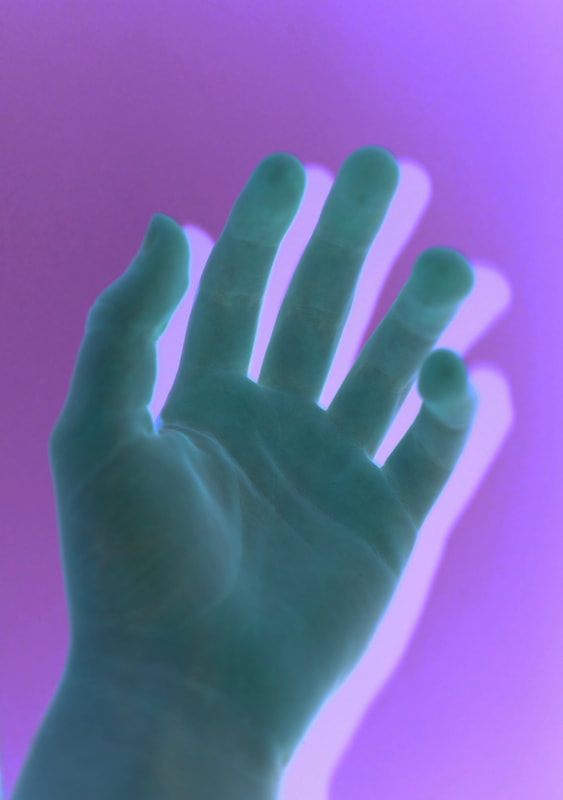
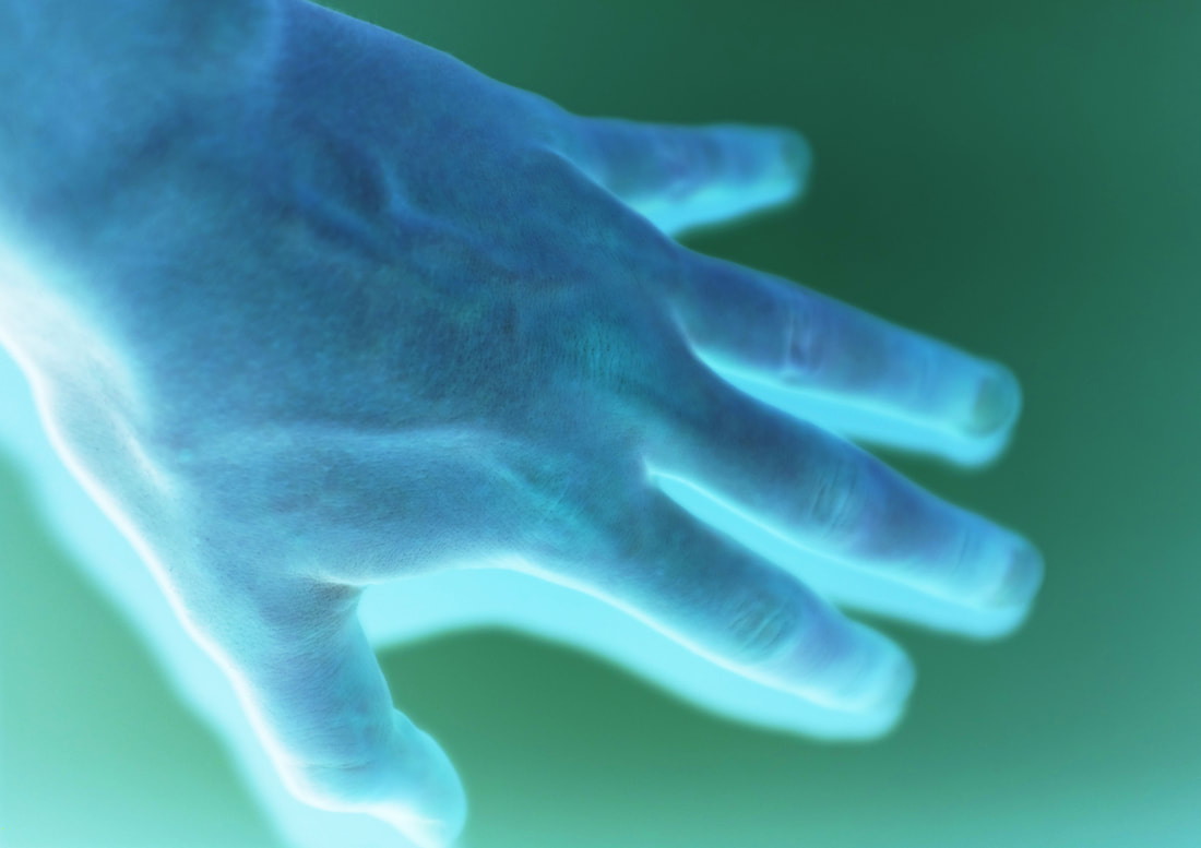
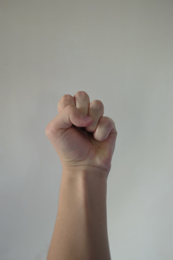
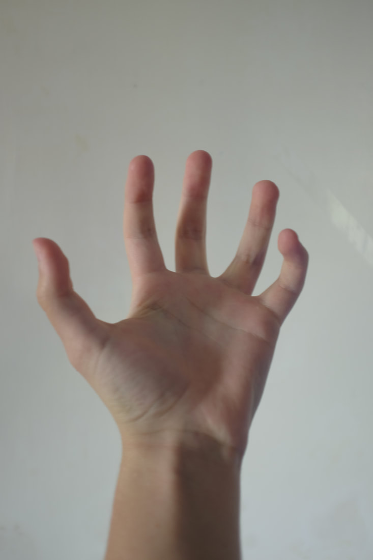
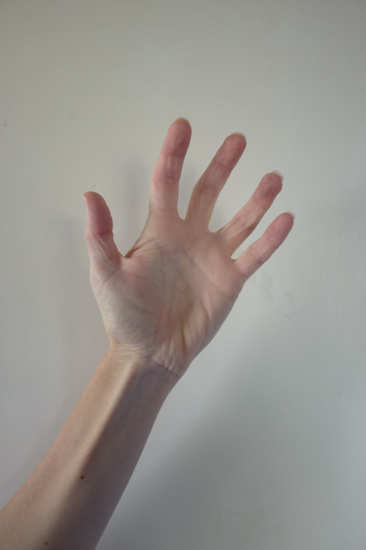
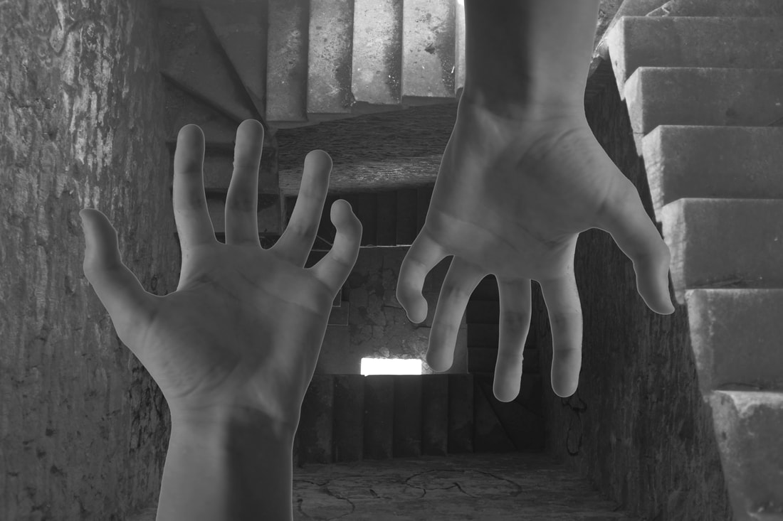
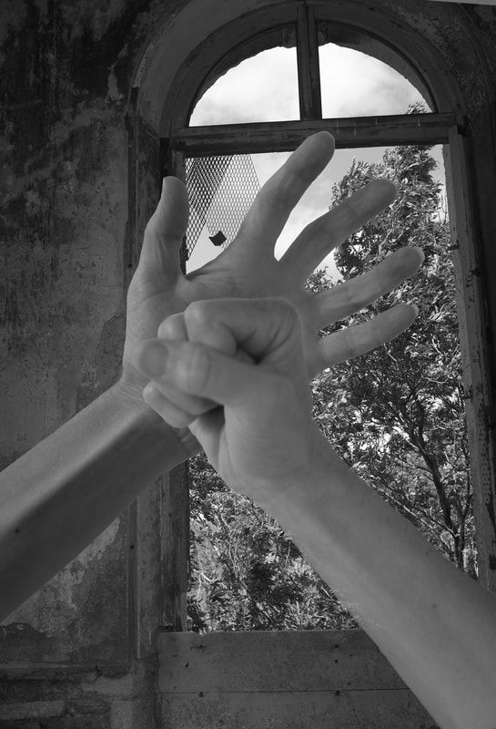
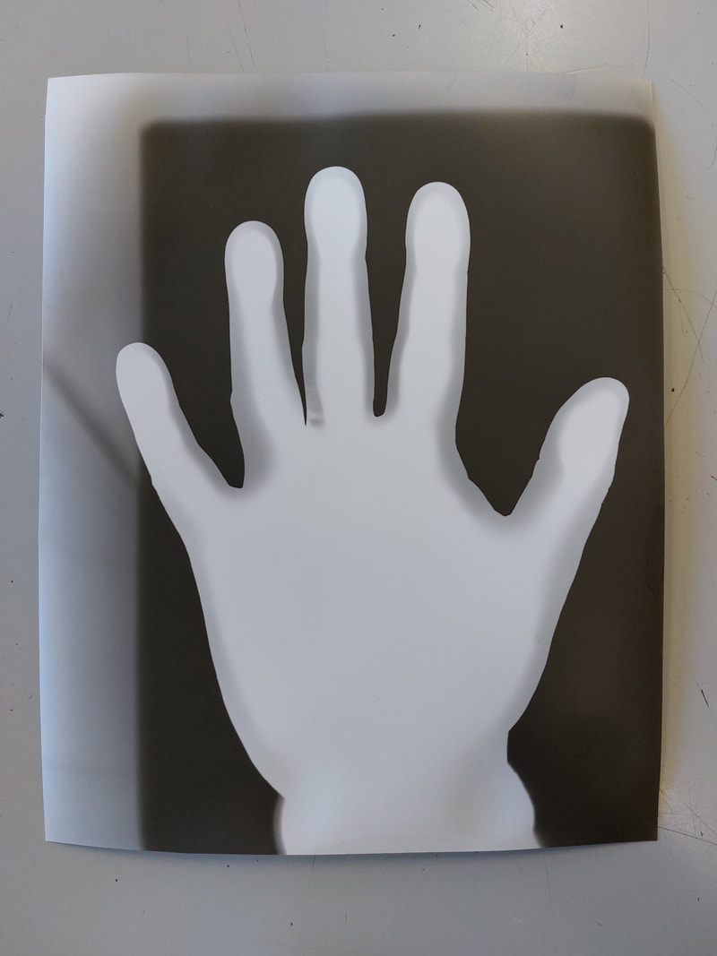
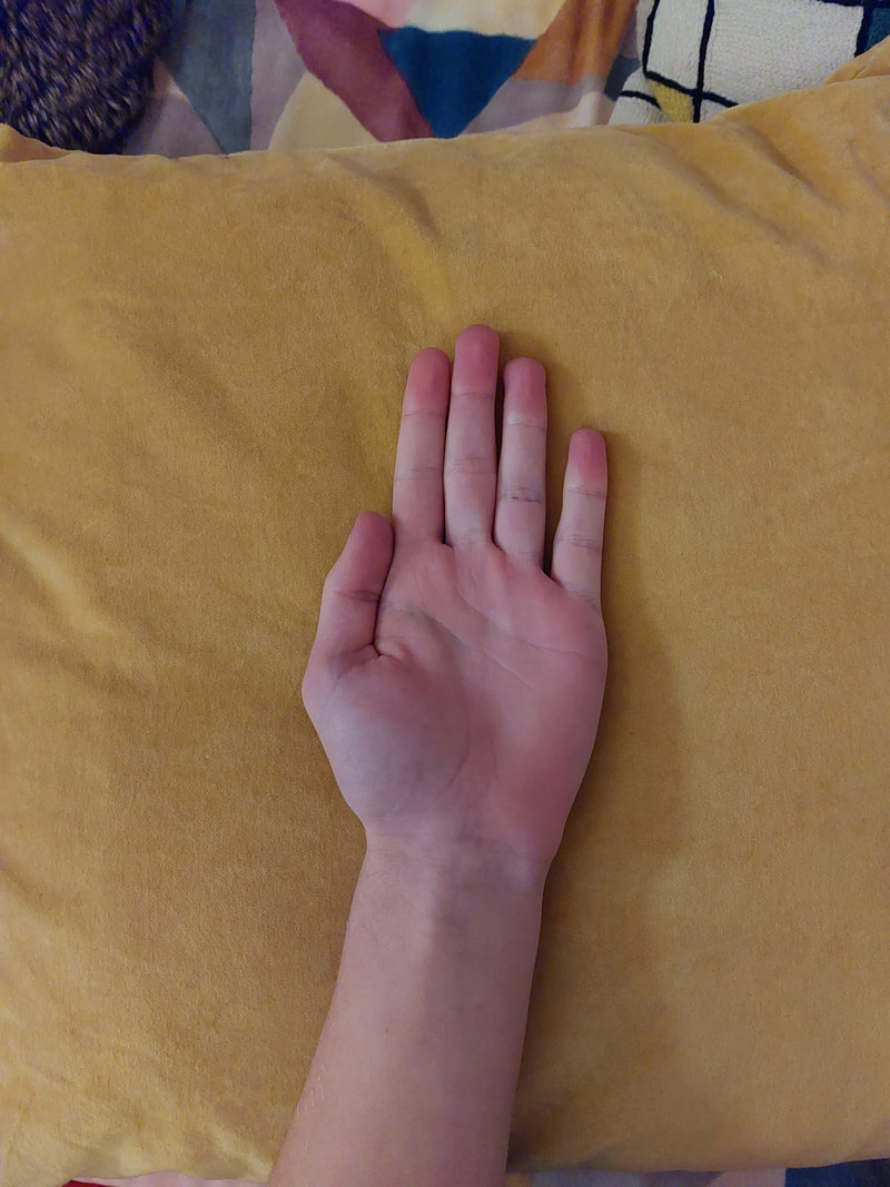
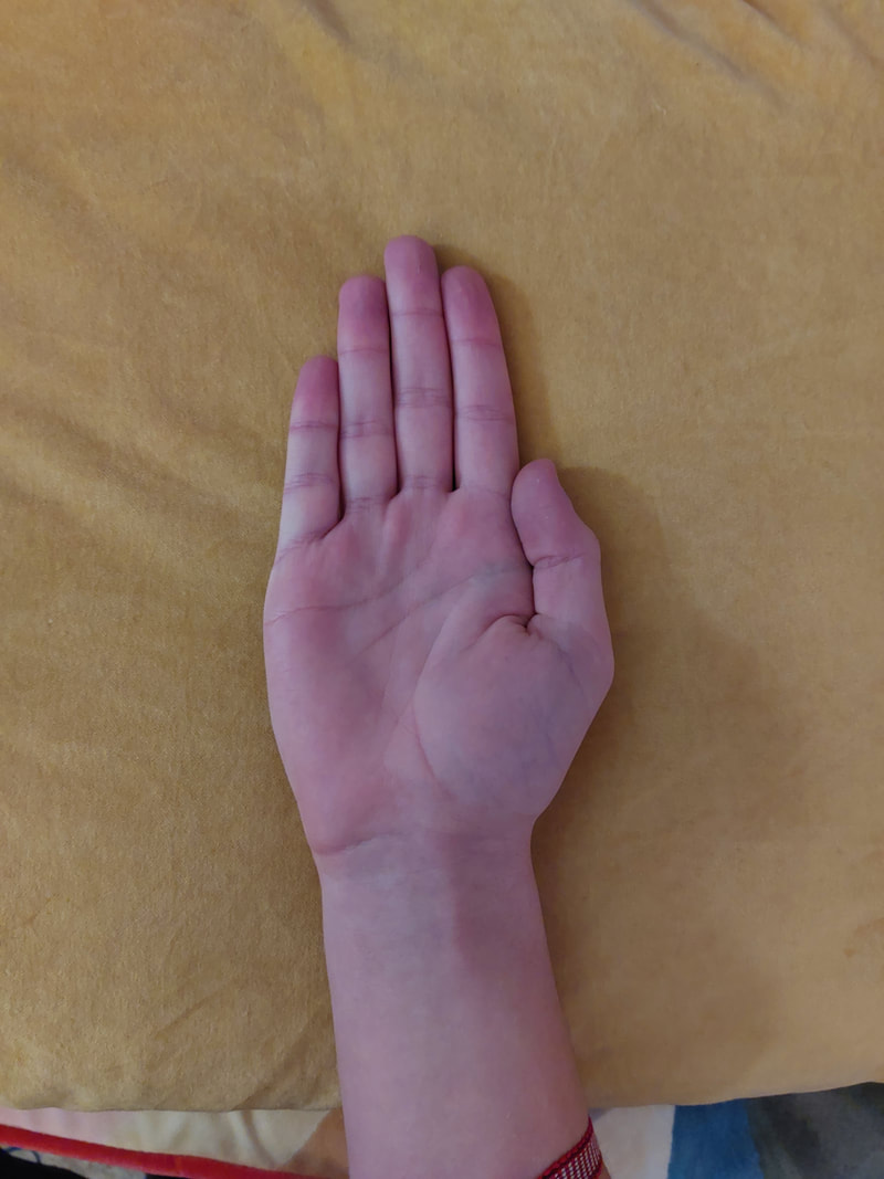
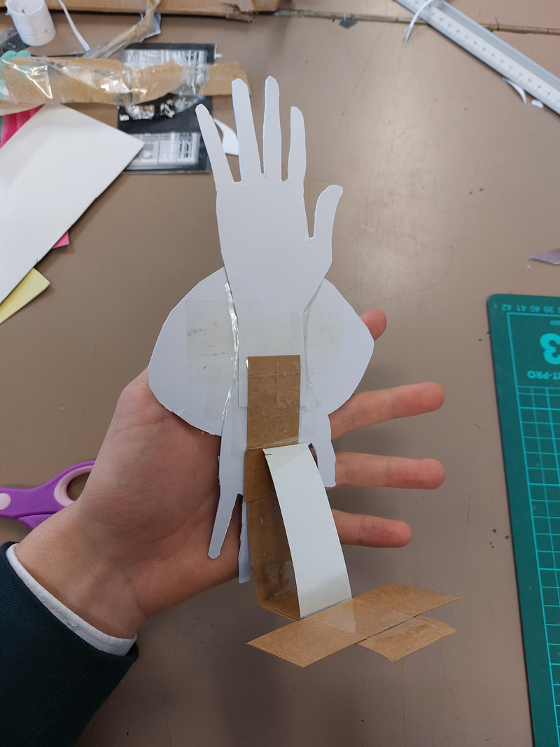
Tim Booth Shoot 1 - Older Hands
Shoot plan
I intend to create my own images based around different hands in different positions. I hope to then edit my chosen favourite pictures with Gimp Photoshop. I will be using natural lighting but then editing my photos making them more artificial. I will use my Camera, a FujiFilm x100s - this will allow me to adjust the settings and take a more detailed photo.
I intend to create my own images based around different hands in different positions. I hope to then edit my chosen favourite pictures with Gimp Photoshop. I will be using natural lighting but then editing my photos making them more artificial. I will use my Camera, a FujiFilm x100s - this will allow me to adjust the settings and take a more detailed photo.
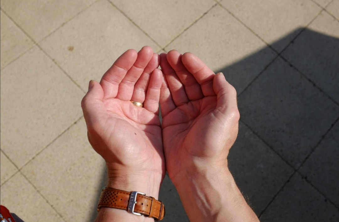
Shoot Review
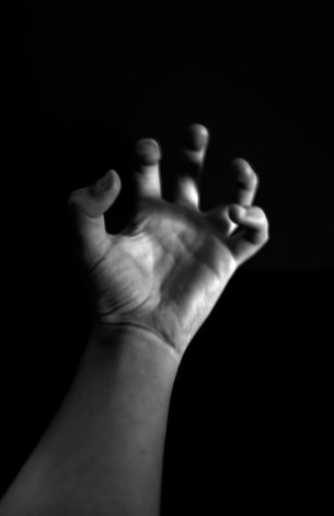
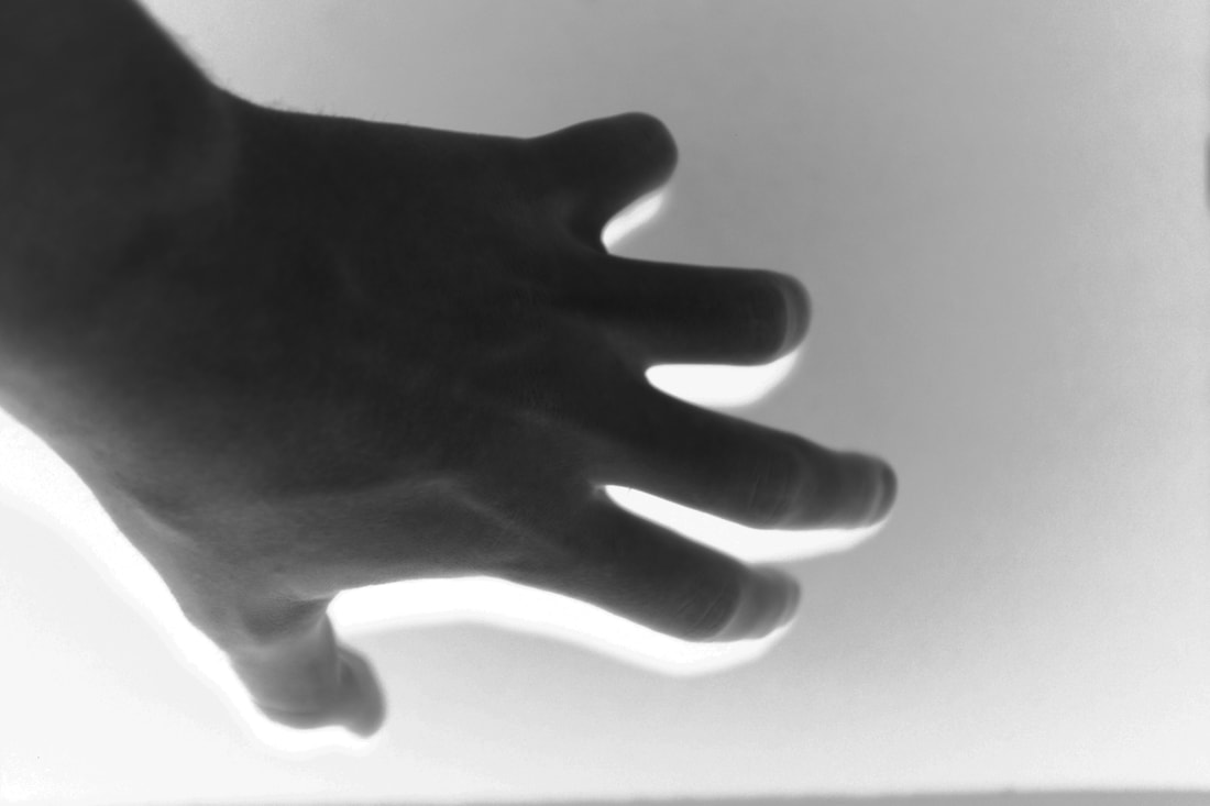
I have photographed my dad's hands. The settings I have used are 1/800 shutter speed, f/10.0 aperture, grayscale, autofocus. What went well was that I think I achieved what I wanted, I used good lighting, focus. I think my shoot could be even better if I had even more photos or more models to take photos of. I have learnt to look closely and to really consider lighting and shadows. I have also learnt more how to use Gimp Photoshop. An photographer that produced similar work was Tim Booth, we have used a similar composition, similar camera settings and similar editing technique.
I have photographed my dad's hands. The settings I have used are 1/800 shutter speed, f/10.0 aperture, grayscale, autofocus. What went well was that I think I achieved what I wanted, I used good lighting, focus. I think my shoot could be even better if I had even more photos or more models to take photos of. I have learnt to look closely and to really consider lighting and shadows. I have also learnt more how to use Gimp Photoshop. An photographer that produced similar work was Tim Booth, we have used a similar composition, similar camera settings and similar editing technique.
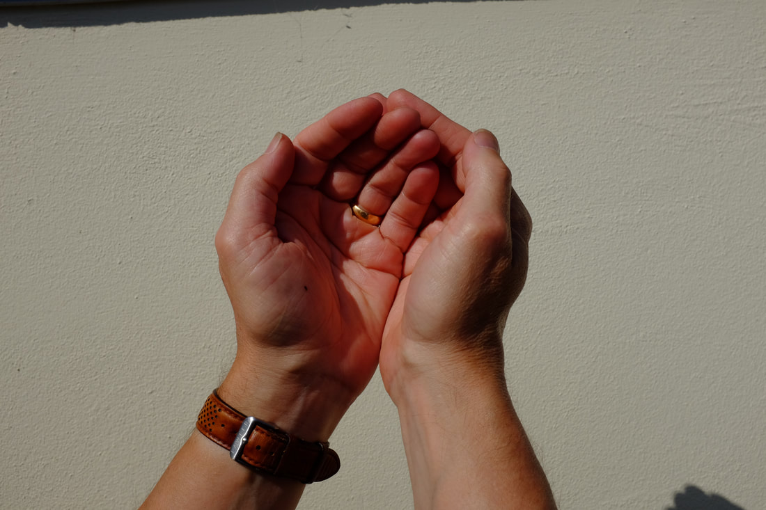
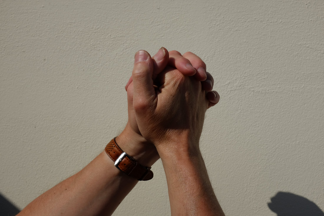
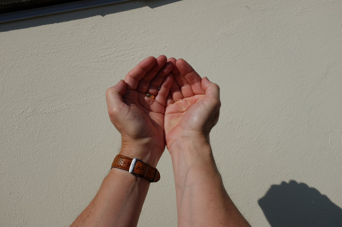
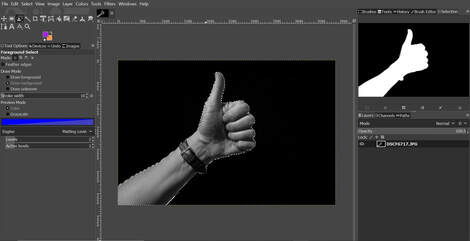
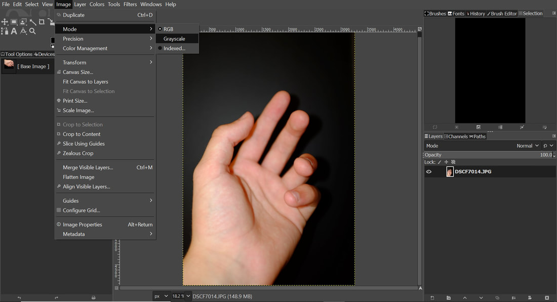
Editing My photos
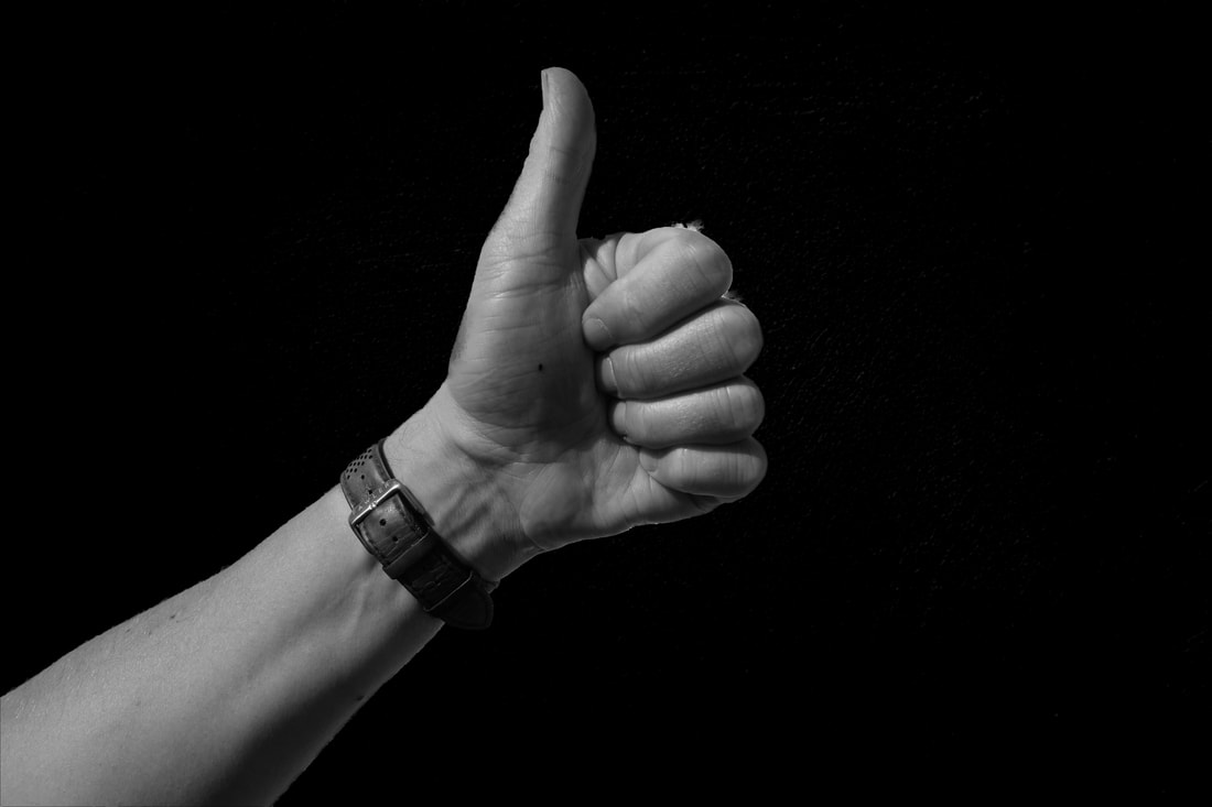
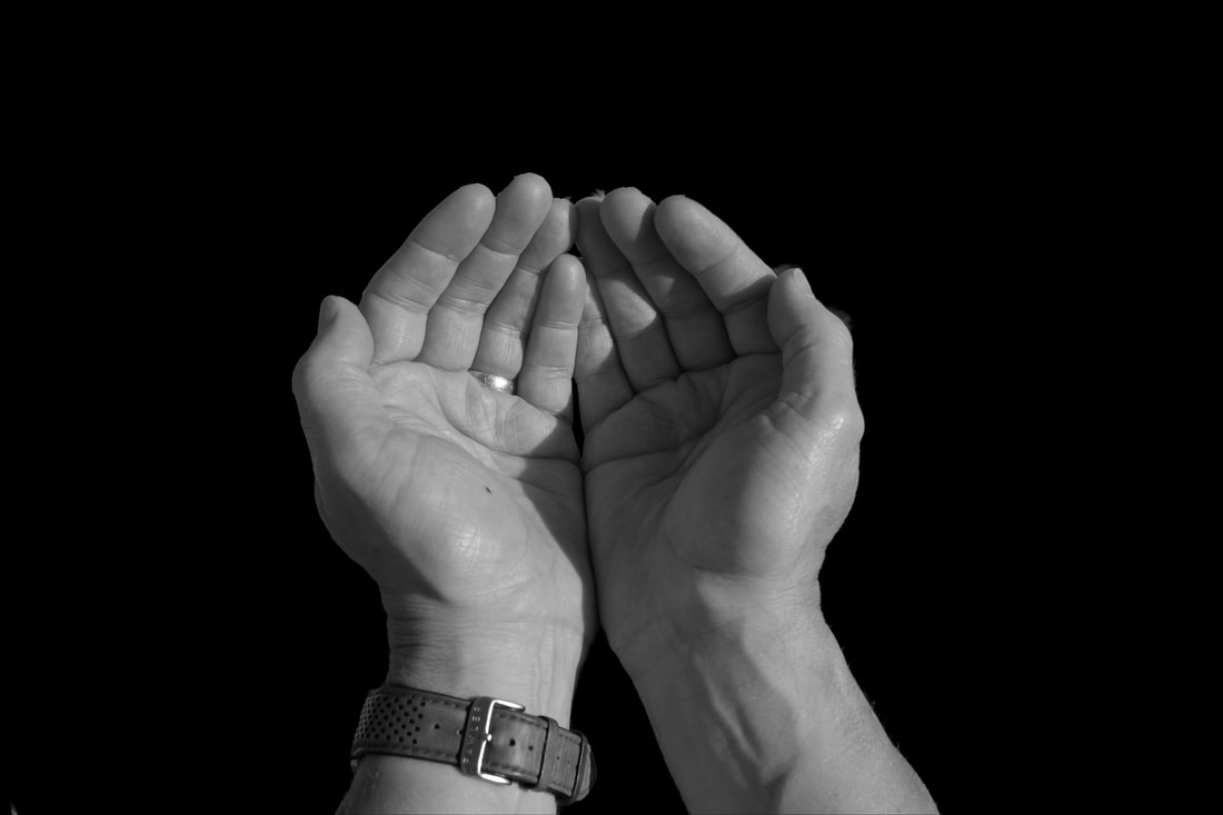
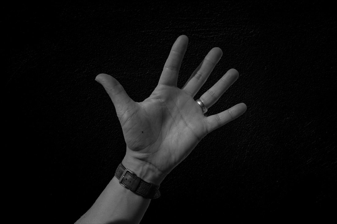
I used Gimp to edit my photos. I learnt how to use the foreground select tool and turned the background to black, then used the grayscale tool to turn the hands to black and white.
|
|
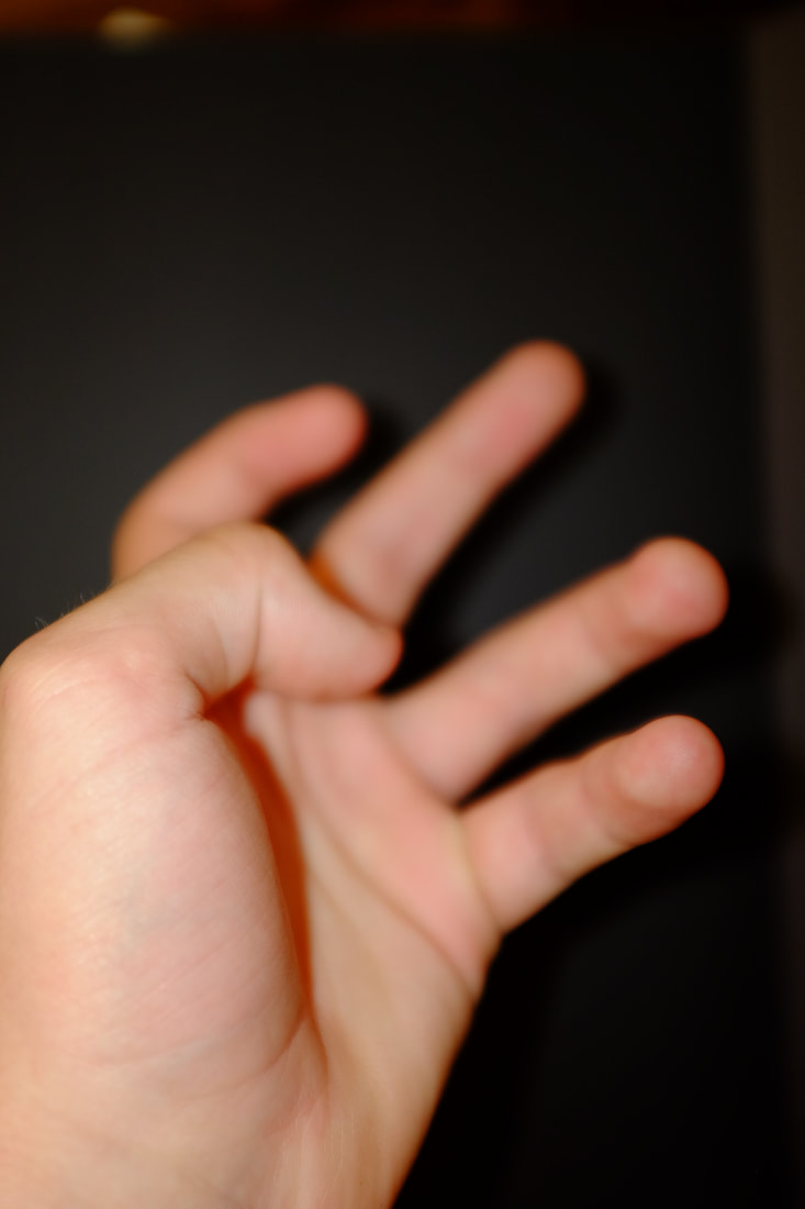
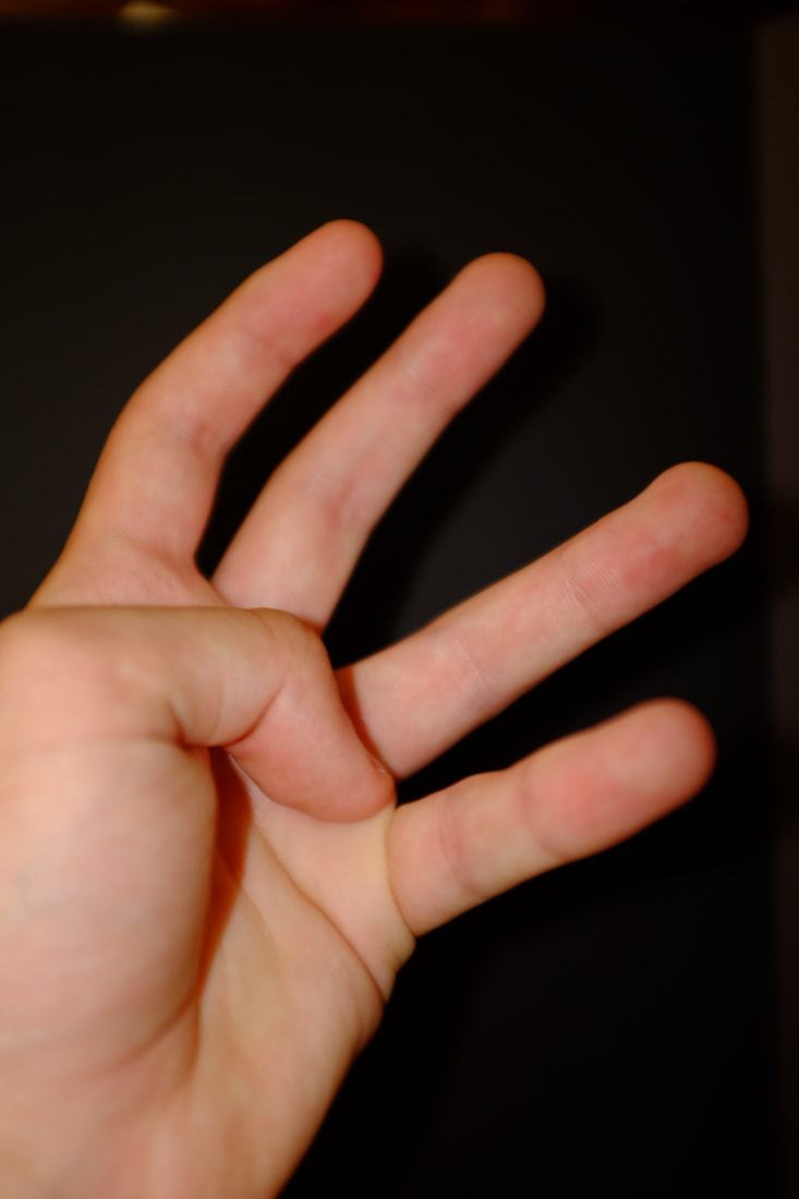
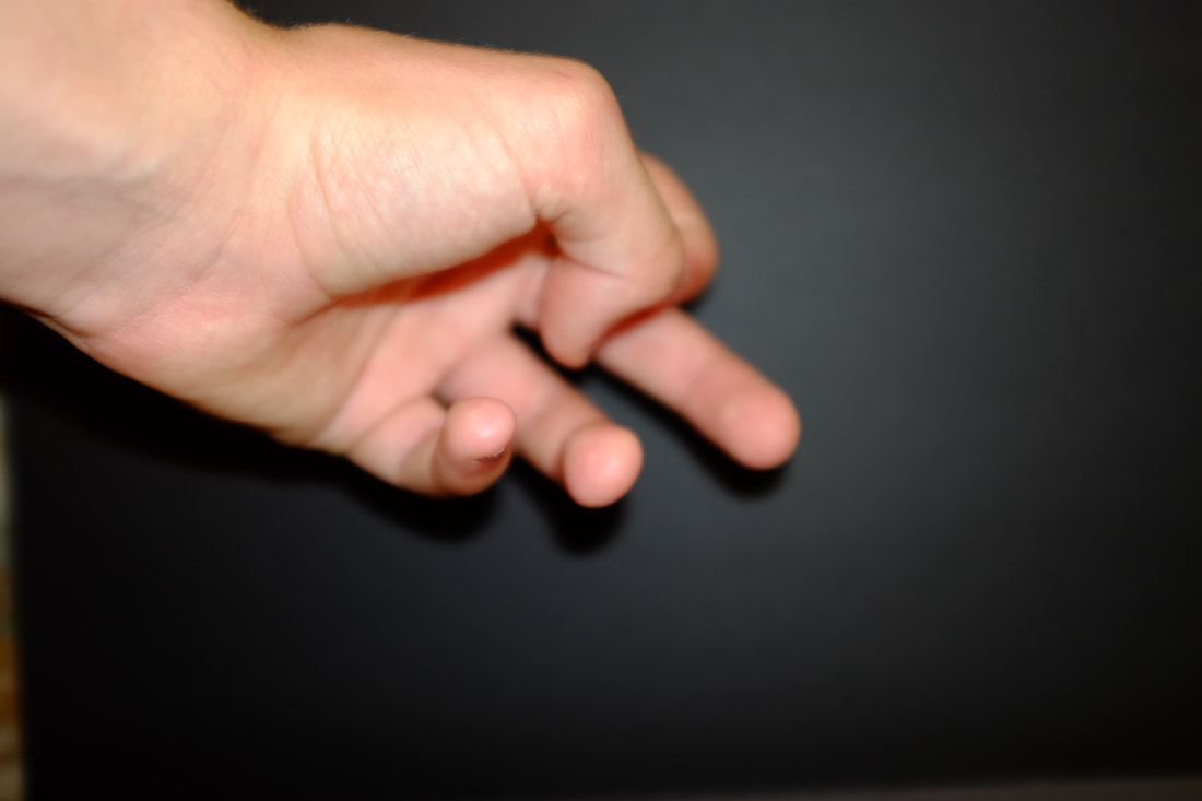
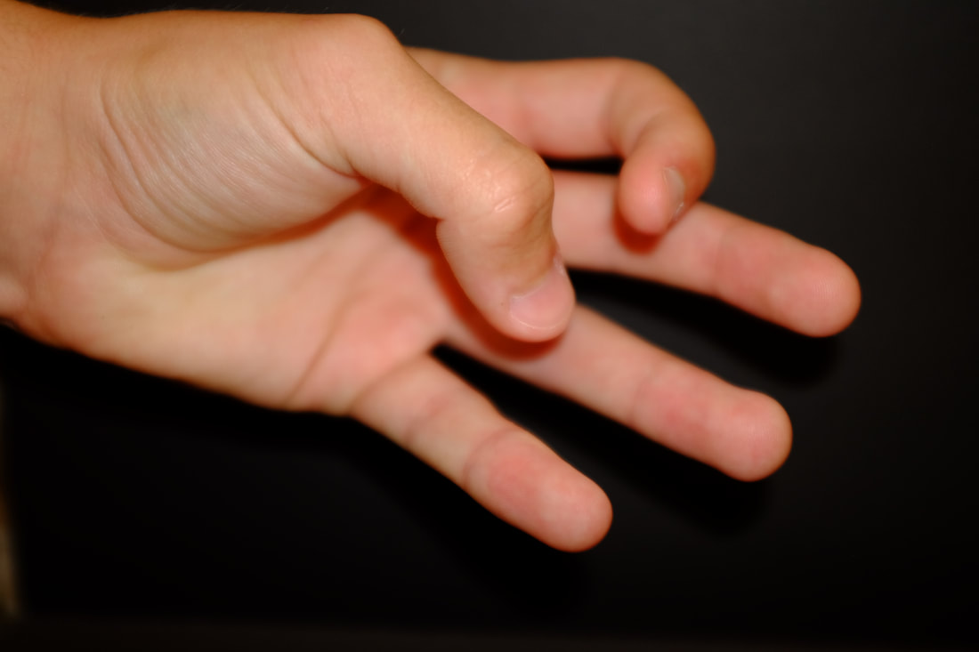
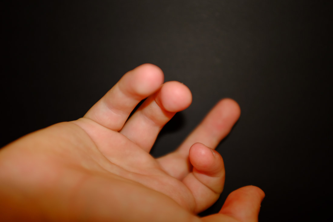
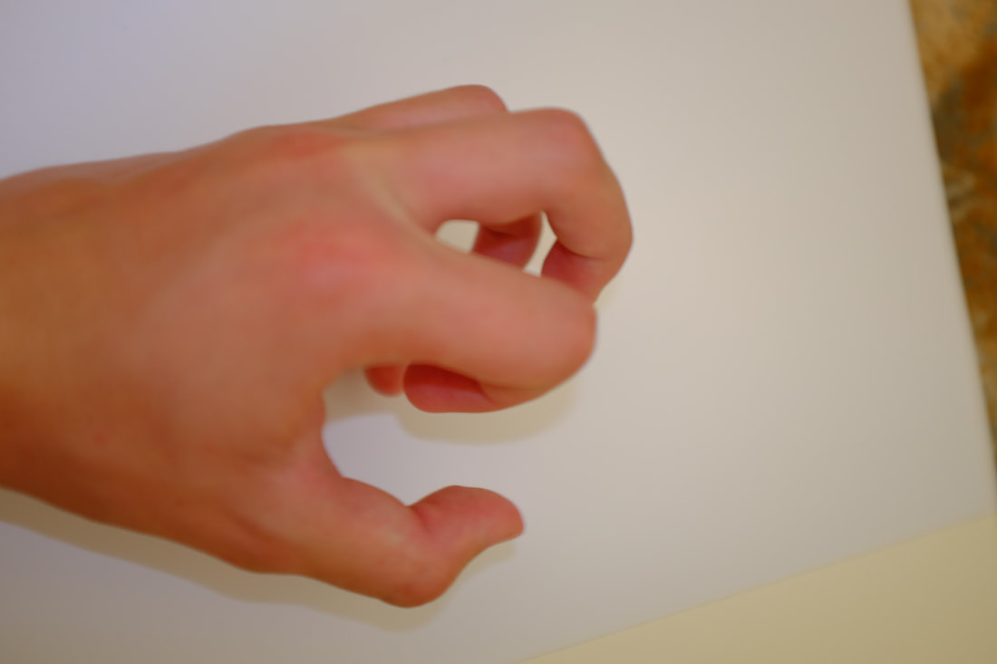
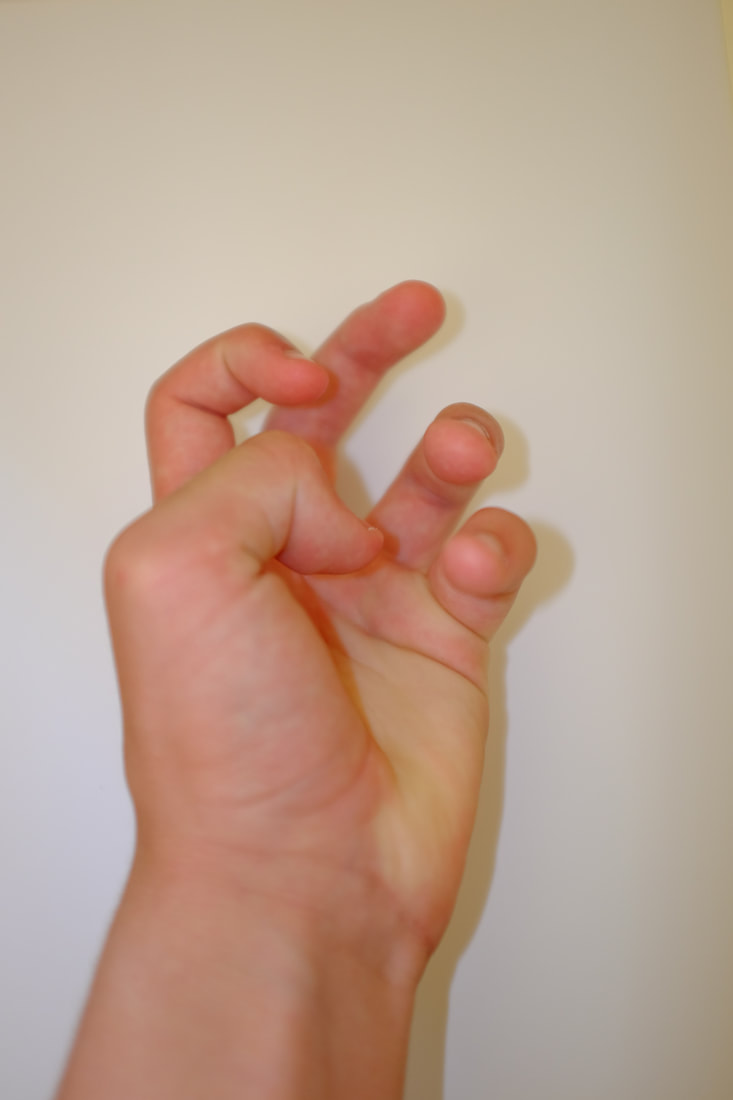
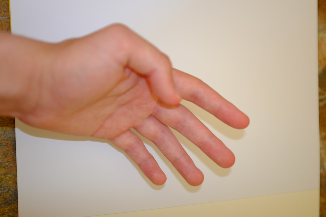
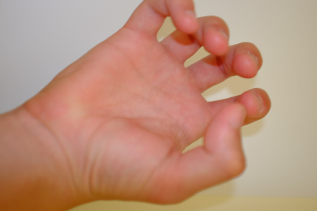
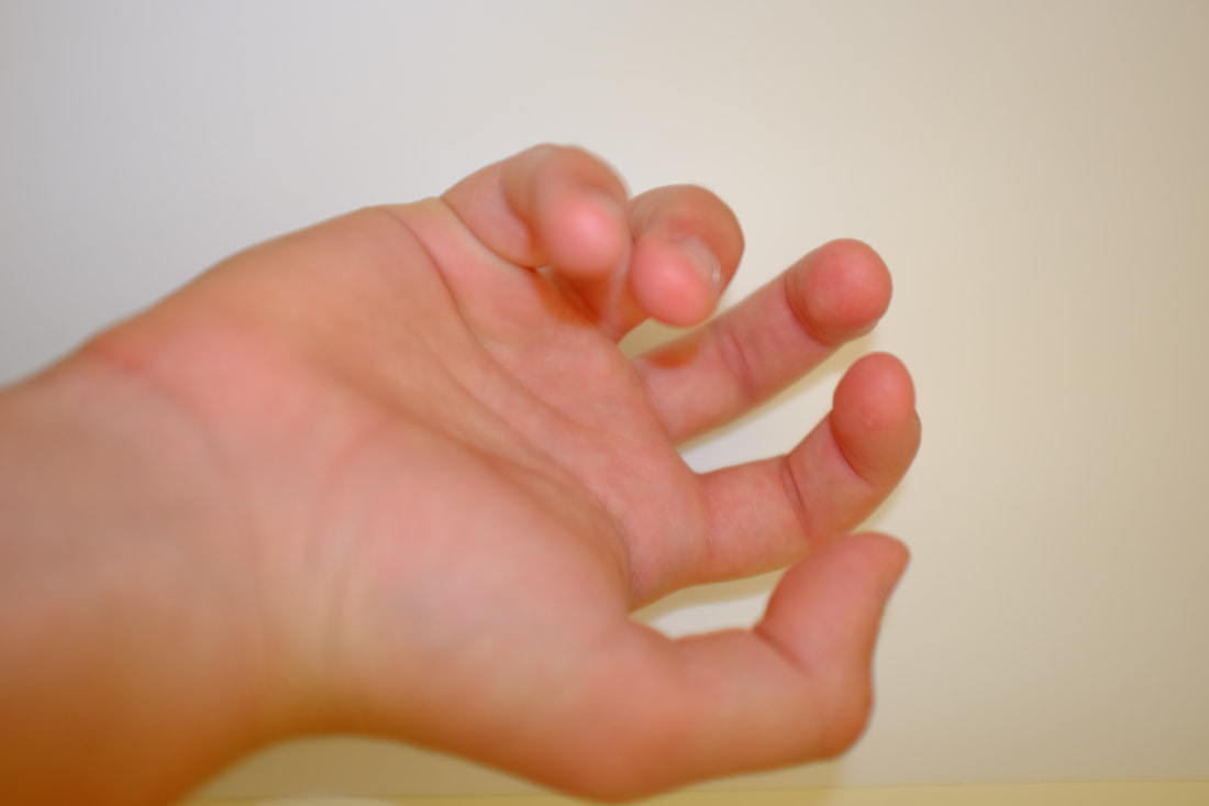
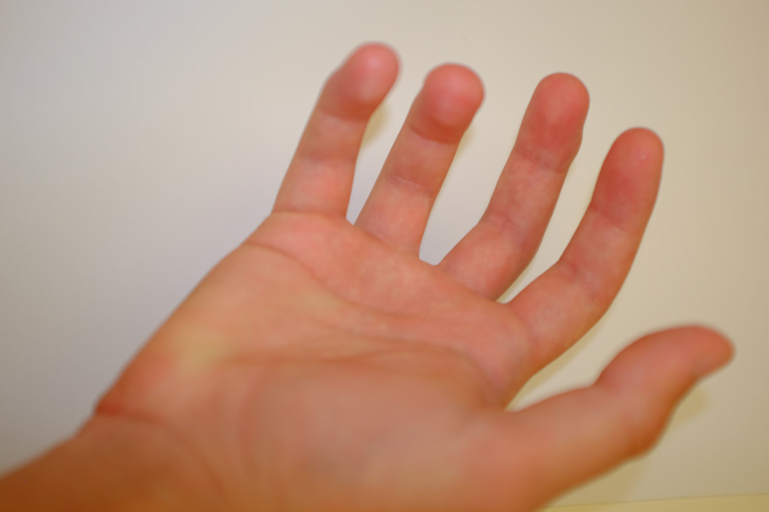
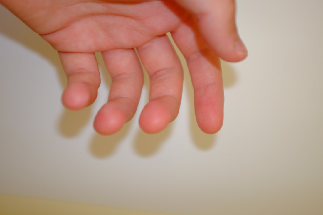
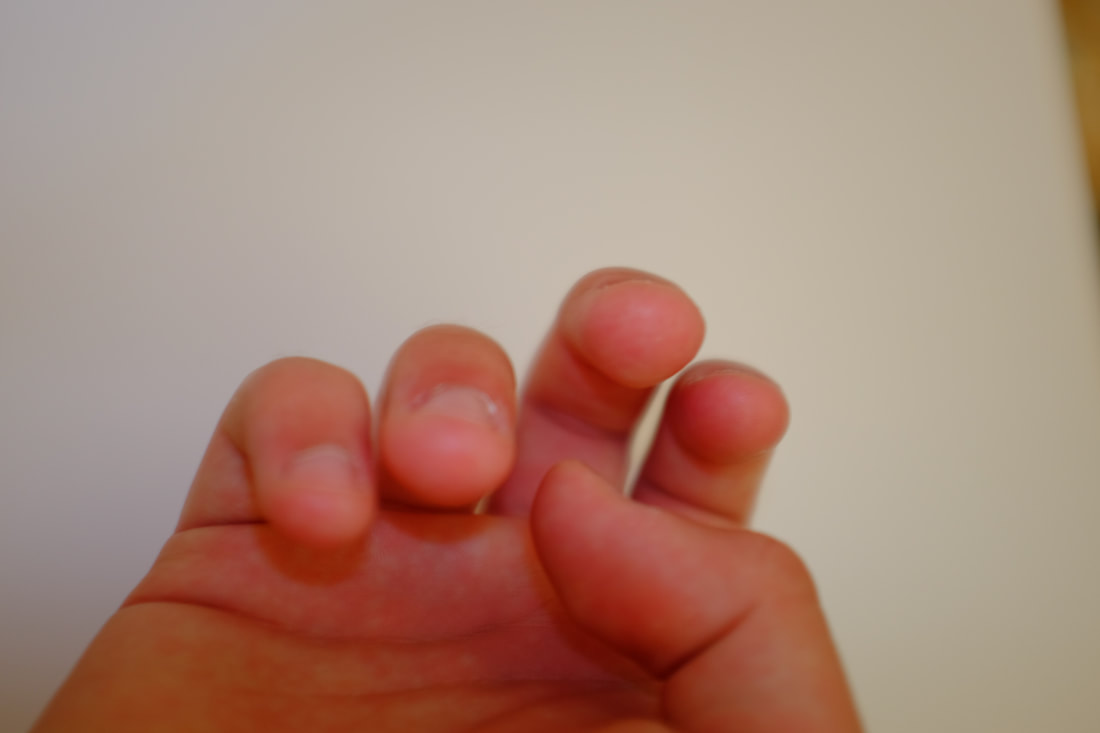
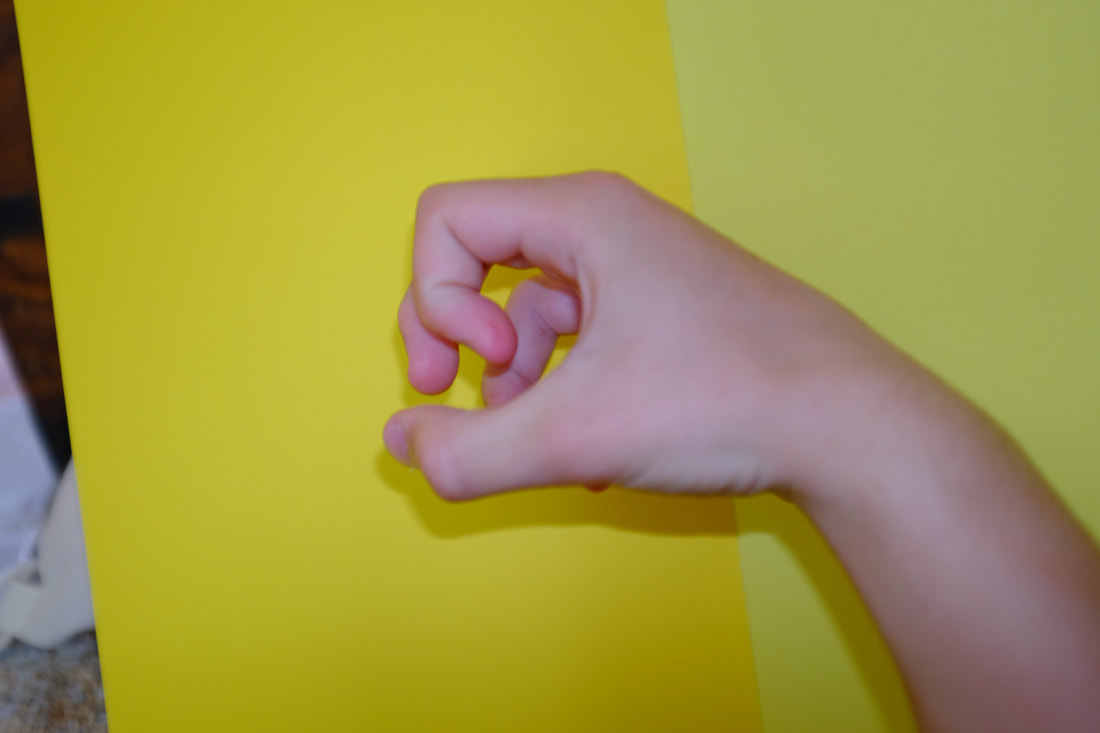
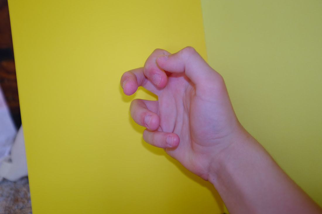
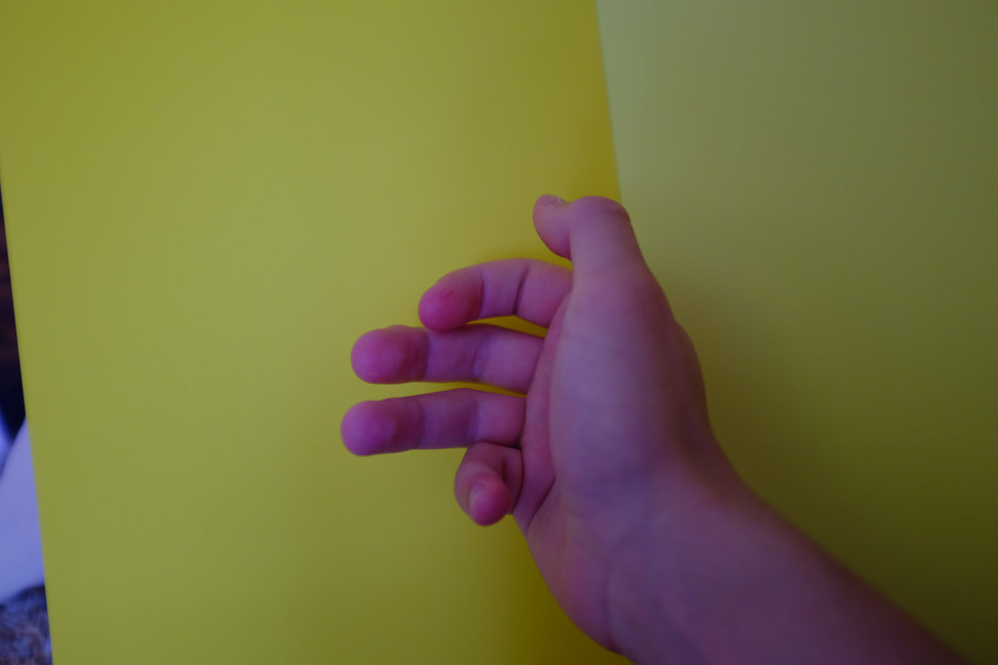
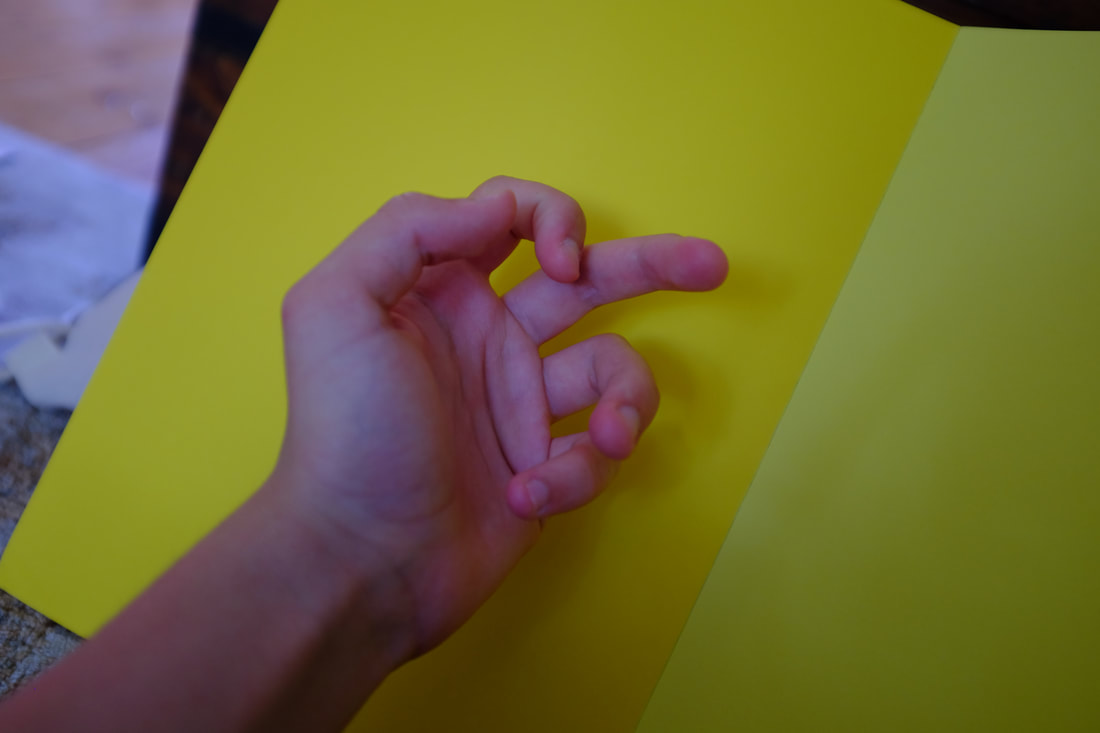
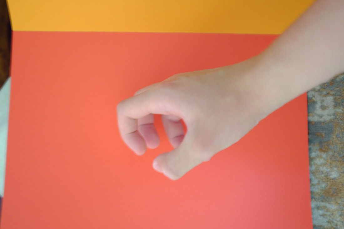
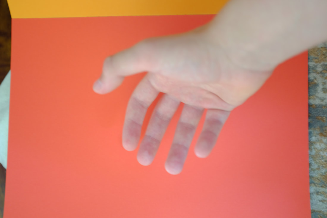
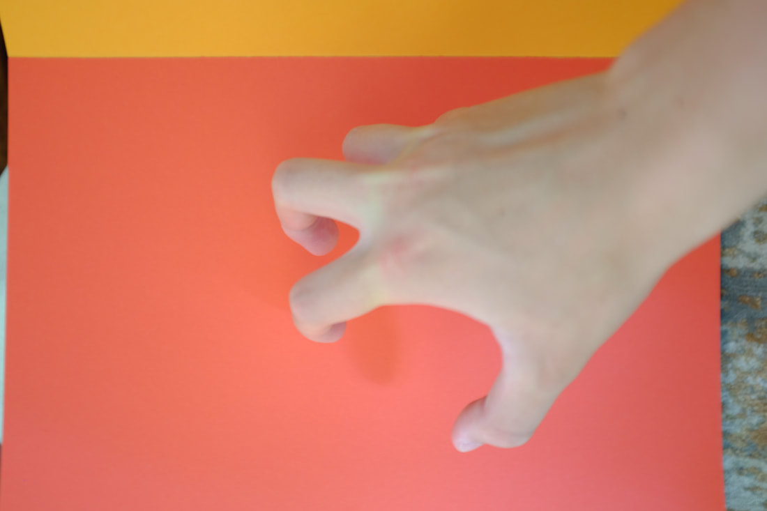
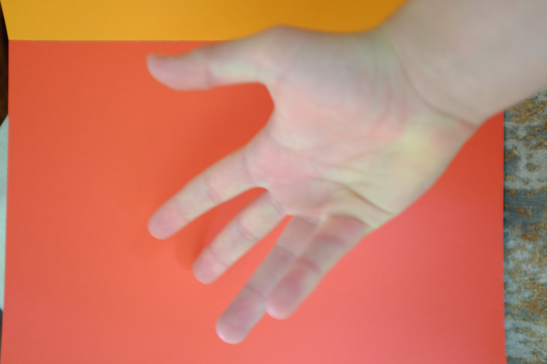
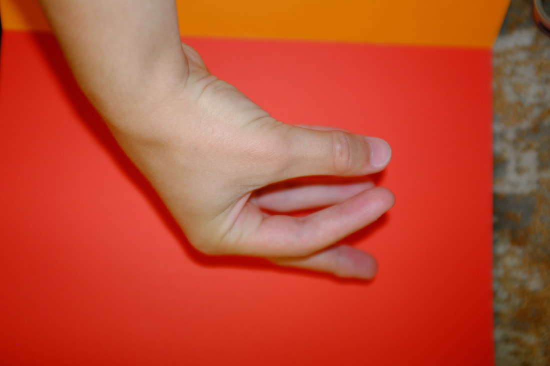
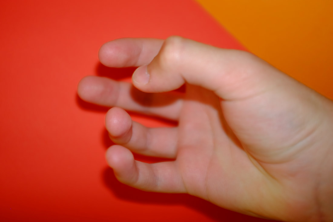
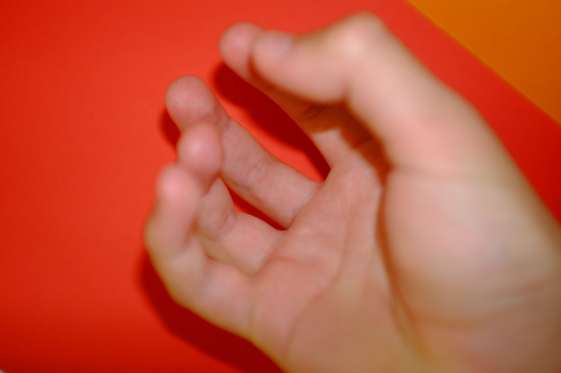
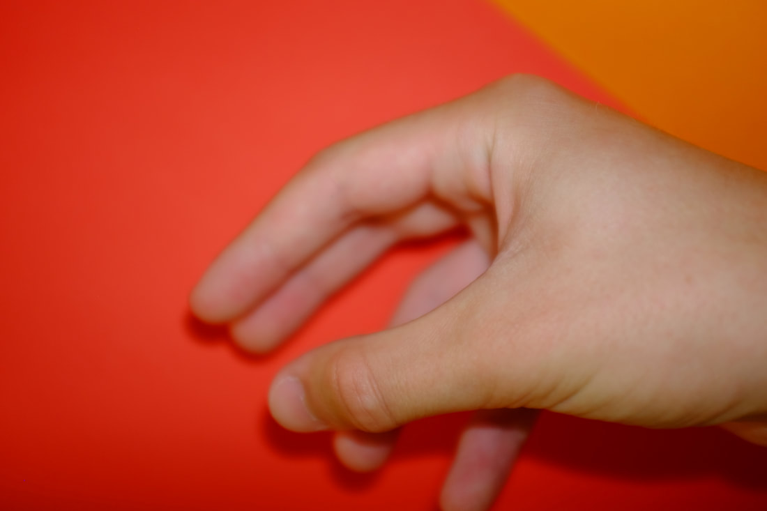
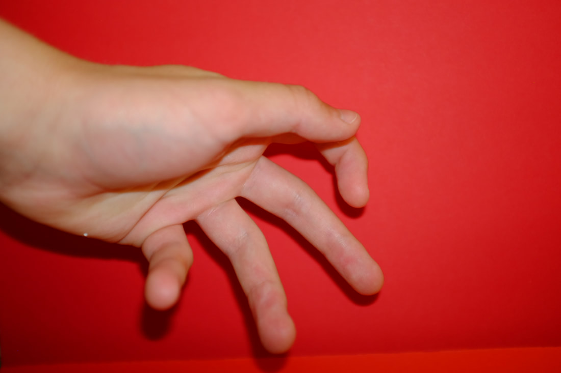
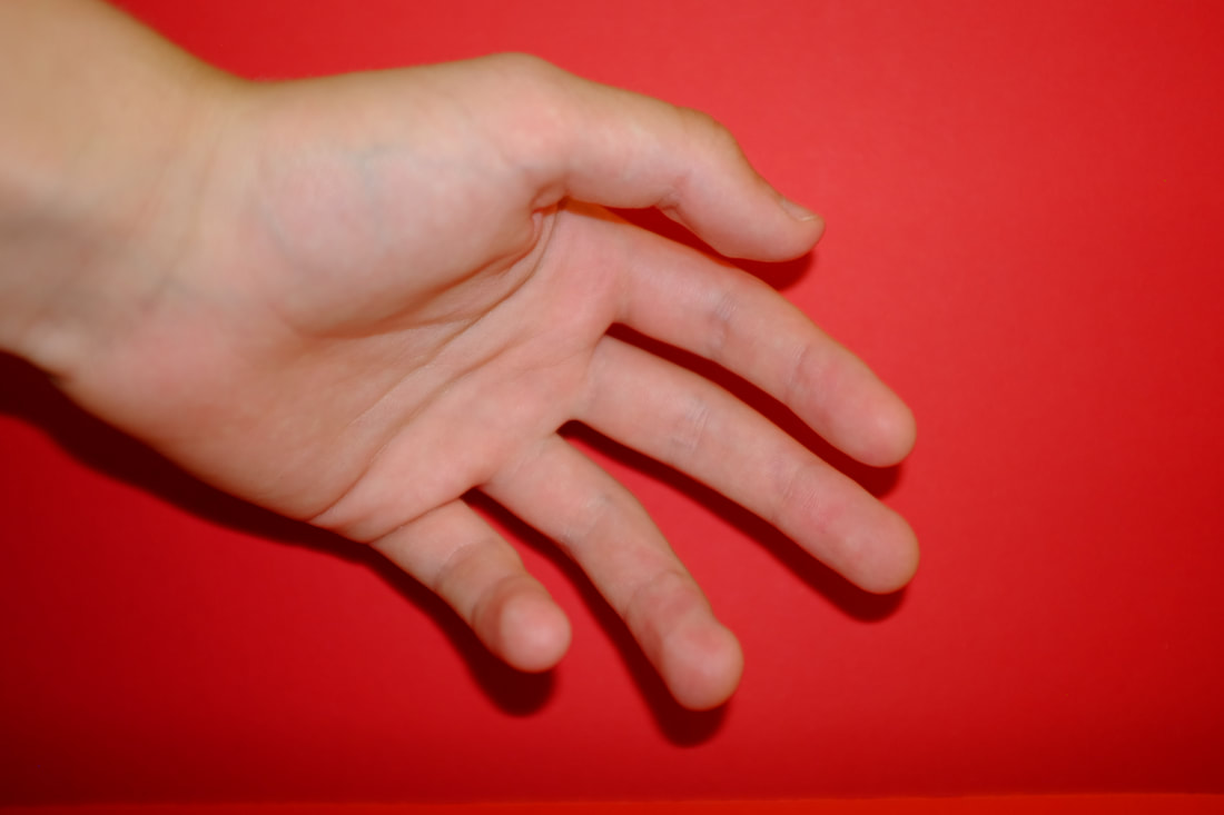
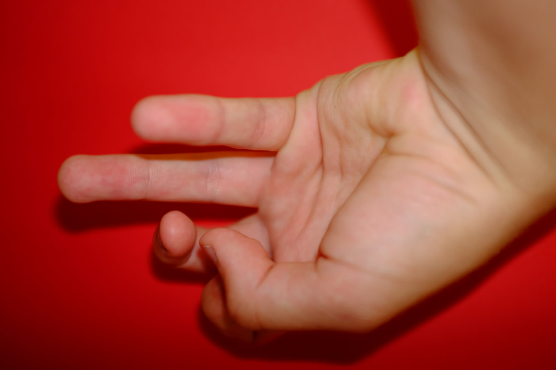
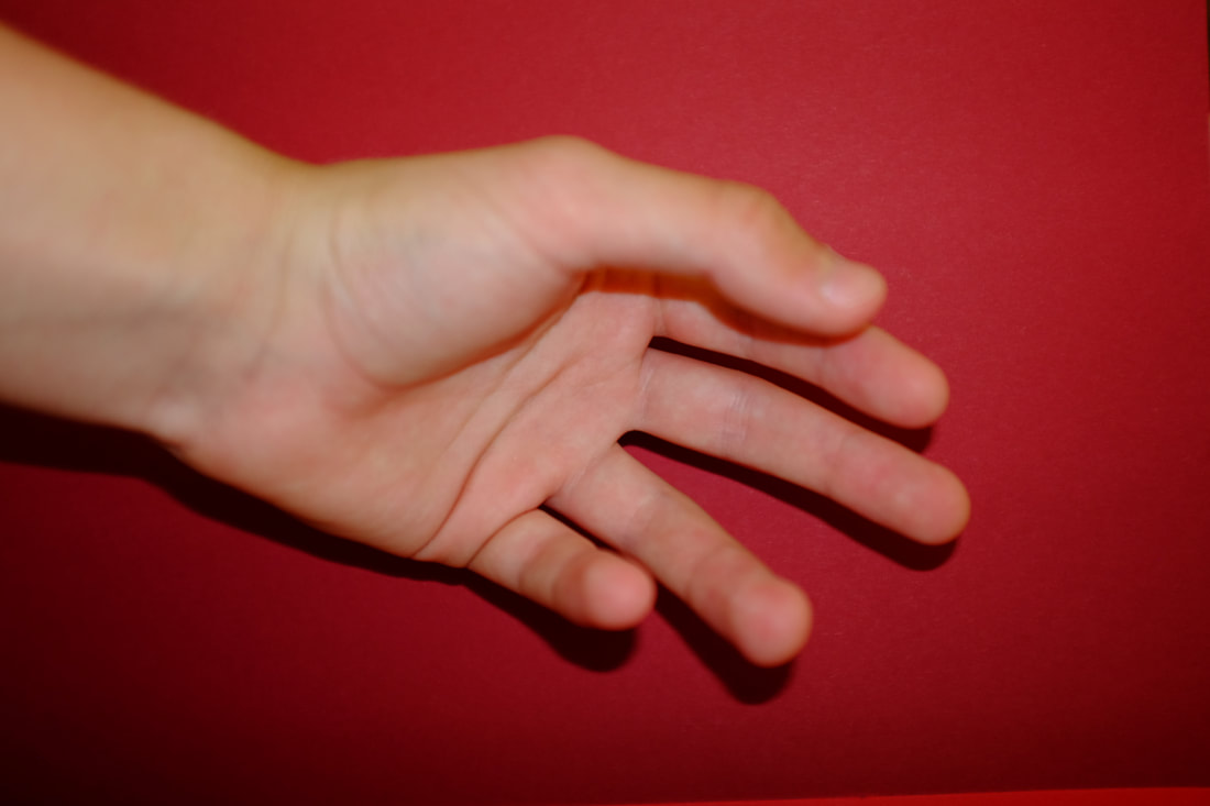
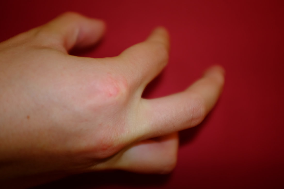
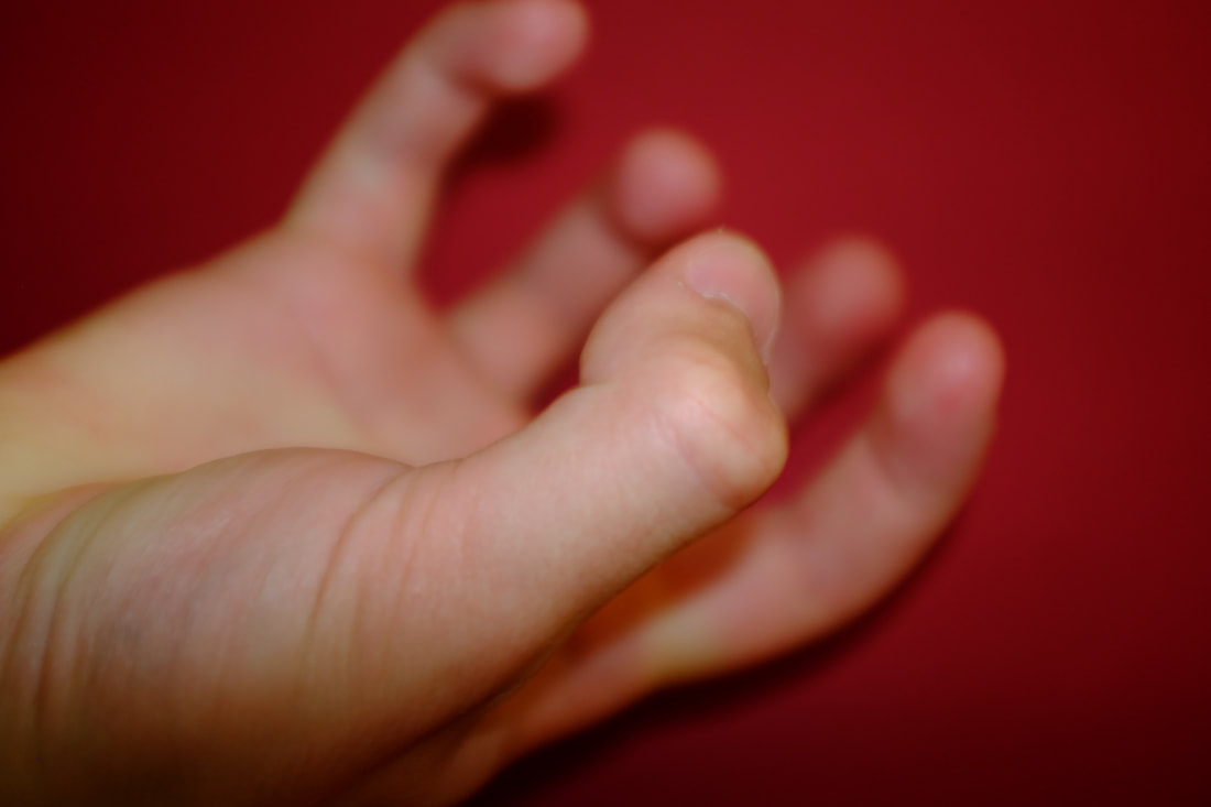
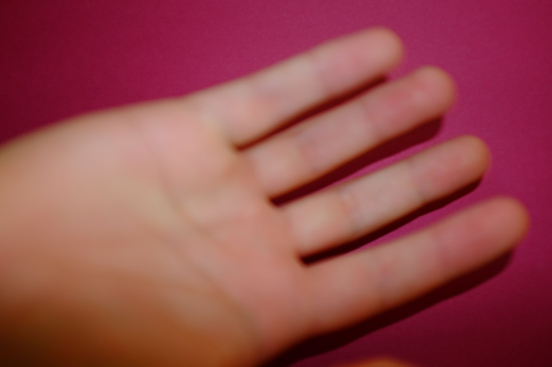
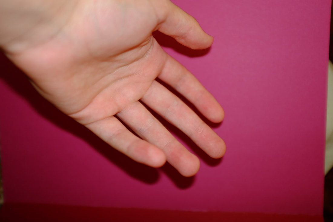
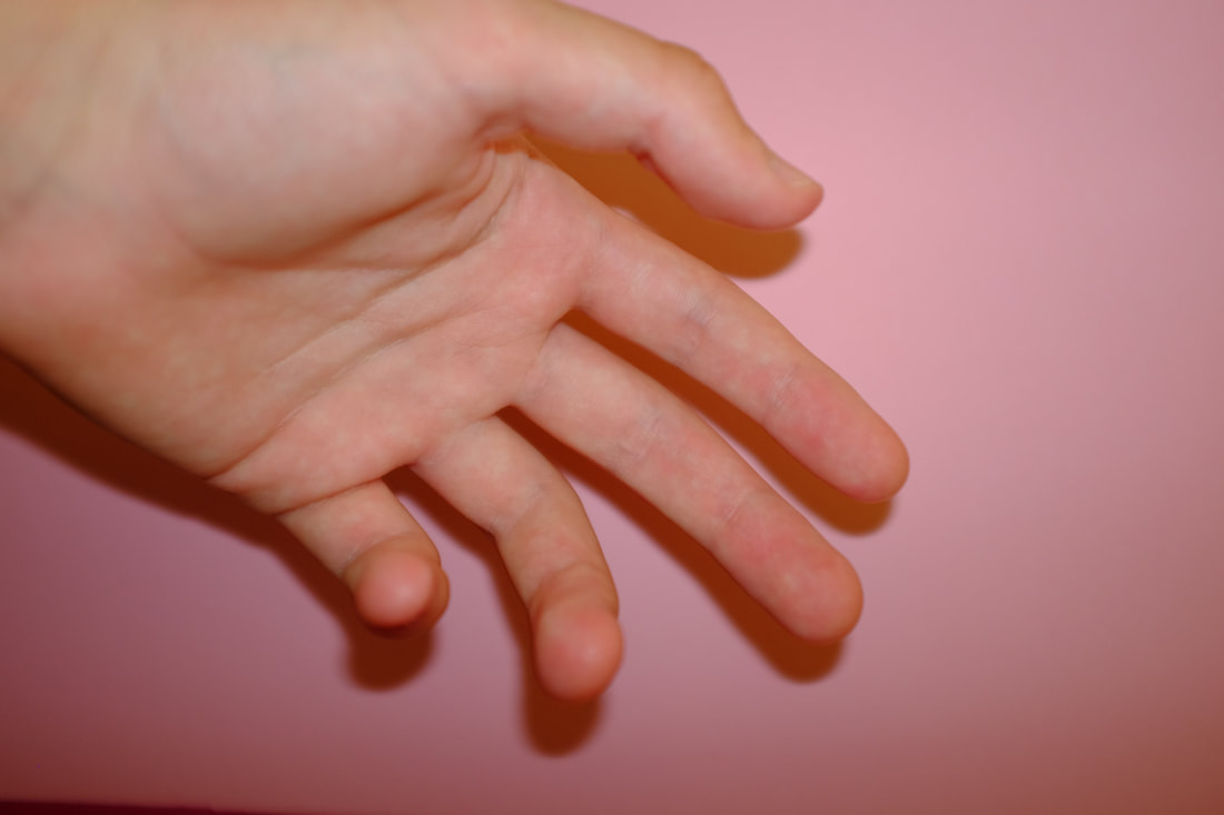
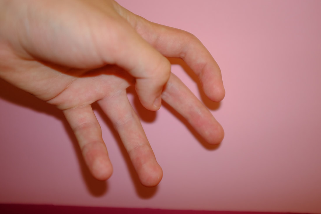
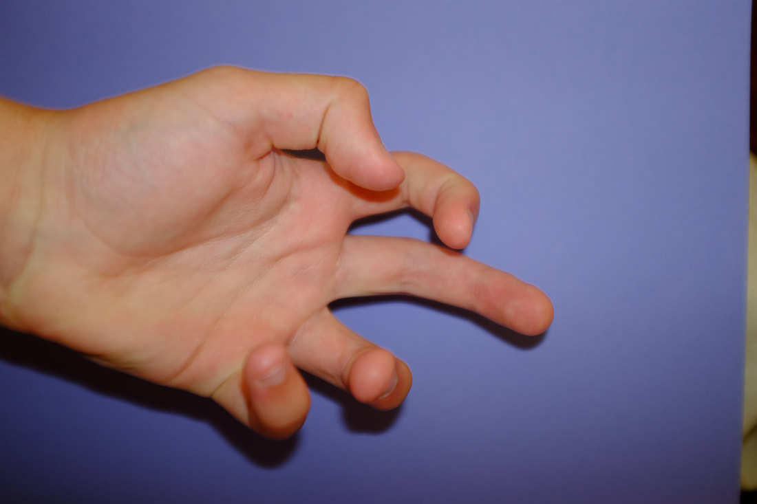
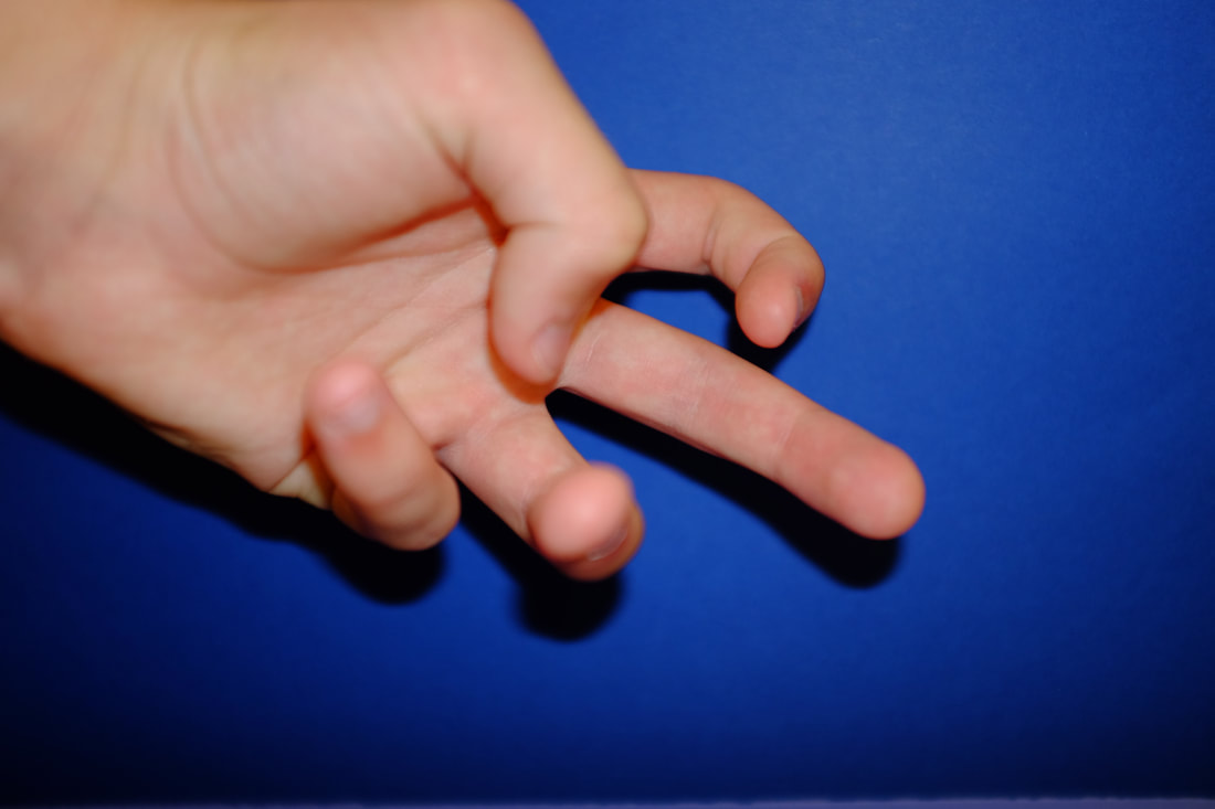
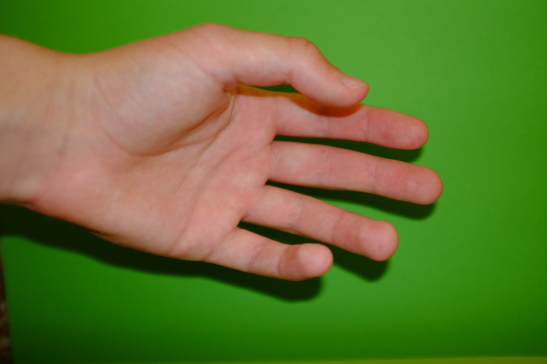
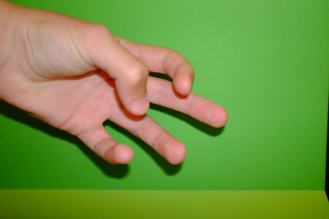
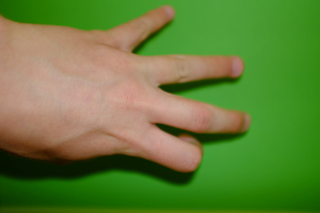
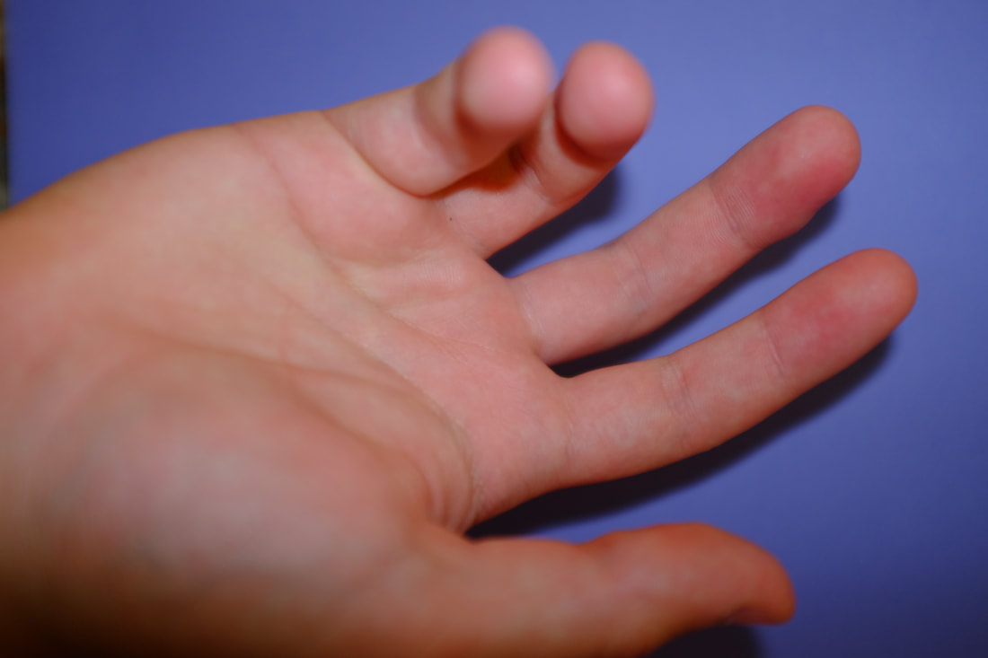
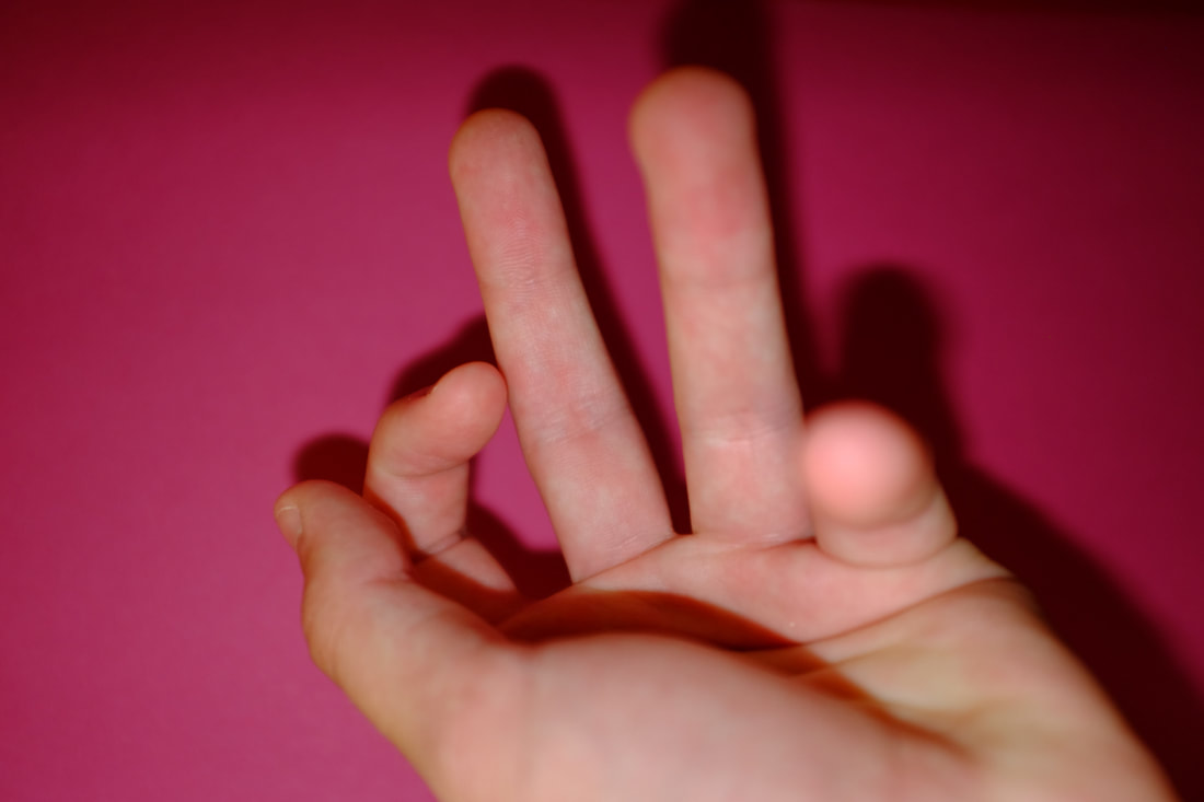
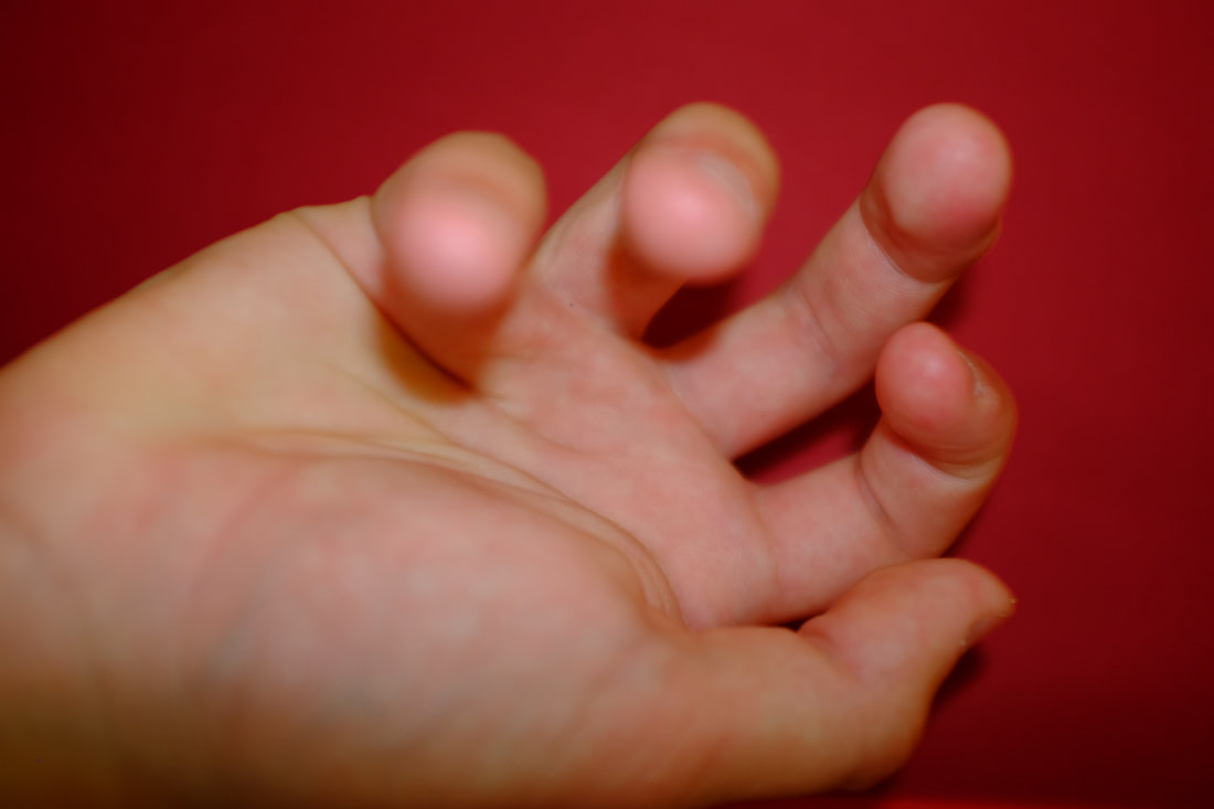
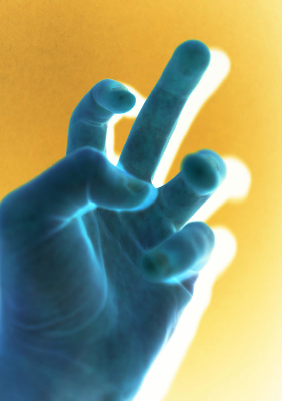
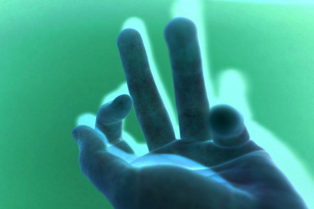
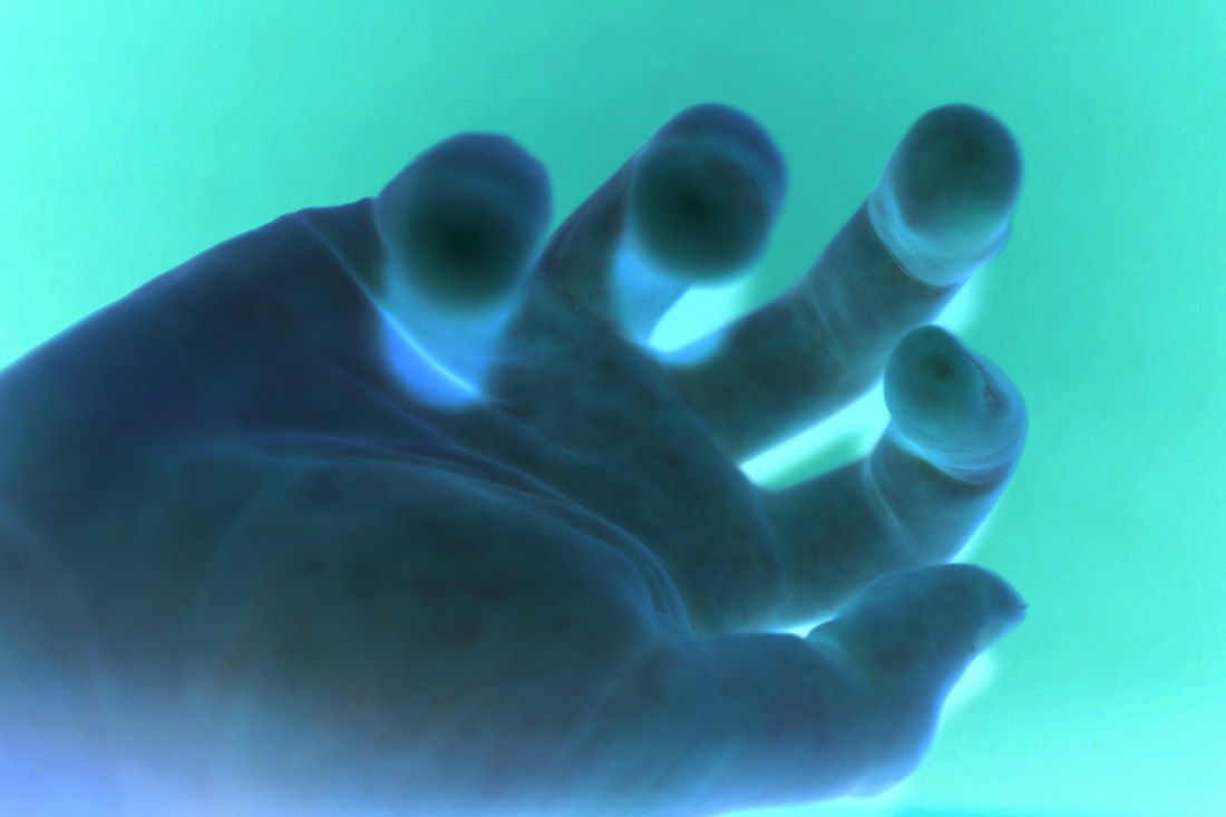
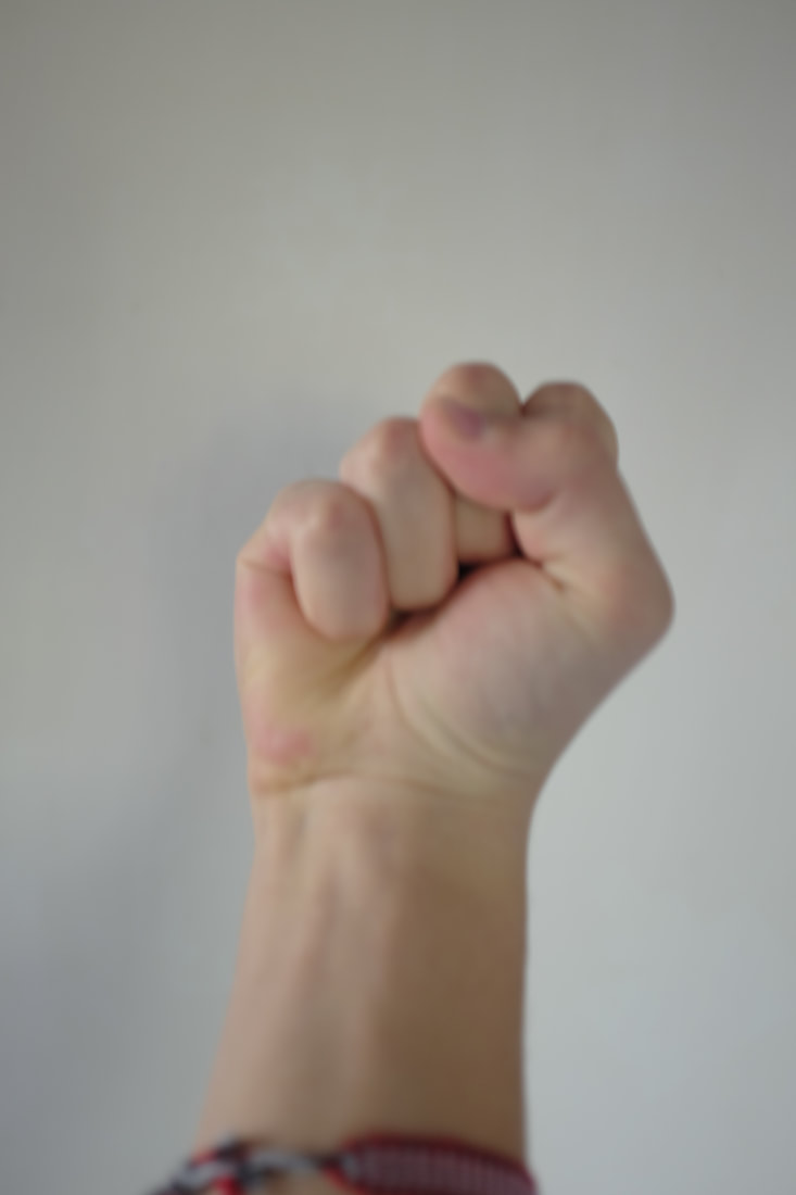
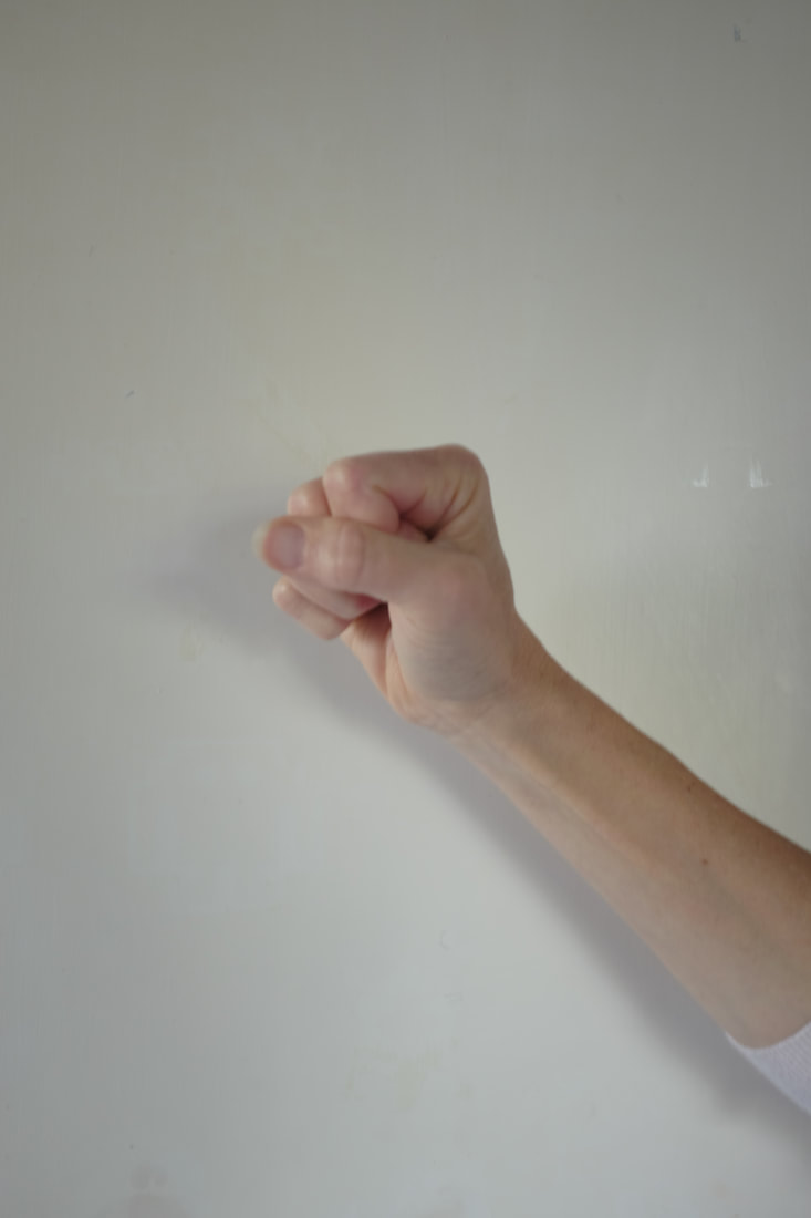
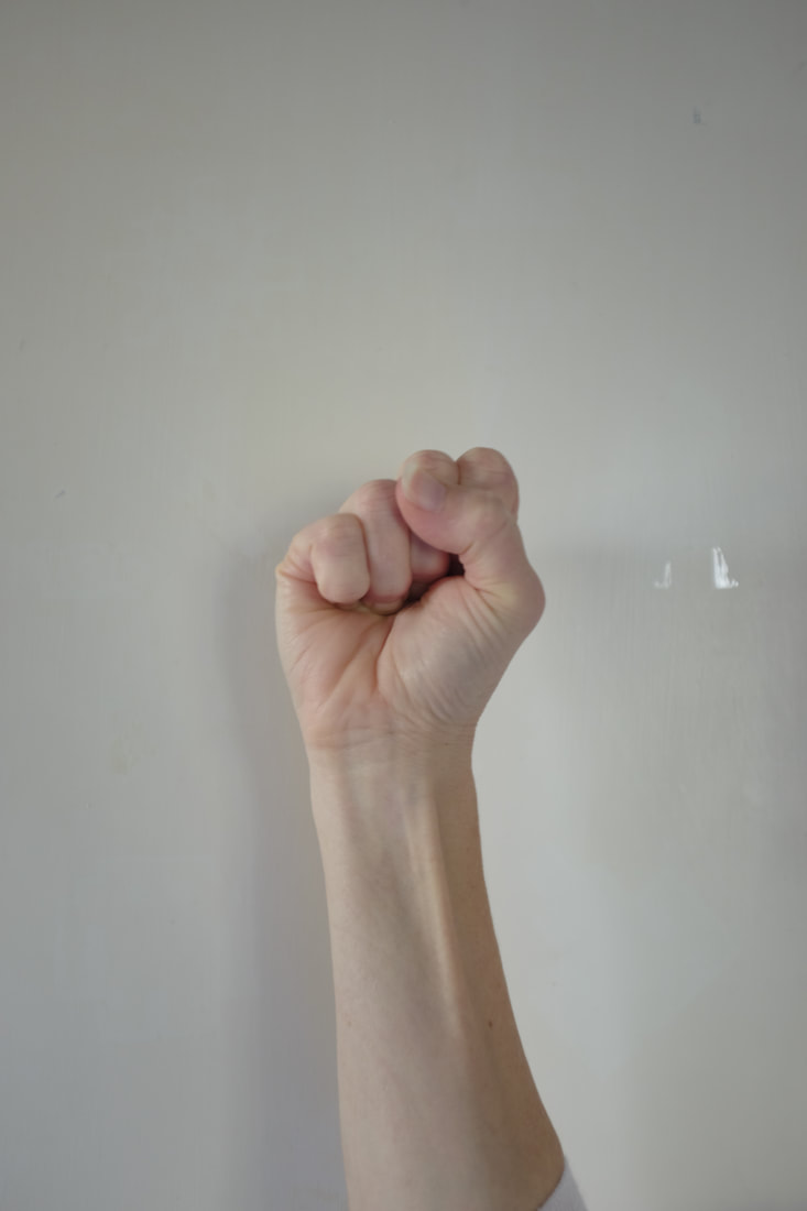
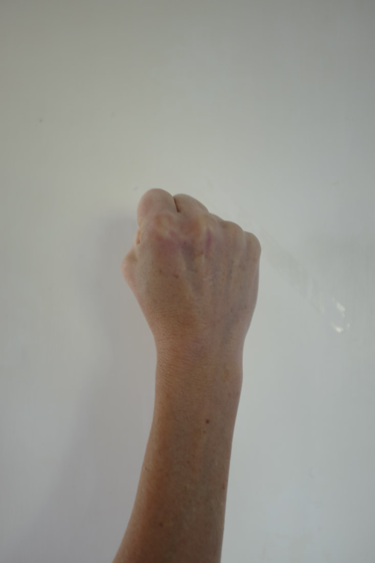
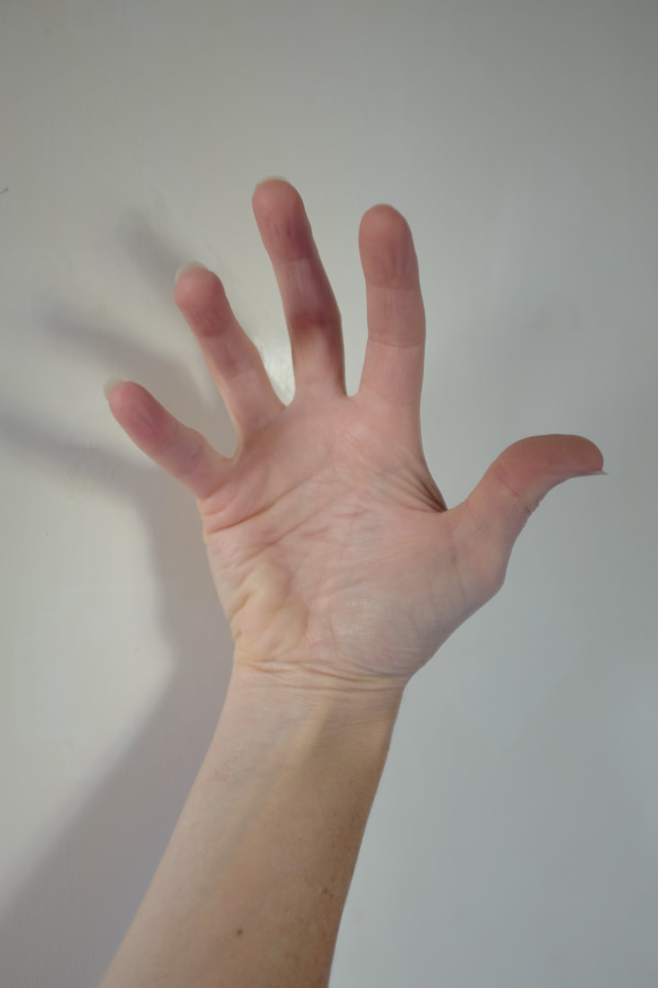
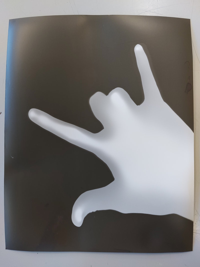
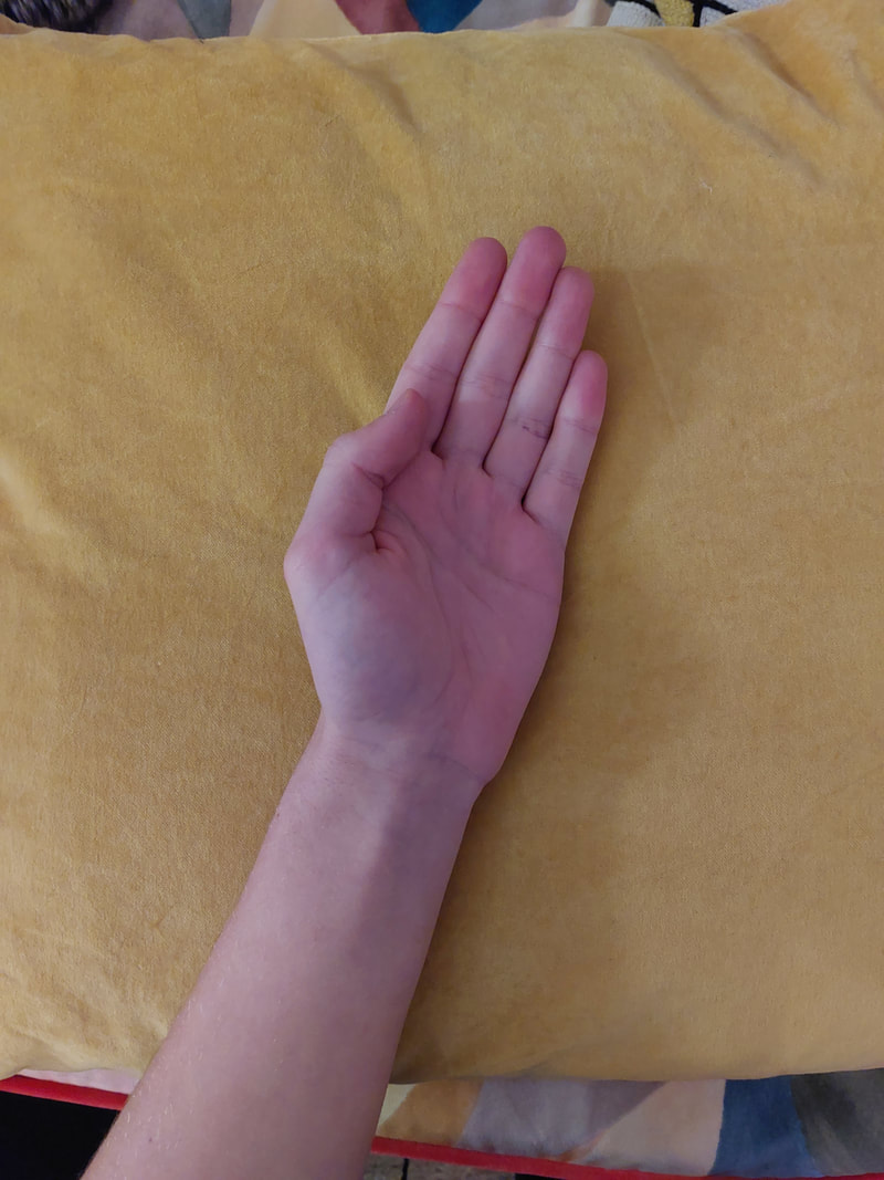
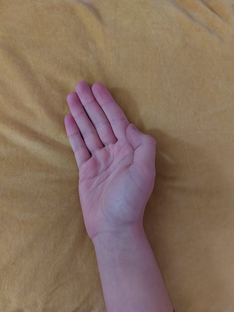
Tim Booth Shoot 2 - Younger Hands
Shoot Plan
My plan is to take a second shoot inspired by the work of Tim Booth. I will take photos of my own hands, as they look younger, this will create a wider variety of photos. I will be using artificial lighting and flash with my Fujifilm X100s.
My plan is to take a second shoot inspired by the work of Tim Booth. I will take photos of my own hands, as they look younger, this will create a wider variety of photos. I will be using artificial lighting and flash with my Fujifilm X100s.
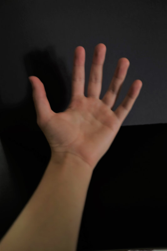
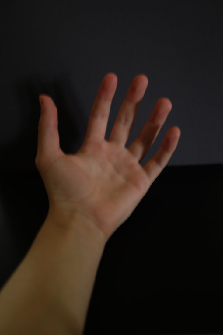
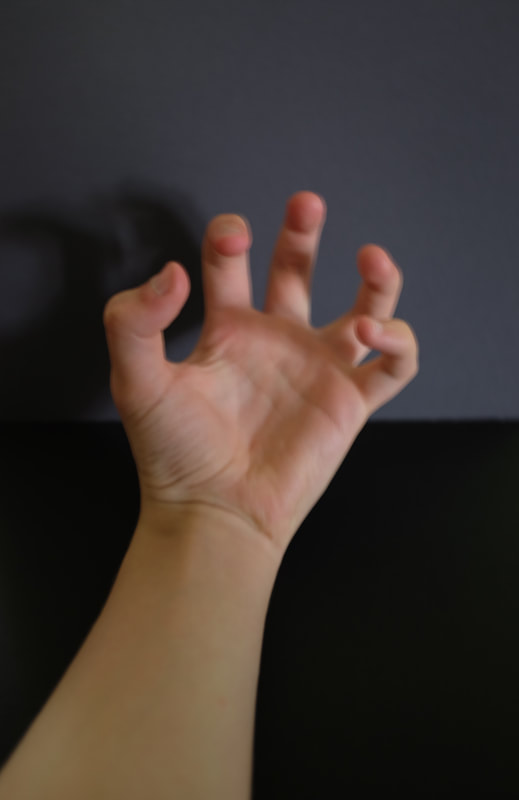
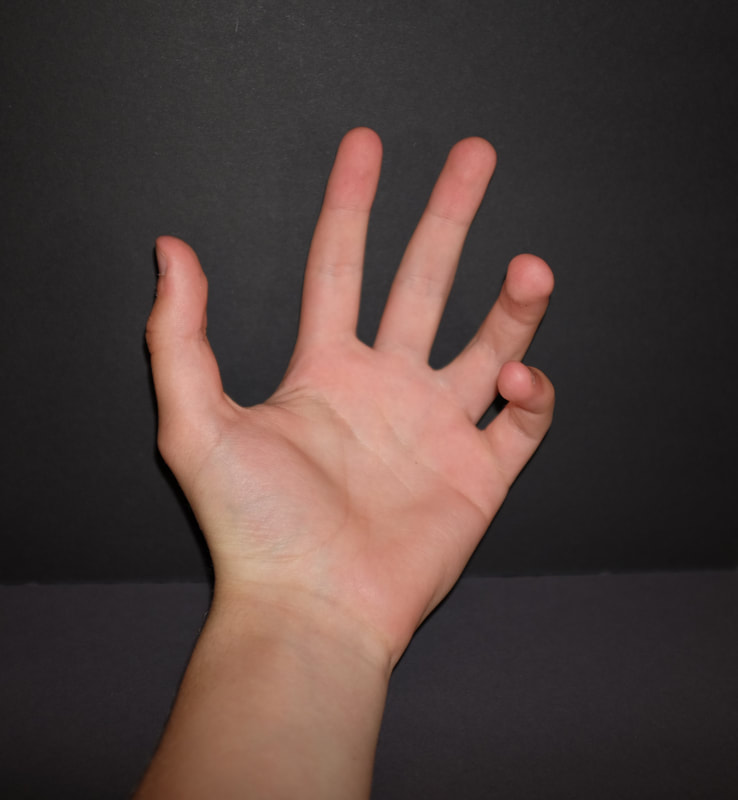
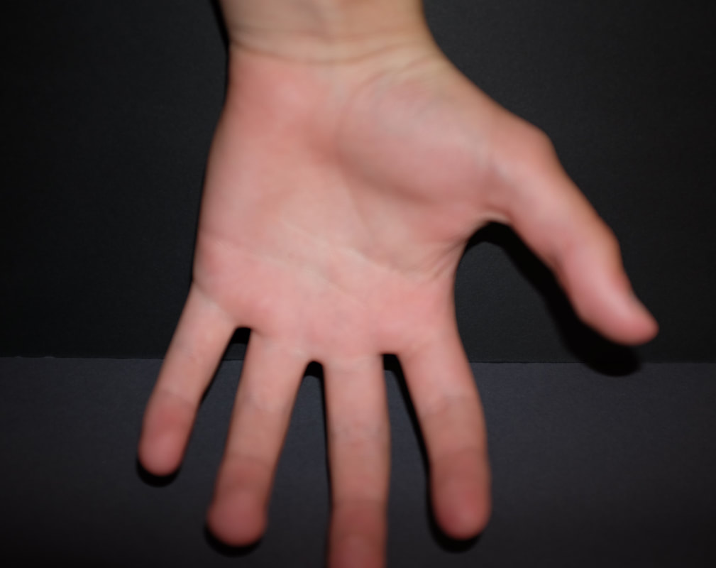
Shoot Review
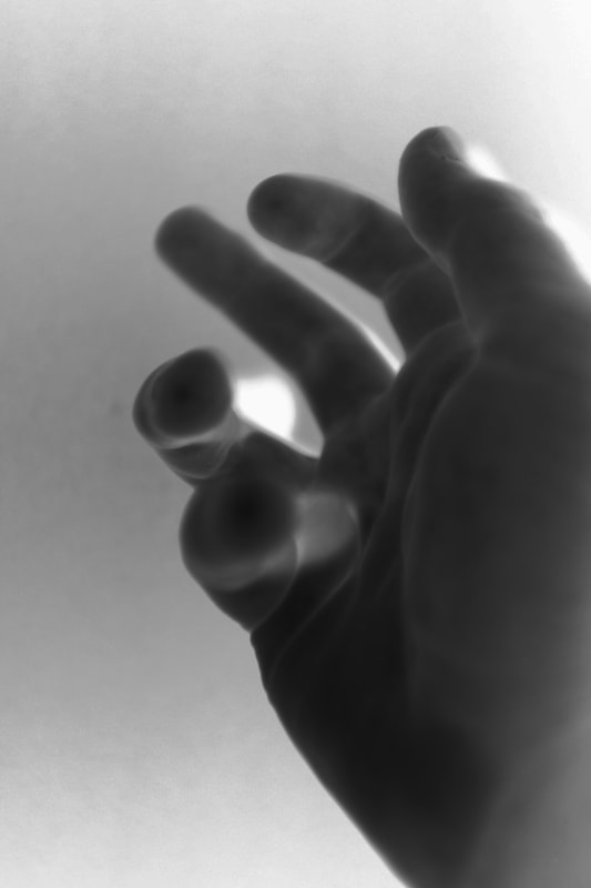
I have photographed my own hands in front of a sheet of black card. The settings/techniques I have used are iso:200, f/2.0 aperture, close cropping, autofocus, again took the photo with my Fujifilm X100s. What went well was that I think I achieved good lighting, composition but I think my shoot could be even better if I had improved my focus in the images. I also could have used more images of my hands in different positions. I have learnt to look closer at framing and the background. This piece of work was influenced by Tim Booth.
I have photographed my own hands in front of a sheet of black card. The settings/techniques I have used are iso:200, f/2.0 aperture, close cropping, autofocus, again took the photo with my Fujifilm X100s. What went well was that I think I achieved good lighting, composition but I think my shoot could be even better if I had improved my focus in the images. I also could have used more images of my hands in different positions. I have learnt to look closer at framing and the background. This piece of work was influenced by Tim Booth.
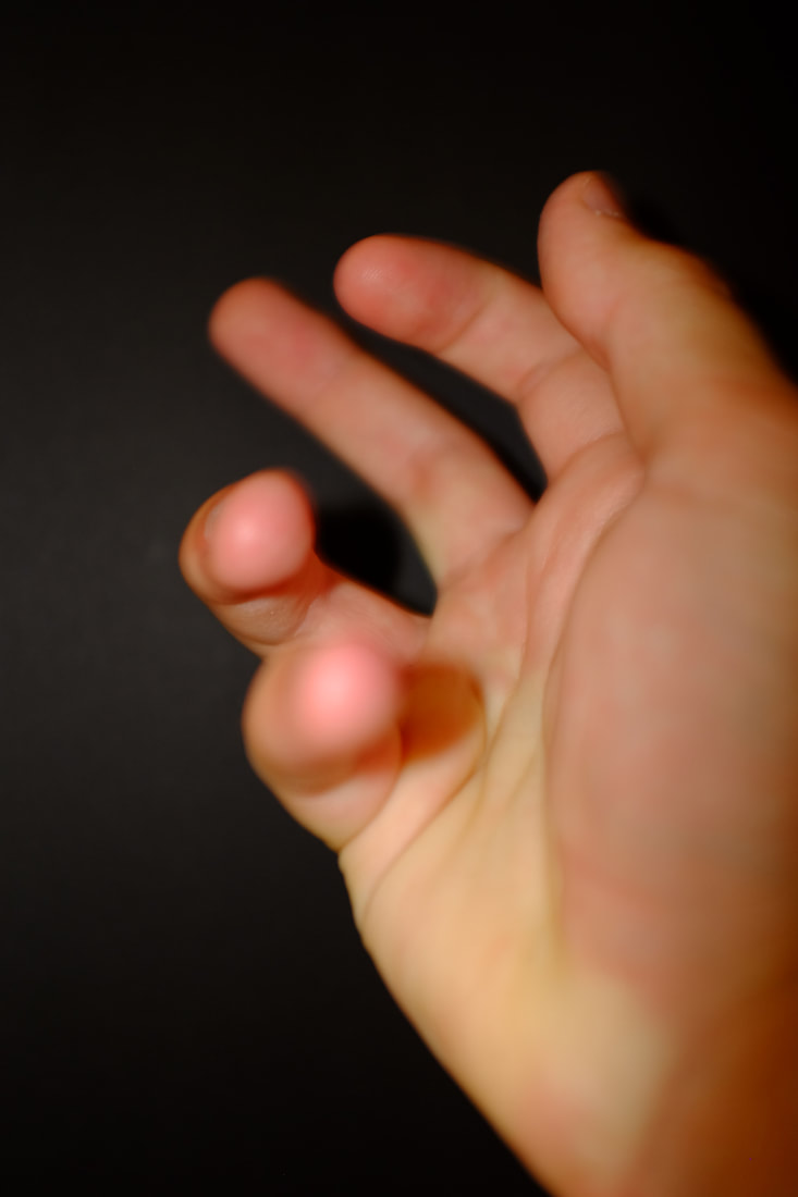
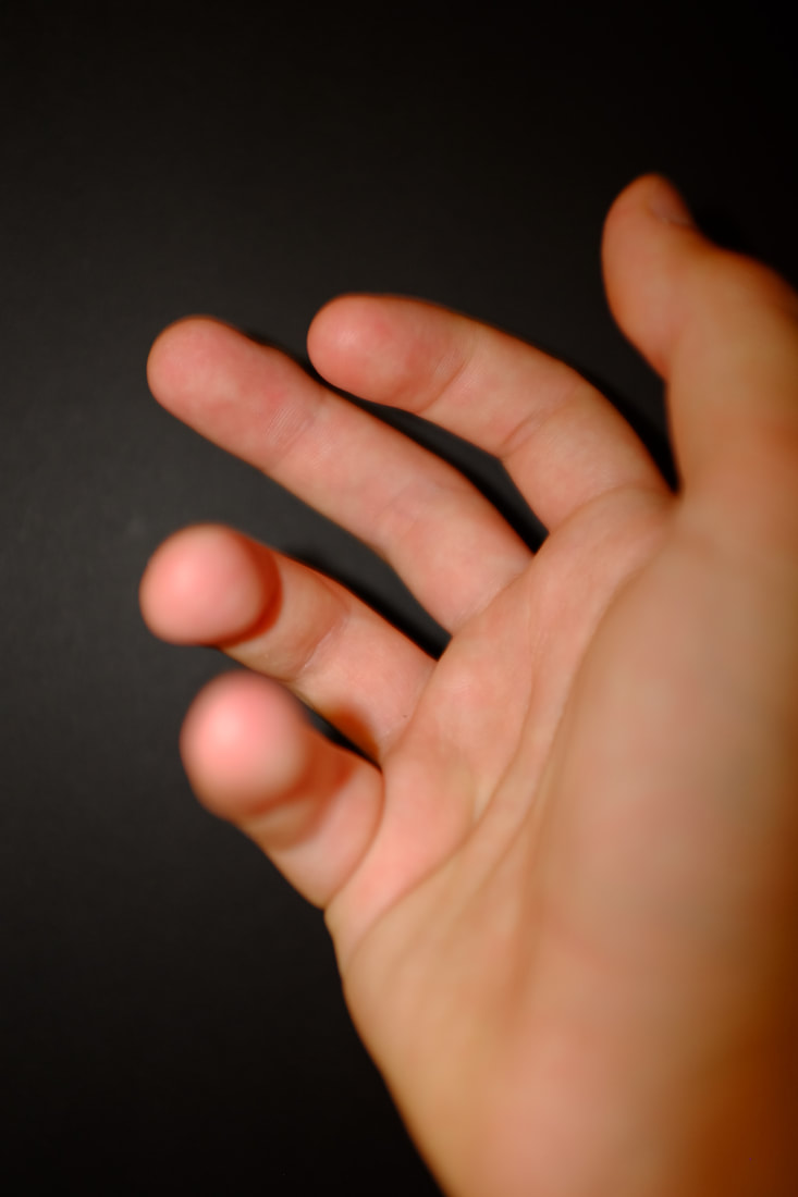
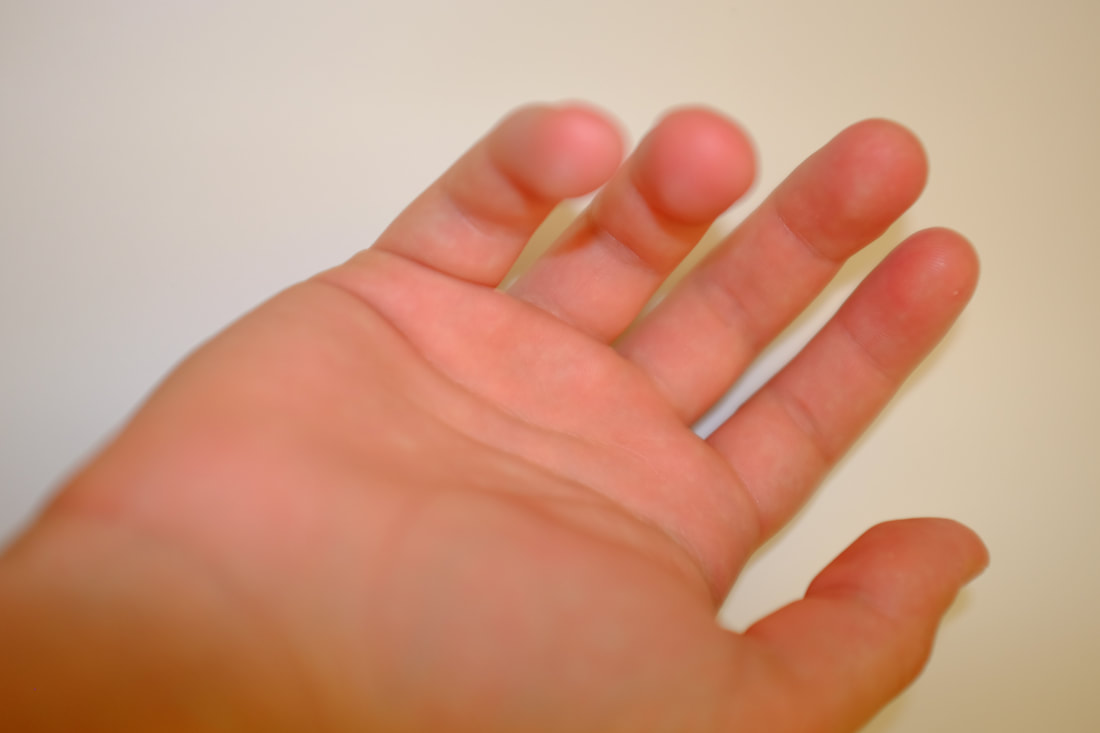
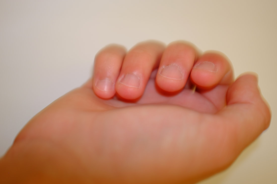
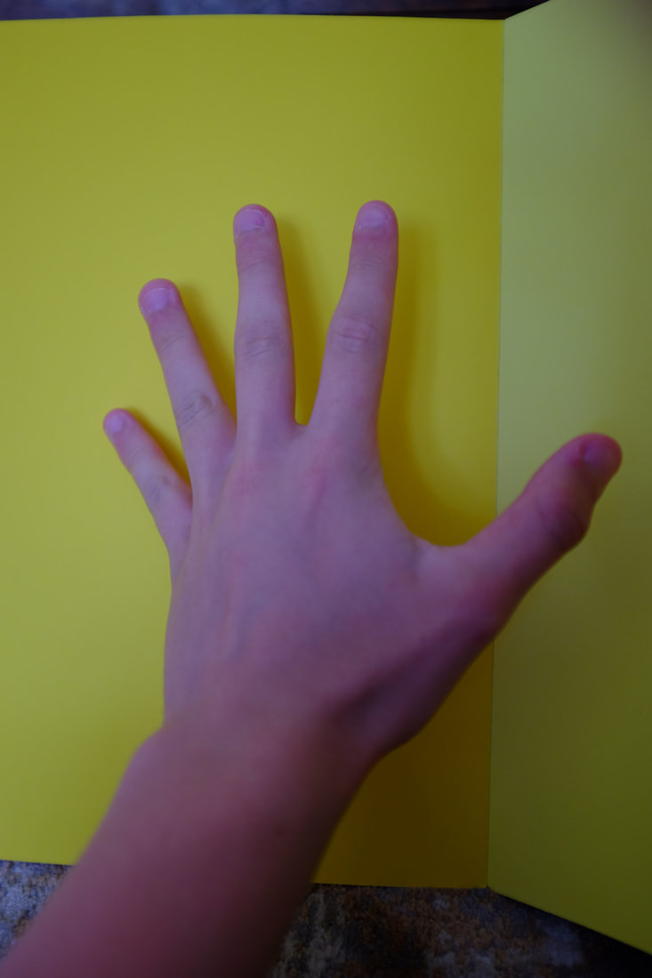
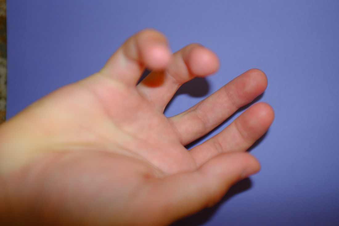
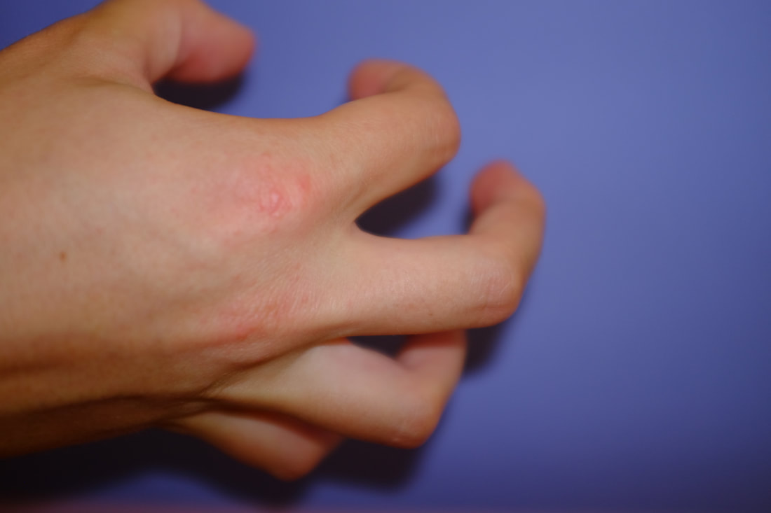
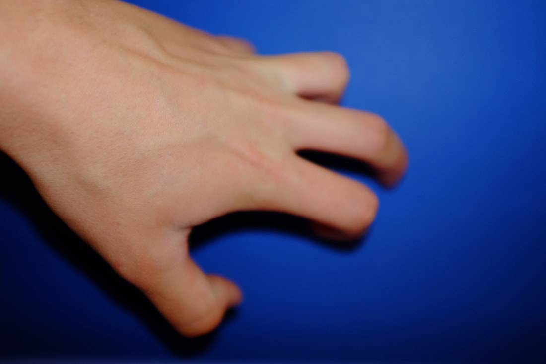
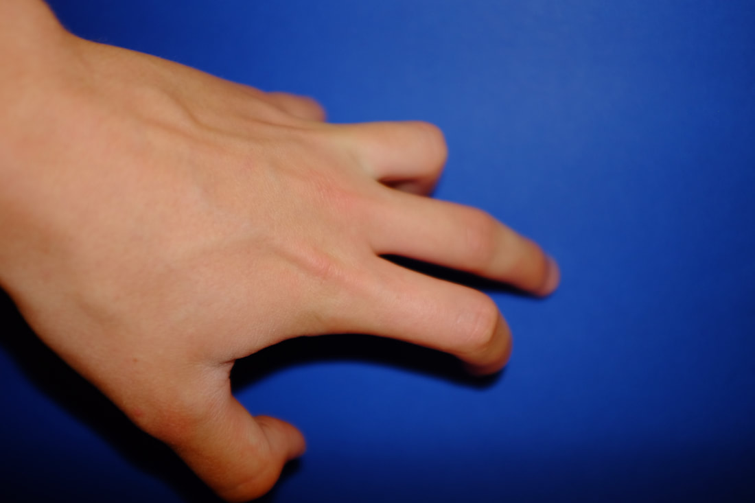
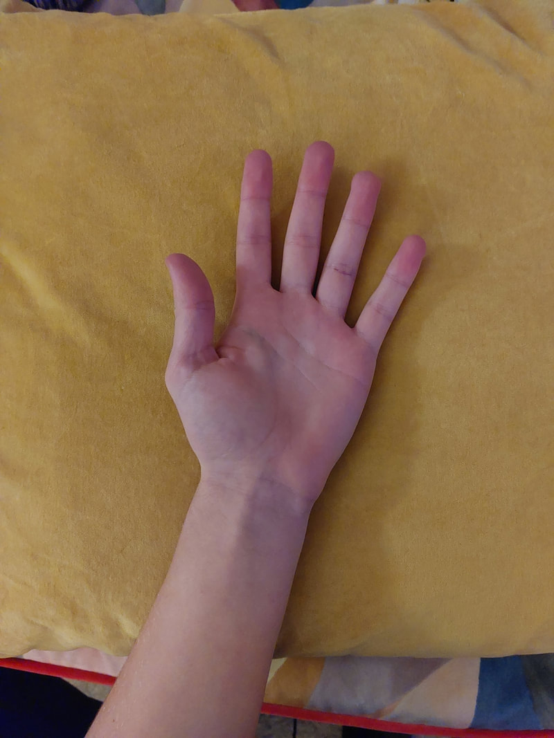
These Photos Edited

I edited my photos using both Gimp and Adobe Photoshop. I turned them to Grayscale mode and used the levels settings to emphasize the details and shadows.
|
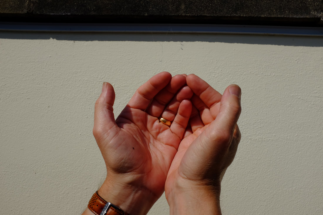
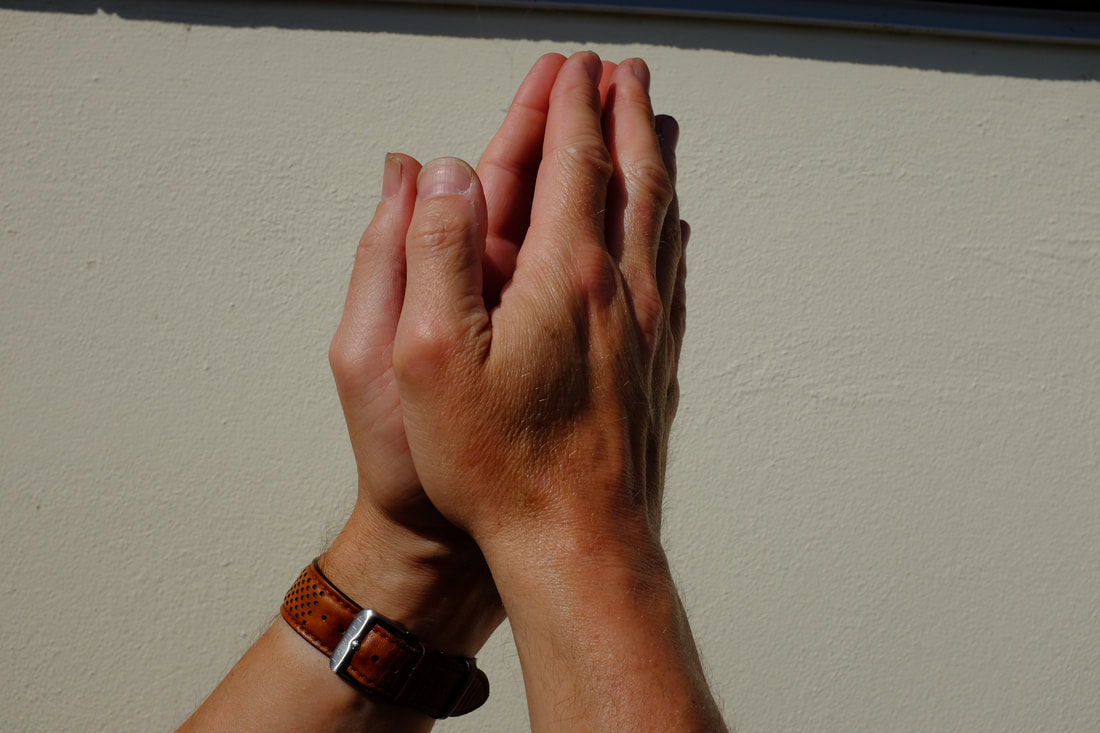
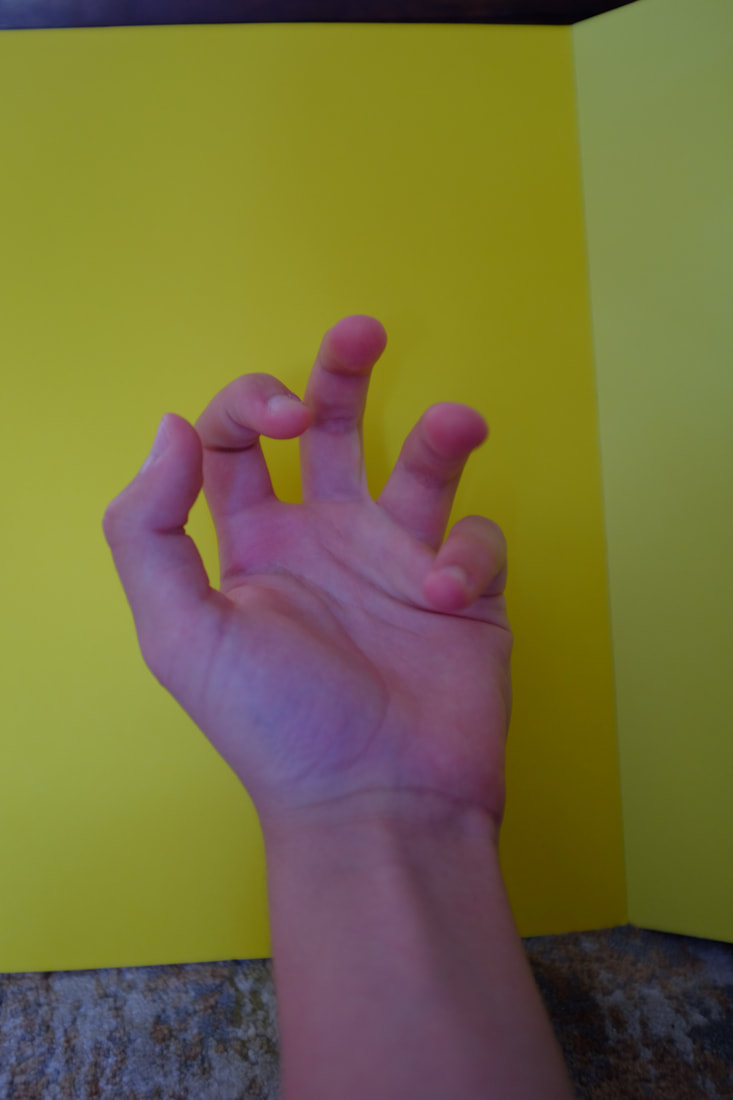
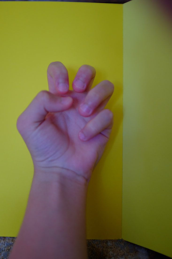
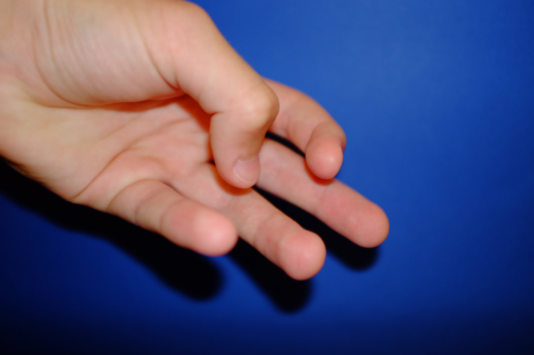
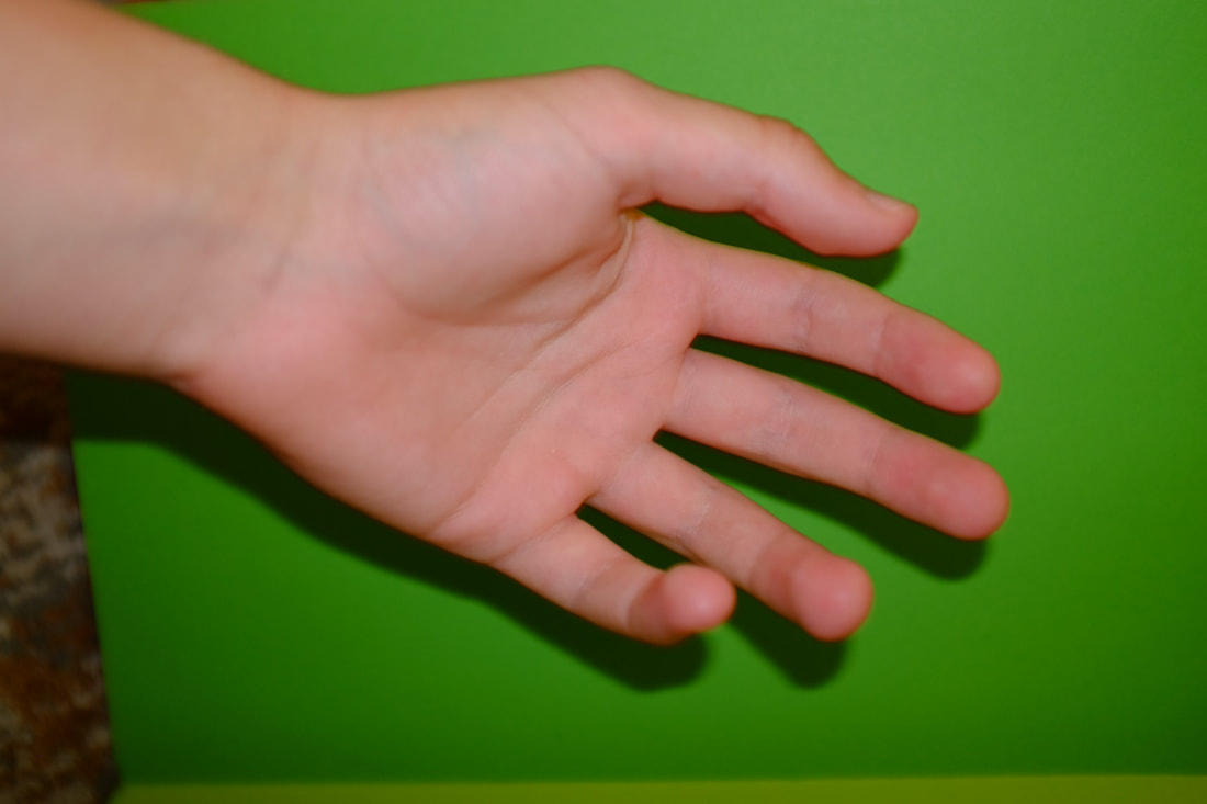
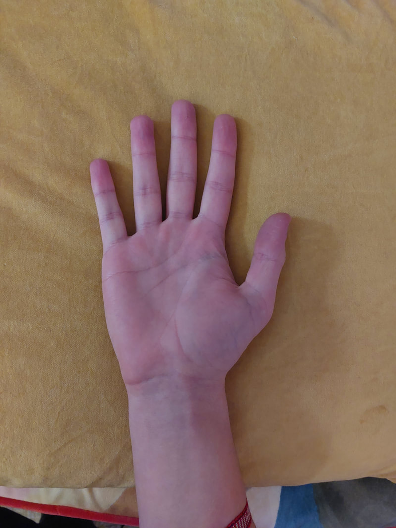
My Picture
|
Tim Booth's Picture
|
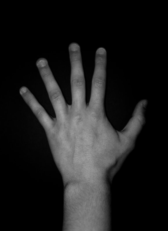
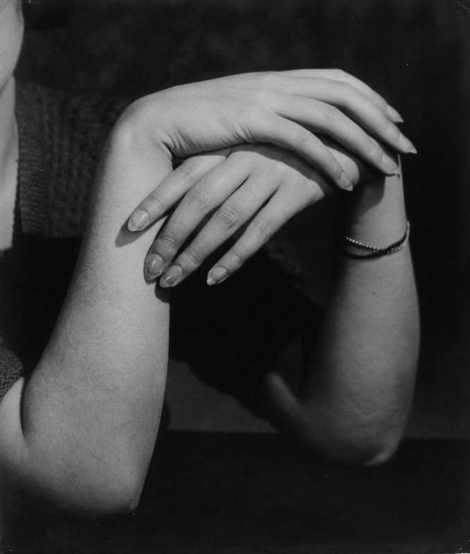
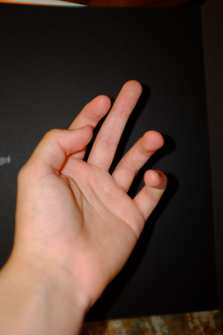
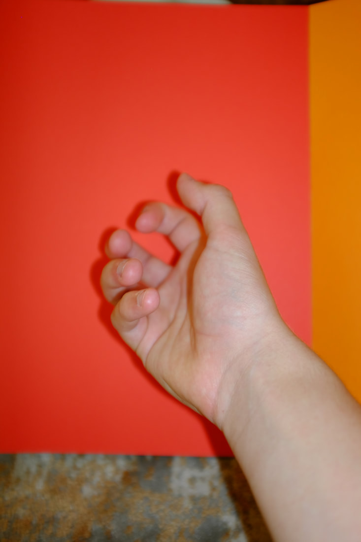
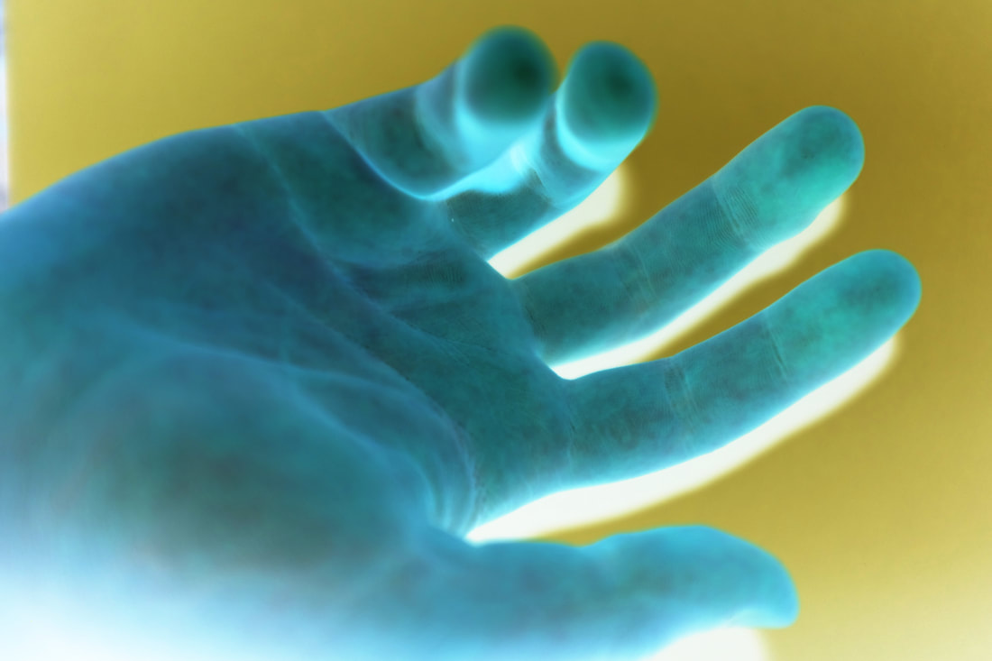
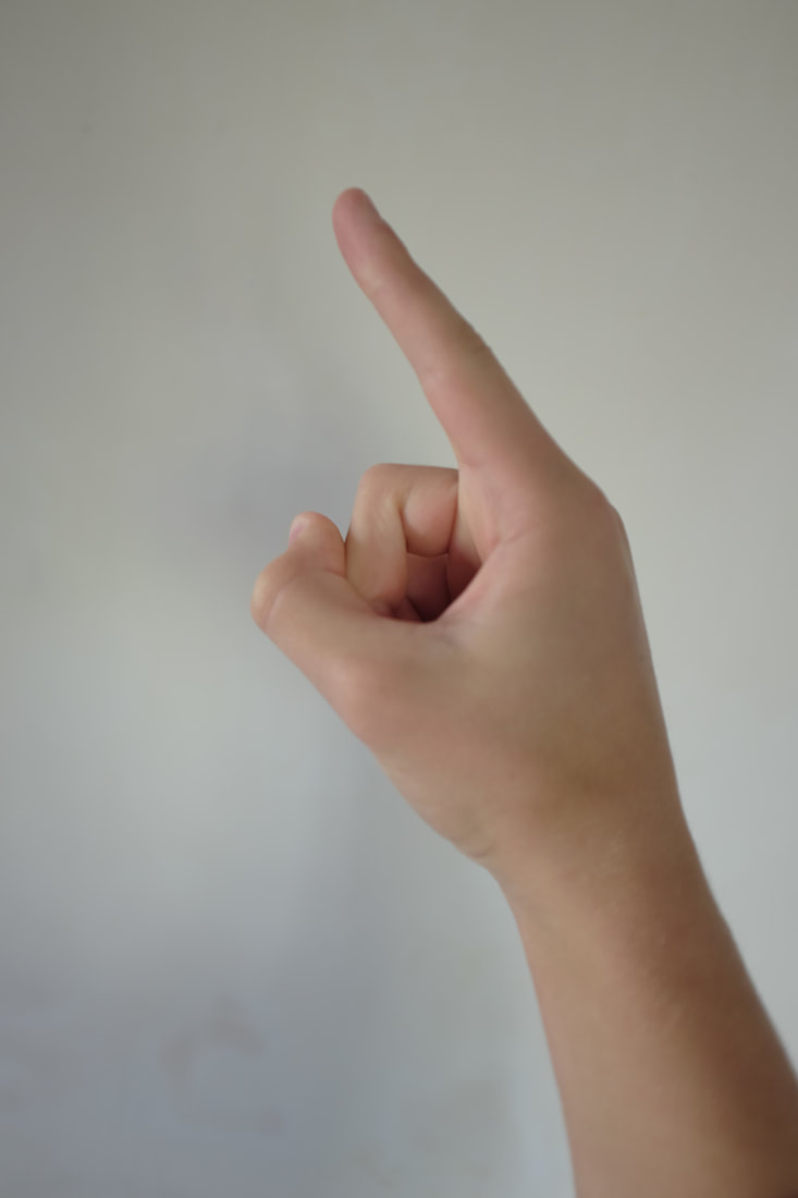
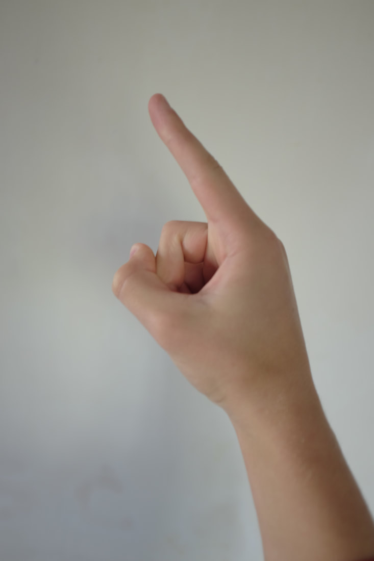
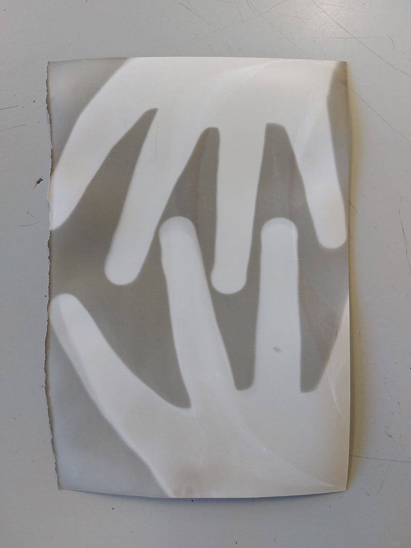
Comparison
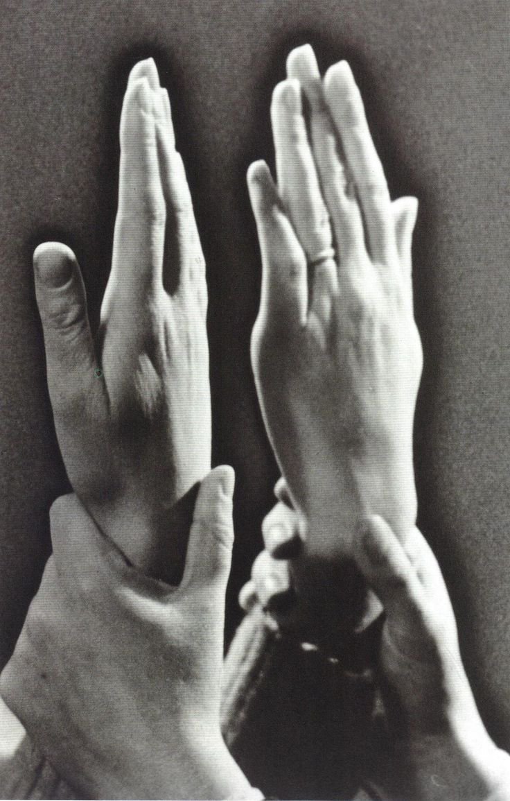
I liked Tim Booths image to two hands clasping, creating a space behind the hands that we do not see. His image gave a focus on the mans fingers and nails. his style highlights the pigmented skin tone. This overall effect creates a powerful image of hands. My response to this was too consider the space behind the clasped hands, creating shadow and using light and dark I created a powerful dramatic picture of a clasping hand. I have learnt how just a simple photo of a hand can have a powerful and expressive quality beyond the photograph.
I liked Tim Booths image to two hands clasping, creating a space behind the hands that we do not see. His image gave a focus on the mans fingers and nails. his style highlights the pigmented skin tone. This overall effect creates a powerful image of hands. My response to this was too consider the space behind the clasped hands, creating shadow and using light and dark I created a powerful dramatic picture of a clasping hand. I have learnt how just a simple photo of a hand can have a powerful and expressive quality beyond the photograph.
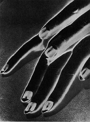
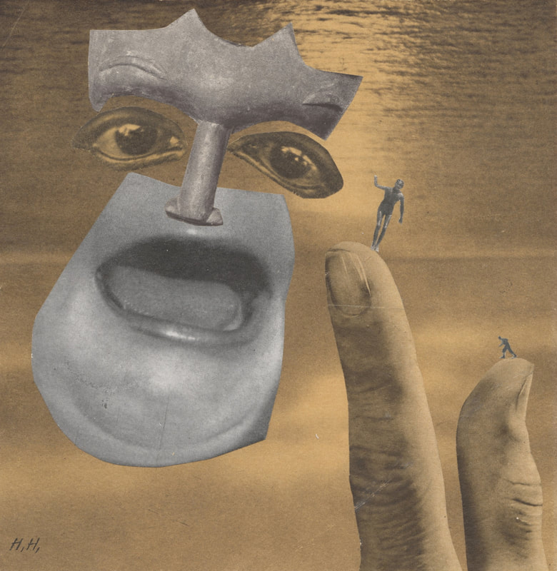
Man Ray
I paint what cannot be photographed, that which comes from the imagination or from dreams, … I photograph the things that I do not wish to paint, the things which already have an existence.
Man Ray was a famous American filmmaker, painter and photographer. Born, Emmanuel Radnitzky, 'Man Ray', on August 27 1890 in Philadelphia, Pennsylvania. He died on November 18, 1976 aged 86 in Paris, France. During his carrier his art spanned painting, sculpture, film, prints and poetry. He mostly work with styles influenced by Cubism, Futurism, Dada and Surrealism. Many of his photos were taken in with a sabattier effect also know as pseudo-solarization, a photo taken in negative or is partially reversed in tone, dark areas appear light or light areas appear dark. Man Ray is well known for his work with photograms, which he called "rayographs" in reference to himself.

|
Image Analysis
It is by the artist and photographer Man Ray. It was created in 1930. It is an example of camera-less photography that he called rayographs, it is also known as the Sabattier effect or pseudo-solarization. The composition shows The tips of a persons fingers. The photo was taken in Black-and-white but when exposed to light, Ray used chemicals to produce negatives. This means the areas of the photo that should be dark appear light and the areas most likely to be light appear dark. The focal point of the image is most made from the persons fingers so I would say the centre finger nail as the contrast of the white surrounded by the black stands out. The techniques used here are artificial lighting, creating good colours for when transferred into negative. The photo was taken with a film camera would have been developed in a dark room. The white outline to the fingers create a number of lines and patterns. The image makes me feel invasive as if I am intruding. But it is also gives a peaceful feel. |
|
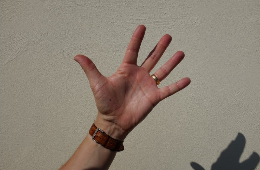
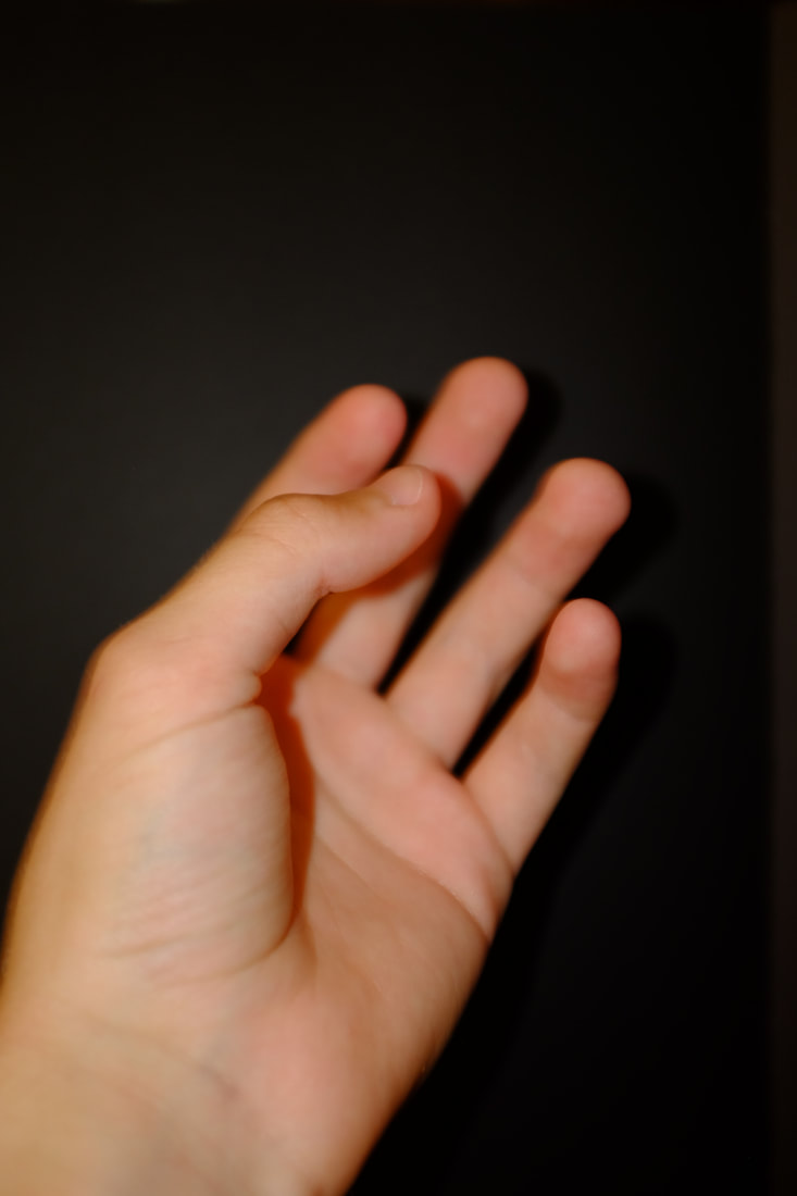
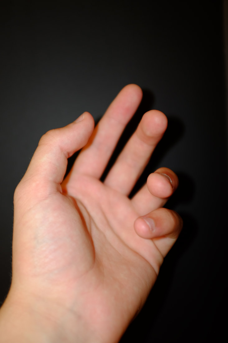
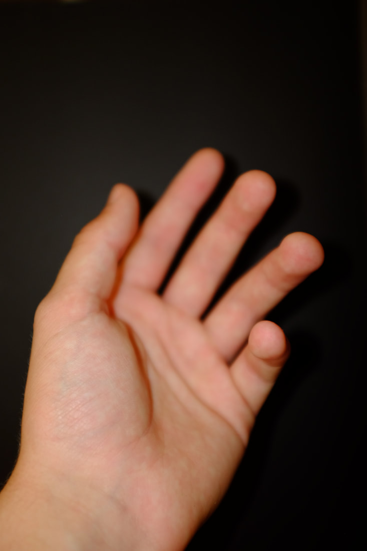
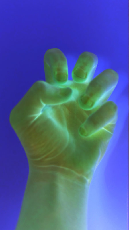
My Inspired Shoots
My plan for my Shoots
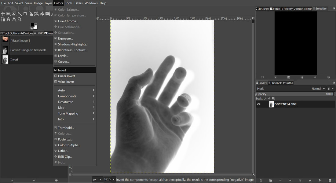
I plan to take photos of my own hands with a different coloured backgrounds. I then plan on turning the photo to grayscale then negative using Gimp photoshop. I also what to try editing the photos into negative but without turning the photo to grayscale so I can to add my own personal twist to Man Ray's style.
I plan to take photos of my own hands with a different coloured backgrounds. I then plan on turning the photo to grayscale then negative using Gimp photoshop. I also what to try editing the photos into negative but without turning the photo to grayscale so I can to add my own personal twist to Man Ray's style.
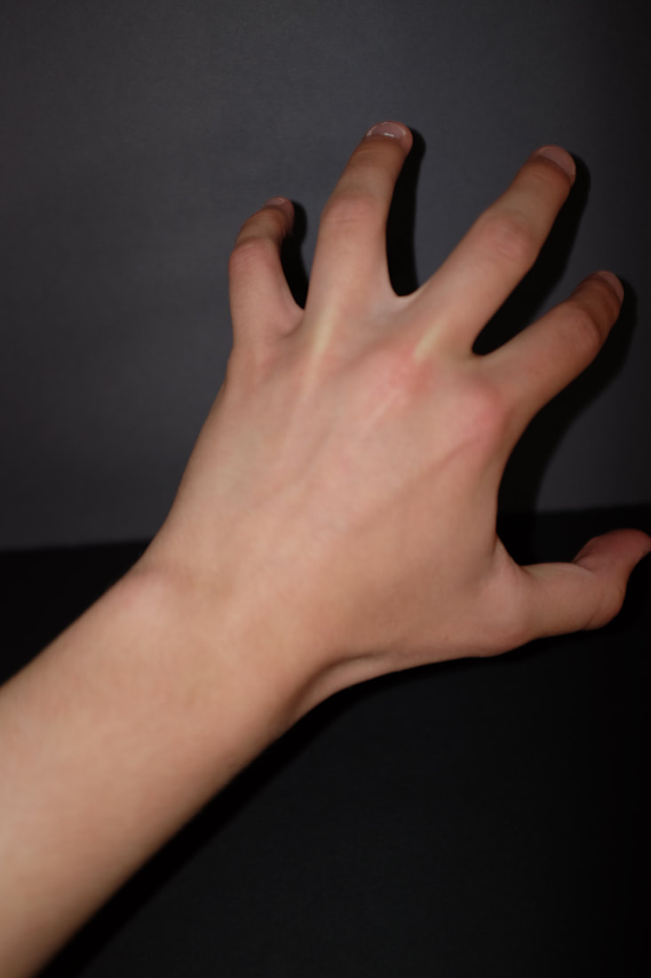
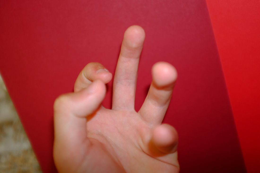
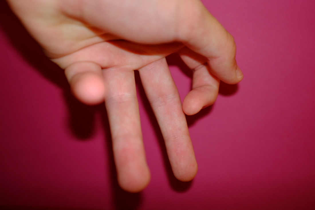
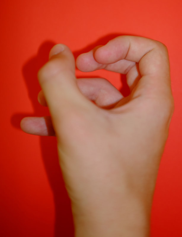
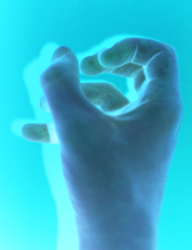
Man Ray Shoot 1 - Black Background
Shoot Plan
I took the photos with a black background to recreate Man Ray's negative photo shoot. I will turn the photos to grayscale then negative.
I took the photos with a black background to recreate Man Ray's negative photo shoot. I will turn the photos to grayscale then negative.
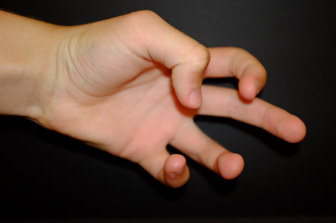
Shoot Review
I have photographed my own hand using using my Fuji Film x100s, I took photos in different positions on a black background. The settings/techniques I have used are 1/34 shutter speed, f2.0 aperture, close cropping, autofocus and ISO 400. I then turned my images to grayscale using Gimp before inverting them. What went well was that I think I achieved good lighting, composition, focus and I managed to capture a generic thing like hands but in a reasonably abstract way. I think that I experimented enough with the shape and positioning of my hand for the limits of the black background that I limited myself to. I have learnt to look closely and to really consider framing. I have had to use my brain a lot to visualise the final image before taking it. My target for the next shoot is too change the colour of my background from black to white. This piece of work was influenced by Man Ray. The link between what I have done and what they have done is we have both taken photos of hands and turned them to negative however I have done this digitally and he would have done it in a darkroom with chemicals.
I have photographed my own hand using using my Fuji Film x100s, I took photos in different positions on a black background. The settings/techniques I have used are 1/34 shutter speed, f2.0 aperture, close cropping, autofocus and ISO 400. I then turned my images to grayscale using Gimp before inverting them. What went well was that I think I achieved good lighting, composition, focus and I managed to capture a generic thing like hands but in a reasonably abstract way. I think that I experimented enough with the shape and positioning of my hand for the limits of the black background that I limited myself to. I have learnt to look closely and to really consider framing. I have had to use my brain a lot to visualise the final image before taking it. My target for the next shoot is too change the colour of my background from black to white. This piece of work was influenced by Man Ray. The link between what I have done and what they have done is we have both taken photos of hands and turned them to negative however I have done this digitally and he would have done it in a darkroom with chemicals.
Editing the Images
I chose my 4 favourite photos to edit on Gimp Photoshop. I then Used the invert tool to make the photo a negative and the curves tool to create the right shadows and lines.

Reflecting...
I realised I had made a mistake. Because I had used a black background for my photos when I inverted the colours the background was white, not black. Meaning they did not reflect Man Ray images I was inspired by. So, I took photos of my hands with a white background so I could more closely recreate Man Rays images in a second shoot.
I realised I had made a mistake. Because I had used a black background for my photos when I inverted the colours the background was white, not black. Meaning they did not reflect Man Ray images I was inspired by. So, I took photos of my hands with a white background so I could more closely recreate Man Rays images in a second shoot.
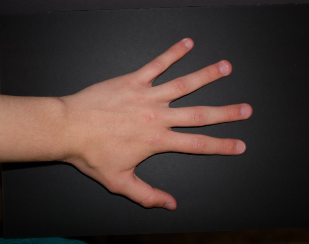
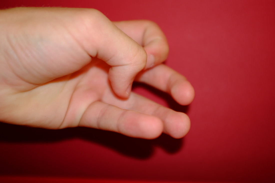
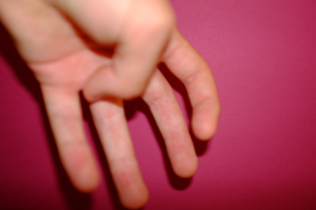
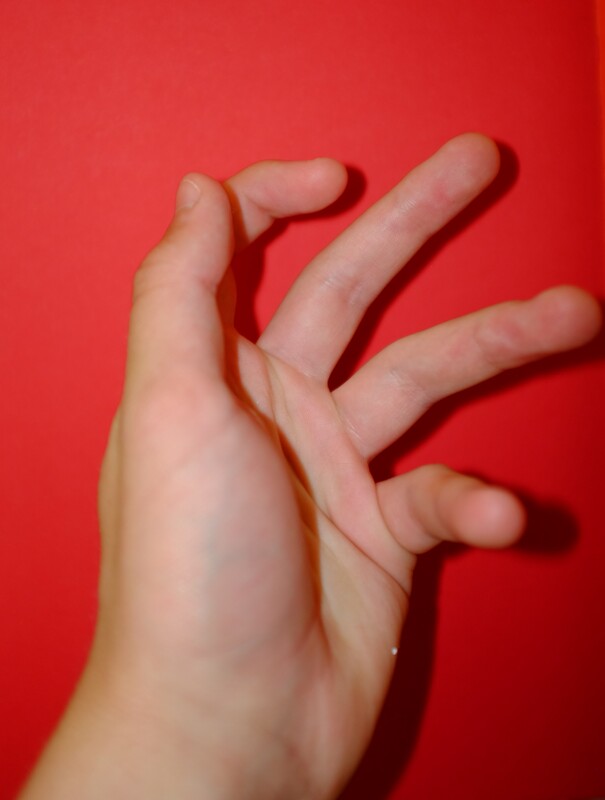
Man Ray Shoot 2 - White Background
I took the photos with a white background to recreate Man Ray's negative photo shoot. I will turn the photos to grayscale then negative.
Shoot Review
I have photographed my own hand in different positions on a black background using my camera. The settings/techniques I have used are 1/34 shutter speed, f2.0 aperture, close cropping, autofocus and ISO 400. I then turned my images to grayscale before inverting them. What went well was that I think I achieved good lighting, composition, focus and I managed to capture a generic thing like hands but in a reasonably abstract way. I think that I experimented enough with the shape and positioning of my hand for the limits of the black background that I limited myself to. I have learnt to look closely and to really consider framing. I have had to use my brain a lot to visualise the final image before taking it. My target for the next shoot is too change the colour of my background from black to white. This piece of work was influenced by Man Ray. The link between what I have done and what they have done is we have both taken photos of hands and turned them to negative however I have done this digitally and he would have done it in a darkroom with chemicals.
I have photographed my own hand in different positions on a black background using my camera. The settings/techniques I have used are 1/34 shutter speed, f2.0 aperture, close cropping, autofocus and ISO 400. I then turned my images to grayscale before inverting them. What went well was that I think I achieved good lighting, composition, focus and I managed to capture a generic thing like hands but in a reasonably abstract way. I think that I experimented enough with the shape and positioning of my hand for the limits of the black background that I limited myself to. I have learnt to look closely and to really consider framing. I have had to use my brain a lot to visualise the final image before taking it. My target for the next shoot is too change the colour of my background from black to white. This piece of work was influenced by Man Ray. The link between what I have done and what they have done is we have both taken photos of hands and turned them to negative however I have done this digitally and he would have done it in a darkroom with chemicals.
Editing the Images

I chose my 4 favourite photos to edit on Gimp Photoshop. I then Used the invert tool to make the photo a negative and the curves tool to create the right shadows and lines.
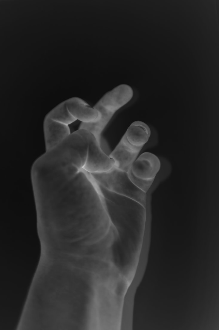
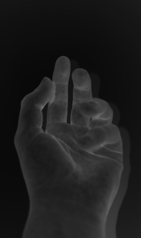
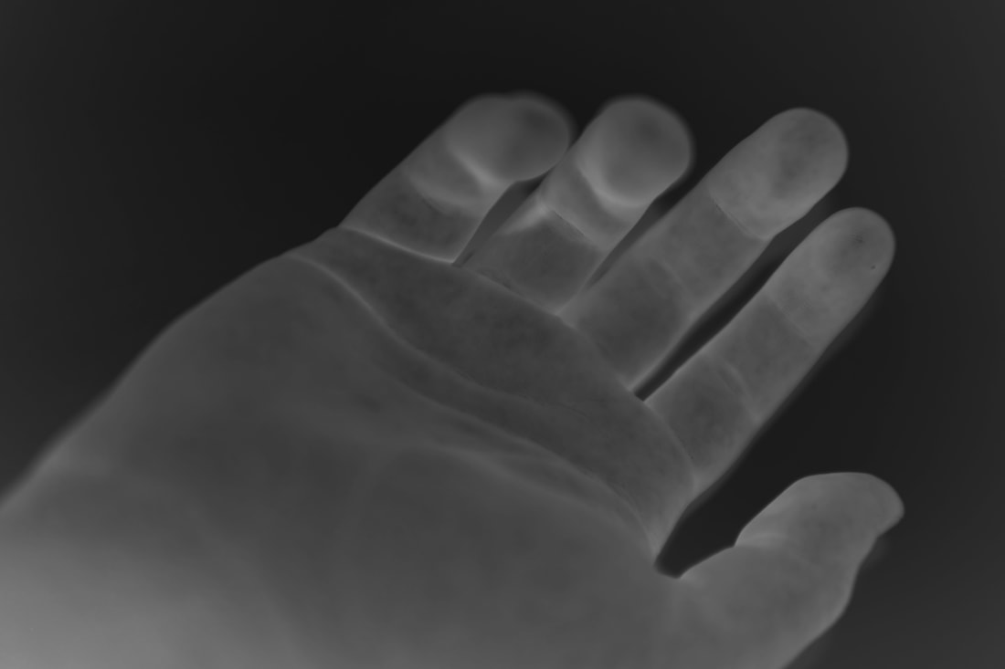
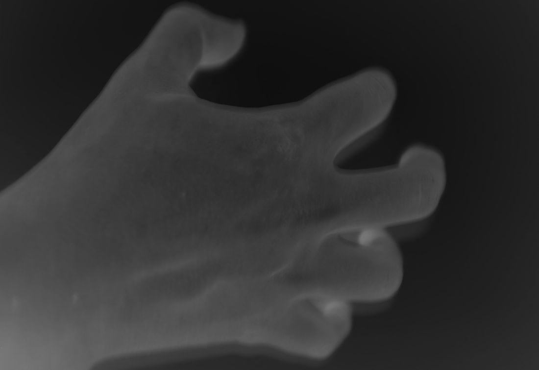
Photo Reflection
I believe these photos are a great inspired re-reaction of Man Rays but with more modern technology. The negatives are not exactly the same, I assume because Man Ray's were taken with film and were inverted in a dark room.
The mistake I made in Shoot 1 (using a black background) meant that I did two shoots, which I am glad about. It also mean I could discover more about negatives and inverting image colours.
My Picture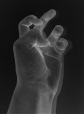
|
Man Ray's Picture
|
Man Ray Shoot 3 - More of My Own Experiments
To add a new perspective or style I changed the background to different colours then will change it to negative without turning it to grayscale. This will create a new effect with the colour of my hand and also the background flipping and their colours contrasting together.

Shoot Review
I have photographed my own hand in different positions on a black background using my camera. The settings/techniques I have used are 1/34 shutter speed, f2.0 aperture, close cropping, autofocus and ISO 400. This time I didn't turn my images to grayscale, instead I edited the colours to be more vibrant then inverted them. What went well was that I think I achieved good lighting, composition, focus. I managed to capture my hands in yet another abstract way. I have learnt to look closely and to really consider framing. I have had to use my brain a lot to visualise the final image before taking it. This piece of work was influenced by Man Ray. I think that I experimented enough with his of rayograms and so this will be my last shoot inspired by him before I come back to the idea and make my own rayograms with chemicals in a darkroom.
I have photographed my own hand in different positions on a black background using my camera. The settings/techniques I have used are 1/34 shutter speed, f2.0 aperture, close cropping, autofocus and ISO 400. This time I didn't turn my images to grayscale, instead I edited the colours to be more vibrant then inverted them. What went well was that I think I achieved good lighting, composition, focus. I managed to capture my hands in yet another abstract way. I have learnt to look closely and to really consider framing. I have had to use my brain a lot to visualise the final image before taking it. This piece of work was influenced by Man Ray. I think that I experimented enough with his of rayograms and so this will be my last shoot inspired by him before I come back to the idea and make my own rayograms with chemicals in a darkroom.
Editing My Final Pictures
Plan
I will choose my favourite photos from each of the colours to edit. I will use Gimp to crop each photo and invert the colour to create a negative.
I will choose my favourite photos from each of the colours to edit. I will use Gimp to crop each photo and invert the colour to create a negative.
I used Gimp to edit to edit the images using the invert image mode. I also used the curves tool to bring out the shadows and make the colours more vibrant and luminescent.
I am very pleased with the way the pictures turned out. I love the bright colours and the range of photos. I like how successfully the shadows came out.
I am very pleased with the way the pictures turned out. I love the bright colours and the range of photos. I like how successfully the shadows came out.
Man Ray Overall Review
Working with photoshop trying to recreate Man Rays style has helped to teach me new techniques and skills.
I think I could have done a better job at remaking Man Rays negative photo, but I think I would need to use a dark room to really improve. In the future I would like to use the dark room.
Working with photoshop trying to recreate Man Rays style has helped to teach me new techniques and skills.
I think I could have done a better job at remaking Man Rays negative photo, but I think I would need to use a dark room to really improve. In the future I would like to use the dark room.
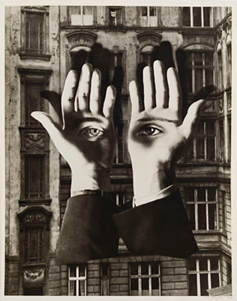
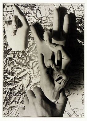
Photographer 3 - Herbert Bayer
Just as typography is human speech translated into what can be read, so photography is the translation of reality into a readable image.
Herbert Bayer is an Austrian-American photographer born in Haag, 1900. He died in California, 1985. Bayer was one of the Bauhaus’s most influential artists who worked with many art forms throughout his career. Most of Bayer’s photographs come from the decade 1928–38, when he was based in Berlin. In 1938 Bayer emigrated to the United States after an invitation from Alfred H. Barr, Jr., the founding director of The Museum of Modern Art.
|
Image Analysis
The title of this piece is Hands Act. It is by Herbert Bayer. It was created in 1930s. It is an example of photomontage. The background of the image is a 2D map viewed from above. On top of the map are 4 photos of hand that have been imposed on top. 2 of the hands appear to be sculpted as there surfaces look smooth and there details painted in. I would say the focal point of the image is the hand second to the bottom as it is detailed and also has a black Z painted into the palm. Most of the image is in focus but the hand furthest to the bottom is the most detailed. The light source appears to be coming from the left, outside of the picture. A repetition of the hands on the right of the image creates a line that dominates that half of the photo. The image is in black and white with the left side of the hands more white and the right side much more. (contextual) The image makes me feel uneasy as the photo is so unnaturally created and edited. |
|
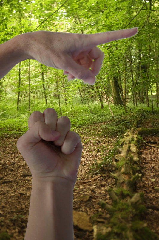
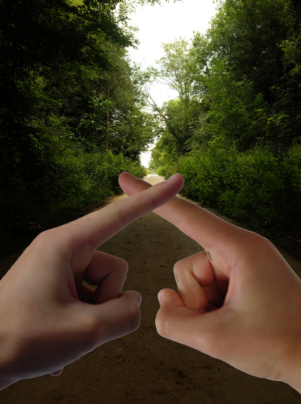
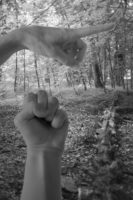
Bayer made this photomontage when he was working as a commercial artist in Berlin, at this time as art manager of Vogue magazine. At this time he also taught advertising and typography at the Bauhaus school. Some would say he was partly responsible for establishing photomontage as a key art style in the 1930s. In my inspired shoot I plan to use the same concept of photomontage to represent the Human Condition.
My inspired shoots
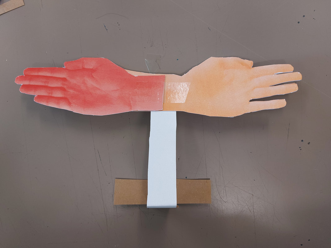
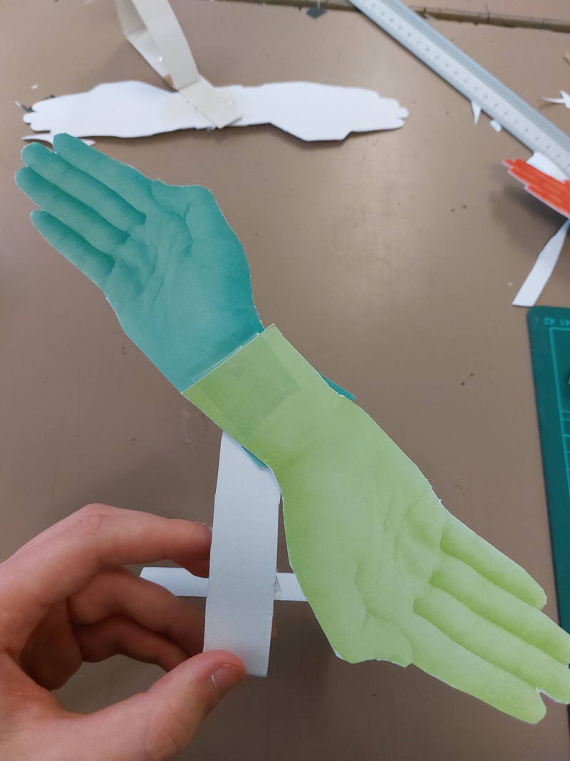
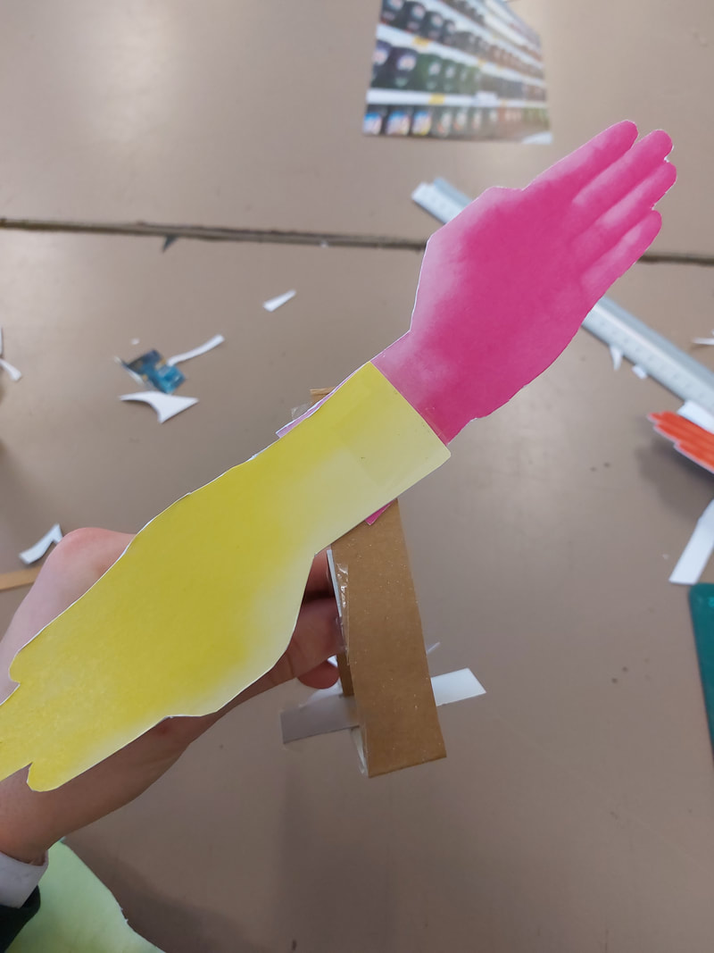
Shoot Plan: For this shoot I will need to take two shoots, as I will need more than one set of photos to produce my collage. I plan to take photos of my own and my families hands. Using Gimp photoshop, I will cut the hands out and paste it onto other photos that I have taken or photos I have found and collaged together. I then plan on turning some photos to grayscale to see if they are improved.
The Shoot
I took photos of the hands in front of a white background because it would make it easier to edit.
The hands at the top of the shoot are my own. Towards the bottom they are photos of my my parents'.
The hands at the top of the shoot are my own. Towards the bottom they are photos of my my parents'.
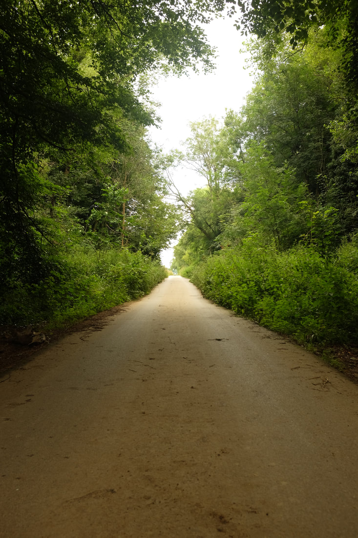
I went to my local woods to take photos, I plan to use theses to collage.
Creating my final Pictures
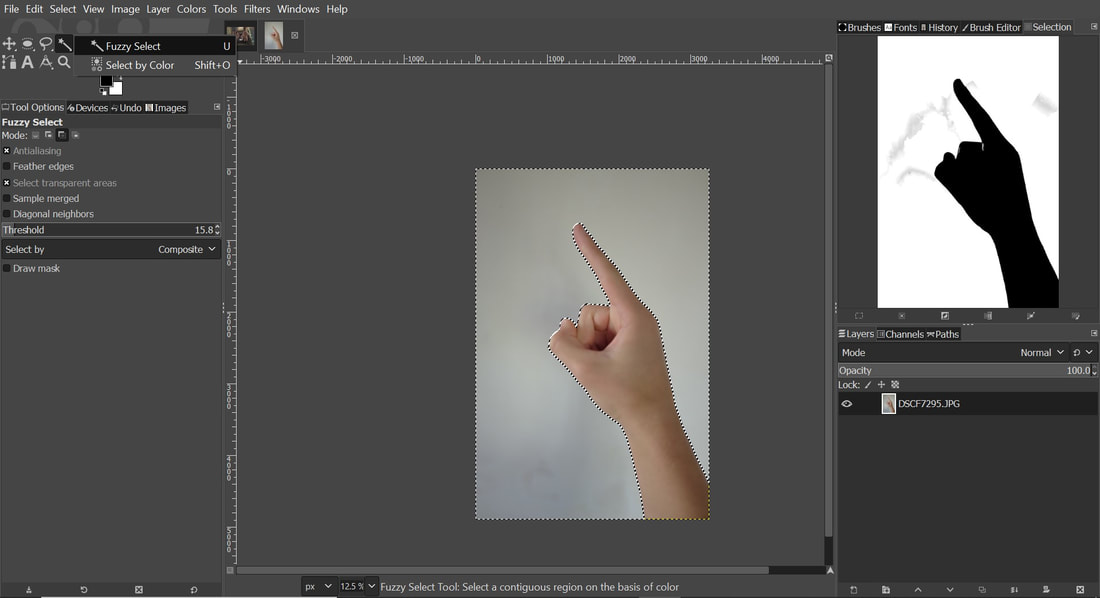
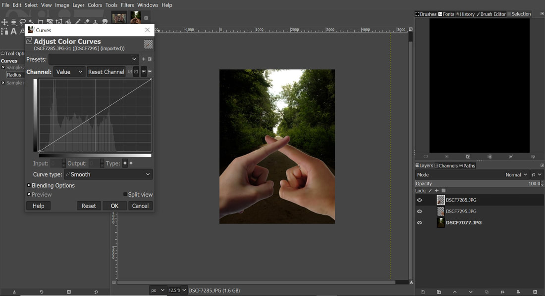
I edited my chosen photos on Gimp Photoshop. I learnt how to use then used the fuzzy select tool so I could separate hands I wanted to use. I then also used the Curves tool to adjust colour and shadows.
My Final Pictures

Editing My photos Further
My Images edited black and white
Review
My Favourite picture
|
Herbert Bayer's picture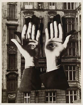
|
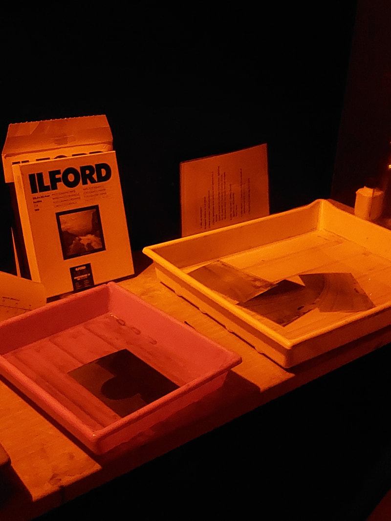
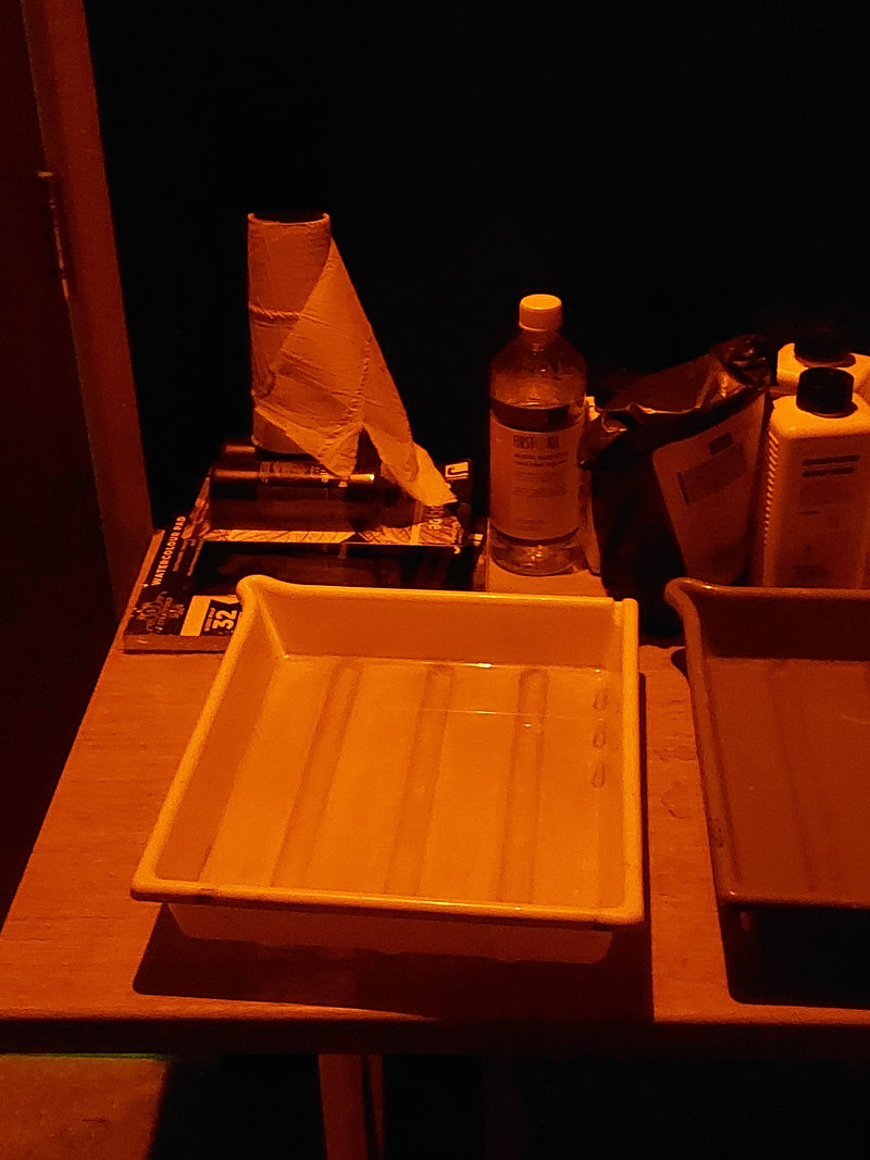
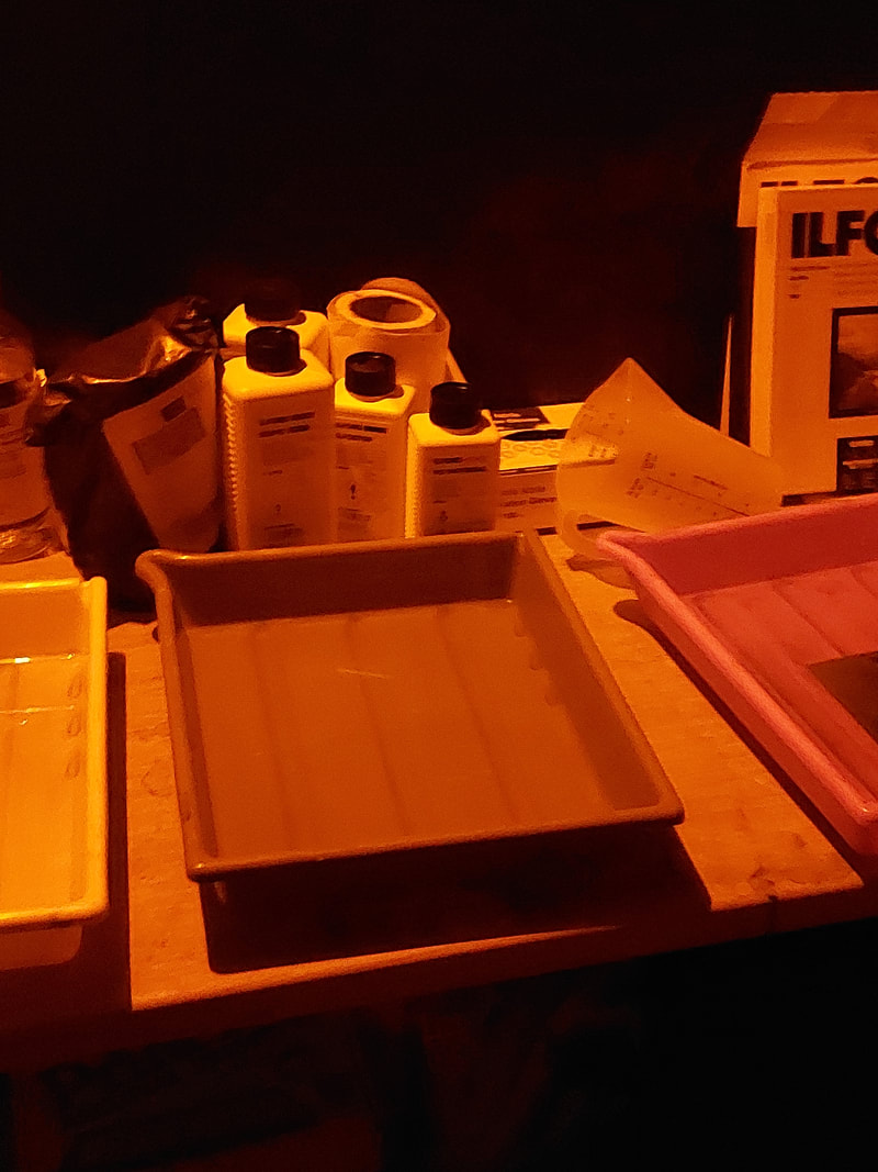
Making Photograms
I have finally freed myself from the sticky medium of paint, and am working directly with light itself. - Man Ray
What is a photogram and how do they work?
A photogram is a photographic image made without a camera by placing objects directly onto the surface of a light-sensitive material such as photographic paper and then exposing it to light within a darkroom.
A photogram is a photographic image made without a camera by placing objects directly onto the surface of a light-sensitive material such as photographic paper and then exposing it to light within a darkroom.
- The paper is then developed by using light-sensitive chemicals in the darkroom. The result is a negative, a shadow image that shows variations in tone; the tones varies depending upon the transparency of the objects used (the amount of light that reaches the paper).
- The shadows or silhouettes are where the objects have prevented light from reaching the surface of the paper. Areas of the paper that have received no light appear white, with areas exposed through transparent or semi-transparent objects appearing white or grey.
A step by step guide
- Set up an enlarger and four different tubs along a line and pour different chemicals in them. Place your developer in the first tub a centimetre from the bottom. Pour a bit of stop bath in the second and do the same with fixer in the next one. Then fill the last on with cold water until just overflowing.
- Adjust the projected light (with the red filter on) and adjust size to fit the photo paper, then place your subject items on your photographic paper
- Expose the photo paper (with objects) under the enlargers white light for about 8 seconds with the timer (if you own one).
- Place your image in the developer and leave it there for about 1 minute. Take it out and make sure to shake the drips off.
- Place the image in the stop bath and leave it for about 30 seconds. Take it out and ensure it doesn’t drip.
- Now place the image in the fixer and let it sit for 3 - 5 minutes. Take it out and once again ensure it doesn’t drip.
- Place the image in the water and wait about 10 minutes. Take it out and dry it well with a squidgy.
- Now hang your image and let it dry in the dark room. Leave it until its dry. After you take it down you will have your finished photogram.
Why am I doing Photograms?
Earlier in my project I looked at the artist/photographer Man Ray and his 'camera-less photography' that he called 'Rayograms' and so I decided to try out this same style and attempted to recreate them by using my camera. But for this shoot I used the darkroom at school to create my photograms.
To make them, he placed objects, materials, and sometimes parts of his own or a model's body onto a sheet of photosensitized paper and exposed them to light, creating negative images.
However this process was not new, camera-less photographic images had been produced since the 1830s but Man Rays experimentation embraced the possibilities for irrational combinations and chance arrangements of objects, emphasizing the abstraction of images made in this way.
Photos of inside the Darkroom
My Photograms
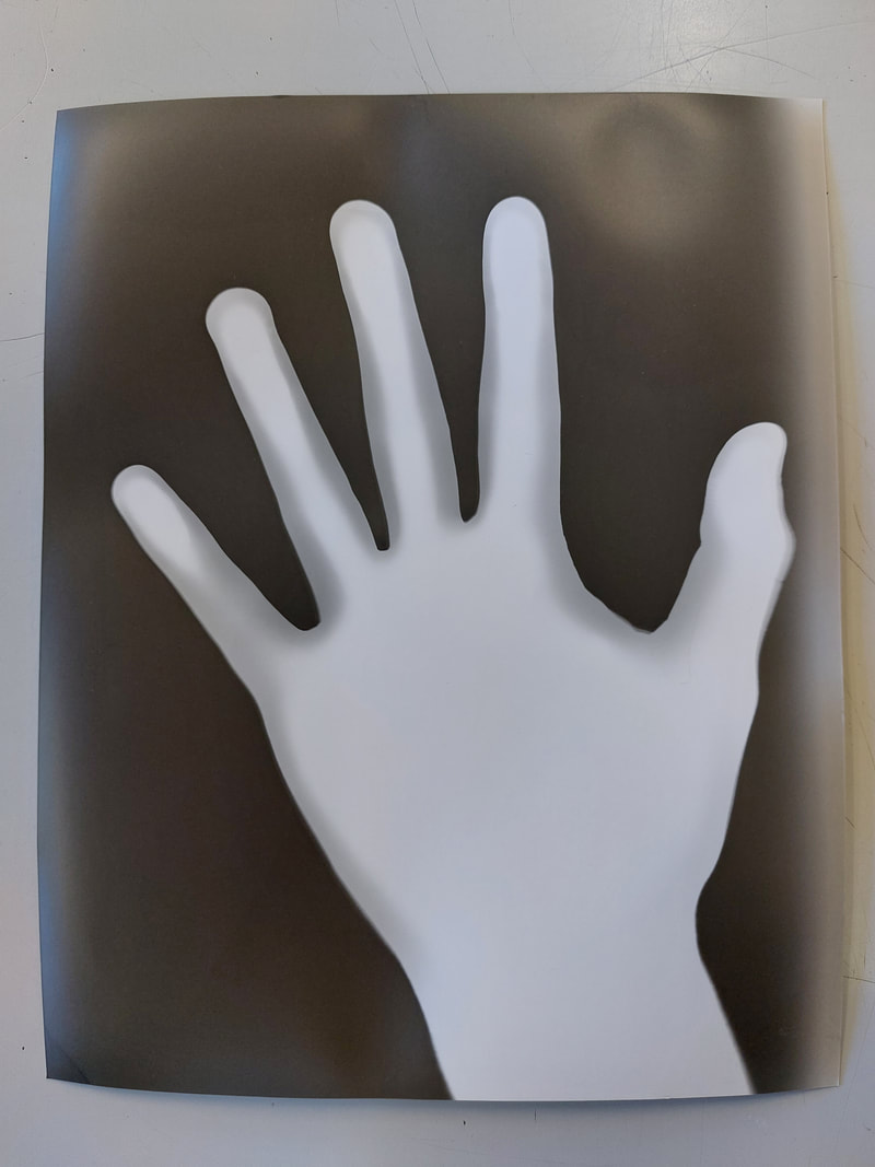
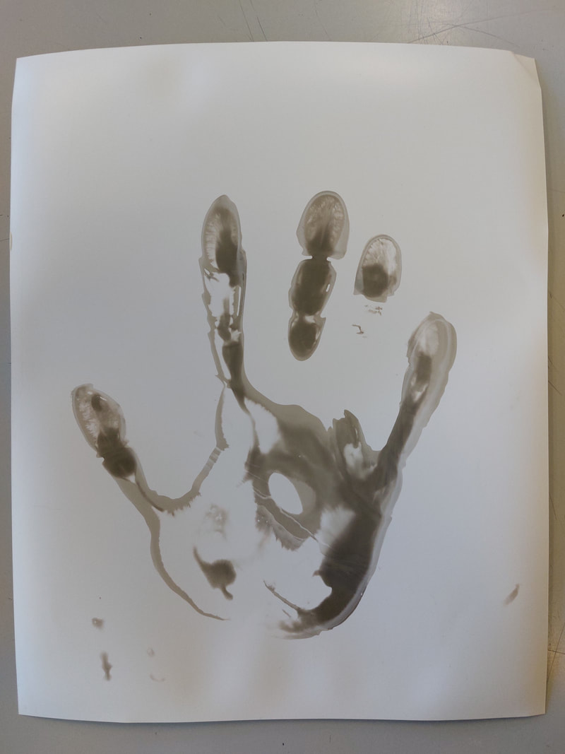
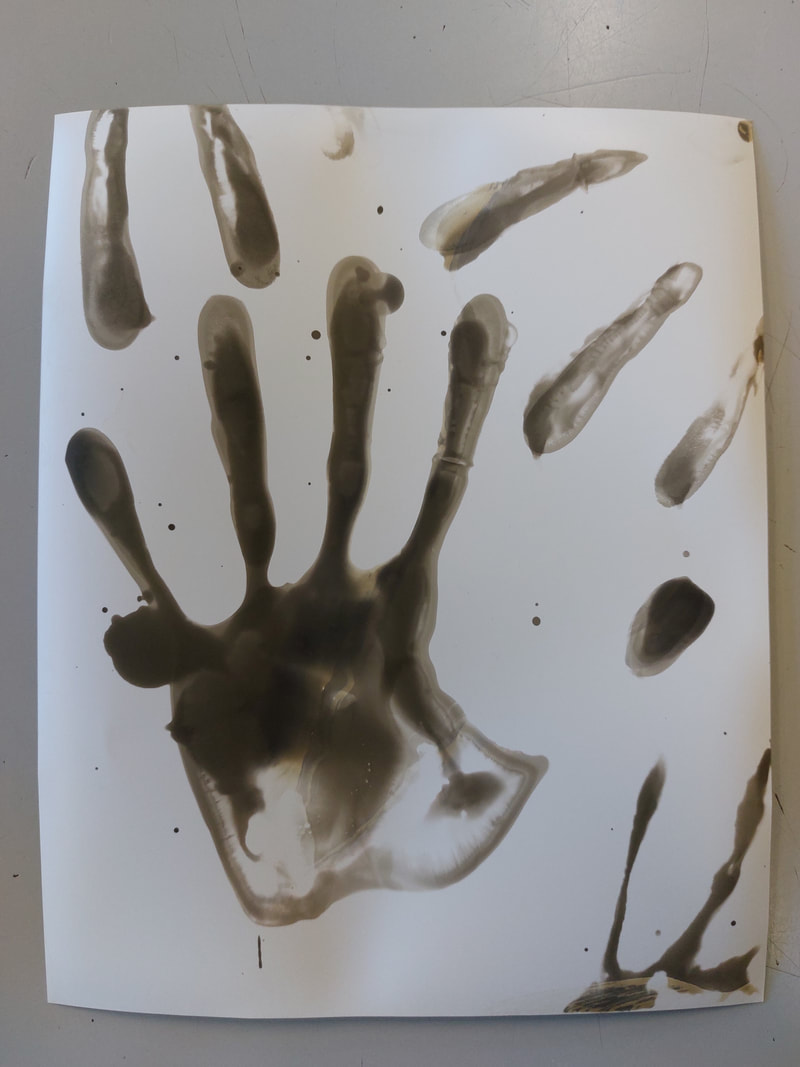
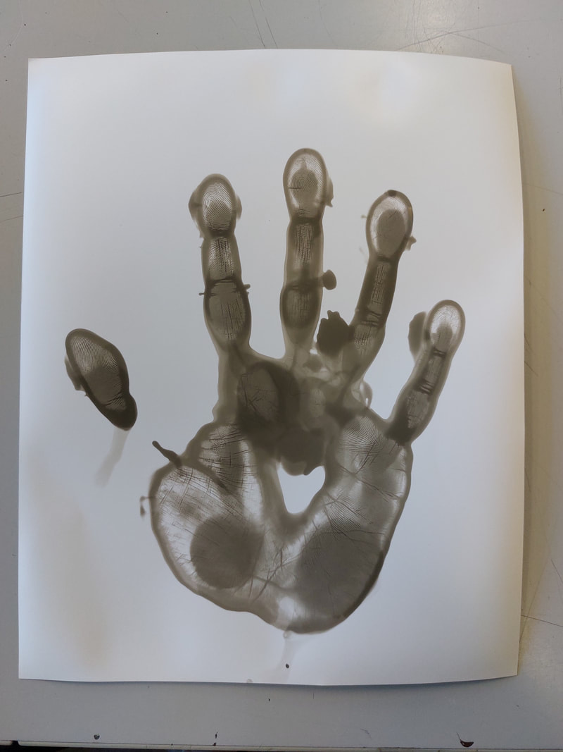
For my first photograms I did them normally and covered the light sensitive paper with my hand and then exposed it too light. Them placed it into the developing fluid, the stopper and the fixer, creating my photograms. I tried just with one of my hands but then also attempted to create one using both of my hands but I used the wrong side of paper and so it didn't turn out as clear as I wanted.
Photograms Review
I have created photograms of my hands a darkroom. Overall I think that the photograms went well but overall it could have been improved if I had created more photograms and done a wider range of hand movements/shapes.
I have created photograms of my hands a darkroom. Overall I think that the photograms went well but overall it could have been improved if I had created more photograms and done a wider range of hand movements/shapes.
In Class Question Activity
Our task in class was to find an image (after searching our topic name) and to answer a number of questions about it.
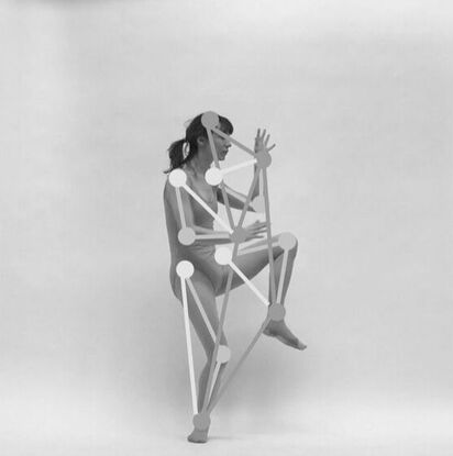
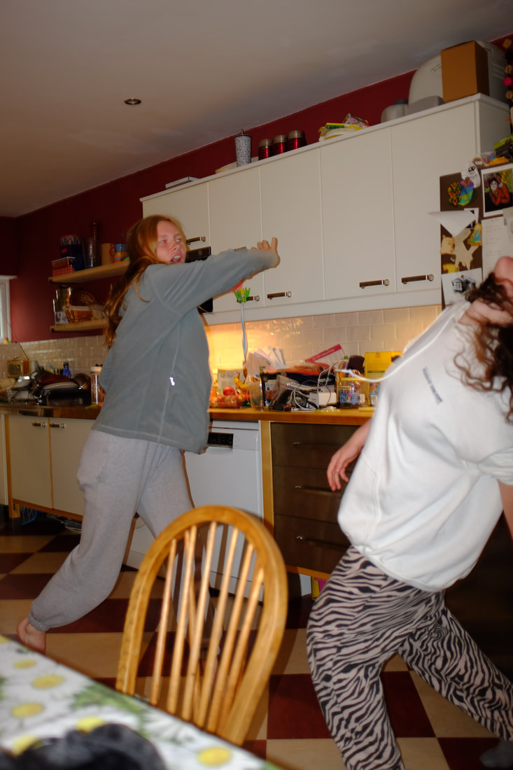
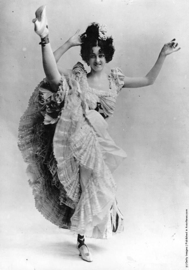
1)What do you see in this photograph?
A woman stands in an active position in the centre of the photo. Over the joints of her body are large dots, they are them joined together by lines. The photo is in back and white.
2) What things do you recognise in this photograph? What things seem new to you?
I recognise the person and her movement/dancing.
3) What is the genre of this photograph?
It is an example of abstract movement.
4)Which Elements seem the most important?
I think that the pattern that she makes and the pattern drawn on top is the most important parts.
5) What is in or out of focus? How has the subject been framed/cropped?
The Entire image is in focus.
6) What equipment, techniques and processes have been used to make the image?
The Photographer used a fast shutter speed, a studio backdrop and photoshop.
7)How has the photographer dealt with space and time?
Roughly 3/4 of the image s negative space with the focal point only taking up the centre space.
8) After research what do you think this photograph is about, Why do you think the artist made this photograph?
The Photo is about motion and new motion capture technology that the photographer was trying to share.
9) What title would you give to this photograph? What other titles could we give it?
I would title it 'The Patten of motion.' Others called it 'The still dancing queen.'
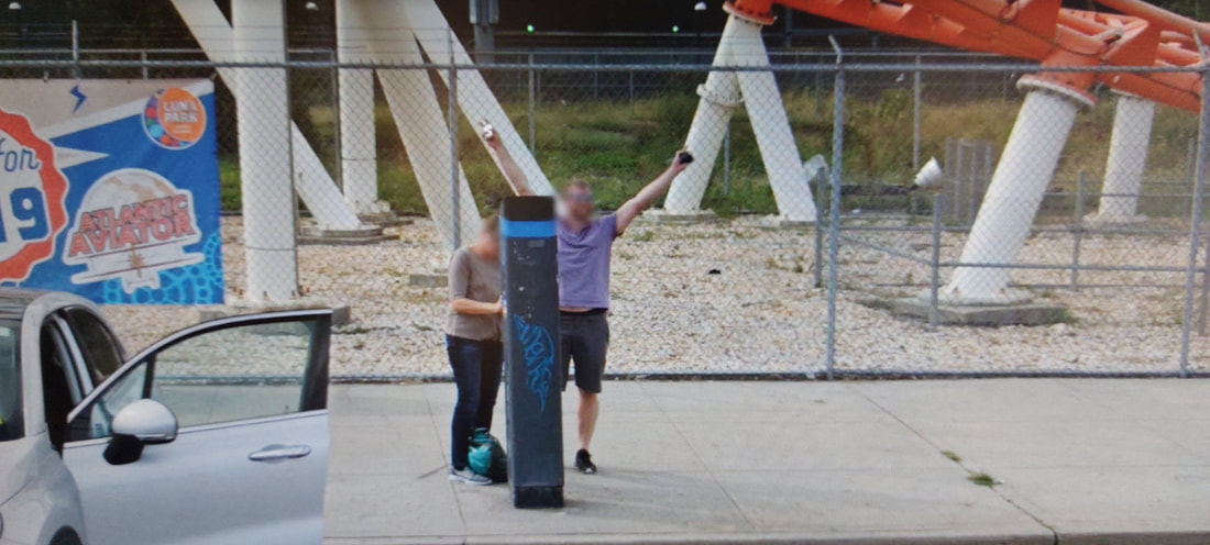
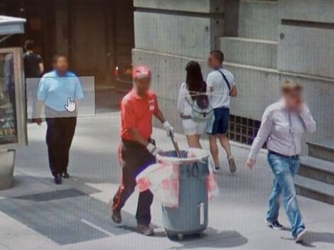
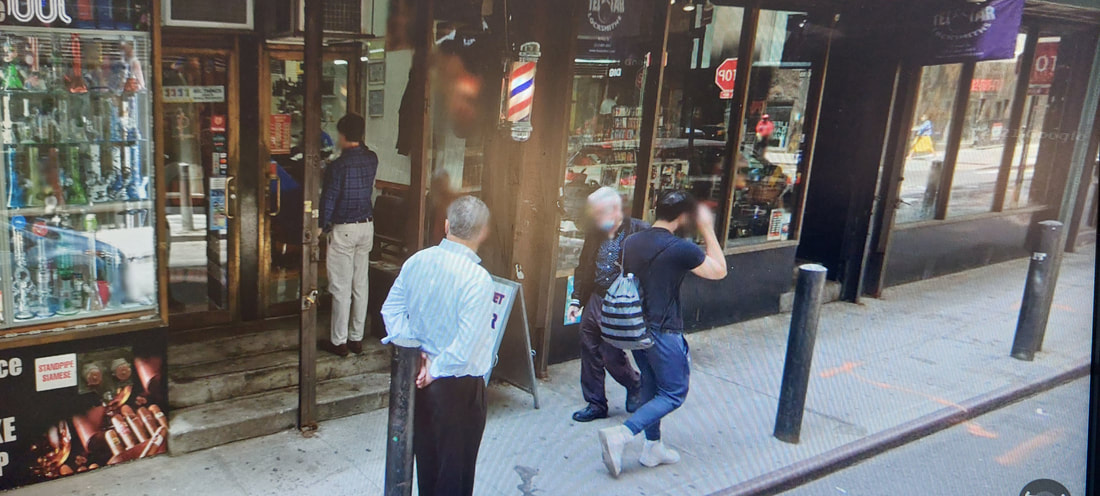
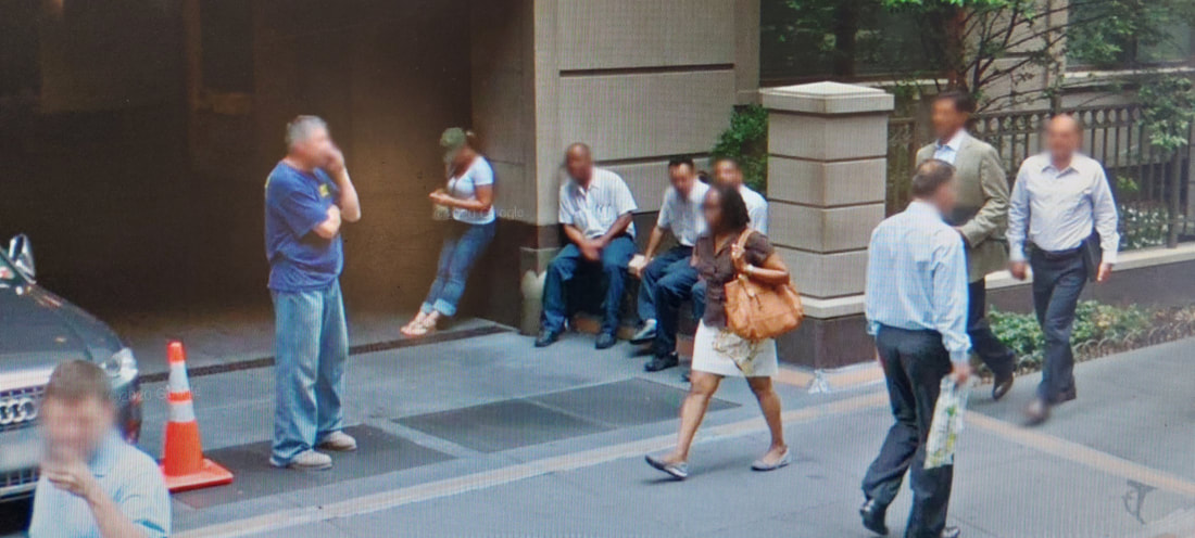
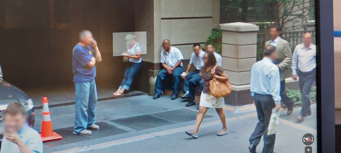
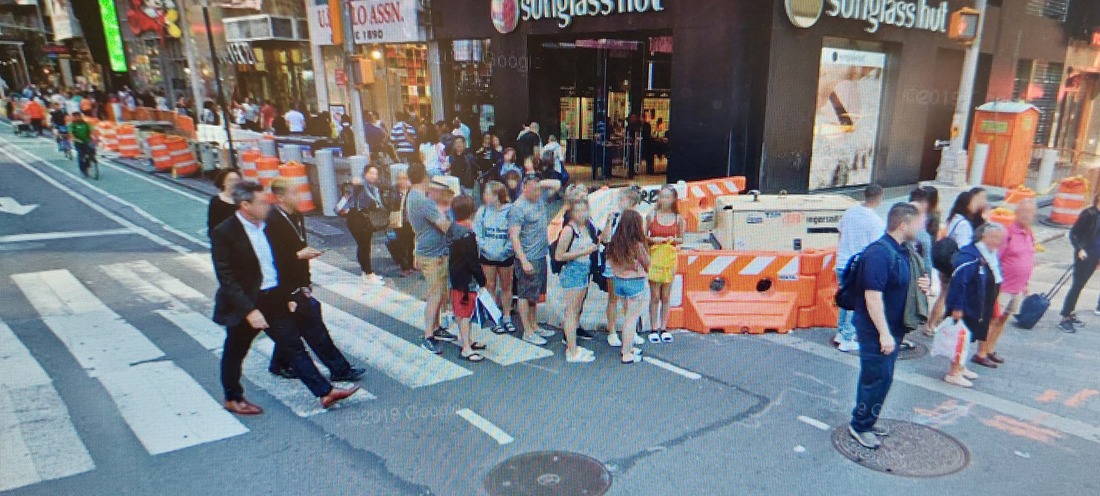
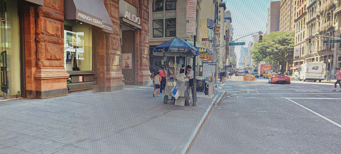
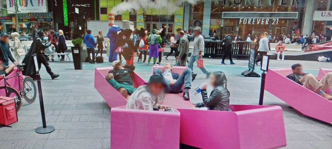
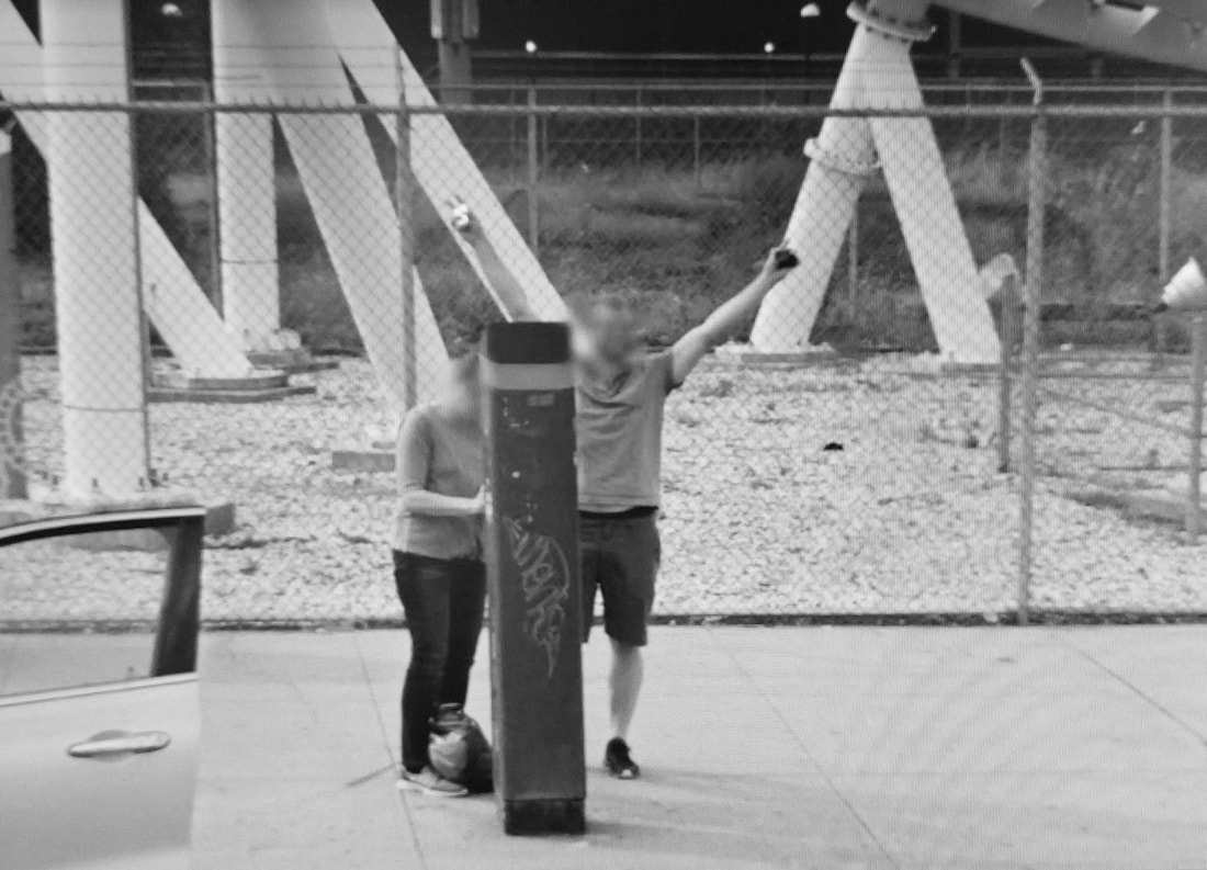
Street Photography on Google Maps - In Class Challenge
Michael Wolf
Michael Wolf born - 30 July 1954, died 24 April 2019 - was a German born artist and photographer who captured life in big cities. His work focuses primarily on architectural patterns and structures, as well as street photography and interactions within the big city. He won three World Press Photo Awards from 2005 to 2011.
Today Our Challenge was too take photos using Google Street View, of thing we would usually not be able to, similar to the style of Michal Wolf.
Today Our Challenge was too take photos using Google Street View, of thing we would usually not be able to, similar to the style of Michal Wolf.
Photographers Gallery
|
Image Analysis
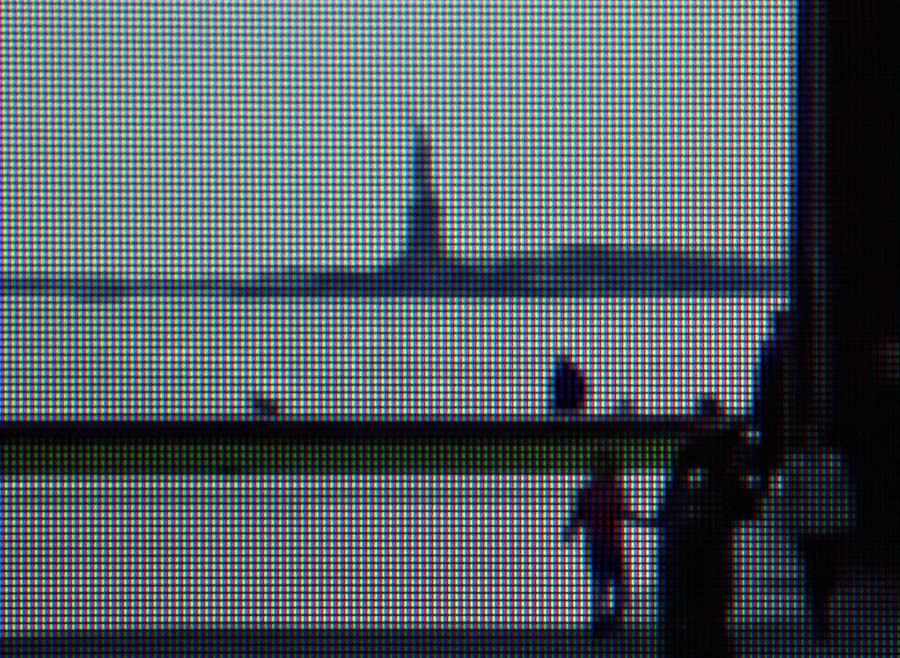
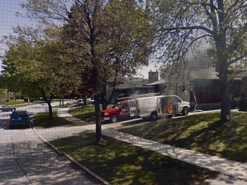
This piece is from a collection named ‘A Series of Unfortunate Events. It is by Michal Wolf. It was created from 2009-10. It is an example of contemporary street photography. The composition shows a photo taken of a computer screen. The screen shows a google street view photo of a traditional suburban street in America. The photo is taken from the road facing towards the left of the street. The road is lined with trees and in the driveway of a house is an open van that is on fire. Behind that is a second, red van. The focal point of the image is the van that is of fire although it is not directly centred and is partially obscured by the trees. It is placed towards the centre right of the image. The techniques used here are focusing on the screen. Within the google street view natural outdoor lighting has been used. The colours in the image are natural, daytime lighting and colours. The main pattern and texture I can see in the image is created by the photo being of a computer screen. |
|
My Shoot Gallery
Review
How do you feel about this approach to photography?
I can appreciate the style of photos that Michal Wolf has taken, I think that this it is an interesting and great new way to view and use new modern technology to create art. I believe that I accurately created work in a similar style to Michal Wolf. I managed to capture images that work together as a collection. To do better I could have taken more with different times of day or a variety of weather to create a wider variety of street life.
My Photos edited
I used Gimp to edit the images to grayscale and then using curves to change the shadows and light to something that I like a bit more.
My photo

|
Michael Wolf's photo
|
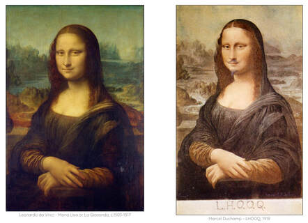
'Something borrowed'
Readymades - In class Challenge
Marcel Duchamp
The term readymade was first used by French artist Marcel Duchamp to describe the works of art he made from ordinary objects that have already been manufactured. It has since often been applied more generally to artworks created by other artists that have used this style.
The term readymade was first used by French artist Marcel Duchamp to describe the works of art he made from ordinary objects that have already been manufactured. It has since often been applied more generally to artworks created by other artists that have used this style.
|
Artists don't work in isolation. They are influenced by one another, passing on ideas and traditions over generations. Sometimes, particular images become very well known and have greater influence over future generations. Take a look at these two images:
|
|
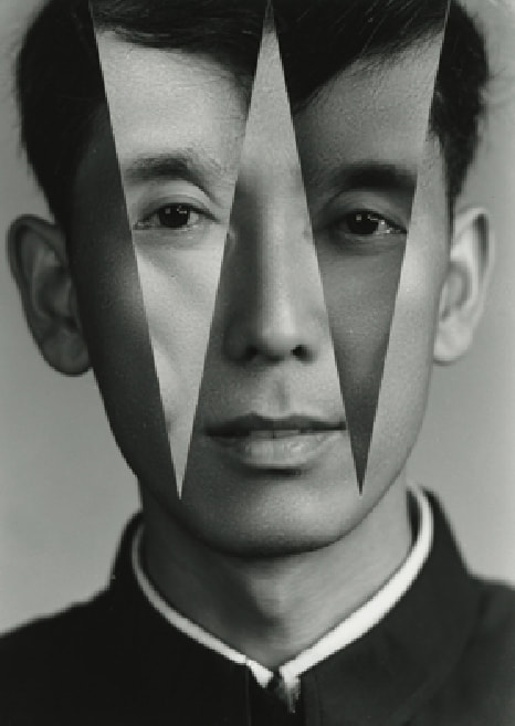
Kensuke Koike - Readymades continued
|
Kensuke Koike (小池健輔, Koike Kensuke) was born June 28, 1980 in Nagoya, Japan. Based in Venice, he is a modern contemporary visual artist and is well know for his appropriation/work with ReadyMades.
|
|
Artists Gallery
|
Image Analysis
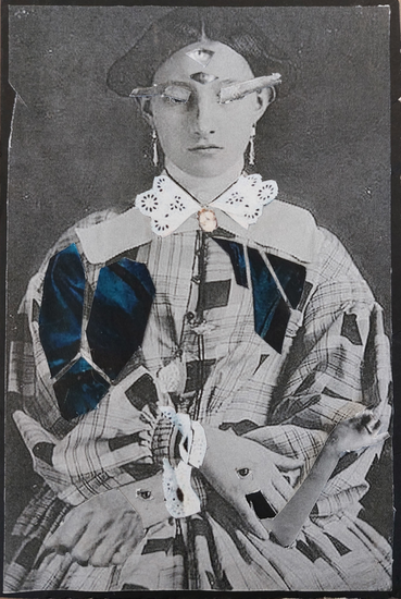
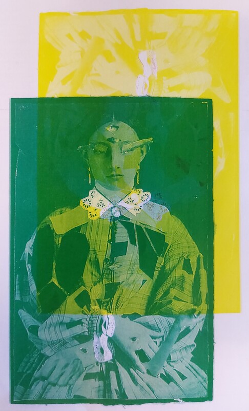
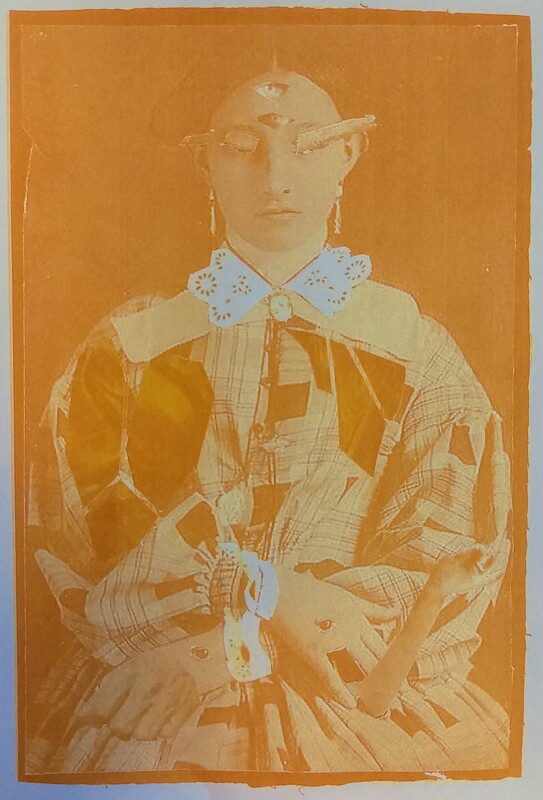
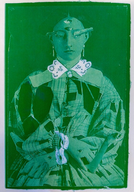
The image is called “I SEE YOU” it is from the collection Nothing Added, Nothing Removed. It is by Kensuke Koike in the 2010s. It is an example of modern Readymade photography. The composition shows a man’s face in black and white. Most of the photo has been cut into ten rings surrounding the man’s left eye. Each ring is the same width and they each fit inside one another, shrinking like a spiral until you reach the eye at the centre of the image, this the focal point. It is placed directly in the centre but slightly more towards the top of the image. The techniques used here are precise cutting and measuring of the image. The colours in the image are only black and white. The patterns I can see in the image are the spiral created by the rings cut into the photo. The image makes me feel peculiar as the eye and spiral have a strange and alien like quality. |
|
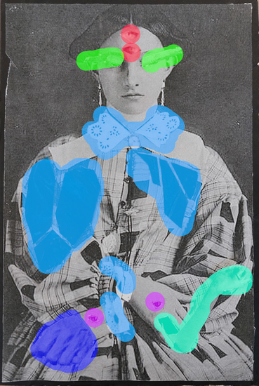
Creating My Own Readymades
I worked mainly on the photo on the left, cutting the photos on the right up to take the most interesting parts and combined them to create my own photo, a new mix of ideas.
|
|
Final Image (left)
I printed each picture that I had chosen and selected my favourite parts from each of them. I then cut them out using scissors and a scalpel and stuck them down to produce a surreal creation, a merger of each of the old photos. a selection of the best parts.
On the right is my image but each part that I rearranged or moved I have highlighted, each of the different colours indicating it has been taken from a different image.
|
|
Editing My Readymades
I did something I had never tried before and photocopied my readymade, I then printed it a number of times using only one colour. This created a good effect and by using the printer it made a change to using photoshop or my computer.
I first printed in black, orange and green before then printing red and green together to create a overlaying effect and green and yellow together to make another overlaying style.
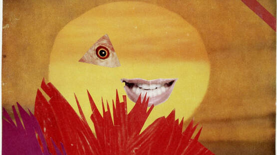
Hannah Höch
Hannah Hoch, 1889-1978 is a German born artist, known for her political collages and photomontages, a form that she helped pioneer. She produced her art mostly in the German Weimar period, in the Dada movement. Photomontage, is a type of collage in which actual photographs, or photographic reproductions pulled from the press and other widely produced media and repurposed to form a collage.
The Dada movement formed in 1915 in Zurich, Switzerland was an artistic movement that rejected monarchy, militarism, and conservatism. Dadaists felt that art should have no boundaries or restrictions and that it can be new, playful and involved with the current culture and politics. These sentiments arose after the Great War, which caused society to question the role of government, and to reject militarism after seeing the atrocities of war. Many Dada pieces were critical of the Weimar Republic and its failed attempt at creating a democracy in post-WW1 Germany.
The Dada movement formed in 1915 in Zurich, Switzerland was an artistic movement that rejected monarchy, militarism, and conservatism. Dadaists felt that art should have no boundaries or restrictions and that it can be new, playful and involved with the current culture and politics. These sentiments arose after the Great War, which caused society to question the role of government, and to reject militarism after seeing the atrocities of war. Many Dada pieces were critical of the Weimar Republic and its failed attempt at creating a democracy in post-WW1 Germany.
|
Image Analysis
The title of this piece is called Kleine Sonne (Little Sun). It is by Hannah Hoch. It was created in 1969. It is an example of an abstract Collage. The composition shows dark yellow or orange background. In the centre is a lighter yellow circle. Inside the circle are two collaged images, a triangle with an eye in the centre and a cut out smiling mouth. At the bottom and left of the image is a collage of what looks like red and purple coloured plants. The focal point of the image must be the cut out mouth and eye placed in the centre. The technique used here is collaging. The colours in the image are mostly warm and mostly yellow with a range of reds and purples. The texture in the picture looks mostly rough but smooth in parts, I think this is because of the rugged nature of their collage style. The image makes me feel like on edge like I'm being watched or followed. |
|
Photos I will use to create the Collage
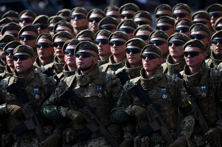
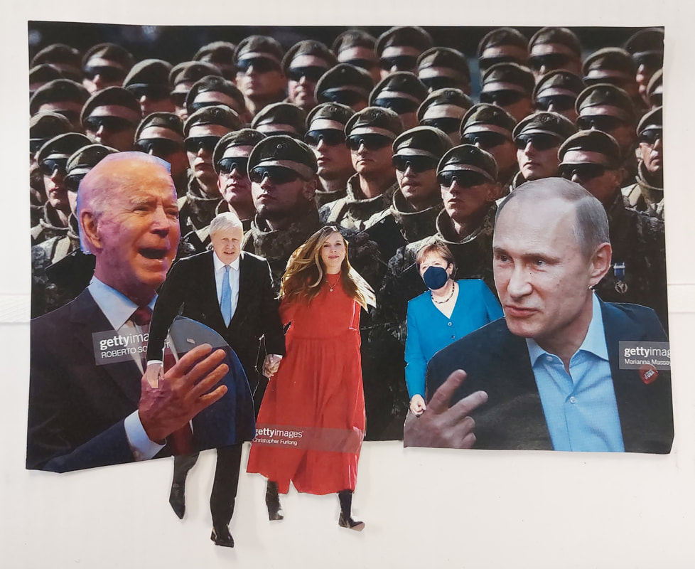
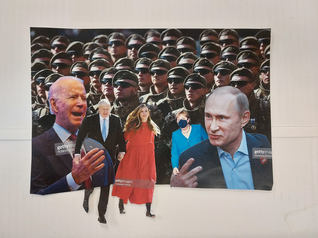
I chose to use these 5 pictures to create a collage that focuses on the biggest news in politics at the time.
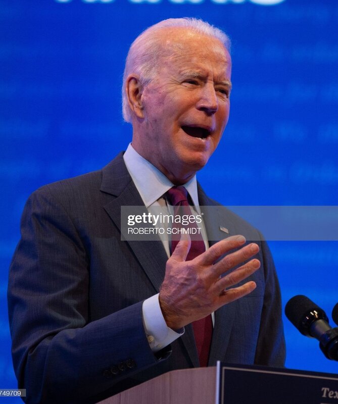
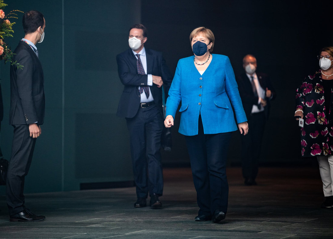
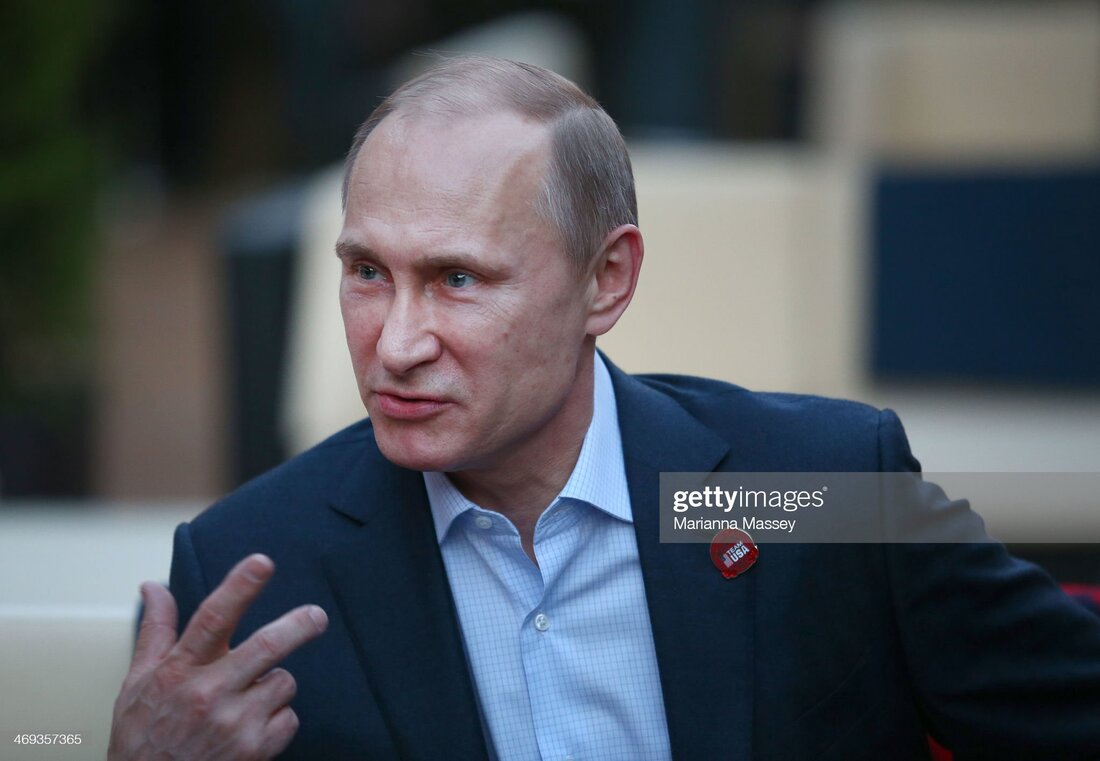
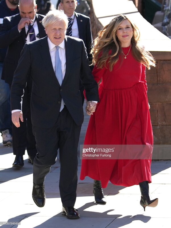
So, the biggest thing on the news at the time was the Ukraine Crisis, and so I used a picture of the Ukrainian army, printed it and used it as the background. Also related to Ukraine I decided to use 2 pictures of Joe Biden and Putin, I printed these pictures quite large and places them on the left and right hand sides of the collage. The last remaining things in the news was Boris Johnson and his wife Carrie Johnson, and the transition of power in Germany away from Angela Merkle and towards the SPD. For these images I printed them, delicately cut them out and placed them in two places either side of the other world leaders, this was just a way to make the collage fit better and look more professional.
So, the biggest thing on the news at the time was the Ukraine Crisis, and so I used a picture of the Ukrainian army, printed it and used it as the background. Also related to Ukraine I decided to use 2 pictures of Joe Biden and Putin, I printed these pictures quite large and places them on the left and right hand sides of the collage. The last remaining things in the news was Boris Johnson and his wife Carrie Johnson, and the transition of power in Germany away from Angela Merkle and towards the SPD. For these images I printed them, delicately cut them out and placed them in two places either side of the other world leaders, this was just a way to make the collage fit better and look more professional.
My Final Collage

Review of my Hannah Höch work:
WWW: I like the final collage that I created. I believe that my use of politics and that my positioning of the images created a good depiction of Höch's work while still keeping it with some of my own differences.
EBI: I should have used more or other images to create a second collage that looked at the other, abstract side of Höch's work, similar to the image of hers that I analysed. I also wish I could have found images without watermarks but this is not much of a problem.
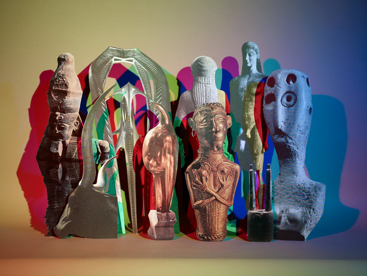
Matt Lipps
Matt Lipps was b. 1975 in Oakland, California. Lipps is a collector of images from books and magazines which he cuts out from their original texts to create new three dimensional assemblages. Lipps took his BFA in Photography from California State University, Long Beach in 1998. He now teaches at the University of California, Los Angeles and at San Francisco State University.
Matt Lipps has spent the past decade focusing on the relationship between sculpture and photography. His photo-sculptures "simultaneously catalogue, lament, and celebrate photography's 21st-century transformations." Lipps uses cut-out images that he finds in discontinued photographic publications and magazines, arranging these images to create still life photographs. He then photographs these scenes using a large format analogy camera.
Matt Lipps has spent the past decade focusing on the relationship between sculpture and photography. His photo-sculptures "simultaneously catalogue, lament, and celebrate photography's 21st-century transformations." Lipps uses cut-out images that he finds in discontinued photographic publications and magazines, arranging these images to create still life photographs. He then photographs these scenes using a large format analogy camera.
|
Image Analysis
The piece is untitled, it was created in 2010 by Matt Lipps. I would say this is an example of abstract found photography. The composition shows a number of cuttings from newspapers or magazines, including: sculptures, paintings, other artwork and a person on the left who is looking up to the right. The background of the image is a deep red/orange colour, a number of lights are faced to the clippings creating large shadows over the background. The focal point of the image is the statue of the body in the centre, the contrast of the white of the statue compared to the bright colours of the artwork and other clippings. The techniques used here are artificial lighting, angle and height, specific use of space, the cutting and creating of a 3D collage. The colours in the image are a warm background but mostly colder colours in the clippings, using a range of tones to create a great contrast between the colours and between the background and foreground. The patterns I can see in the image are created by the strangely shaped clippings in the centre of the photograph and the different shadows on the deep background. I think the texture in the picture looks soft and smooth. The image makes me feel relaxed and peaceful. |
|
Making Day - 3D collages
Previously known as mock exam day
Before the exam day:
On the exam day:
- Take a series of photographs of subjects relating to your Human Condition theme.
- Print these out.
On the exam day:
- Cut them up and re-arrange them as a 3D construction – remember to take photos of the processes as you go along.
- Re-photograph your collage construction and print this image out again.
- You could experiment with photographing the whole construction or selected parts of it. Consider lighting, angles and crops.
- You could even experiment with re-photographing your photograph (either a printed image or on screen)
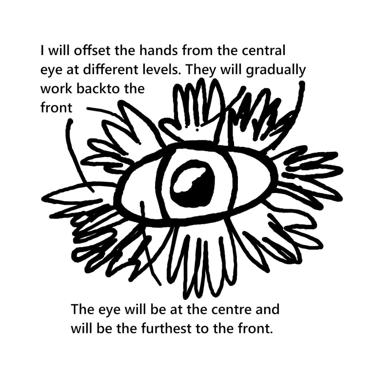
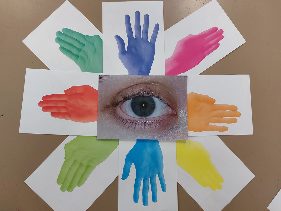
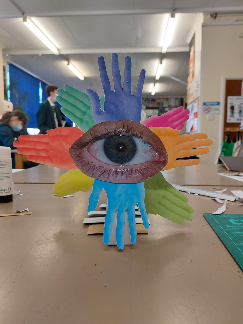
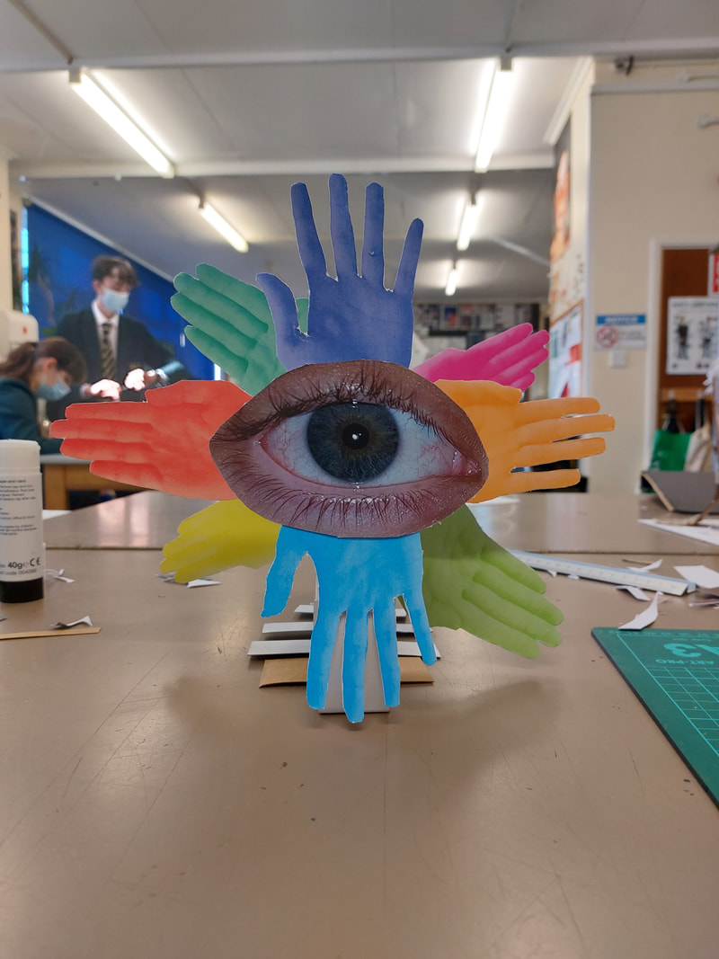
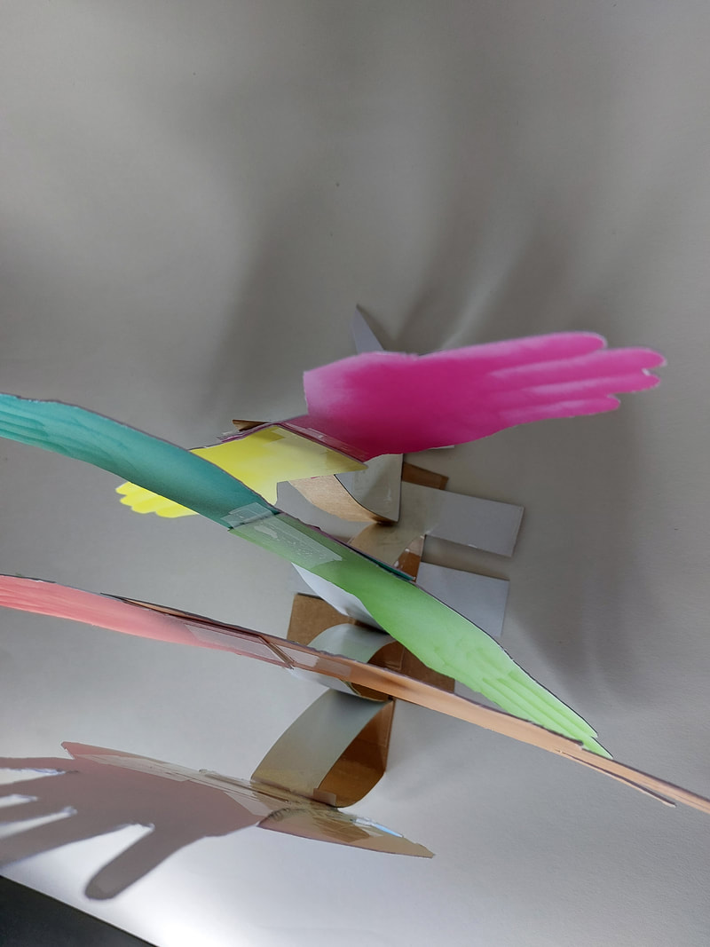
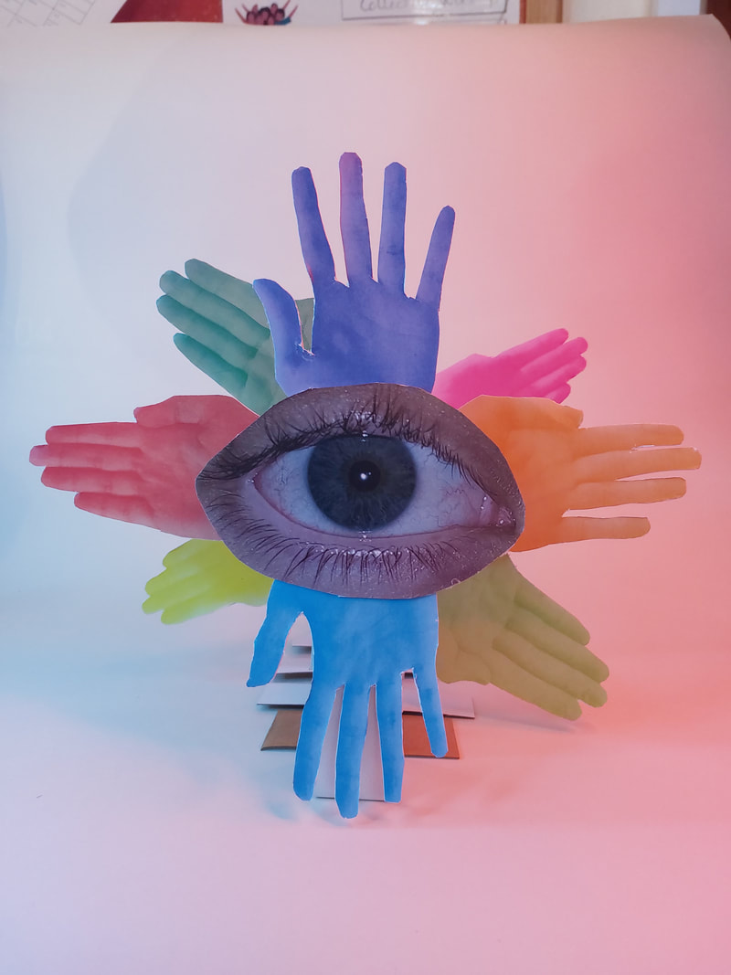
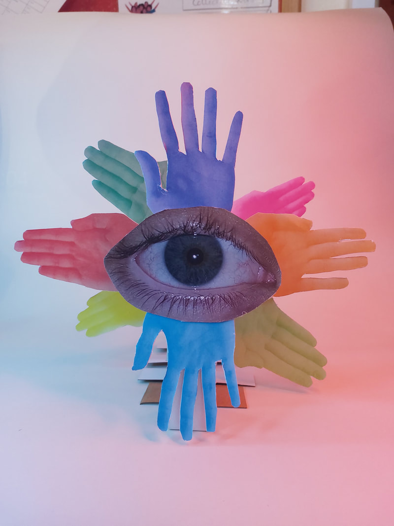
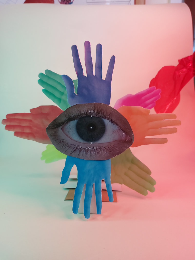
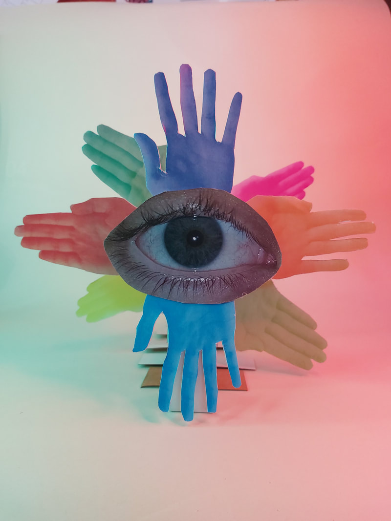
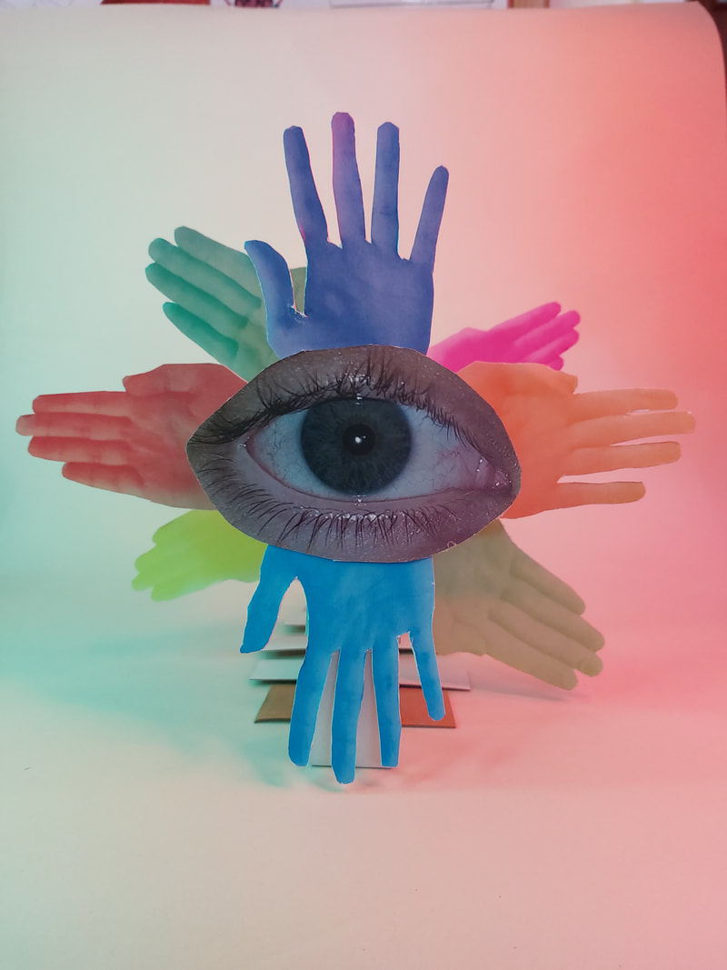
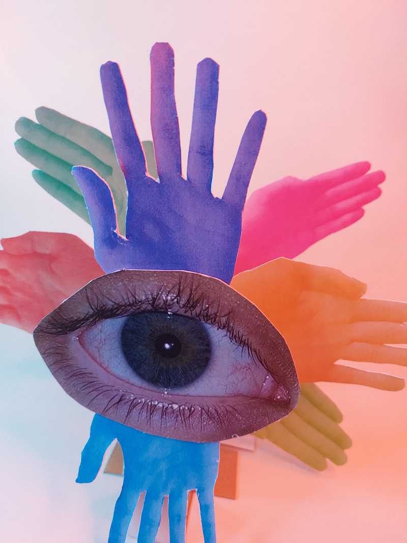
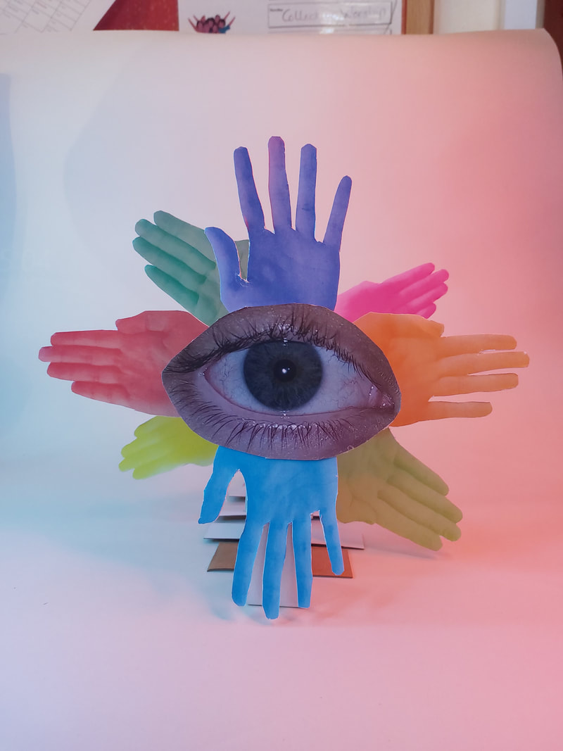
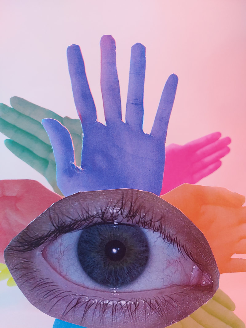
My Plan
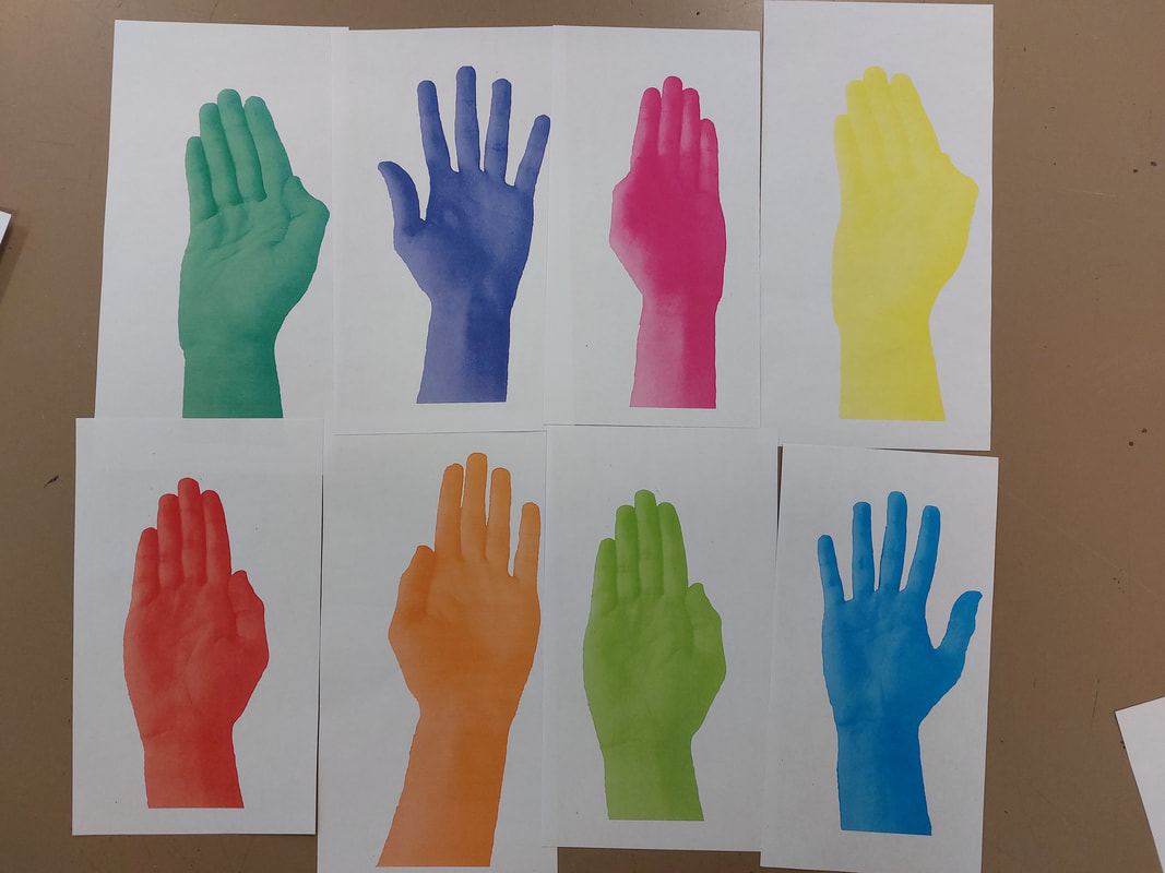
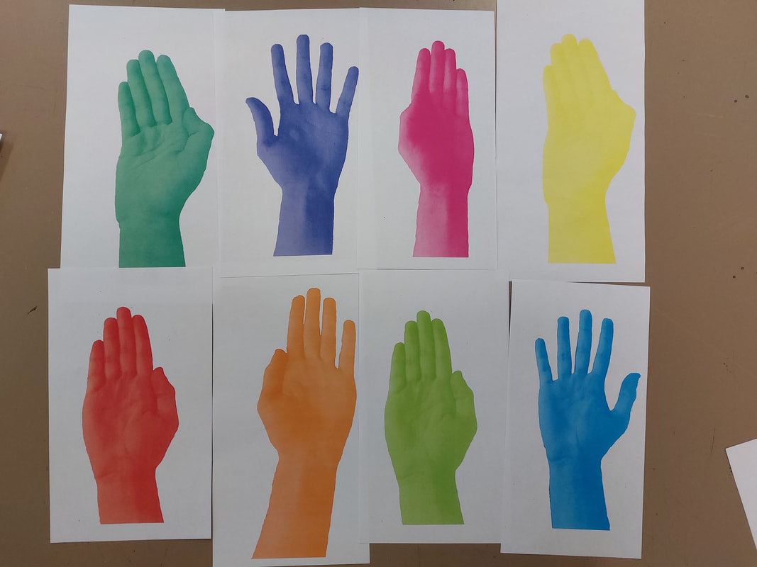
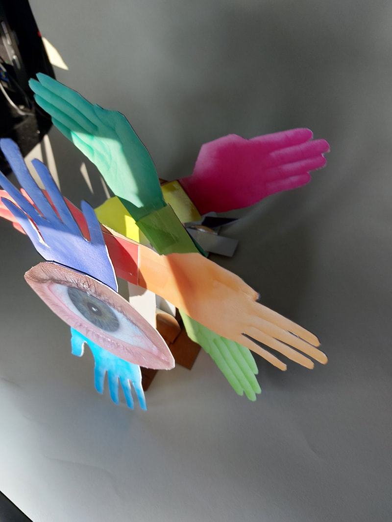
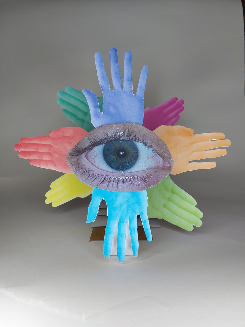
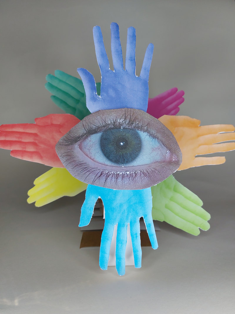
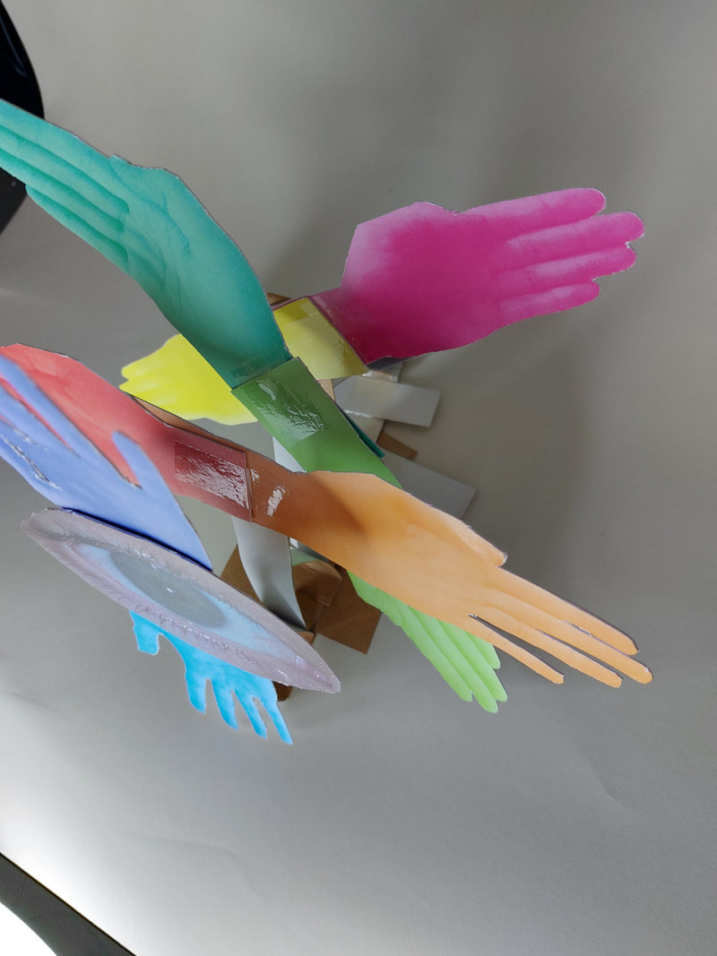
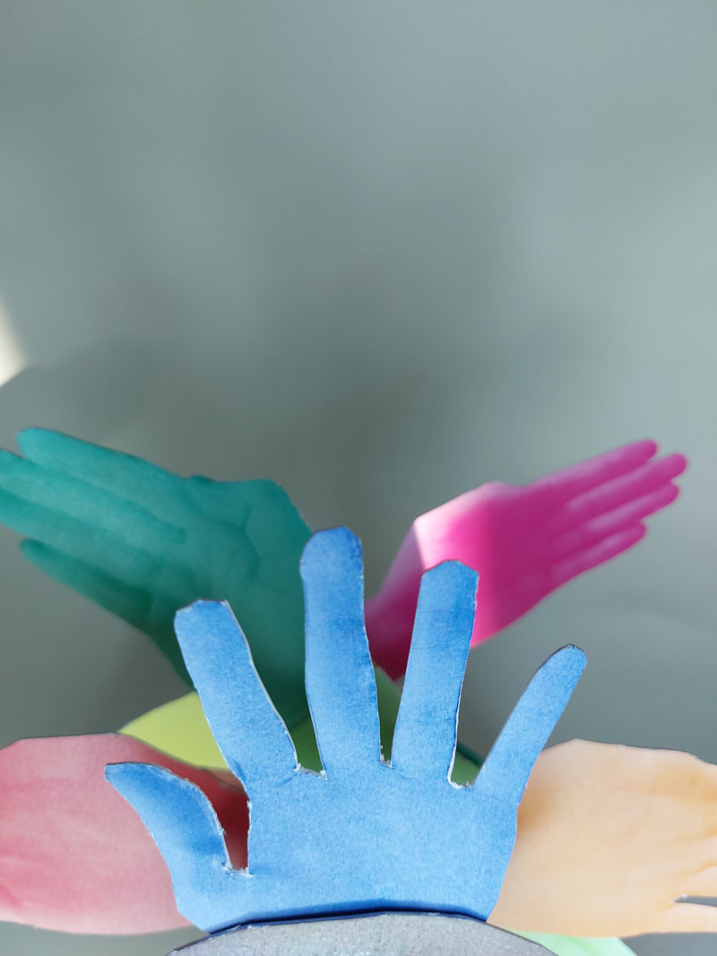
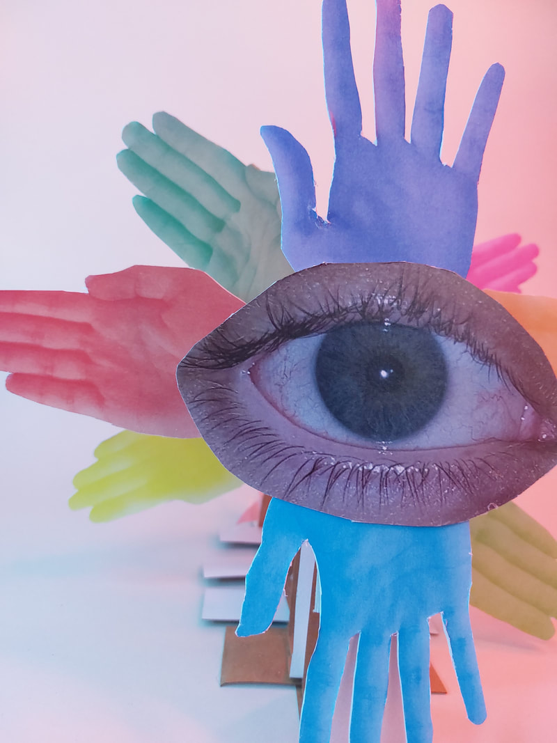
I will offset the hands from the central eye at different levels, they will gradually work back to the front.
The eye will be at the centre and will be the furthest to the front.
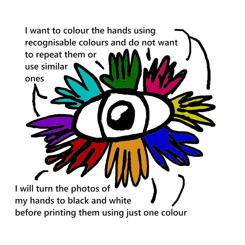
I want to colour the hands using recognisable colours and do not want to repeat them or use similar ones.
I will turn the photos of my hands to black and white before printing them using just one colour
The eye will be at the centre and will be the furthest to the front.
I want to colour the hands using recognisable colours and do not want to repeat them or use similar ones.
I will turn the photos of my hands to black and white before printing them using just one colour
|
|
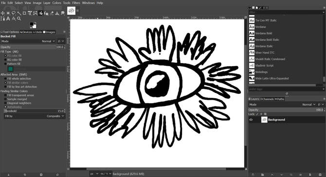
To create my plan I used the ink pen and fill tool of Gimp Photoshop. I then used the text tool to write on top of my drawing.
|
|
My shoot for my final piece
Making my final project
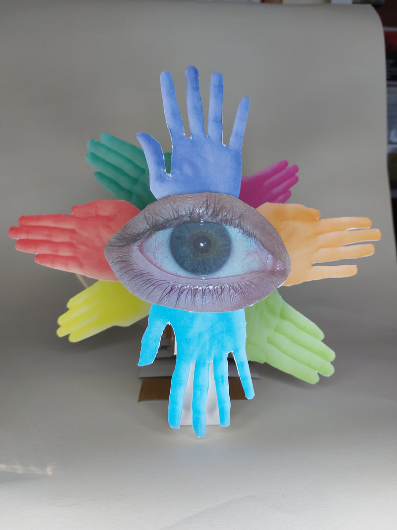
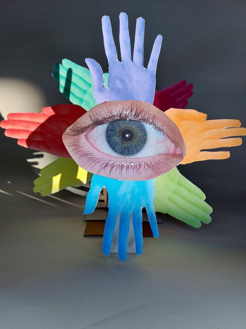
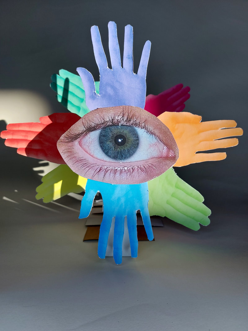
'Biblical Angel'
Production and creation
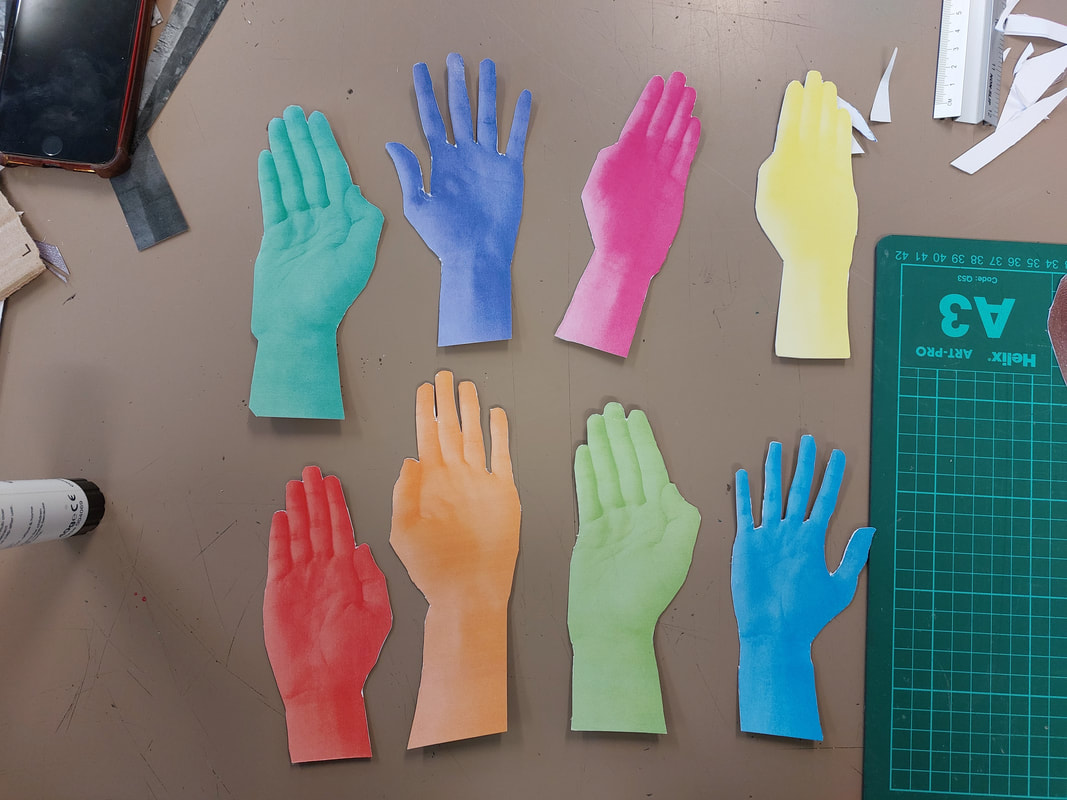
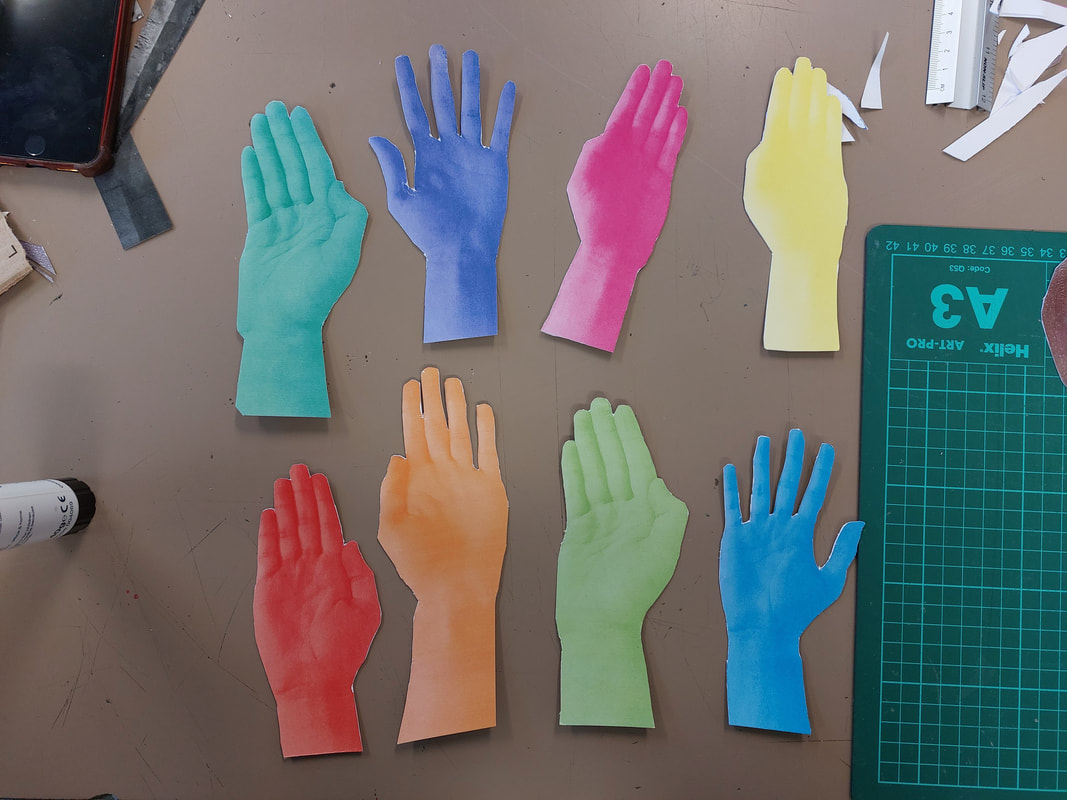
I turned each hand photo to grayscale using Gimp Photoshop.
I then printed my photo using just one colour, a special ability that the school printer has. This created the effect that I was looking for and by using the printer it made a change to using photoshop or my computer. It was also helpful as I was able to learn new skills. I placed the photos into the shape that I planned.
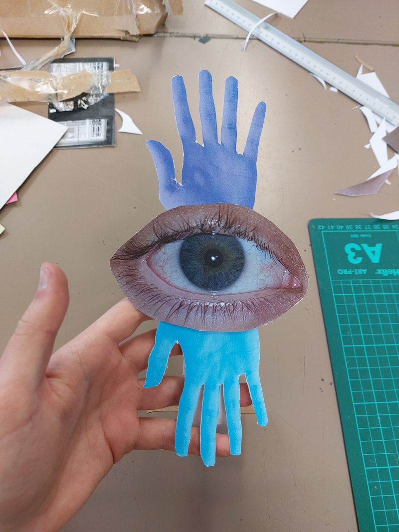
I stuck the paper hands and the eye onto card so they were more sturdy and then cut each one out.
I turned each hand photo to grayscale using Gimp Photoshop.
I then printed my photo using just one colour, a special ability that the school printer has. This created the effect that I was looking for and by using the printer it made a change to using photoshop or my computer. It was also helpful as I was able to learn new skills. I placed the photos into the shape that I planned.
I stuck the paper hands and the eye onto card so they were more sturdy and then cut each one out.
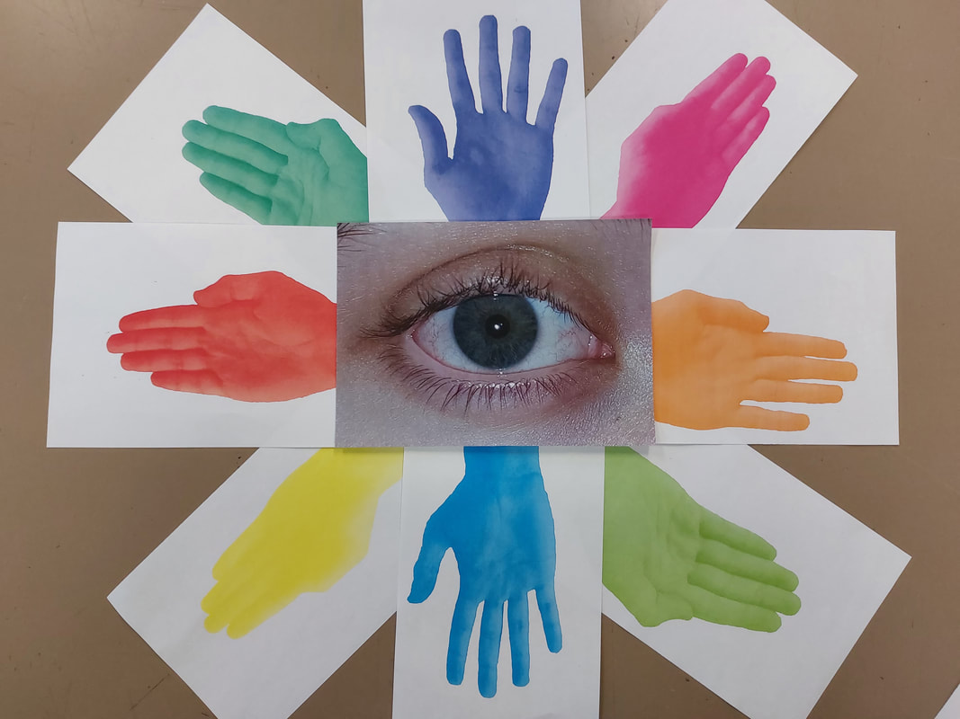
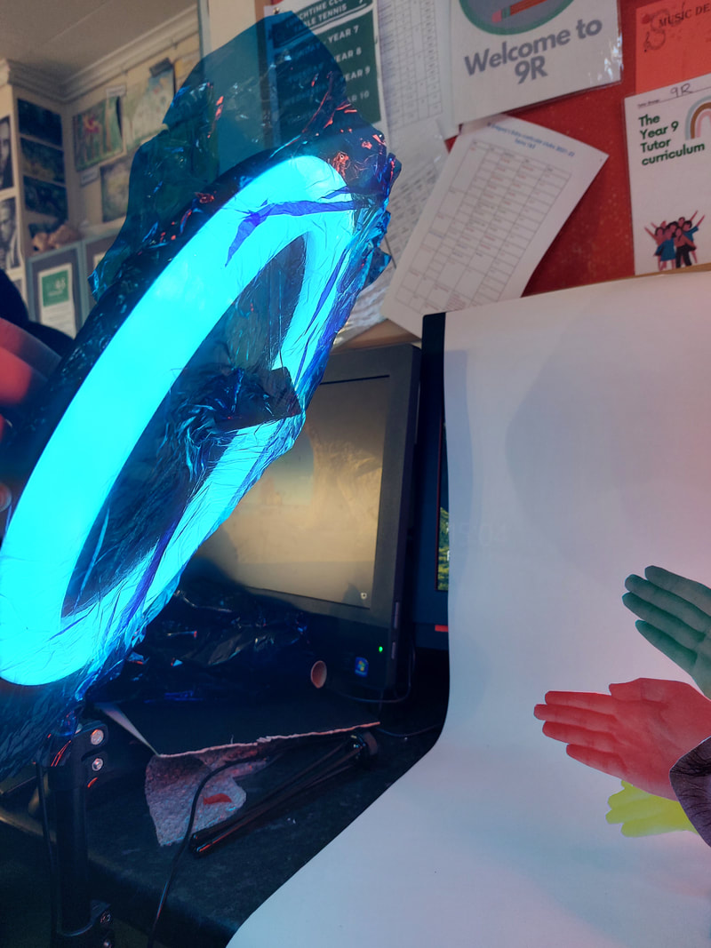
As our task was to create a 3D image out of 2D photographs I had to create a stand that could hold the up and also not fall over, all while being easily disguisable. To created mine using card and to avoid having to make a stand for each hand I stuck them together in pairs. I placed them each behind one and other in a row and used the first bottom blue hand to disguise the front stand, and in turn each other stand was also hidden.
Taking My Final Photos
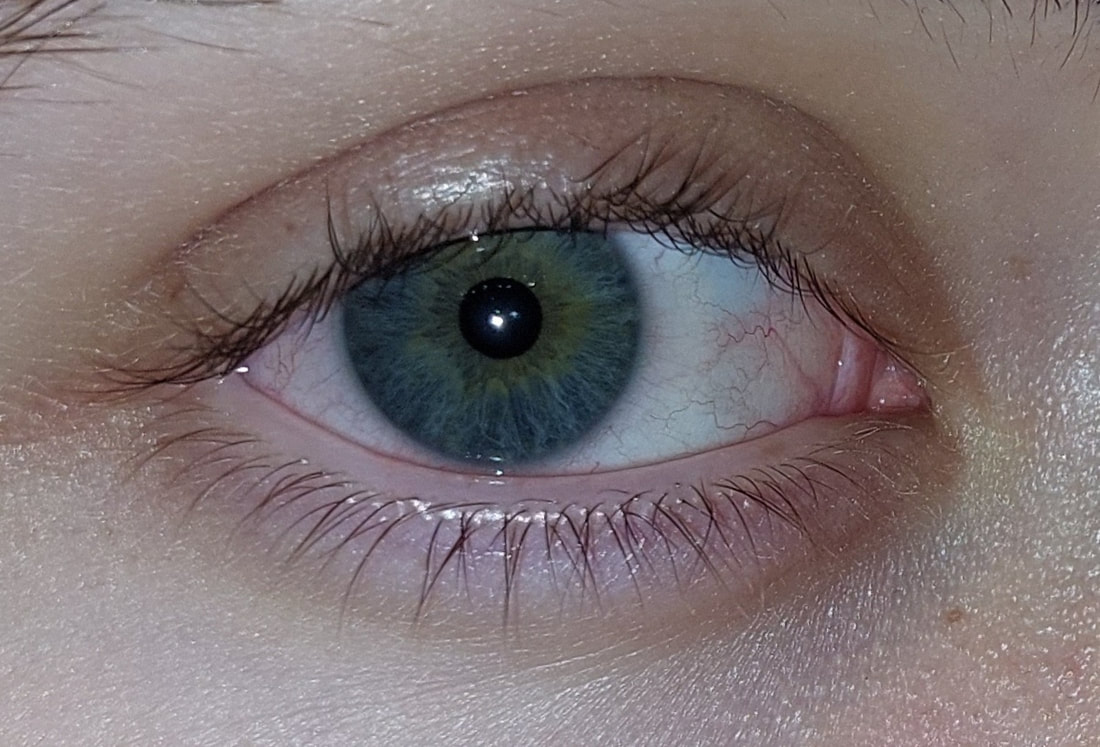
I placed my photos in front of a white sheet of paper and used 2 ring lights to evenly spread the light, but a ray of natural light was shining through the window onto the my model. At first I covered it but I think the shadow over the eye made it look boring and it dulled the colours. I stopped covering the sunlight an I really liked the shadows and colours that it produced on my model. I think that it makes them look as if the eye is actually glinting and shinning .
I placed my photos in front of a white sheet of paper and used 2 ring lights to evenly spread the light, but a ray of natural light was shining through the window onto the my model. At first I covered it but I think the shadow over the eye made it look boring and it dulled the colours. I stopped covering the sunlight an I really liked the shadows and colours that it produced on my model. I think that it makes them look as if the eye is actually glinting and shinning .
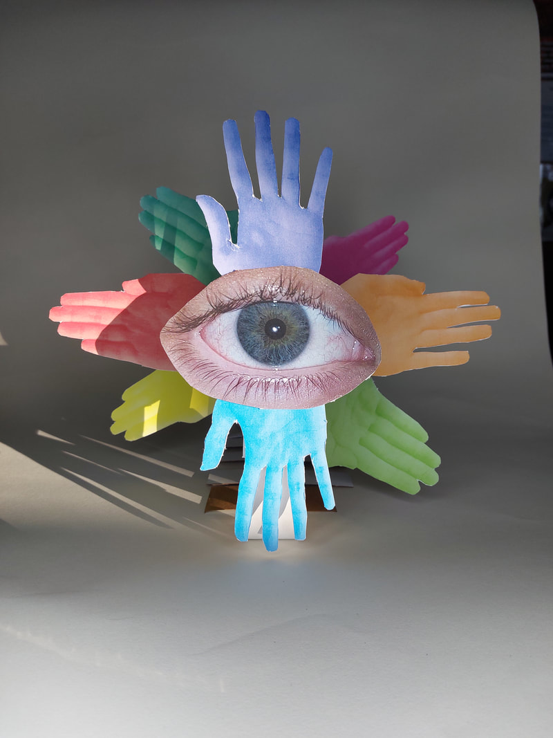
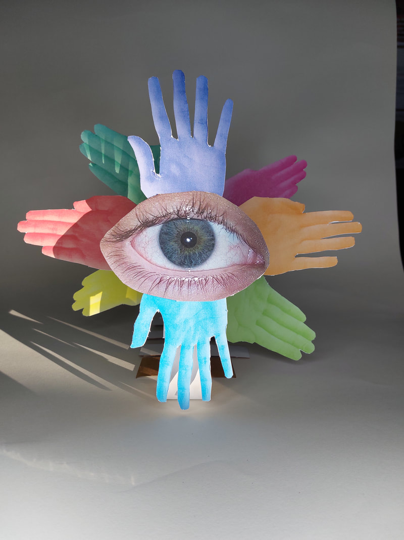
I wanted to take more photos but also to improve and change them from my first shoot.
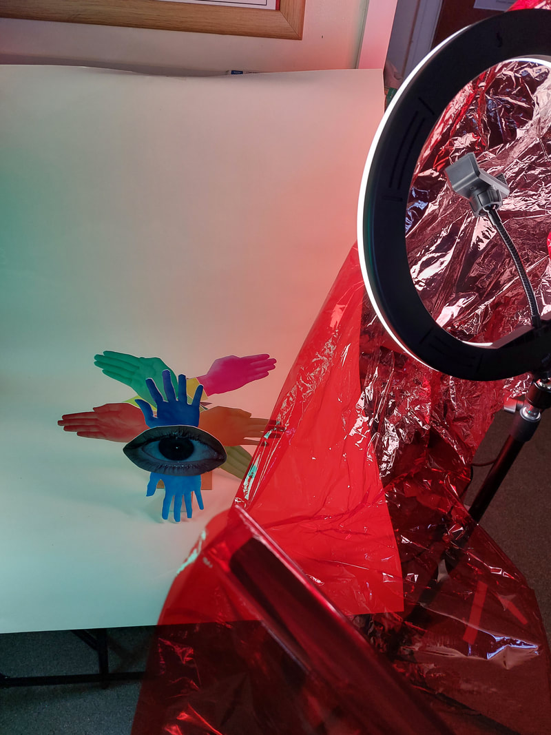
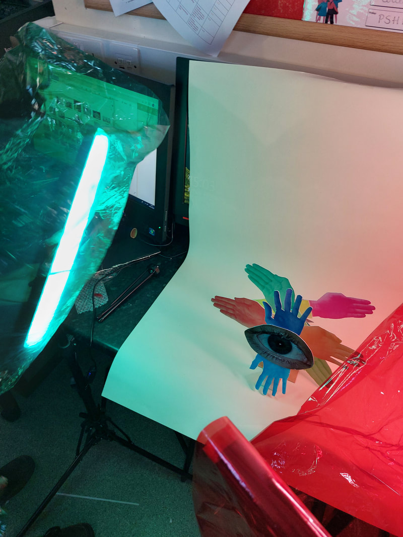
To take the next photos we placed coloured gels over the white ring lights, this changed the background colours and created different shades on the coloured parts of my model. I really like the way that these photos turned out and the way that it changes the feelings that they give off. I also like that because of the ring lights the model does not have shadows unlike on my other images, this, mixed with the coloured lights I think really is an improvement to my shoot.
To take the next photos we placed coloured gels over the white ring lights, this changed the background colours and created different shades on the coloured parts of my model. I really like the way that these photos turned out and the way that it changes the feelings that they give off. I also like that because of the ring lights the model does not have shadows unlike on my other images, this, mixed with the coloured lights I think really is an improvement to my shoot.
My favourite Photos
I chose my favourite photos and edited them to create my final photos.
I used Gimp Photoshop to edit the photos using the curves and crop tools but also another couple that improved shadows and vividness of the colours.
I chose my favourite photos and edited them to create my final photos.
I used Gimp Photoshop to edit the photos using the curves and crop tools but also another couple that improved shadows and vividness of the colours.
|
|
The Final Images


Review for Making Day:
WWW: I believe that this photo shoot and final piece was very successful. I loved the colours and shadows that were created. I also like the way it reflected the work of the photographer that I have been working with as inspiration.
EBI: I could have taken more photos especially of the prosses of creating the image through the arts and crafts part of the day. I should have showed the printing technique.
Full Project Evaluation
I have been investigating the main theme 'Human Condition' through photographers and artists that use the idea of Readymades.
For this Unit I have researched lots of photographers for inspiration, such as Matt Lipps, Marcel Duchamp, Michael Wolf and Hannah Hoch. I explored these photographers' styles as inspiration to develop an idea of what sort of images work for my theme. Another photographer whose work I have explored is Kensuke Koike. We found him whilst researching photographers/artist that used ReadyMades. For me, his images stood out because I liked his use of cutting and the way he shaped his images. His images influenced my final piece as I also tried to use the cutting and moving of my photos to create a greater, larger image. Another photographer that significantly inspired my project was Man Ray as his work with 'rayograms' and hands had a large influence on what I wanted from my photos how I used them to create my final piece.
Over the last few months, I have experimented with a wide range of materials, techniques and processes for the unit. They include: Cyanotypes, photograms, and my DSLR and phone camera but mostly I have been experimenting and leaning new skills with photoshop. I have been refining my initial photos from each shoots and have been attempting to learn from each one and get better at every attempt.
To improve on the entire project, I believe I needed to produce a more in depth response to each photographer that we looked at. Although I do not think that my level of work has been to different to when I have looked at other projects or themes. Overall I could have had a more cohesive and similar themed set of images, but this was difficult because I did not feel sure in what I was aiming for by the end of my overall theme. Despite all of this I really did enjoy this project because I could see how it was so different to standard photography and the incorporation of artists and abstraction brought the project to life. I also enjoyed my use of the printer and the work that we completed through cutting and collaging.
The final piece of my project, that I have since named ‘Biblical Angel’. I recognised what I had created using the coloured hands and the eye in the centre is a biblical image representing an original description of angels. I feel this process of making connects with the Dadaists Marshal Duchamp, Hannah Hoch and Man Ray and their use of seemingly random (unconscious) objects and images spliced together in photomontage, to create a new image that we perhaps recognise or have seen before. I therefore believe that this was the most successful part of the entire project.
My Final Piece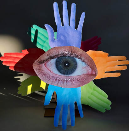
|
Angels depicted in the Bible
|
Human Condition - Extended
Threshold Concepts
What are Threshold Concepts?
https://www.photopedagogy.com/threshold-concepts1.html
Threshold Concepts are the BIG IDEAS that will help students develop a deeper understanding of photography. They are not meant to be instantly understood. Once opened, they introduce students to troublesome knowledge; a new way of seeing the subject they are studying.
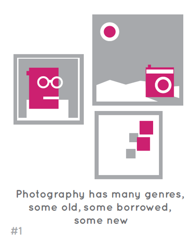
Photography has many Genres, some old, some borrowed, some new
Photography has many genres, some of which are borrowed from painting (e.g. still life, portraiture, landscape). Some are special to photography (e.g. photojournalism). Artists/photographers often play with our expectations about genre for creative purposes. 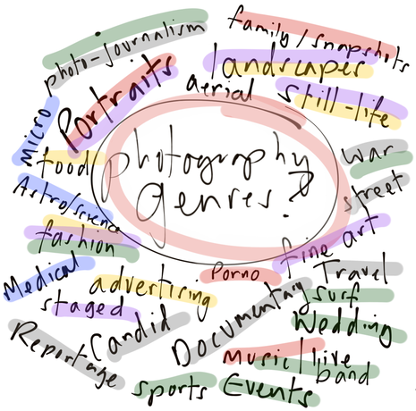
|
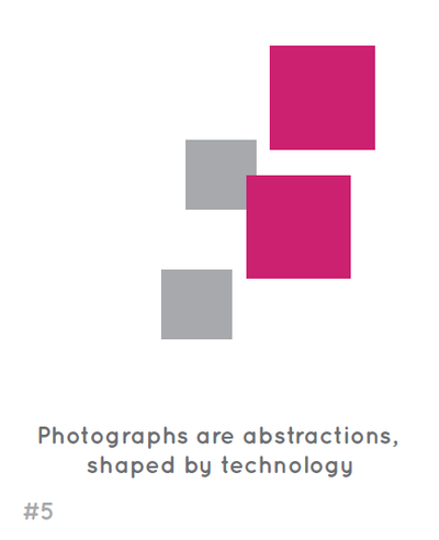
Photographs are abstractions, shaped by technology
Cameras ‘see’ the world differently to the way we see the world with our eyes. Photography is able to generate an almost perfect illusion of reality. We tend to see only the subject depicted rather than the photograph itself. However, all photographs are, to some extent, abstraction. The flatness of photographs creates relationships between objects that may not have existed in reality. All photographic images have been shaped by the technology the photographer chooses and by a process of selection, editing and manipulation. Each and every photographic image is therefore made or constructed, rather than being a window onto the world. 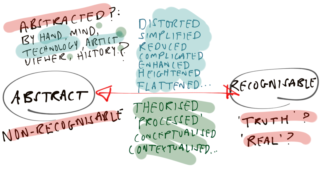
|
Tabletop Sculpture's - Still Life
Jan Svoboda
|
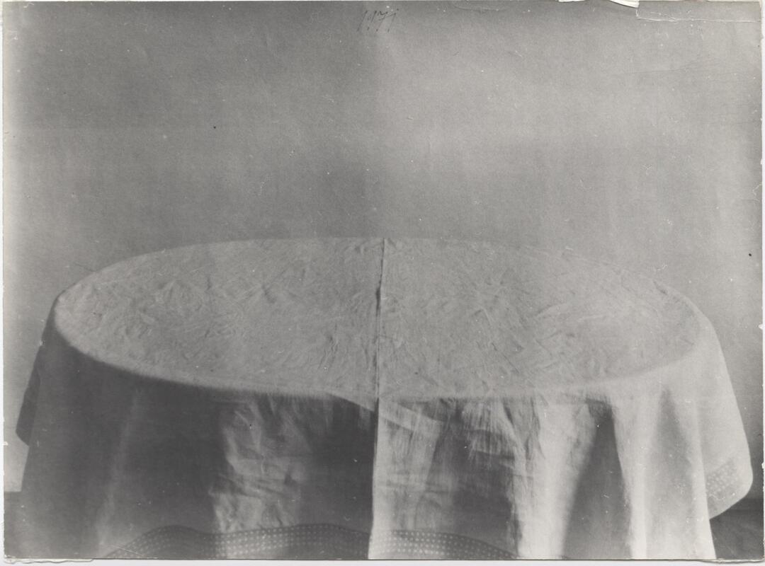
The Czech artist/photographer Jan Svoboda lived and worked in the same space. His photographs feature the spaces and objects that were familiar to him every day. He also photographed his own torn and damaged photographs, sometimes scattered on the floor or pinned to a wall. Svoboda's tables (he seemed to own several) function as surfaces for still life arrangements and are often draped with cloths. However, the table itself is also the subject of many photographs. It's an amazing example of how an entire body of work, a whole lifetime, can be spent making photographs in one space with very few resources.
|
|
|
Image Analysis
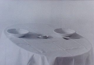
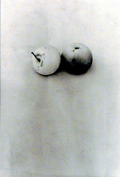
The title of this piece is TABLE XXX. It is by Jan Svoboda. It was created in 1970. It is an example of abstract interior photography. The composition shows a flat, rounded table, covered by a white table cloth. Behind the table you can see a wooden flooring. On top of the table cloth is a small pot or plate next to a small shrivelled fruit or vegetable. The light in the image is cast from off the left side of the photo, as a shadow is being cast from the objects on the centre in the table. The focal point of the image are the objects, placed at the centre of the table. The techniques used here are bright lighting, angle and height, negative space. The picture is in black and white. The patterns I can see in the image are created by the wooden floor in the back ground of the image and also the creases of the white table cloth. The texture in the picture looks soft and smooth on the table cloth but also slightly dirty but not as in it’s never been cleaned. The wooden flooring looks solid and cold. The photographer has used a film camera as it was taken in the 1970s. |
|
My Shoot
Shoot Plan
I missed taking the shoot in class and so will do it in my own time. I plan on using some objects usually used for still life art that represent my topic the best.
I don't want to only focus on recreating Jan Svoboda photos I want to make the objects seem strange and moulded together by taking the photos at different angles and by using close ups.
Shoot Review
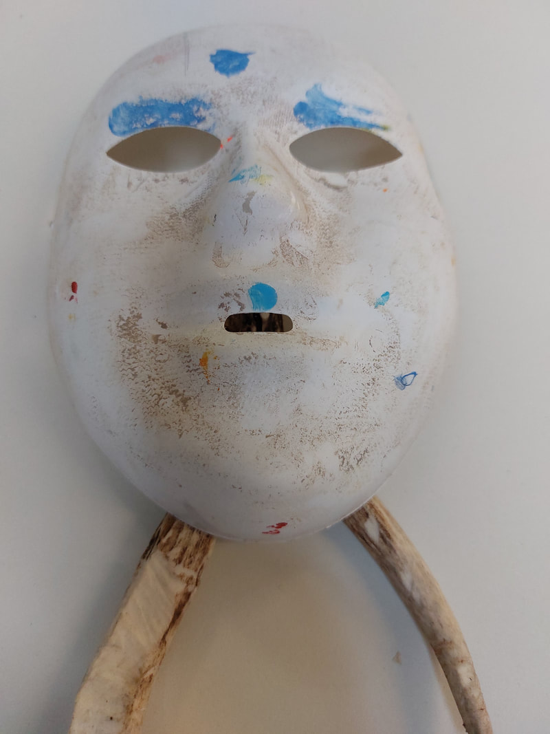
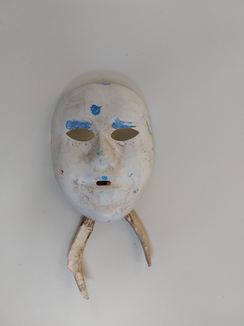
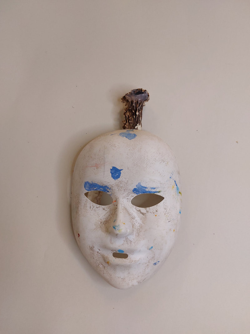
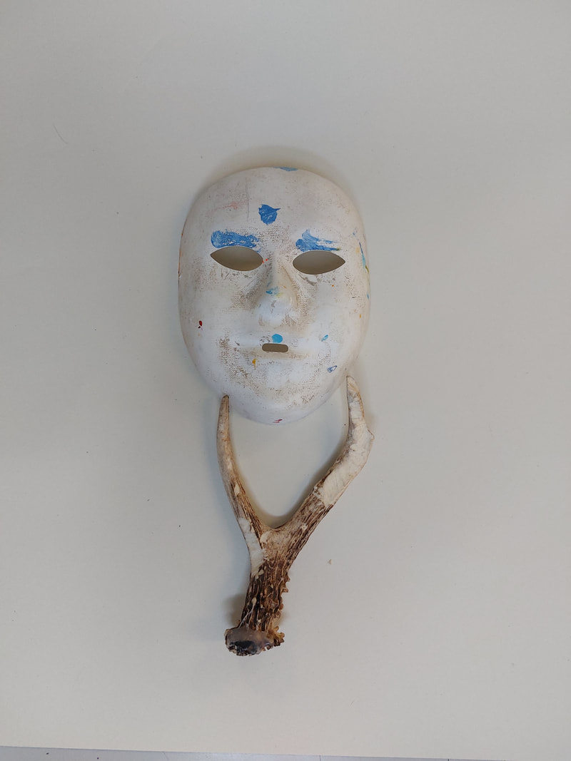
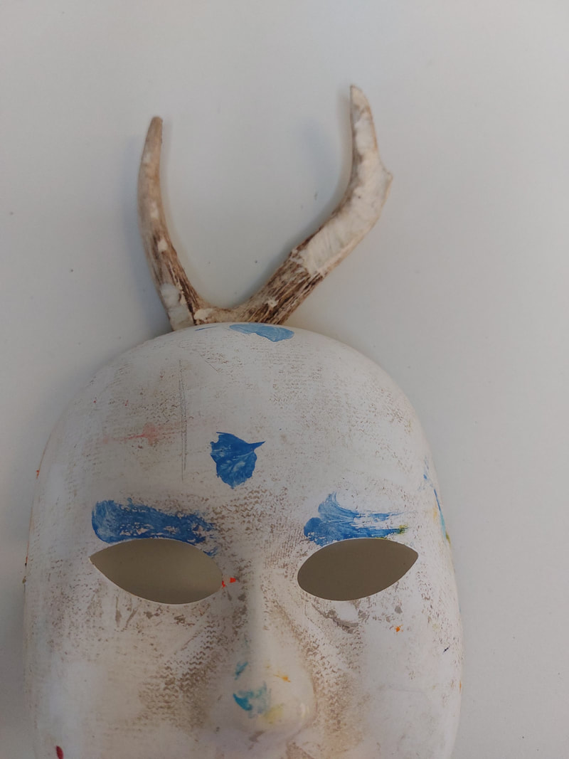
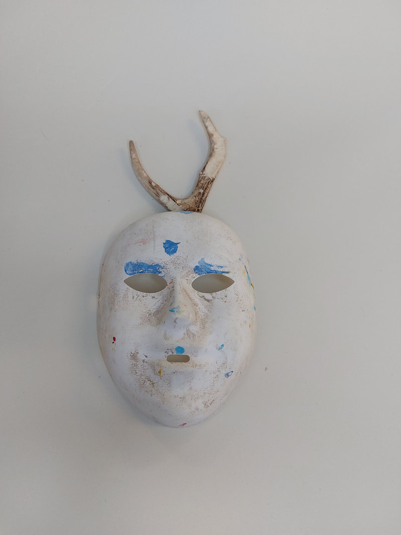
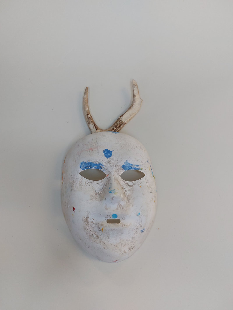
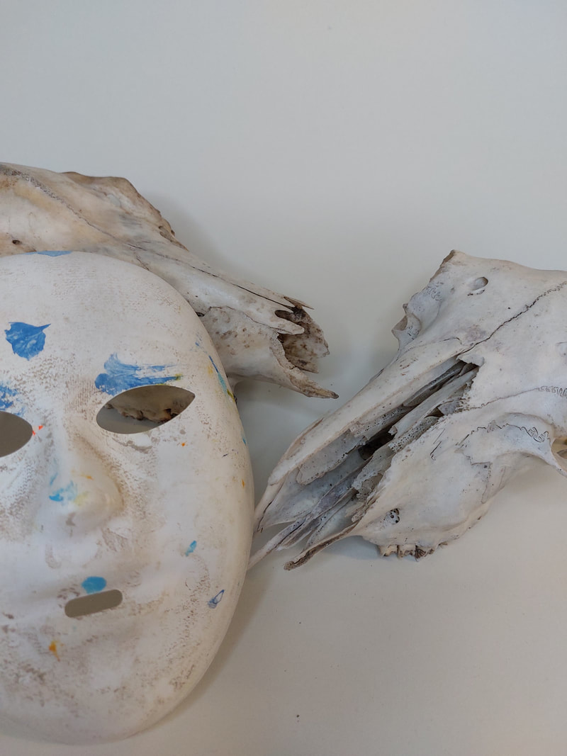
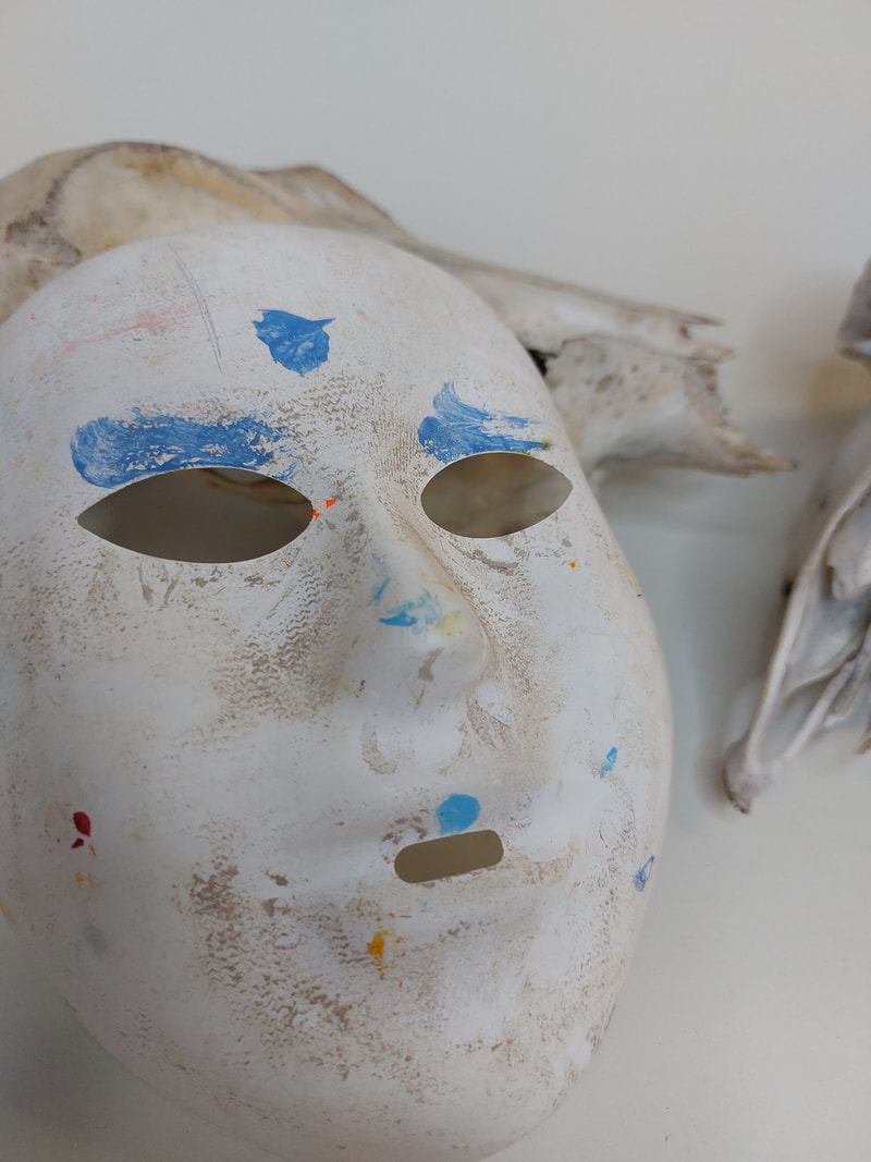
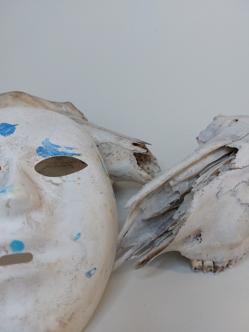
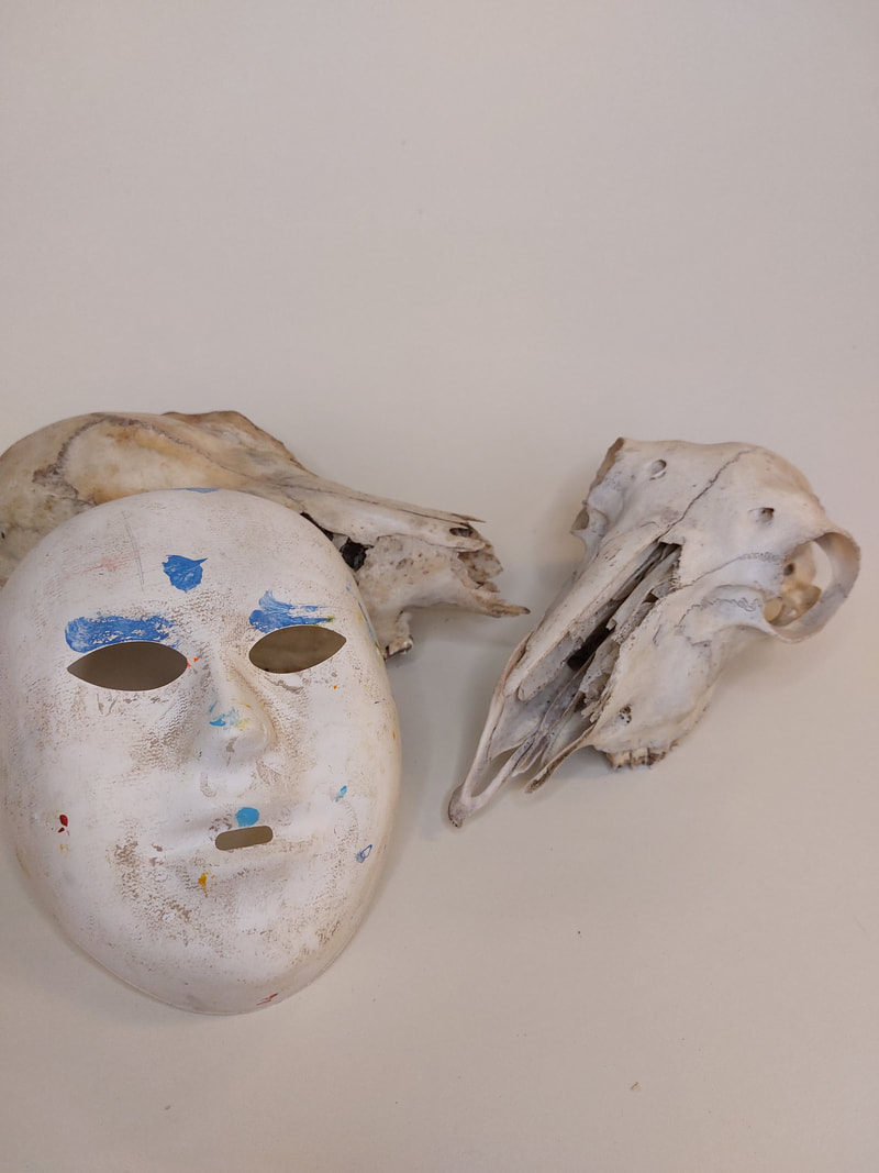
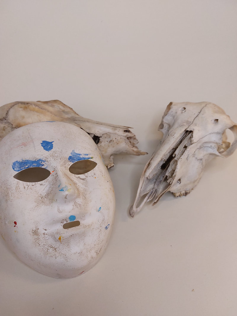
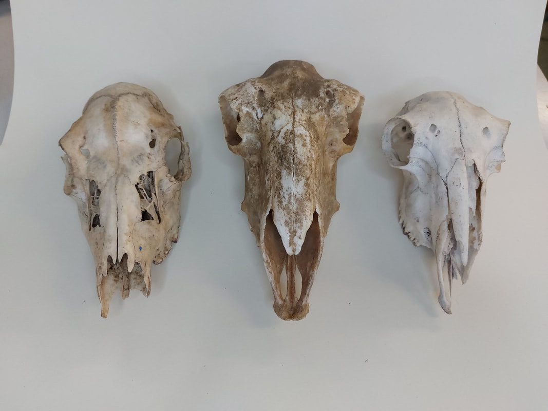
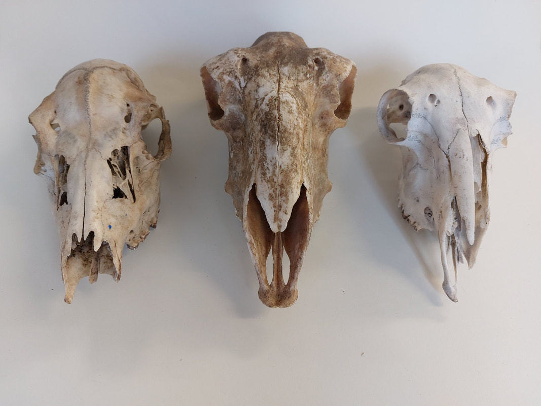
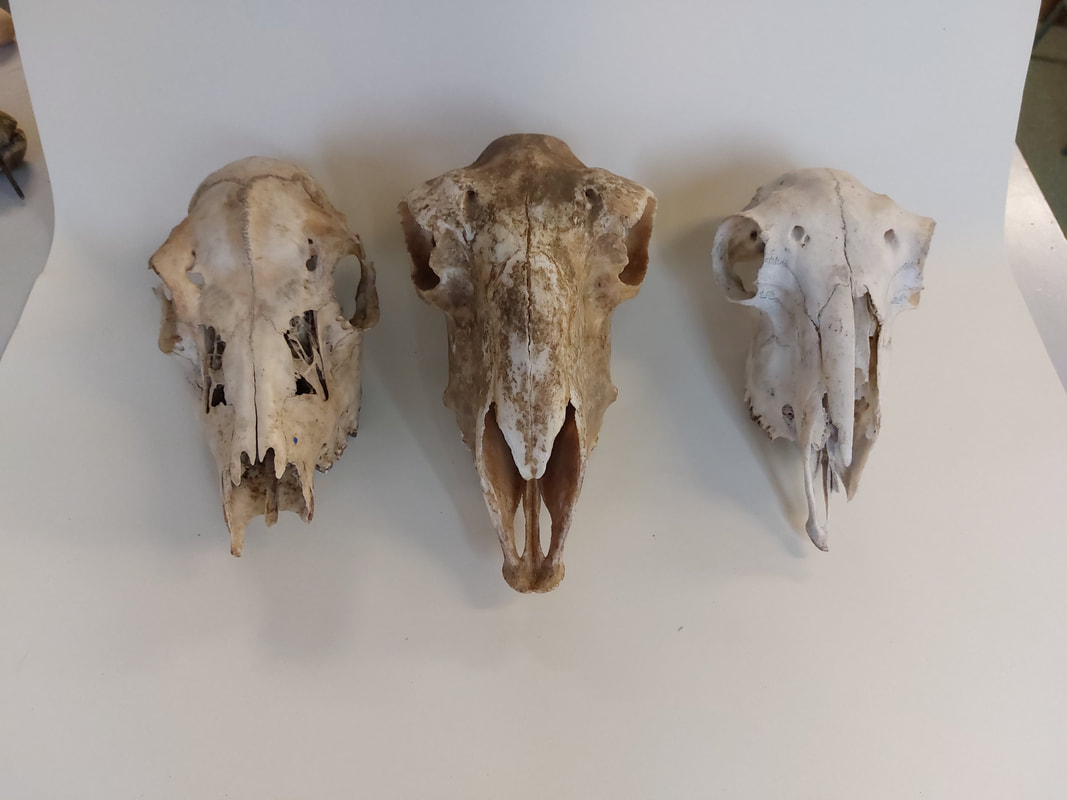
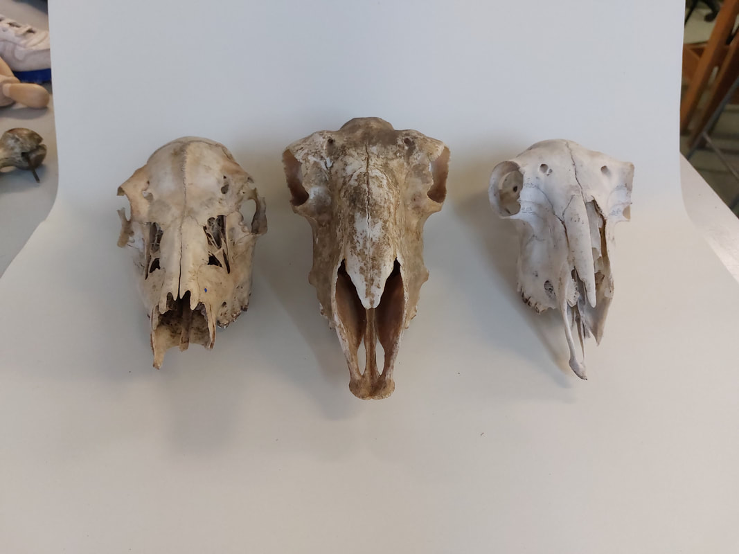
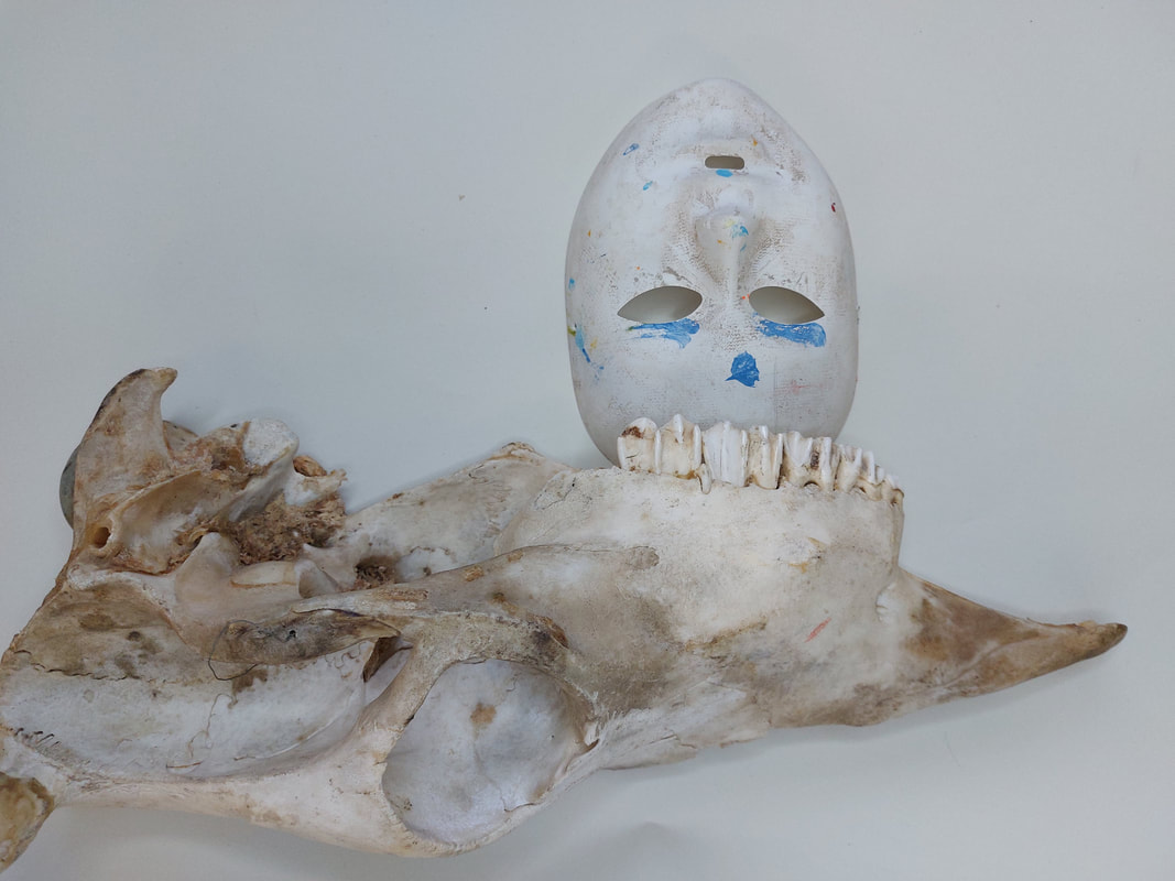
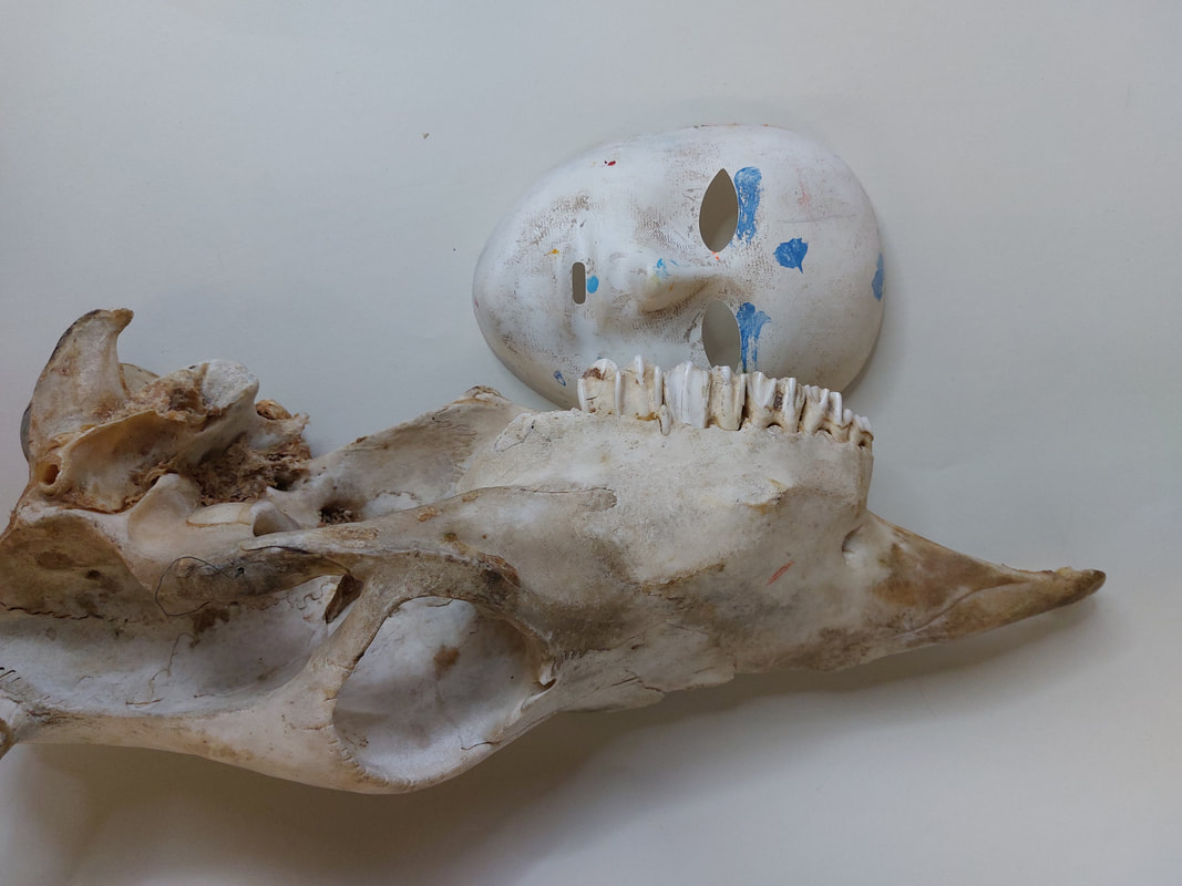
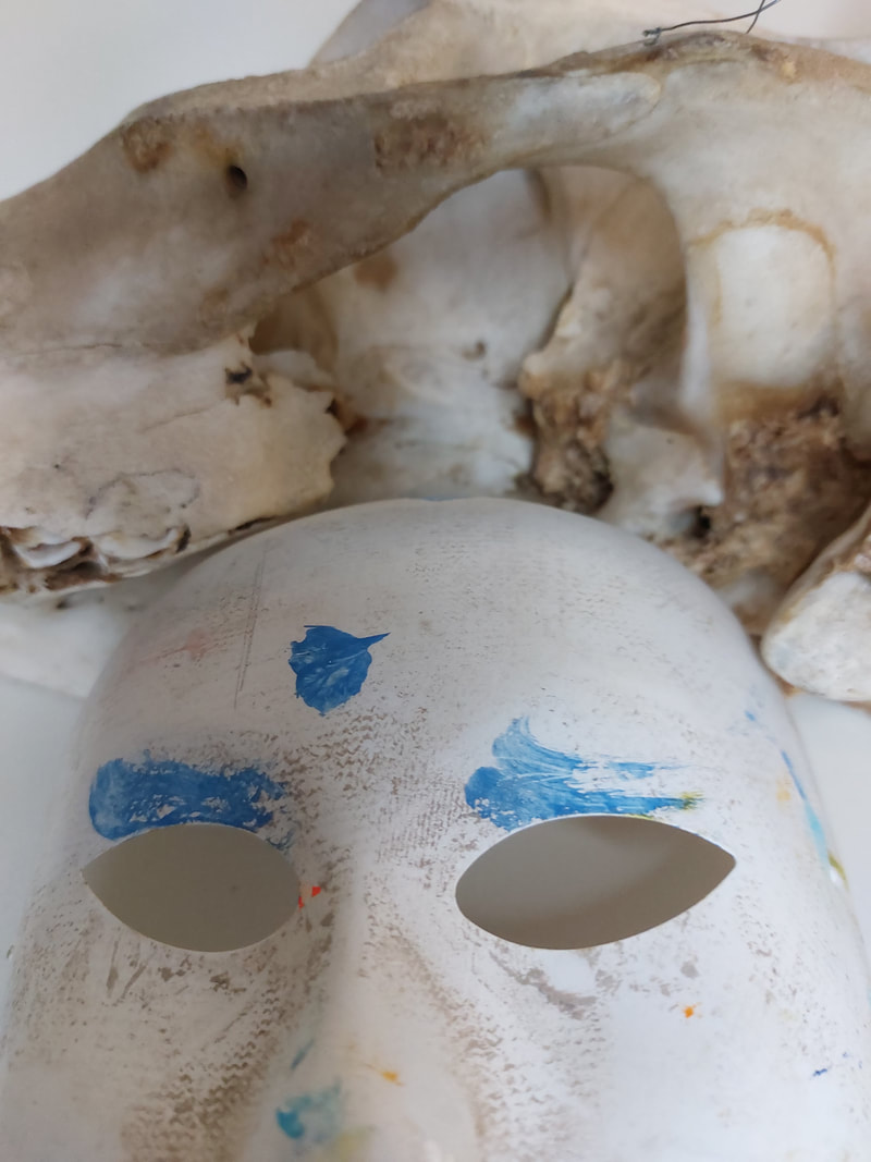
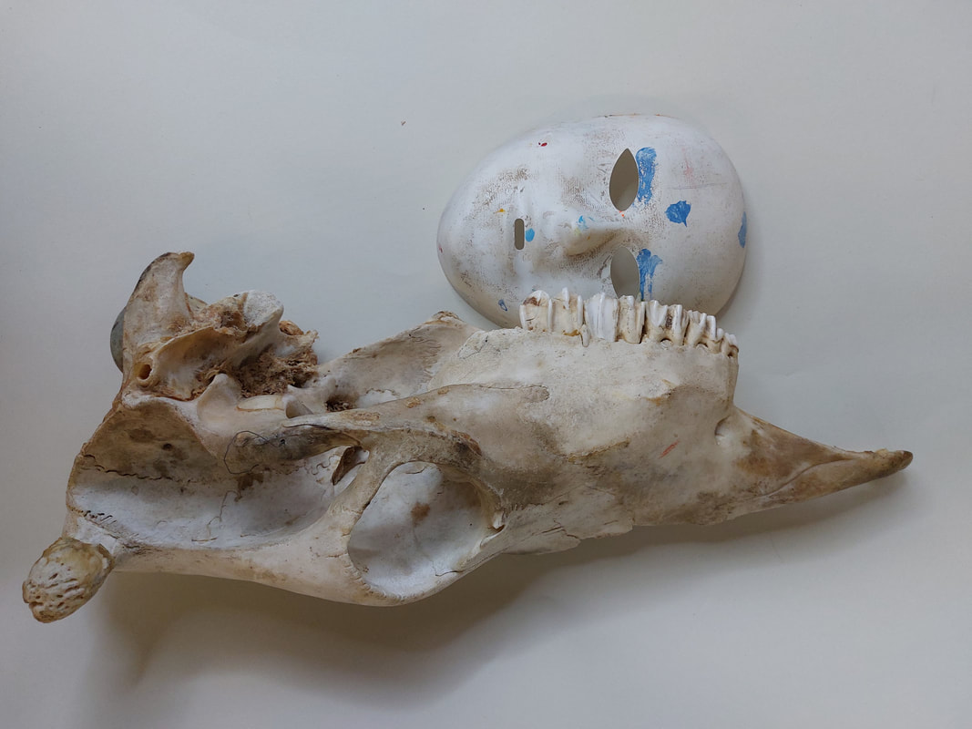
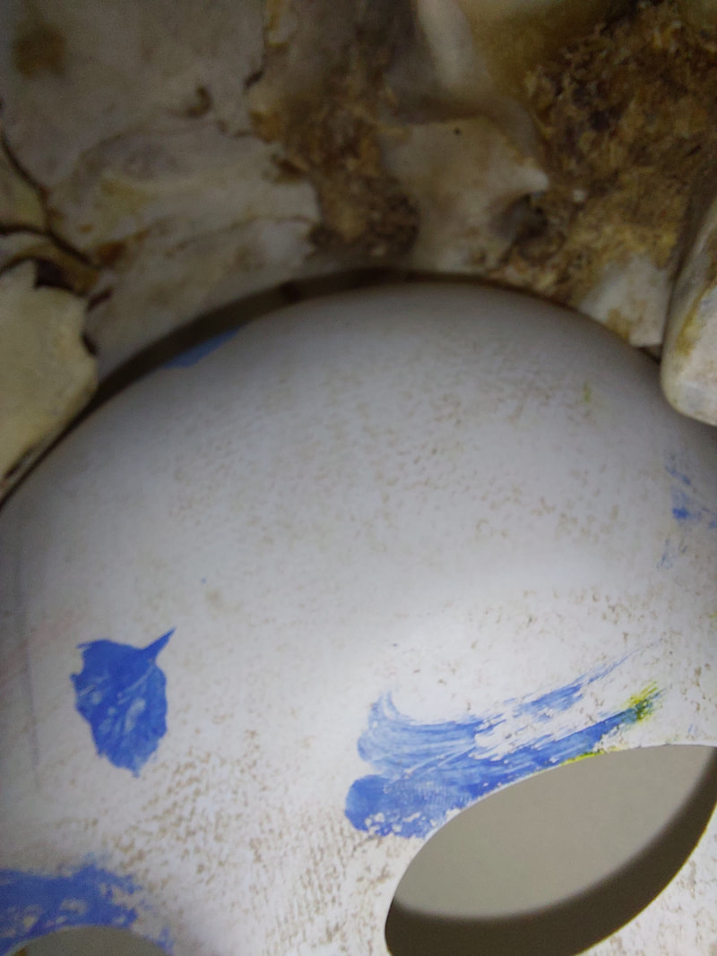
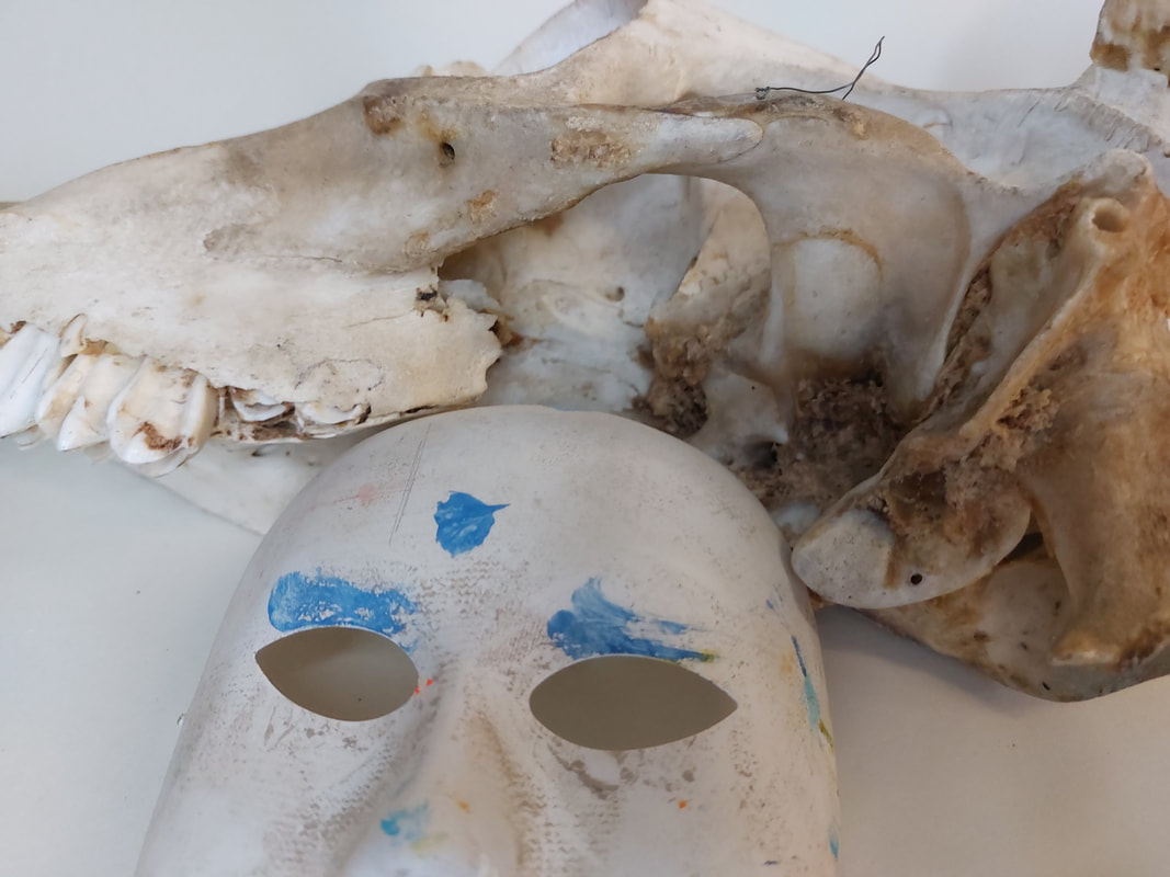
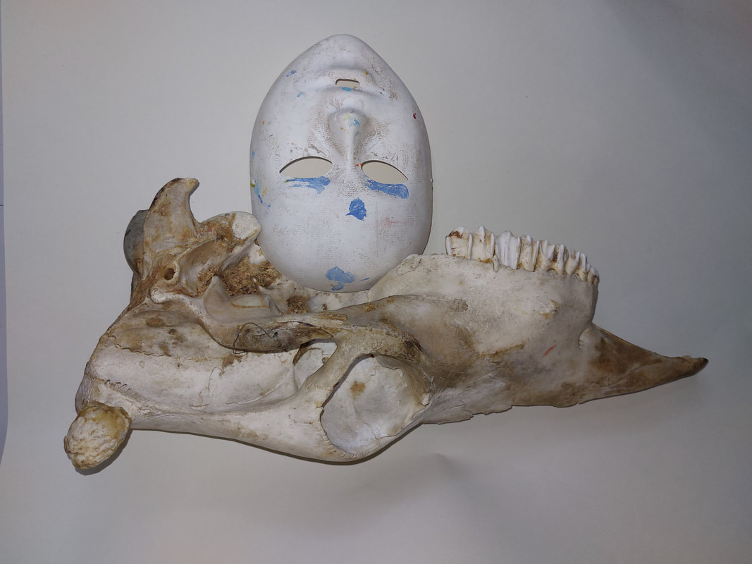
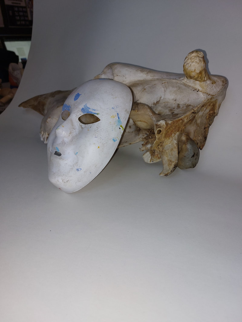
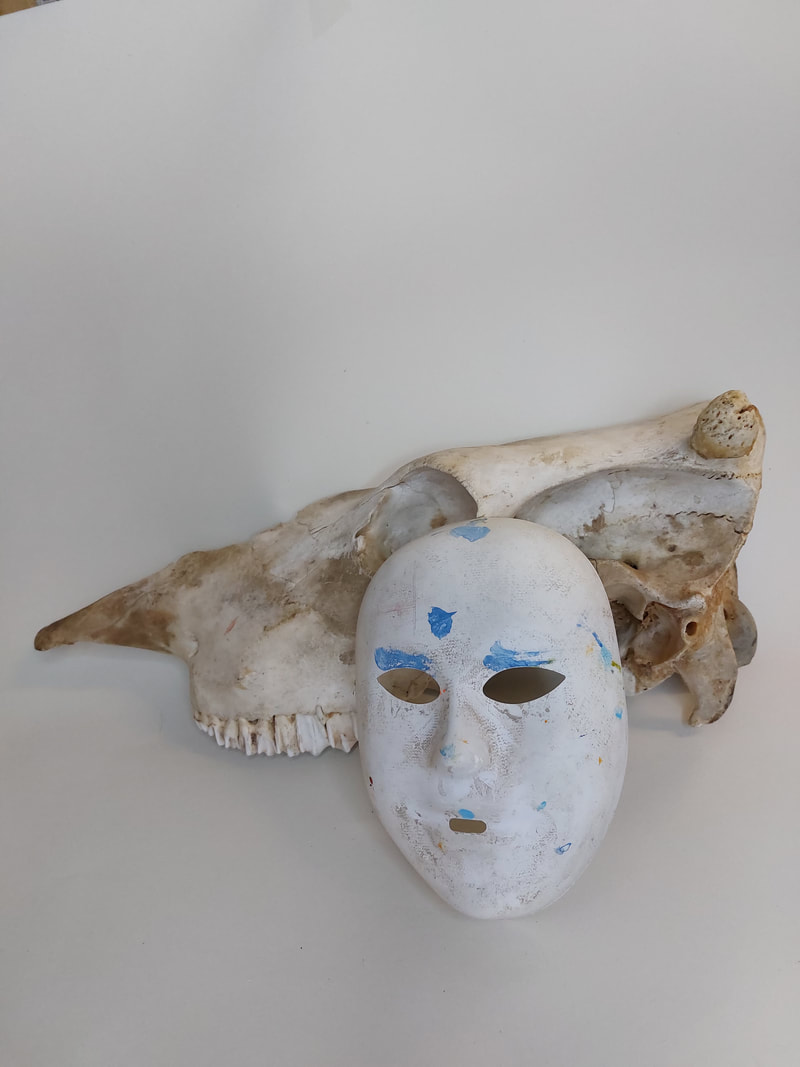
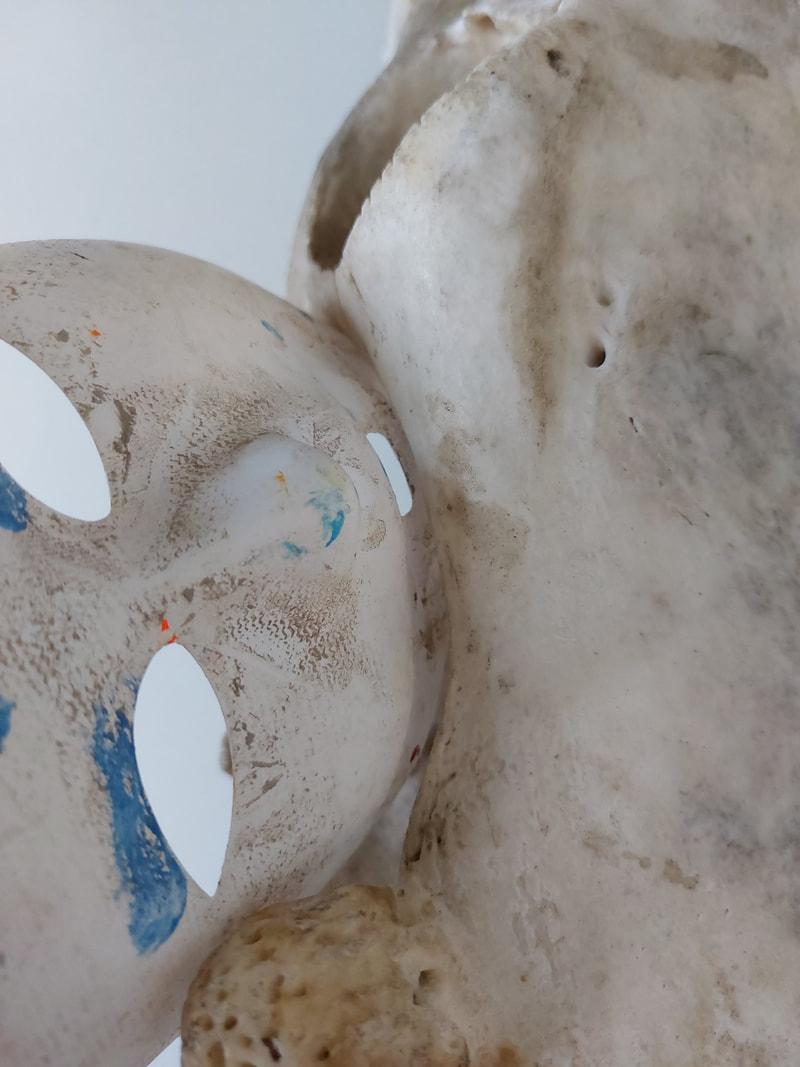
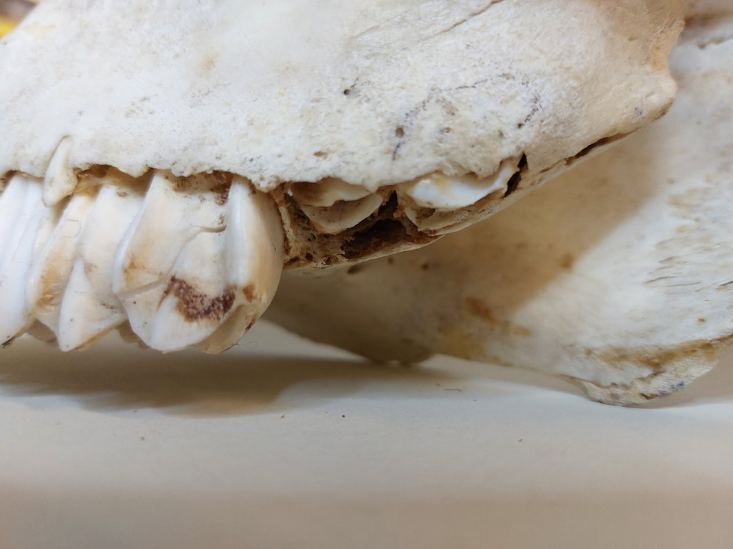
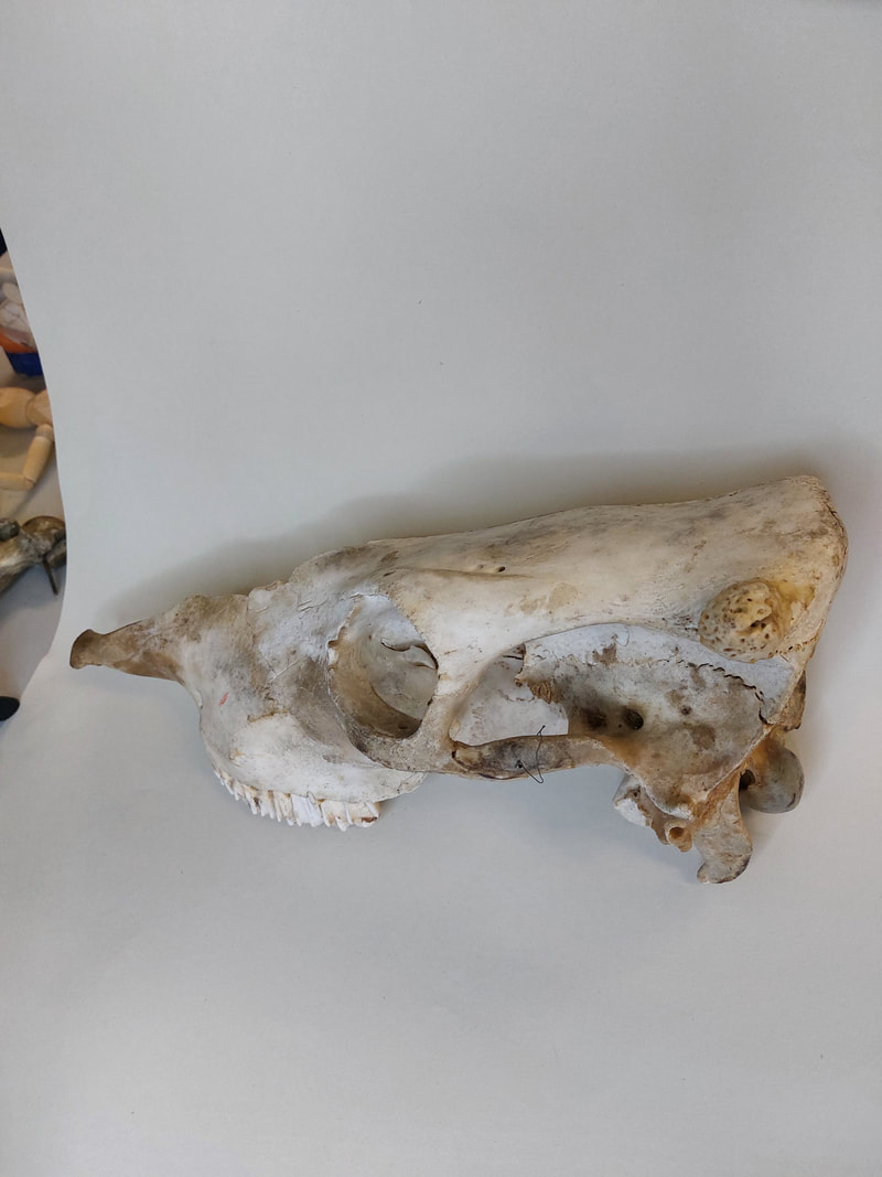
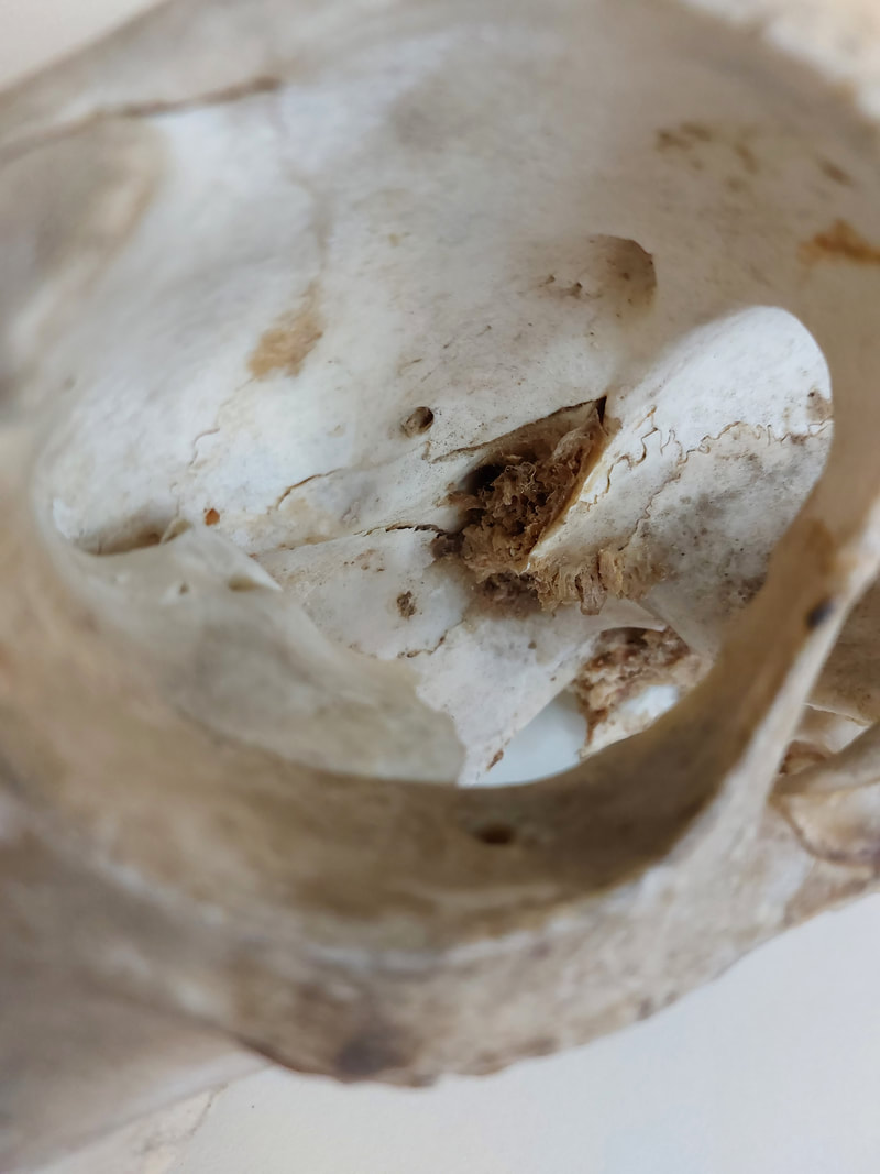
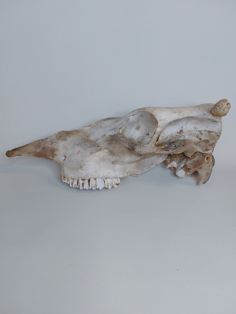
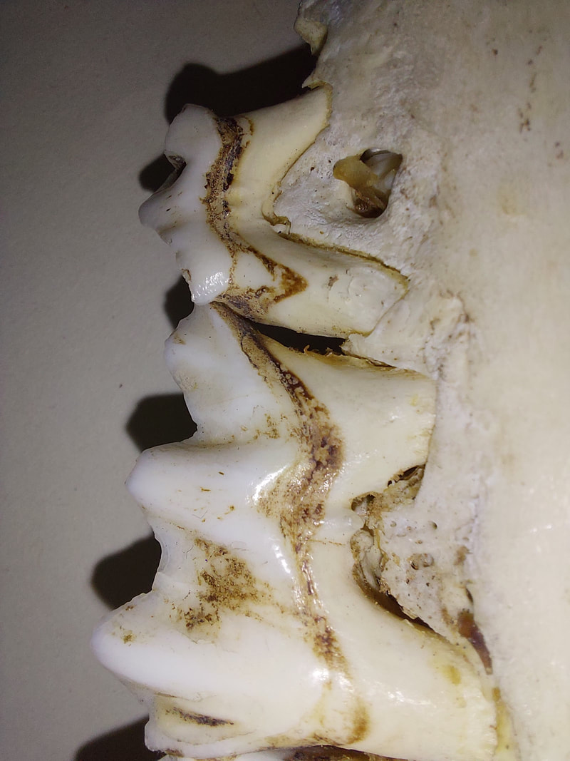
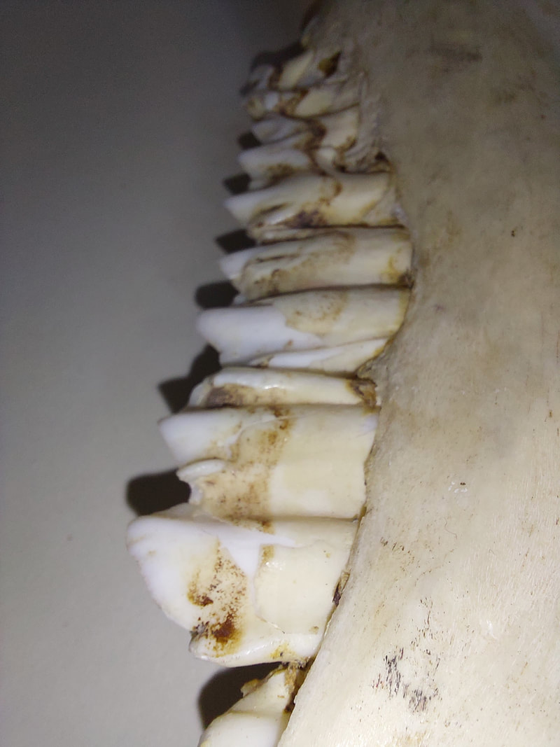
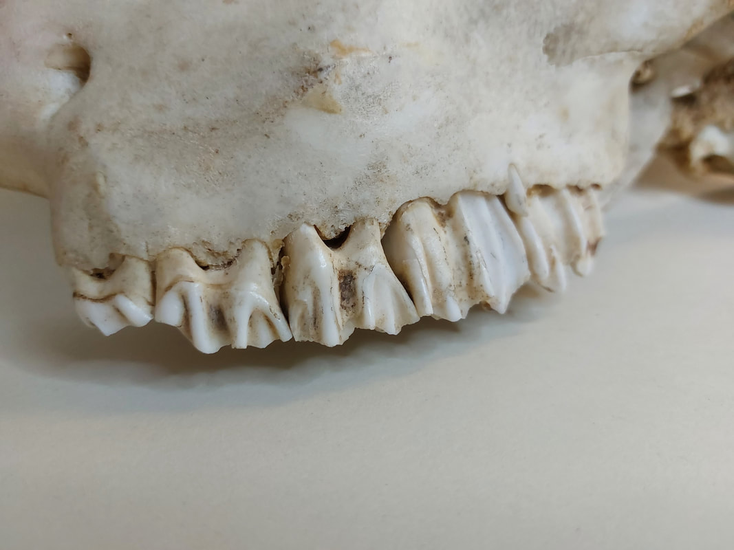
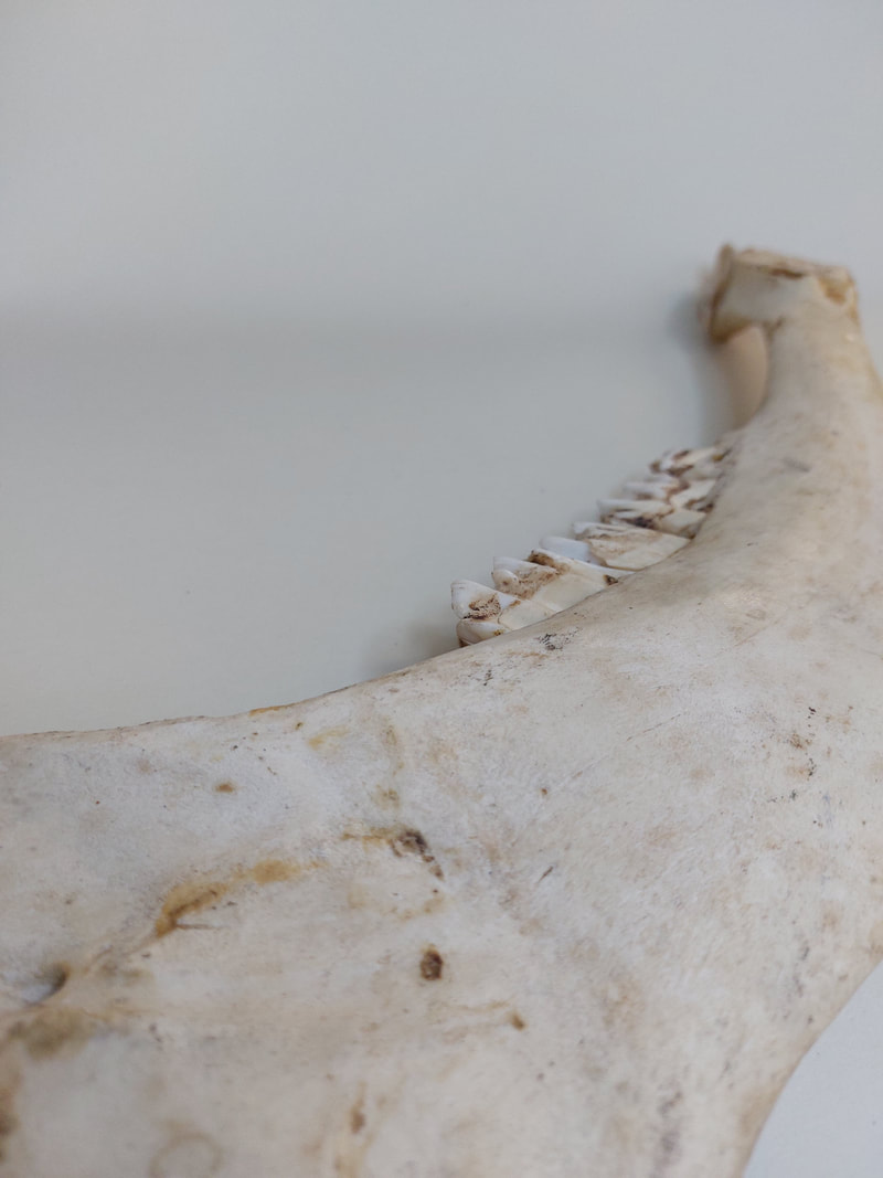
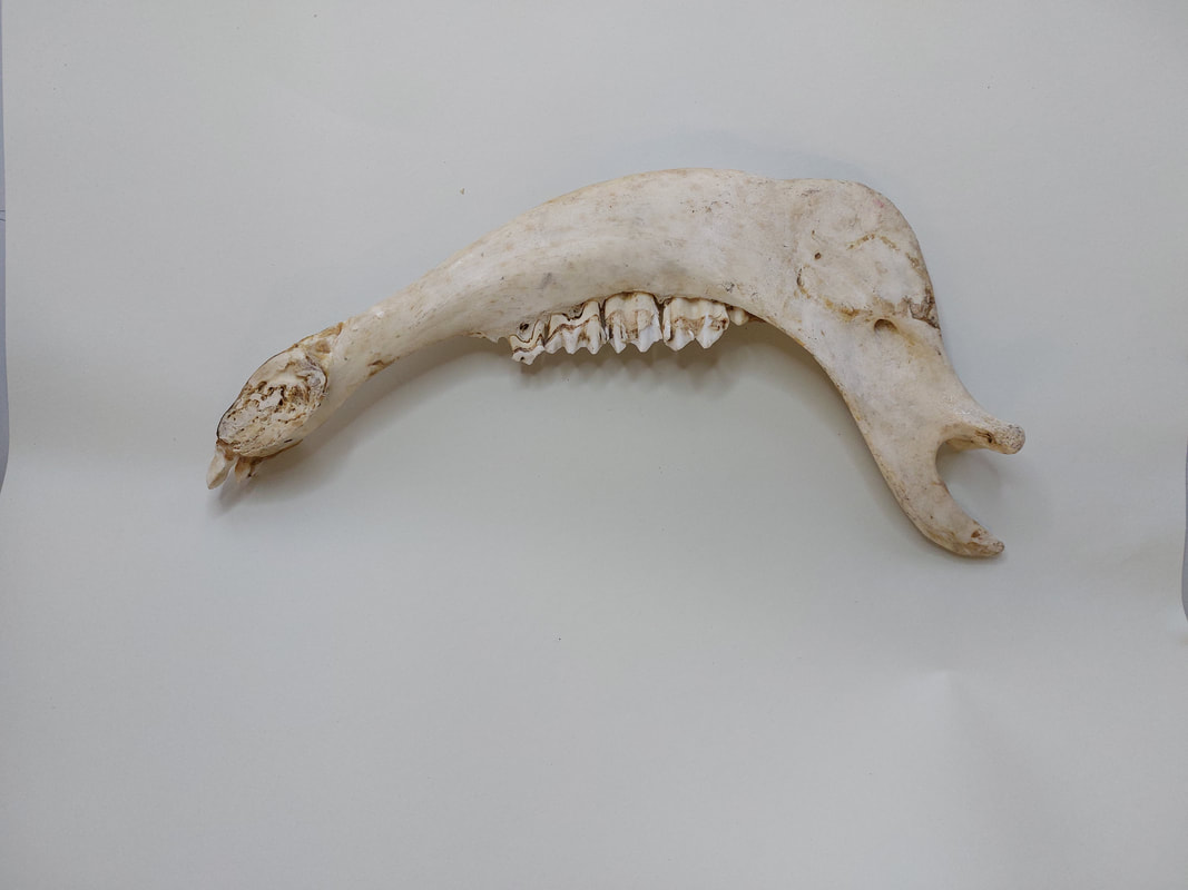
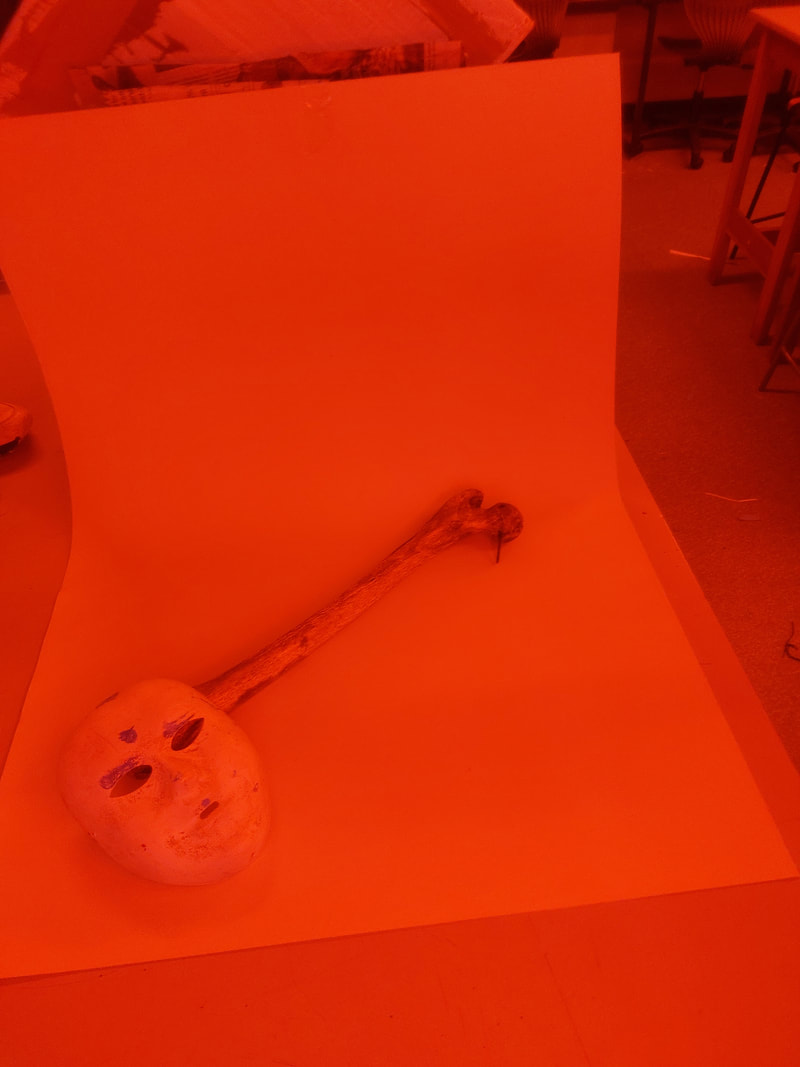
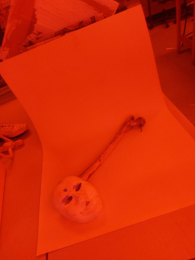
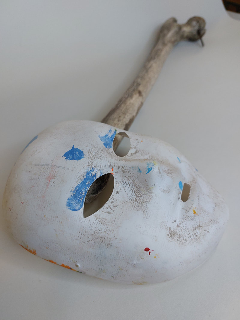
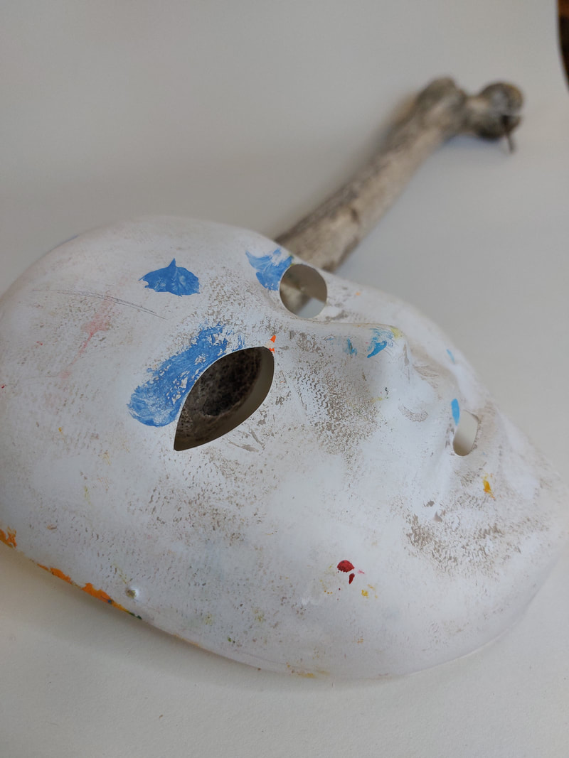
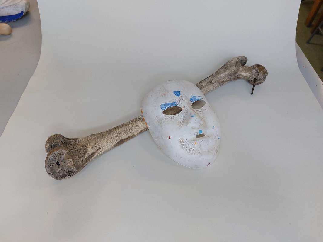
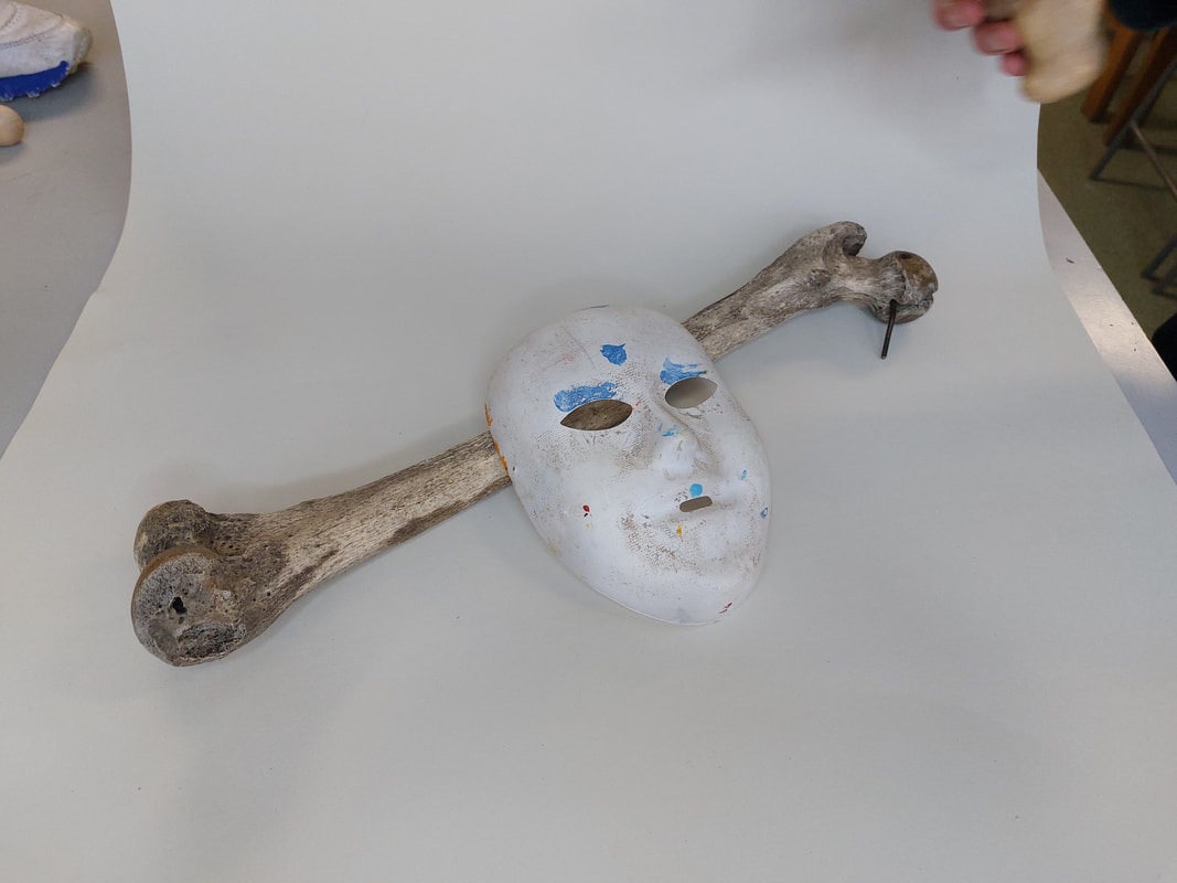
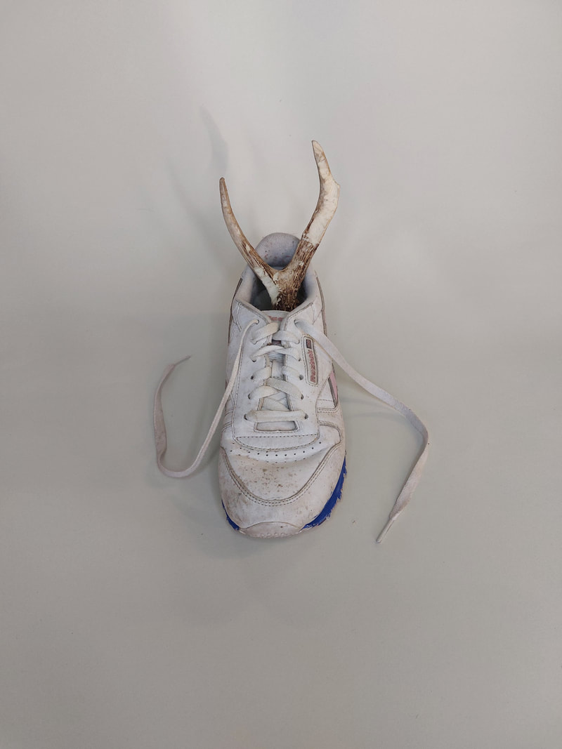
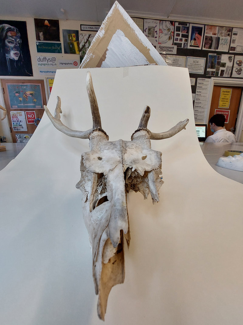
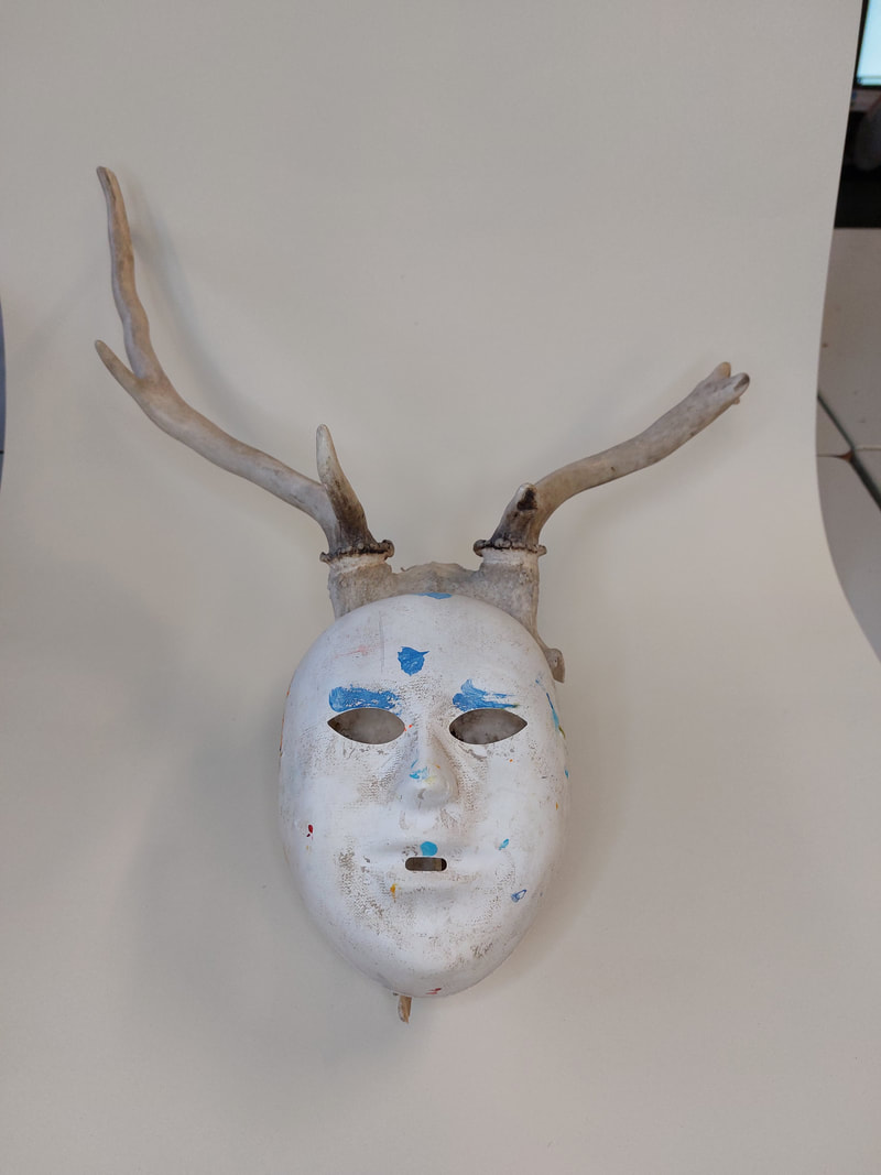
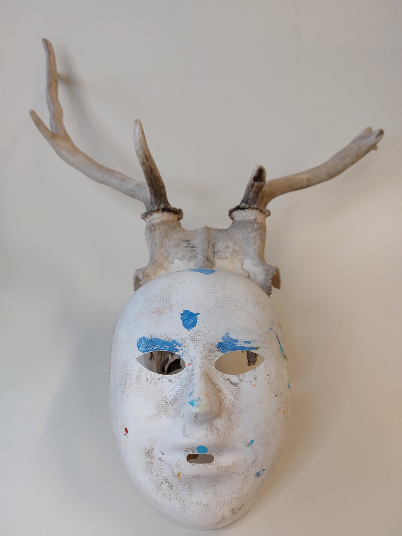
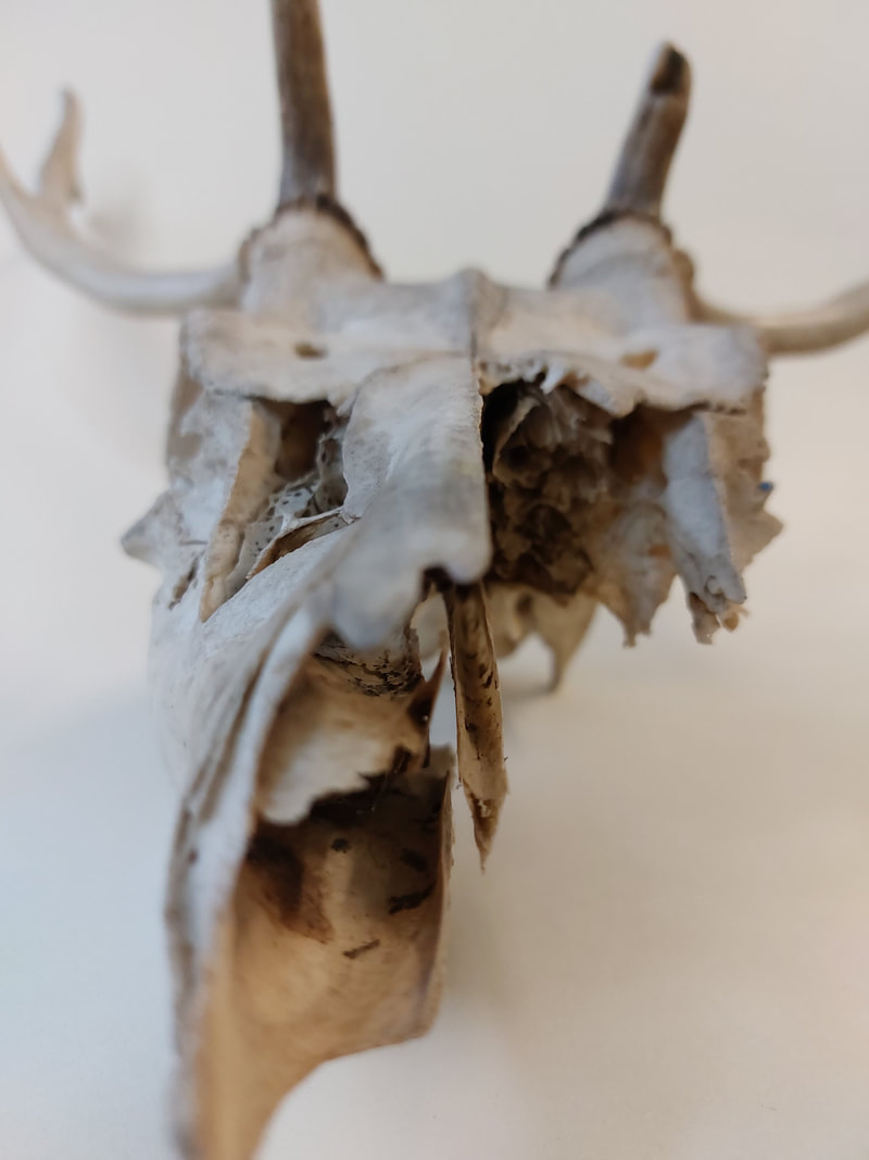
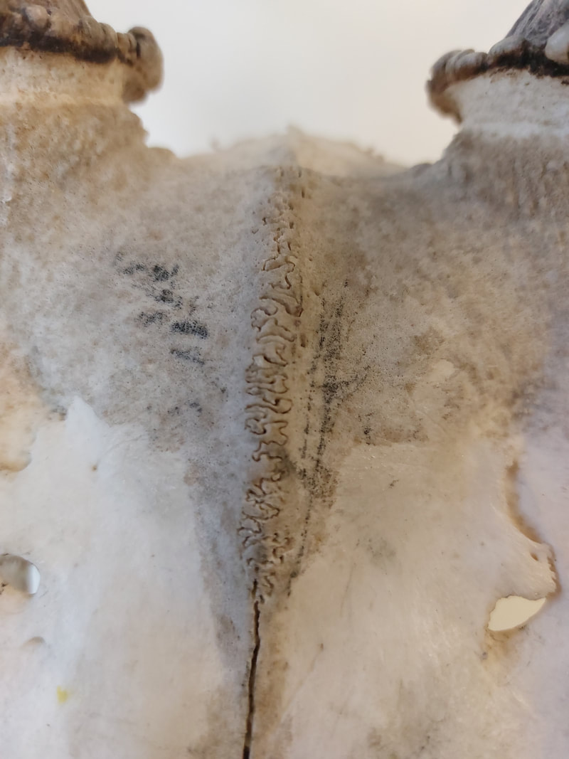
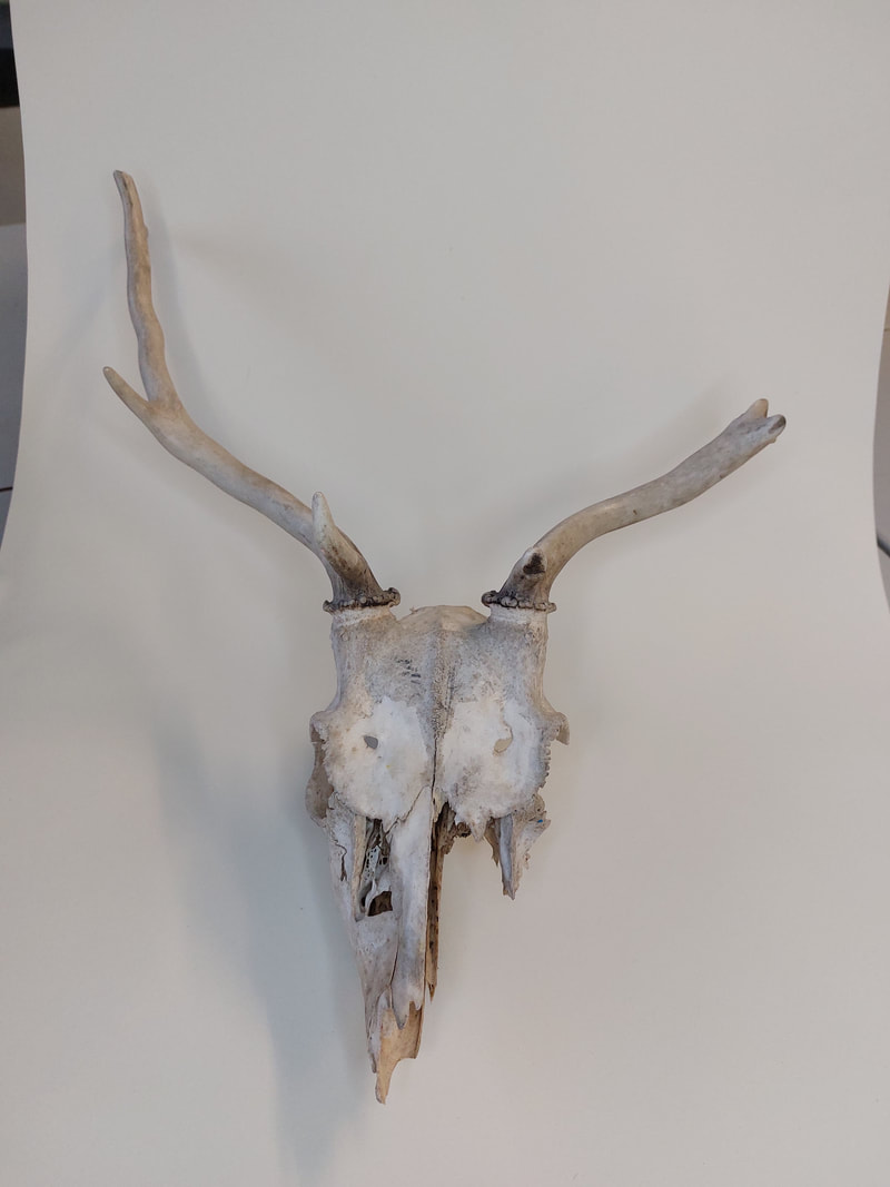
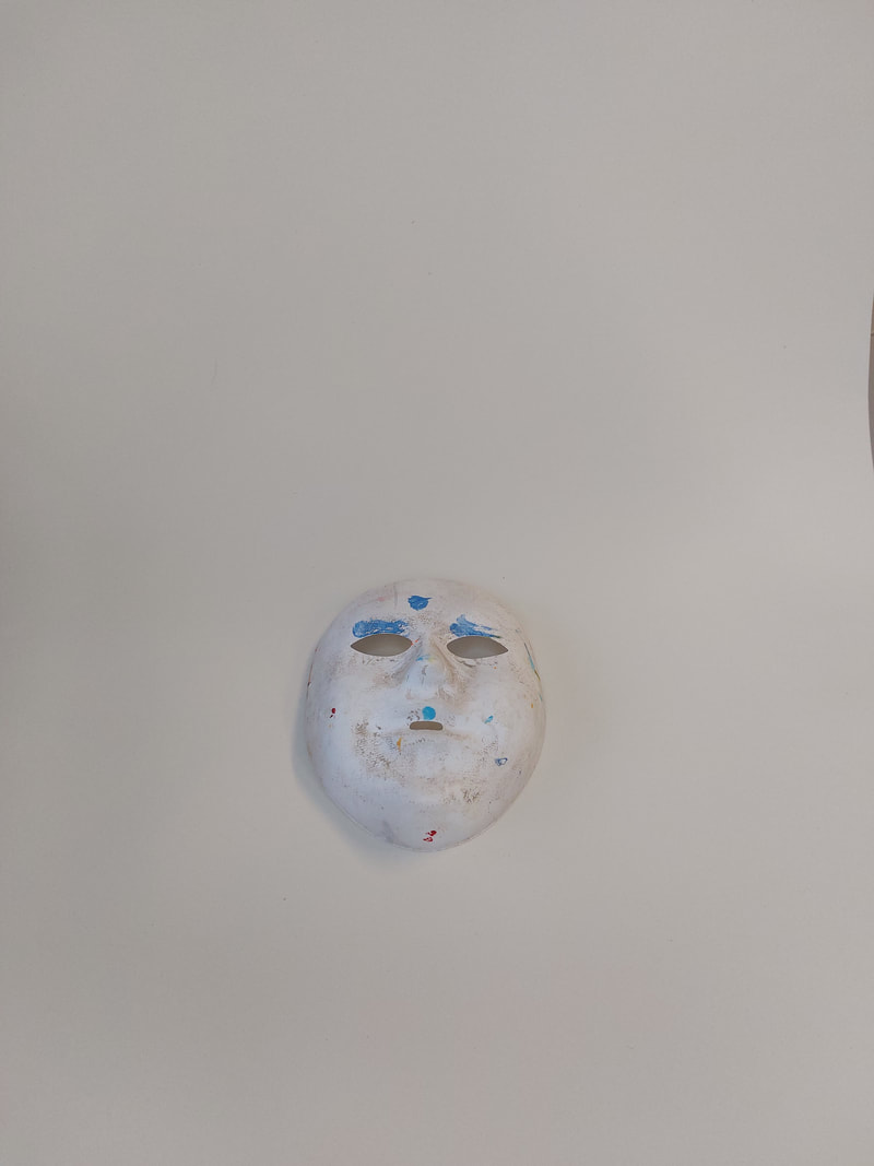
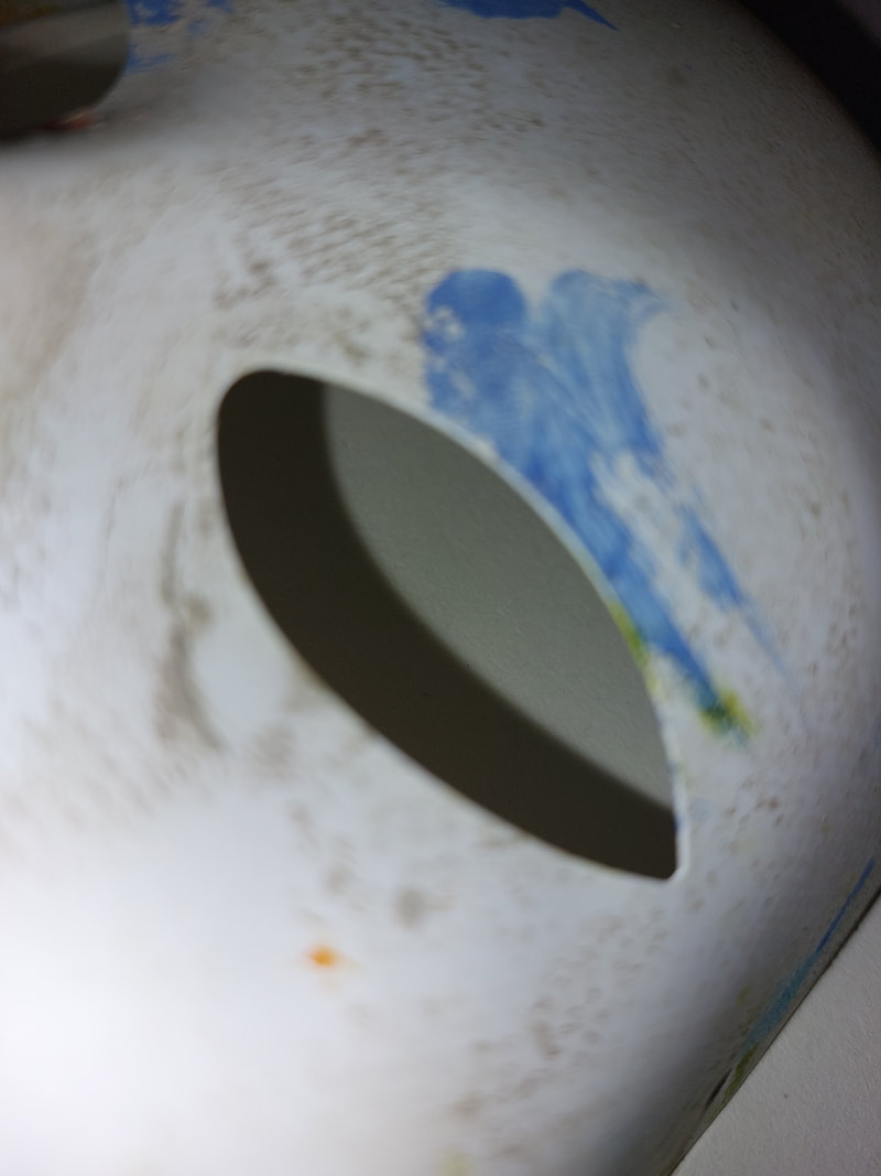
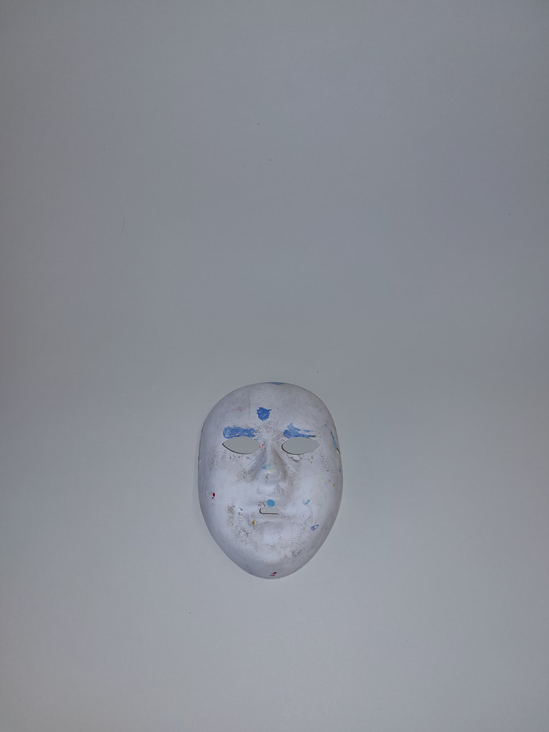
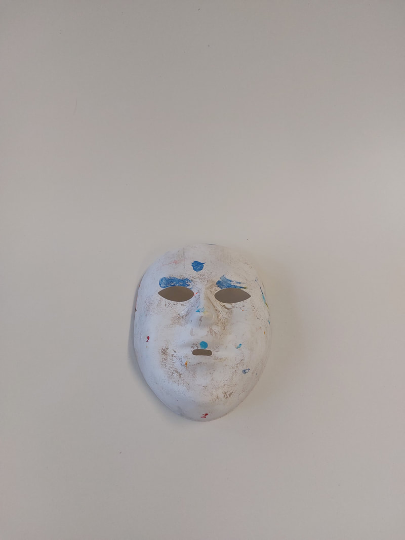
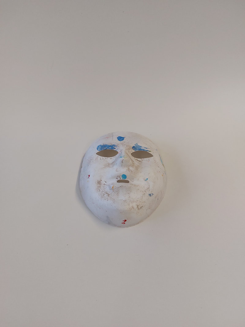
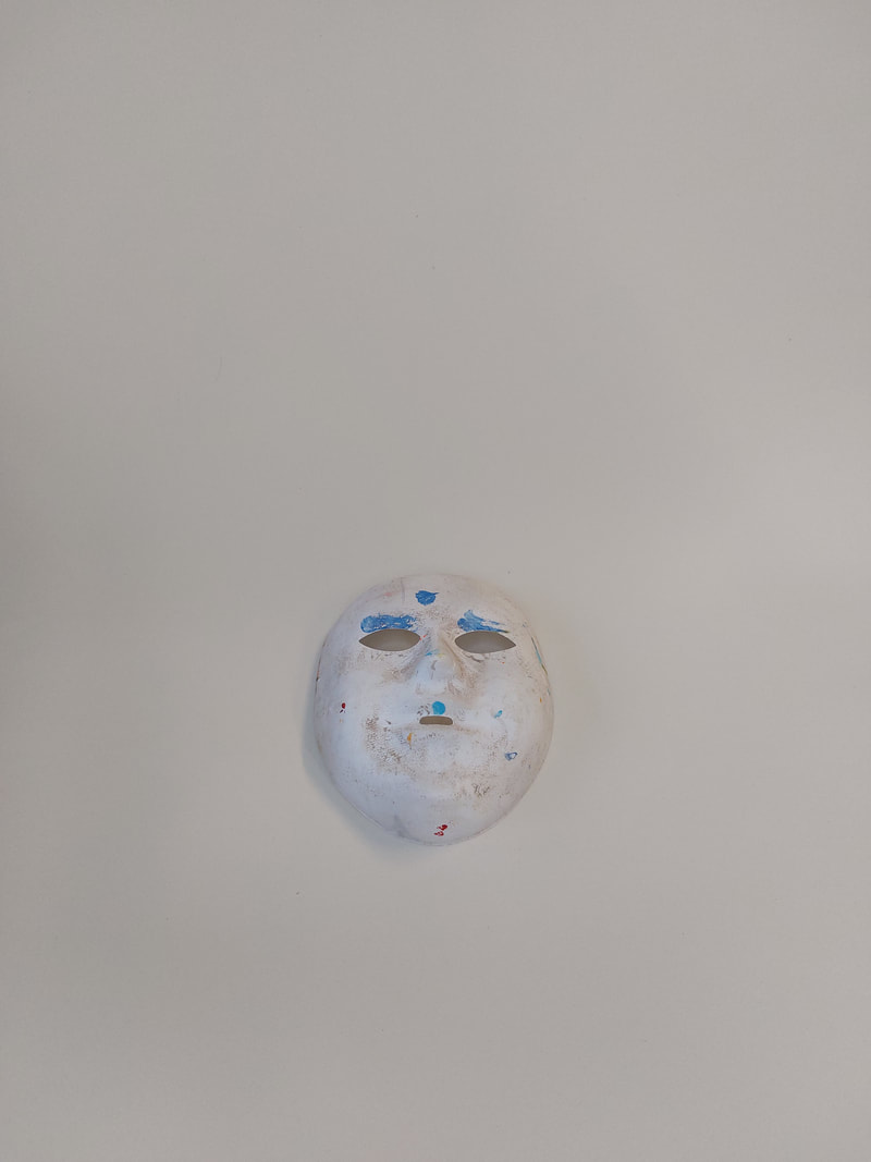
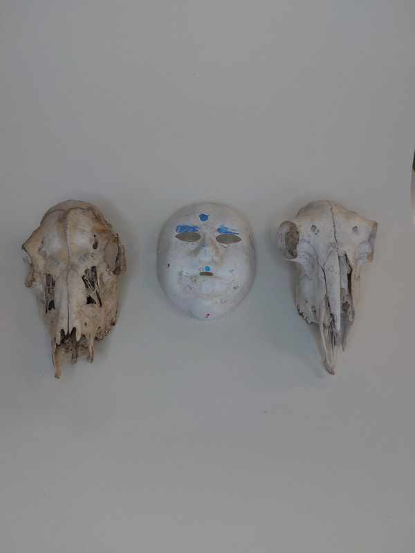
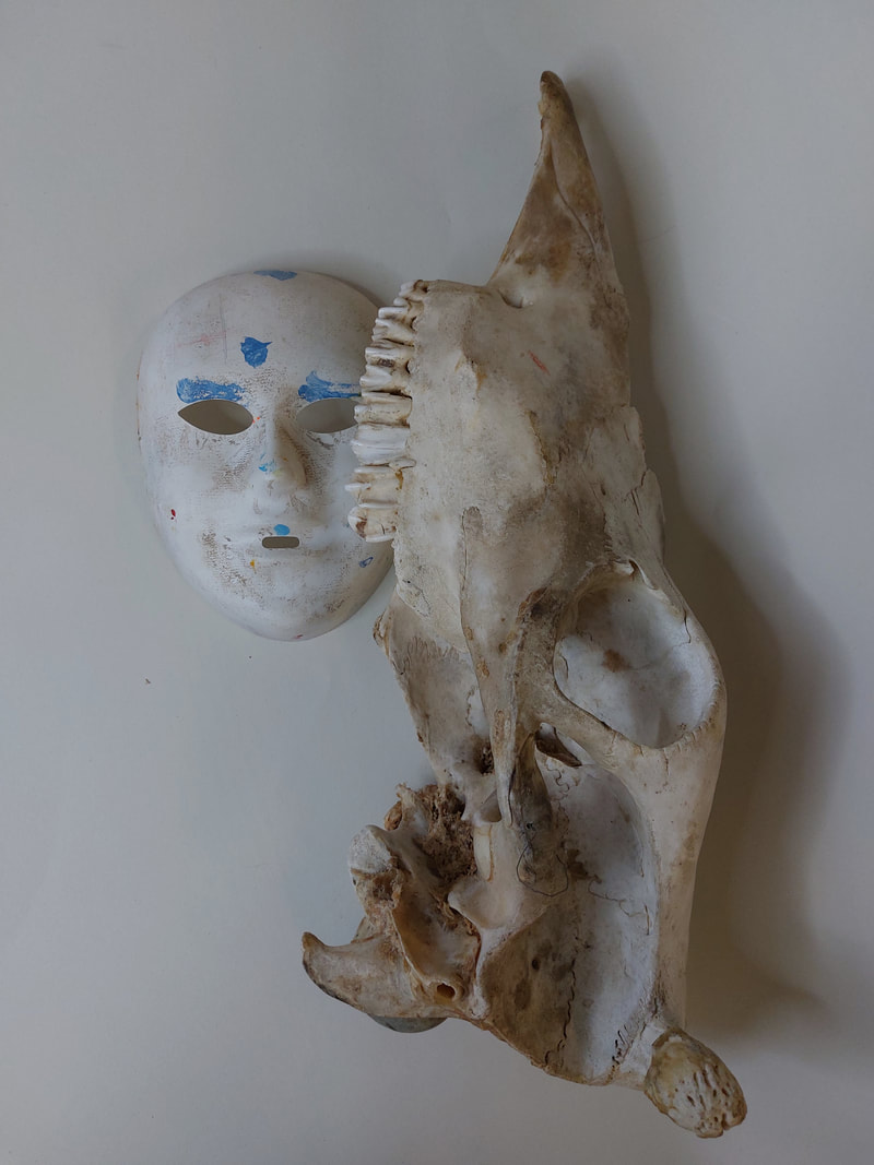
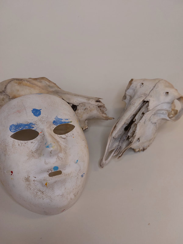
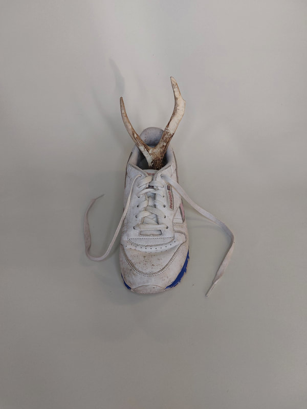
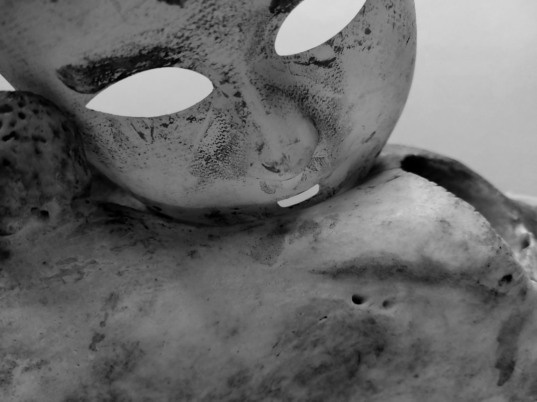
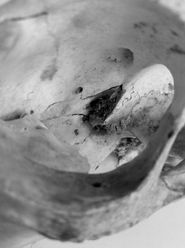
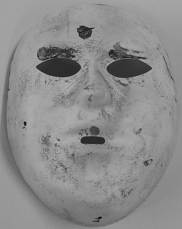
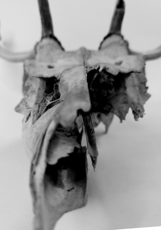
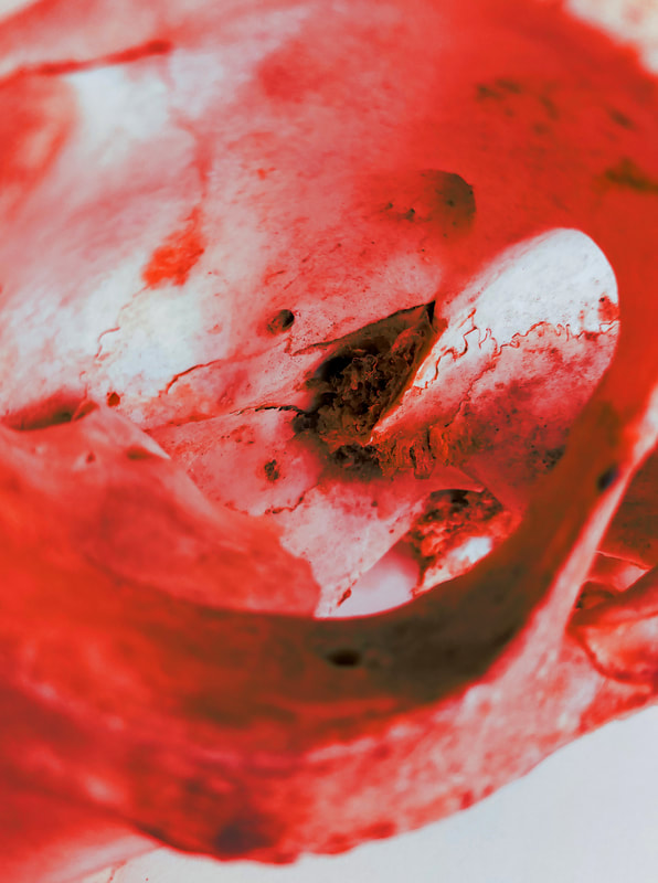
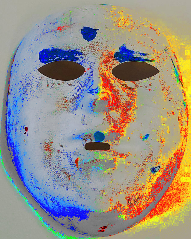
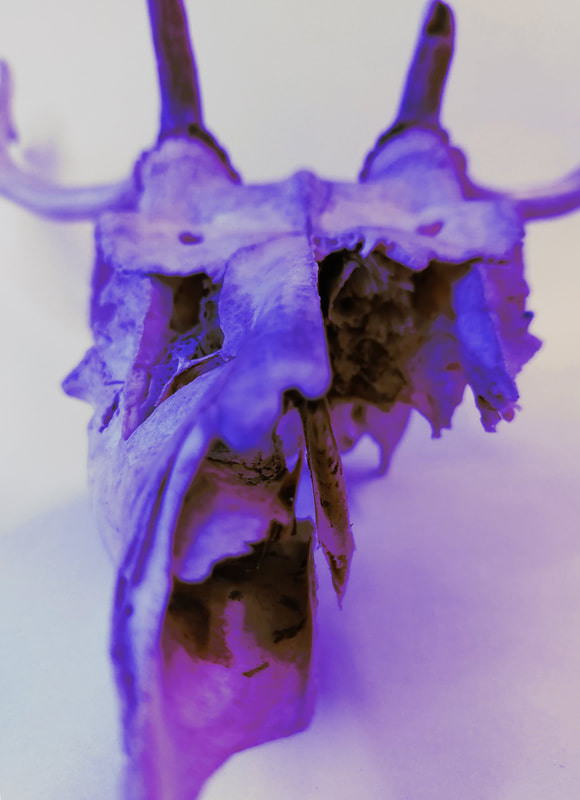
I missed taking the shoot in class and so had to take it in my own time, after school. I placed a white sheet of paper onto a school table and took photos of my school's art department's still life objects, meant for drawing/painting. I found objects that I thought represented my topic the best, like the bones, skulls models and shoe. I also found a mask in the shape of a plane human face, I then used this to add another level of freaky human styling to the photo.
To improve I think I could have complete a second shoot where I uses objects and a table coved by a cloth, in order to have created more similar subjects.
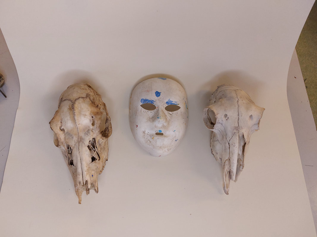
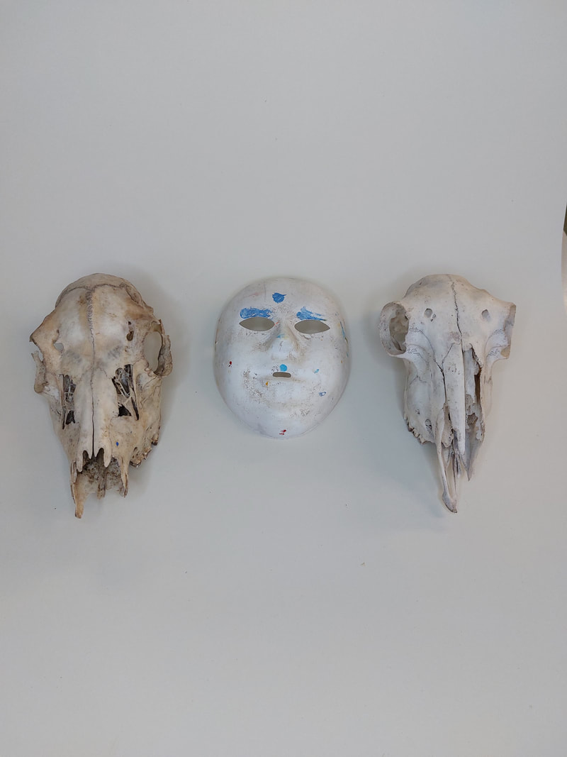
My favourite images
After Editing and cropping (using Gimp), these are the images that I believe best represent Jan Svoboda's work.
My Image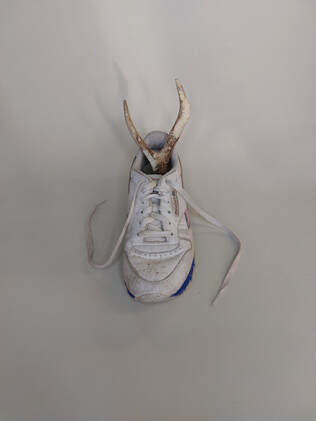
|
Jan Svoboda's Image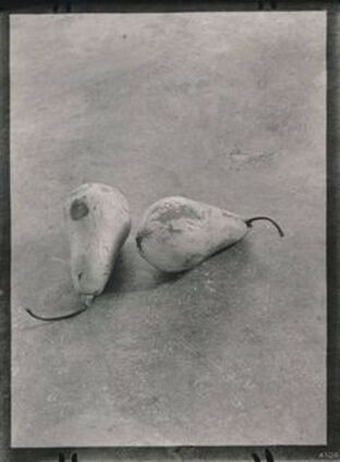
|
Editing and Changing my Images to create a new style
I used GIMP photoshop to edit my photos, turning them to grayscale and changing the curve effect tool so I could further insinuate the light and dark colours to create white backgrounds and dark shadows.
|
|
Editing to Grayscale
Editing using Colour Balance

Jan Svoboda Review
I think that my project went very well. I enjoyed the shoot and being able to complete the artist study even though I had at first missed the lesson. I am happy with the photos I have produced, especially after editing, they perfectly represent my individual look that I was going for, without having to look at the influences from other photographers. It made it easier that just looking at Jan Svobodas images.
I could improve by producing another shoot, this time with new materials and objects that more closely represent Svoboda's photos but this would mean losing the link back to my human condition subtheme.
Photographing Photographs
Once photographs have been printed (as a single image on a piece of paper, in a book or newspaper or on a poster/billboard) they become objects in the world. Some photographers have decided to photograph these photographs. My task is to look at different photographers who have used this style and produced photos.
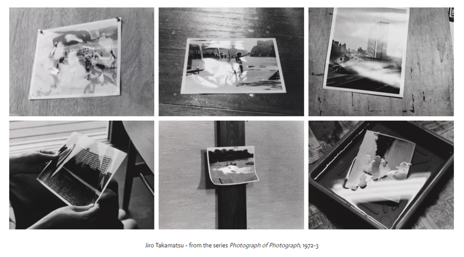
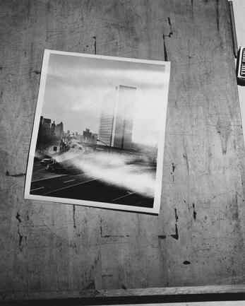
Jiro Takamatsu
These pictures are photographs of photographs from the family album of the artist, Jiro Takamatsu. Rather than take the pictures himself, Takamatsu hired a professional photographer. The subject of each image is also obscured by reflected light, reminding us that photographic prints have particular physical qualities - edges, a shiny surface etc. Some of the images are held, others pinned to a wall, lying on a surface or submerged in liquid.
|
Image Analysis
This photo is from a collection by Takamatsu Jiro called ‘Photograph of Photograph’. It was created from 1972–73. It is an example of… abstract interior photography. The composition is a picture of a picture, as the name of the collection suggests. The printed photo is located slightly to the left of the centre of the image at a slant to the rest of the image, it is off a building and road taken from above the ground. The printed photo lays on top of a messy wall or table, where there are paint marks and scratches and it is covered by reflected light, shrouding the photo. The focal point of the image is the printed photo at a slant, slightly to the left of the centre of the image. The techniques used here are unnatural lighting, angle and height. The photo is in complete black and white. The lines in the image make up the printed photo’s border. The background also includes lines, where they have been painted on from past artworks. The texture in the picture is varied, the printed image is glossy and looks smooth, however the rest of the image is messy and the table looks rough. The assume the photographer has used a film camera as it was taken in the 70s. The image makes me feel claustrophobic and slightly creeped out by the close cramped nature of the scene and the use of black and white colouring. |
|
Julian Germain
|
For every minute you are angry you lose sixty seconds of happiness, is a 2005 book by Julian Germain. It sensitively documents his friendship with Charles Snelling, an elderly man living alone in a small house in Portsmouth, whose portraits appear alongside pages from Snelling’s own photo albums and objects in the house, including framed photographs of his beloved wife.
|
|
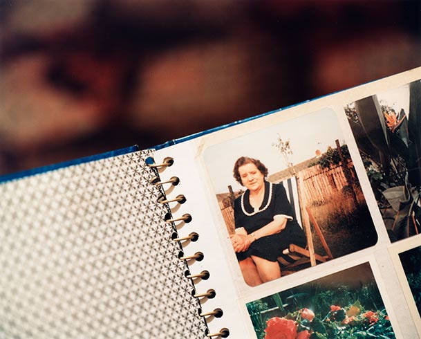
|
Image analysis
This piece is by Julian Germain. It is from a collection called every minute you are angry you lose sixty seconds of happiness created as a book in 2005. The composition shows a wall, split in two, and the bottom half is what looks like a painted orange metallic wall cover. The other, top half of the image is a wall covered by a floral wallpaper. In the top left is an image of a woman, it is explained that this is Charles Snelling’s (the subject of the book) wife. Underneath the photo is a small sticker that is partially obscured by shining light. In the bottom right is a note that says ‘put rubbish bin out (wed night)’. I think the focal point of the image is each of the objects on the wall but mostly the photo of the woman in the top right of the image. The techniques used here are bright lighting, angle and height, negative space, a warm white balance. The colours in the image are shallow and thin but warm and mostly yellow or orange with a range of tone. The patterns I can see in the image are created by the wallpaper on the top half of the image. The lines in the image are the huge divider down the middle of the image, separating the different wall types. The texture in the picture looks smooth but solid and slightly rough. The image makes me feel melancholy but also as if I am intruding on the space of the photographers subject. |
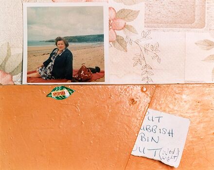
|
My shoot
Shoot Plan
To take photos like Julian Germain I plan to use my family's collection of photo albums, ranging from before and after I was born. I also plan to take photos of the unfinished or unused pages of the book and use different angles to create more of a variety of images and a range styles or feelings.
To take photos like Julian Germain I plan to use my family's collection of photo albums, ranging from before and after I was born. I also plan to take photos of the unfinished or unused pages of the book and use different angles to create more of a variety of images and a range styles or feelings.
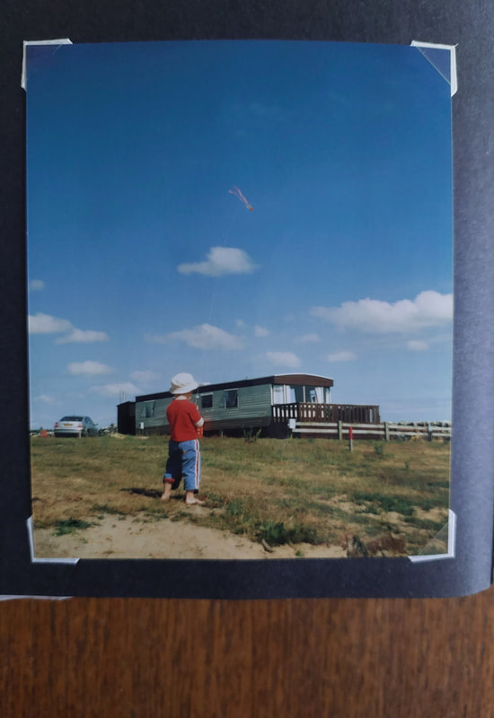
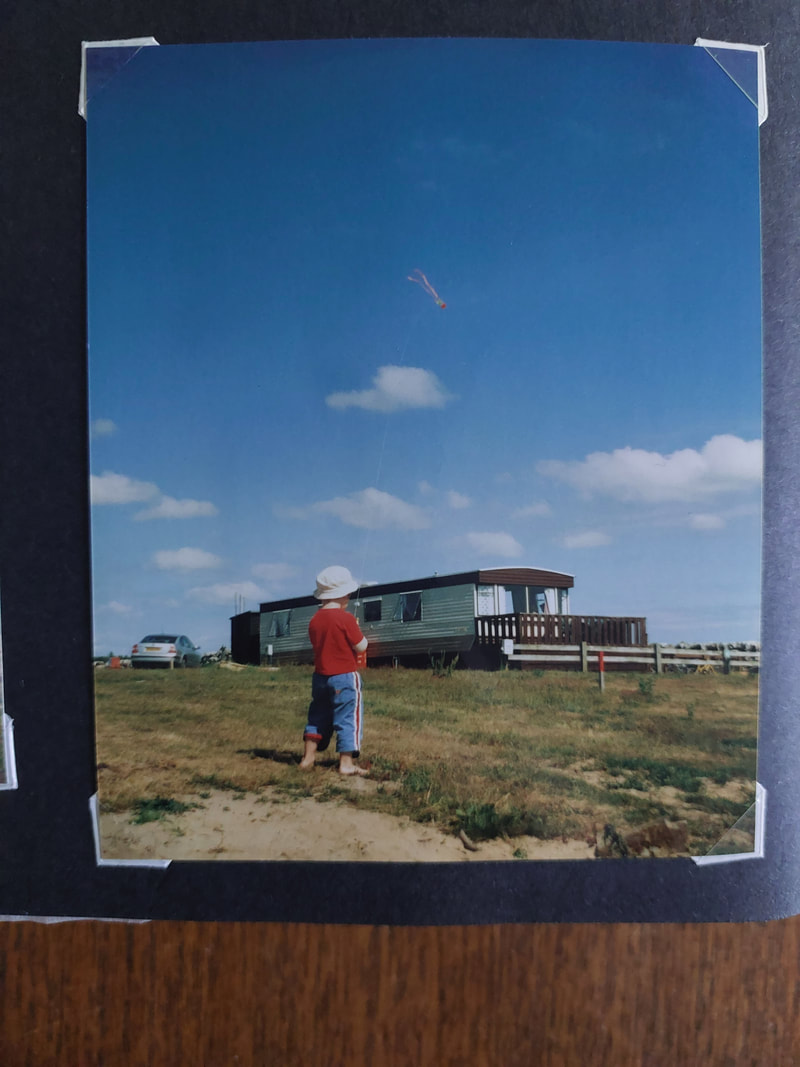
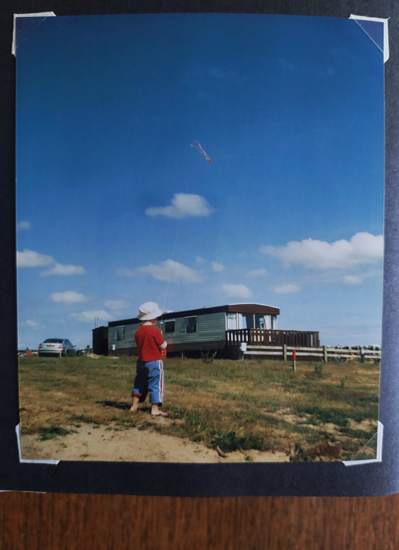
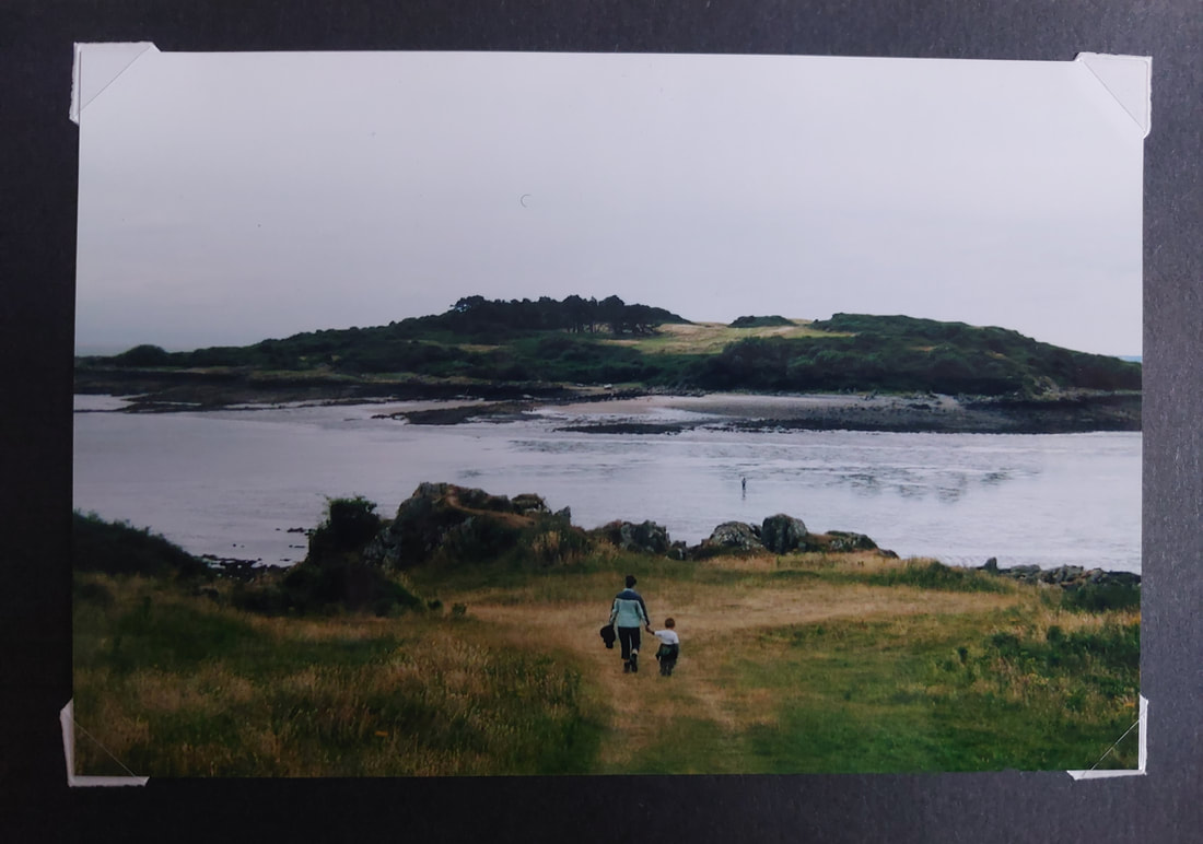
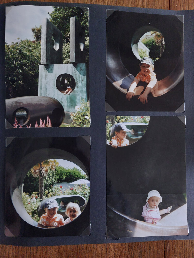
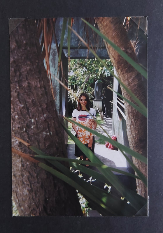
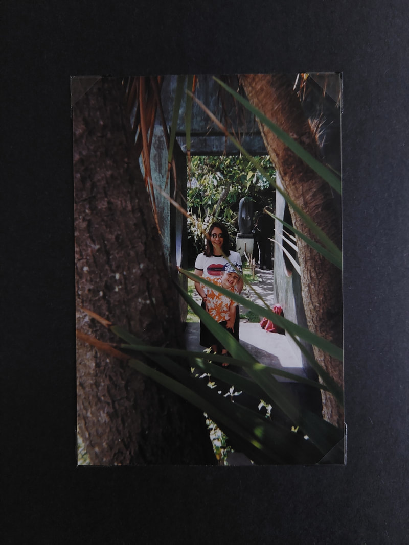
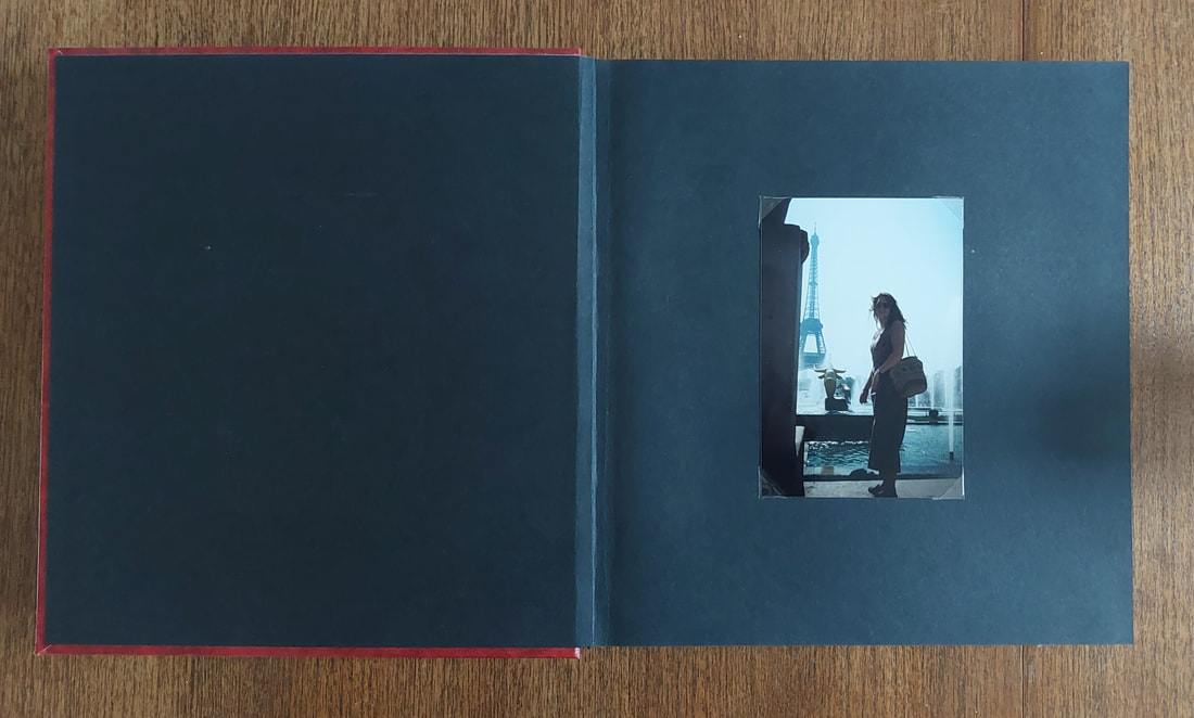
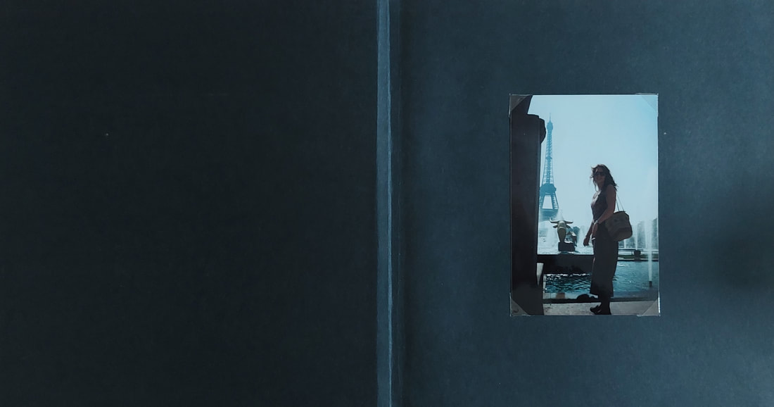
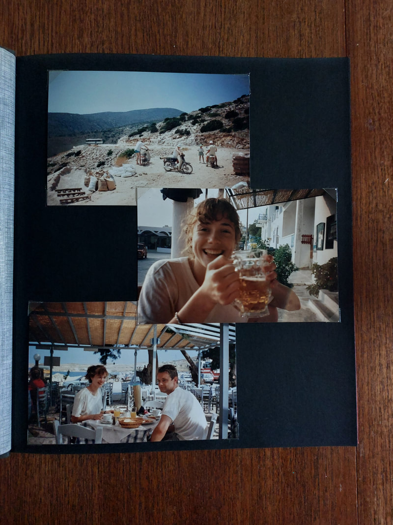
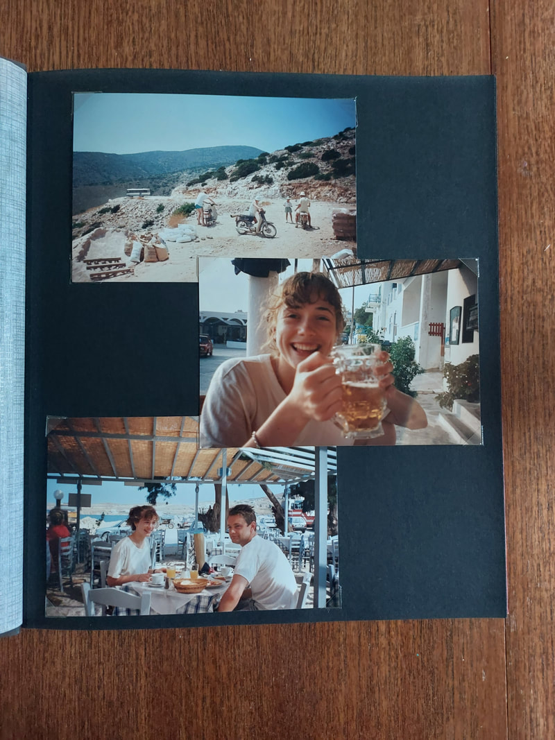
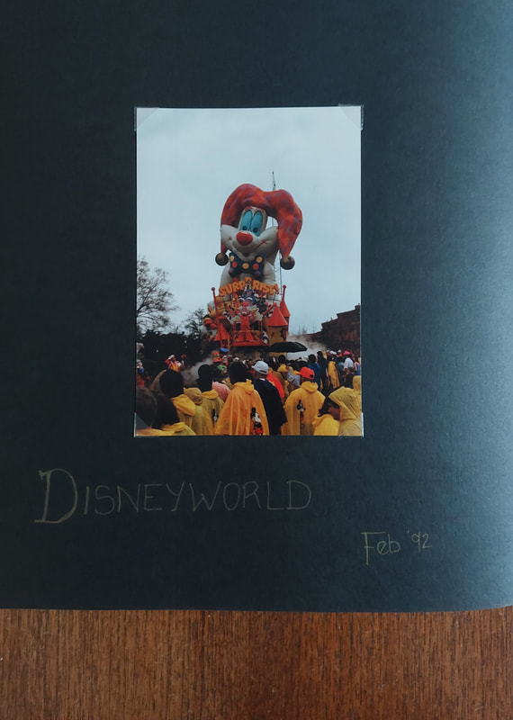
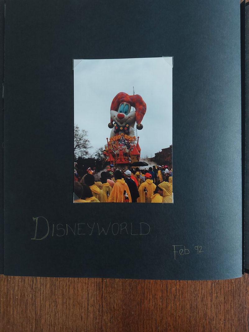
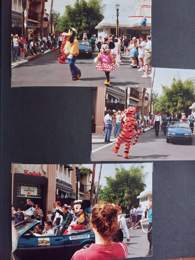
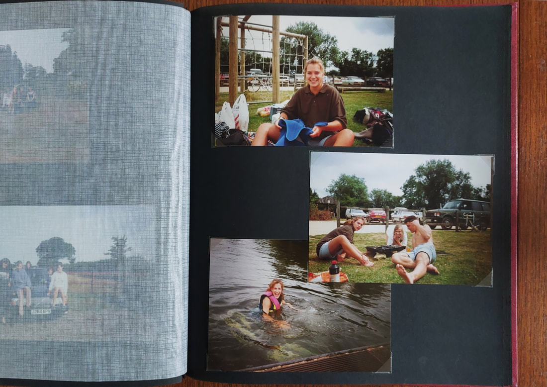
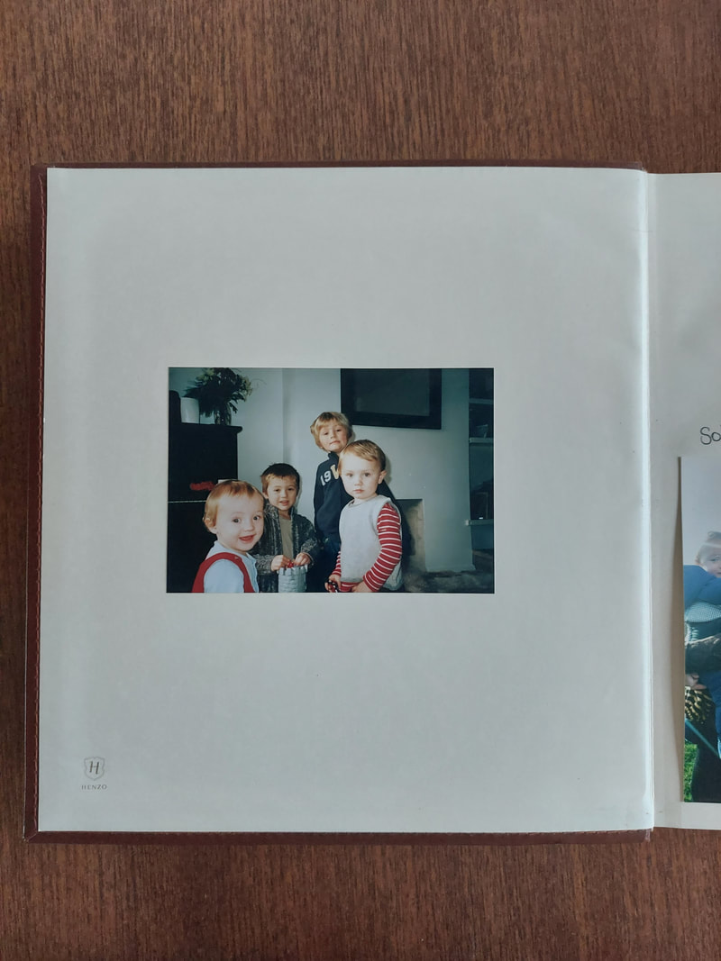
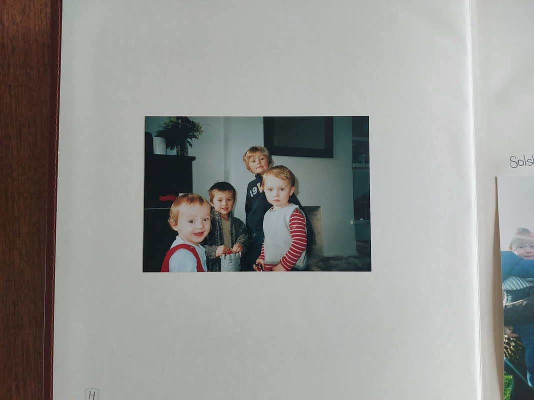
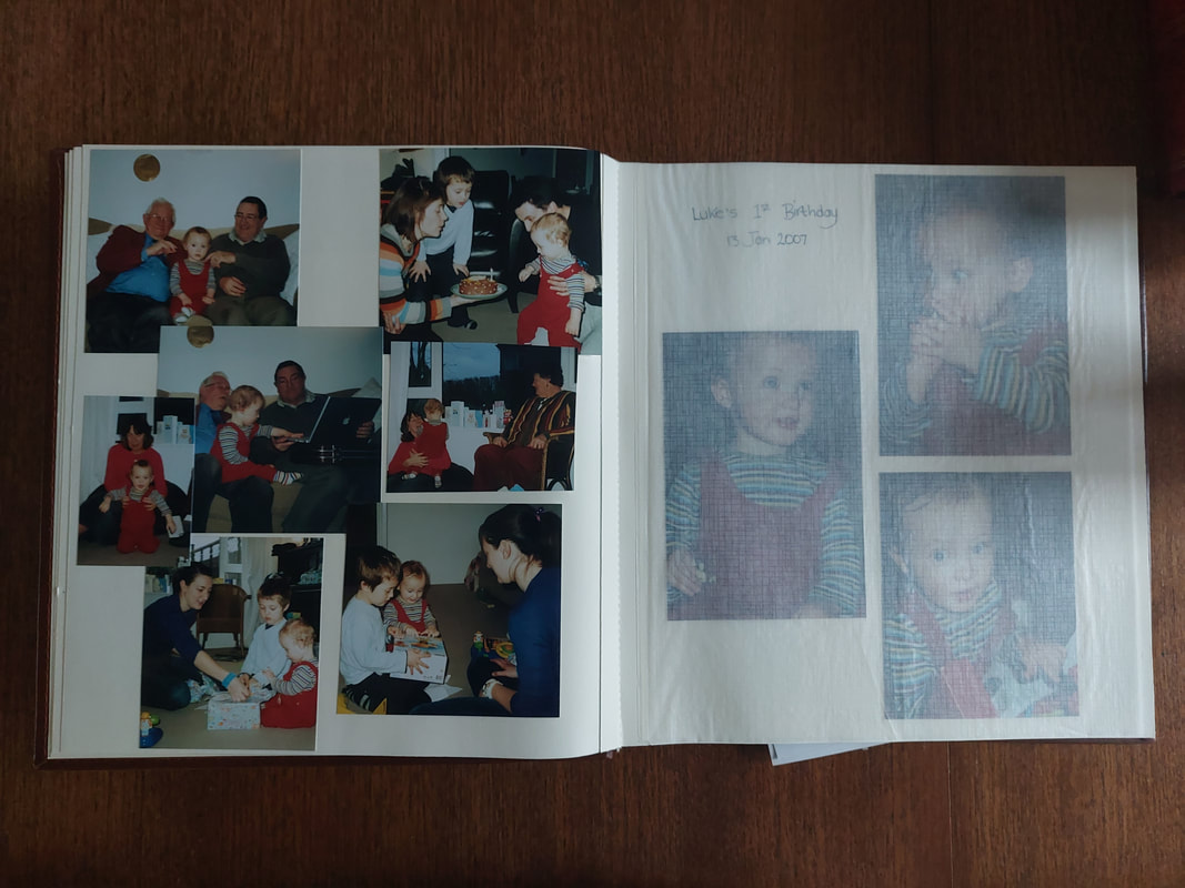

Shoot Review
I am happy with the outcome of this shoot. The images are what I had been hoping for, I got good angles and, I think, good cropping on each of the images. I think I did get a good variety or images and styles, like I was hoping for.
To improve I would take a second shoot using new photo albums and photos, where I would try a different approach, of taking photos in my own style.
Editing my Images
|
|
My favourite Images after editing
I have selected my favourite three images from the shoot - all were edited in the same way. I edited the shadows and brightness using the Curves tool on Gimp Photoshop to bring out the colours but wanted them to stay true to the photo in terms of their colours and tones. I also cropped them in order to get what I think are the best proportions
My favourite images in black and white
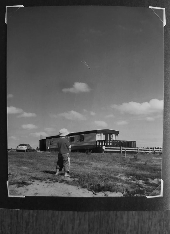
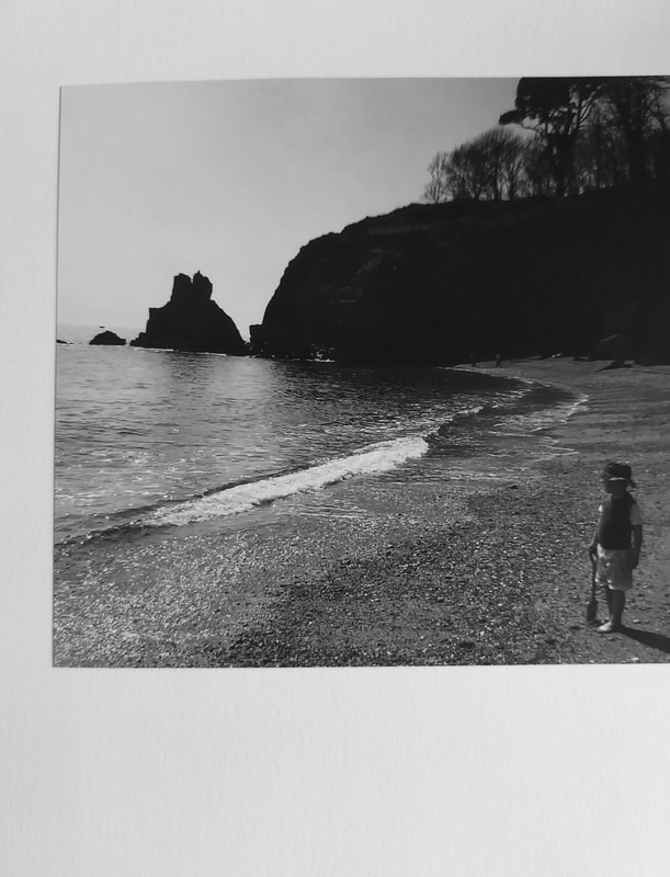
I also made some black and white variations for further development and I like them but I think that the ones above more accurately represent the style of Julian Germain.
My work
|
Julian Germain's work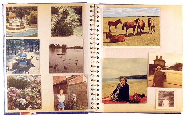
|
Luigi Ghirri
In 1973 Luigi Ghirri took a series of 41 pictures of maps in an atlas. The series is called 'Atlante'. Ghirri takes macro (super close-up) photographs
of the various signs contained in various maps of the earth, sky and oceans - the names of places, borders, palm trees, lakes and rivers, stars etc. Ghirri was interested in the way that physical places become abstracted in the process of making maps. He was also aware that photography (a very popular pastime by the 1970s) was becoming the primary way in which people were experiencing reality.
of the various signs contained in various maps of the earth, sky and oceans - the names of places, borders, palm trees, lakes and rivers, stars etc. Ghirri was interested in the way that physical places become abstracted in the process of making maps. He was also aware that photography (a very popular pastime by the 1970s) was becoming the primary way in which people were experiencing reality.
|
Image Analysis
This piece is part of a collection by Luigi Ghirri called 'Atlante'. It gives a photographic reading of an atlas. It was created in the 1970s. The composition is a map printed into an atlas. The background is a dull greyish brown, cream colour representing the ground, on top of the ground are a series of lakes located in the top left and bottom right of the image, these lakes are being fed by a couple of rivers, coloured dark brown. There are also a number of green patches, I assume represent grass growth or land covered more by shrubbery, although most of the image is negative space. The focal point of the image are three palm trees grouped in the centre of the photo, I assume representing the existence of palm trees in the area. The techniques used here are artificial lighting, angle, negative space and macro photography. The colours in the image are light cold colours, mostly browns but with splashes of faded light blue and green. Each colour in the image has its own pattern and texture, the brown is a cross hatch, the blue has straight lines traveling from left to right and the green has diagonal lines from top left to bottom right. The palm tree symbols are just plain black. The photographer has most likely used a film camera as it was taken during the 70s. The image makes me feel quite cramped and claustrophobic but also as if there is a sense of wide space just out of my reach, this feeling most likely created by my recognition of the land that the atlas is representing. |
|
My Shoot
Shoot plan
After looking at the work of Luigi Ghirri I intend to create images by taking photos of an atlas using my camera. I plan on using whatever lighting is best, natural or artificial (by using the flash on my phone) so I don't let the take the photos with any shadows covering them.
After looking at the work of Luigi Ghirri I intend to create images by taking photos of an atlas using my camera. I plan on using whatever lighting is best, natural or artificial (by using the flash on my phone) so I don't let the take the photos with any shadows covering them.
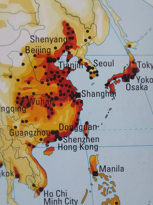
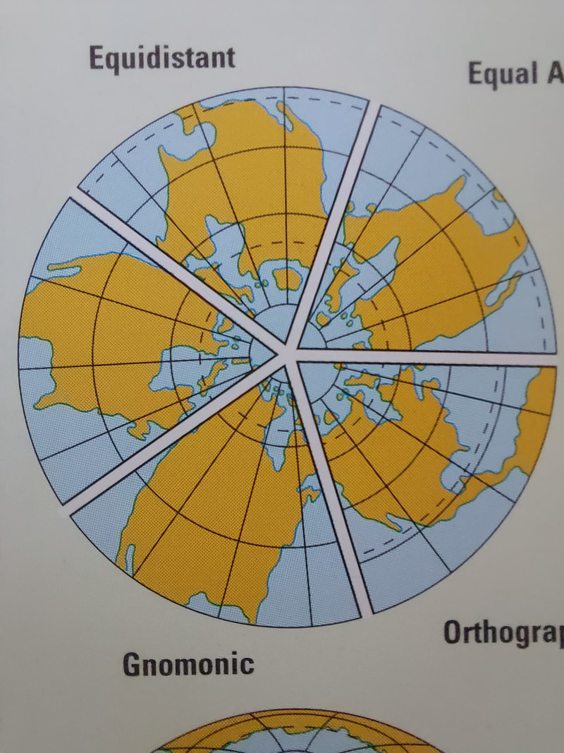
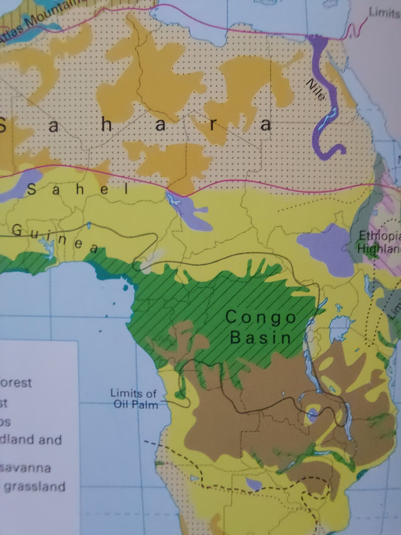
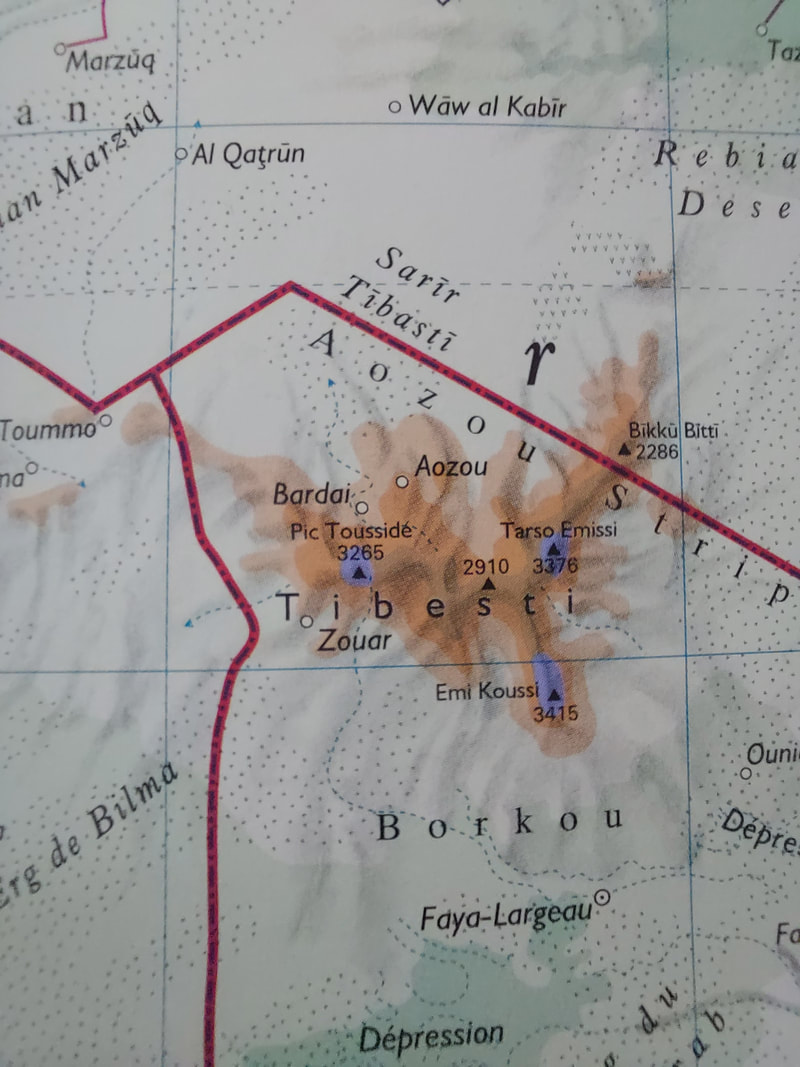
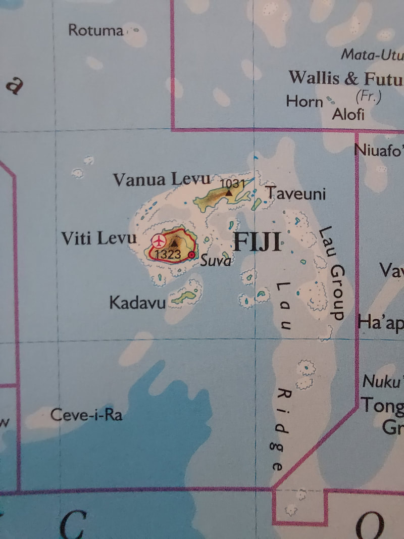
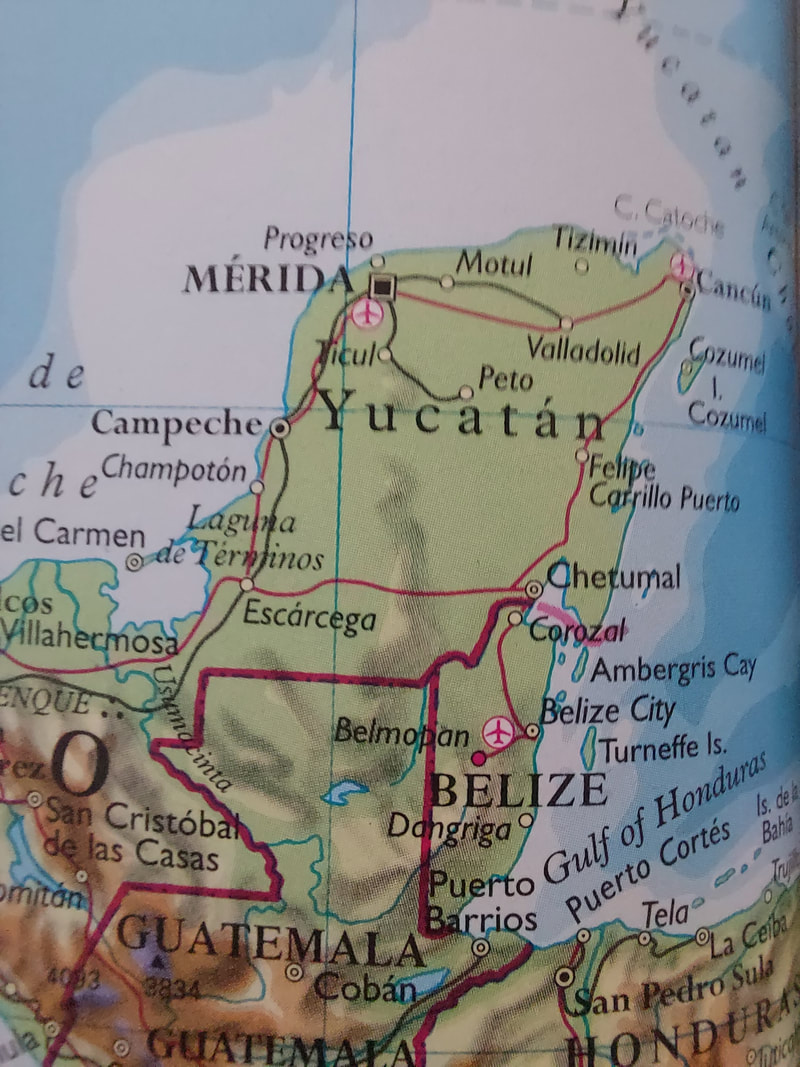
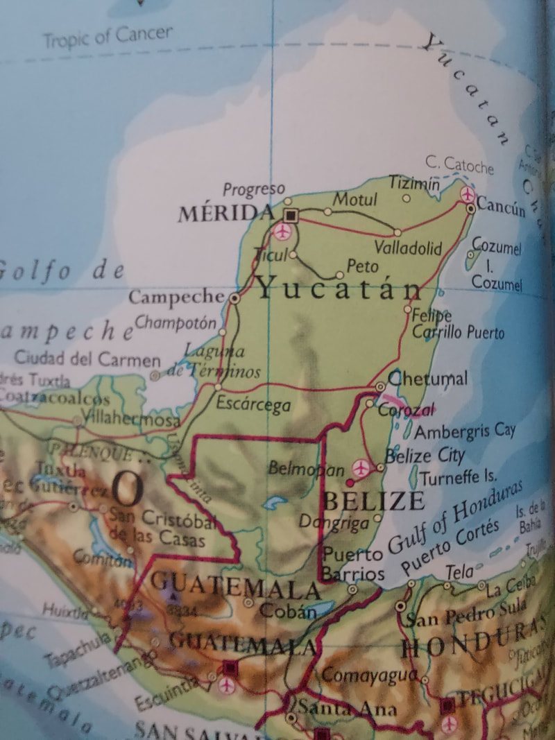
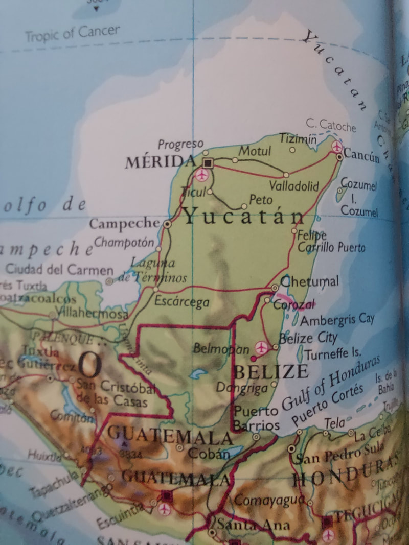
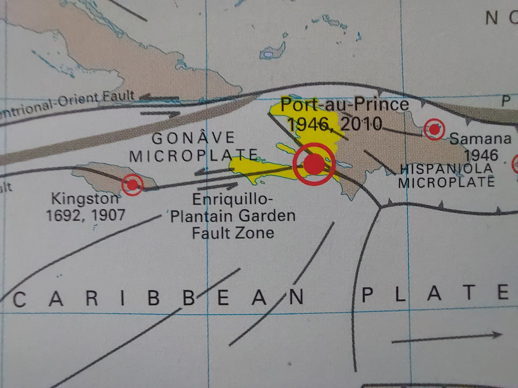
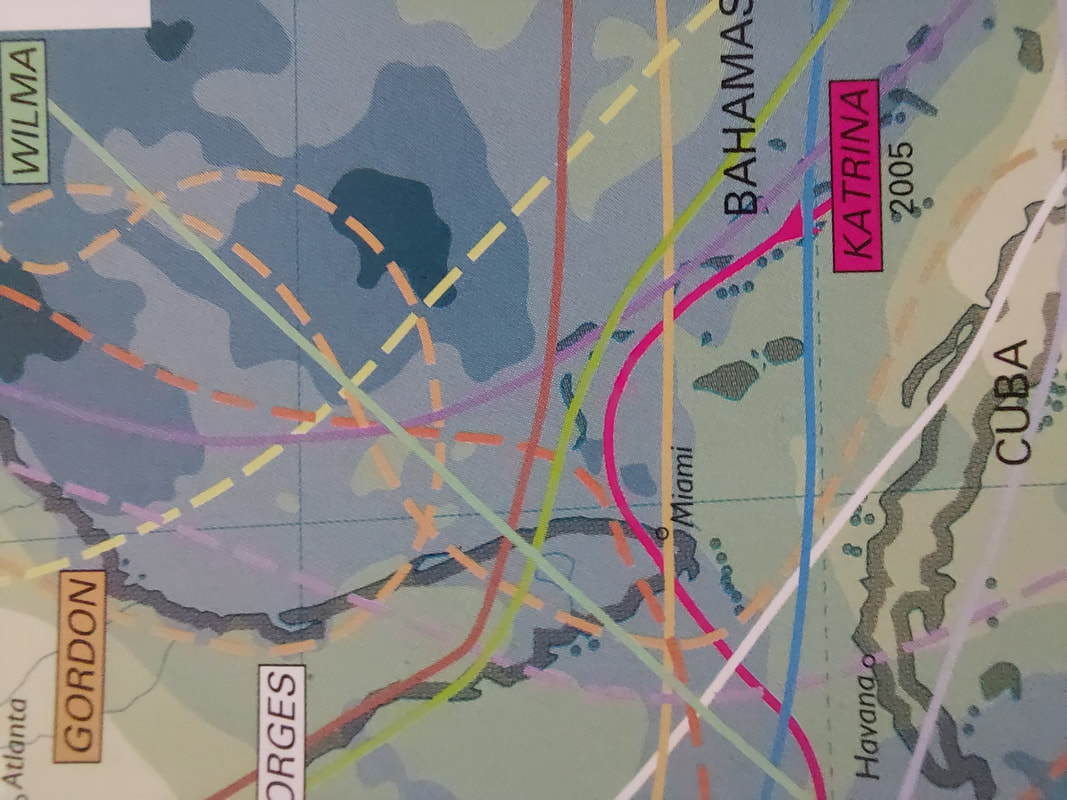
Shoot Review
I have photographed an atlas from my home, trying to find maps and pictures that are different and more individual. The settings and techniques I have used are autofocus, macro mode on my phone and artificial lighting. Because I used my phone camera for the images I paid extra attention to the ISO and White Balance that I was using. What went well was that I was able to take good photos of the atlas' maps and picture that I thought were the most thought provoking and unique, due to there colours and shapes. I think my shoot could be even better if I was able to make the pages of the atlas flatter and had better colouring/lighting. I need to take more photos and so would take another shoot, this time probably of something slightly different like drawing/art from a comic book. I have learnt to look closely and to really consider framing/cropping. This piece of work was influenced by Luigi Ghirri . The link between their work and mine is that we have both taken photos of an atlas/map book.
I have photographed an atlas from my home, trying to find maps and pictures that are different and more individual. The settings and techniques I have used are autofocus, macro mode on my phone and artificial lighting. Because I used my phone camera for the images I paid extra attention to the ISO and White Balance that I was using. What went well was that I was able to take good photos of the atlas' maps and picture that I thought were the most thought provoking and unique, due to there colours and shapes. I think my shoot could be even better if I was able to make the pages of the atlas flatter and had better colouring/lighting. I need to take more photos and so would take another shoot, this time probably of something slightly different like drawing/art from a comic book. I have learnt to look closely and to really consider framing/cropping. This piece of work was influenced by Luigi Ghirri . The link between their work and mine is that we have both taken photos of an atlas/map book.
My Photo
|
Luigi Ghirri's Photo
|
Final Piece for the Human Condition project
Fragmented Body
AO4: PRESENT
Final Piece based on your research and experimentation (25marks)
Present a personal, informed and meaningful response, demonstrating analytical and critical understanding, realising intentions and making visual and written connections, linking all of your ideas together.
Final Piece based on your research and experimentation (25marks)
Present a personal, informed and meaningful response, demonstrating analytical and critical understanding, realising intentions and making visual and written connections, linking all of your ideas together.
Before the exam day:
- Create a Pinterest board called final piece ideas and pin at least 20 different ideas for possible final pieces from these boards.
- Add these to the planning page in your sketchbook with your chosen context and final piece ideas from your board.
- Choose 3 favourites ideas and do another photoshoot.
- Using these photographs, create at least 3 different mock ups of your final pieces. Experiment with the new ideas you have found.
- Create your final piece.
- Experiment with photographing the whole construction or selected parts of it. Consider lighting, angles and crops.
- You could even experiment with re-photographing your photograph (either a printed image or on screen).
Final Piece inspiration from other artists
I created a Pinterest board of my inspiration before finding photographers that I am inspired by: https://pin.it/l91wgw6
Lorna Simpson
Lorna Simpson was born August 13, 1960. She's an American photographer and multimedia artist. She came to prominence during the 80s and 90s and is most well-known for her work in conceptual photography. Her works have been included in numerous exhibitions both nationally and internationally. She is best known for her photo-text installations, photo-collages, and films. Her early work raised questions about the nature of representation, identity, gender, race and history. Simpson continues to explore these themes in relation to memory and history in various media including photography, film, video, painting, drawing, audio, and sculpture.
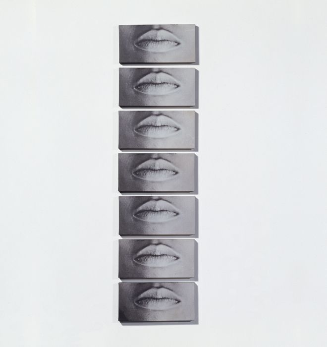
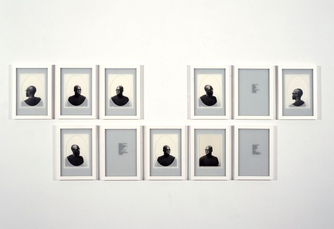
What I like about their pictures
I really like the idea of adding some text to my piece and presenting my chosen photos next to each other, in the same or different frames. I also like the adding of notes and measurements to the piece and the use of contrasting colours like red, blacks and white.
I really like the idea of adding some text to my piece and presenting my chosen photos next to each other, in the same or different frames. I also like the adding of notes and measurements to the piece and the use of contrasting colours like red, blacks and white.
|
Image Analysis
The title of this piece is 7 mouths. It is by Lorna Simpson and was created in 1993. It is a form of conceptual multi media. The composition shows 7 printed pictures of mouths in a line that seem like they have been printed onto canvas. These pictures are hung onto a large white background. Each photo is in black and white and seems to be of the same person but each has slightly different shading and shadows. The focal point of the image are the row of 7 eyes down the centre of the picture. The techniques used here are artificial lighting, grayscale colouring, angle, height and negative space. The patterns and lines I can see in the image are created by the repeating canvases down the centre of the image. The image is made mostly of the negative space and so looks very smooth. The artist has printed her photos into physical pictures and used a camera to take a photo of this conceptual piece. |
|
Daniel Gordon
|
Daniel Gordon was born in 1980 in Boston, massachusetts. He is an American artist who lives and works in Brooklyn, New York. He is best known for producing large colour photographs that operate somewhere between collage and set-up photography. His work, as described by The New York Times, "Involves creating figurative tableaus from cut paper and cut-out images that Mr. Gordon then photographs. In addition, he seems motivated by a deeply felt obsession with the human body and the discomforts of having one.
|
|
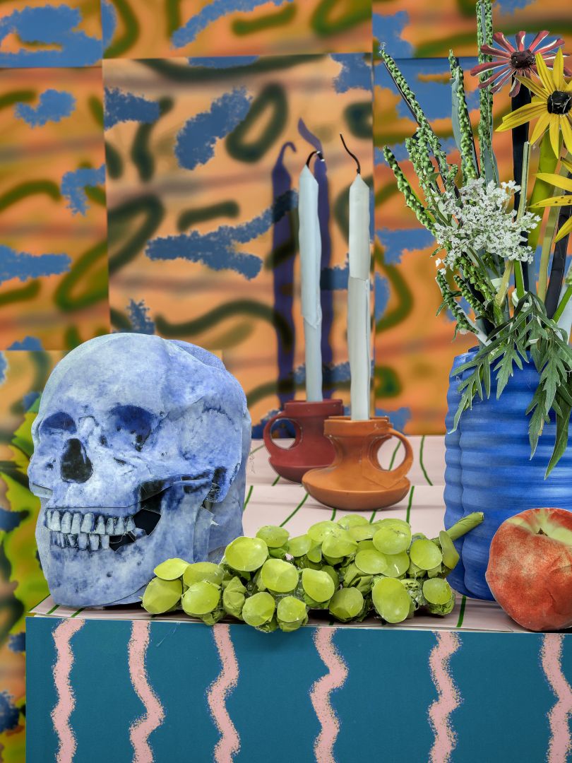
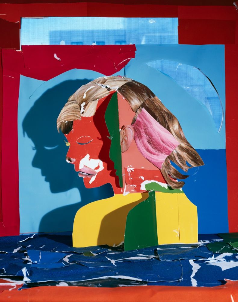
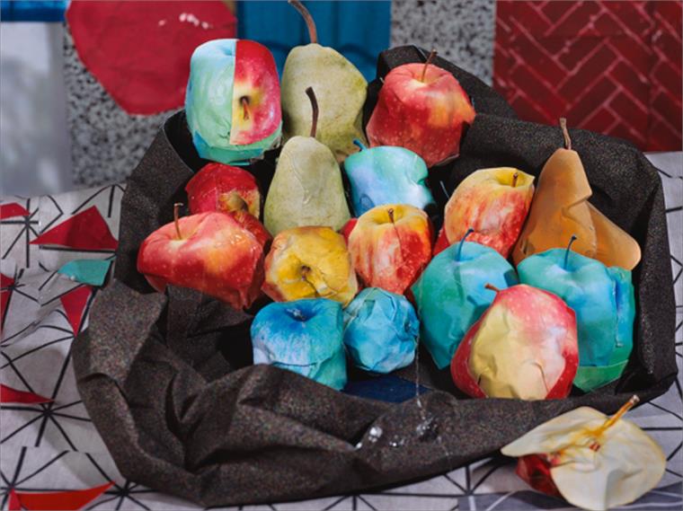
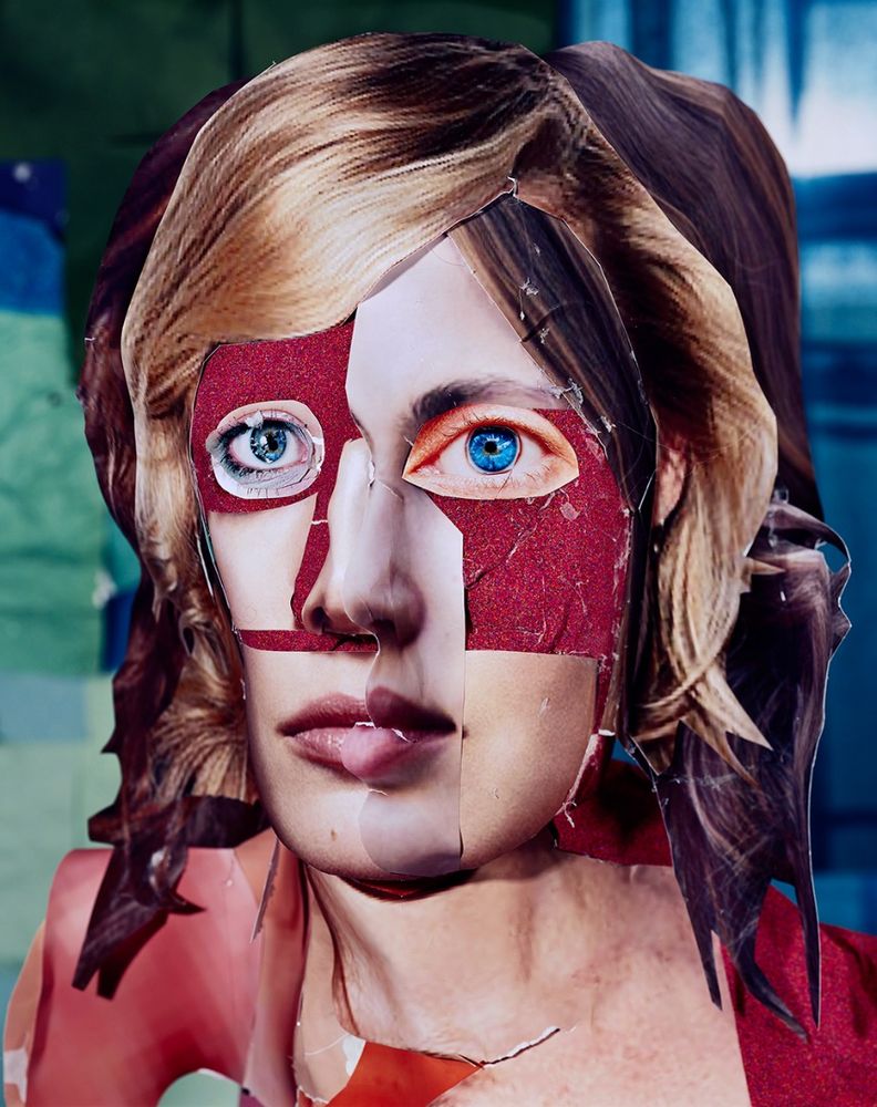

What I like about their pictures
I like his use of contrasting and complimenting colours and the way he sticks his different photos together in order to create other sculptures and creations, especially in his people, where he mixes faces and colours.
I like his use of contrasting and complimenting colours and the way he sticks his different photos together in order to create other sculptures and creations, especially in his people, where he mixes faces and colours.
|
Image Analysis
This piece is from a collection called The Green Line. It is by Daniel Gordon. It was created in the 2000s or the 2010s. His art operates somewhere between collage and set-up photography. To create each piece, he sorts through photographic images found on the Internet, prints them, and builds 3-D tableaux he then shoots with a camera. The composition shows a portrait of a woman to her shoulders. However, she has been pieced together like a jigsaw, with found pictures of other women and with block colours of green, red and yellow. The woman’s hair is blue and her left eye is blue, the other, her right eye, is black or dark brown. Even her shoulders and neck are pieced together by deep purple-like colours. The background of the image is out of focus and is made up from a number of colours that look like they have bene ripped up from other places. The focal point of the image is her entire face, but mostly her blue hair or blue eye as the colours are particularly vivid. The techniques used here are angle and hight, vivid colouring and a shallow depth of field. The patterns and lines I can see in the image are created through the interloping printed pictures and colours and the cutting and ripping of the prints. The texture in the picture looks smooth but not too smooth as the pictures have been ripped and stuck down onto a 3D surface. I believe the photographer has used the internet to find his images and a traditional DSLR camera has been used. |
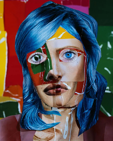
|
Anthony Gerace
Anthony Gerace is a canadian photographer and artist based in London, England but he grew up in London, Ontario – a small city a couple of hours’ drive from Toronto. He started taking pictures in high school and experimenting with collage a few years later. Gerace’s collages recall the avant-garde movements of the ’30s and ‘40s, and his photographic series American Homes, Some Cities and Mountains seem to be influenced by the classics of American photography from the ‘70s as well as the Northern American landscapes of his native Toronto.
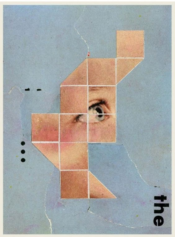
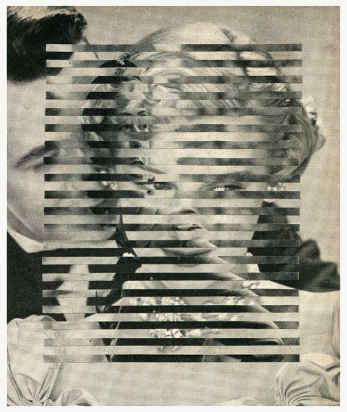
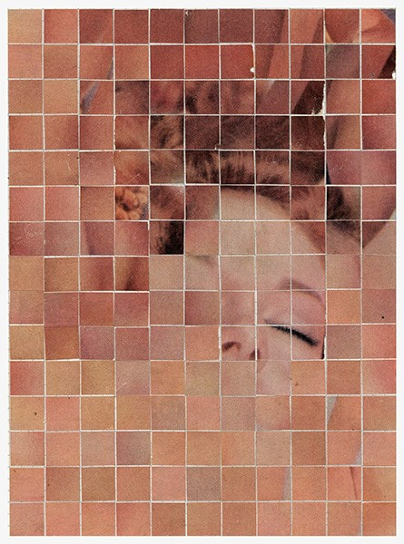
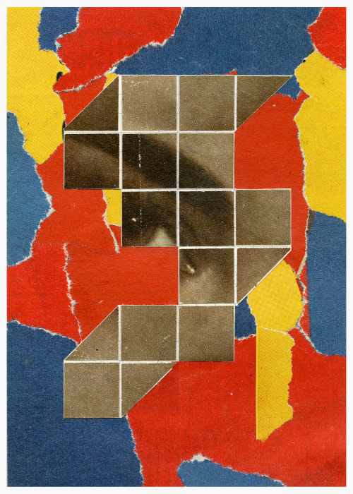
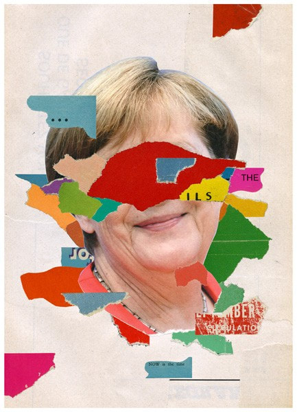
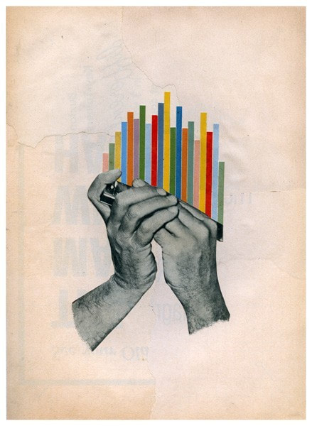
What I like about their pictures
I like the work of Anthony Gerace the most, his moulding of his work and the incorporation of other found photos/designs. His cutting of the photos into uniform squares, lines or rectangular shapes also inspires me. Gerace has also produced political art, that mixes with my earlier work with Hannah Hoch.
I like the work of Anthony Gerace the most, his moulding of his work and the incorporation of other found photos/designs. His cutting of the photos into uniform squares, lines or rectangular shapes also inspires me. Gerace has also produced political art, that mixes with my earlier work with Hannah Hoch.
|
Image Analysis
This piece is from a collection called there must be more to life than this. It is by Anthony Gerace. It was created in the early 2010s. It is an example of an abstract collage. The composition shows a portrait picture of a woman but the image has been cut into small, equally sized squares. Some of the squares however have been moved and taken away from the image, leaving it jumbled and recognisable but misshapen. The woman looks as if she is wearing a purple knitted jumper and she has blonde hair. The focal point of the image is her slightly parted lips and mouth in the centre of the collage, like most of her face they have been mostly untouched by the jumbling of the squares, the woman’s lips also have a deep red shade of lipstick and so it sticks out in an image of mostly dull colours and pastel purples. The techniques used in the image before it was cut up look like natural lighting, angle and height a cool white balance and a shallow depth of field. The patterns and lines I can see in the image are the repeating square grid created by the cutting up of the photo. The image makes me feel uneasy but calm as my brain thinks that I should be able to but can’t recognise the subject but the colours are cool and calming |
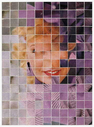
|
More Inspiration
These are the photos I took at school of past final pieces. I did this to see the different approaches that other people took and to get some inspiration and ideas from past students.
These are the photos I took at school of past final pieces. I did this to see the different approaches that other people took and to get some inspiration and ideas from past students.
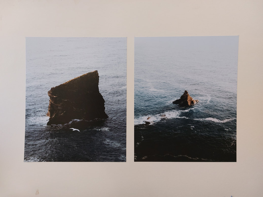
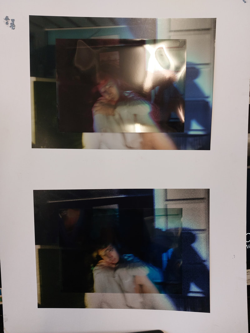
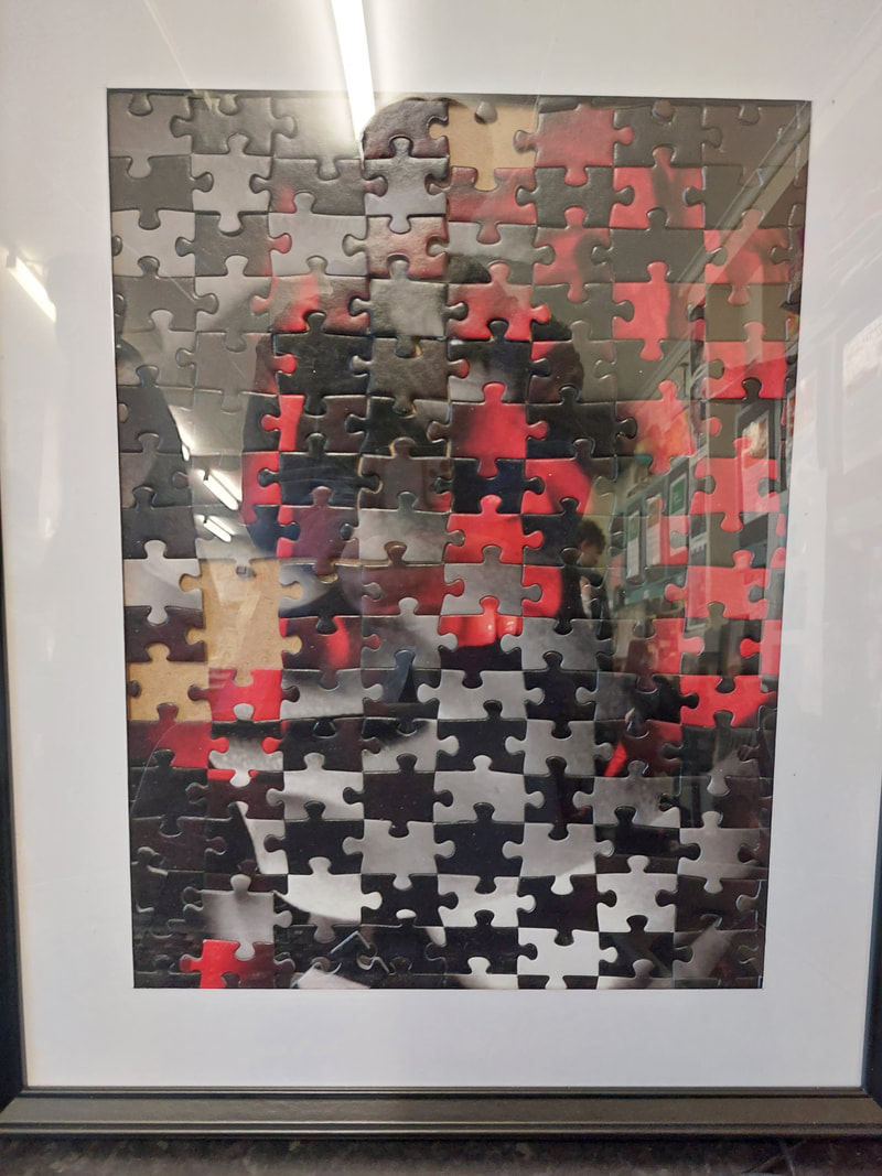
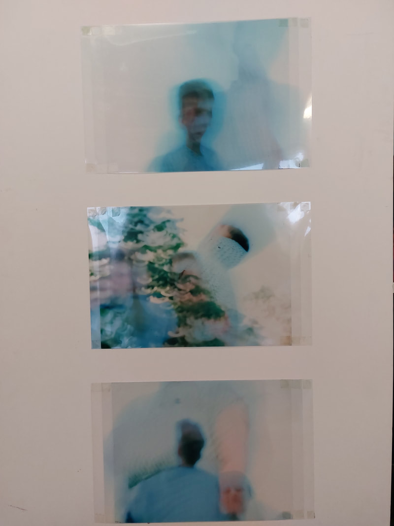
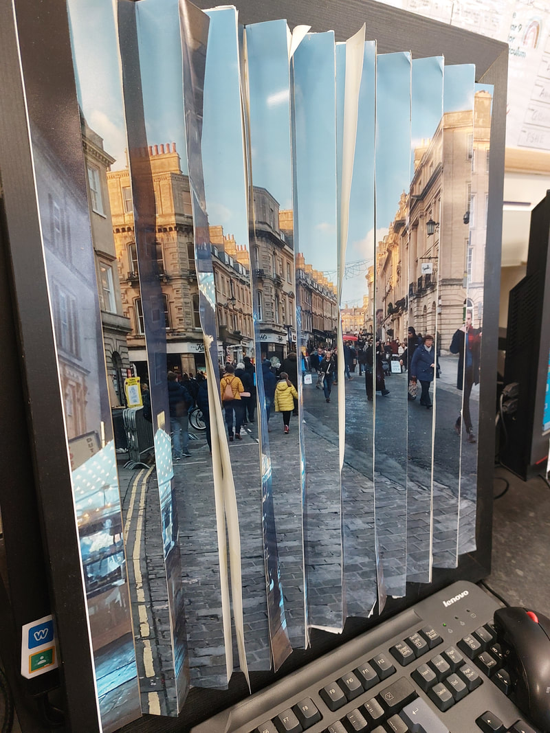
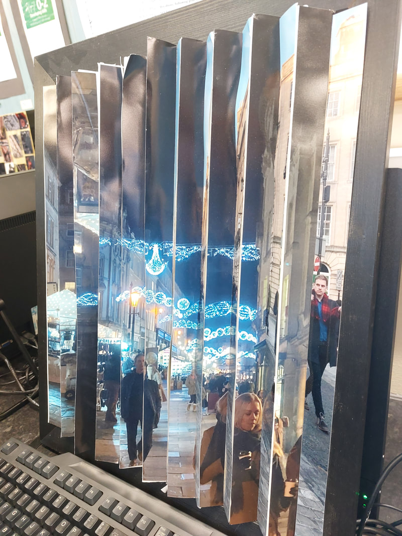
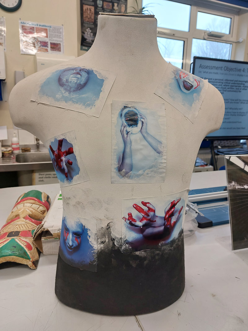
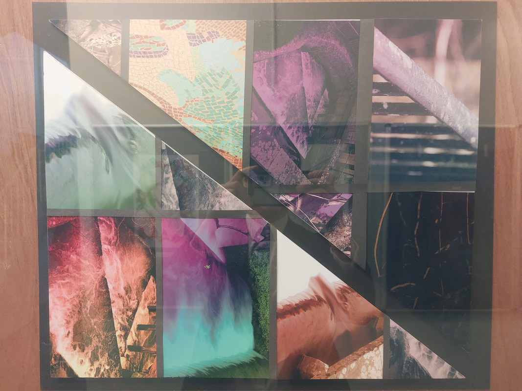
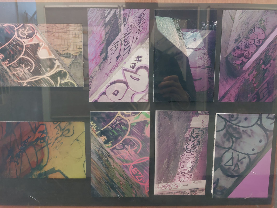
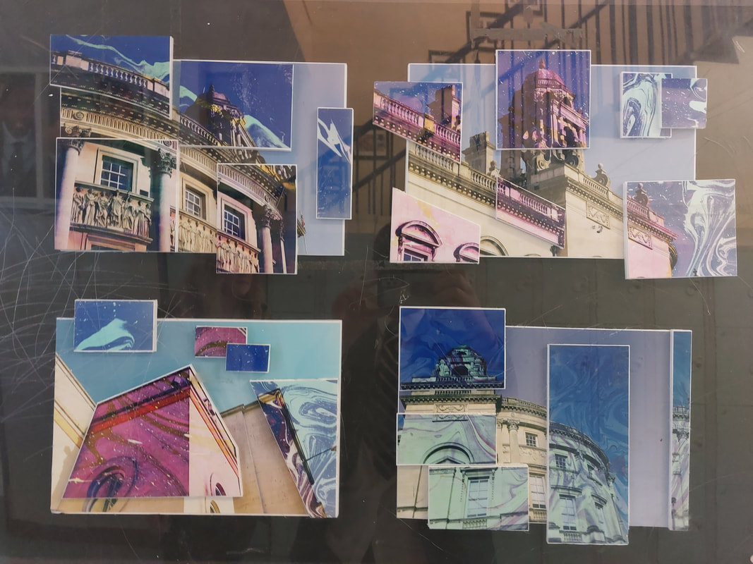
Why Fragmented Body?
My work takes elements of the real world, rather than exploring realism and reportage of the human figure or body. I am more interested in building a body of work that explores the figure and the body through the fragmentation, abstraction and symbolism of the human condition. This will allow me to explore the human condition in a more personal way, wondering weather it can have a more subjective meaning than we imagine.
For my final piece, my subject is The Human Condition but more specifically the Human Form. I have called my specific subtheme Fragmented Body as I want to introduce a form of abstraction to the subject, where I could cut and stitch together the human form and look at the human condition from a different perspective.
At the begging of my topic I looked mostly at hands and the different ways in which we perceive them. I then moved more into actually ‘fragmenting’ the human body through the use of photoshop. Finally, I looked closer at abstraction and produced a 3D piece that mixed together colour, layers and both eyes and hands.
In this final piece, I want to continue with my different uses of colour and the fragmentation of the human body. I am planning on keeping it mostly to the use of the human face and want to add pictures using layers, similar to my 3D piece, in order to add another layer of meaning to the piece.
My Plans for My Final Piece
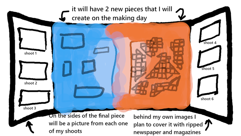
I made my first plan on my laptop using Gimp photoshop and my digital pen. I used the paint tool and the type/text tool to explain my ideas.
I made a second plan during lesson where I used an A3 piece of paper and my pen/pencil. On this plan I went into more detail and elaborated a little more on my designs.
I made a second plan during lesson where I used an A3 piece of paper and my pen/pencil. On this plan I went into more detail and elaborated a little more on my designs.
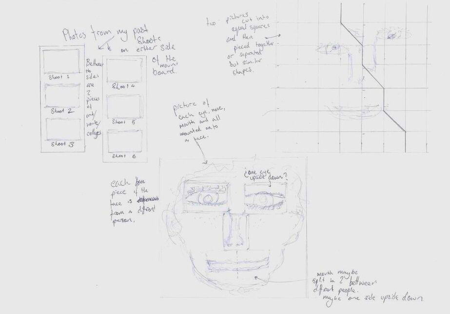
My First Trial Shoots
Idea 1
To test out my ideas I took a number of selfies, some of which I would use as a base image and some I would use to cut up and add on top of the base image. I then cut out my mouth, eyes and nose and reshaped by face.
To test out my ideas I took a number of selfies, some of which I would use as a base image and some I would use to cut up and add on top of the base image. I then cut out my mouth, eyes and nose and reshaped by face.
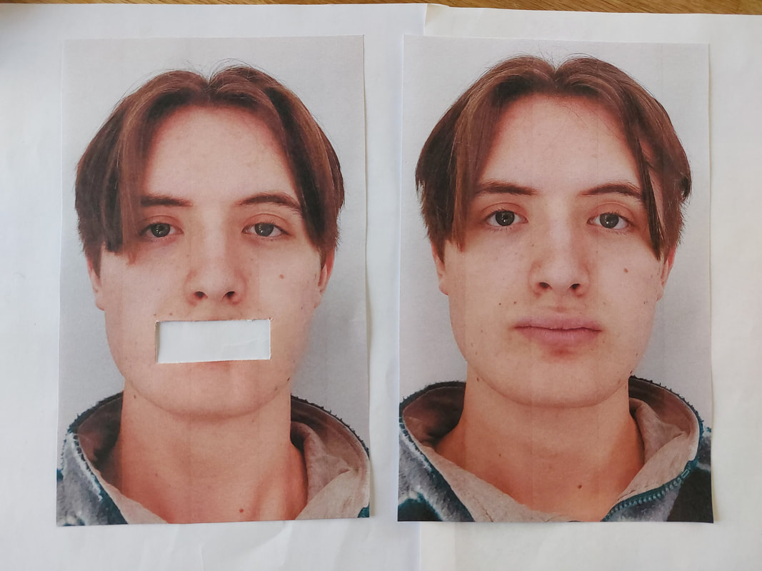
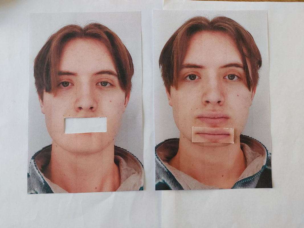
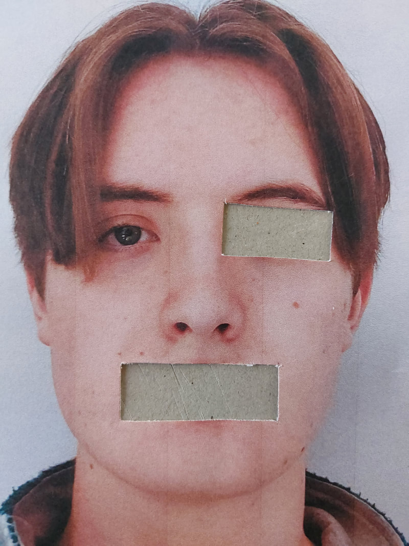
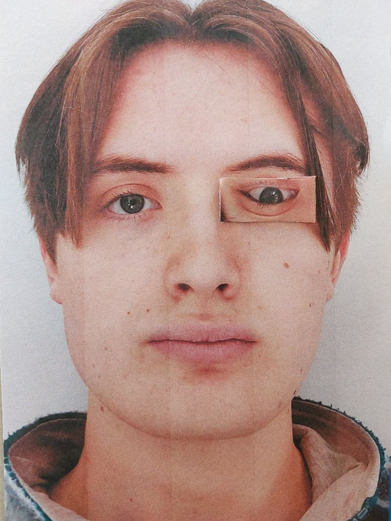
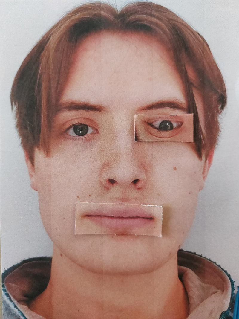
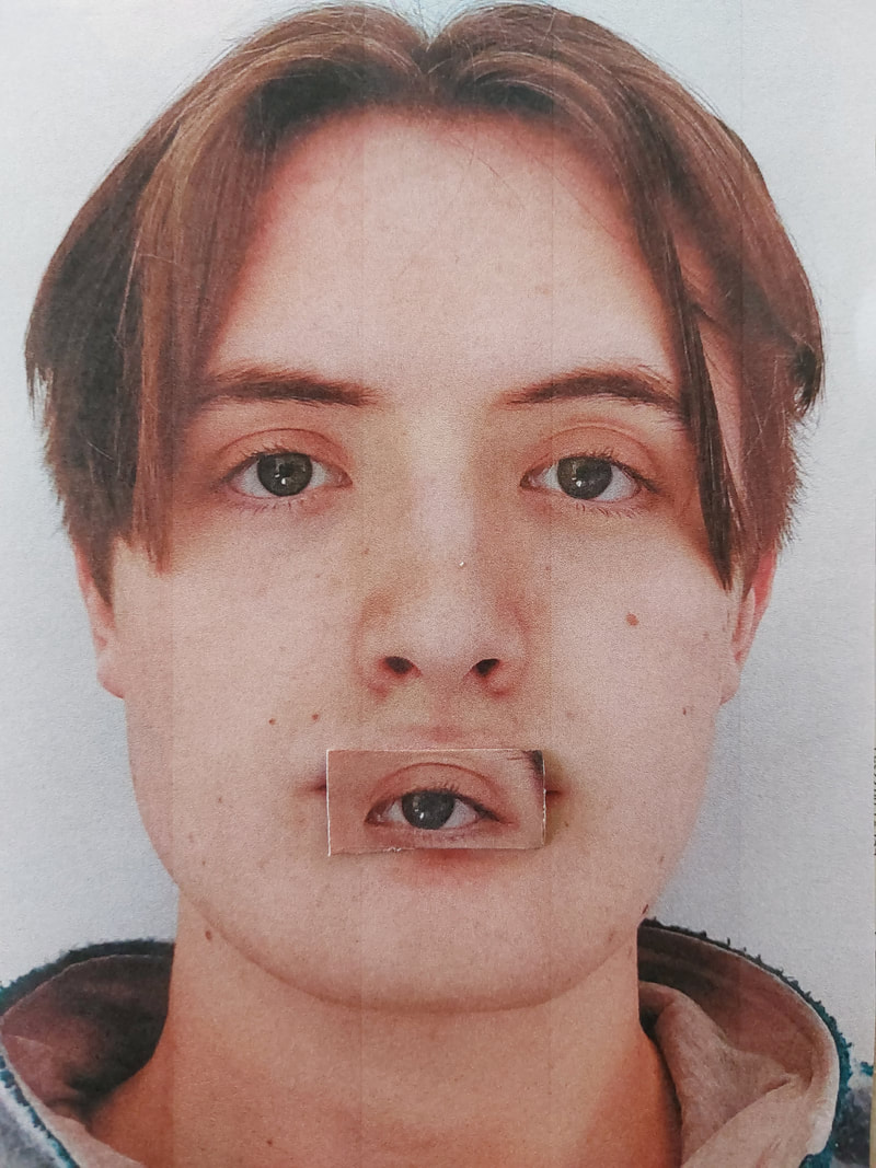
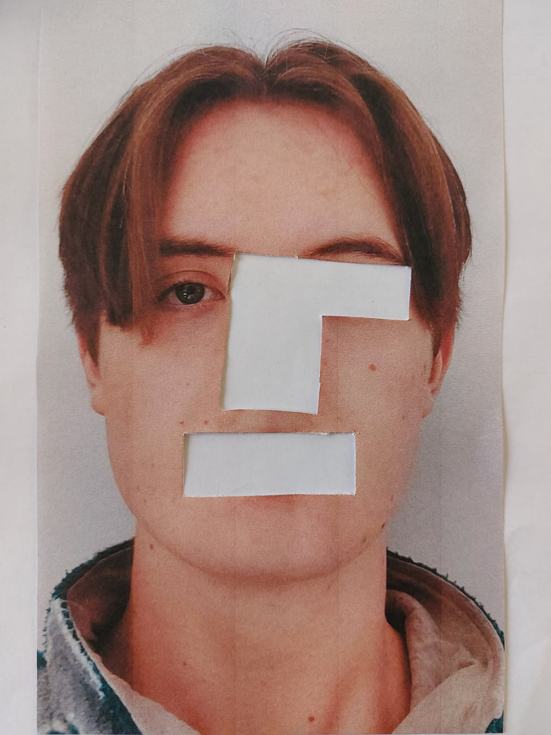
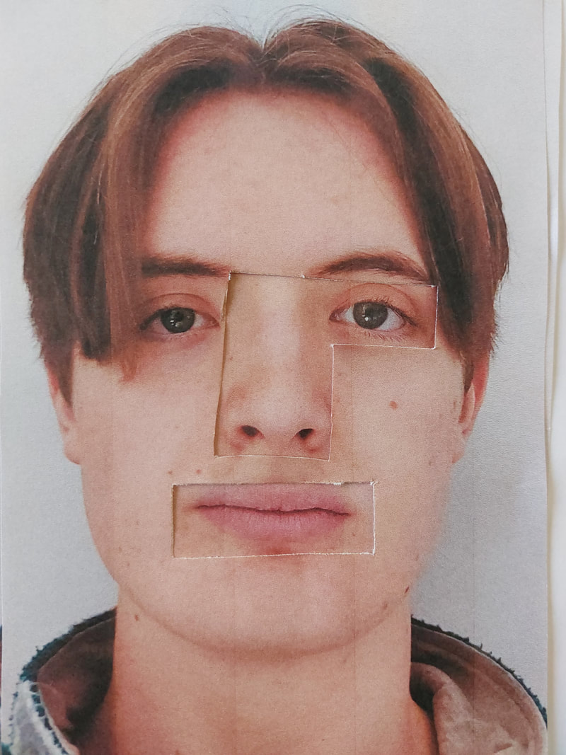
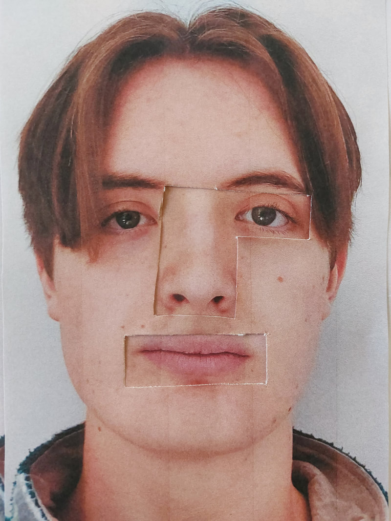
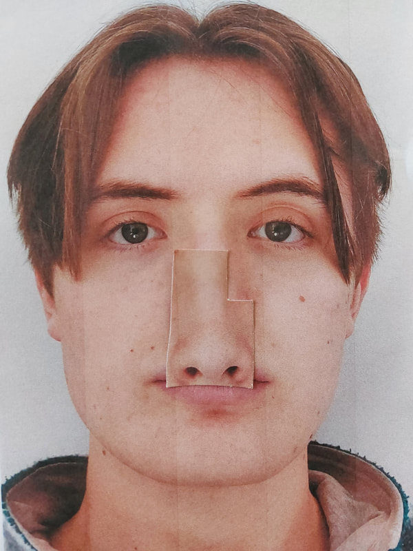
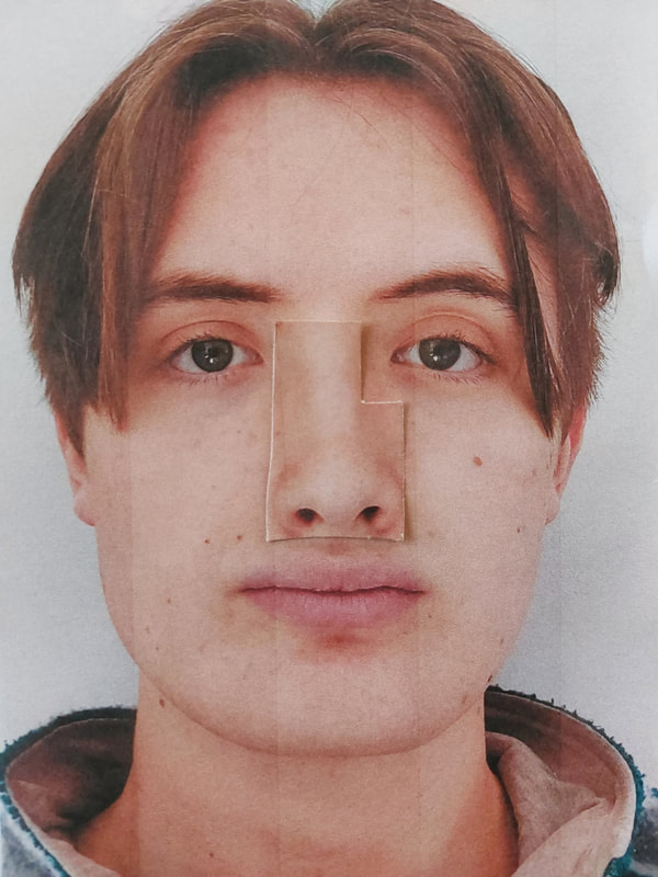
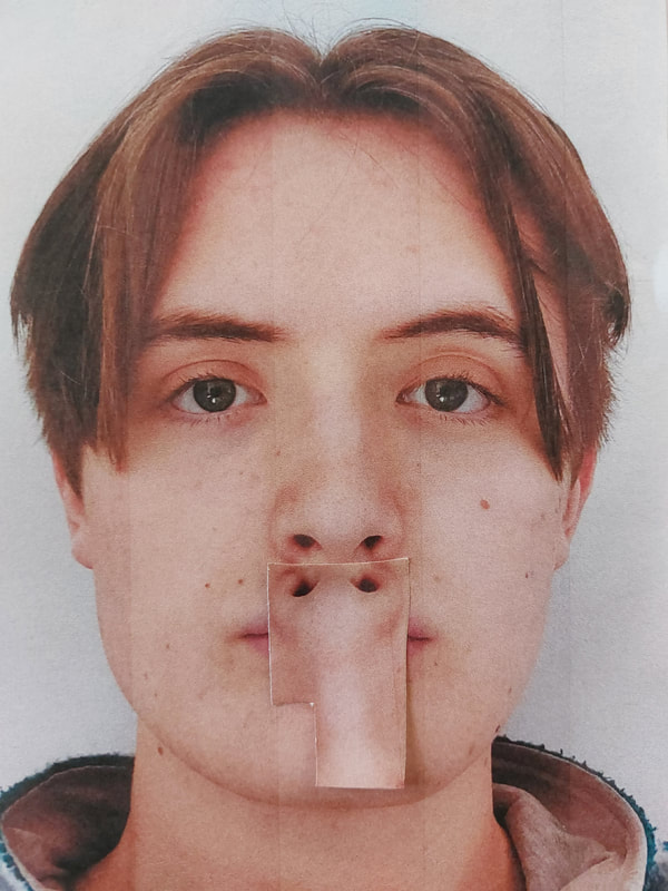
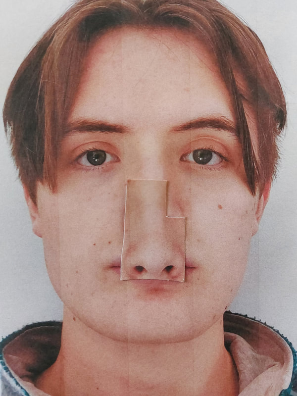
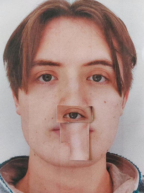
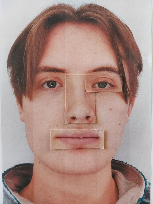
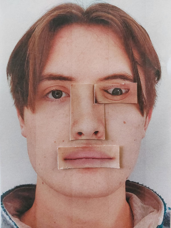
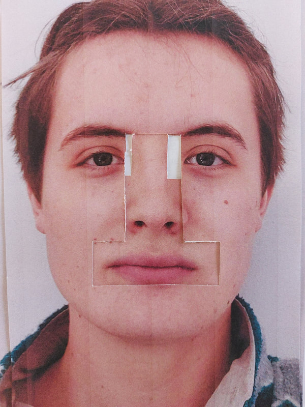
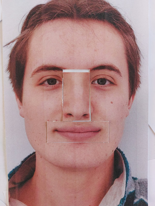
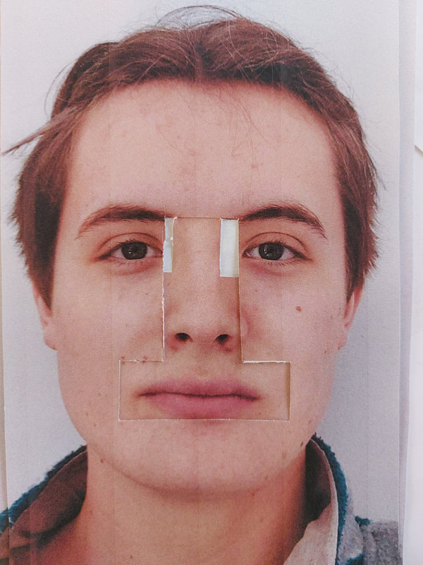
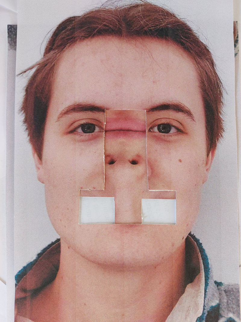
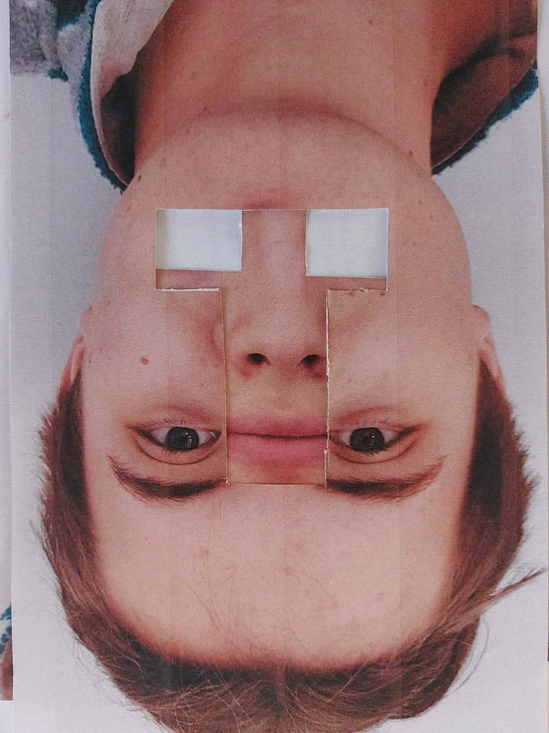
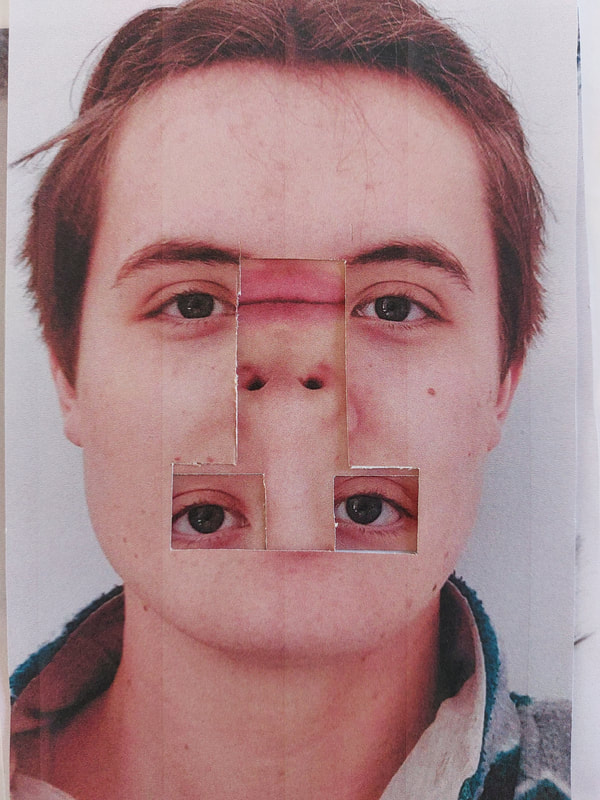
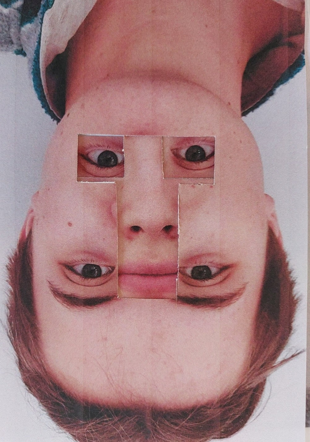
Idea 2
I then had another idea, if you turned one picture upside down you could cover the base image in the reverse, this then lead to a good number of pictures and a new style that I was very pleased with. The white paper covers most of the face but it still remains the recognisable. I also added some of the eyes, noses and mouths that I had cut out previously and I added them into the image.
I then had another idea, if you turned one picture upside down you could cover the base image in the reverse, this then lead to a good number of pictures and a new style that I was very pleased with. The white paper covers most of the face but it still remains the recognisable. I also added some of the eyes, noses and mouths that I had cut out previously and I added them into the image.
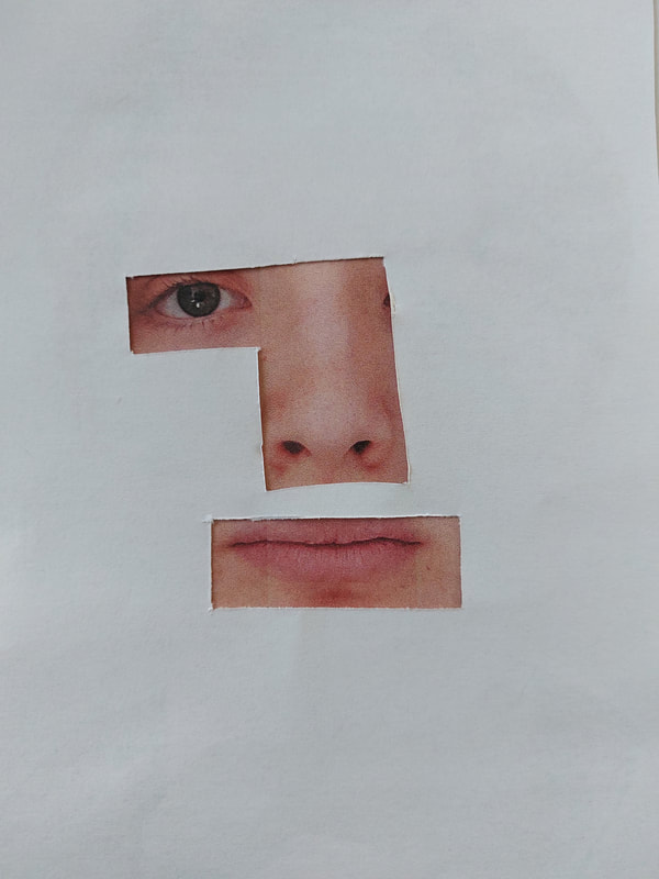
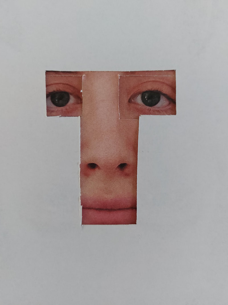
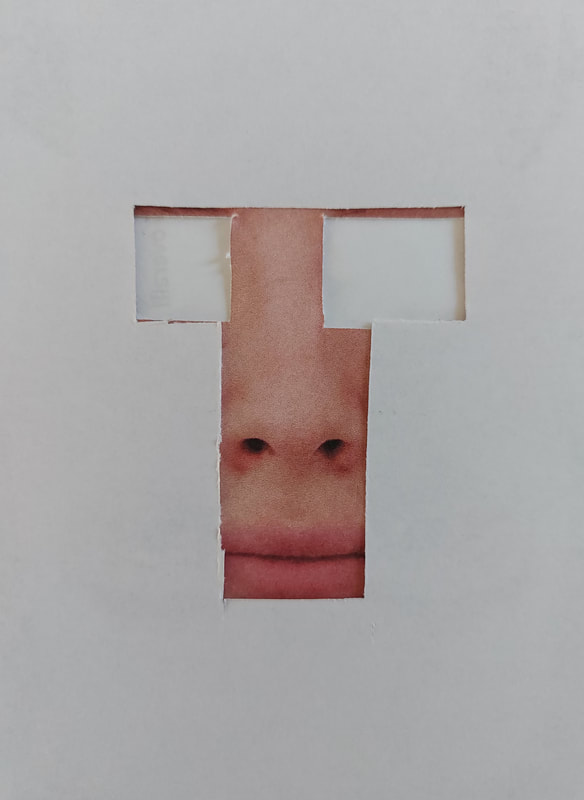
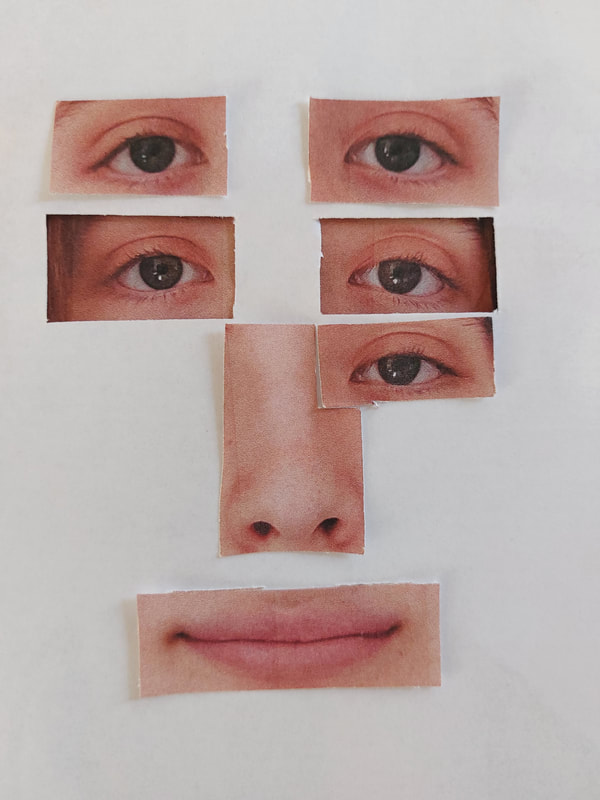
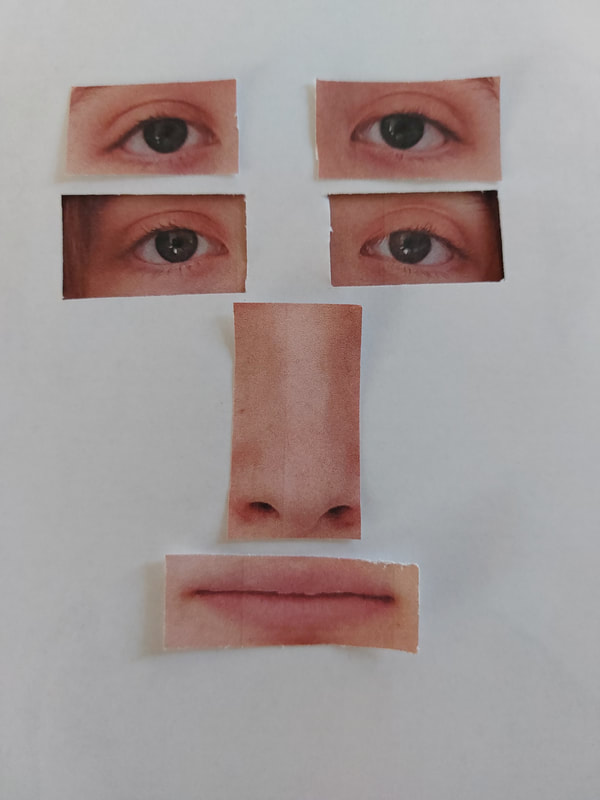
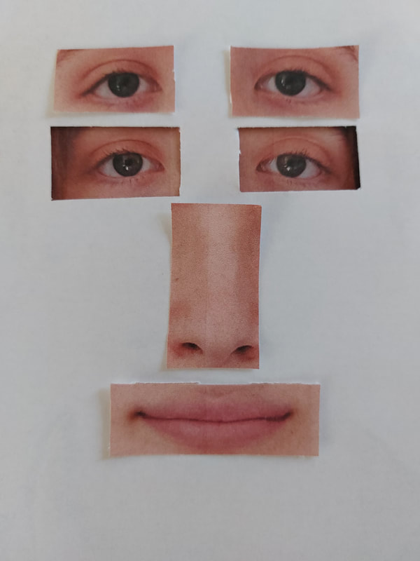
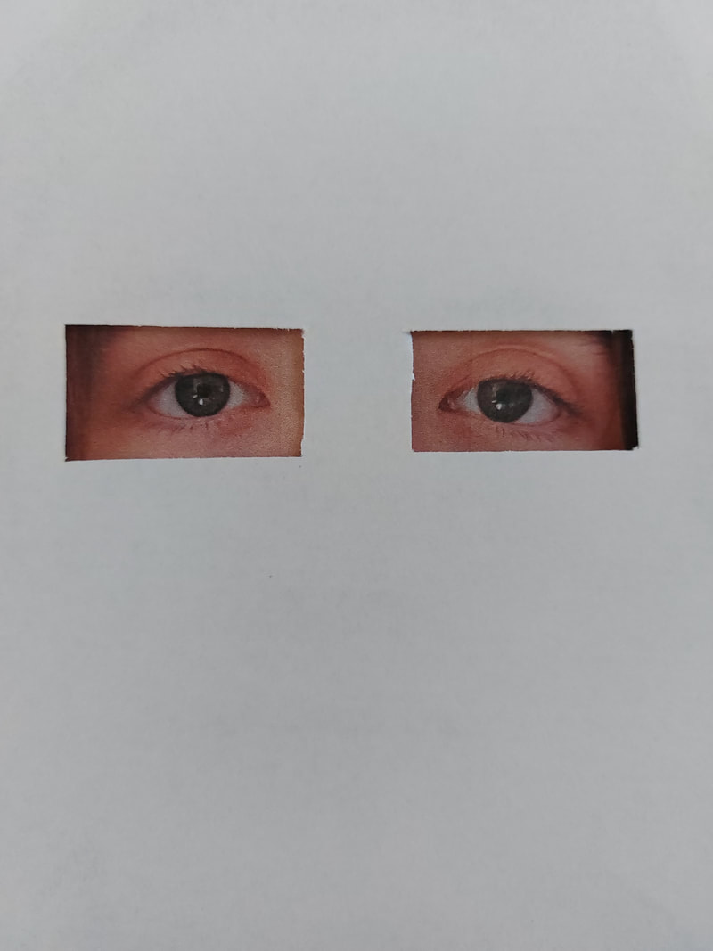
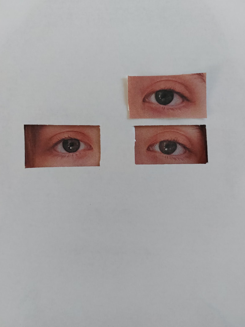
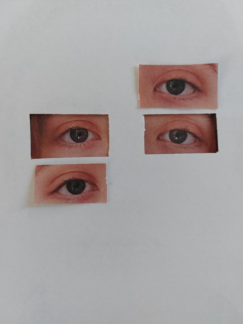
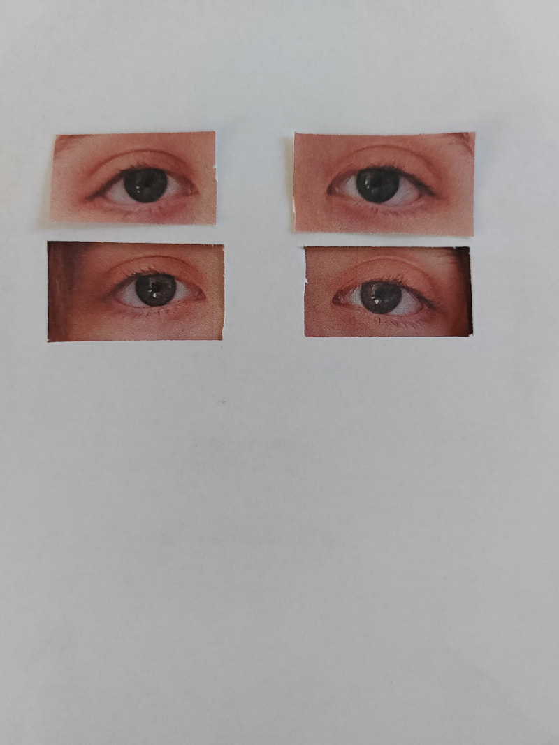
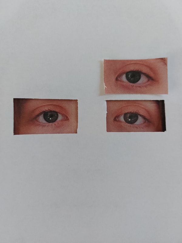
Idea Evaluation
For my final piece I want to make the pictures more complex and to have more levels and layers. When I add the cut out pieces onto the base image I hope to use foam board so it elevates them.
I also want to show how my topic has developed from the beginning and so along the sides I will print out the photos from each phase of my coursework and hope to stick them along the sides of my final piece.
The message I want to show about the Human Condition is to question the human form itself and to look at it in a more personal way, looking at the more subjective meaning than we don't look for.
The photos I will use to represent the progression of my project
To show how my topic has developed from the beginning of my theme to the end I have chosen these eight images and I will place them along the sides of my final piece to show the progression. The photos are not from each individual shoot of photographer but instead I just chose the ones that I liked the most and that I think are the most important and show my ideas/progression the most accurately.
After revisiting my final piece and replanning, I couldn't see how I could fit this into my piece.
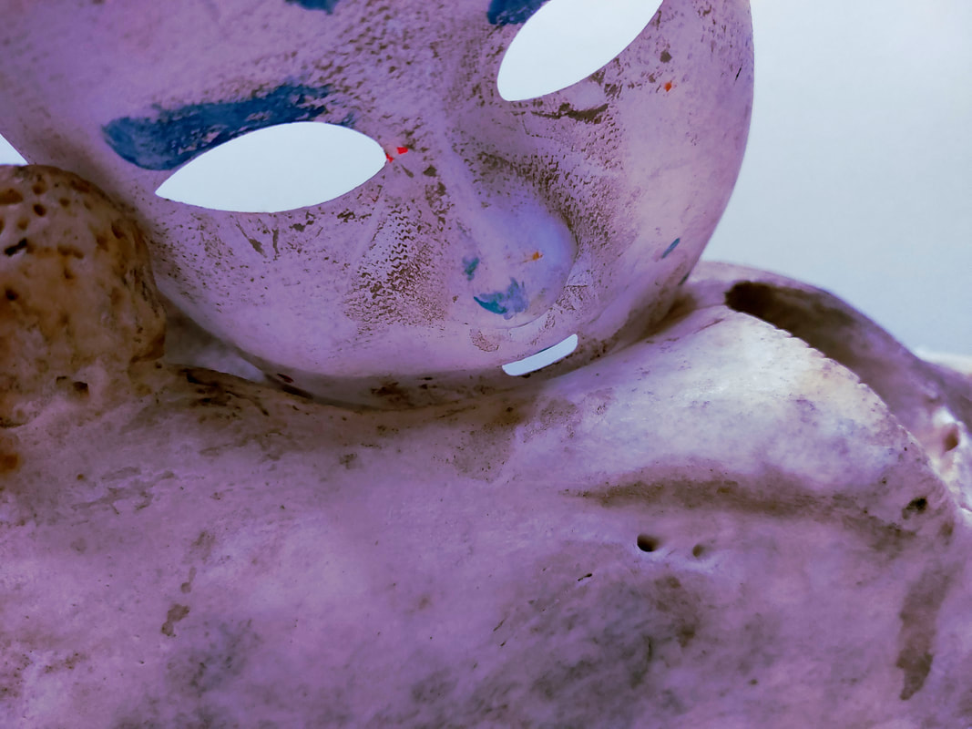
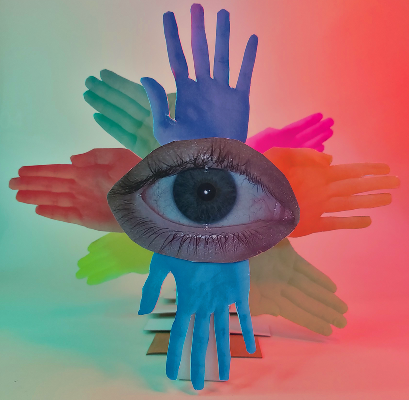

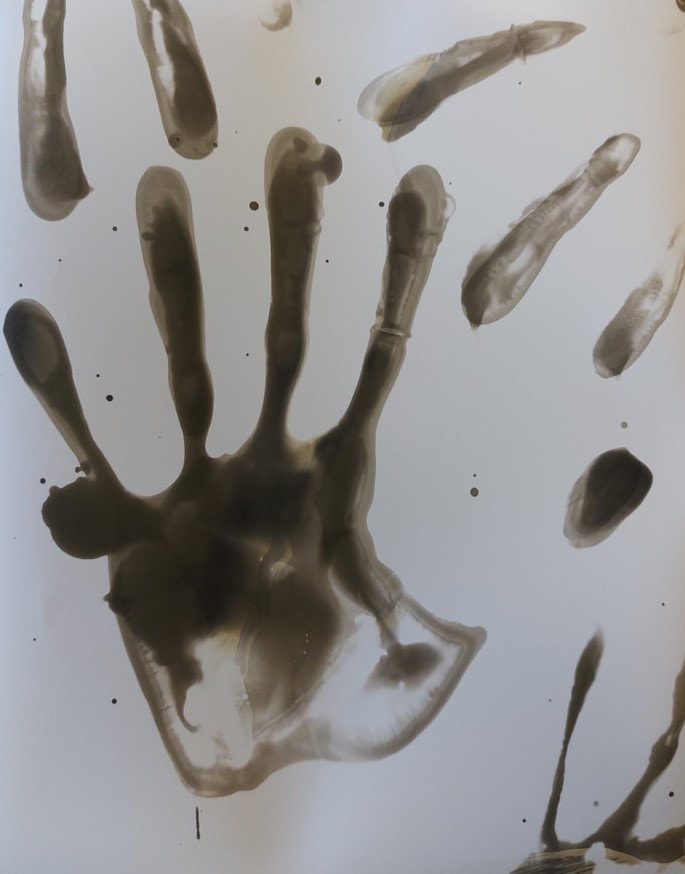


My Final Shoot
Shoot plan
After looking at my plans, my shoot will be a series of headshots of my friends. I will be using natural lighting and take the photos in front of a white background in my photography room. I will take all of photos on my Fujifilm X100s, this means I can adjust the focus, iso and aperture to achieve the images I want to. I will mostly use auto focus, a large aperture for a shallow depth of field.
After looking at my plans, my shoot will be a series of headshots of my friends. I will be using natural lighting and take the photos in front of a white background in my photography room. I will take all of photos on my Fujifilm X100s, this means I can adjust the focus, iso and aperture to achieve the images I want to. I will mostly use auto focus, a large aperture for a shallow depth of field.
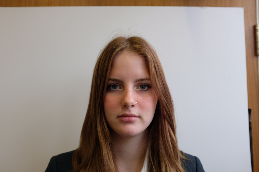
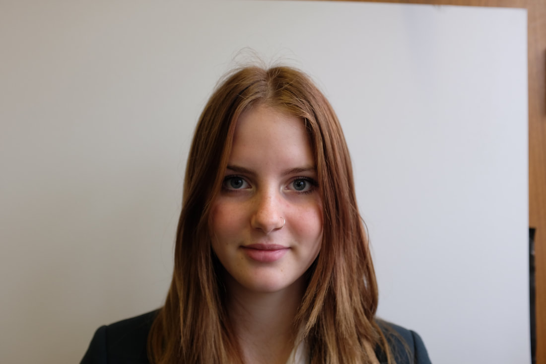
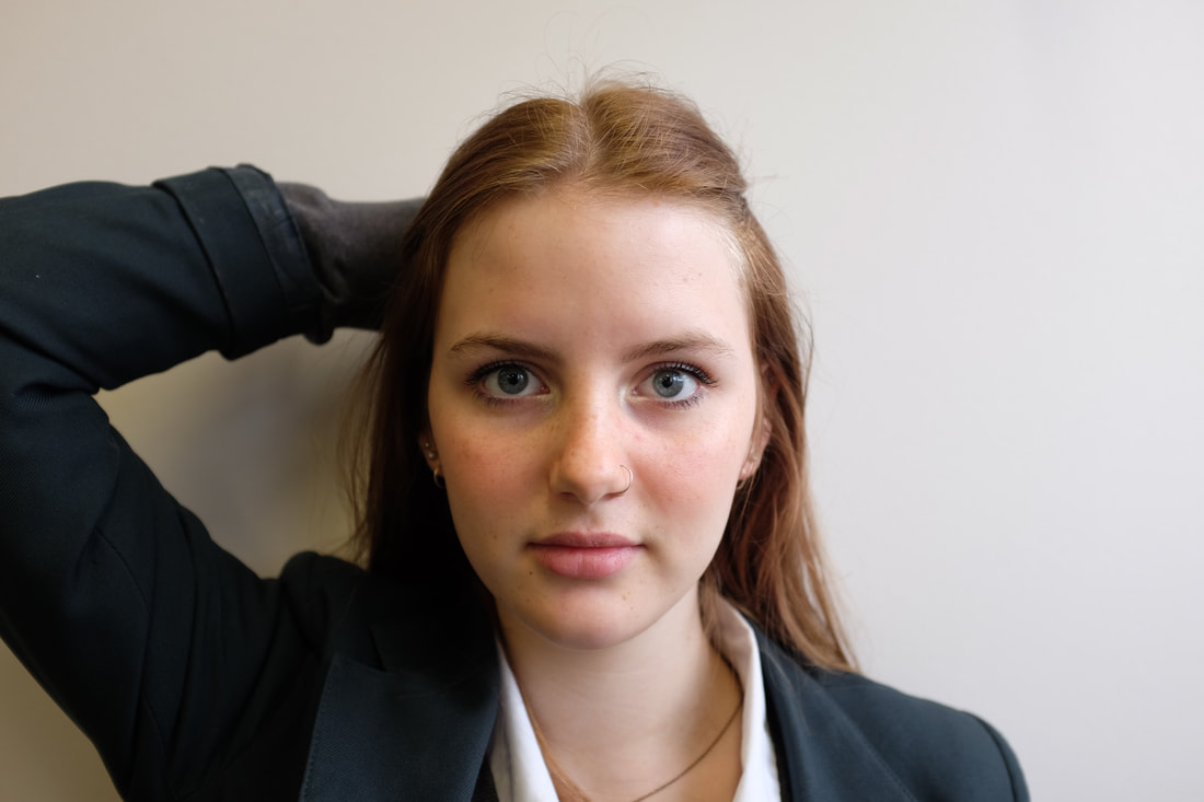
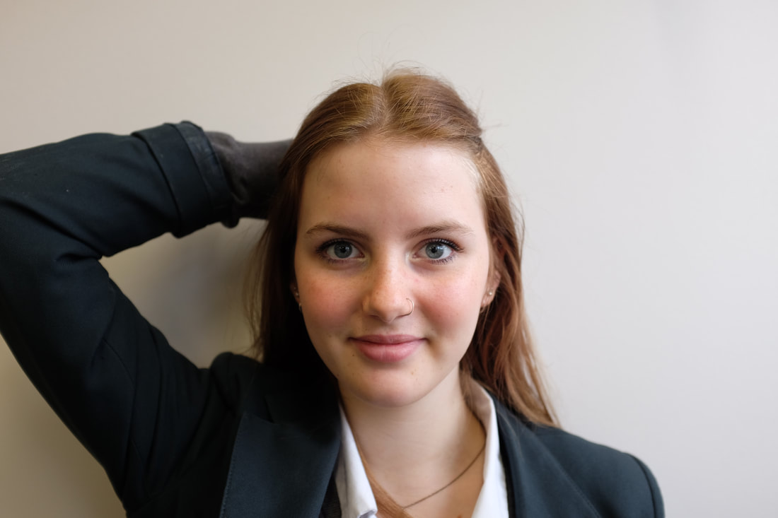
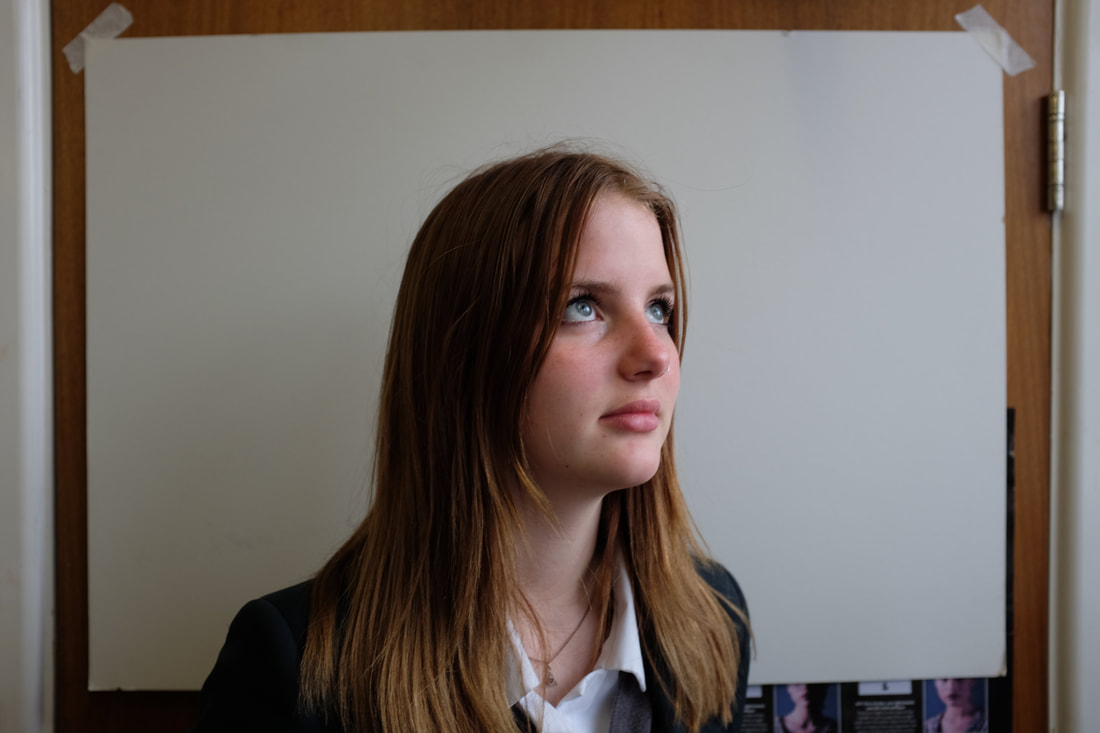
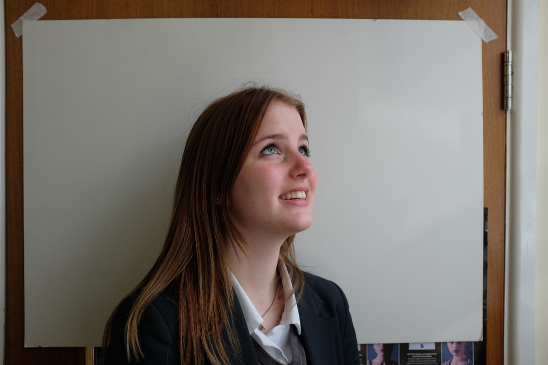
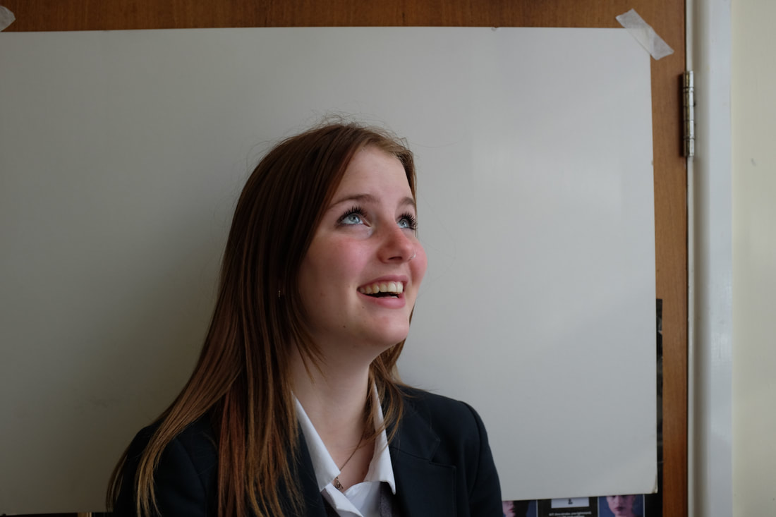
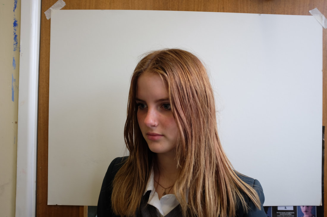
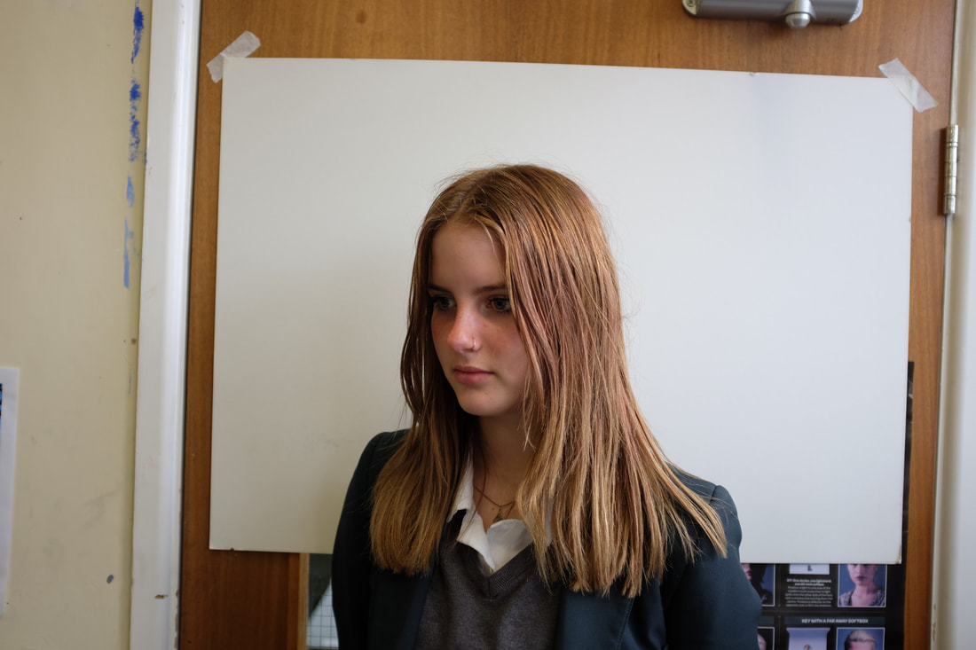
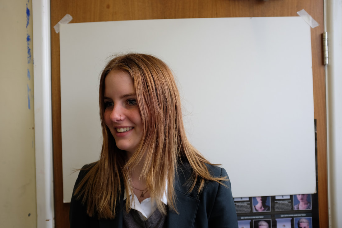
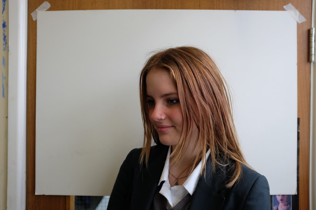
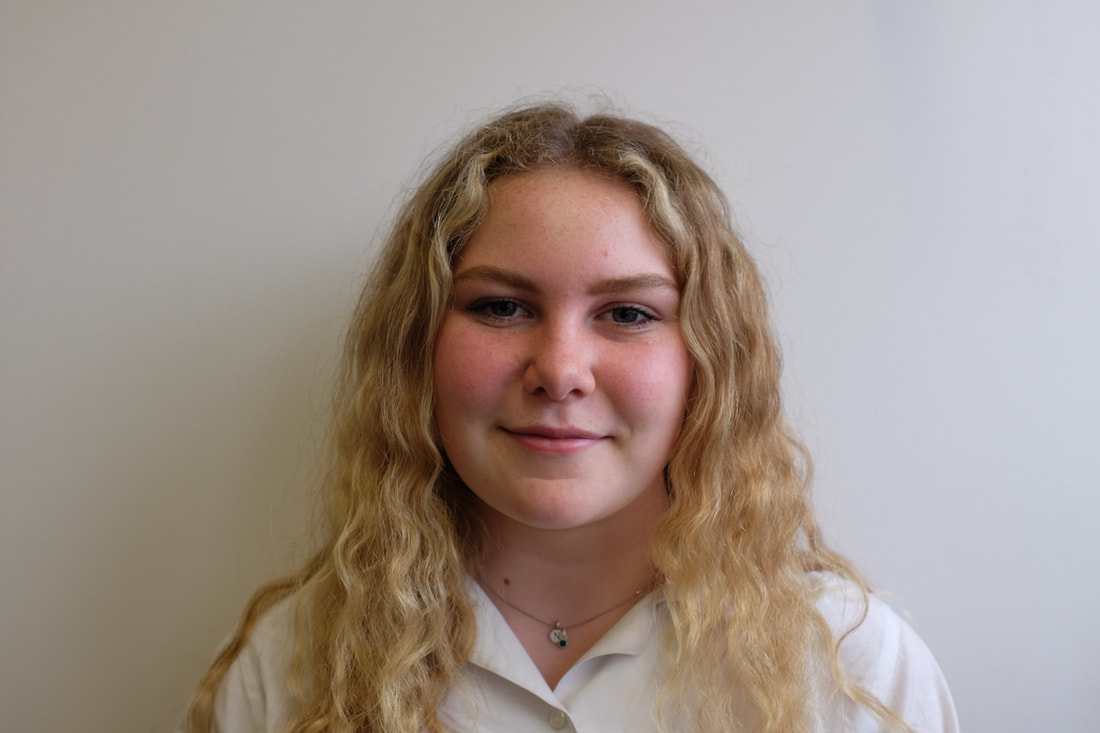
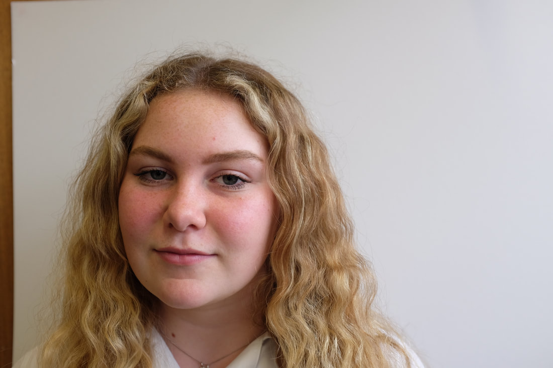
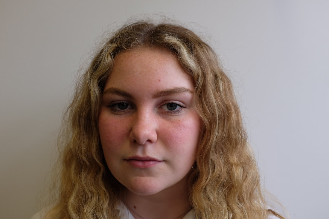
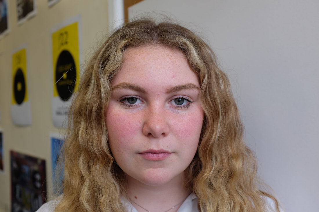
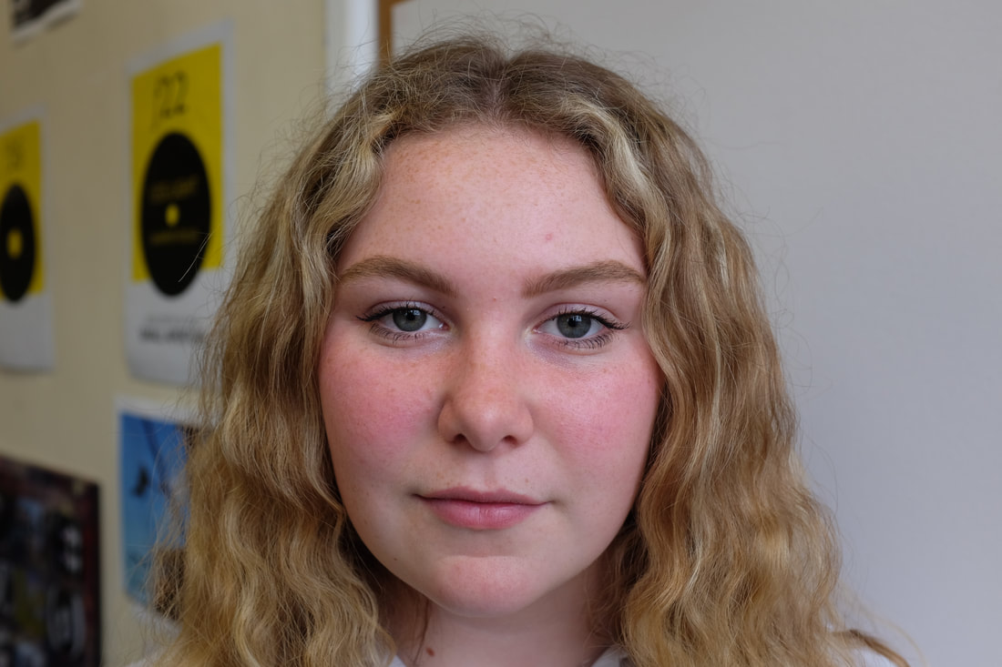
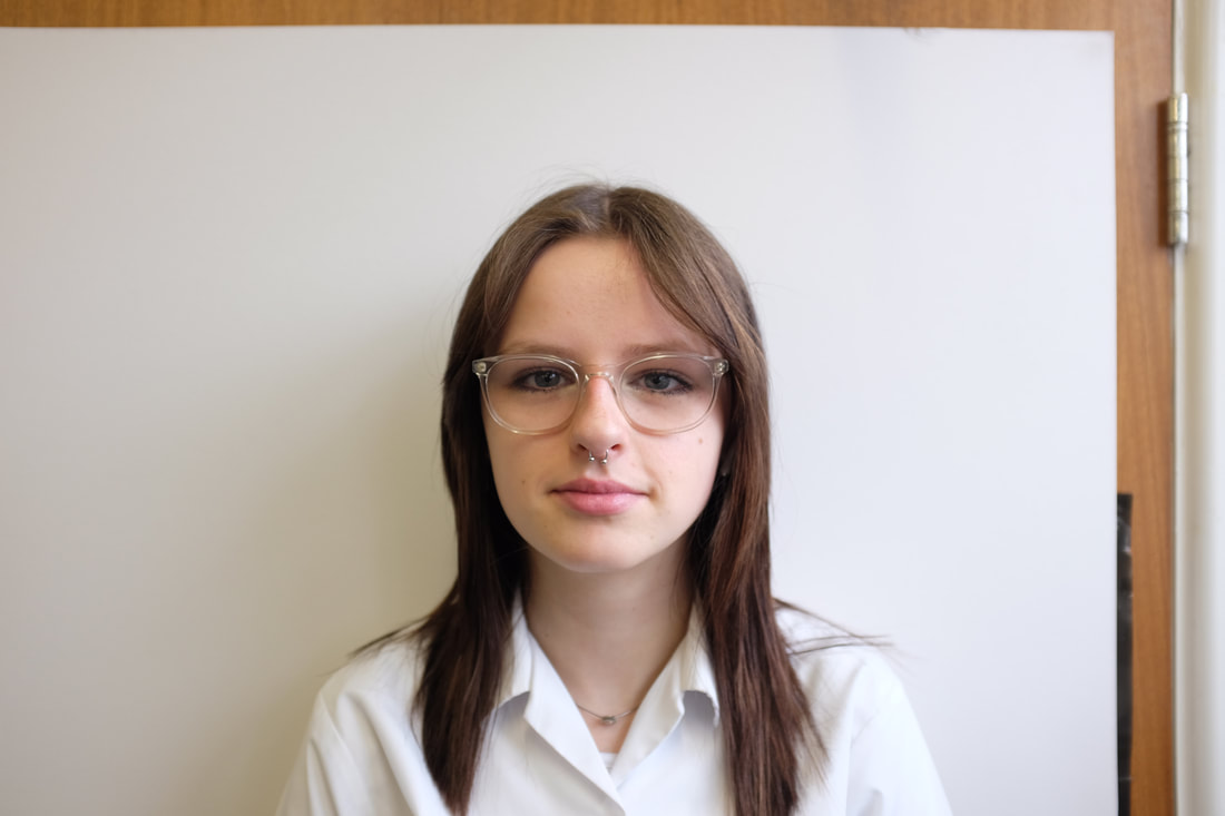
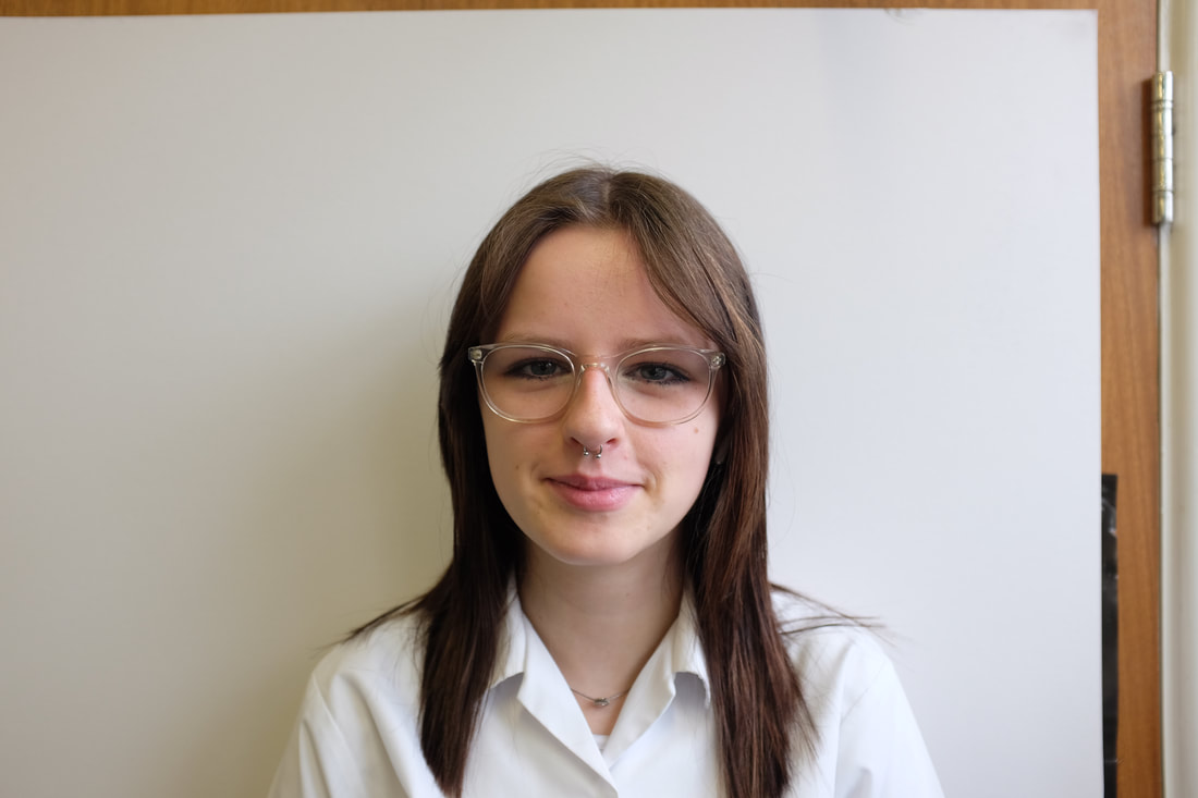
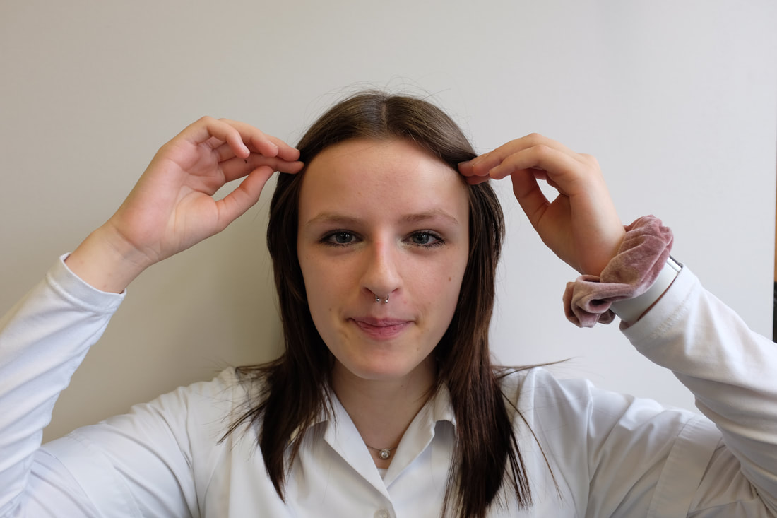
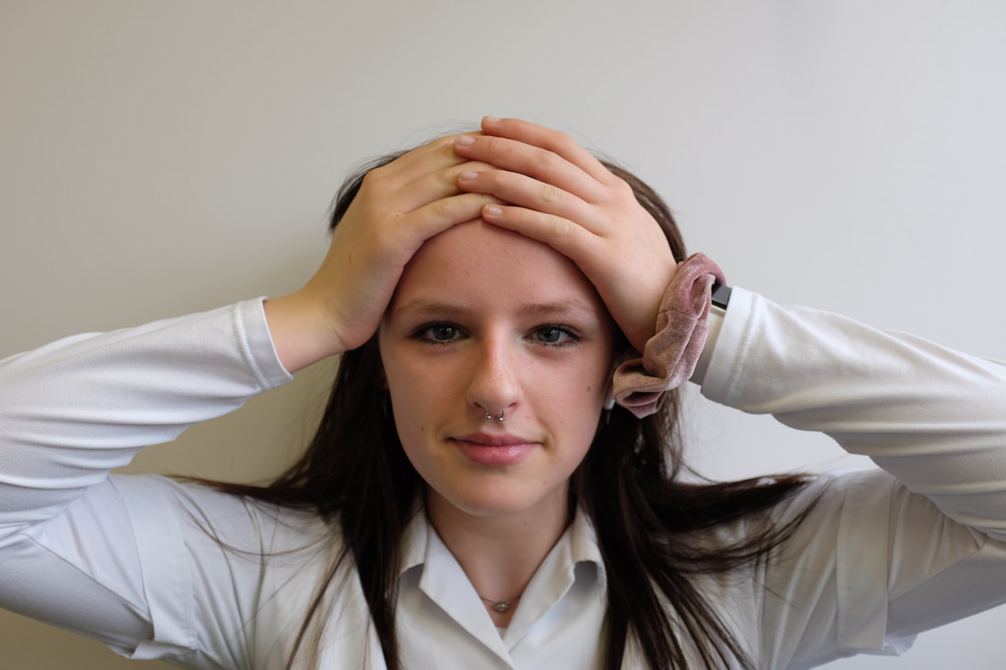
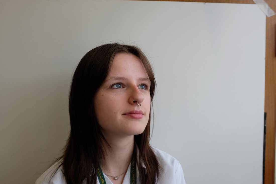
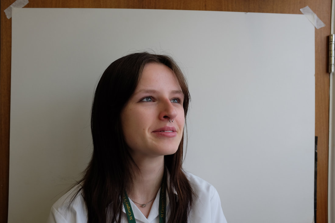
I have photographed my friends in school. On my camera the settings I have used are 1/75 shutter speed, a f4 aperture, autofocus and paid particular attention to the ISO, keeping at 200 or 400. What went well was that I think I achieved good lighting although some shadows could be improved and a good positioning of the photos so that I could use all the different parts of the images in my final piece. I think my shoot could be even better if I had experimented more with positioning and maybe used artificial lighting to really equal out the shadows on the face. I have learnt to look closely and to really consider and plan the shoot before you take the photos, visualise the final image before taking it, looking for what parts I will collage with. I also used more manual, and tested the different settings on the camera a lot which meant I have improved my understanding of how camera's settings worked.
These photos are exactly what I wanted for my final piece collages. I am able to make all of my final piece with these photos.
These photos are exactly what I wanted for my final piece collages. I am able to make all of my final piece with these photos.
My final plan
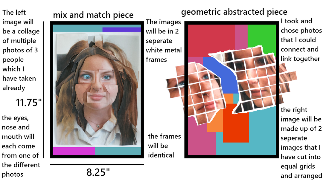
Practicing and creating my piece
The Abstract Geometric frame
I printed a set of photos off that I thought would fit the Anthony Gerace side of my piece. I started by marking a grid in pencil on the back of the photos, I chose to do it half and inch by half and inch as it seemed to be the best size without cutting the most important bits of the photo in half. I then began to cut my photos into equal strips across the horizontal gridded lines where I had previously marked. Once both of the photos had been cut into strips I put the images together, mimicking another style that I had been looking at.
I printed a set of photos off that I thought would fit the Anthony Gerace side of my piece. I started by marking a grid in pencil on the back of the photos, I chose to do it half and inch by half and inch as it seemed to be the best size without cutting the most important bits of the photo in half. I then began to cut my photos into equal strips across the horizontal gridded lines where I had previously marked. Once both of the photos had been cut into strips I put the images together, mimicking another style that I had been looking at.
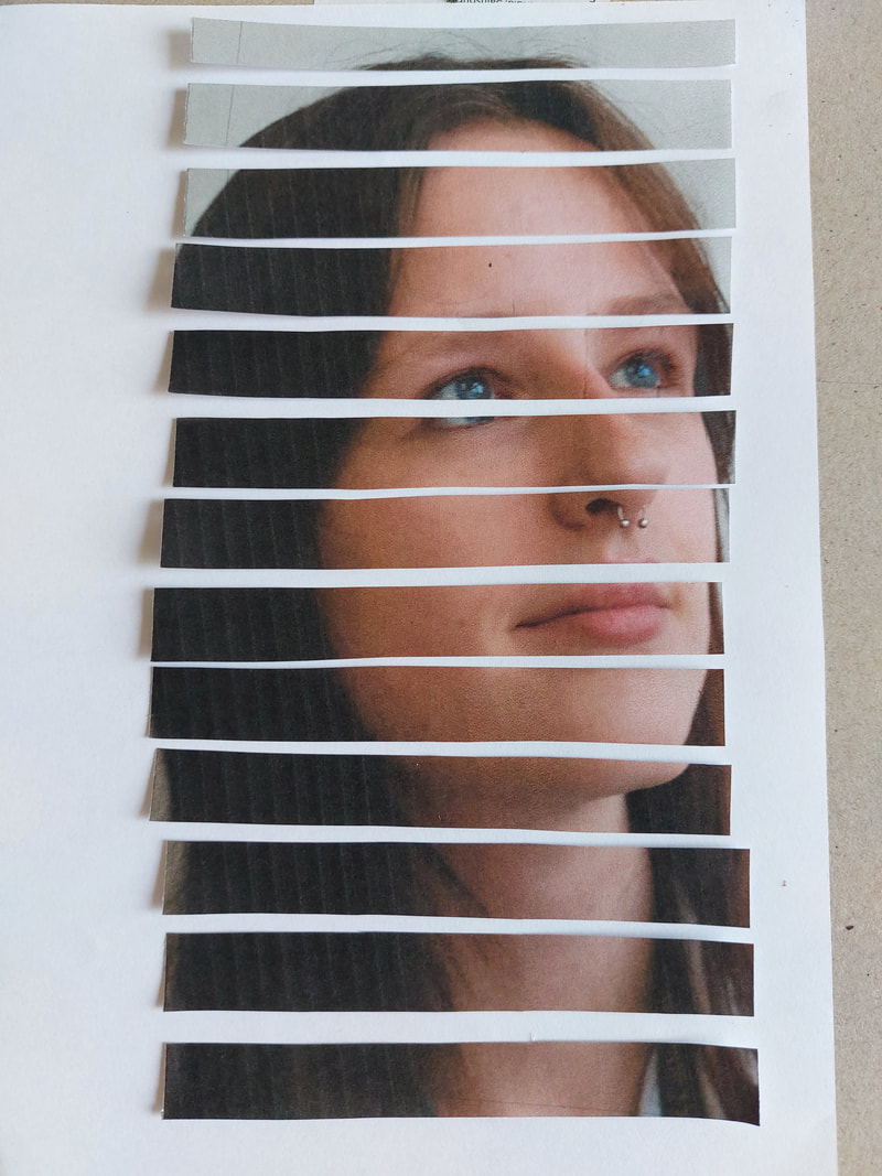
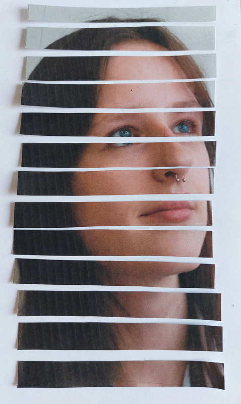
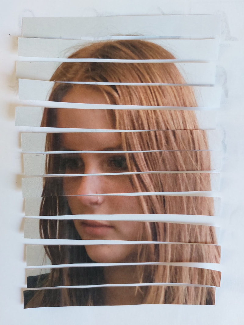
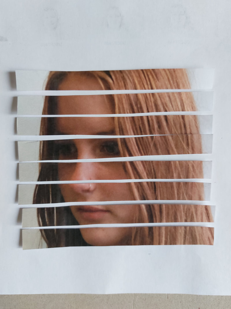
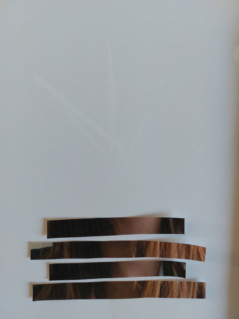
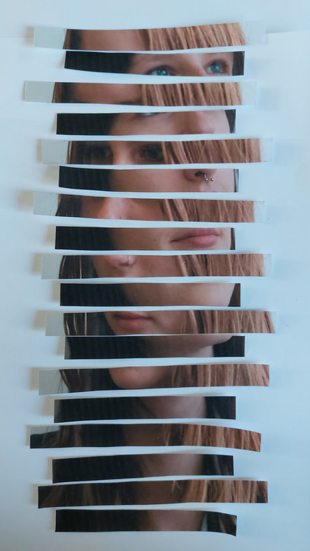
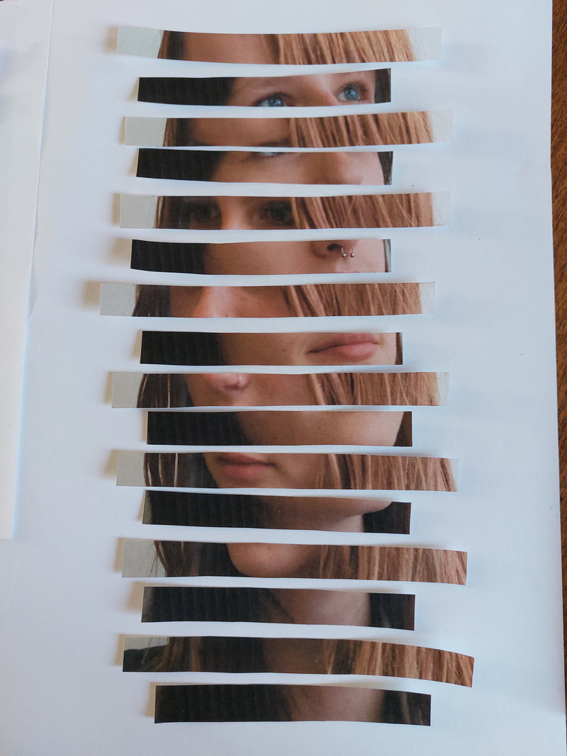
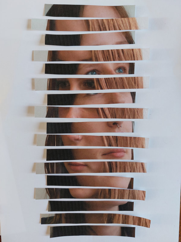
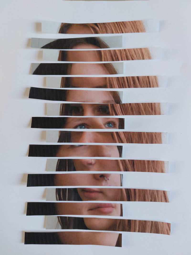
After cutting the photos into strips I then cut across the vertical lines, creating the grid look that I wanted. I successfully made sure that I wasn't cutting the important parts of the photo in two.
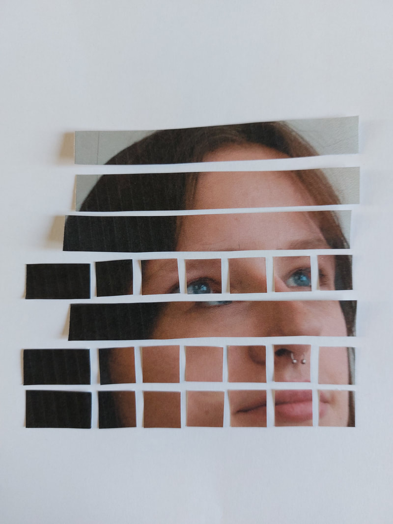
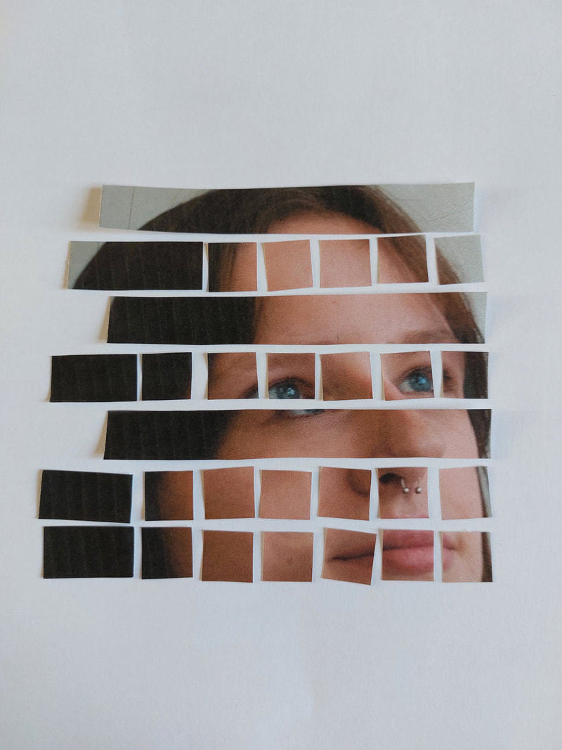
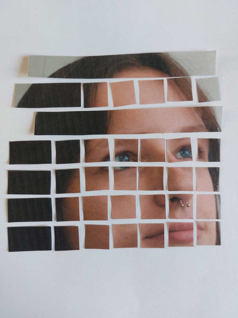
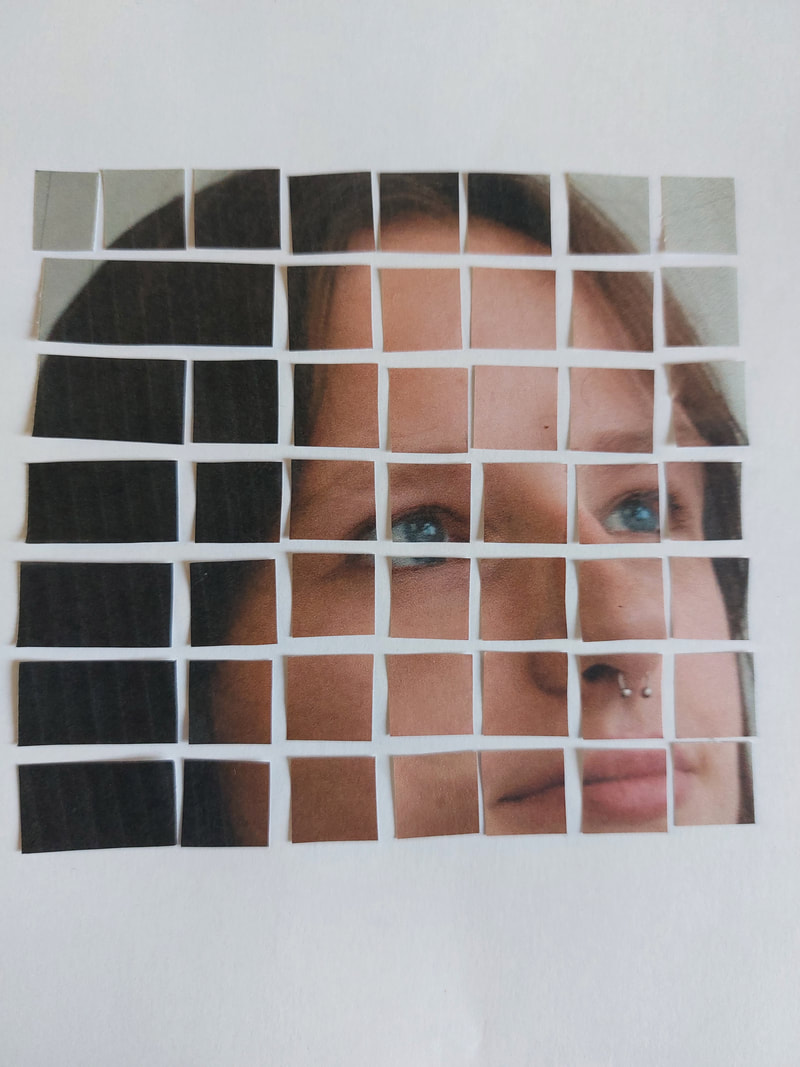
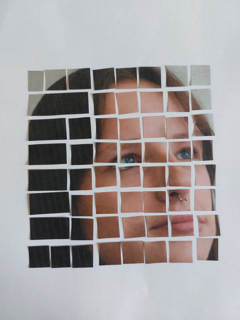
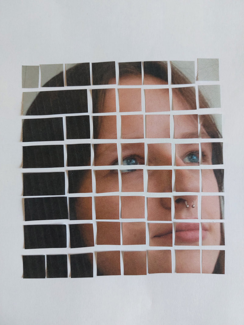
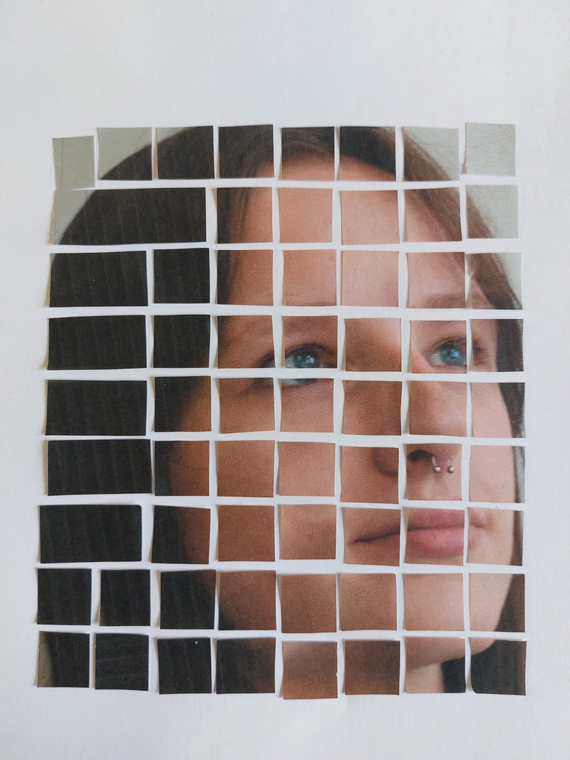
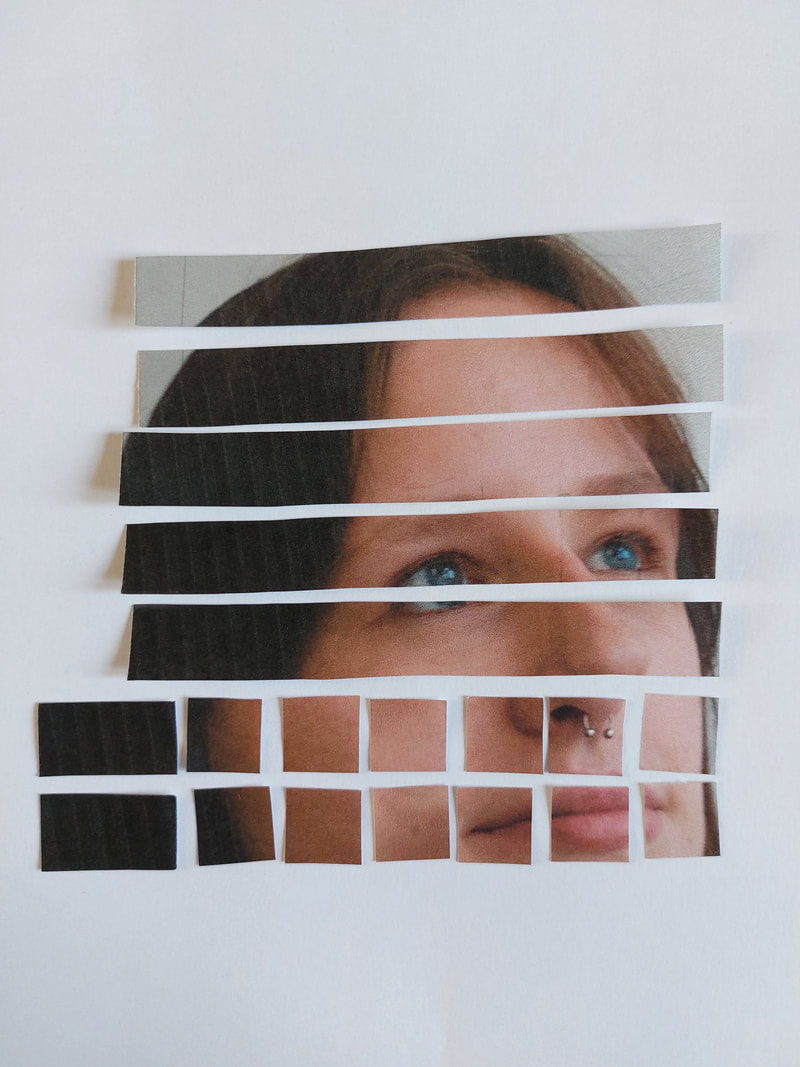
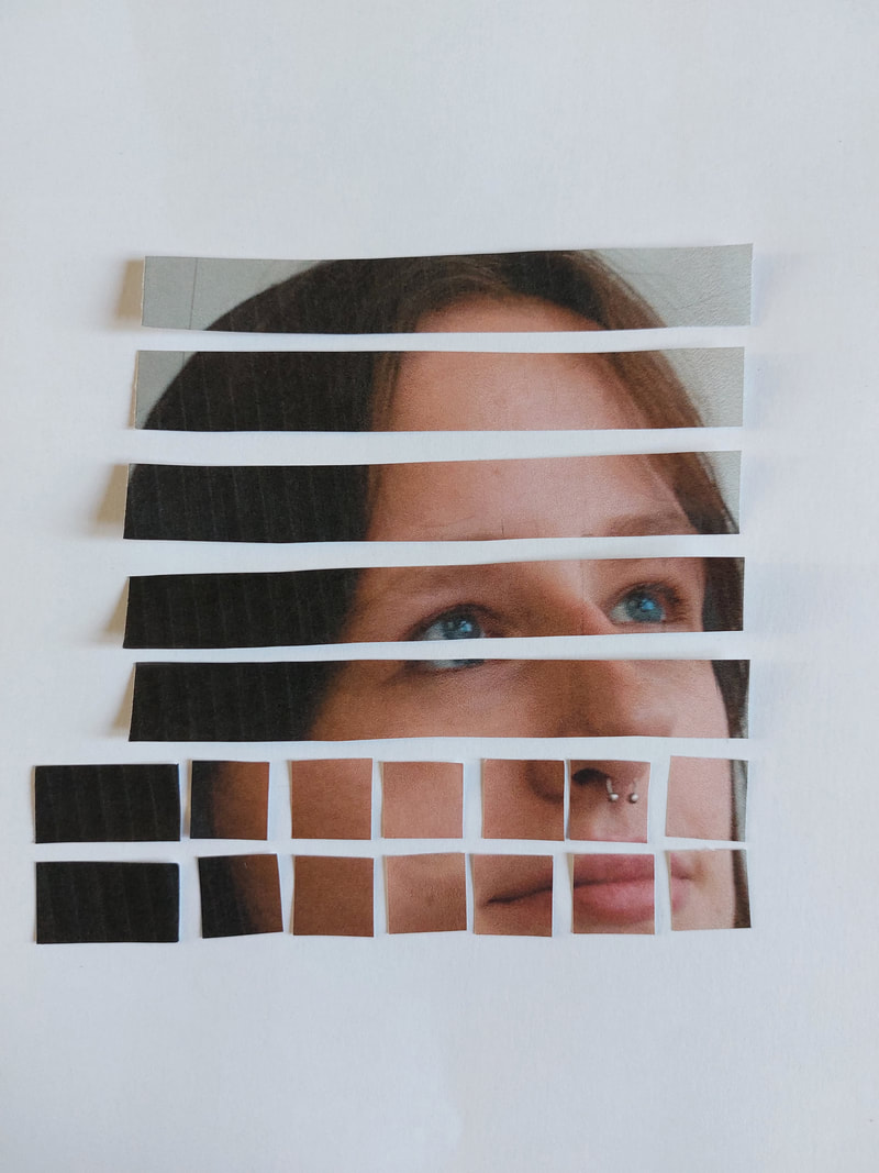
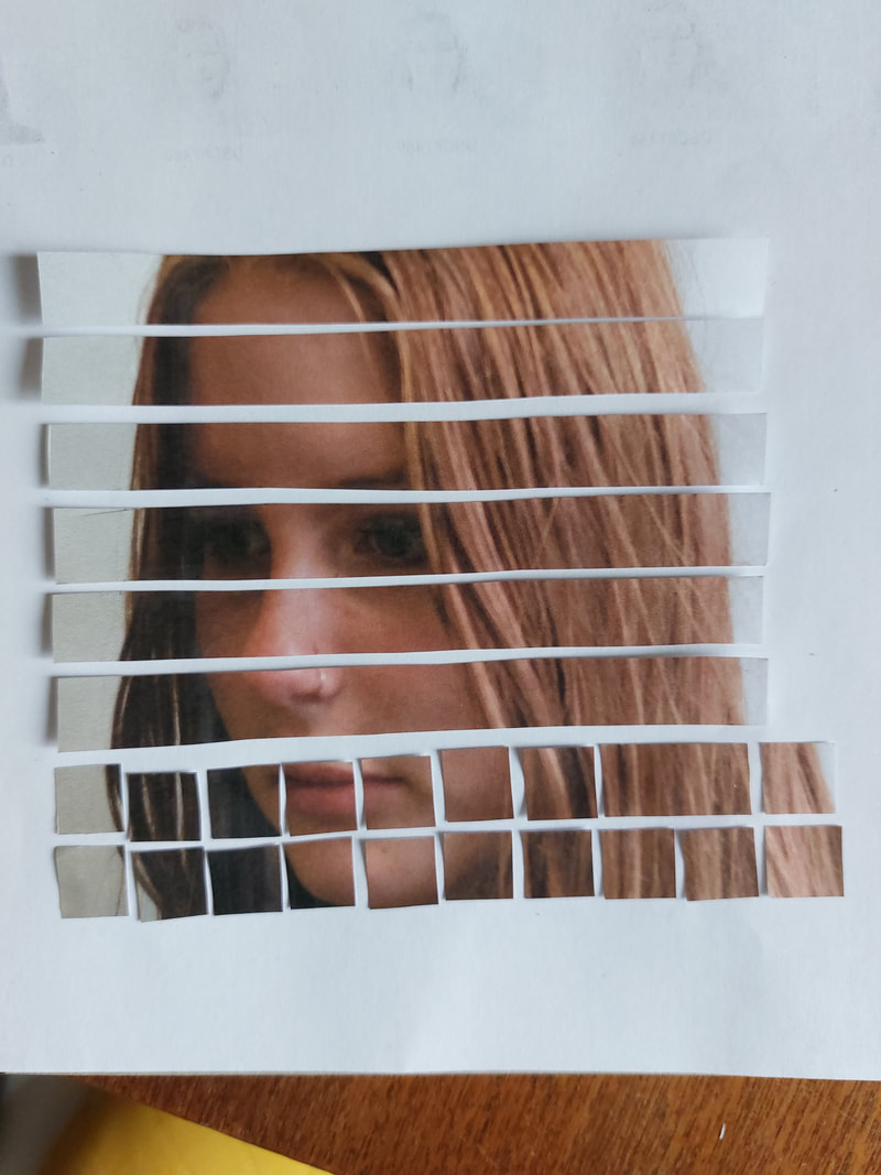
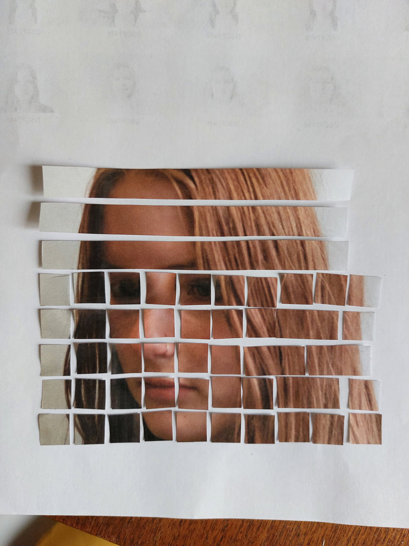
I took away the squares around the sides of the image, leaving mostly just their face. I took away the squares inbetweener the two faces, mirroring the shape on the other side so that they look like they would piece together like a jigsaw. I also achieved the look that I wanted, with each of the photos looking up/down at each other.
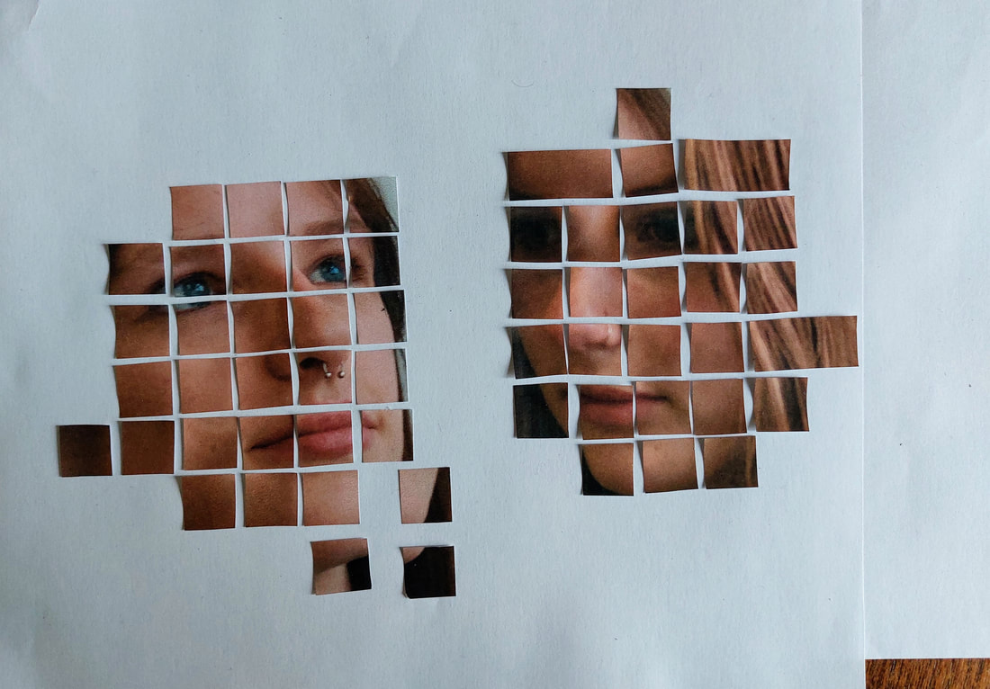
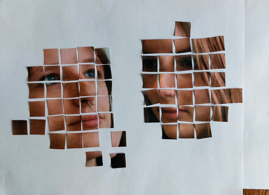
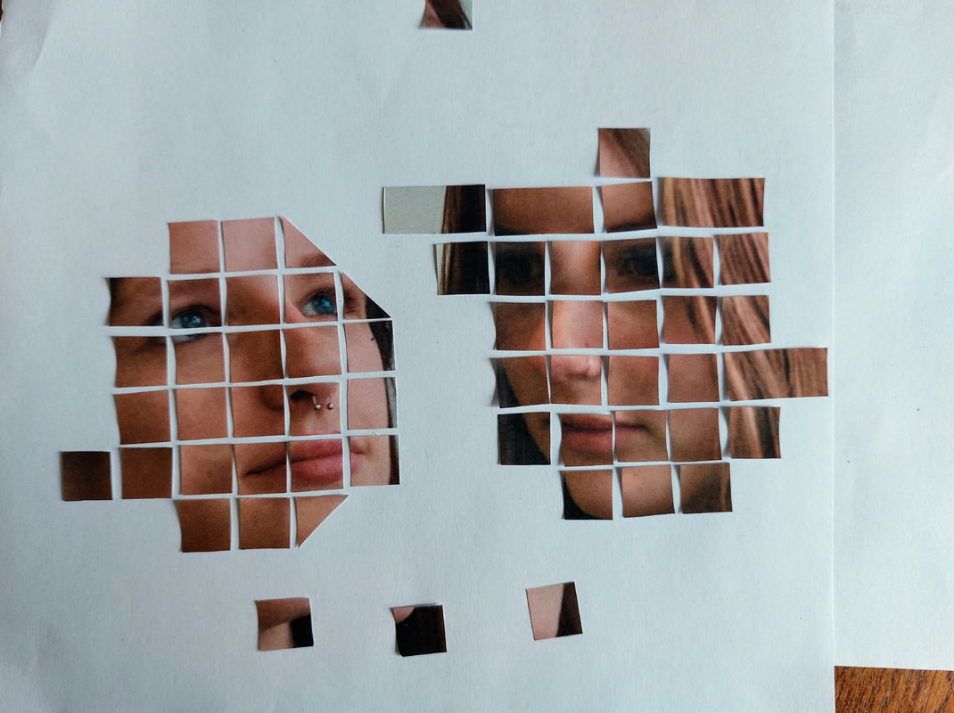
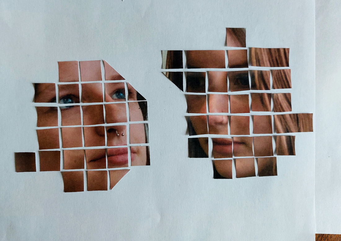
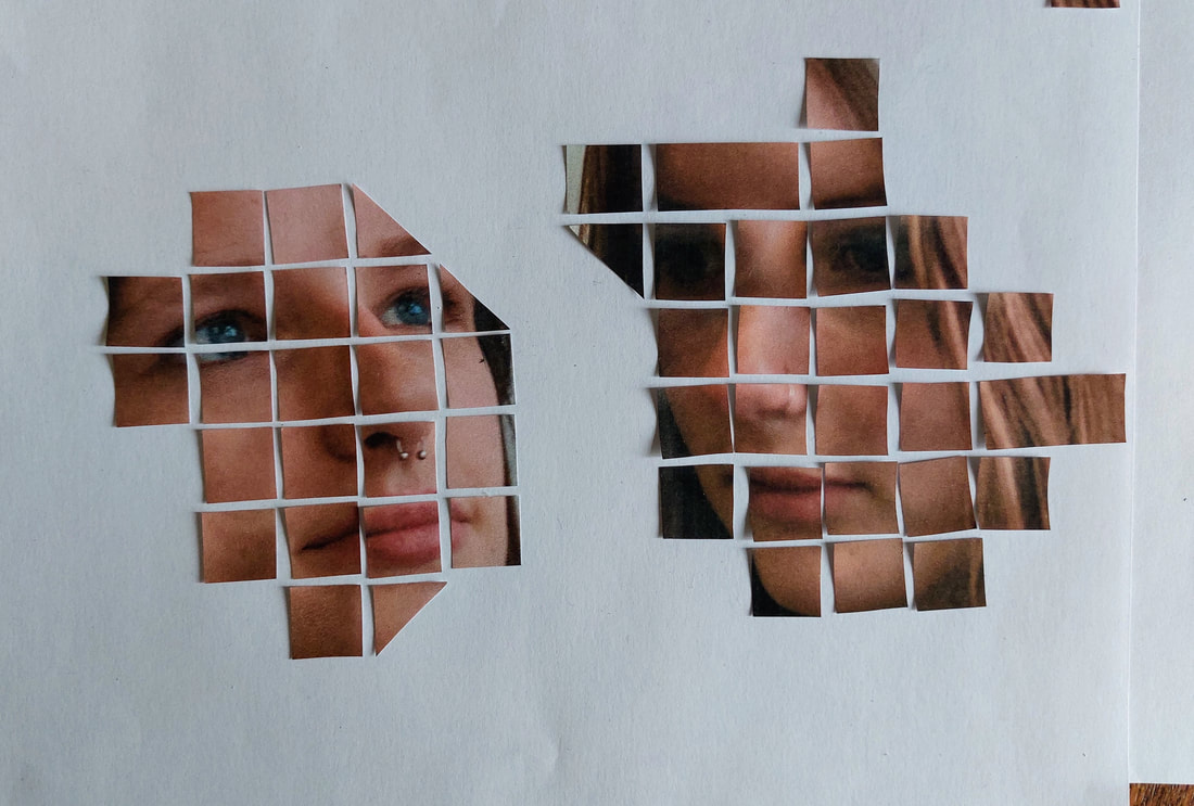
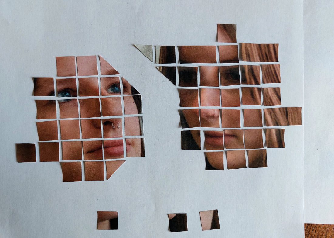
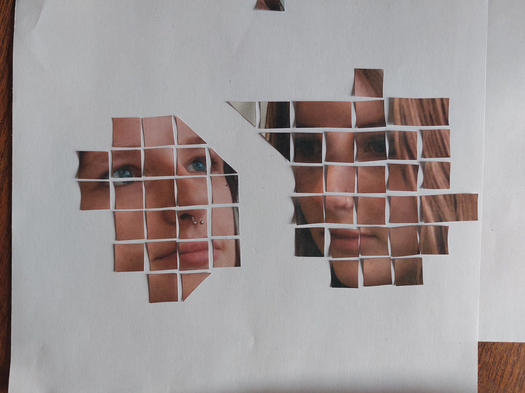
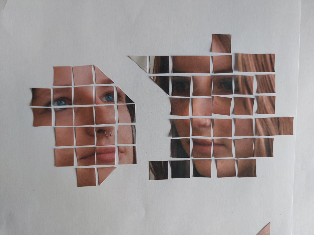
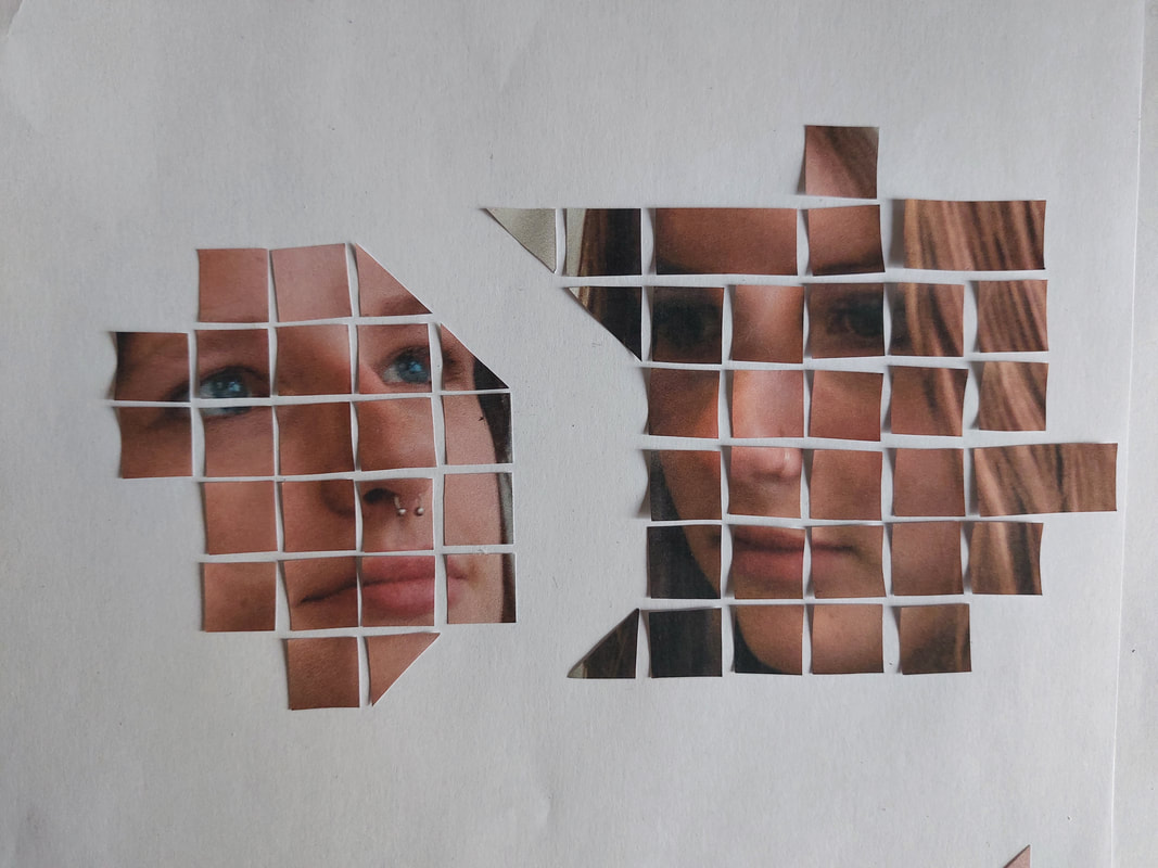
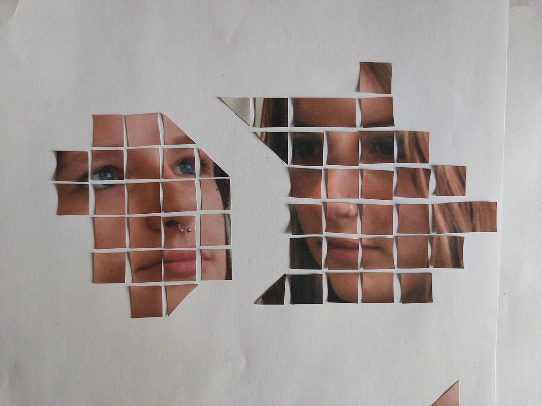
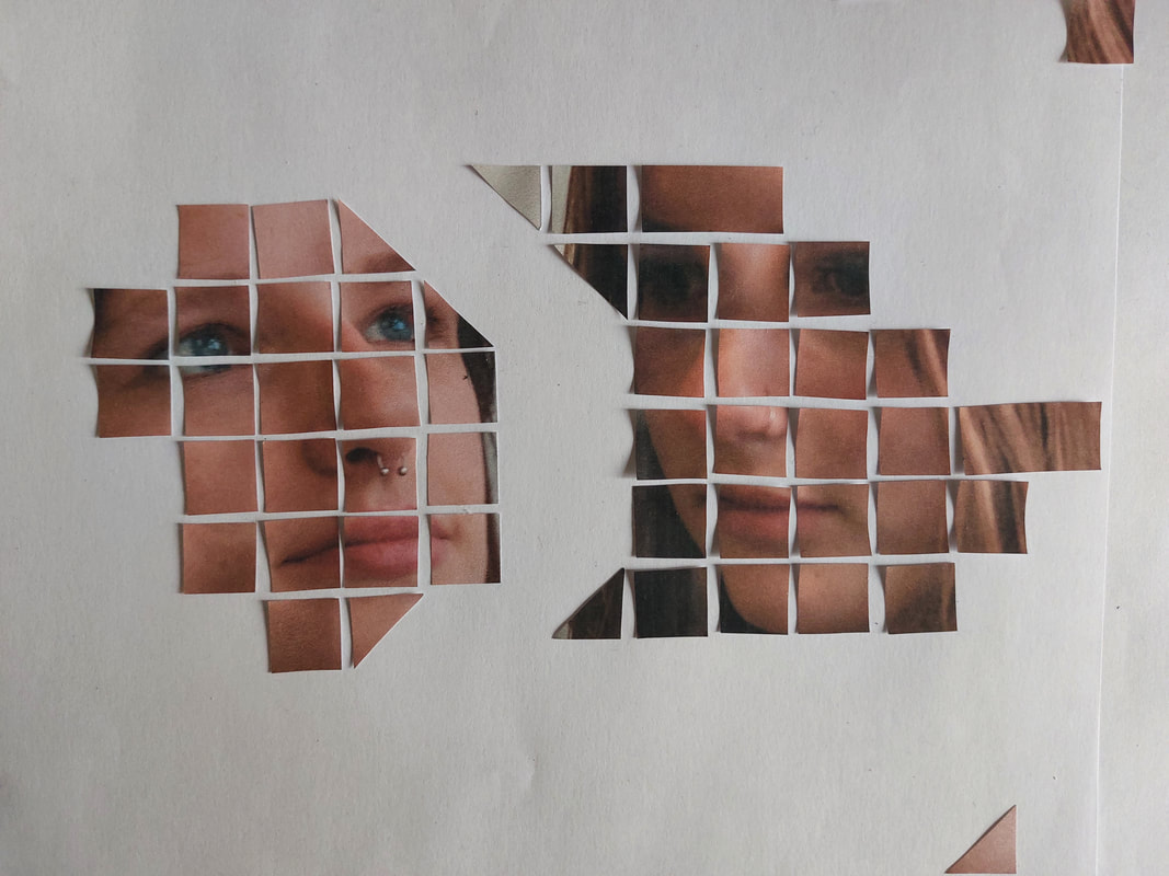
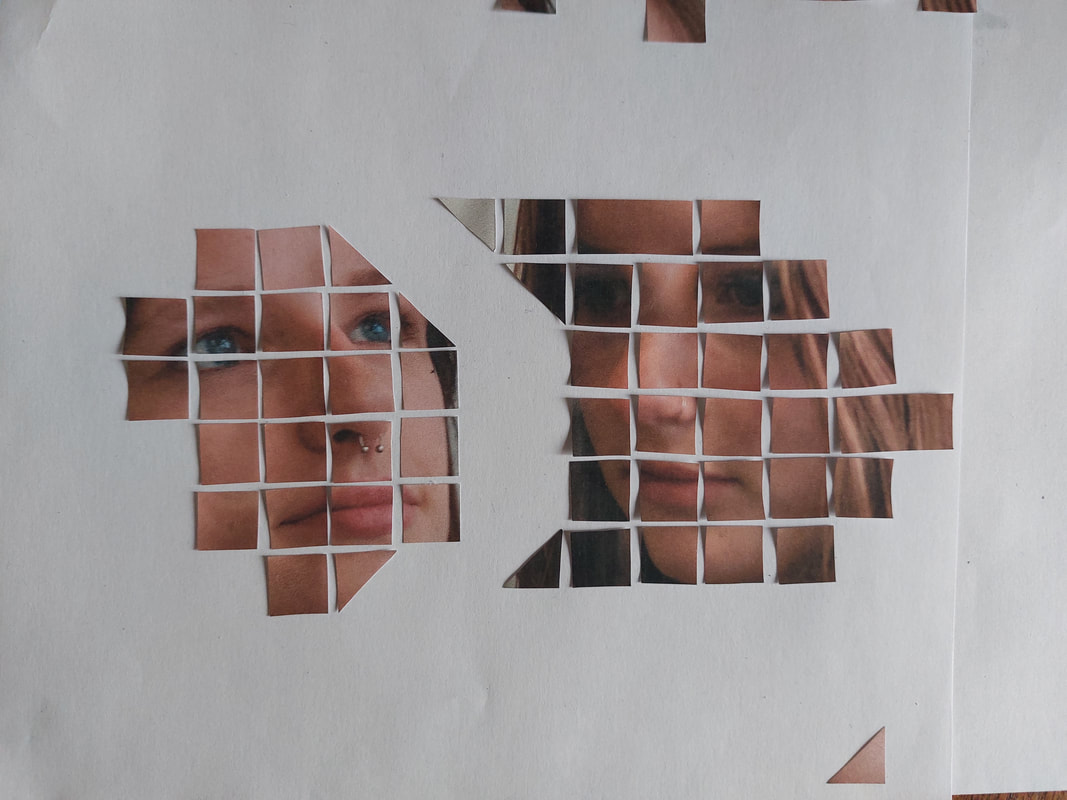
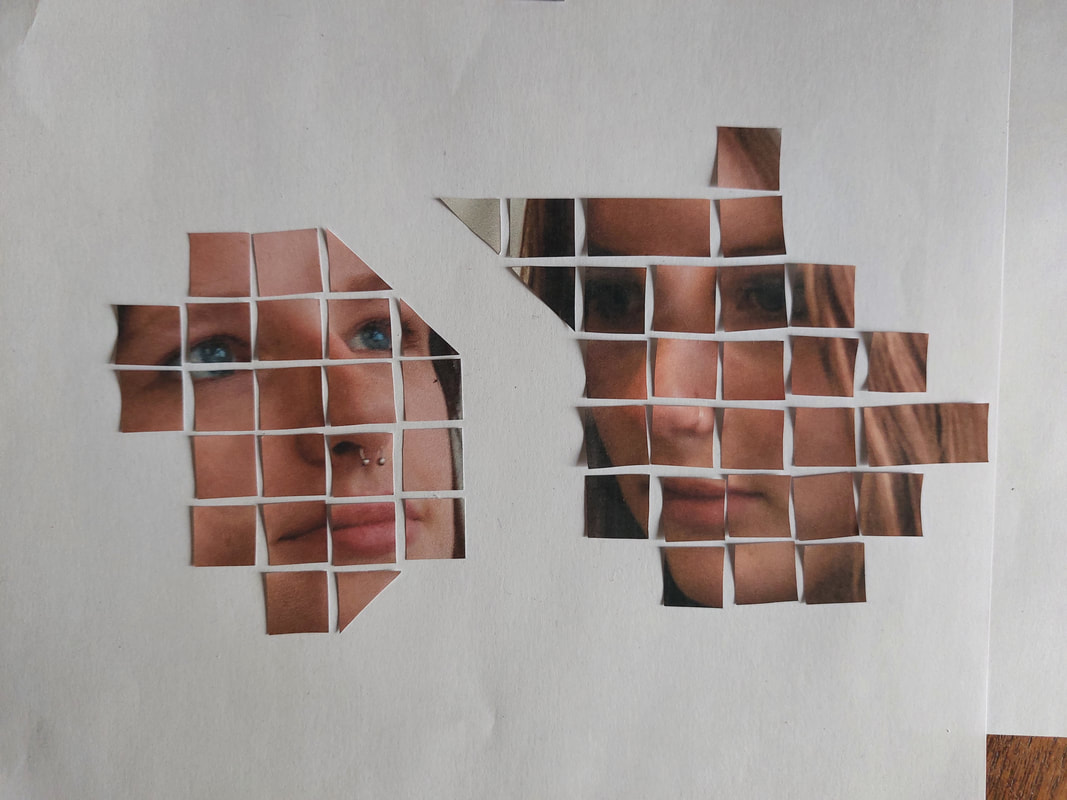
The 'Mix and Match' frame
I printed the photos that I thought would fit the 'mix and match' side of my piece. I started by comparing each of the photos to which ever one looked best to be the base image that I would add the other cuttings onto. I then began to cut out which eyes, noses and mouths I thought were the best and most varied/unusual. I then began to add the bits that I had cut from other photos onto my chosen base image, and photographing each different combination that I thought worked, trying the different eyes, noses and mouths until i got the combination write.
I printed the photos that I thought would fit the 'mix and match' side of my piece. I started by comparing each of the photos to which ever one looked best to be the base image that I would add the other cuttings onto. I then began to cut out which eyes, noses and mouths I thought were the best and most varied/unusual. I then began to add the bits that I had cut from other photos onto my chosen base image, and photographing each different combination that I thought worked, trying the different eyes, noses and mouths until i got the combination write.
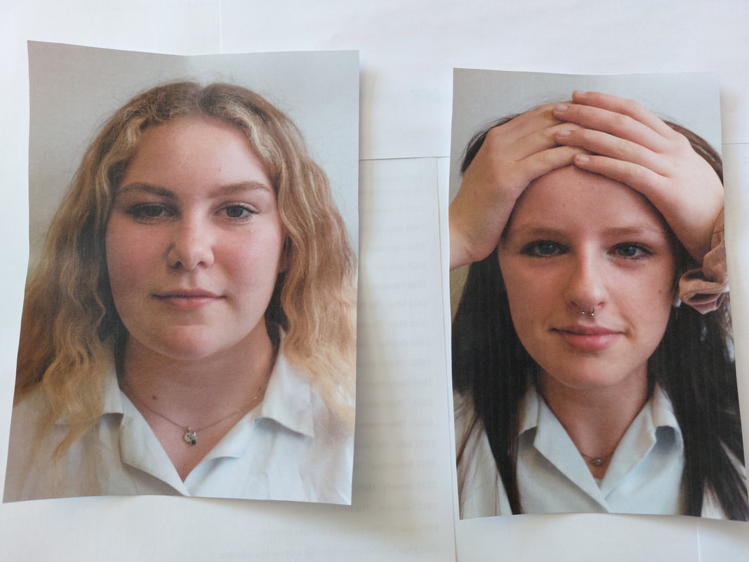
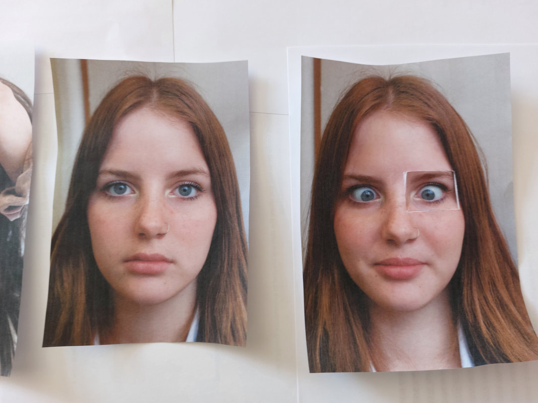
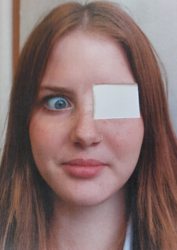
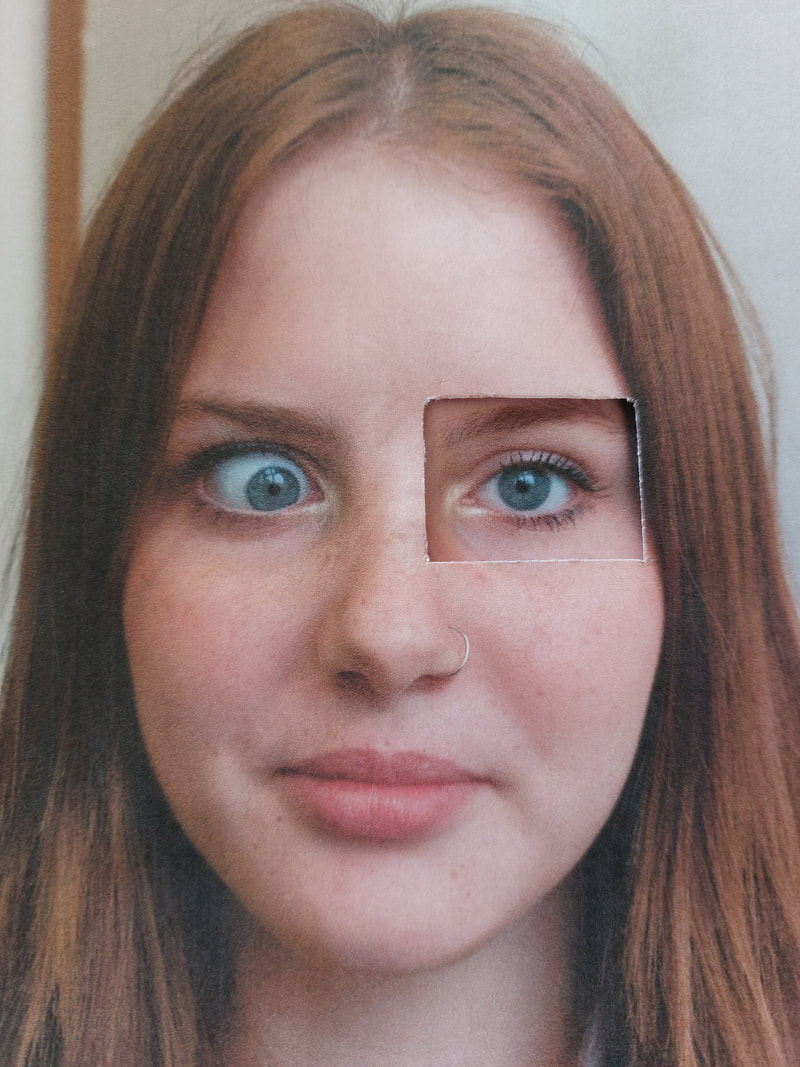
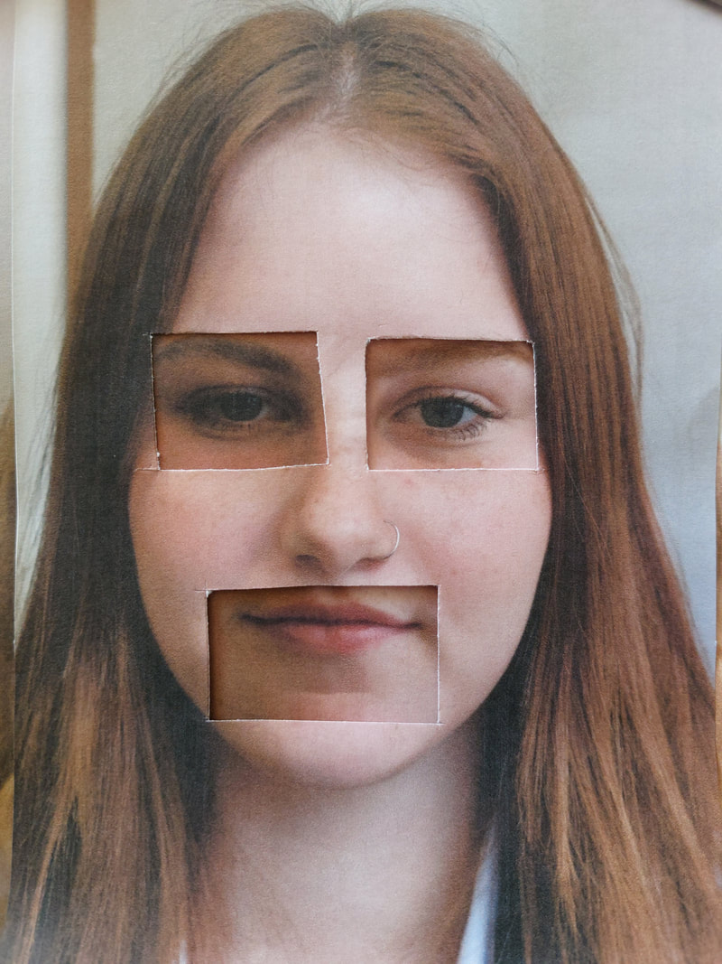
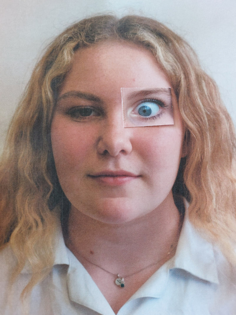
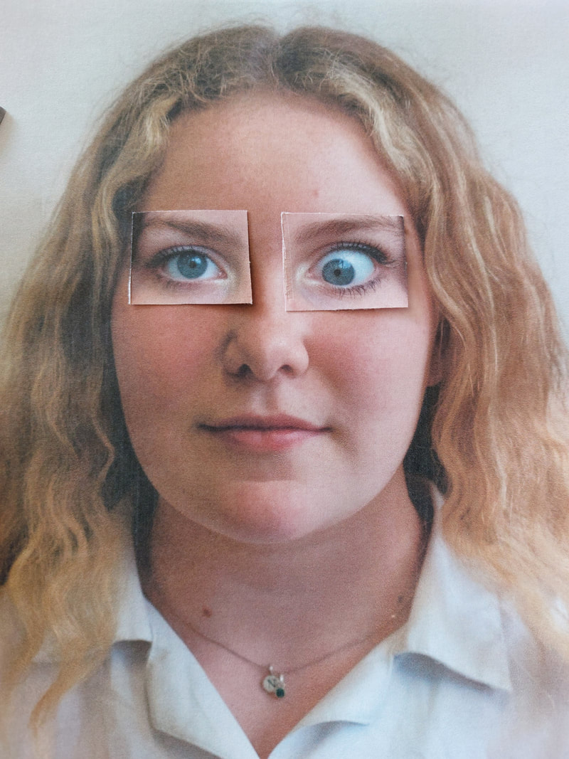
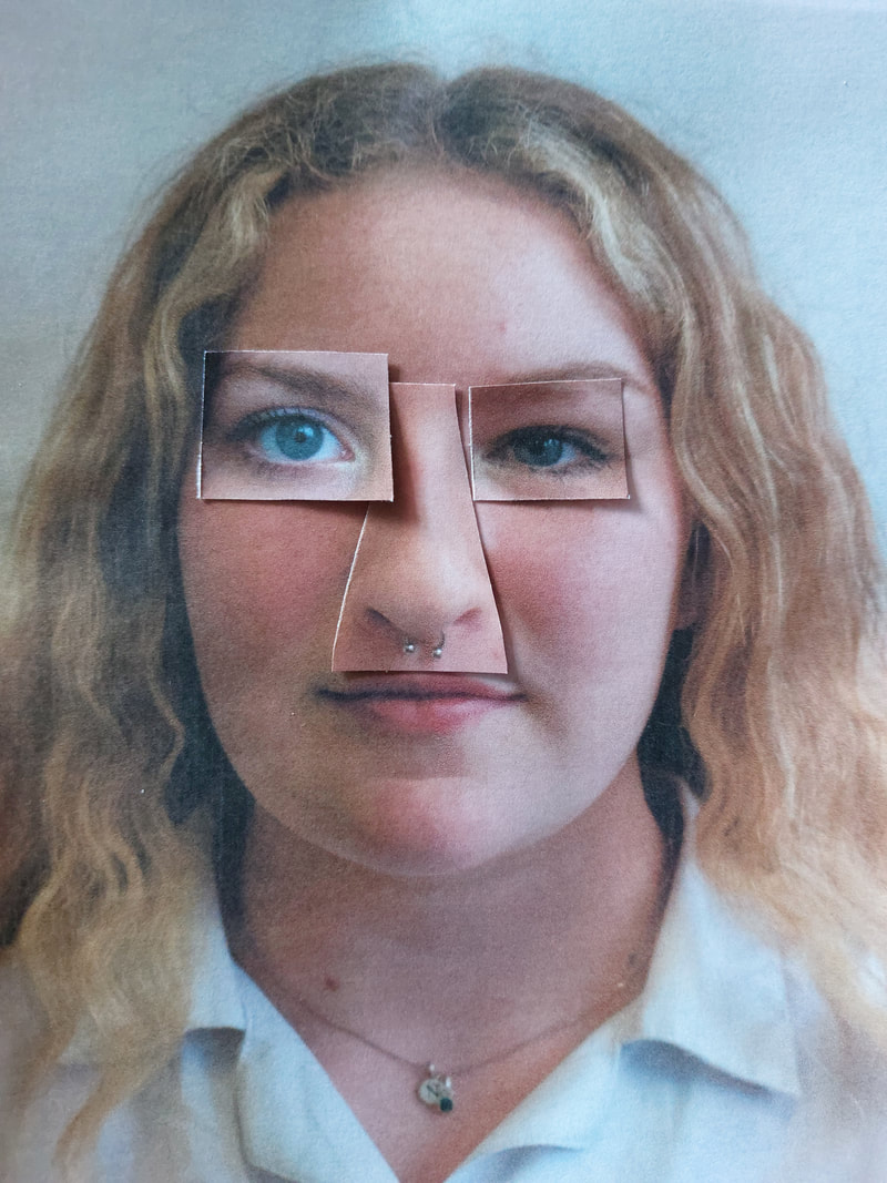
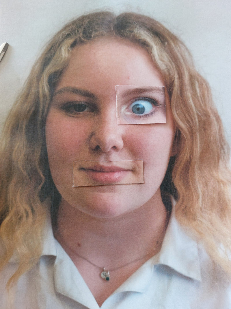
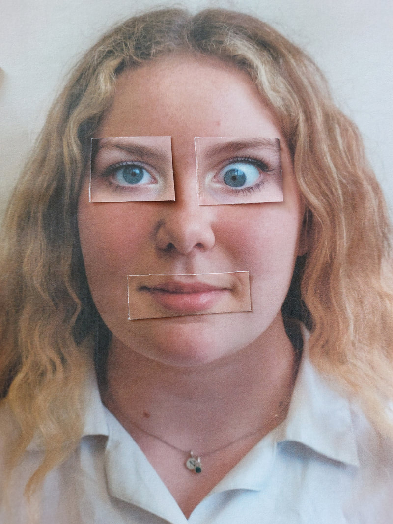
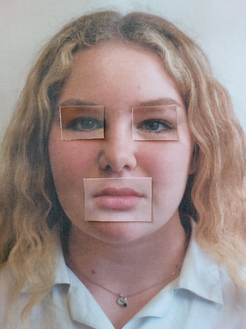
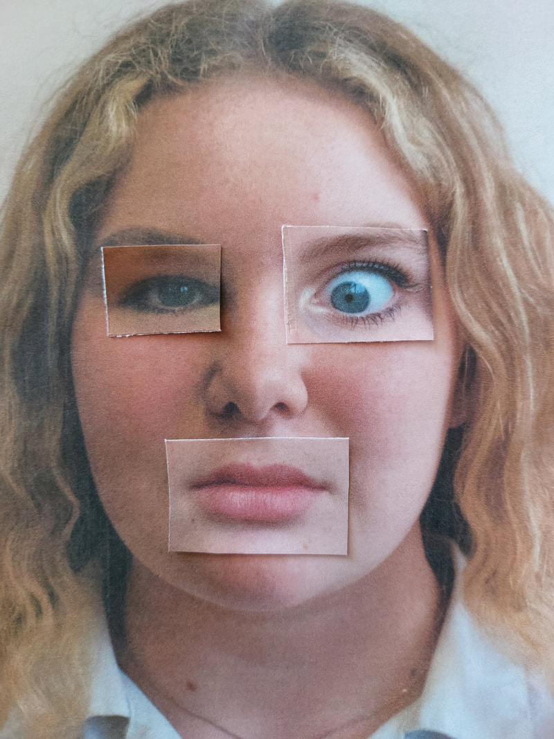
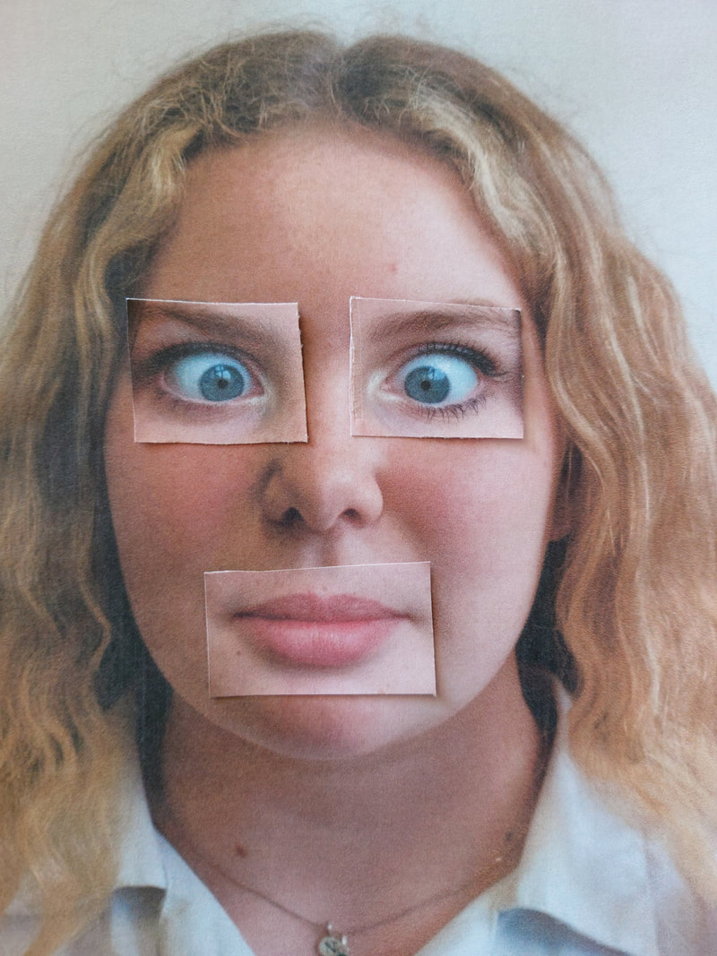
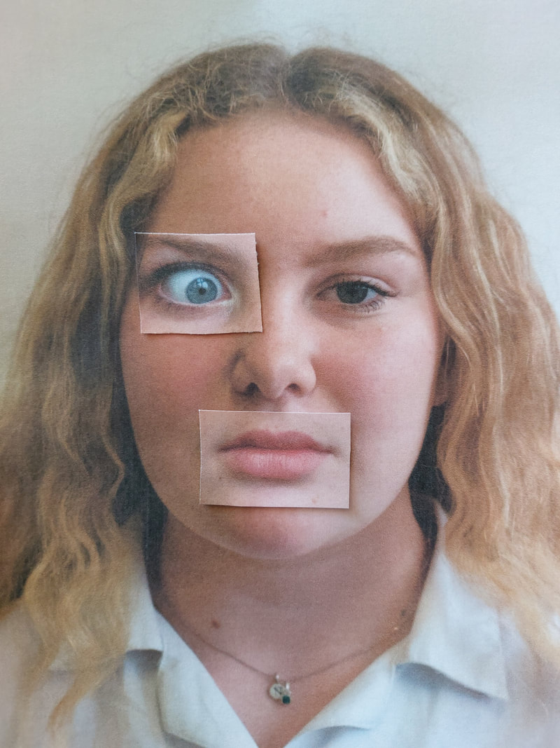
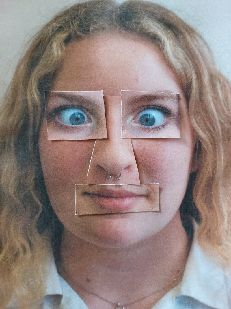
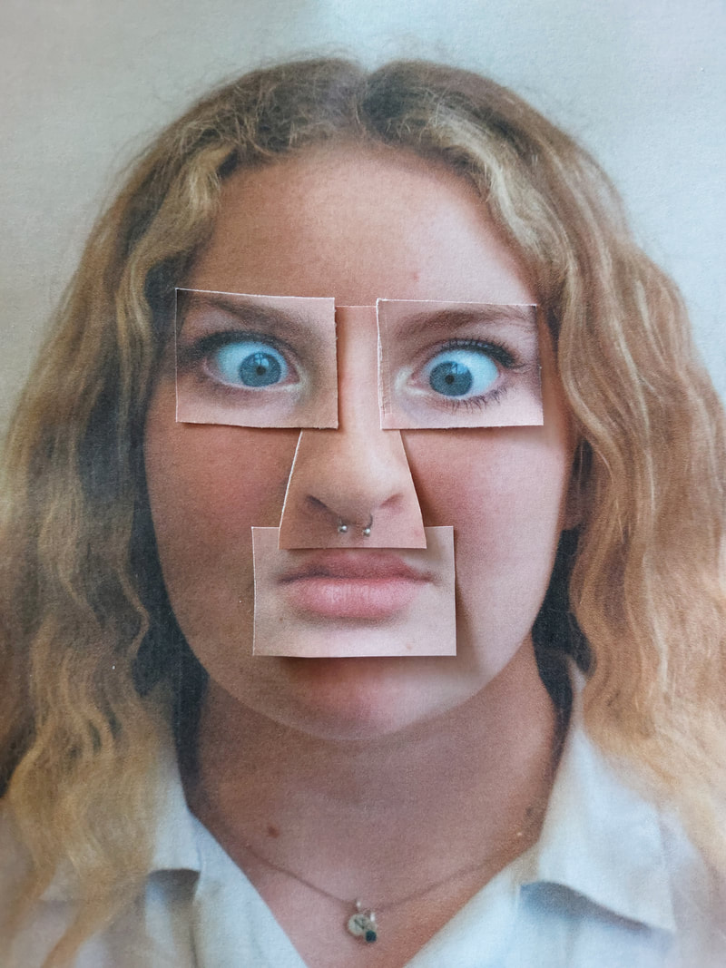
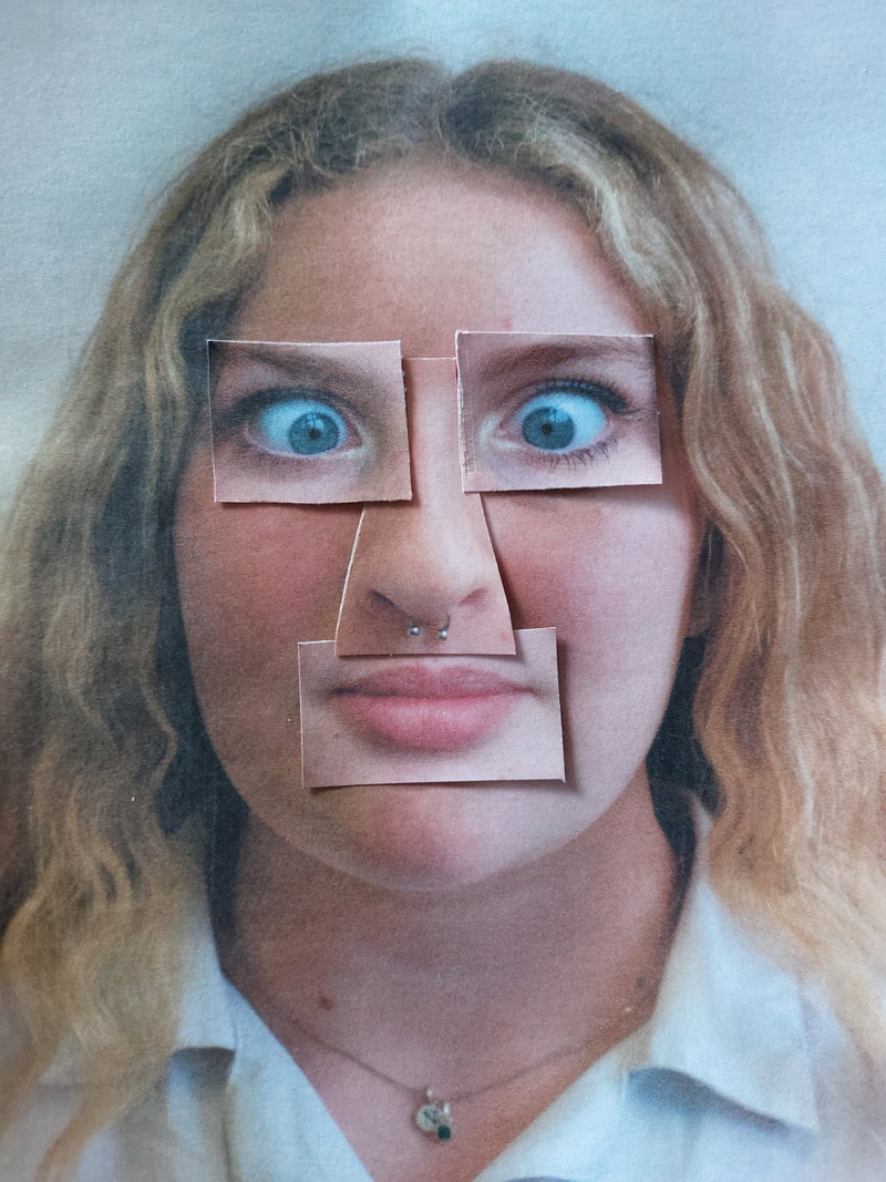
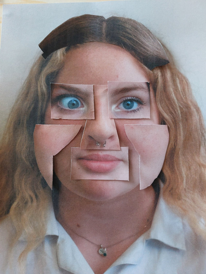
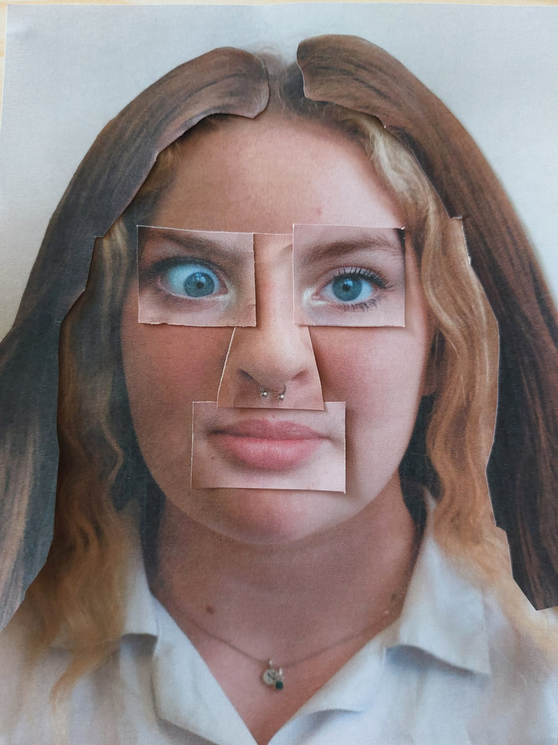
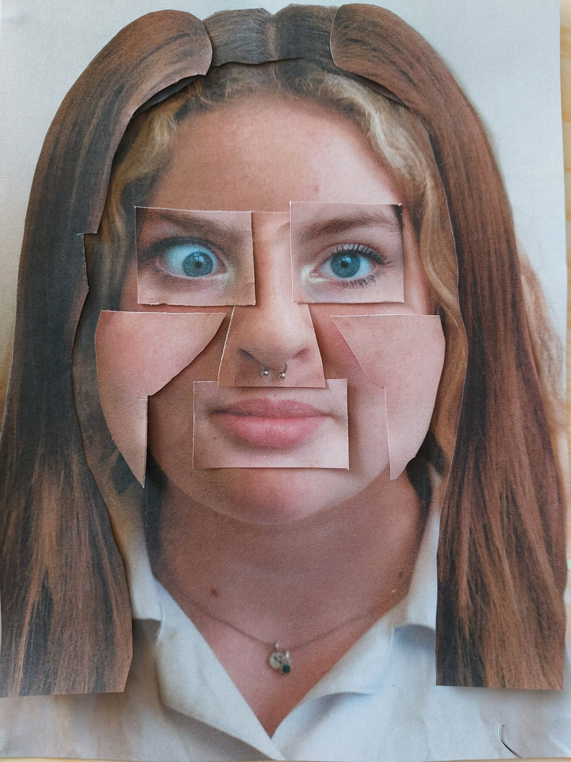
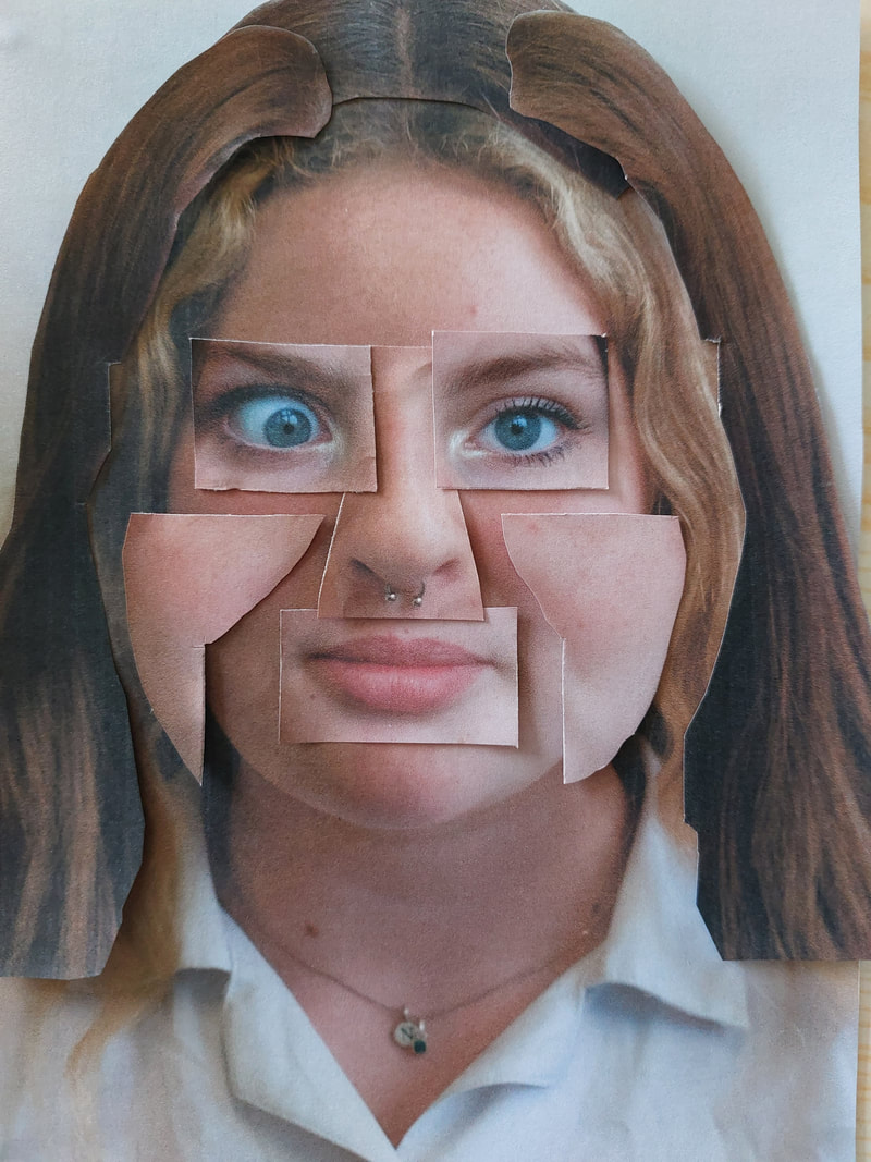
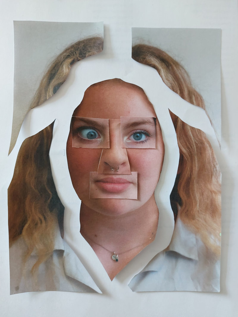
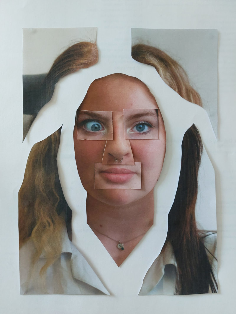
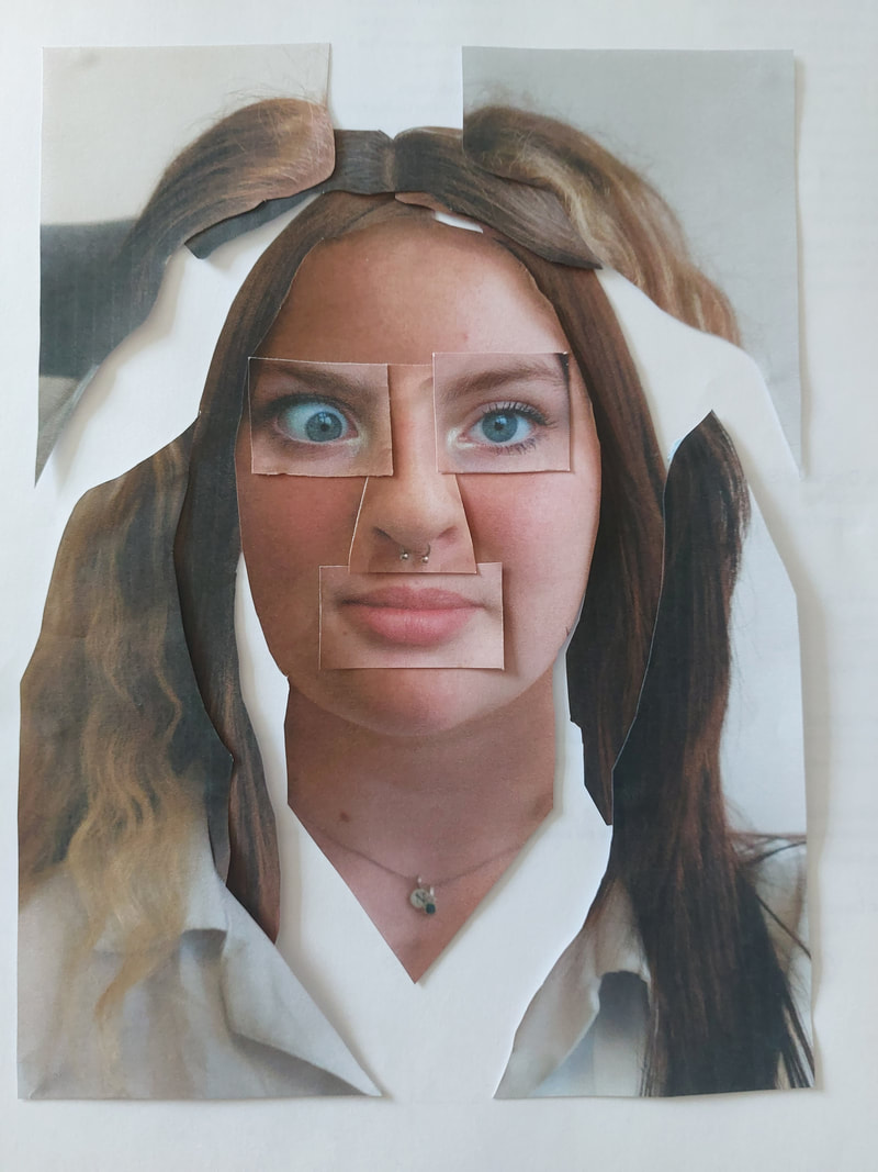
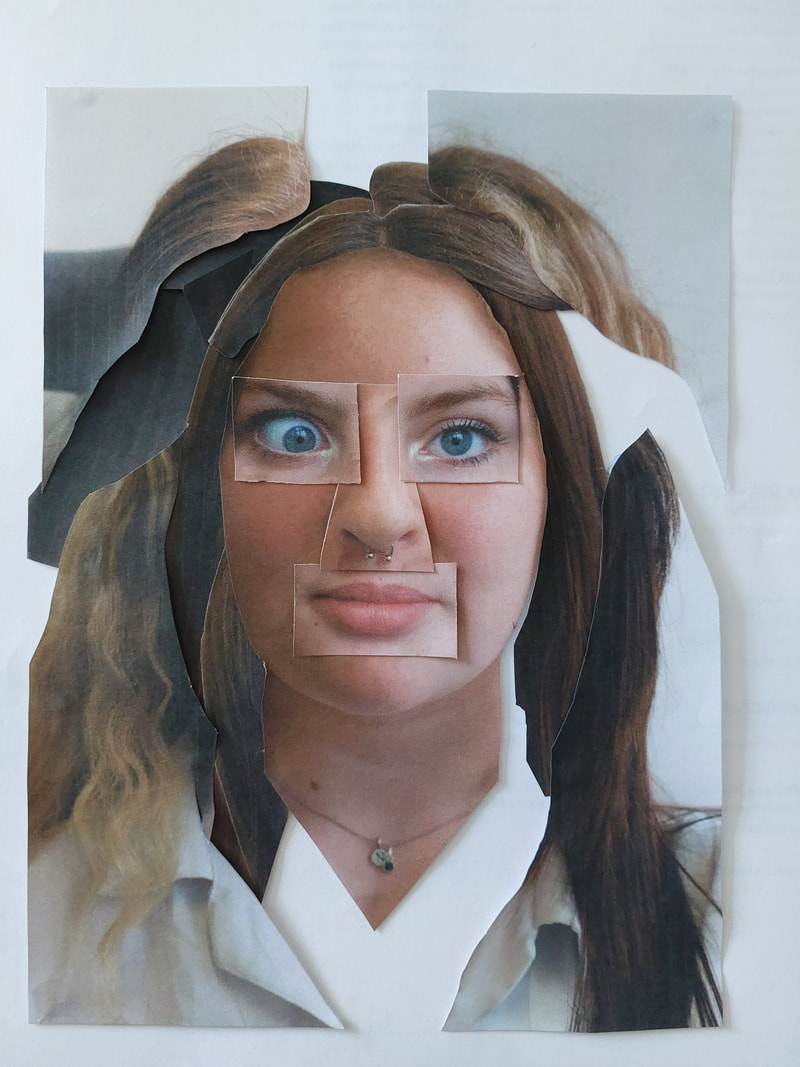
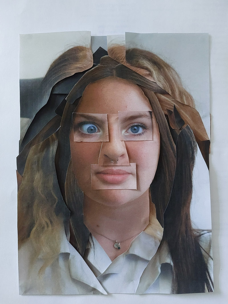
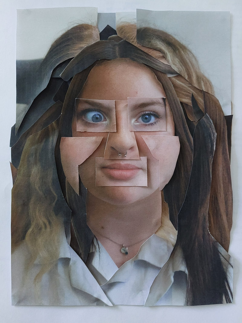
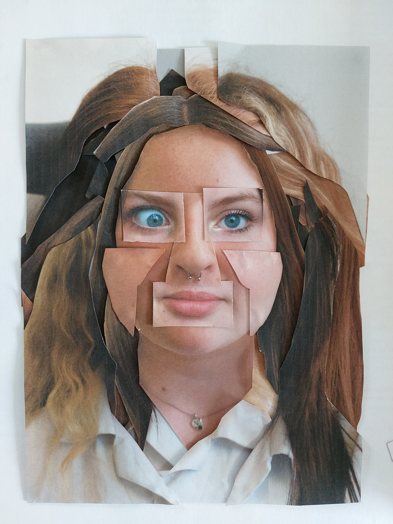
Images and art I will use as a background
For parts of my image I wanted to collage together some pictures to go behind my own pictures / pieces. To find these background clippings I looked through a magazine that we had called The Gentlewoman and I then looked through an art book that my family owned full of iconic art pieces, I cut out the best bits and rearranged them around my frames to find the best formations.
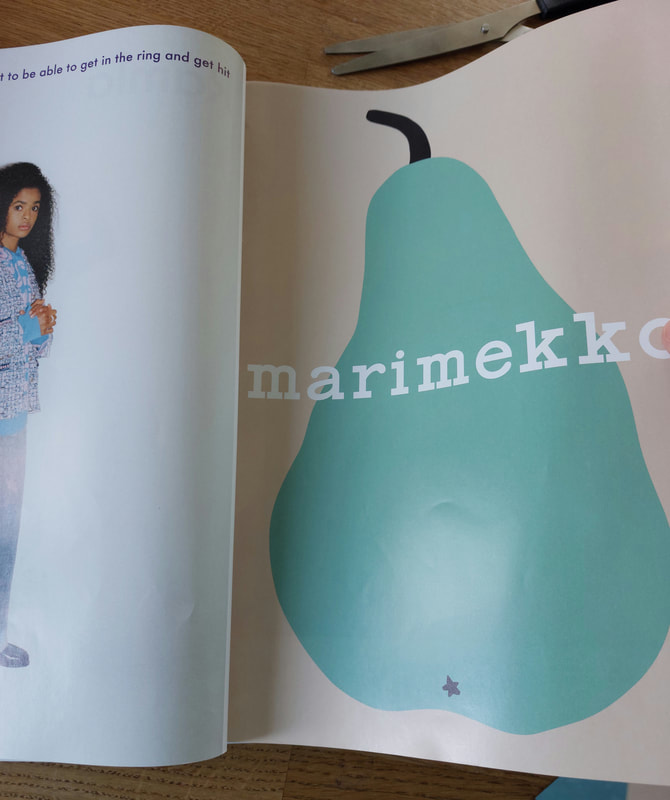
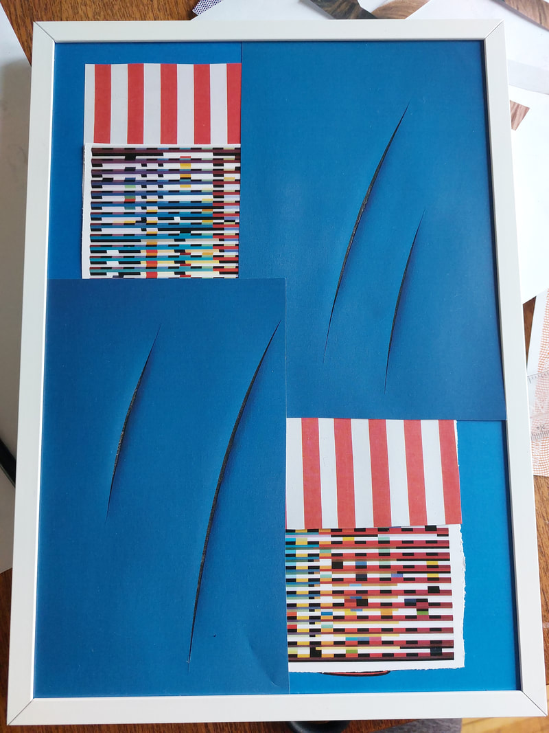
Making My Final Piece
On Exam Day
I started by placing out both of my frames and began to shape and arrange the base image. This helped me too see what my designs looked like when in the frames.
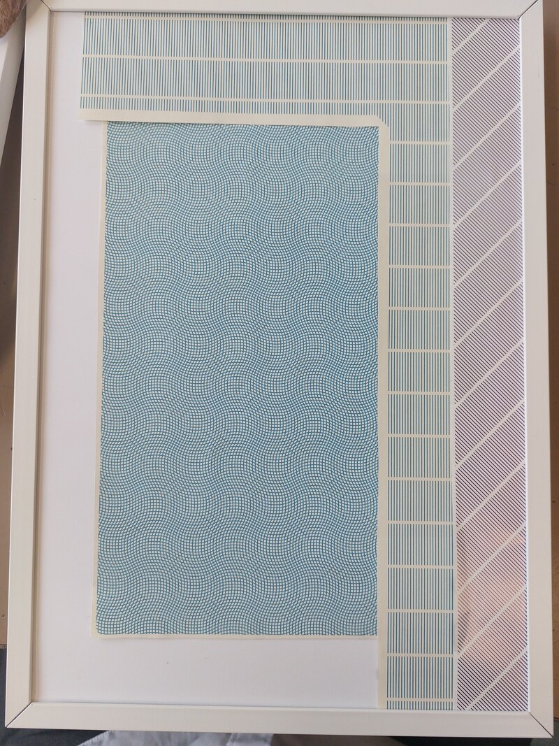
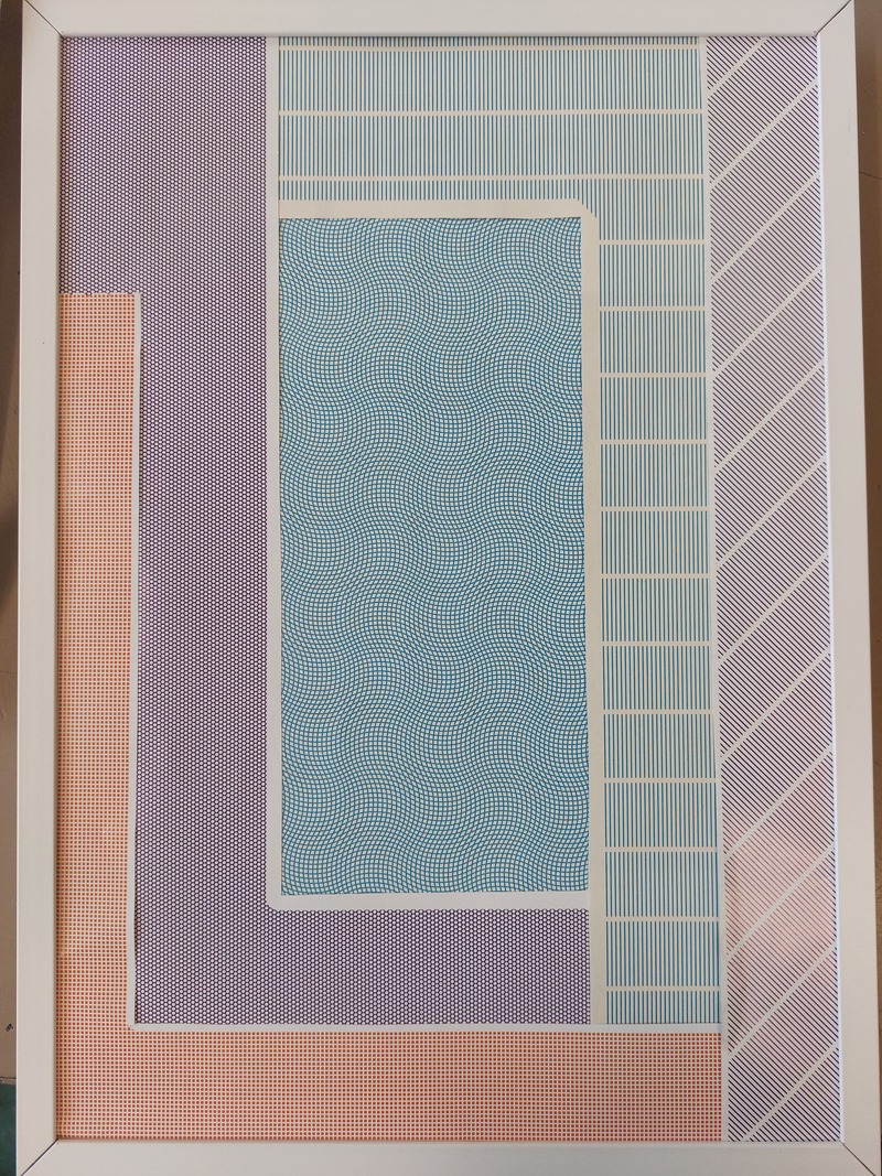
I started with my piece on the left, that I called Mix and Match. By printing each photo that I had chosen and cutting out each part of the face. I used a guillotine to cut pf the white borders around the image I then used a crafting scalpel and a cutting board to cut out each part of the face. I also used different layers inside of the image, I used foamboard and stuck on the eyes, nose, mouth, cheeks and parts of the hair to add another layer to the piece, for some of the raised parts I even used 2 layers of foamboard adding yet another layer of detail.
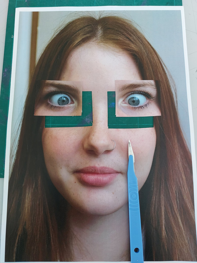
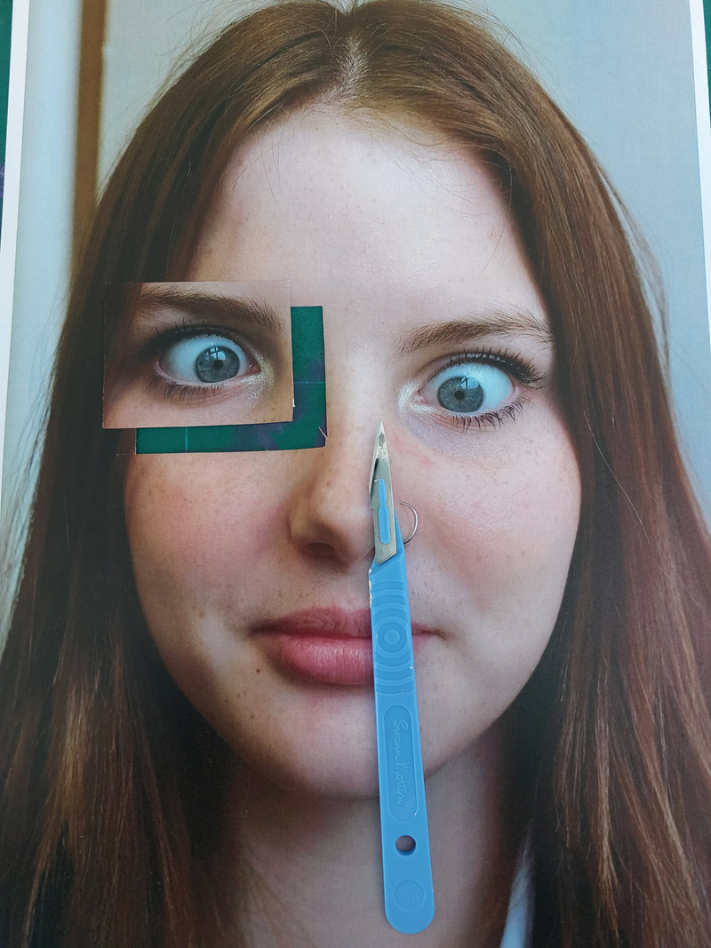
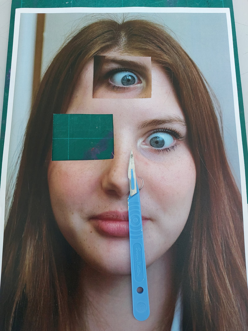
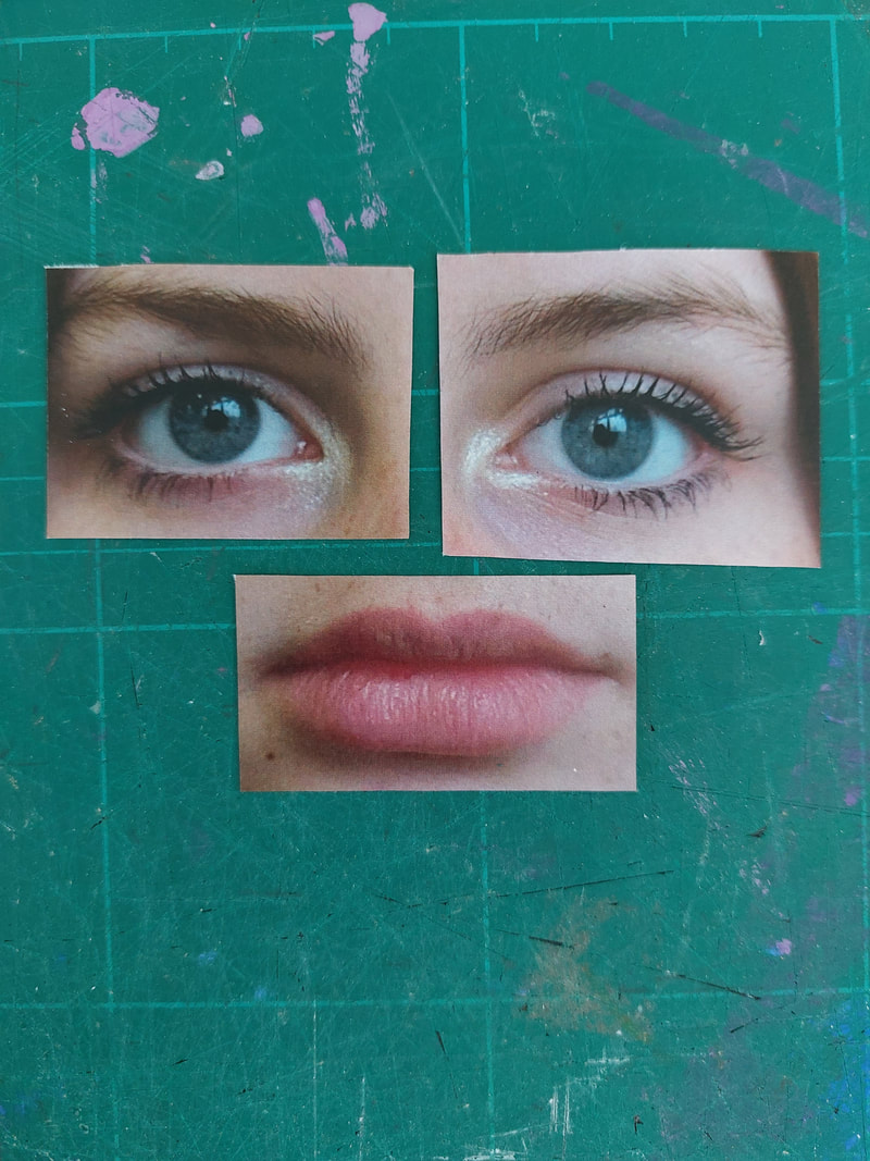
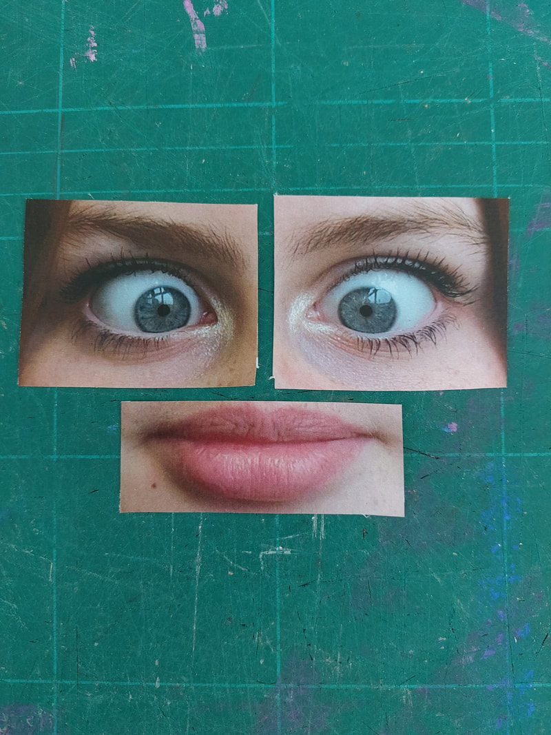
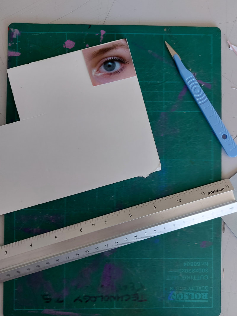
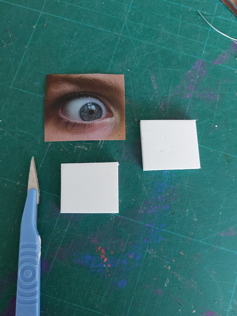
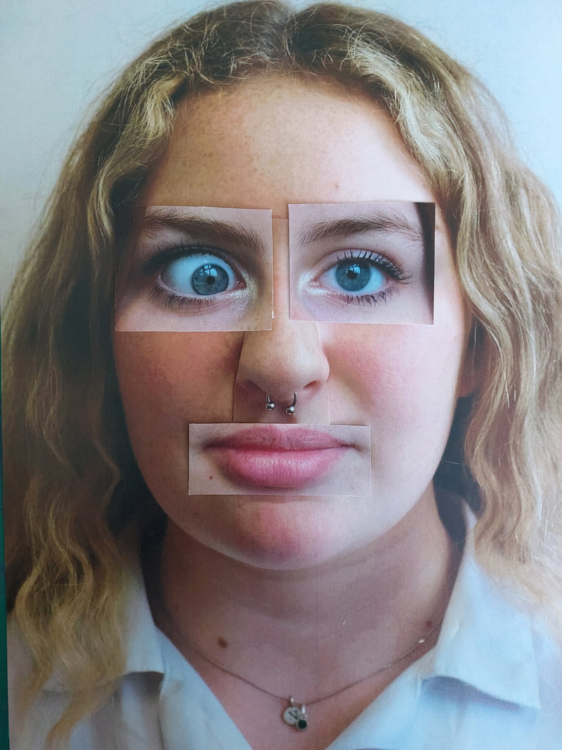
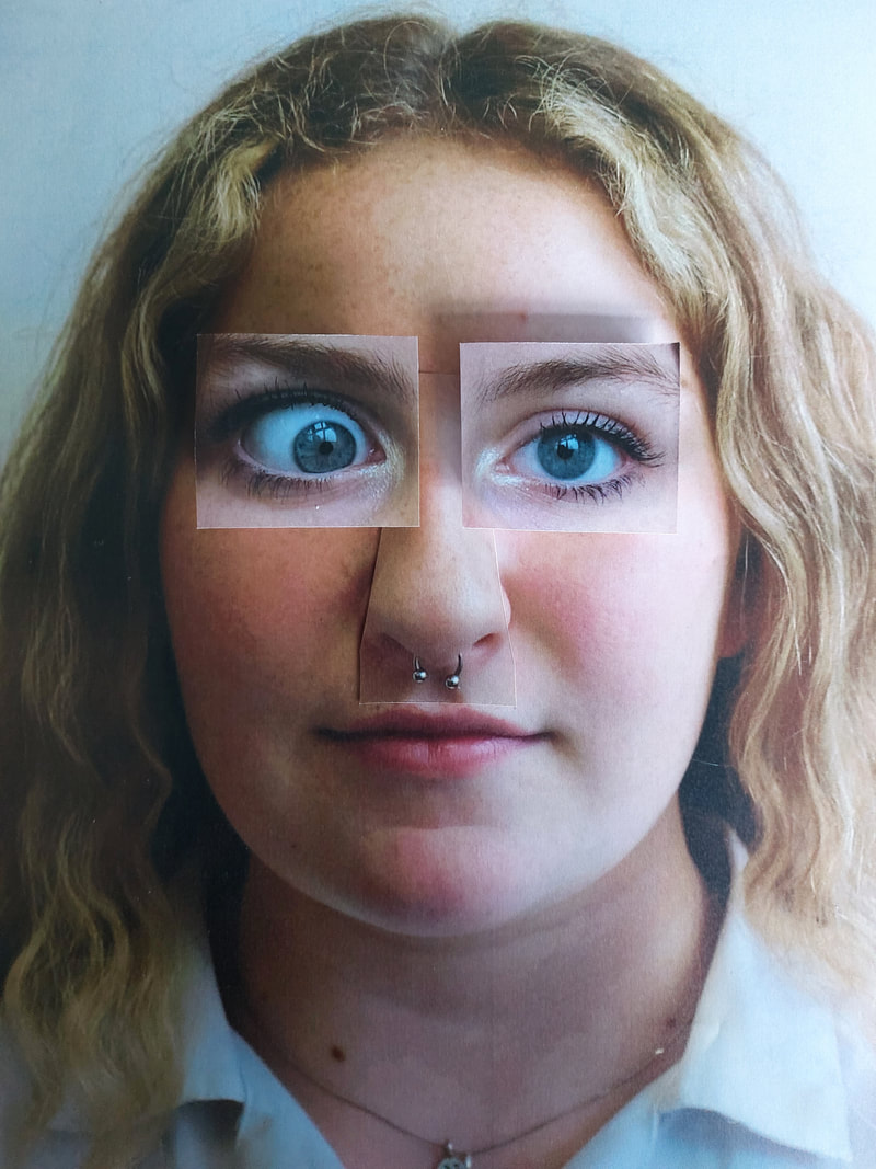
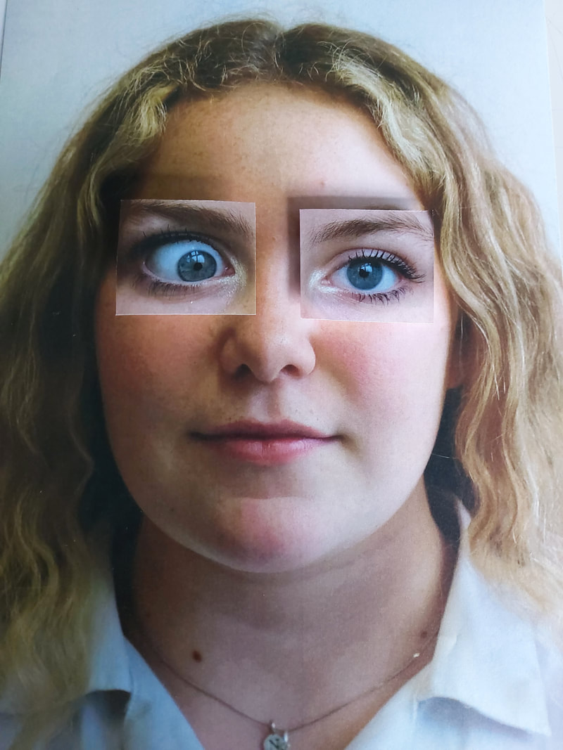
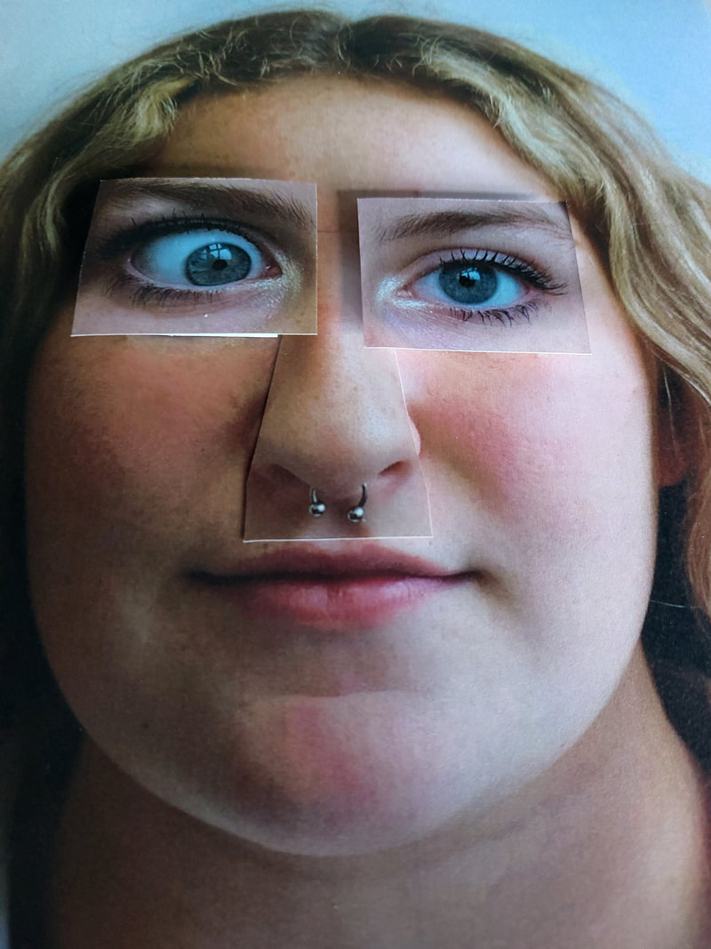
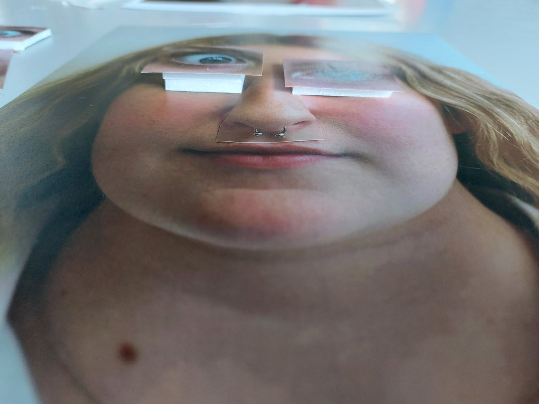
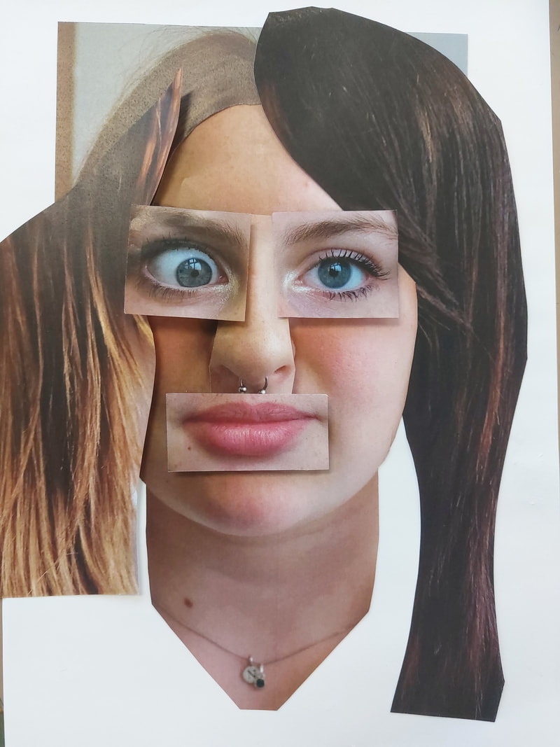
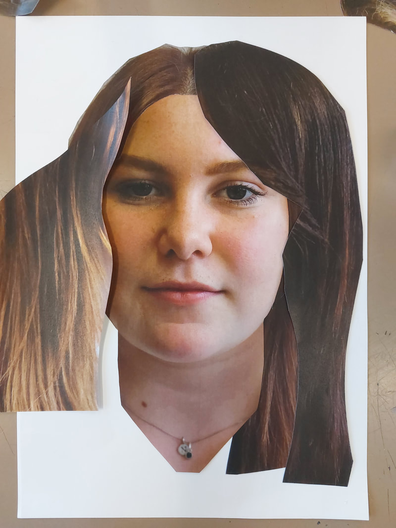
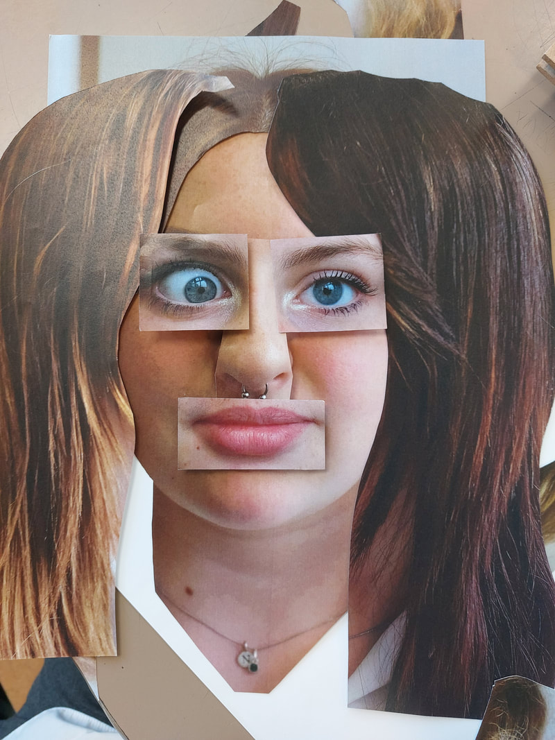
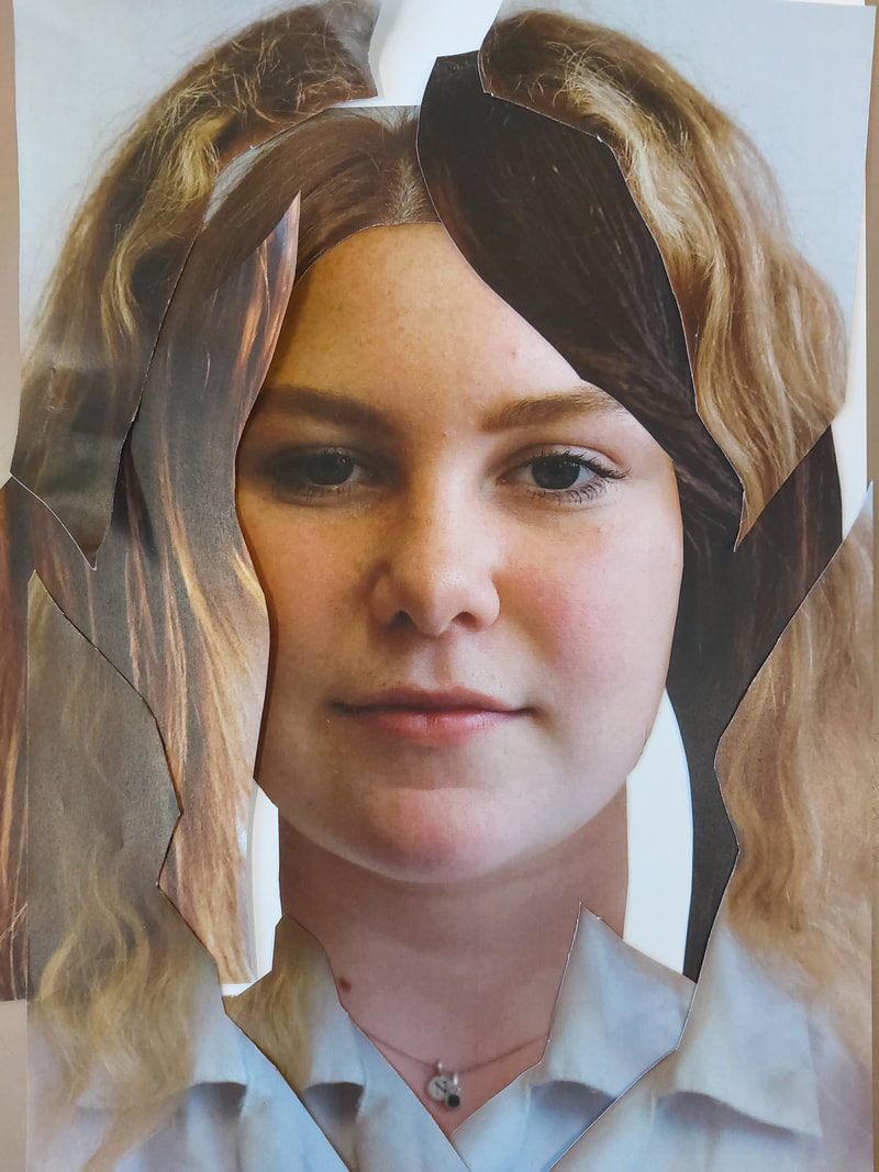
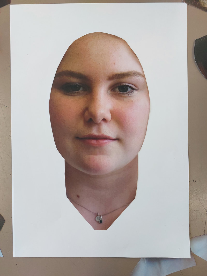
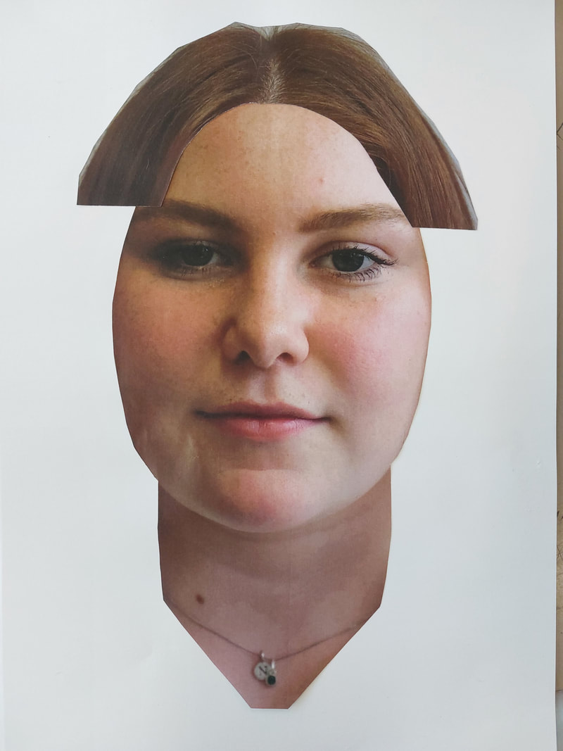
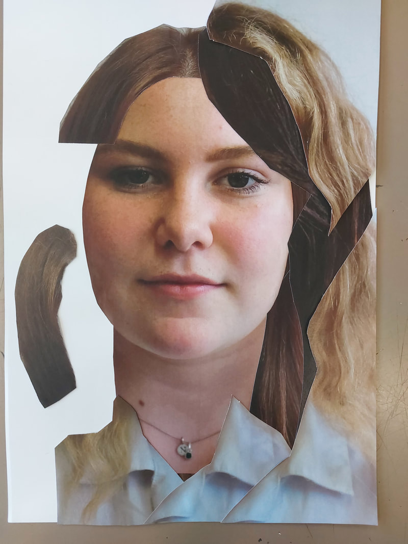
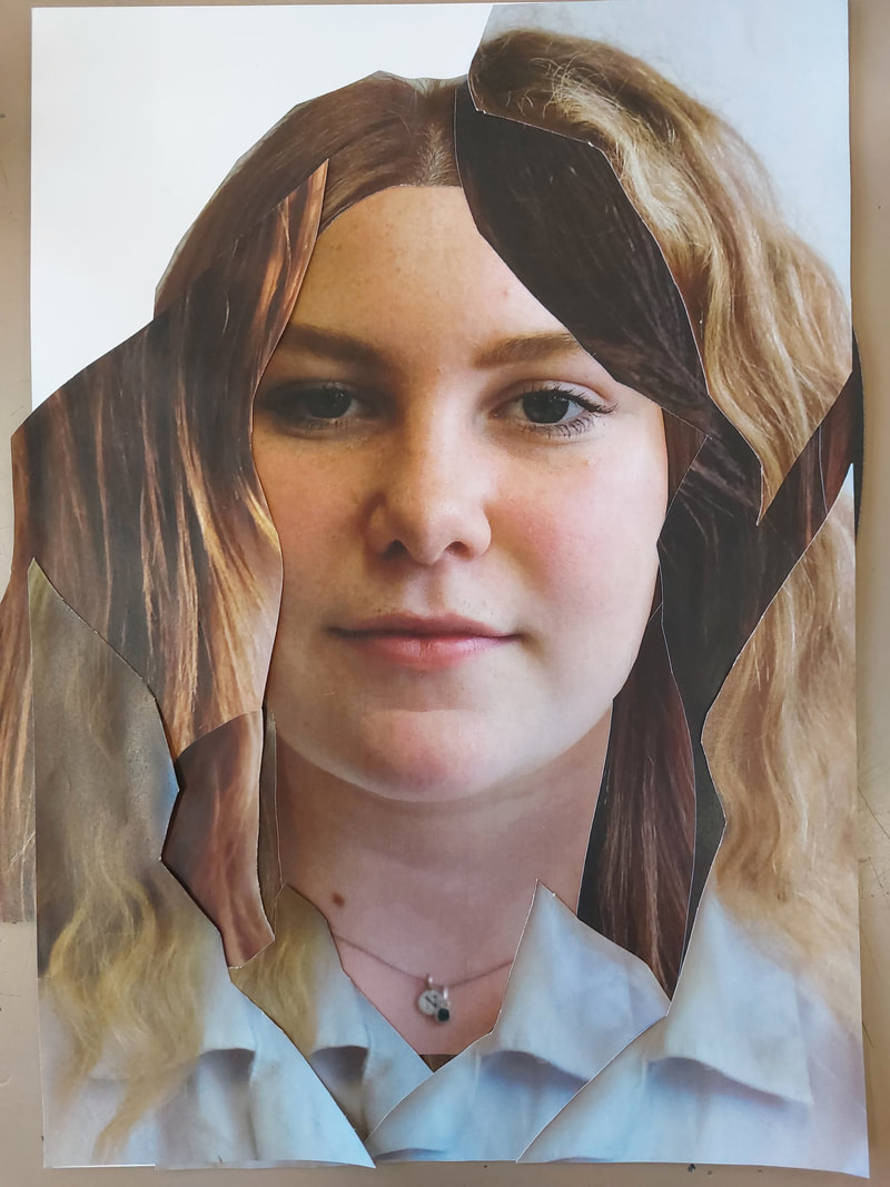
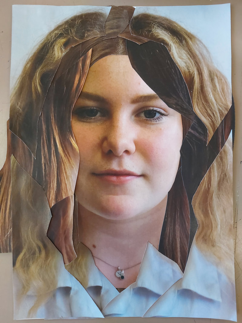
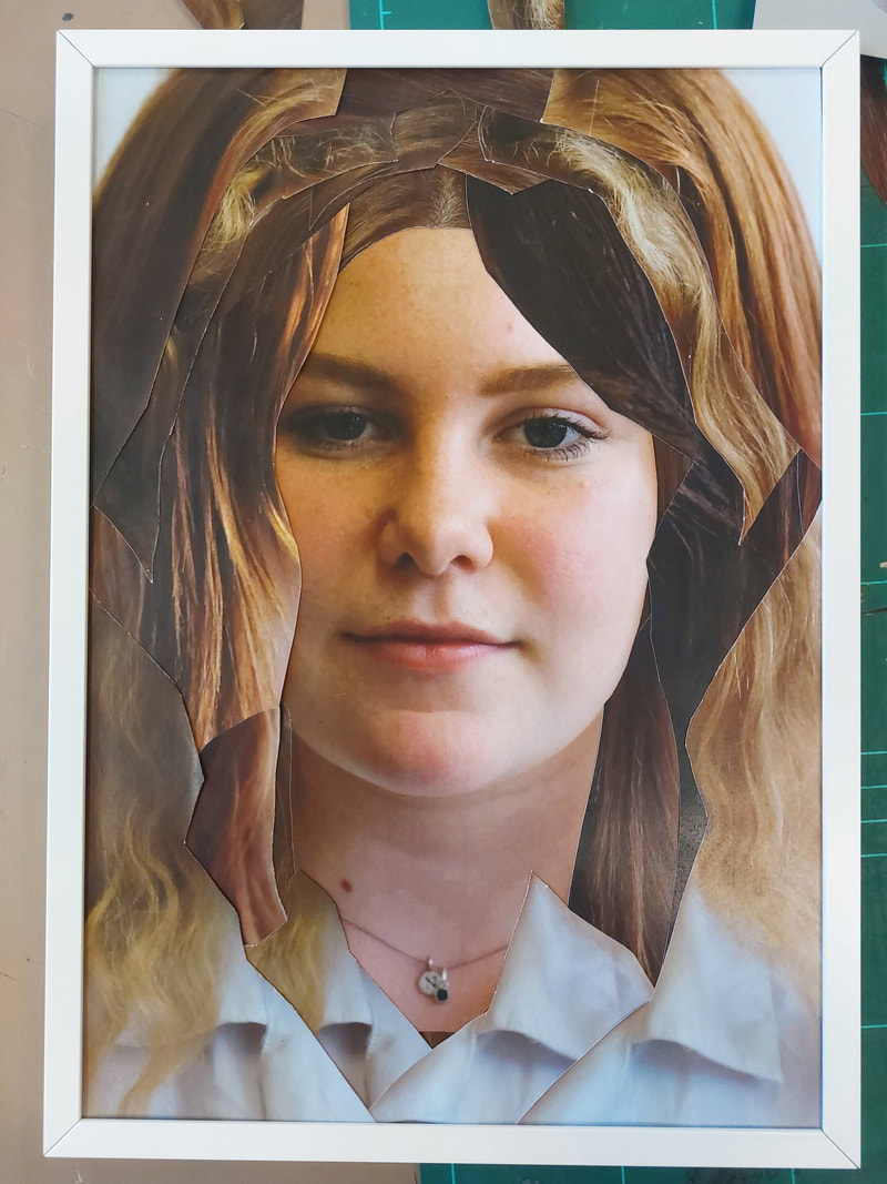
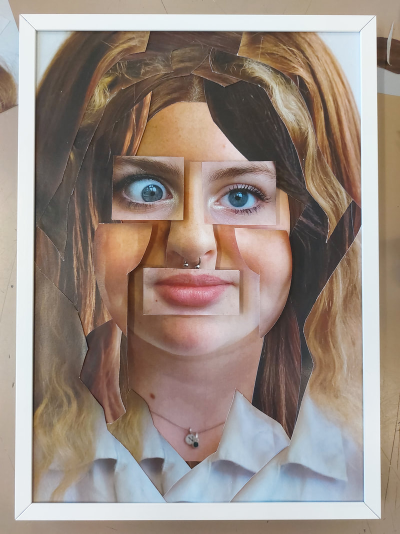
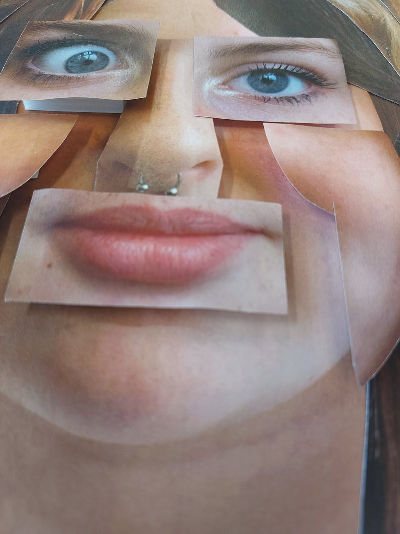
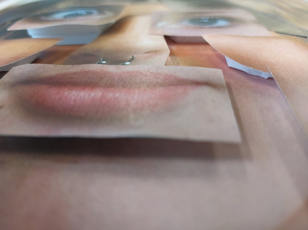
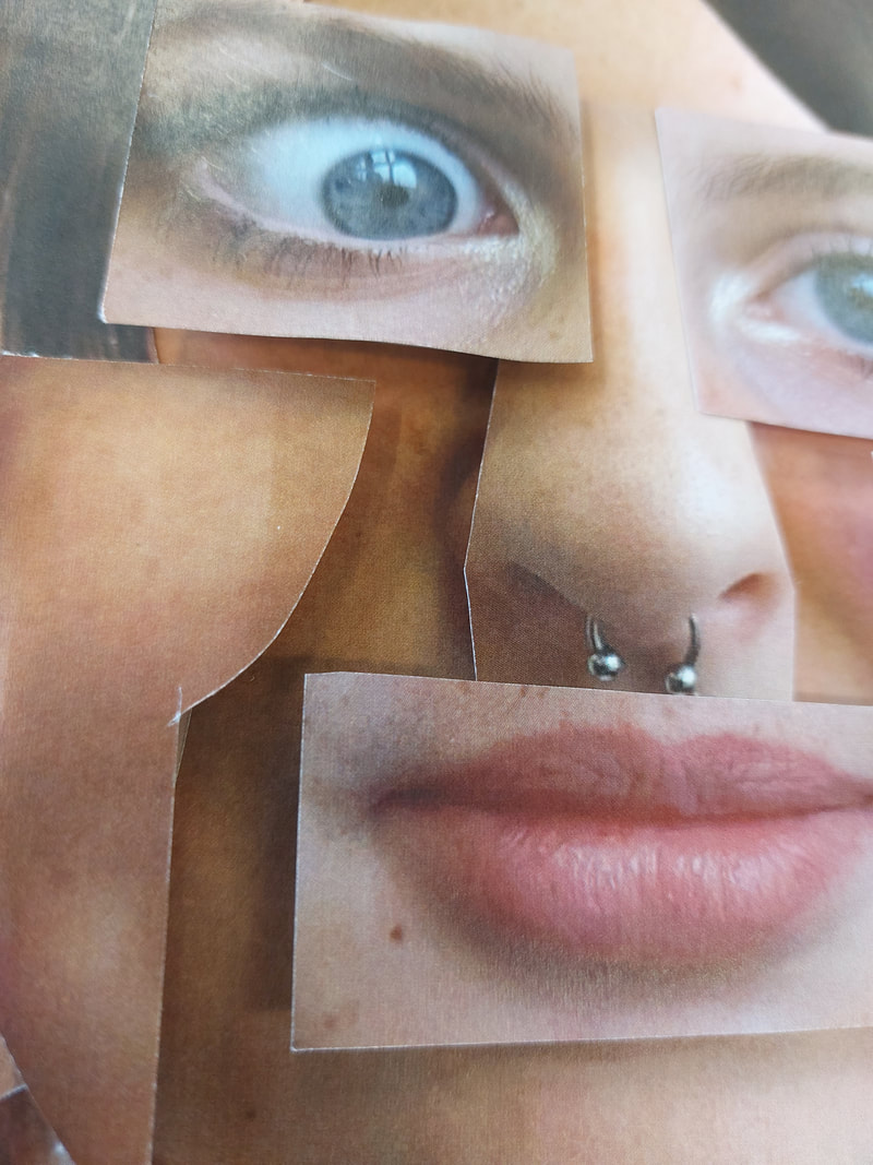
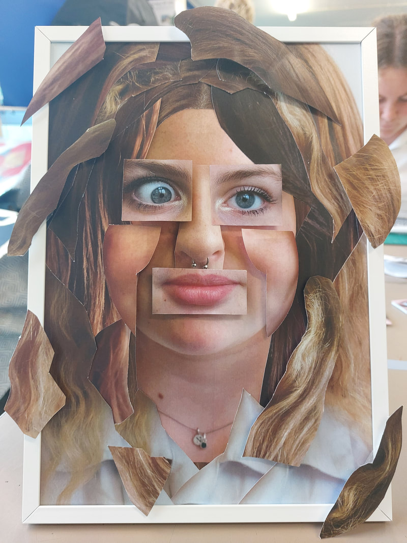
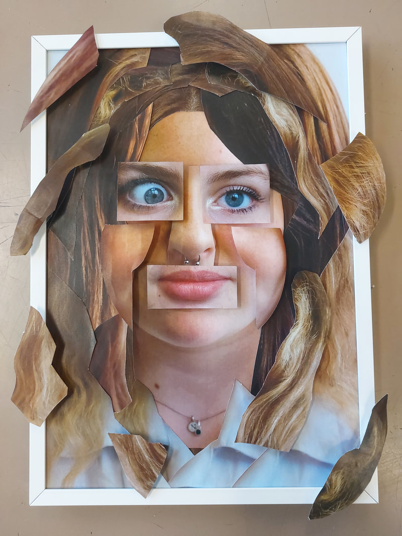
For the second half of my piece, like my plan, I printed the two images that I needed and drew a 1 by 1 inch grid on the back of the image. I then used a guillotine to cut the image into the squares, and arranged them on the frame and background before sticking them down. The images were bigger than I expected and didn't fit in the frame as well as I had hoped but to solve this I placed the pictures on a slant, in the end I liked this more than the original plan. To finish I placed the perspex screen on top of the frame.
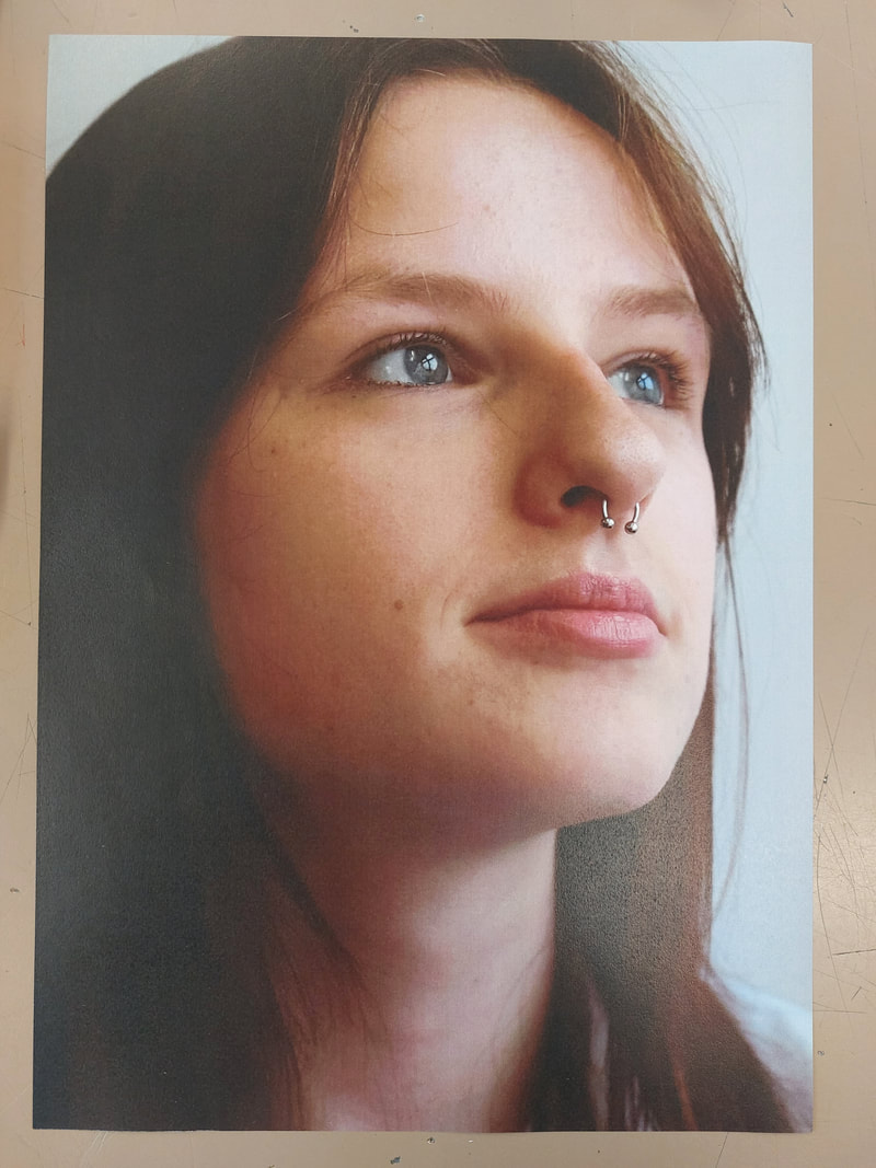
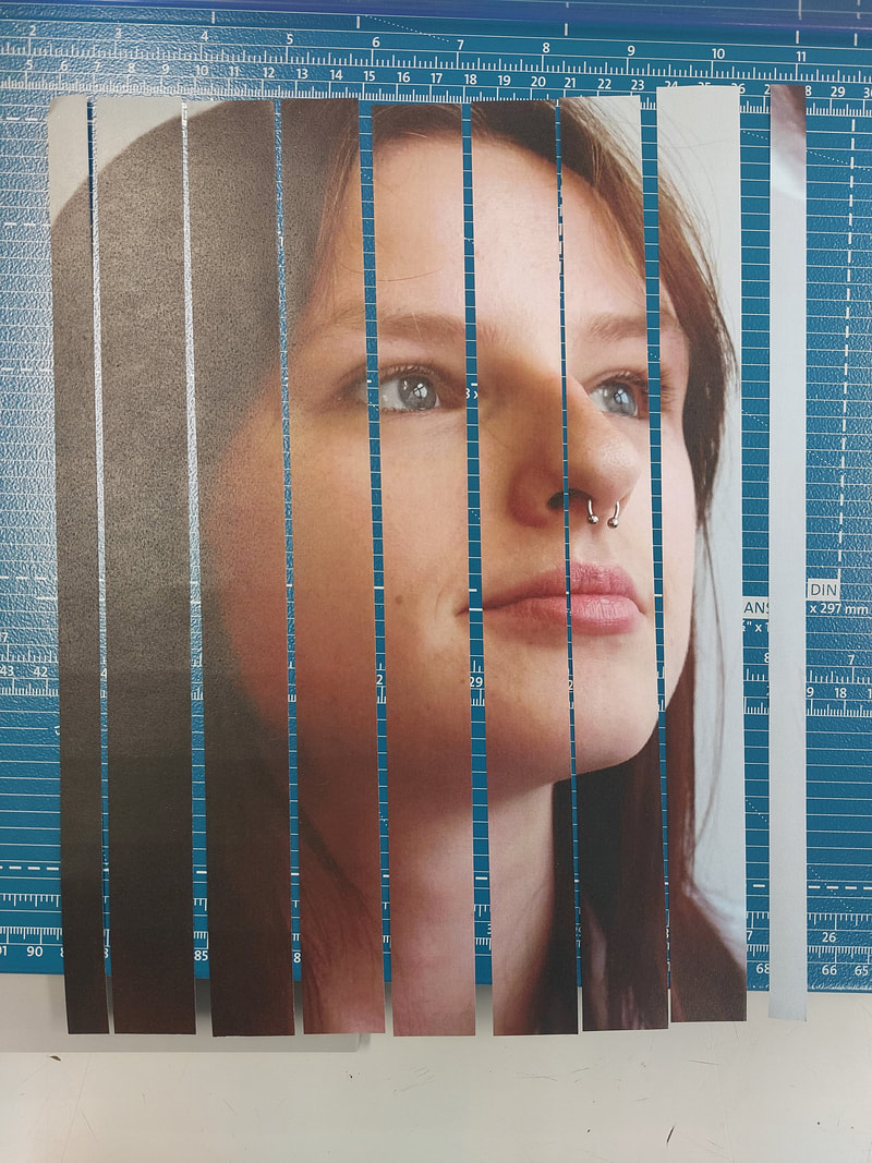
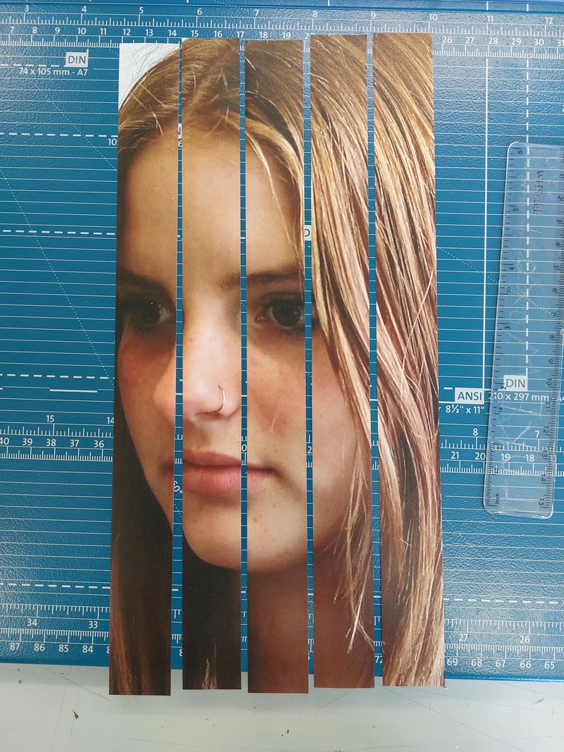
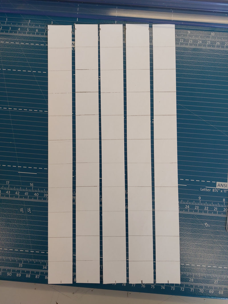
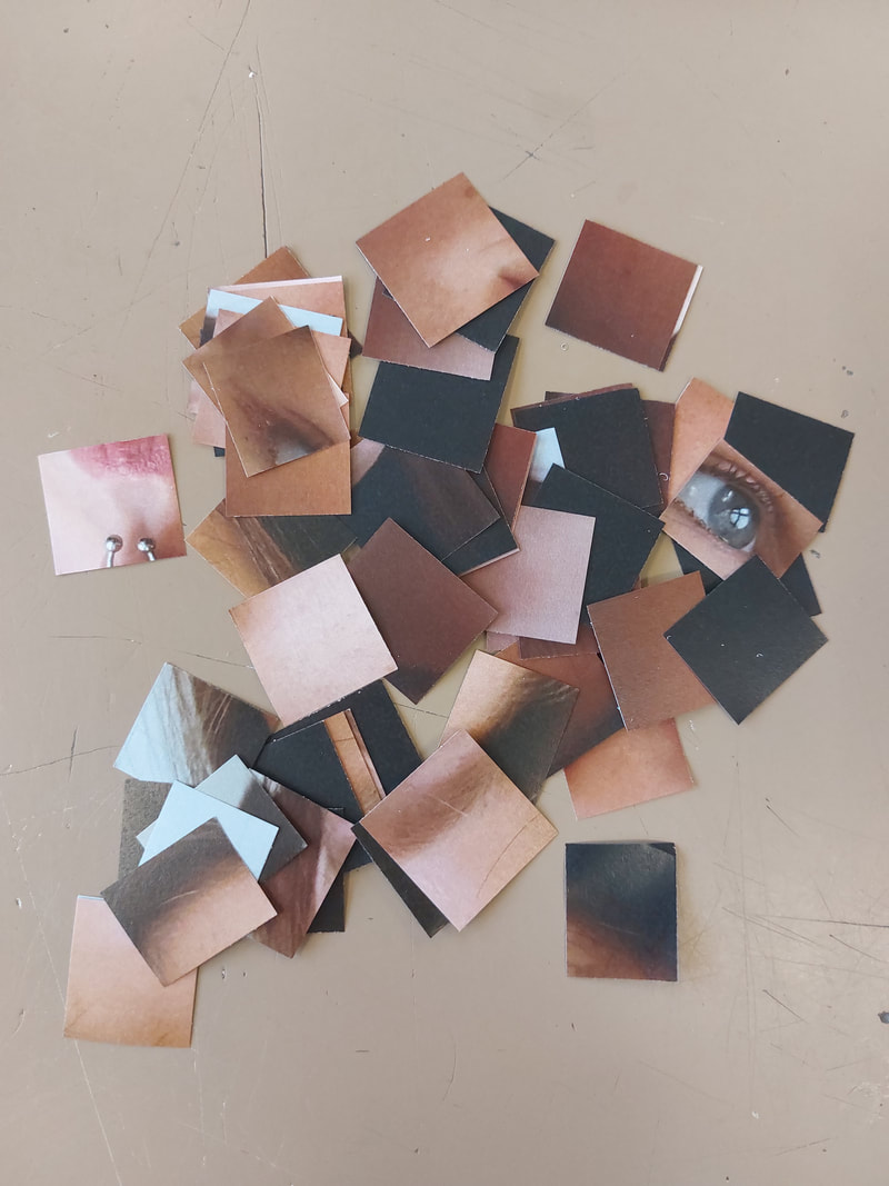
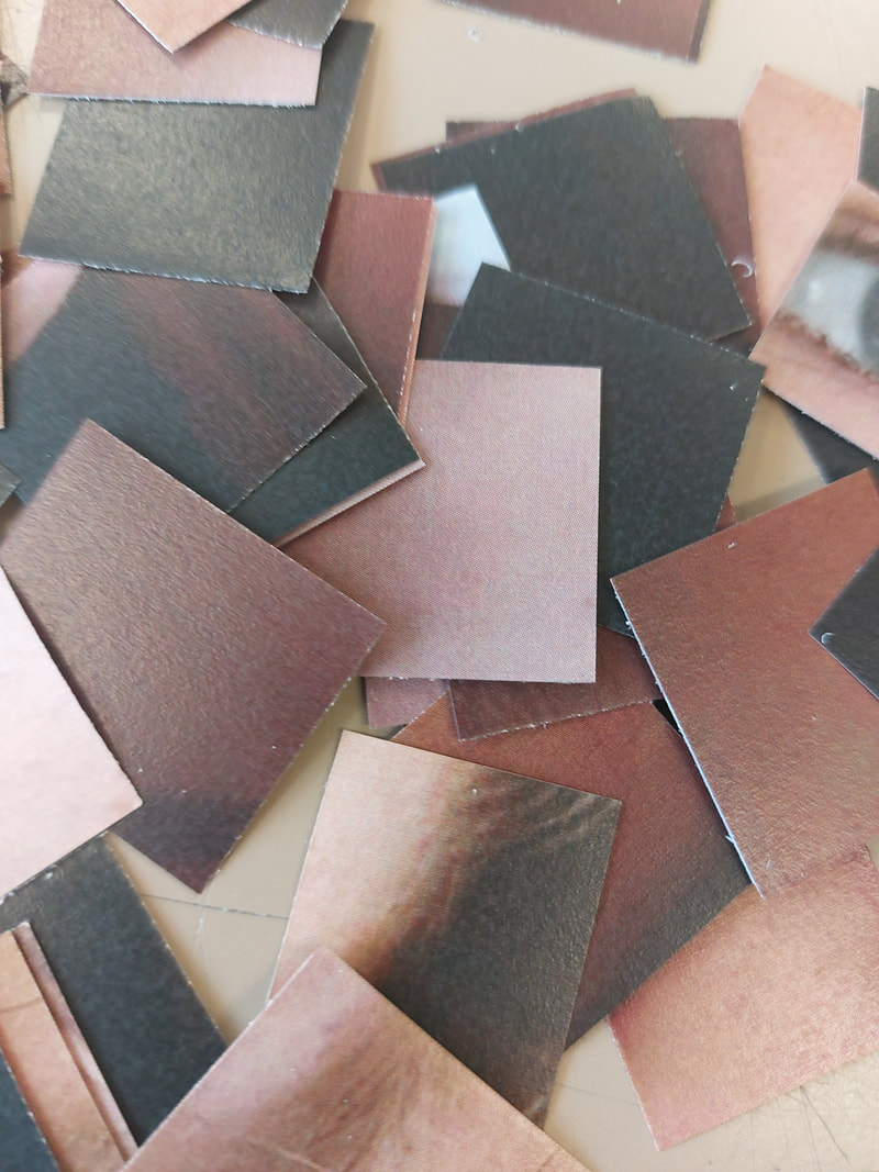
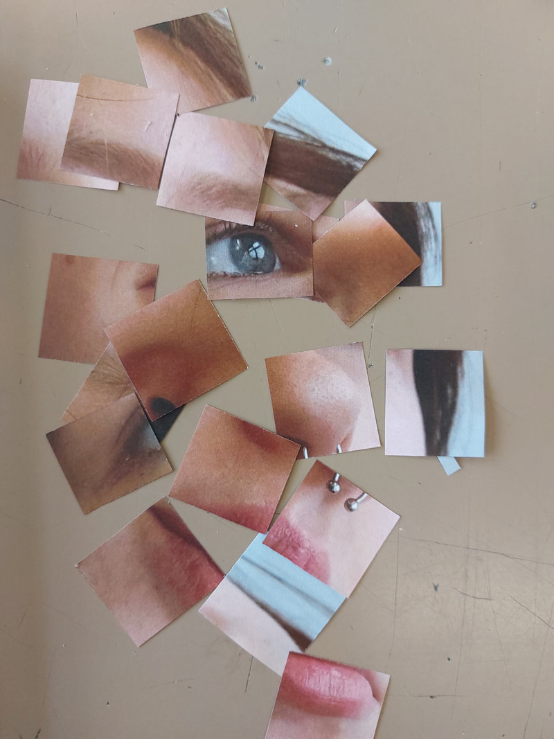
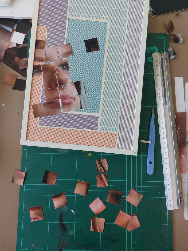
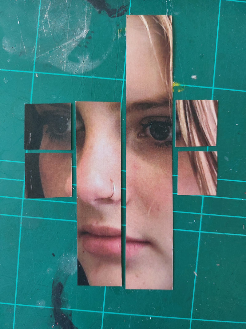
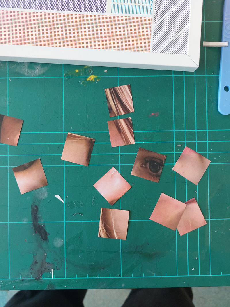
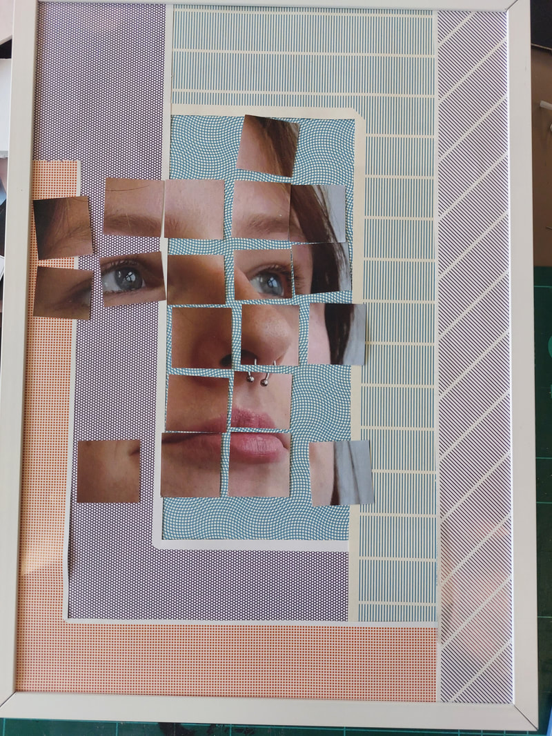
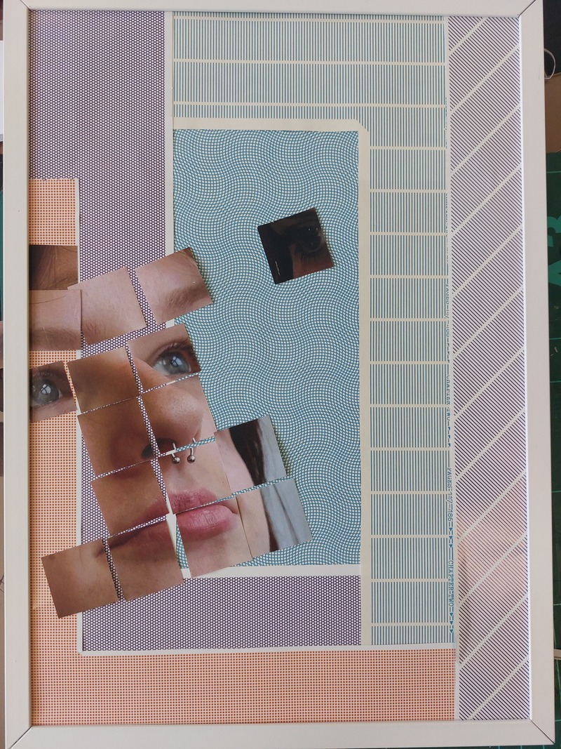
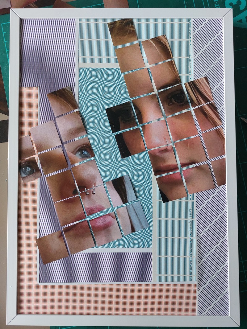
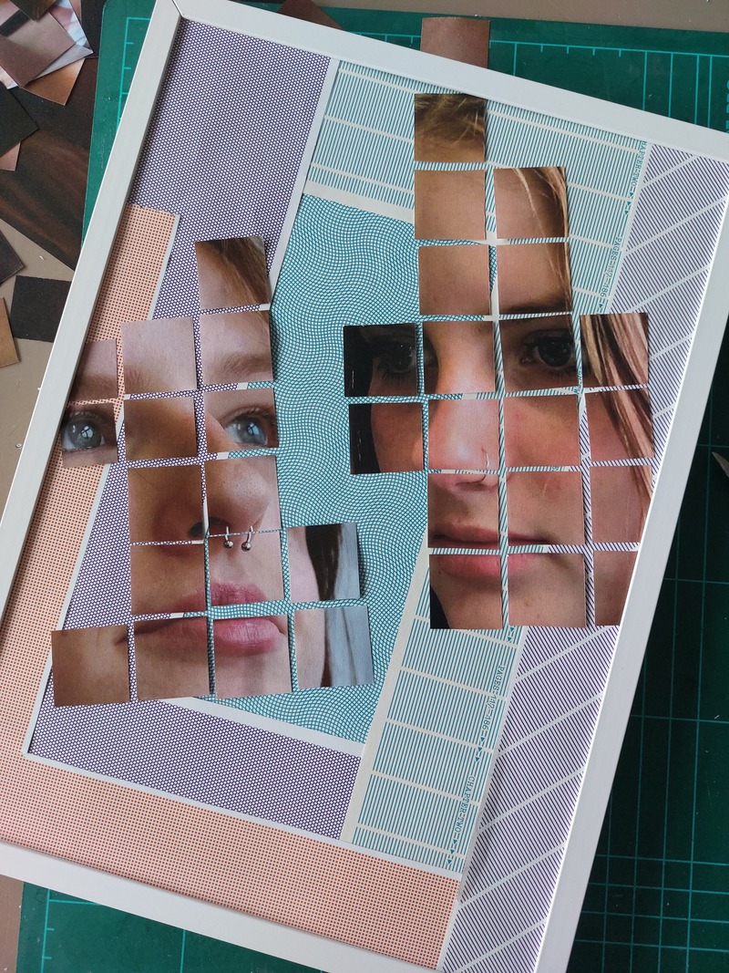
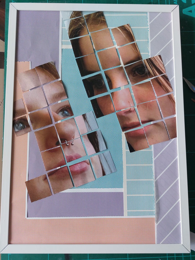
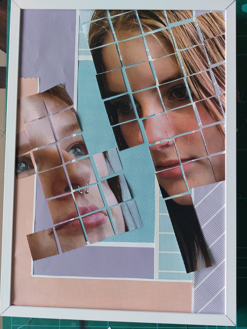
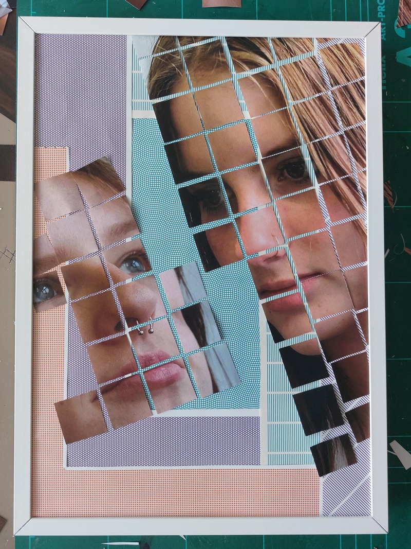
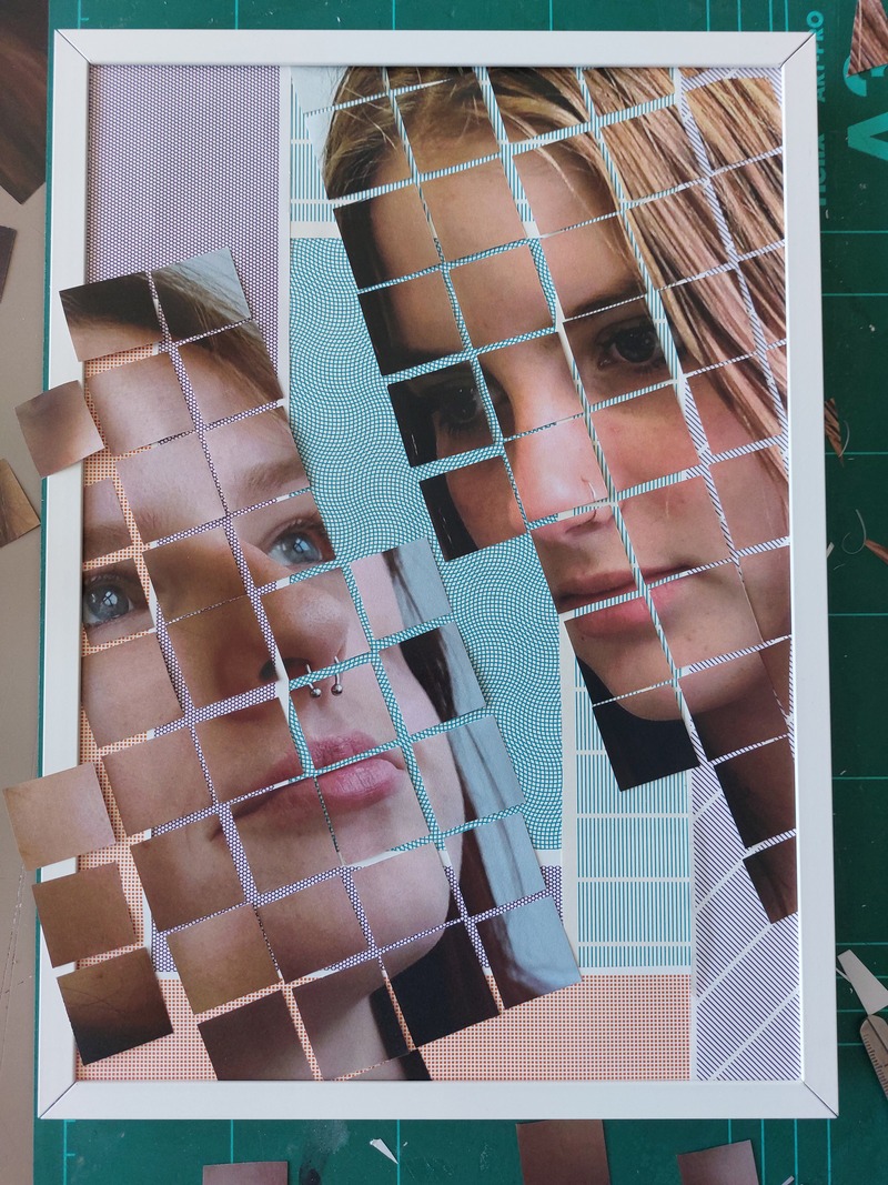
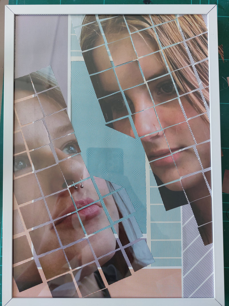
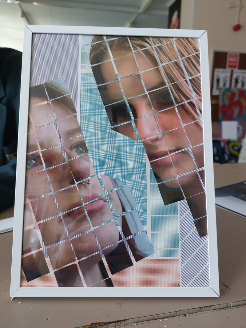
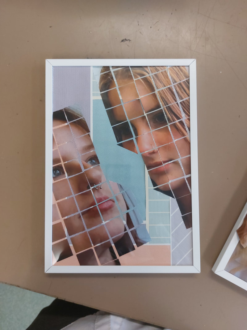
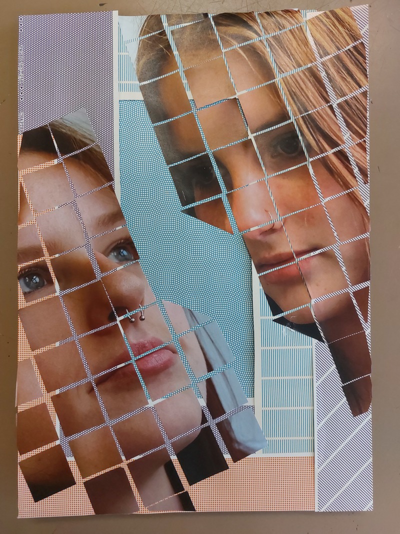
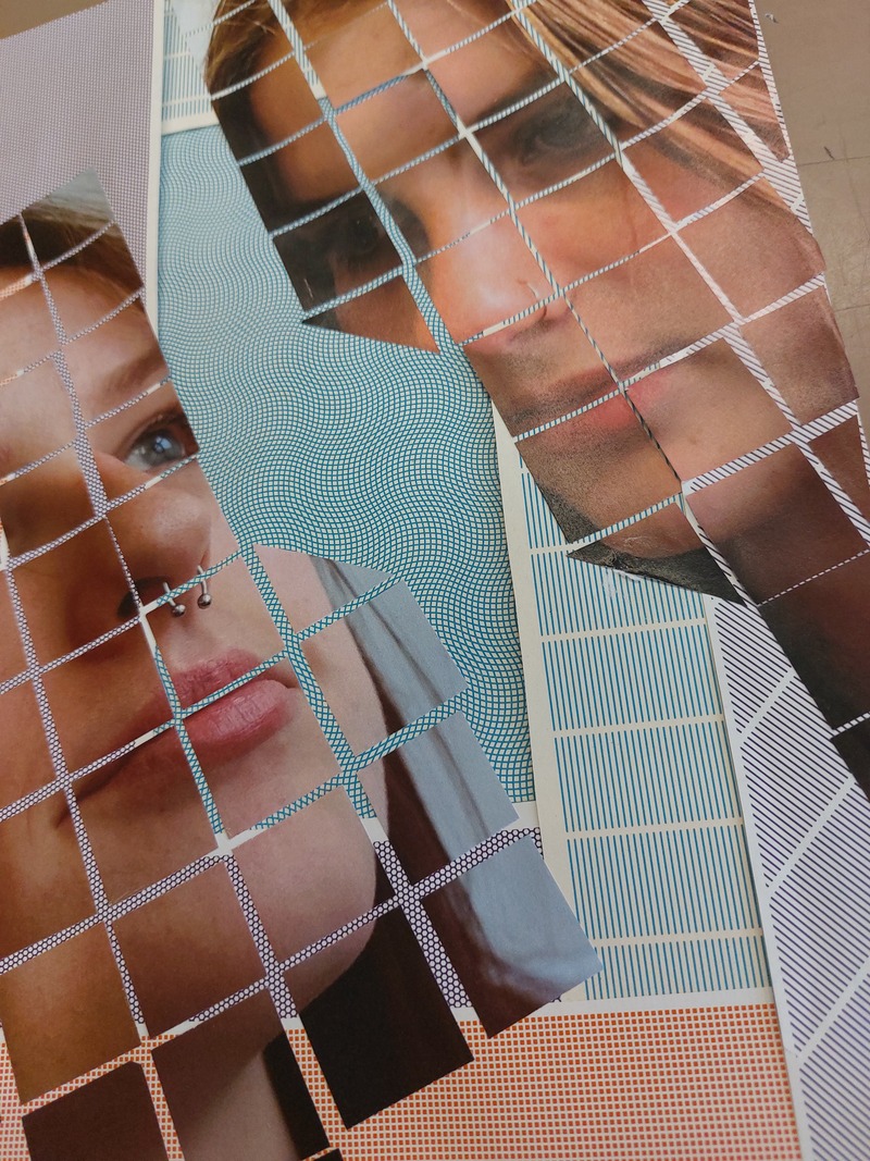
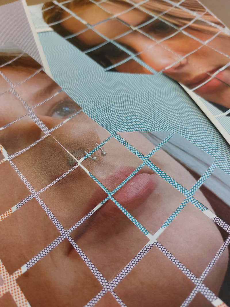
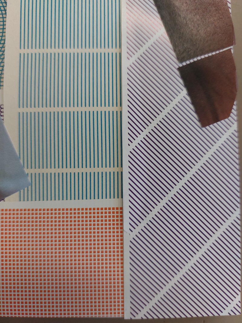
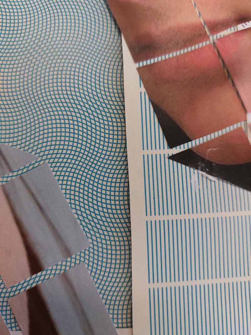
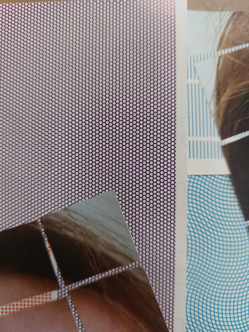
To finish, I placed the 2 pieces next to each other and took photos to show my Final Piece together.
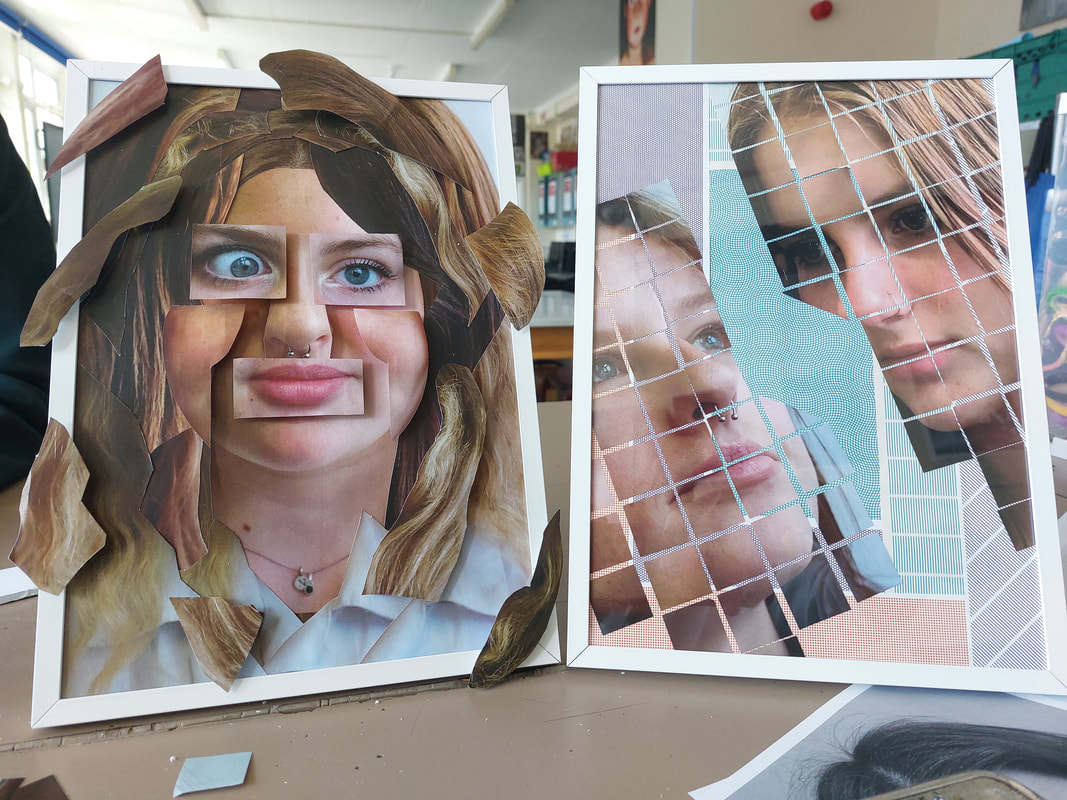
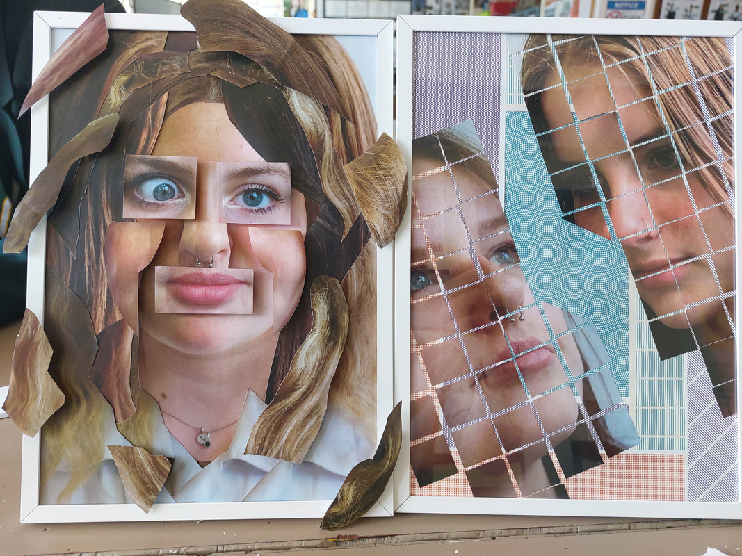
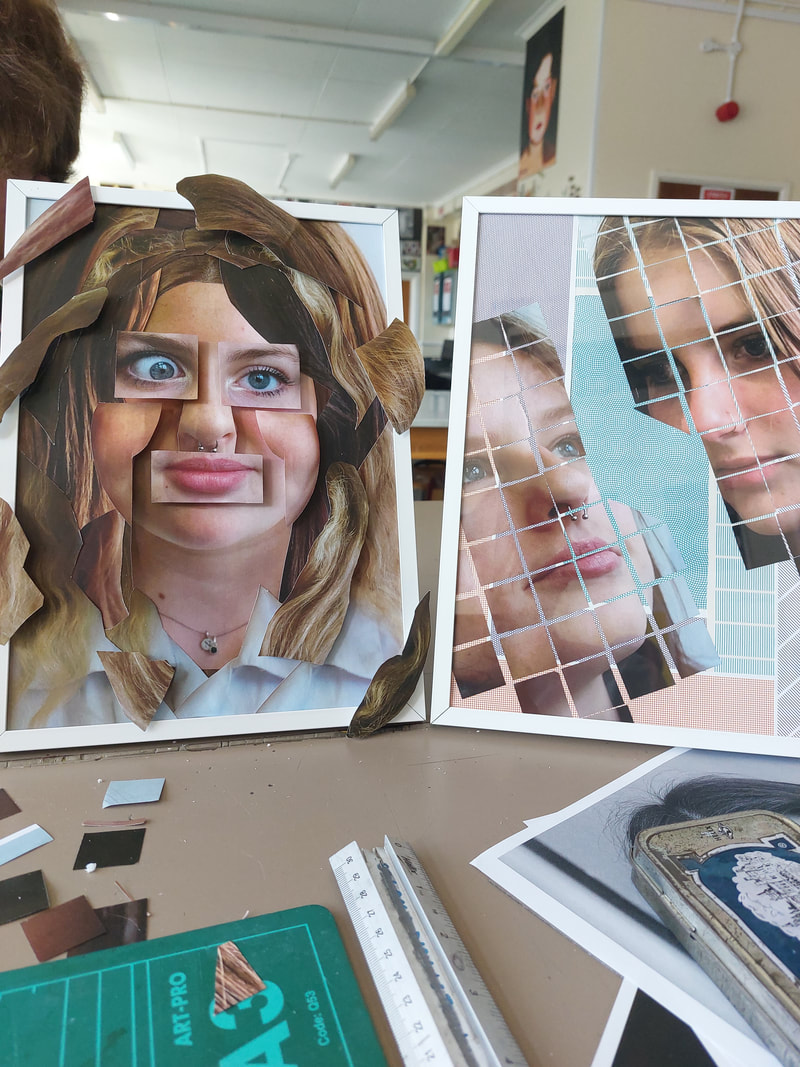
Review of my Final Piece
My final piece for the Human Condition project was split in two. I made two separate pieces in two separate frames, although these pieces did follow a similar theme and were developed with the same set of ideas. I think that they both turned out very successfully.
The right piece, I call Mix and Match, is an abstracted portrait, it is evidence of organic abstraction, with curves/naturality. This piece was created by collaging many different pictures of my friends that I took on my Fujifilm x100s camera. I cut together and chose the perfect images that I could use for the portrait’s eyes, mouth, nose, cheeks, hair and the base image itself. After forming the face, while planning, I realised that my collage did not resonate with me and I felt that I needed to upgrade it as it did not fit my expectations. This is when I decided to cut up more than just the face and I added the cheeks and the hair, creating a much more filled and successful image.
In my first half of the piece, I wanted to express the idea of identity and the expectations/ideas of what makes someone ‘normal’. I did this both by collaging but also by placing some parts of the hair over the edges of the frame showing how we should break of the prison of societies expectations. Although I wanted to express these ideas in more than just visual way I think that the ideas behind this creation are successfully expressed.
The Left piece, I don’t have a name for, it is a abstracted geometric piece, with repetition, lines and pattern. I created the piece by cutting two images into a one by one inch grid and then arranging them so they look as if they are looking towards each other. I chose the two images that I thought were best at creating the piece that I wanted, with one person looking up and one looking down. In the second piece I also created a background from magazine clippings and pages that I thought worked the most with my plans, the patterns formed by these magazine pages reminded me of graph paper and along with it the idea of creating something new, this carried on in the rest of the piece as the squares of my photos could also suggest building blocks.
Overall, I am very happy with he outcome of both the pieces when placed together. I think that I used good texture and levels with the use of the foamboard and also but also good a good use of collage, linking back to my photographers/artists that I looked at earlier in the year like: Hannah Hoch, Herbert Buyer and Kensuke Koike.
If I was to do it again I think I would have done more the the right half of the piece as I felt that it needed more work to improve it and get it to another/better level. I Think that I also could have experimented more with colour as it was a big part of my project before this, to improve this I could have added bits of black and white to the hair of the left half of the image or edited and changed the colours used in the rest of the piece, like reversing the colour of one or two of the squares.
Full Project Evaluation
For my project ‘Fragmented Body’, my take on the Human Condition unit, I have used lots of photographers for inspiration, such as Hannah Höch, Man Ray and Kensuke Koike. I explored these photographers' techniques, styles and themes to help me develop an idea of what sort of images work for my own different ideas.
One photographer whose work I looked at for my final piece is Antony Gerace. I found his work whilst researching images related to my work on Pinterest. His images really stood out to me as I liked their style in cutting up the images into squares and collaging together different colours and shapes. His images influenced my final piece as I used the style of collage and colour as a focal point in both of the images I produced for my piece. Another photographer I explored was Herbert Bayer. I emulated his work in my final piece and his style of splitting up the body heavily impacted on the way I viewed my project and my ideas. I loved the way he separated the body from something that we knew to something new, cutting up images of the body and using different backgrounds, similar to my ideas for my final piece.
I have investigated the theme of the human form using the process of collage and abstraction. The starting point for my project was the human form, I was researching the photographer Tim Booth’s work as it is centred around detailed photos of hands and the human body. He was great to look at first as I was able to form a more stable view on my project and develop my ideas. I experimented more for the first time with photo editors like photoshop or Gimp, I took pictures of my own hands and my parents to make a comparison between younger and older hands. I took lots of images using my Fujifilm X100s camera. After this my second photographer was Man Ray, I was still focusing on the human form as a theme but I also wanted to move into a more abstracted idea within this theme. His use of photograms/rayograms and the negative created by his pictures was what I was looking for and what I attempted to recreate with my shoots.
Over the course of the year I have experimented with a wide range of materials, techniques and processes for my human condition project. They include: photograms/rayograms using developer stop and fix chemicals, moving images, photoshop, in person manipulation, collaging and DSLR. I produced my photograms in the darkroom after looking at the work of Man Ray as it was a chemical technique that he had used. I now understand the use of the different chemicals when making the photograms by analysing the effect of each chemical when it is exposed to light, this gave me greater control over my end product.
Finally, out of the 2 projects in component 1, Abstraction and Human Condition, it was my Human Condition project that I have definitely enjoyed the most. This is because I was really able to apply myself and focus. All of my previous work had lead to me being able to write, analyse and I could improve on all the mistakes that I was making before in the Abstraction project. I also experimented with using chemicals and was able to use the darkroom for the first time. The fact that because of covid, component 2 was cut out and project 2 of component 1, The Human Condition was made much longer meant that I was able to develop and sustain my ideas, progressing aspects of my work. I investigated many more photographers and discovered many more ideas using elements of their work because I had so much longer to work on the project.
However, My Abstraction project was also very successful. I loved first discovering photography, the different techniques and settings that affected everything about taking a photo. My abstraction project meant I was able to create any idea from any subject and develop it into a full piece. Many of the photographers that I looked at in the abstraction project were my favourite to follow, like: John Baldasari, Alice Quaresma or Barbara Kruger. During the project I produced some really successful work even though there was a lot I could have improved on.